It's a game changer: Joanna Gaines' unconventional tile trick makes this tiny room feel instantly taller
Has the Fixer Upper star started a whole new tile trend?


Joanna Gaines' new show Mini Reni has just featured a striking breakfast nook makeover. But it's not the speed with which the makeover happened that's caught our eye, rather the fact that she's used tile on the walls of a dining space.
'A tiled accent wall and a place to gather set this breakfast nook apart,' commented Joanna. Over on the Magnolia website, there's more:
'Spacious wood windows in the breakfast nook gave the space existing character and charm. In order to highlight those windows, Jo and the team created an accent wall around them using tile. Rectangular tile in a checkered pattern also created the illusion of a taller ceiling, which made the space feel bigger.'
A post shared by Joanna Stevens Gaines (@joannagaines)
A photo posted by on
Tile trends are always changing, but what is noticeable is that many designers are now using different types of tile in more unconventional spaces, such as dining spaces, and are rethinking tile layout patterns as a clever way to introduce texture onto a wall or to change the proportions of a room.
'We've looked before at how interior designers make living rooms look higher, and one of the easiest ploys is to use vertical stripes, like in the room below. This tricks the eye into seeing the wall as taller than it is, which is a great trick for improving the proportions of a small or low-ceilinged space,' says Lucy Searle, Editor in Chief, Homes & Gardens.
'What Joanna Gaines has done is a little more unusual: using slim, vertically hung tile in a space that might usually confine them to a floor. Their layout not only creates the visual trick of lengthening the wall, the tile material itself also brings some beautiful natural texture to the room that couldn't be replicated with wallpaper or paint.
'It's important to note the lack of grouting, which would have made it feel more utilitarian. However, it's not needed here, unlike in a kitchen or bathroom. The Home Depot has a similar tile in a soft terracotta and a white if you wanted to repeat this pattern.'
Sign up to the Homes & Gardens newsletter
Design expertise in your inbox – from inspiring decorating ideas and beautiful celebrity homes to practical gardening advice and shopping round-ups.

Lucy Searle has written about interiors, property and gardens for over 30 years, starting within the interiors departments of women's magazines before switching to interiors-only titles in the mid-1990s. In 2018, Lucy took on the role of Global Editor in Chief for Realhomes.com, taking the site from a small magazine add-on to a global success. She was asked to repeat that success at Homes & Gardens, where she has also taken on the editorship of the magazine, which is the UK's oldest interiors magazine at 103 years old. Lucy is a serial renovator and also owns rental properties in the UK and Europe, so brings first-hand knowledge to the subjects she oversees.

The Mini Reni team 'used a dry stack method of installation – meaning no spacers or grout – to make the wall feel more artisanal and less like a bathroom or kitchen,' explains the Magnolia team.
But how to ensure an unusual material such as tile feels cohesive in a room? The answer lies in color choices.
'The gold and white color of the tile ties back to the wallpaper in the dining room. To bring an additional layer of interest and functionality to the space, the team built a multi-tiered shelf using copper and wood – materials anyone could find at their local hardware store. The copper ties with the golden hue of the tile, while the shelves were painted white. Each shelf was cut with rounded corners to give them added interest as opposed to a standard rectangular plank.'
We love this concept, but since tile ideas are an expensive and more permanent fixture than paint or wallpaper, what do you need to consider before following Joanna's lead?
A post shared by Joanna Stevens Gaines (@joannagaines)
A photo posted by on
Luxury interior designer, Naomi Astley Clarke, suggests you, 'choose finishes that are lasting and timeless as possible and suit the architecture of the building. That way they will always be suited to the home they belong in even if fashions come and go.
'However, face the fact that the room will age, and that your tastes and needs may change over the course of two decades, so make choices that allow for some level of flexibility – for example, a paint color is easy to change, tile less so. So perhaps choose tile or hard finishes that are more neutral and that will work with many colors – then the wall colors can be more dramatic and easily change over time.
'Splurging on finishes is often worth it because things like flooring and tiles are there to stay. Make sure you love them and, if you can spend those extra pennies, it should pay off.'
Shop Joanna's Gaines' breakfast nook Mini Reni
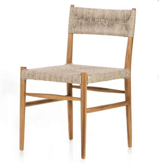
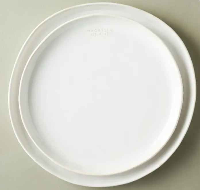
To shop the entire room, you can visit Magnolia's shop. Good news! Much of the product is on sale, too. These are our favorite pieces:

Was $1699.00, Now $1,359.20
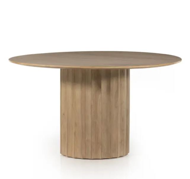
This elegant round top wooden dining table from Magnolia stands out for its indent design, rounded base. The light wood color is very on trend.
If tiled walls in unconventional spaces is indeed a new interior design trend, it's safe to say we're fans.

Lola Houlton is a news writer for Homes & Gardens. She has been writing content for Future PLC for the past six years, in particular Homes & Gardens, Real Homes and GardeningEtc. She writes on a broad range of subjects, including practical household advice, recipe articles, and product reviews, working closely with experts in their fields to cover everything from heating to home organization through to house plants. Lola is a graduate, who completed her degree in Psychology at the University of Sussex. She has also spent some time working at the BBC.
-
 Plants never to grow next to fruit trees
Expert advice on which plants to keep away from fruit trees to encourage a healthy harvest
By Jacky Parker Published
-
 Martha Stewart's tips for arranging daffodils are unbelievably simple and effective – it's the only flower advice you need this springtime
Martha shows us that we can create gorgeous bouquets of this seasonal flower by simply trimming the stems and placing them in specific vases
By Hannah Ziegler Published

