Interior design tips – 37 insider tricks from top designers
These interior design tips will help you discover the secrets of decorating success from the world’s best interior designers
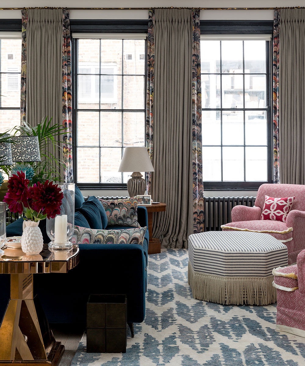

Kiera Buckley Jones
If you want to learn from the best, you’re in the right place. We’ve asked the world’s leading designers to share their expertise so you can embark on your next room remodel with additional design savvy.
Interior design is a broad church that covers everything from the intricacies of the color wheel to more practical tips around furnishing your home for functionality. Here, we cover the top pieces of advice our favorite interior designers thought it important you know.
These interior design tips will provide the inside track on how to select furniture, fabrics, work with color, choose lighting and a whole lot more.
Interior design tips
Get ahead of the crowd with home decor ideas and advice from the most celebrated designers, and discover how to bring the latest interior design trends to every room, with our top interior design tips.
1. Add character with upholstery and rugs
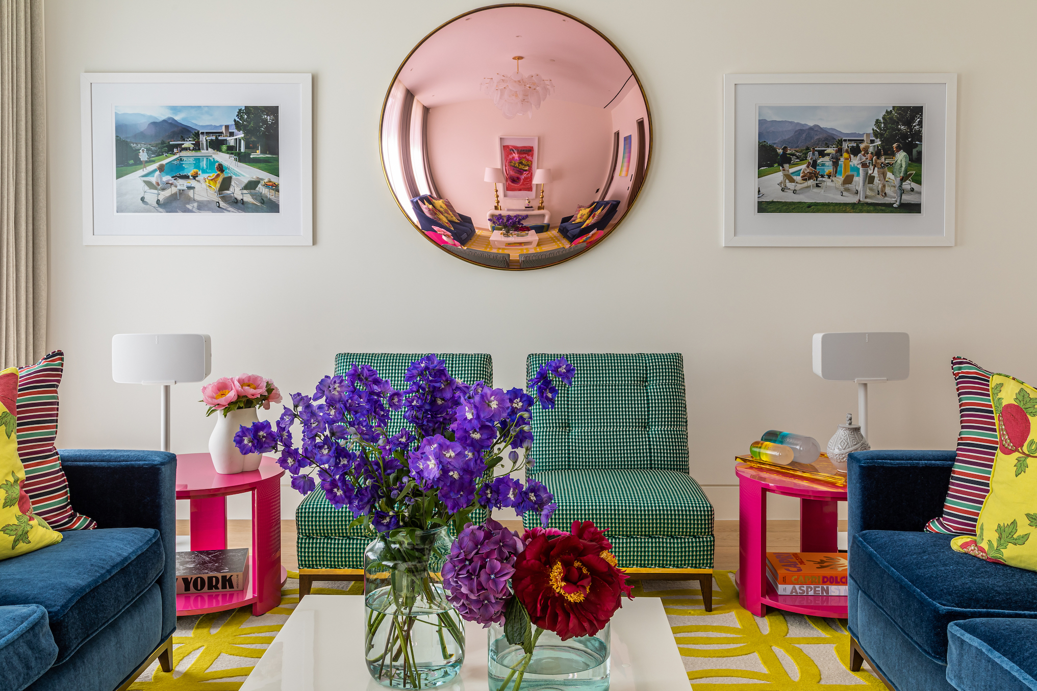
Decorating ideas needn't be labor-intensive: it is possible to completely transform a temporary home without decorating the walls. Instead, use patterned rugs and upholstery. Team with quirky artworks and accessories to create a joyful and inviting scheme.
‘Our clients wanted to infuse their rental with a signature of their own and commissioned us to furnish the house in a wardrobe of color and cool,’ says Samantha Todhunter.
‘The blank canvas allowed us to let our studio philosophy loose – a new traditional mixing classic shapes, sleek finishes and of course an exuberant use of color! The result brings an instant smile, and our clients have an interior that they can pack up and reinvent wherever they go, and it will always feel fresh and relevant.’
Sign up to the Homes & Gardens newsletter
Design expertise in your inbox – from inspiring decorating ideas and beautiful celebrity homes to practical gardening advice and shopping round-ups.
2. Use a mural as a headboard
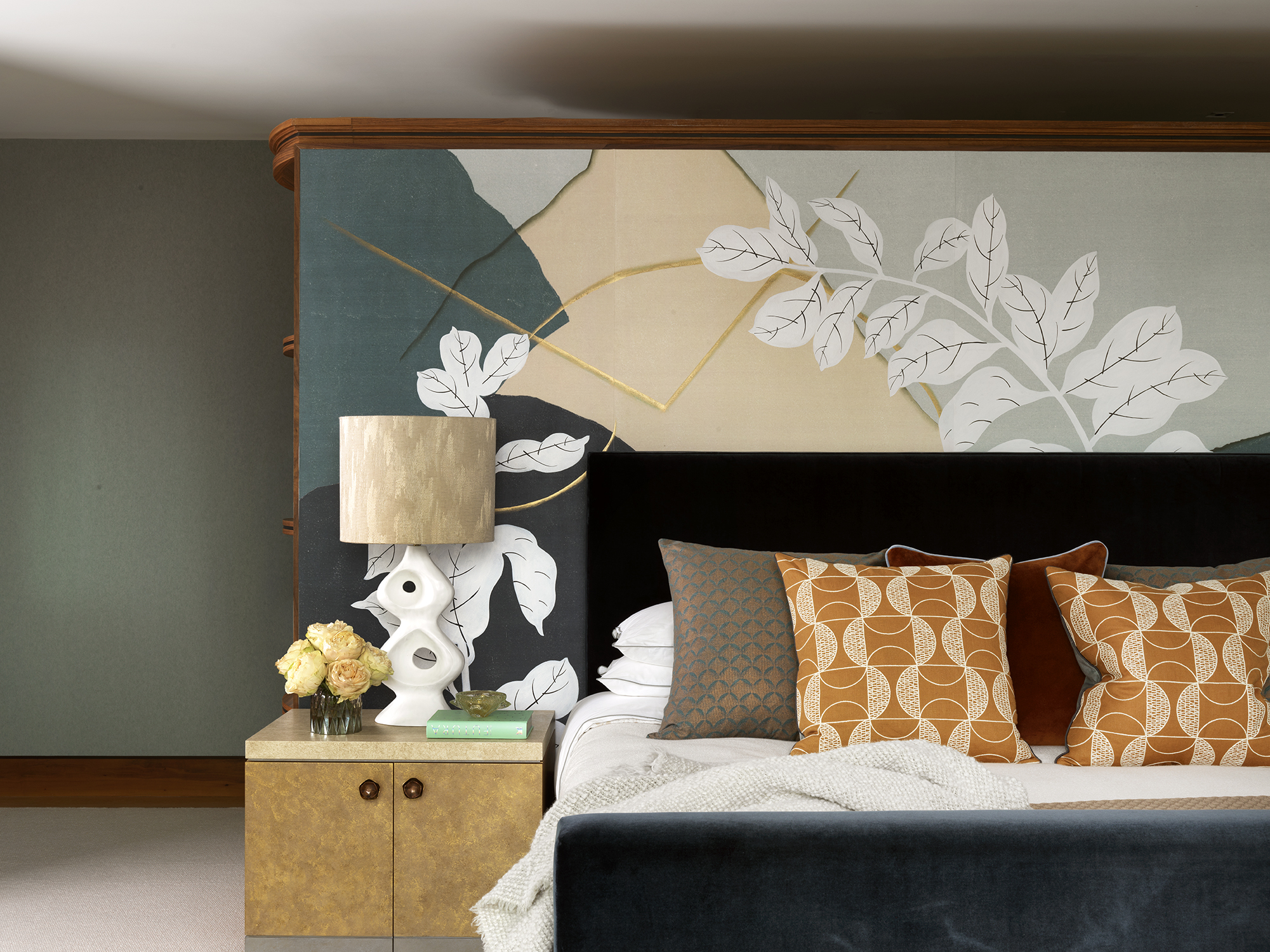
Wall mural ideas offer focus in a room and can transform a plain space dramatically. For example, a striking bedroom wallpaper behind a bed creates a focal point, while scatter cushions in a small-scale pattern in one of the featured colors bring the look together.
‘The accent color of the master bedroom is aqua blue, a strong color that blends with the ethos that the master bedroom should be the most soothing room in the house,’ says Natalia Mylar. ‘A botanical Fromental wallcovering provides a statement wall behind the master bed, complementing the luxurious blue velvet upholstery. Crisp, tailored pieces and white accents bring a freshness to the room.’
For anyone with a generous budget you can commission wallpaper and murals to suit your scheme perfectly; otherwise, there are many online brands that can size their designs to suit your room's proportions.
3. Paint on a pattern
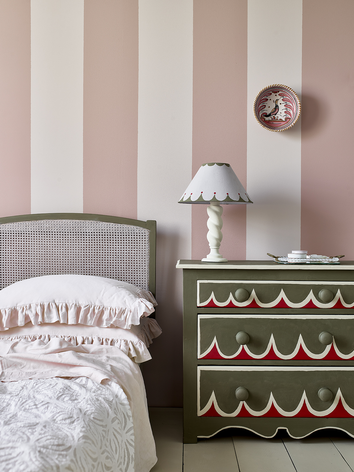
Consider bedroom paint ideas such as upcycling a piece of furniture with a decorative paint technique. This is not only good for the environment but gives you the opportunity to flex your creative muscles.
‘Painting is absolutely the best form of DIY – a coat of color not only transforms the look of your home, but it’s also wonderfully soothing to pick up a paintbrush,’ says Annie Sloan.
‘Whether it’s adding a stripe or two to your lampshades and vases, or updating an old chest of drawers, the simplest splashes of color and pattern can breathe fresh life into your home.’
4. Go big in small spaces
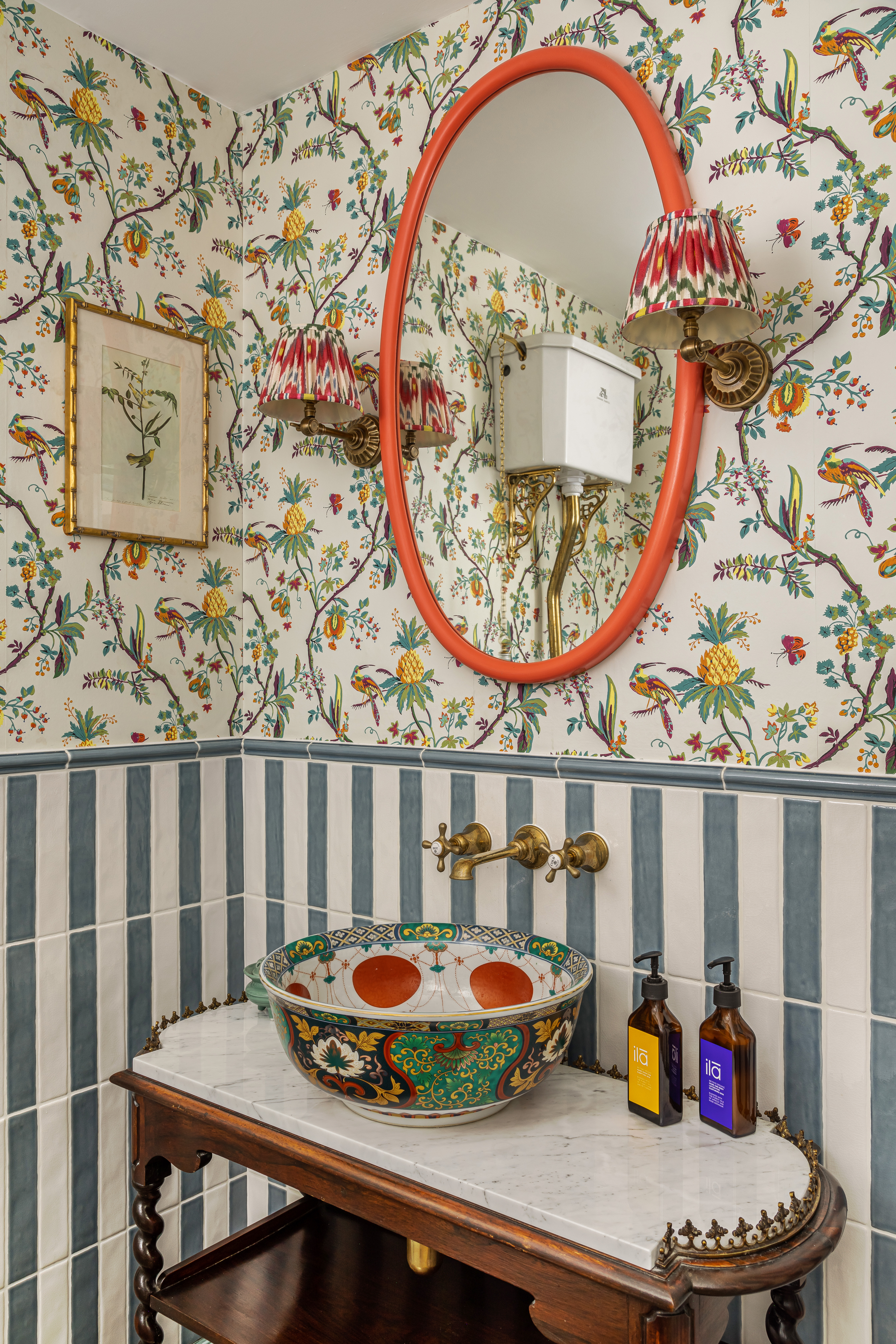
The downstairs bathroom may be the smallest room of the house but this doesn’t mean it can’t take a punch of pattern. In fact, the powder room is the perfect space in which to go all out and clash your prints.
‘Pattern and color are integral to our design,’ says Lucy Barlow, creative director of Barlow & Barlow. ‘Mixing different patterns together always brings a room alive and creates a happy home! We love combining busy florals with simple stripes as they balance each other out whilst creating interest. Try playing around with contrasting materials, too, such as a vibrant wallpaper next to fun tiles. Smaller spaces such as a bathroom are the best places to start when it comes to pattern.’
5. Wallpaper the whole room
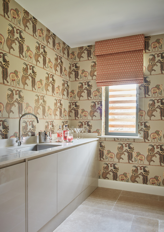
Have courage in your decorating choices and cover all your walls in the same wallpaper rather than restricting it to just one. Go even further and match your window dressing in a slightly smaller print. It’s a case of go big or go home.
‘An easy way to introduce color to any room is to go bold with your walls,’ says Emma Deterding, creative director and founder, Kelling Designs. ‘Whether you opt for a beautiful, bright paint color, or choose a wallpaper in a vivid tone, you can really transform a room quickly and easily. The key is to choose something that you love and cover all the walls as opposed to just a feature wall.’
6. Merge horizontal and vertical stripes
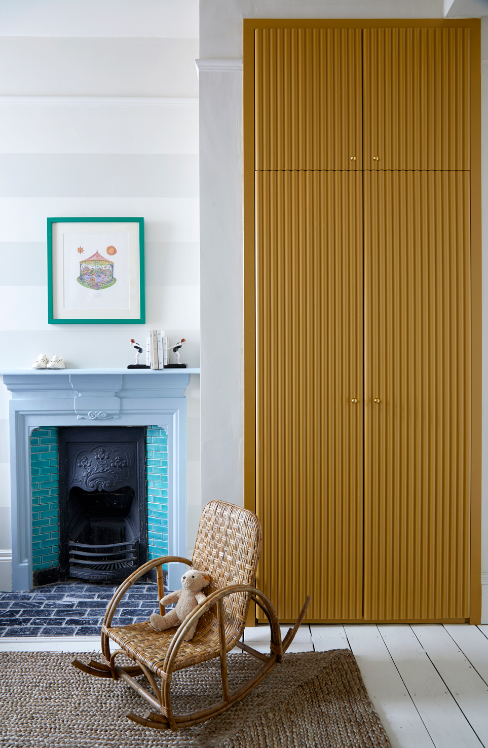
Create a visual effect with stripes of different scales on a horizontal and vertical. The stripes across the fireplace make this room seem wider, while those down the wardrobe give the impression of height. This precise use of pattern is functional yet decorative.
‘With the design of this nursery, we wanted to create a space that felt cheerful and engaging but could stand the test of time,’ says Andrew Griffiths of A New Day. ‘The yellow closet brings a bold hint of color against walls painted in a gentle stone. While its strong vertical lines juxtaposed with the thick gloss-painted horizontal stripes of the chimney add a playful touch.’
7. Create an installation
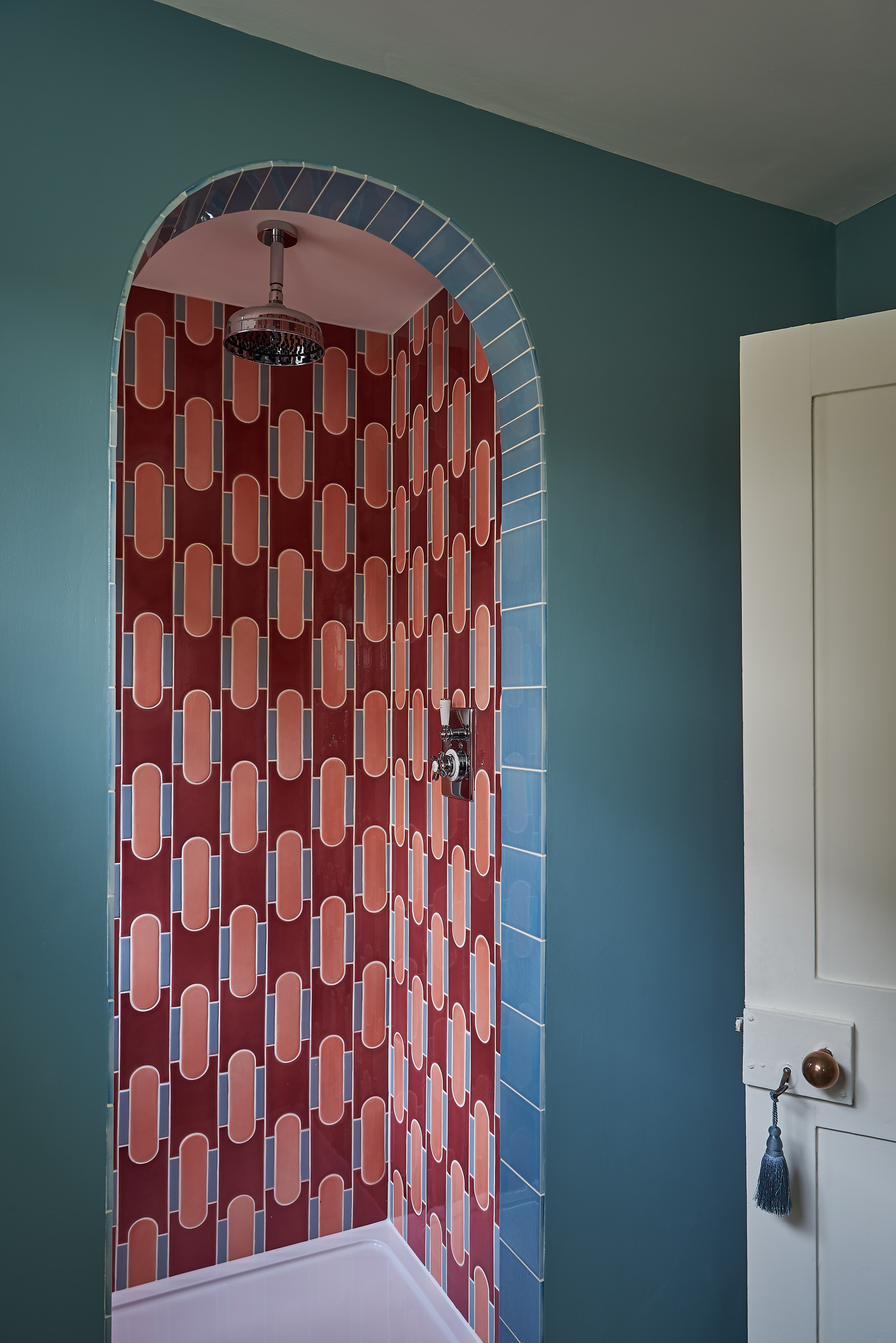
Sometimes decorative details in unusual alcoves can create a wow factor – like this Milanese-inspired take on bathroom tile ideas. The modern 1970s aesthetic is a cool contrast within this period home.
‘Pattern can be a great way to introduce a real feature into a room but getting the balance right is important,’ says Pandora Taylor. ‘I fell in love with these unusual mosaic tiles, but I felt using them throughout the bathroom would be a bit overwhelming; instead I used them just in the shower. By using the pattern sparingly, it becomes an interesting surprise and a welcome break to the plain painted walls.’
8. Use print within shelves
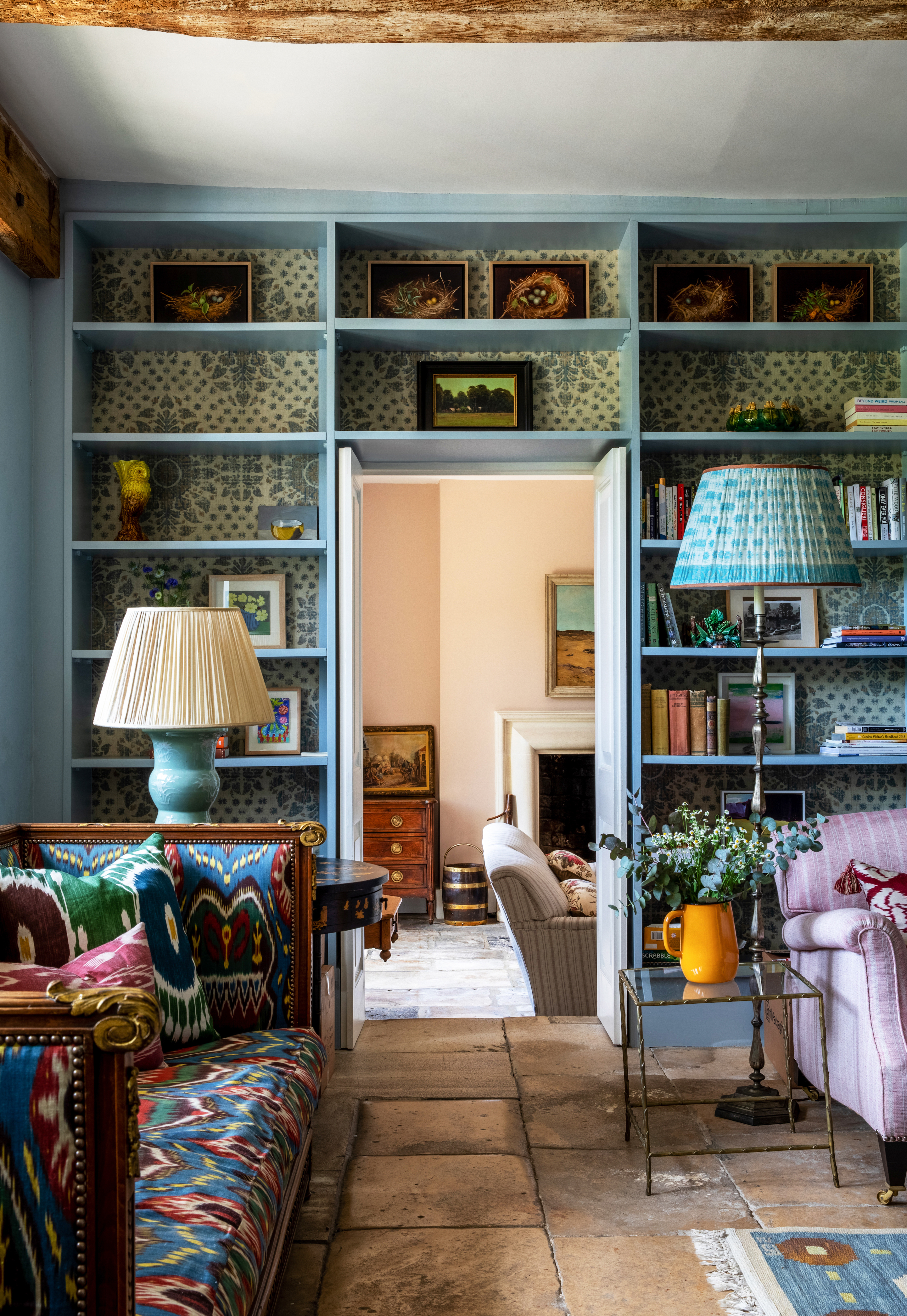
Layer fabrics and wallpapers of different scales to create a lived-in homely aesthetic. Use a roll of wallpaper or offcuts as part of bookshelf ideas. Display with well-loved books and treasured belongings.
‘I love to use lots of different patterns within one room to build up a characterful space, but I always try to consider the balance, combining bolder patterns with more delicate prints so as not to overwhelm the space,’ says Lucy Cunningham. ‘Applying wallpaper to the back of shelves is a great way to add print and color for those that don’t feel confident enough to use it across a whole room.”
9. Be consistent with styles
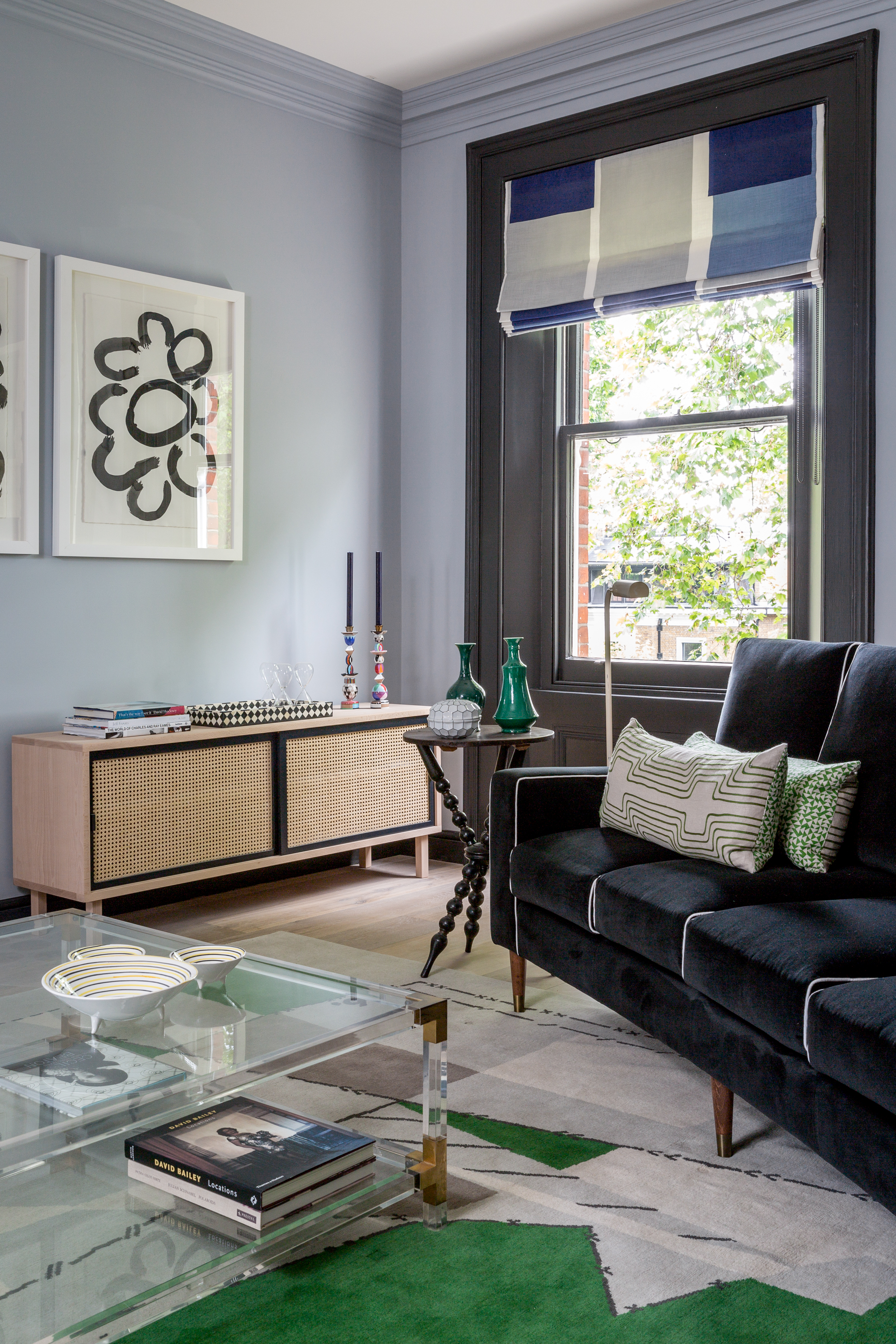
Keep your room cohesive by selecting designs that have a similar narrative when mixing patterns. If you are going for strong graphic patterns, such as geometrics and checks, then make sure your florals have the same clean simplified spirit.
‘Making a home feel comfortable is always a priority when designing a space, as is creating something that feels unique,’ says Kitesgrove’s senior interior designer, Katie Lion. ‘Incorporating a mix of pattern, print and texture creates a space that feels layered and nuanced, allowing key pieces and features of the room to come to the foreground. This can be particularly effective when curating different areas within one large open-plan living space.
10. Make dining intimate
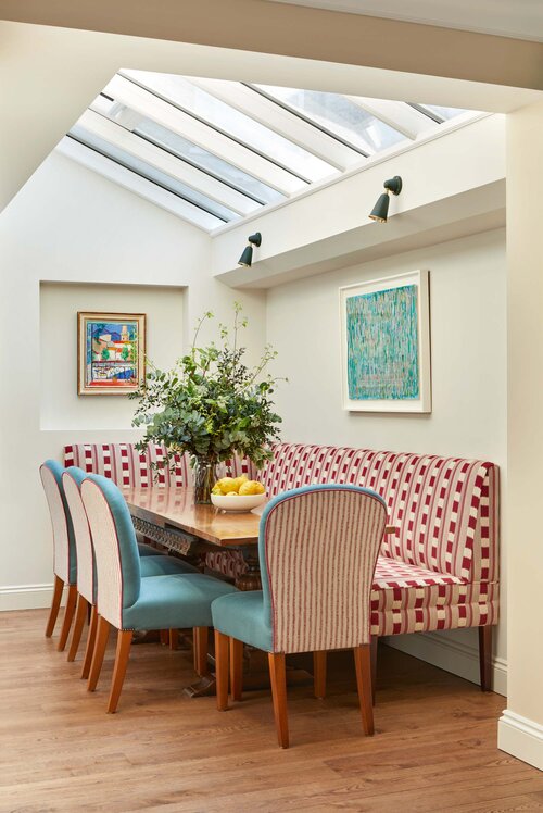
An upholstered banquette across two walls not only provides ample seating as part of dining room ideas but it also creates a sense of intimacy around the table. The strong red checkered design here mirrors the bold stripe of the back of the upholstered chairs.
‘When creating a dining area within an open plan space, I always find it helpful to ensure that the furniture feels anchored. Banquette seating is a great way to maximize seating, as well as zoning a space,’ says Isabella Worsley.
11. Source upscaled furniture
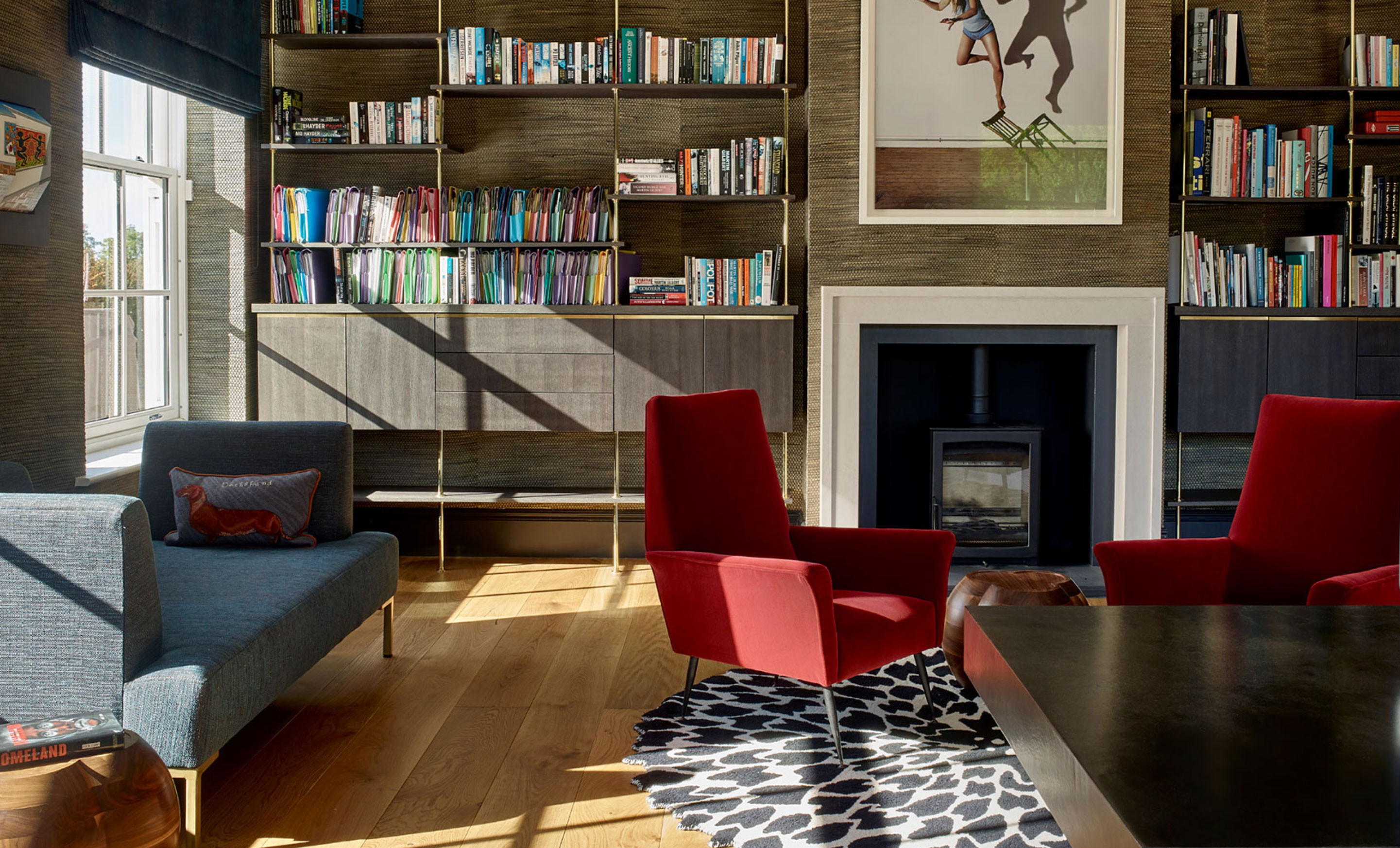
Brand new furniture is wonderful, of course, but decorating with antiques will create an atmosphere that new pieces just can't. And the beauty of working with older furniture is that you can easily create an eclectic mix that is united, perhaps, by just a finish, a paint color or a handle style.
‘We often source and collaborate with Studio27, One Brick Lane and The Restoration in London,’ says Caz Myers. ‘All three specialise in upscaling mid-century pieces to add warmth, color and individuality while respecting the design and watching the budget.’
12. Add layers to create comfort
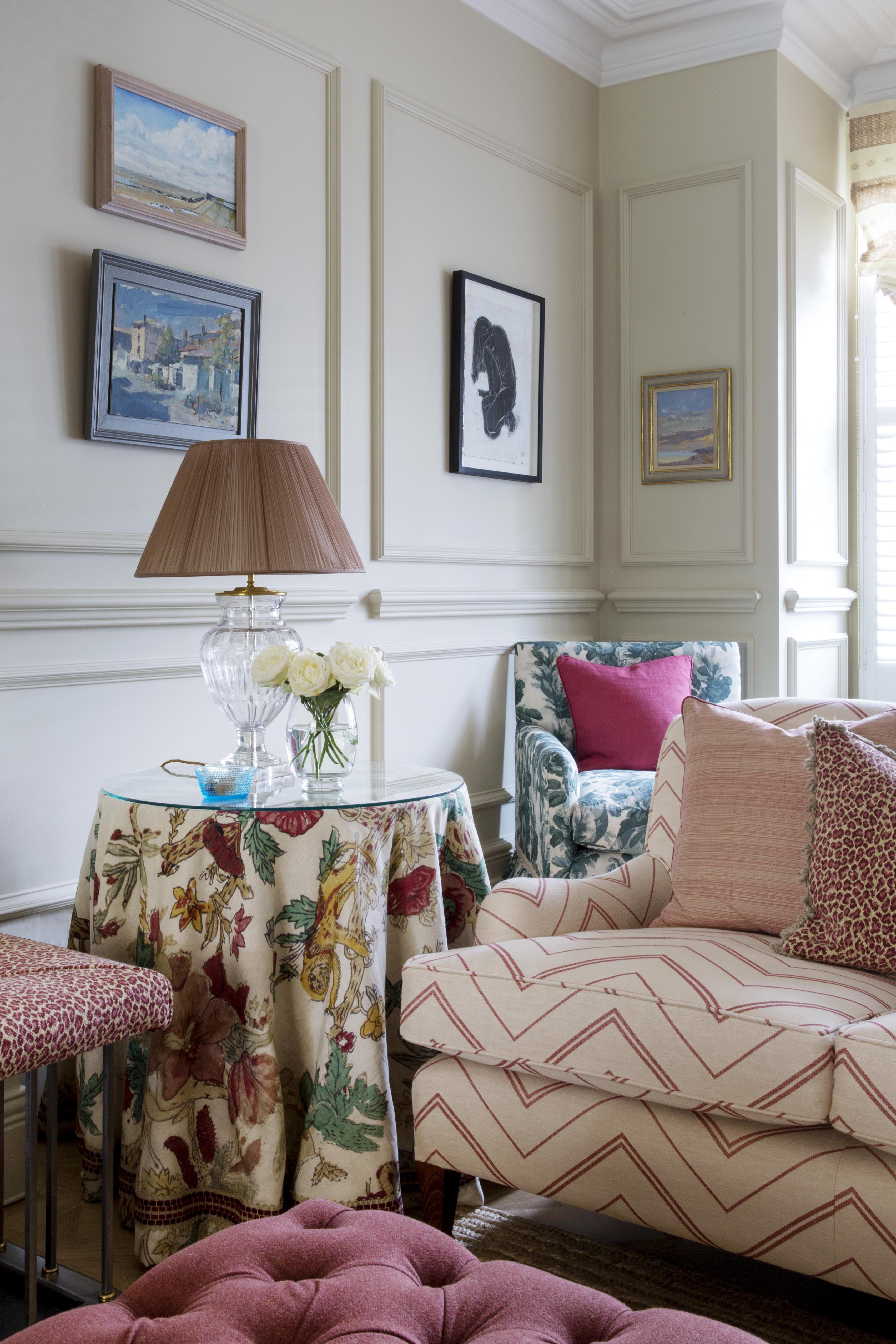
Layering in a room is hugely important for adding both comfort and extra color and pattern.
‘A simple trick is a cloth-covered table – be it a console, center or side table,’ says Nicole Salvesen of Salvesen Graham. ‘This can be a traditional treatment with a generous bullion fringe around the bottom or more modern, with a pleated or graphic fabric. A long cover is also really useful for hiding things behind.'
13. Invest in the best fabrics you can find
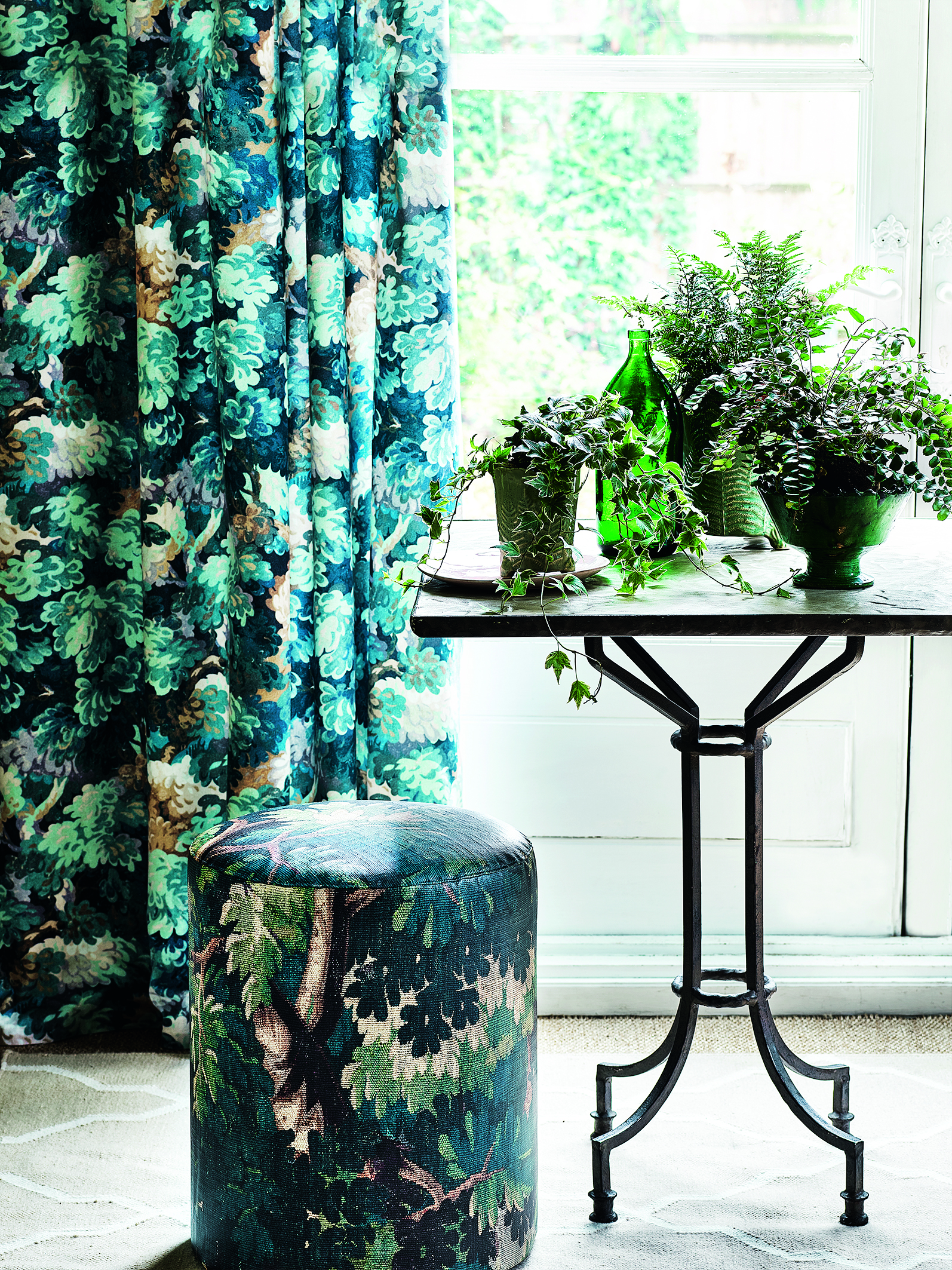
High quality fabrics will create a high quality finish – but more than just offering the luxe look, they're likely to be more hardwearing than less expensive textiles.
‘For affordable yet inspiring fabrics, I recommend The Cloth Shop and Warris Vianni, both in west London,’ says Georgina Cave.
14. Hide away utilities
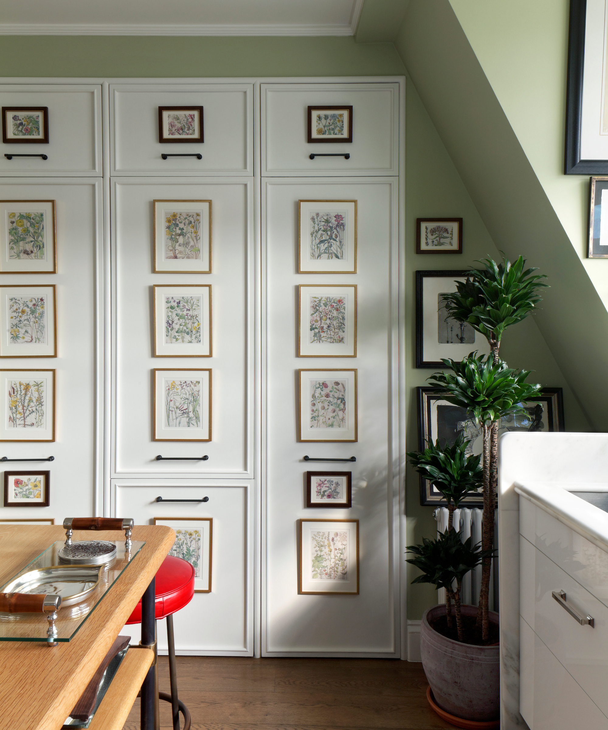
‘In an open-plan kitchen and living area, hide away as many utilities as possible,’ says Martin Brudnizki. ‘I have a wall of built-in cupboards and behind the doors are the fridge freezer, washing machine, tumble dryer and all the cleaning products. I’ve decorated the fronts with framed botanical prints, which add a sweet focal point to the small kitchen space.'
15. Dress windows to let in light
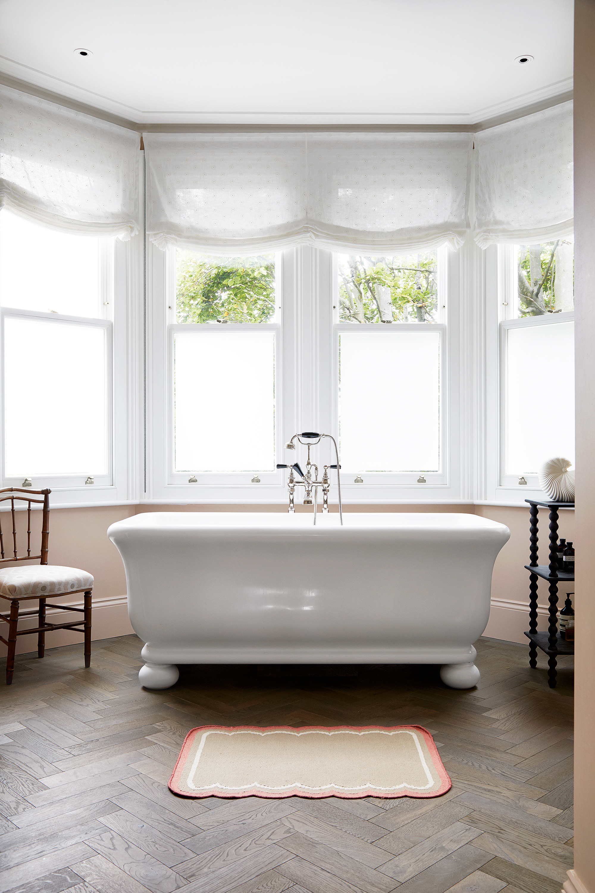
Light-filled rooms are so much more refreshing to spend time in than dark ones, but using window treatment ideas ensures they still look well dressed.
‘Be canny with window treatments. It’s not always necessary to have hefty lined and interlined fabrics – a simple unlined blind can be very effective and much less expensive,’ says Emily Todhunter.
16. Replace kitchen wall cupboards with a pantry
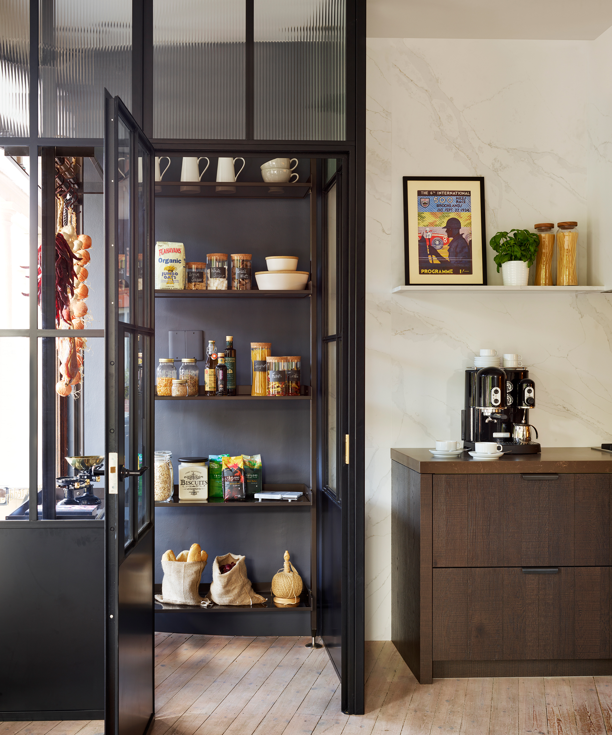
‘Being creative with storage can make a room feel larger and let the finishes come to life,’ says Philippa Thorp. ‘Carve out a small walk-in pantry or laundry room: this creates a task-driven area and keeps the kitchen walls free of cupboards. An unexpected benefit is it’s less expensive too.'
17. Be bold with color – selectively
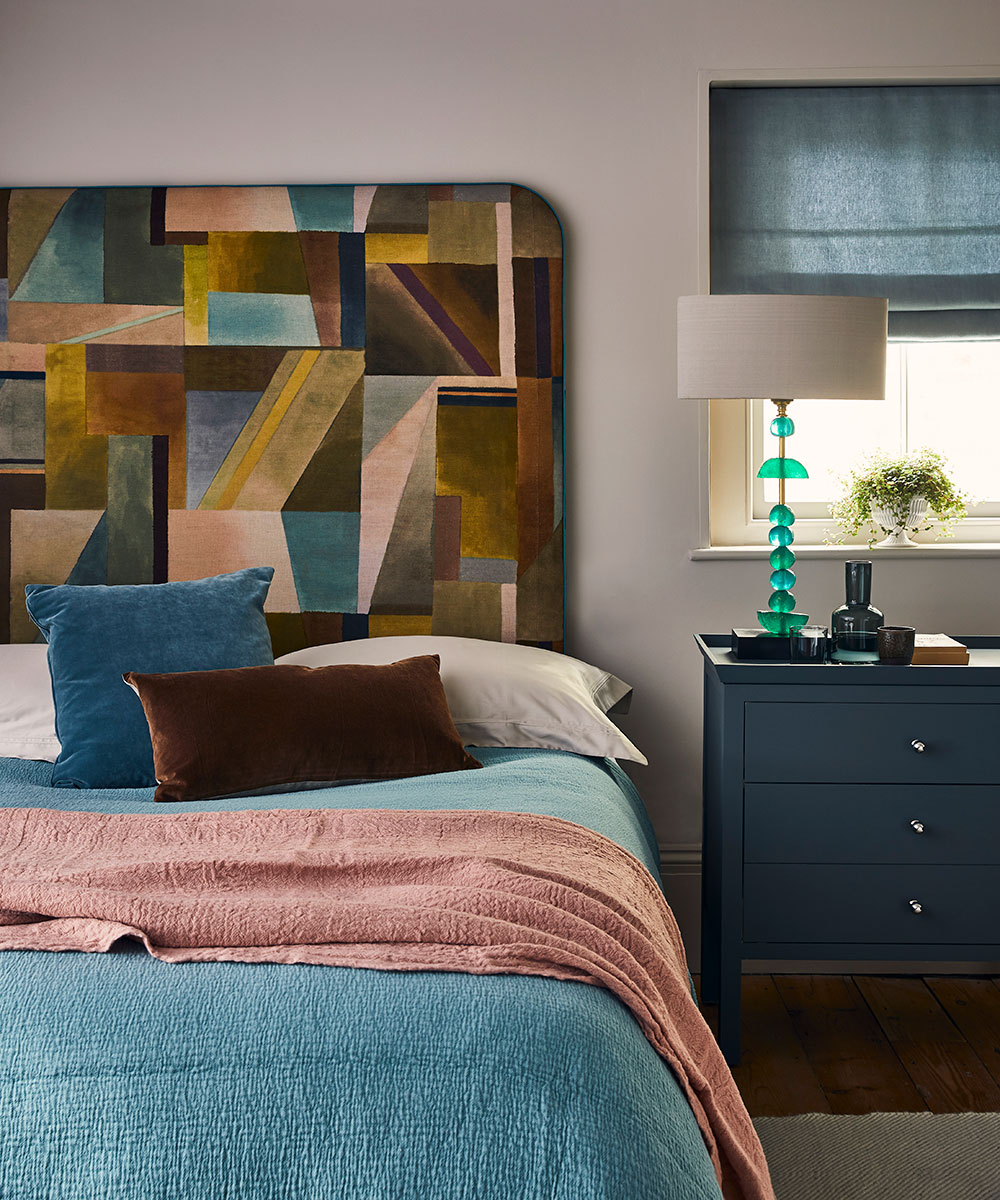
Mix colors with confidence using the color wheel and consider including a confident accent shade.
‘A bold color choice can really elevate a scheme, especially in a small guest room. Focus it on one area – a headboard or a bedcover – to pack a statement punch,’ says Tiffany Duggan of Studio Duggan.
18. Swap out accessories to reflect the season
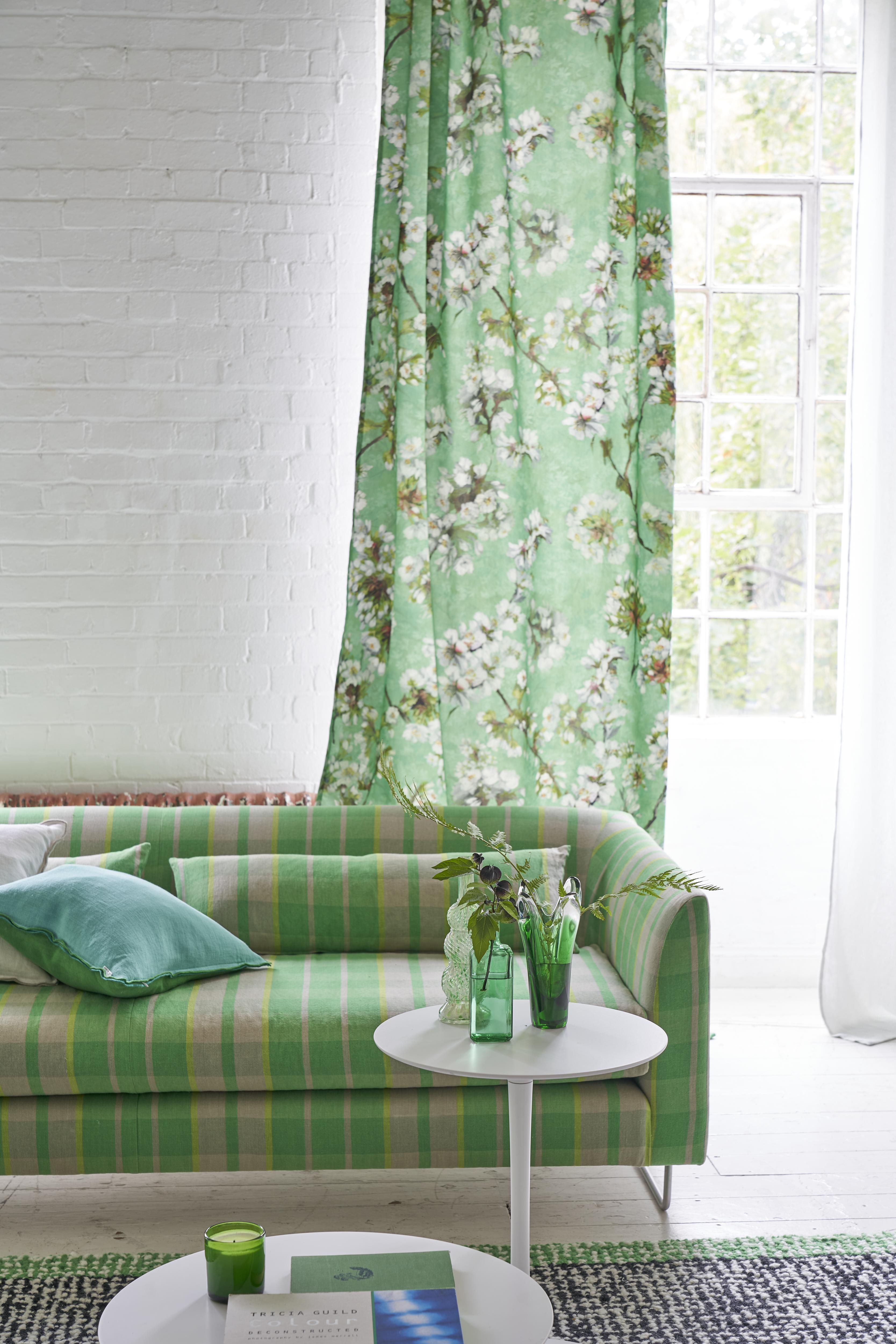
‘Small changes can have instant impact. Follow the seasons: add cushions and throws and layer rugs as winter takes hold; in summer, hang vibrant silk and crisp linen at the windows,’ says Tricia Guild of Designers Guild.
19. Use paint effects for a unique look
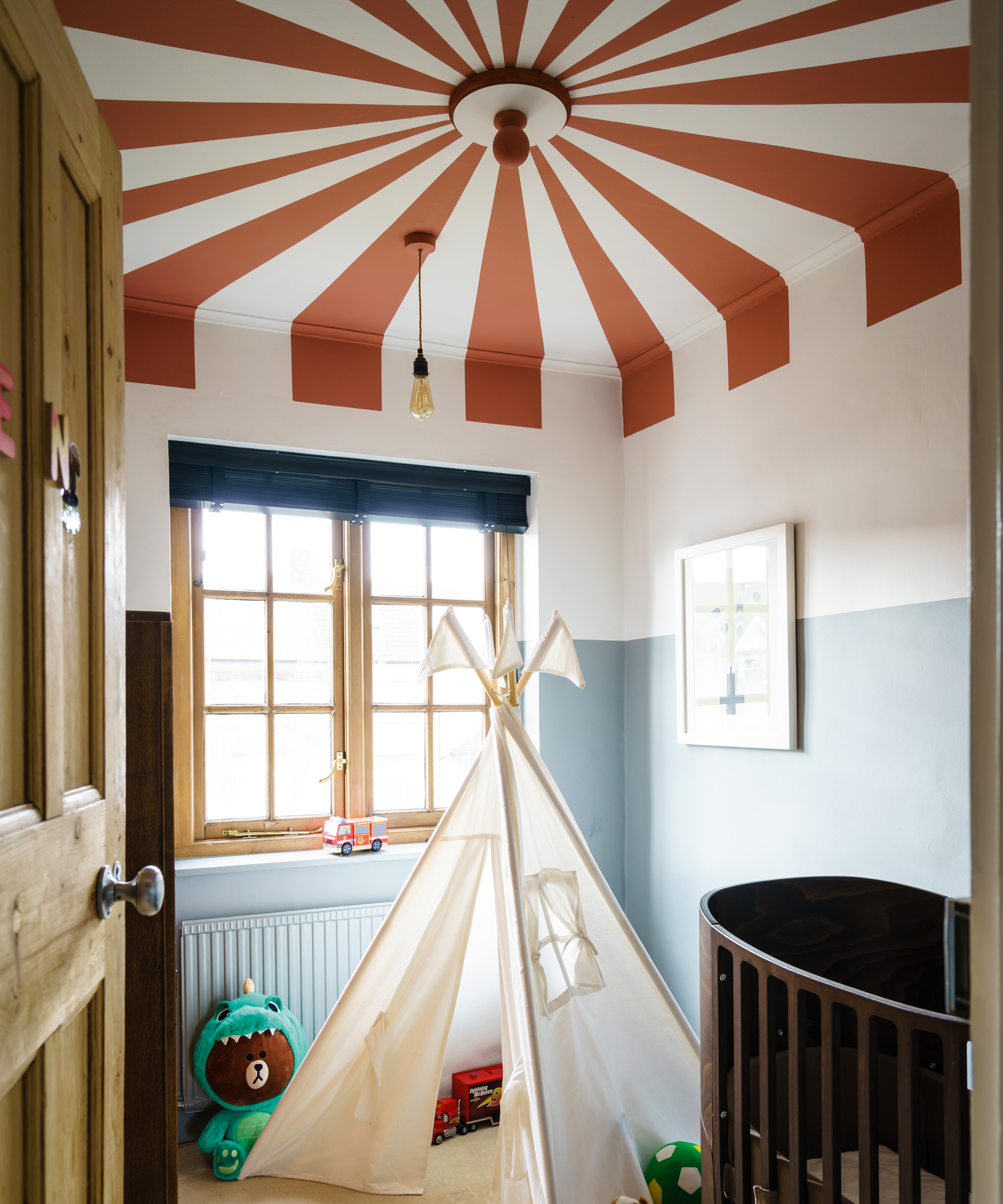
Paint effects can bring individuality to a room. Try a stencil to make the project easy, which can be used for a ceiling as here, or the walls. ‘It is an inexpensive but effective way to create a beautiful backdrop,’ say Katie Glaister and Henry Miller-Robinson of K&H Design.
20. Buy one statement piece
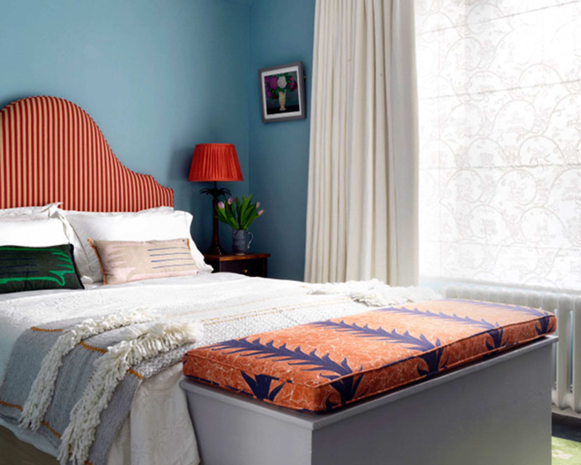
‘A mix of high-street and statement pieces can be particularly effective to get the most out of your budget – just make sure the investment item is truly a one-off,’ says Beata Heuman.
'Edition94 in South Kensington, London, is a treasure trove of vintage furniture and handcrafted homeware. Its founder, India Whalley, has a great eye for individual designs, which she sources from hidden corners around the world. I love the vintage side tables that she hand lacquers in bold colors – each piece is unique and can be made in whatever color you like.'
21. Make art part of your interior design scheme
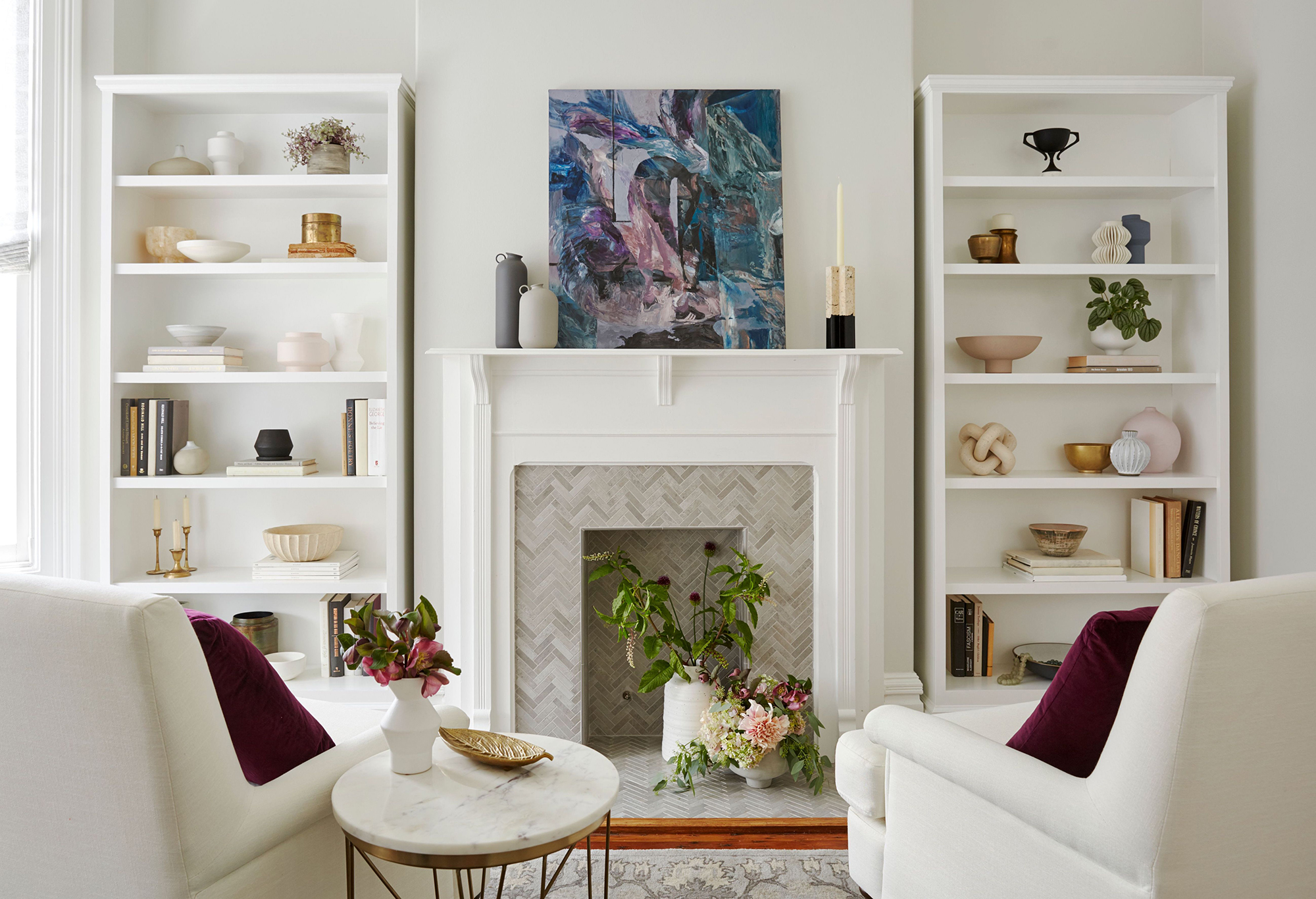
At planning stage, choose art to put into your design scheme – it may even be that a piece of art can inspire a room's new look.
‘For well-priced art, we turn to British Art Portfolio,’ says Emma Deterding. ‘It’s run by two women who scour the country for work by young and established artists. They have an unbelievable selection of paintings and sculpture.'
22. Put accessories high on your list
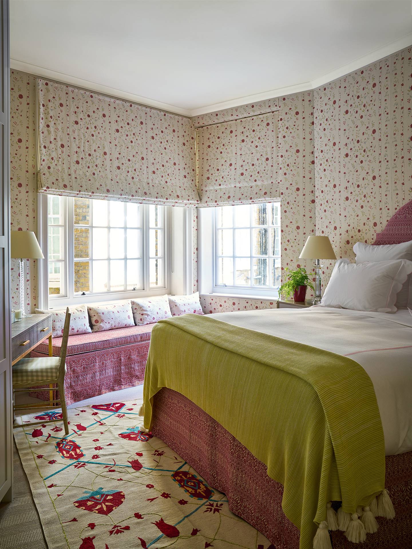
‘Focus on accessories. For instance, dress a bedroom with inexpensive plain fabrics but add a colorful bedspread and some tasseled cushions. They’re so adaptable and will instantly create a strong look,’ says Penny Morrison.
23. Mix high end with low end
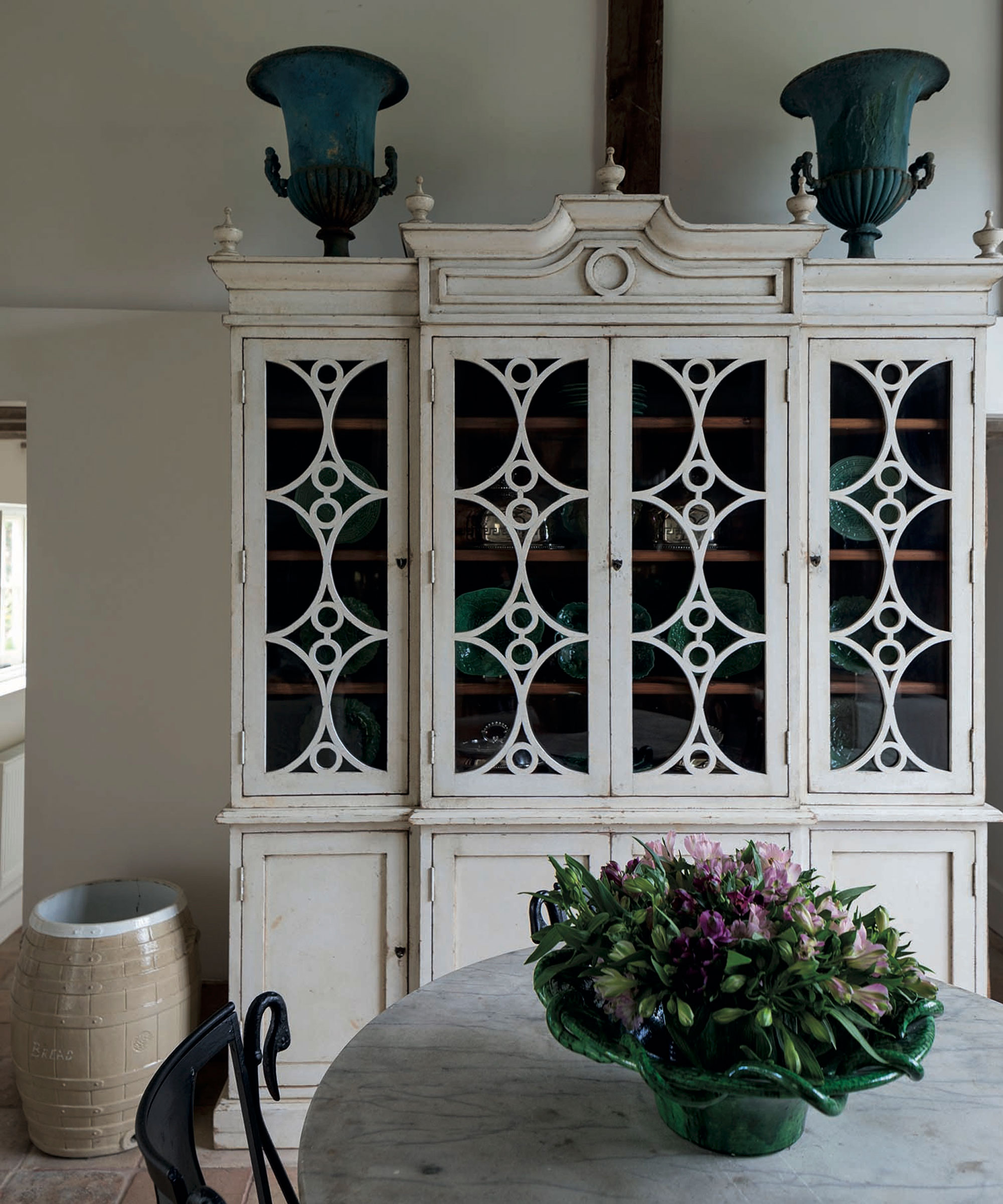
‘Remember the rule to mix high end with low end. A woven wicker basket will look better on an 18th-century chest than on a precious porcelain jardinière. Also, one place we recommend never to save on is the floors. This will be the most difficult thing to change in the future,’ say Paolo Moschino and Philip Vergeylen of Paolo Moschino.
24. Find aged finishes to add character
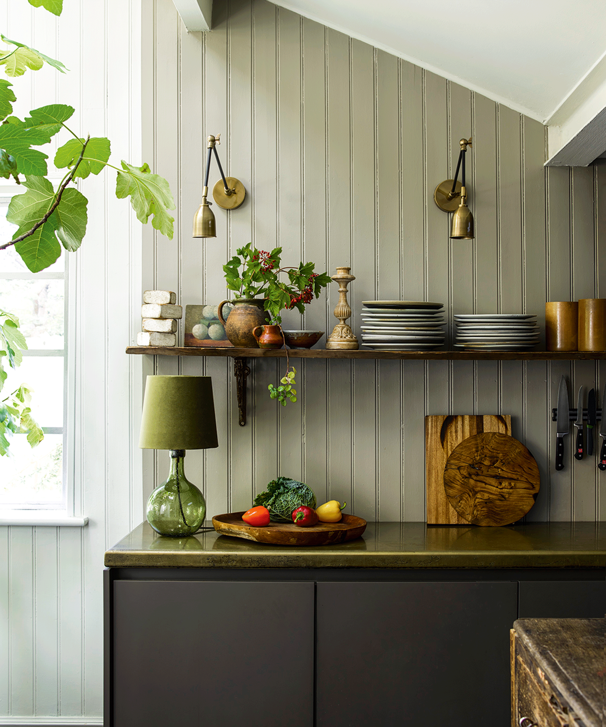
‘Aged brass as a finish is big news in the world of interiors, but you don’t need to buy new fittings. We work with craftsmen and artisans, including Masterfix Solutions, who transform the surface appearance of existing light fittings to an exquisite finish,’ says Roselind Wilson.
25. Use house plants
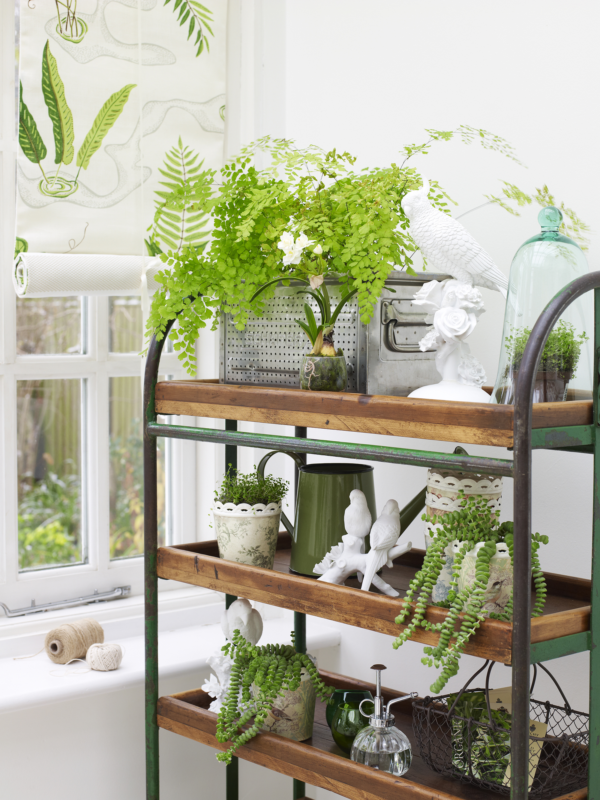
‘Use house plants wherever you can. For London-based clients, we go to Patch, which also offers advice on what will survive where. Collect unusual and reclaimed planters: zinc buckets are great for a rustic touch, but you can use anything,’ says Katie Cox of Ham Interiors.
26. Be clever with upholstery
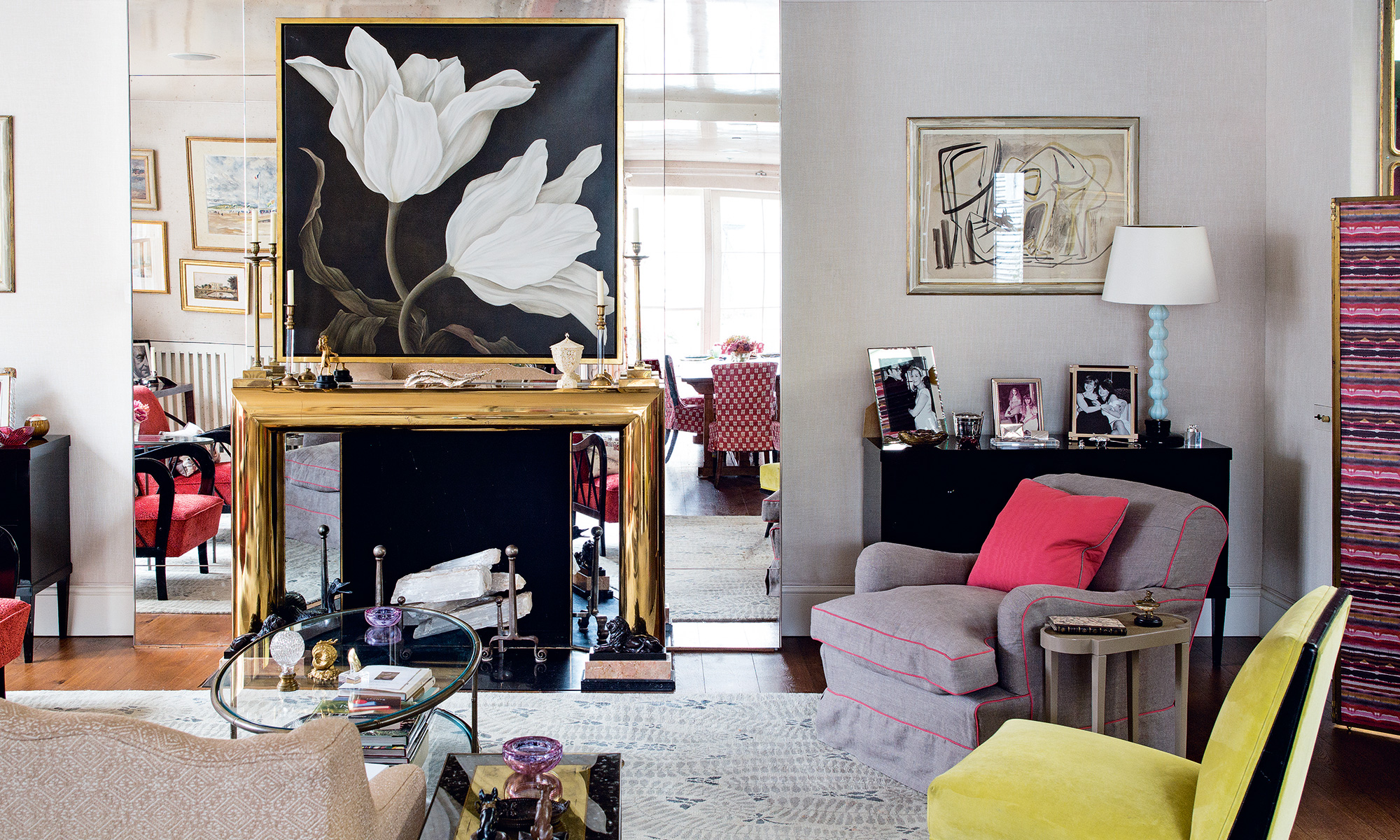
‘Be clever when upholstering a sofa,’ says Nina Campbell. ‘If you find a fabric that you love but can’t afford, don’t go for a cheap alternative. Instead choose a plain for the sofa then use the fabric you adore on a single chair or a cushion. Having a sofa made up is expensive and if you think your fabric is second best, you’ll only regret it.'
27. Reimagine what you already have
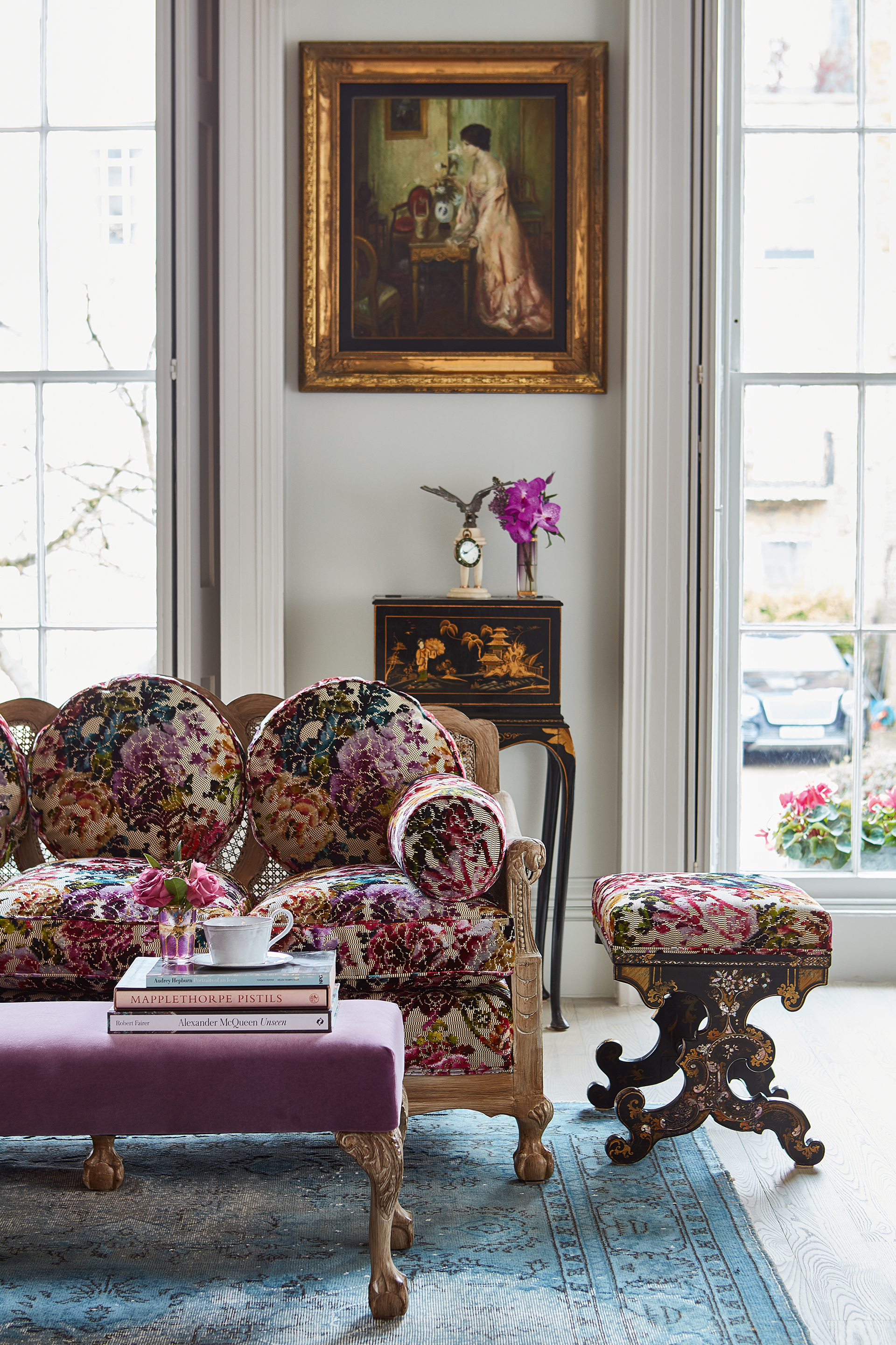
‘Reimagine the items you own,’ recommends Nicola Harding. ‘A tired piece of furniture can be transformed by being moved or used differently. Look at the colors next to it and embrace contrast.'
28. Boost plain fabrics for a luxe look
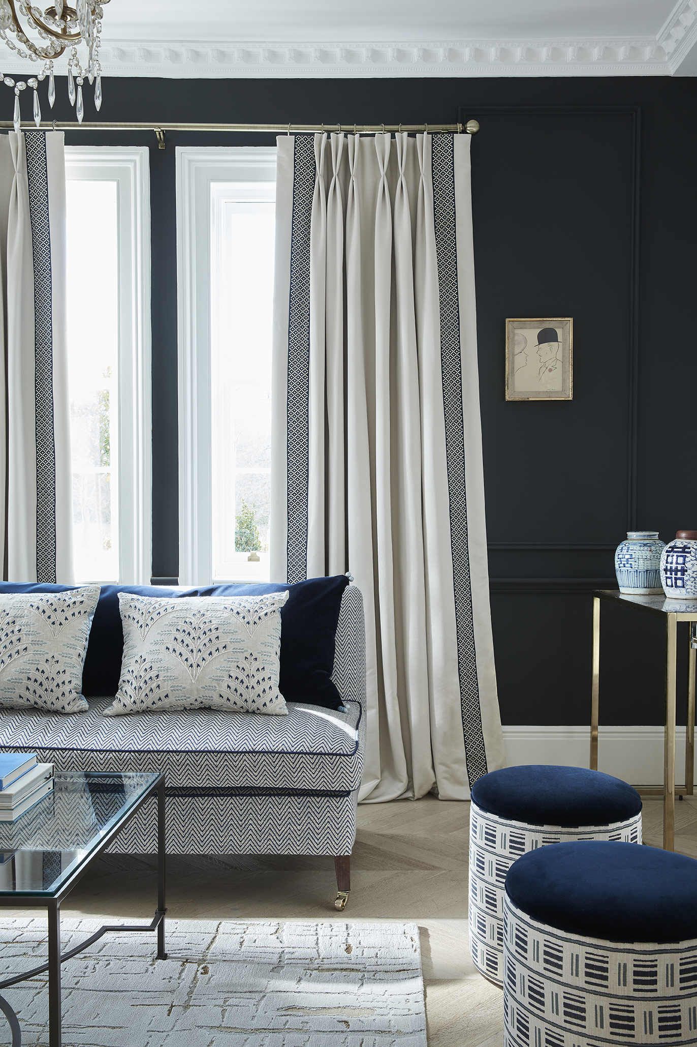
‘At an expansive window, maximise your budget without compromising on style by bordering less expensive, good-quality linen curtains with a more expensive, elaborately patterned fabric,’ says Lucy Barlow.
29. Look for one-offs and unusual collaborations

‘We trawl flea markets and look to the high street for hidden gems, and keep an eye out for interesting collaborations,’ says Sophie Coller of Kitesgrove.
30. Shop globally to get the best
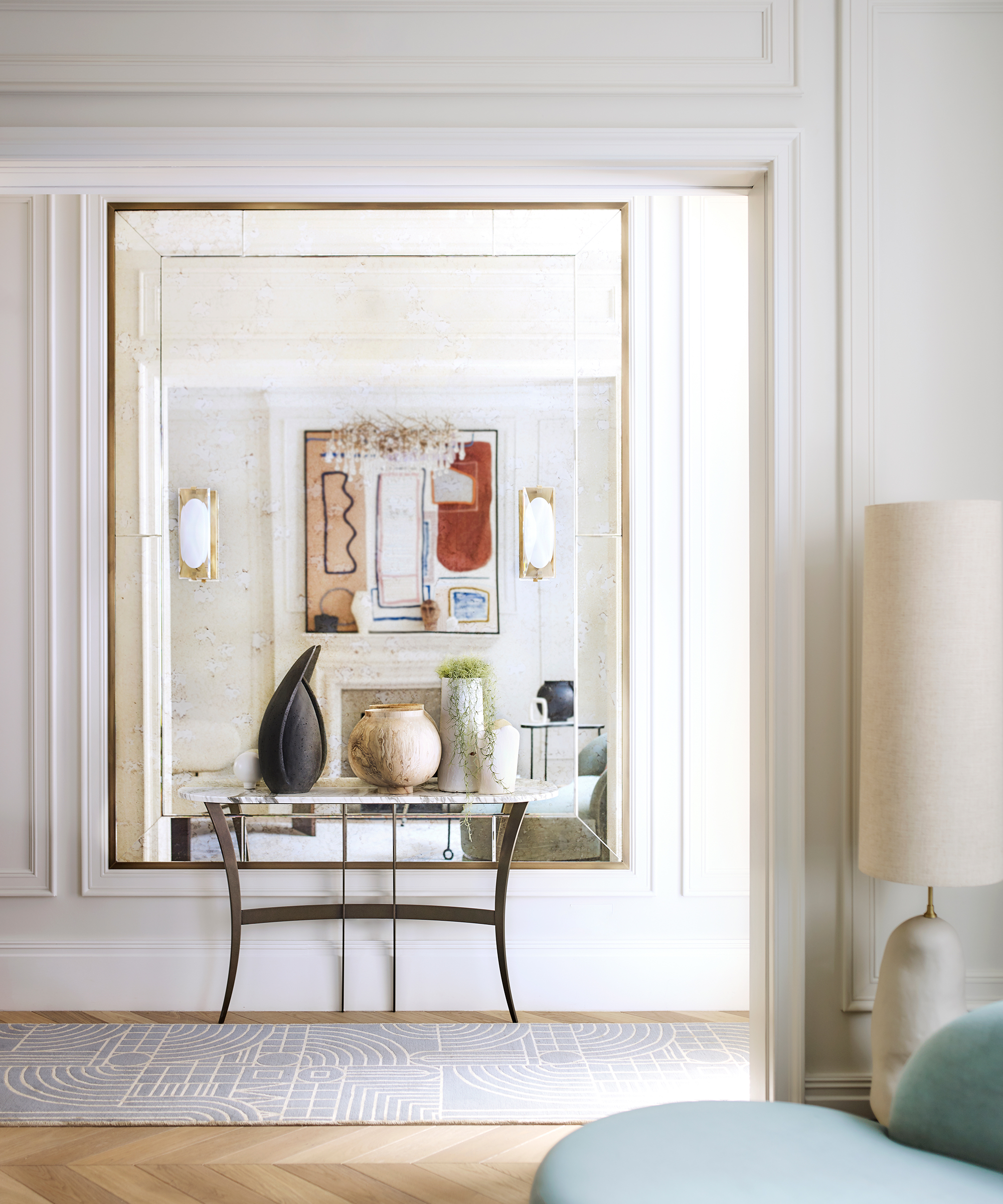
‘When shopping for projects, consider buying internationally rather than limiting yourself to your own market. The US is great for furniture, while the Netherlands has for amazing tapware and Germany is wonderful for appliances,’ says Irene Gunter of Gunter & Co.
31. Put lighting in cabinetry
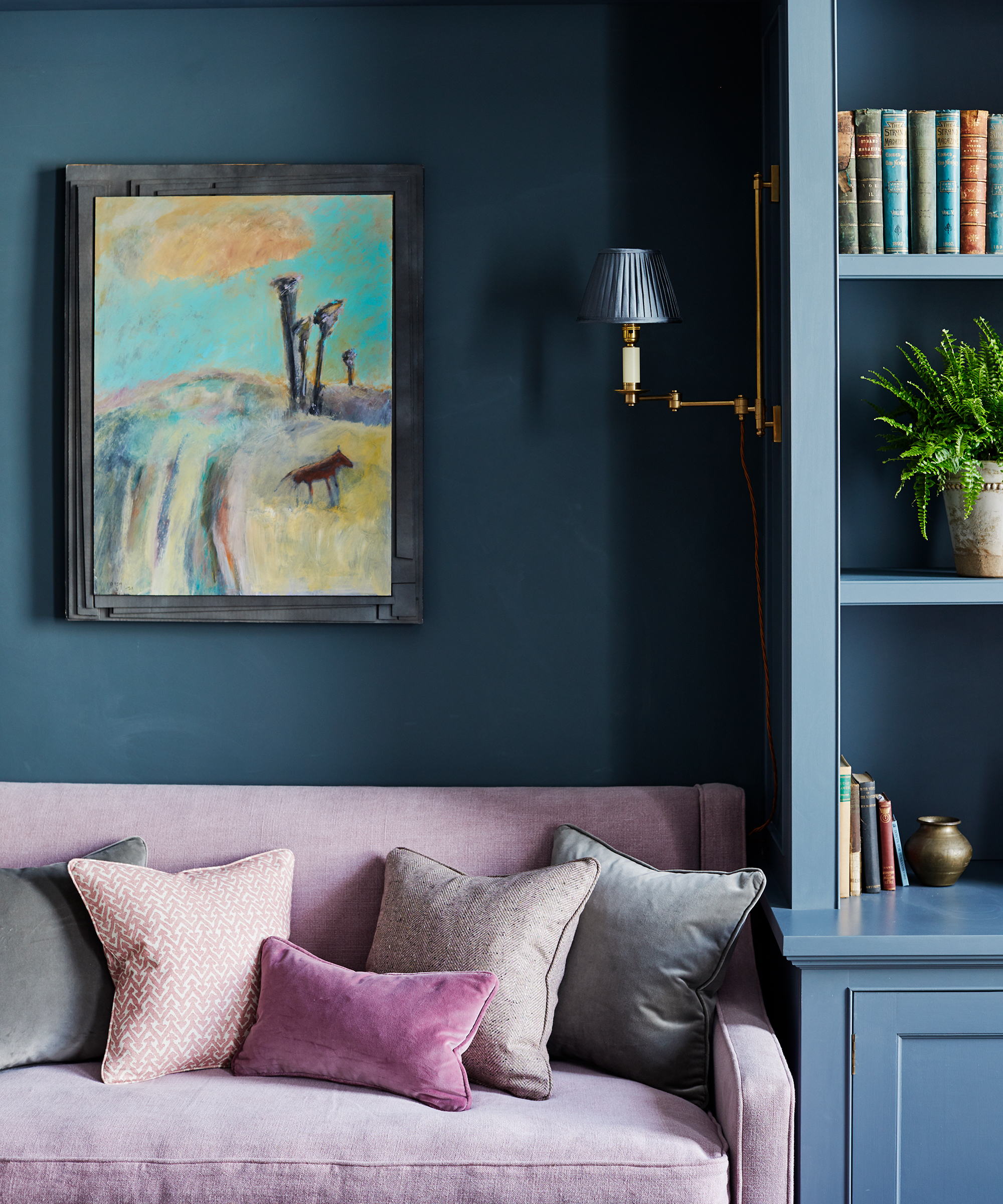
'Try fixed wall lights mounted on cabinetry or bookcases,’ says Emma Sims-Hilditch of Sims Hilditch. ‘Pretty decorative lampshades are a great way to create subtle yet pleasant atmosphere. Ensure lighting is decorative rather than task for the cabinetry in bedrooms and sitting rooms, where you might want to avoid harsh light.'
32. Give craft a role in your interior design
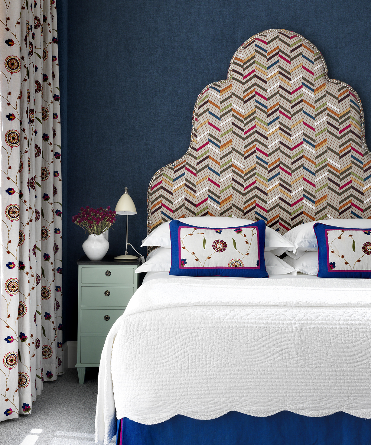
Featuring craftwork in your scheme, whether embroidery, framed textiles or artefacts is a wonderful way to add character.
'We love to create one of a kind pieces which make a room completely individual, from hand-painted murals to embellished cushions and headboards,' says Kit Kemp.
33. Consider the room's temperature
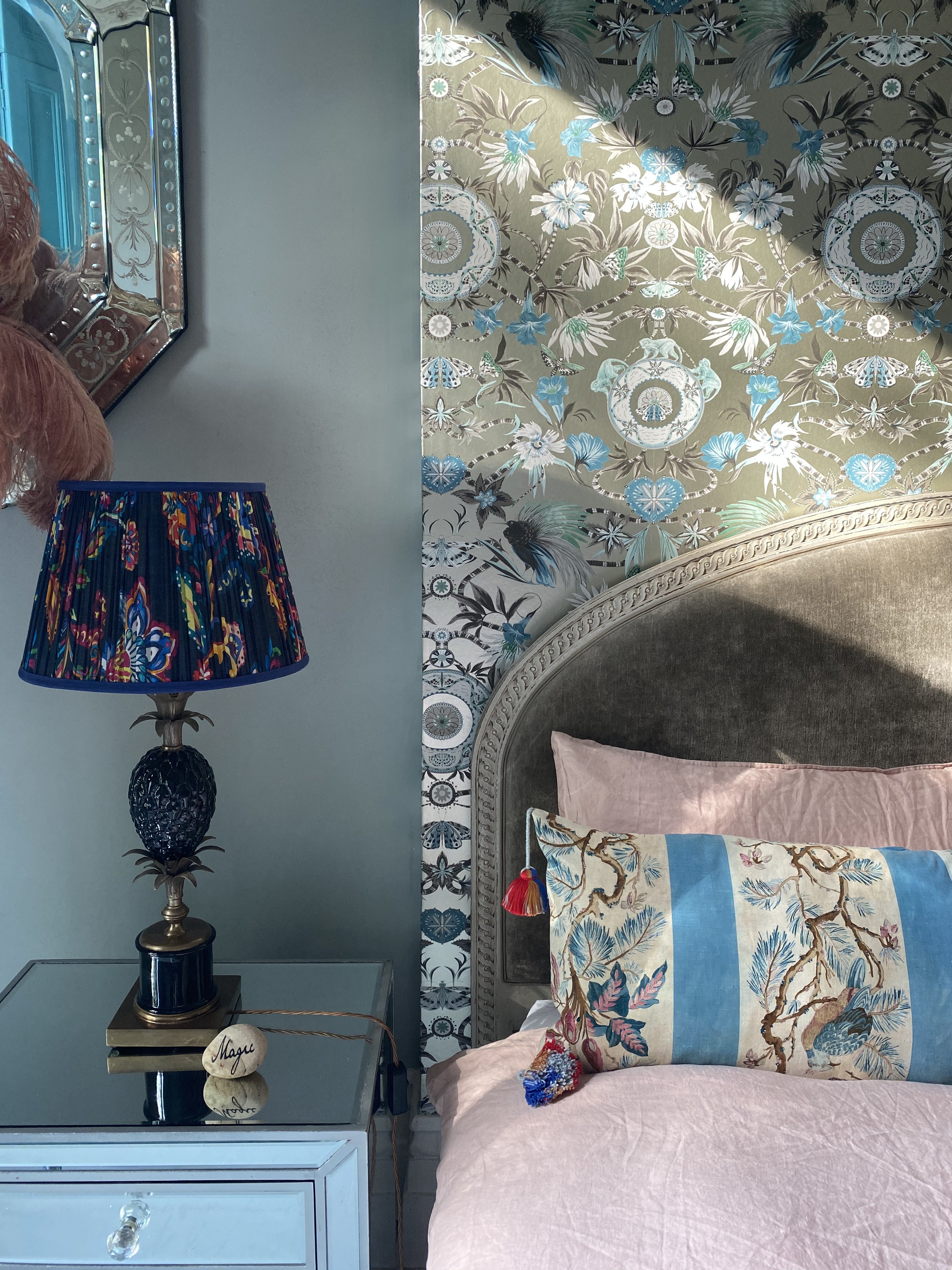
'Generally, cooler colors are more relaxing, while warmer colors excite,’ says Matthew Williamson. ‘Think about the kind of space you want to create and how you'll use it.
'Do you want your living room to feel like a serene enclave or as electric as the city that surrounds it? Do you want your bedroom to feel romantic or to channel the charm of an English country home? Working out the function of a space will inspire the color combinations you might like.’
34. Use trimmings to add detailing
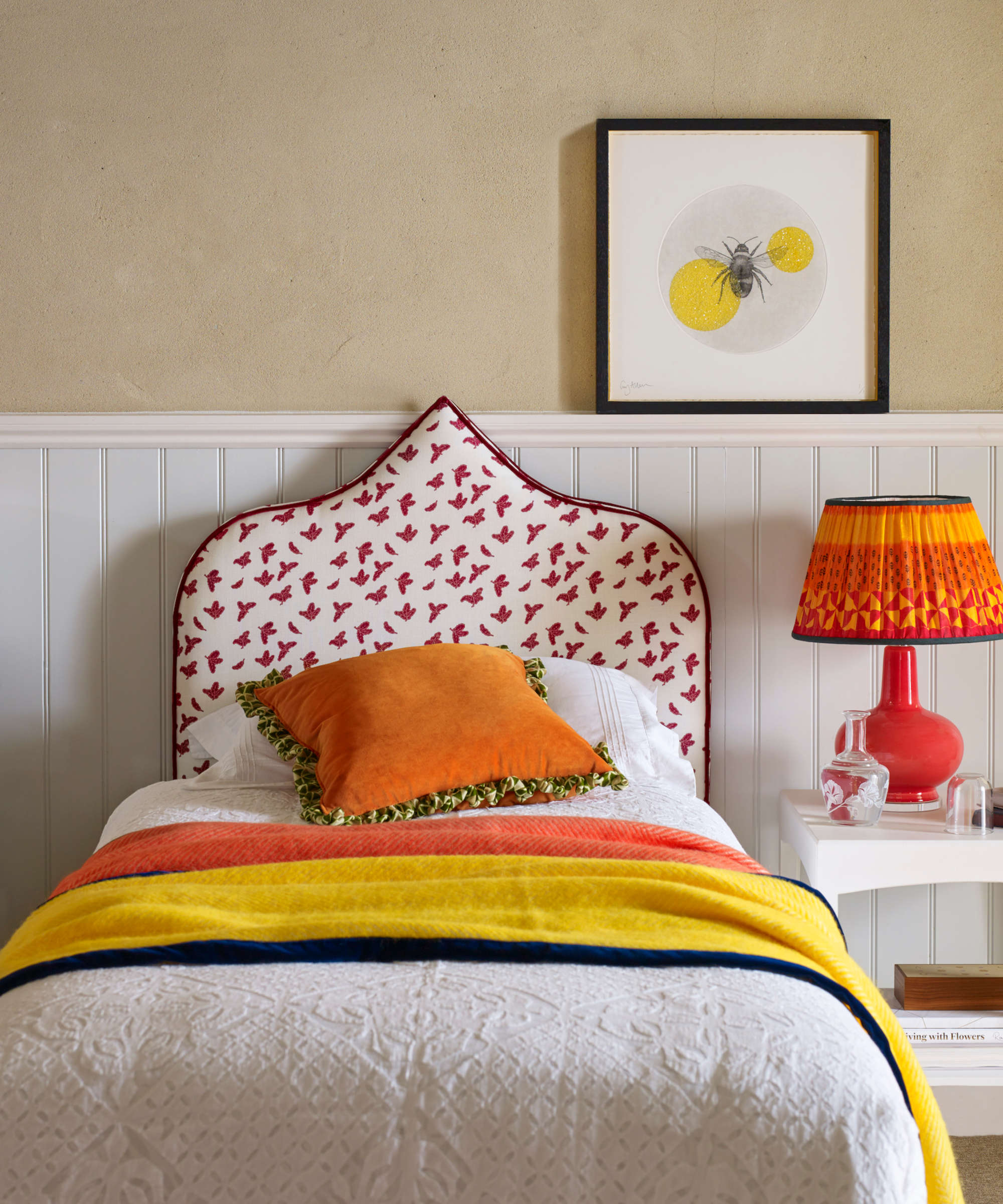
'Use trims to tie a scheme together – they’re perfect for adding an extra punch of color,’ says Katharine Pooley. ‘Pick out a hue from artwork or other accessories in the room. You can also use them to enhance existing items such as headboards or lampshades. Trims can be added to make them more interesting and give them a new lease of life.'
35. Create a moodboard to build your scheme
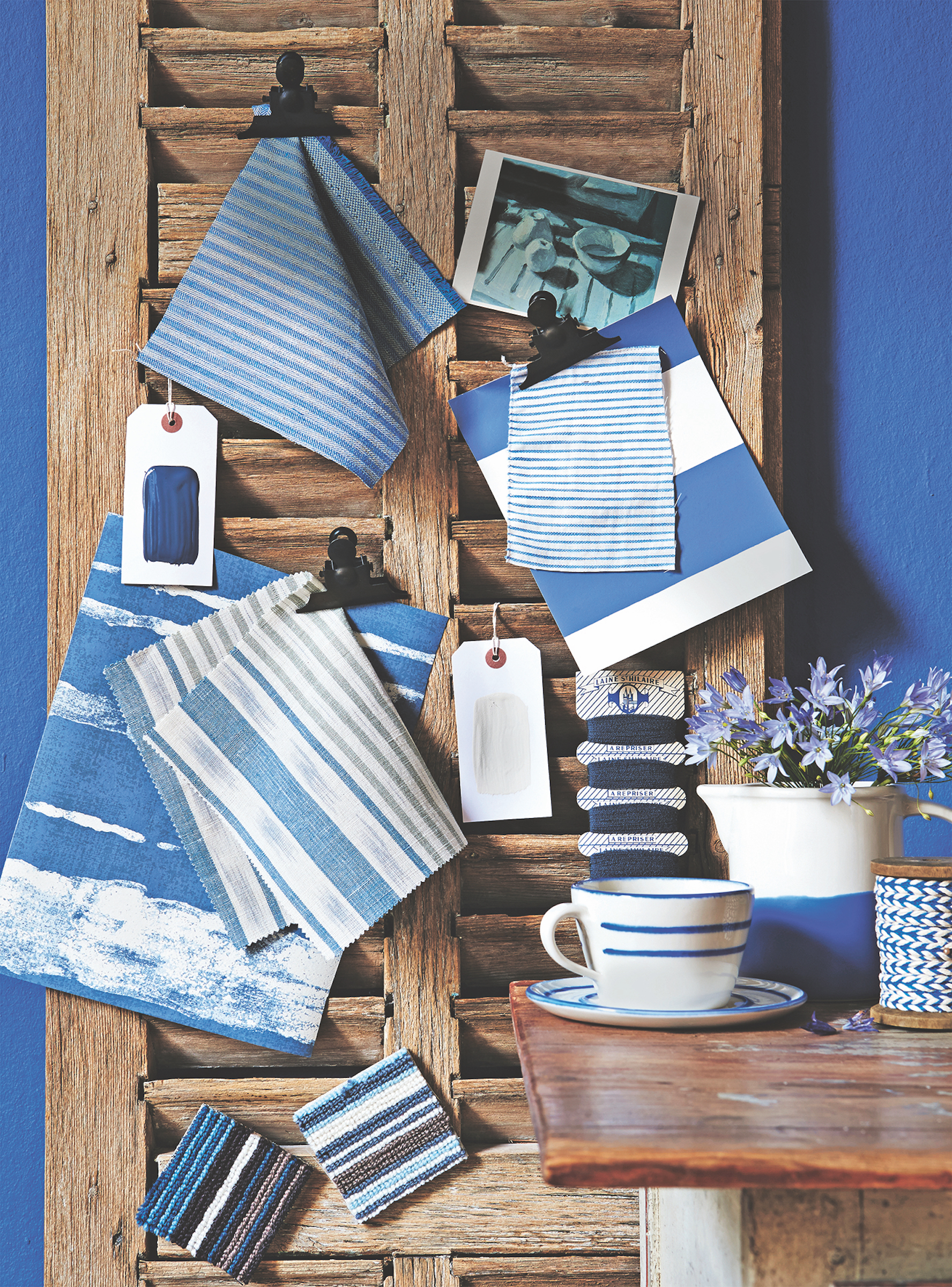
'It’s a good idea to create a long-standing mood board,’ says Peter Sheehan of The London Resolution. ‘A good architectural or interior designer will be able to look beyond the obvious and analyze what it is you like about those images.' With practice, you can do this, too.
36. Use antiques to create an authentic feel
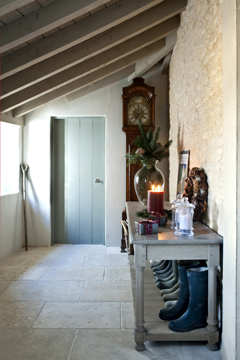
'Antiques add gravitas and depth to an interior, says Emma Sims-Hilditch. 'They embody a sense of history and heritage that help a home to tell a story. But where do these pieces fit into a modern home?'
'When considering a modern interior, sharp lines, smooth surfaces and open spaces spring to mind. While this is often the case, this doesn’t mean that everything in the home needs to be new. For instance, an antique commode can be converted into a smart vanity with a washbasin, bringing character to what might otherwise be a fairly stark bathroom. Additionally, reupholstering antique dining chairs or a sofa in a fresh or fun fabric is an excellent way to incorporate antiques into a contemporary space, balancing the old and the new.
'Whether it is family portraits, furniture or even board games that are steeped in family history, heirlooms can always be incorporated into a home. For instance, a dark wood grandfather clock passed down through the generations can work beautifully against the Cotswold stone of a converted barn, or against the fresh walls of a city townhouse that has been gutted and sensitively reconfigured.'
37. Create a unique look with art
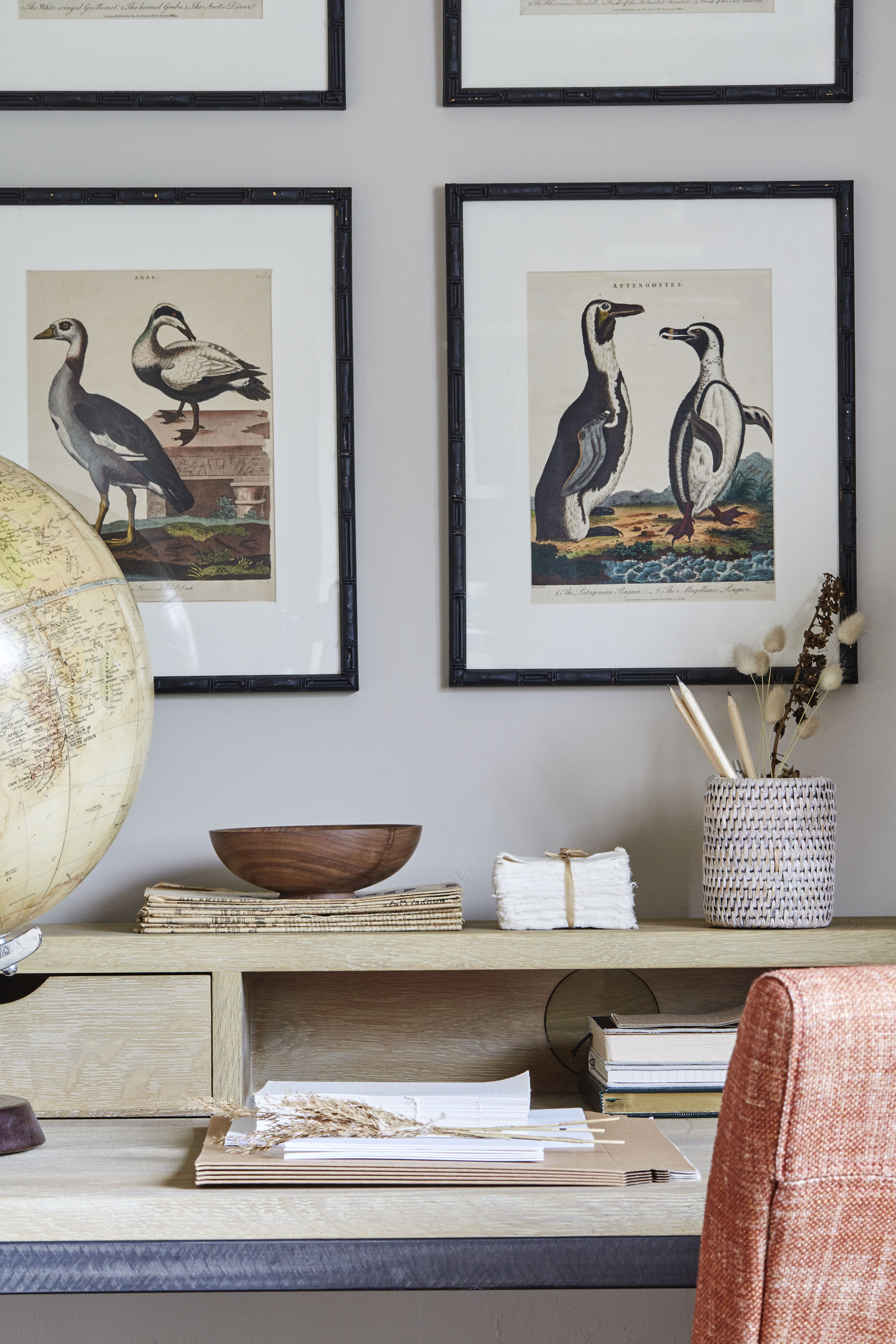
'Artwork is an incredibly personal addition to an interior, and as such we recommend selecting a piece that speaks to you,' says Emma Sims-Hilditch.
'There are plenty of one-of-a-kind, beautiful pieces to choose from at antique dealerships and markets. Once you have found the piece for you, consider how it might be used to determine other design decisions, such as forming a palette based on the key colors used. If your chosen artwork is looking a little tired, it is possible to have it expertly restored, making it a striking and vibrant addition to a modern home.'
What are the 7 principles of interior design?
The seven principles of interior design are aimed at helping decorators, professional or otherwise, create a perfectly balanced interior. They include:
- Balance – this is about creating a perfectly composed room, whether through using symmetry in interior design or through using the 60 30 10 rule to design a color scheme. Concentrating on using line in interior design is a useful expert technique, too.
- Unity aims at using color, shapes or motifs to create a cohesive space. This might be within furnishings, paint colors and finishes across single small spaces, large, open-plan rooms or throughout entire homes.
- Rhythm can be used with repetition to create cohesion, again using color, pattern and shaping.
- Emphasis is all about creating a single focal point in a room that inspires the rest of the scheme. This could be as simple as a table centerpiece, an architectural element or accent wall ideas.
- Contrast is important in an interior design scheme for both highlighting and mitigating the effects of the colors and furnishings you choose. So, a curvaceous sofa in a kitchen diner that's otherwise full of hard, angular lines creates a pleasing contrast that's simple to create. Another example might be an angular central pendant in a living room that's otherwise packed with soft furnishings and curves.
- Scale – using scale in interior design is another way to create contrast and emphasis. For instance, you could choose an over-sized lamp to create impact in a living room. Scale is also about getting proportions right: you can use both the 70/30 split and the golden ratio to get this right; they are rules interior designers use effectively.
- Detail: this is where professional interior designer's strength lies, in having that eye for ensuring the tiniest details, such as commissioned decorative plasterwork, are perfectly and eye-catchingly specified to adding those finishing touches that make a space.

Lucy Searle has written about interiors, property and gardens since 1990, working her way around the interiors departments of women's magazines before switching to interiors-only titles in the mid-nineties. She was Associate Editor on Ideal Home, and Launch Editor of 4Homes magazine, before moving into digital in 2007, launching Channel 4's flagship website, Channel4.com/4homes. In 2018, Lucy took on the role of Global Editor in Chief for Realhomes.com, taking the site from a small magazine add-on to a global success. She was asked to repeat that success at Homes & Gardens, where she has also taken on the editorship of the magazine.
- Kiera Buckley JonesContributing Editor
-
 Your hydrangeas will flourish with bigger blooms and healthier growth thanks to this natural material
Discover why you should be using leaf mold to mulch hydrangeas
By Drew Swainston
-
 Charred little gem with saffron dressing
This recipe with charred little gem is both easy to make and sure to impress guests. It's the perfect side for fresh spring menus
By Alice Hart