Five interior design lessons we’ve learned from Turner Pocock
Top interior tips from renowned design duo Turner Pocock...

Turner Pocock is a much-lauded London and Geneva-based interior design agency, set up by Bunny Turner and Emma Pocock back in 2007.
The power pair work on traditional and contemporary homes to bring their clients’ interiors dreams to life, with some of the best suppliers in the world on speed dial.
See our news section for more expert tips, events and need-to-know product launches
Take a peek at five things we’ve learned from the Turner Pocock team about the ingredients needed for the perfect interiors alchemy.
1. Metallics accents work anywhere
Any room can benefit from a dash of understated glamour, so don’t be afraid to use metallic accents in all types of space. This stylish brass wall light brings an otherwise rustic farmhouse-style bedroom to life, and also proves it’s a fabulous and warm alternative to using chrome with grey.
2. Be playful
Your home should make you happy and is a reflection of your character, so don’t be afraid to experiment and be bold with decor and print choices. A cheeky–but tasteful – piece of art shows a sense of humour and a vista ‘to make you smile’, says Turner Pocock.
3. Embrace the dark side
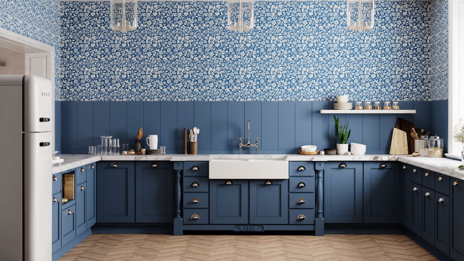
Deep blues are ‘perfect in the grey London light’, says Turner Pocock. Don’t be afraid to go bold on your cabinetry to create a timeless kitchen. Pair with light walls, brightpendants and marbles worktops for a sleek look that will last for years.
Sign up to the Homes & Gardens newsletter
Design expertise in your inbox – from inspiring decorating ideas and beautiful celebrity homes to practical gardening advice and shopping round-ups.
4. Mix jewel tones
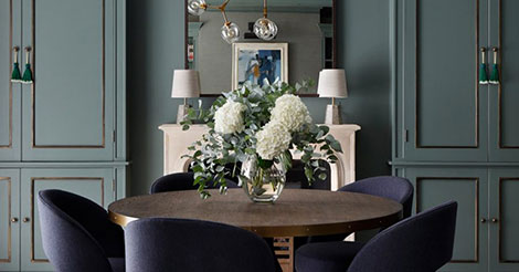
Whoever decided ‘blue and green should never be seen’ obviously never met Turner Pocock. Rich greens and blues actually complement each other perfectly, and beautiful walls in Farrow & Ball’s Green Smoke work wonders with velvet blue chairs in this elegant dining room. Finish with geometric lighting and those metallic accents for extra little touches of glamour.
5. Children’s rooms can be stylish too
Gone are the days when children’s rooms seemingly suffered a style bypass. Turner Pocock shows that you can create a room for kids that’s so chic it would also work for adults. This grey and red colourway makes this twin room gender-neutral, the printed cushions add interest and the gorgeous animal prints are sweet yet super-stylish.
Visit www.turnerpocock.co.uk for more inspiration and information.
See what to buy, where to buy, and who to know in our design section
Ruth Doherty is an experienced digital writer and editor specializing in interiors, travel and lifestyle. With 20 years of writing for national sites under her belt, she’s worked for the likes of Livingetc.com, Standard, Ideal Home, Stylist and Marie Claire as well as Homes & Gardens.
-
 Do cleaning products expire? Professional cleaners warn time could make them ‘less effective, and in some cases, irritating to use’
For the best results, it pays to stay on top of the timeline of your cleaning products
By Chiana Dickson Published
-
 7 of the best tomatoes for growing in pots - expert growers pick their top varieties ideal for large harvests from containers
You can enjoy bumper homegrown harvests in small spaces
By Drew Swainston Published