10 interior design myths dispelled
Interior design experts bust these old school rules wide open...
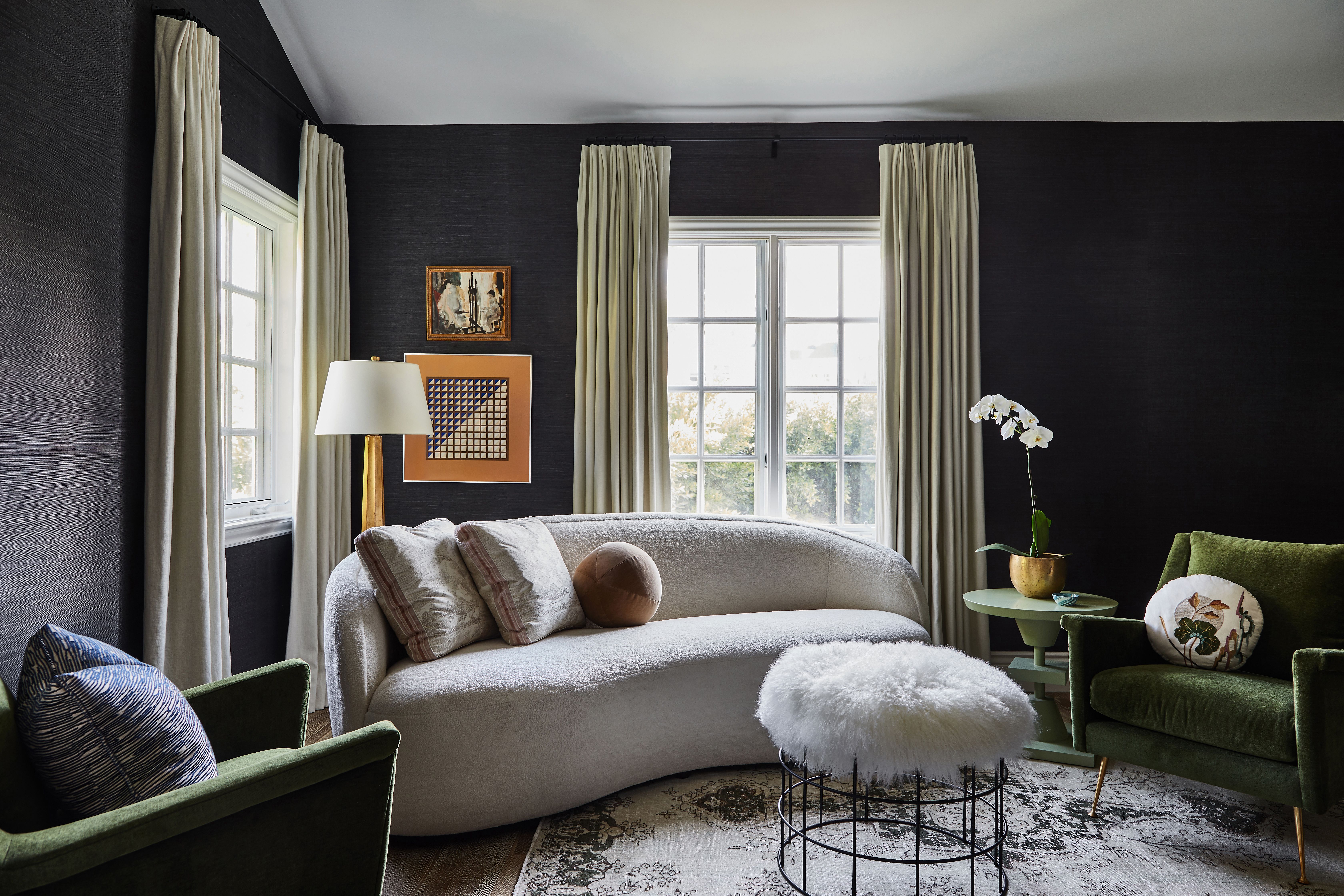

Interior design myths abound – from rules around what you can and can't do with patterns to which colors you should use in small rooms. And while there are some interior design rules that are really beneficial to follow, many are completely outdated – or downright wrong.
So, before you start redesigning a room with a fixed idea of what's wrong and what's right, take a look at the top 10 interior design myths our experts want to dispel below... Because some rules were made to be broken.
See: Interior design tips – decorating secrets for the world's top experts
1. Small rooms should be painted white
Emma Sims Hilditch, of UK-based design studio Sims Hilditch, says: 'Contrary to belief, we recommend that our clients paint their darker, north-facing rooms in darker colors. This creates a cozy, cocooning feel, rather than washing the room out by using a lot of white.'
Brianne Bishop of Brianne Bishop Design, agrees, saying: 'Dark paint does not make rooms smaller. I actually use this trick in the opposite way! By adding depth to a wall it creates an illusion of pushing the wall back and feeling larger.'
- See: The rule of thirds – an interior design rule that really works
2. Wood panelling isn't just for country homes
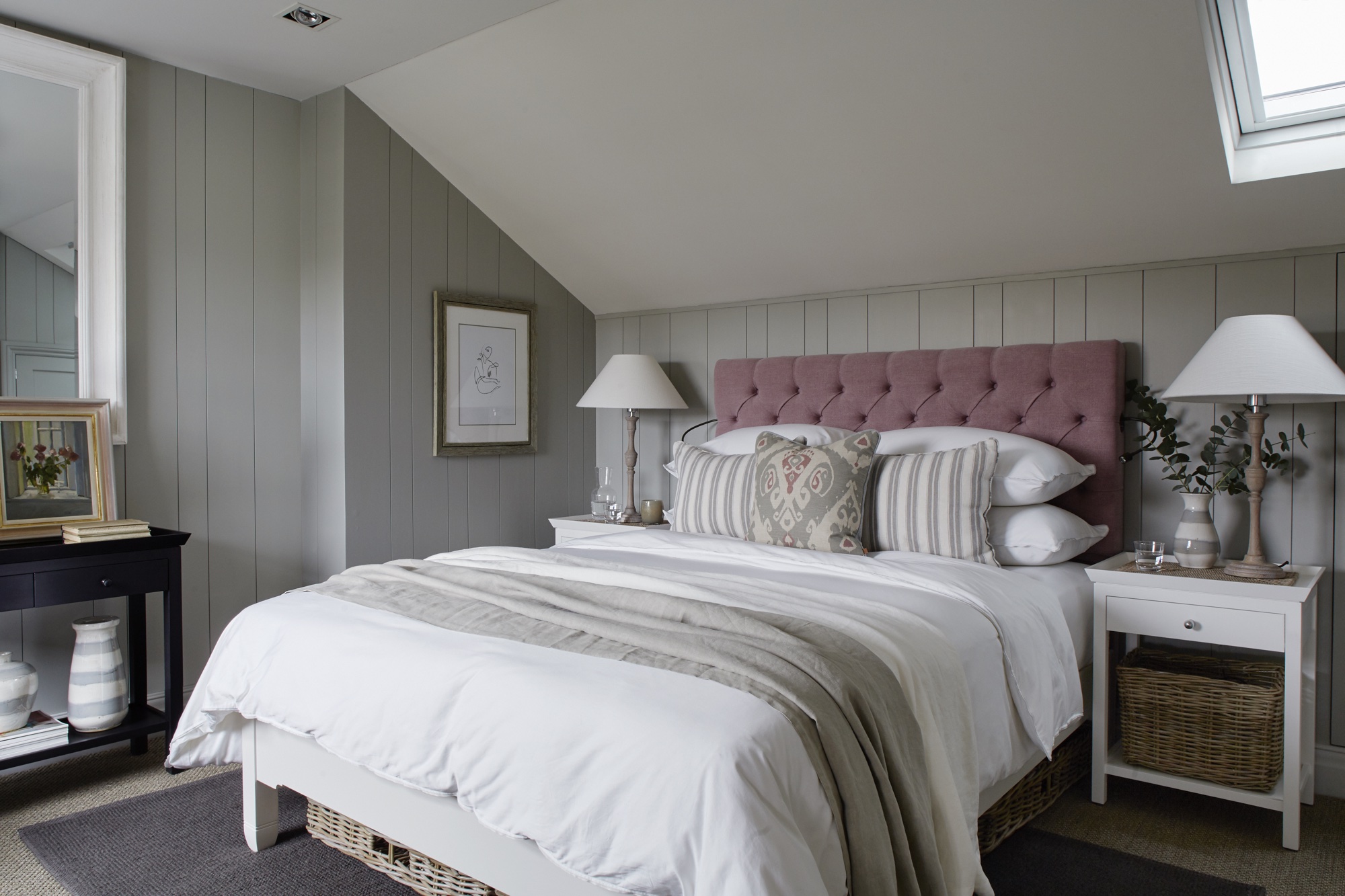
'While it is often found in country homes, wooden panelling can be used in city interiors too!' says Emma Sims-Hilditch. 'It softens the edges of contemporary furniture and sharp lines, without removing any of the elegance and looks great when painted in neutral tones. '
The country-meets-contemporary bedroom designed by Sims-Hilditch above gives a modern rural look to an apartment in London.
Sign up to the Homes & Gardens newsletter
Design expertise in your inbox – from inspiring decorating ideas and beautiful celebrity homes to practical gardening advice and shopping round-ups.
See: Country decorating ideas – bring stunning rustic style to your home
3. You can't mix different patterns
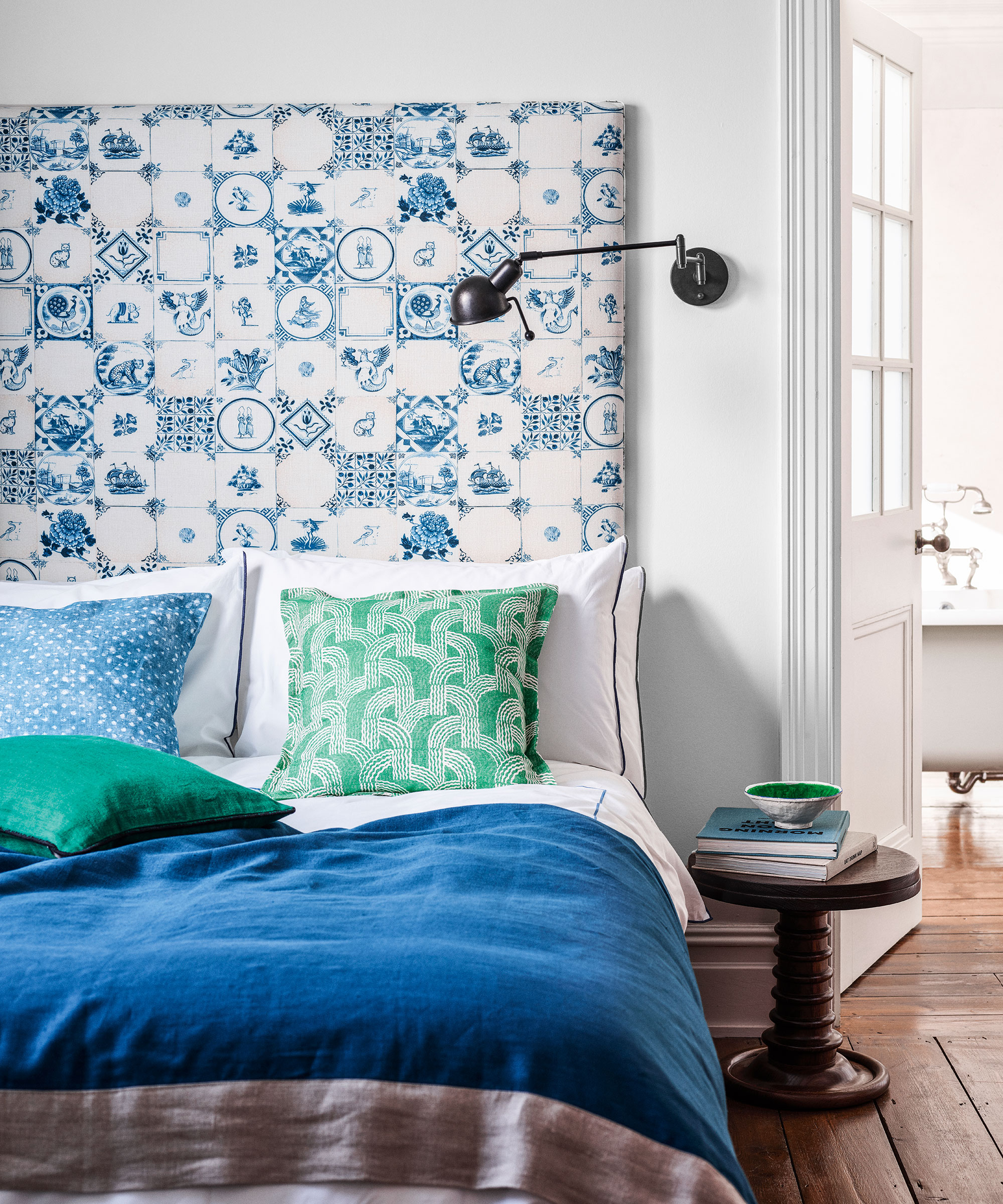
'Mixing patterns is a good thing,' says Emma Sims-Hilditch. 'Pairing plaids with a floral patterned fabric or a small check adds interest and character to a room, and works really well when they adhere to a similar color palette.'
See: How to mix patterns in a room: an interior design masterclass
4. Don't use wood or wallpaper in the bathroom
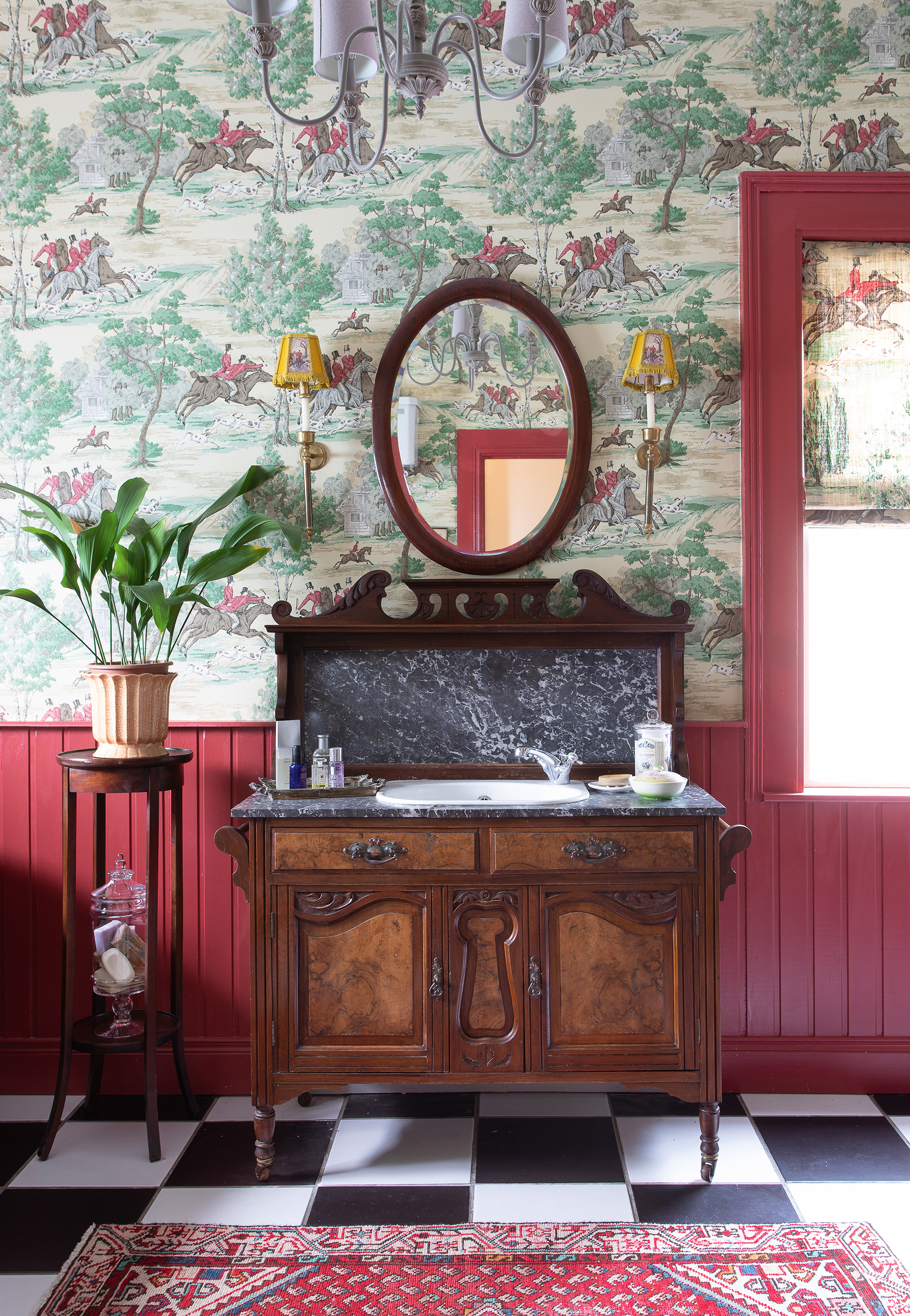
Contrary to popular belief, wallpaper and wooden panelling work well in a bathroom.
Emma Sims-Hilditch explains: 'We often pair a pretty patterned wallpaper with half height panelling for an elegant yet traditional look, and use an adhesive behind the panels to mitigate the effects of damp and moisture.'
5. Everything has to match perfectly
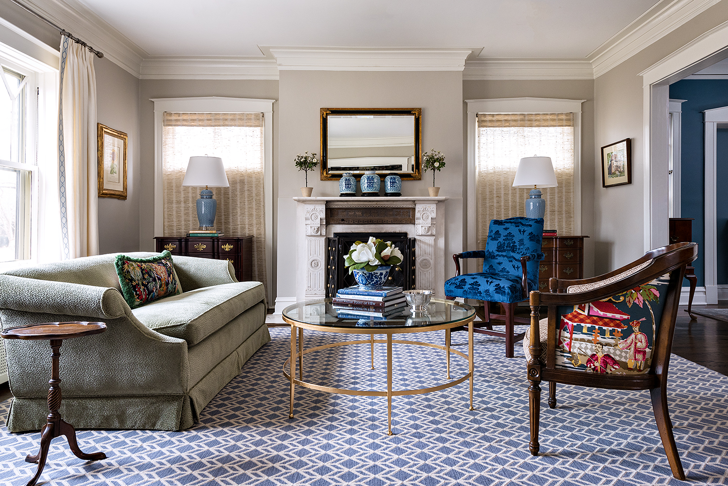
Breathe life into a space with complementary yet different colors, and colorful art and accessories, and different prints. While it's nice for some things to match, this certainly shouldn't be prescriptive.
Mark Lavender, of M. Lavender Interiors, says: 'Mix it up a bit with complementary colors and bring in special pieces in a different style or vintage to bring interest to the room. A room does not have to be sterile.'
See: Layering in interior design – the steps interior designers always follow for successful schemes
6. The ceiling has to be white
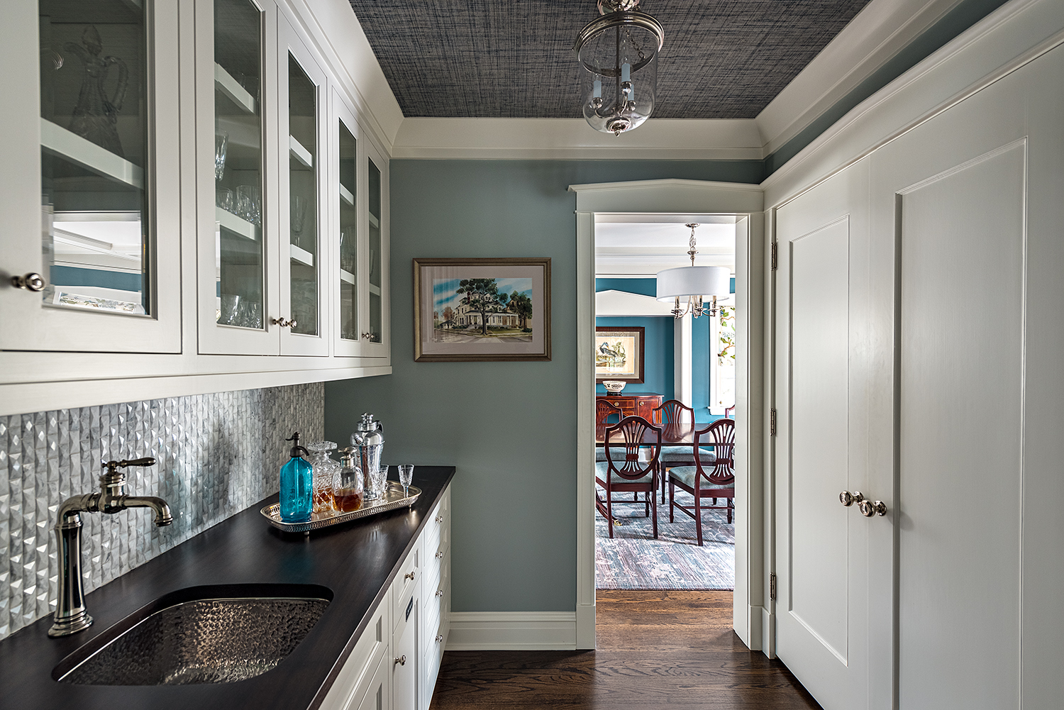
'Go for the 5th wall,' says Mark Lavender. 'Liven it up a bit with color or texture on the ceiling. This is a great way to create drama in a space.'
7. You shouldn't mix metals
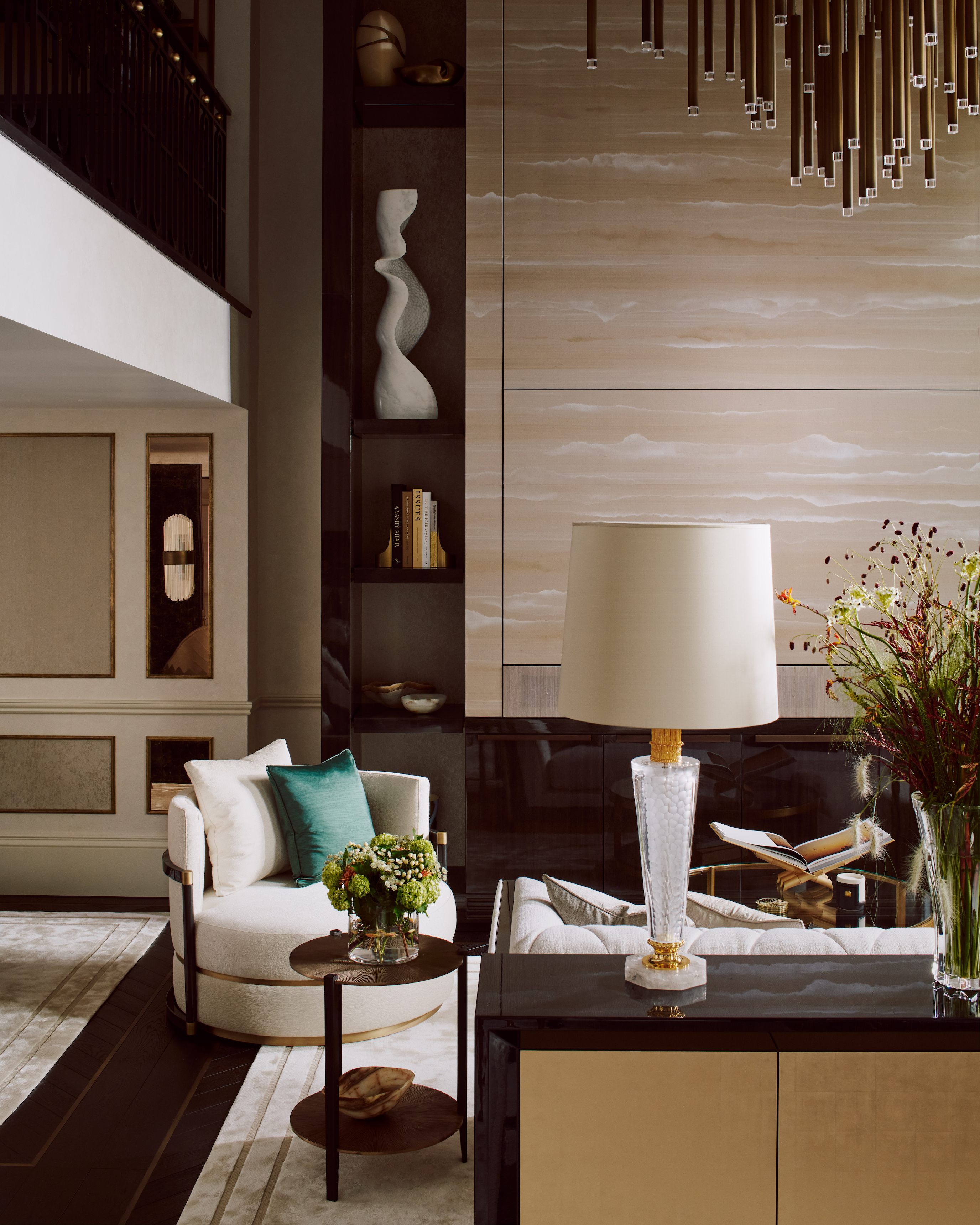
In fact, the opposite is true... Mixing metal finishes actually adds an edge to the finished look.
Brianne Bishop says: 'As long as you stay in the same family of cool versus warm you can certainly mix metals and black goes with both warm and cool metals.'
8. Rugs need to be expensive
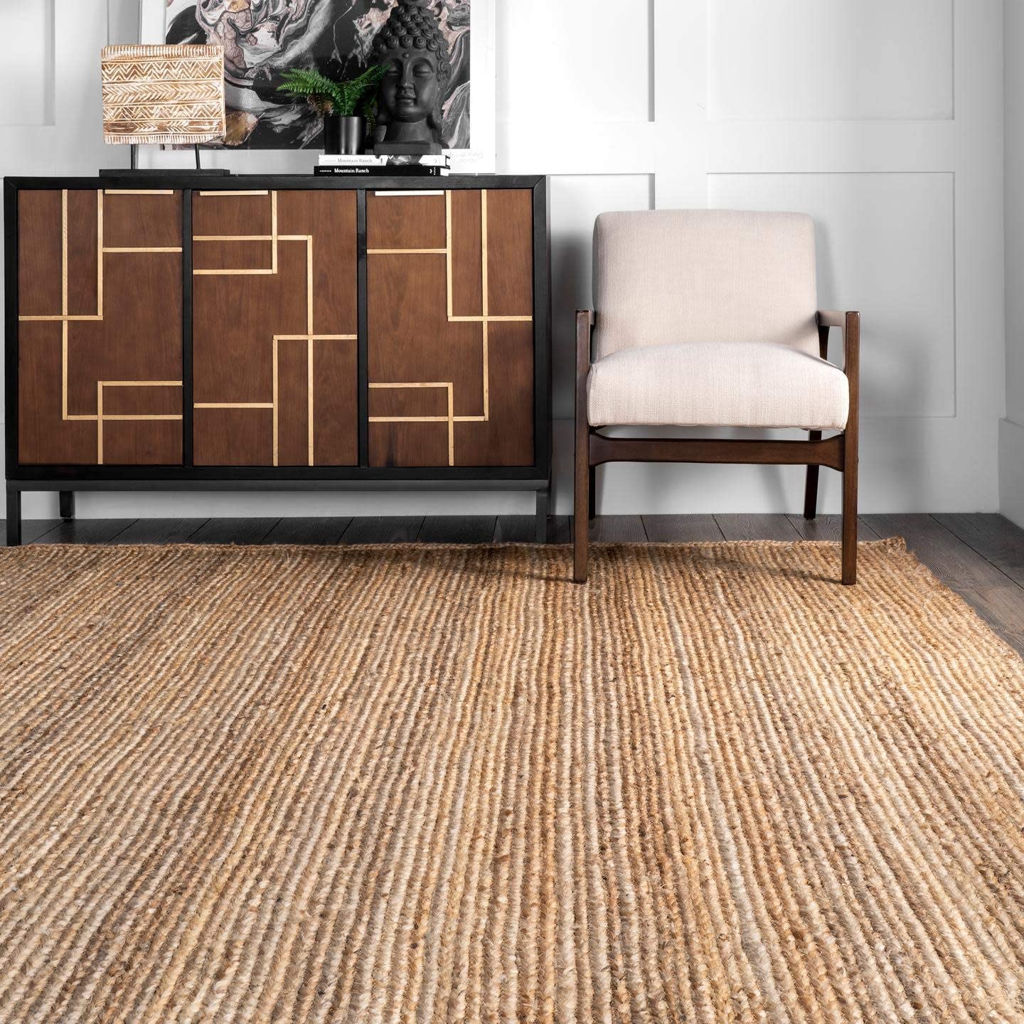
Rug from Amazon
A good area rug can really create a cozy feel as well as add in some print or color to an otherwise neutral room. But, contrary to belief, you don't need to spend a fortune.
'Our clients typically have kids and pets so we have mastered the art of beautiful (even handmade!) rugs that don't break the bank!' Try Studio McGee at Target for some affordable-chic options.
9. Velvet is just for the living room
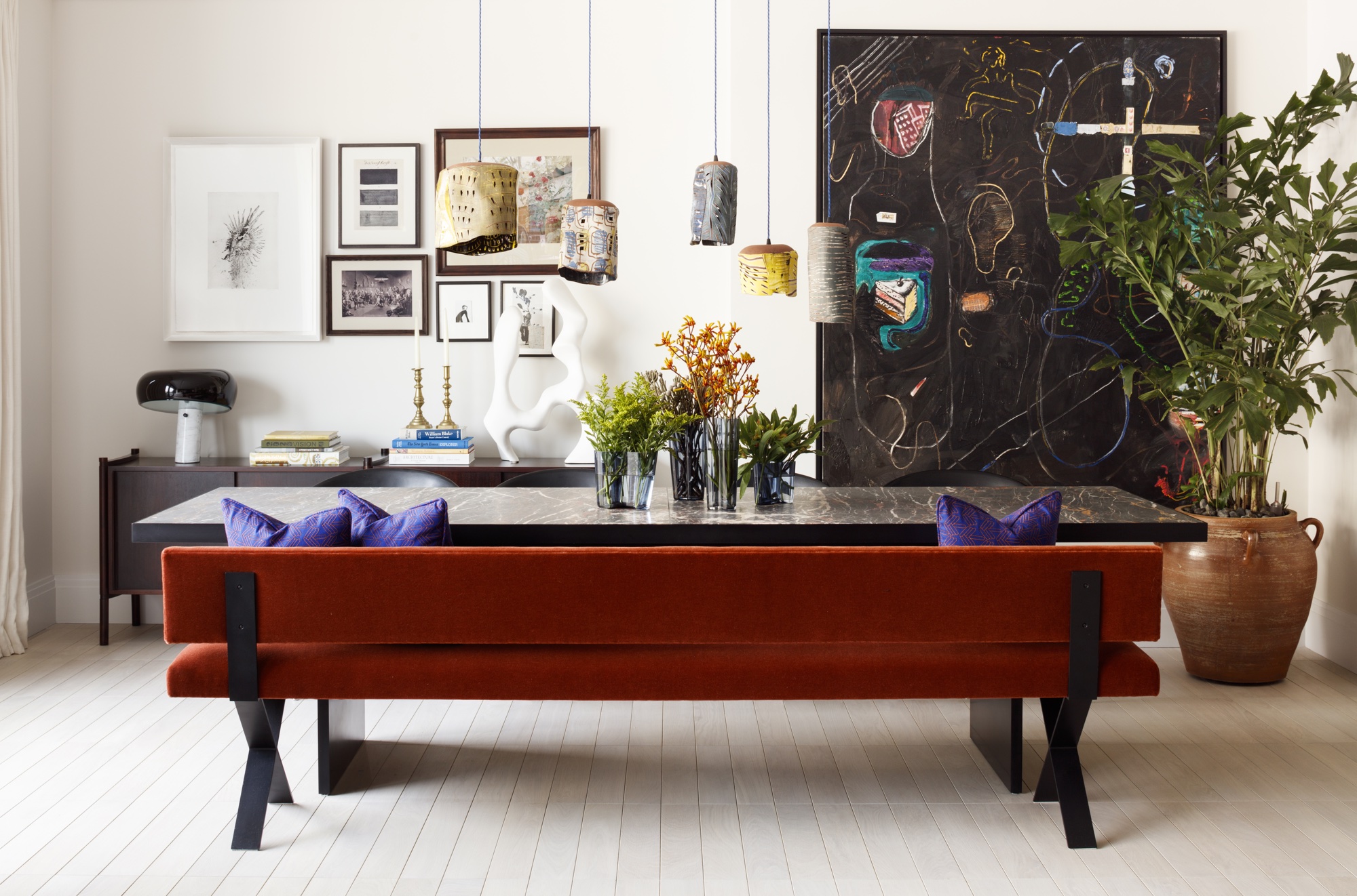
Comfortable, colorful fabrics like velvet are often associated with relaxing in a lounge or snug.
Chairs or wooden benches are often used for the kitchen but, as this room becomes increasingly multi-purpose, there's nothing to say you can't cozy things up a little with velvet benches. We love the above design by Studio Ashby, which incorporates a comfortable backrest along with a popping red hue into its kitchen seating setup.
10. No rugs in the kitchen
A post shared by The Expert (@theexpert)
A photo posted by on
Many people believe you shouldn't place rugs in the kitchen because they'll get dirty too easily with food prep offering ever-present opportunities for stains. However, we spend a huge amount of time in our kitchens, from cooking to socializing, and a hardwearing rug can really add a cozy and stylish element to the space.
See: The golden ratio – learn how to create a perfectly balanced scheme with this rule
The chic scene above, created by Cortney Bishop Design, shows 'balances of creativity, comfort and functionality with a dose of modern flair', and the vintage-style rug helps pull the look together.

Ruth Doherty is an experienced digital writer and editor specializing in interiors, travel and lifestyle. With 20 years of writing for national sites under her belt, she’s worked for the likes of Livingetc.com, Standard, Ideal Home, Stylist and Marie Claire as well as Homes & Gardens.
-
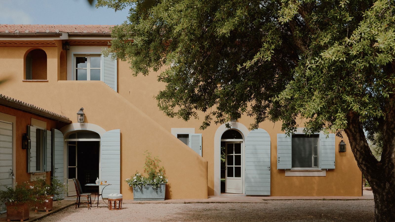 How a British designer brought together the different tastes of a couple wanting to create the dream future-proofed home in the idyllic Italian countryside
‘They wanted a house that would feel immediately like home the minute they arrived, and somewhere relaxing to spend time together as a family and entertain friends.’
By Fiona McCarthy
-
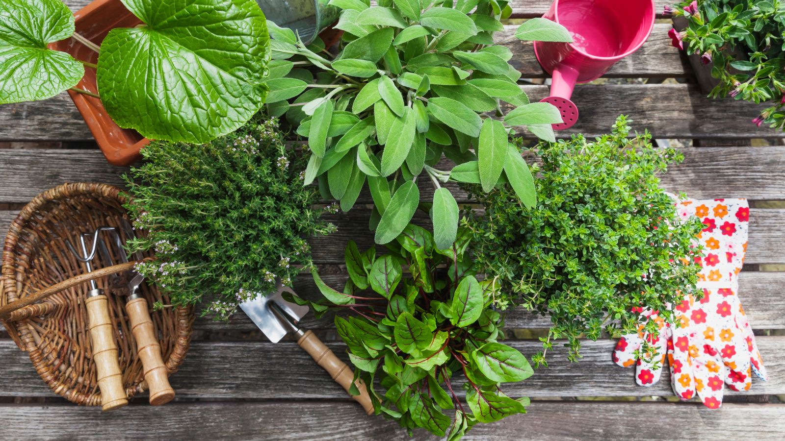 What is your birth month herb? Discover the symbolic meaning behind yours
Herbs offer symbolic wisdom, and play to the natural rhythms of the season
By Lola Houlton