8 interior design mistakes that are easy to make – and how to avoid them
Never make a design faux pas again with these expert tips
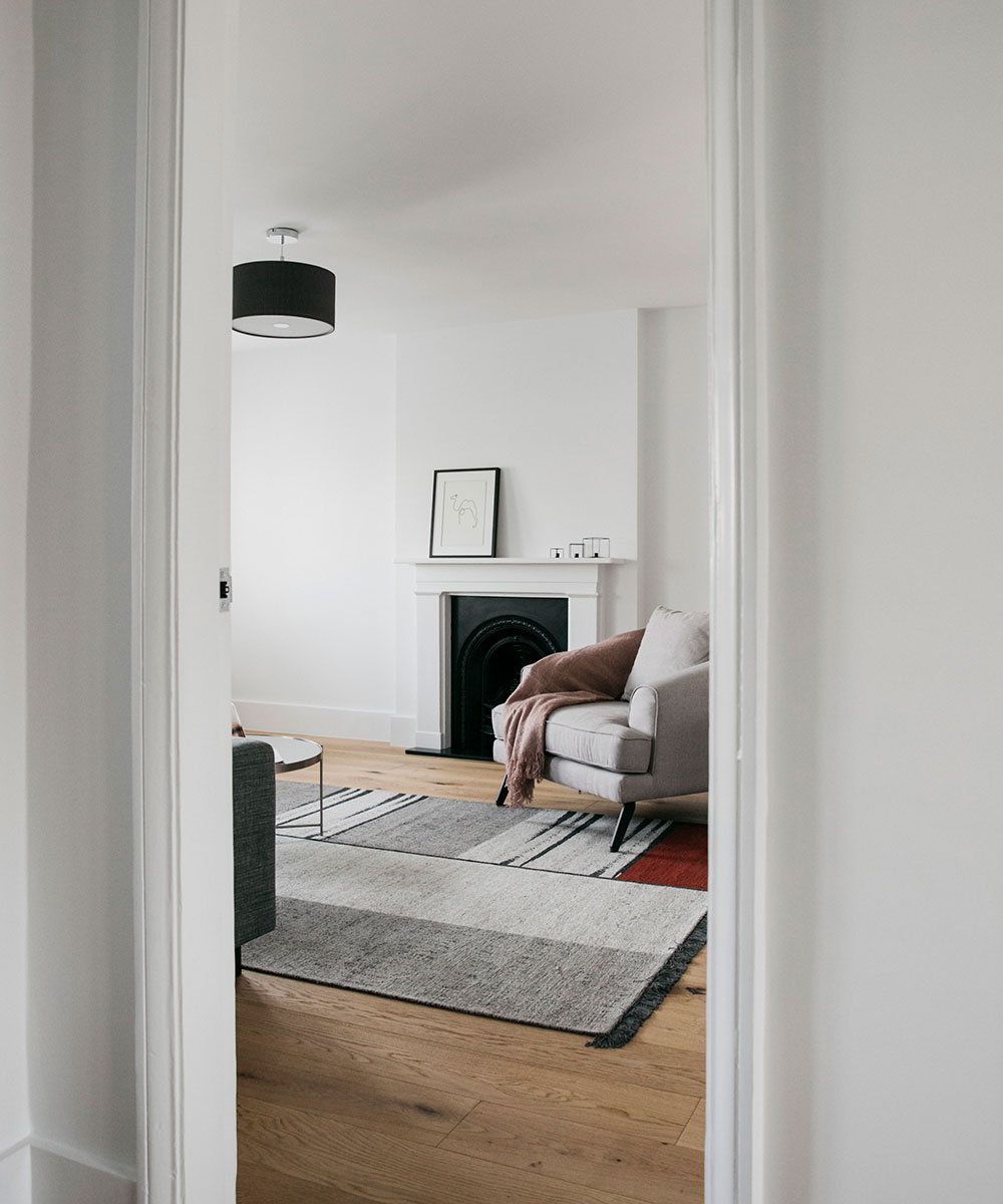

Getting your home's interior design just right is easier said than done. How it looks in your mind might not translate to how you thought it would – and you may not even be able to put your finger on why.
It may be the decor, but it could be the furnishings you have chosen – they are an essential factor in layering a space, while also improving the overall look and feel of your home.
At Homes & Gardens, we have seen our fair share of design mistakes – but we also have tons of expertise on how to avoid them. So, whether you are going for a full re-design or just leveling up a room, there are some simple tips we can give you to make sure you go straight to design diva – and avoid design doom. Here, we discuss just a few, with the help of property experts Kane Hughes and The Furniture Union.
Interior design mistakes – and tips to avoid them
These common design mis-steps are easy to overcome, with just a little know-how.
1. Metal furnishings – but you can add layering to soften them
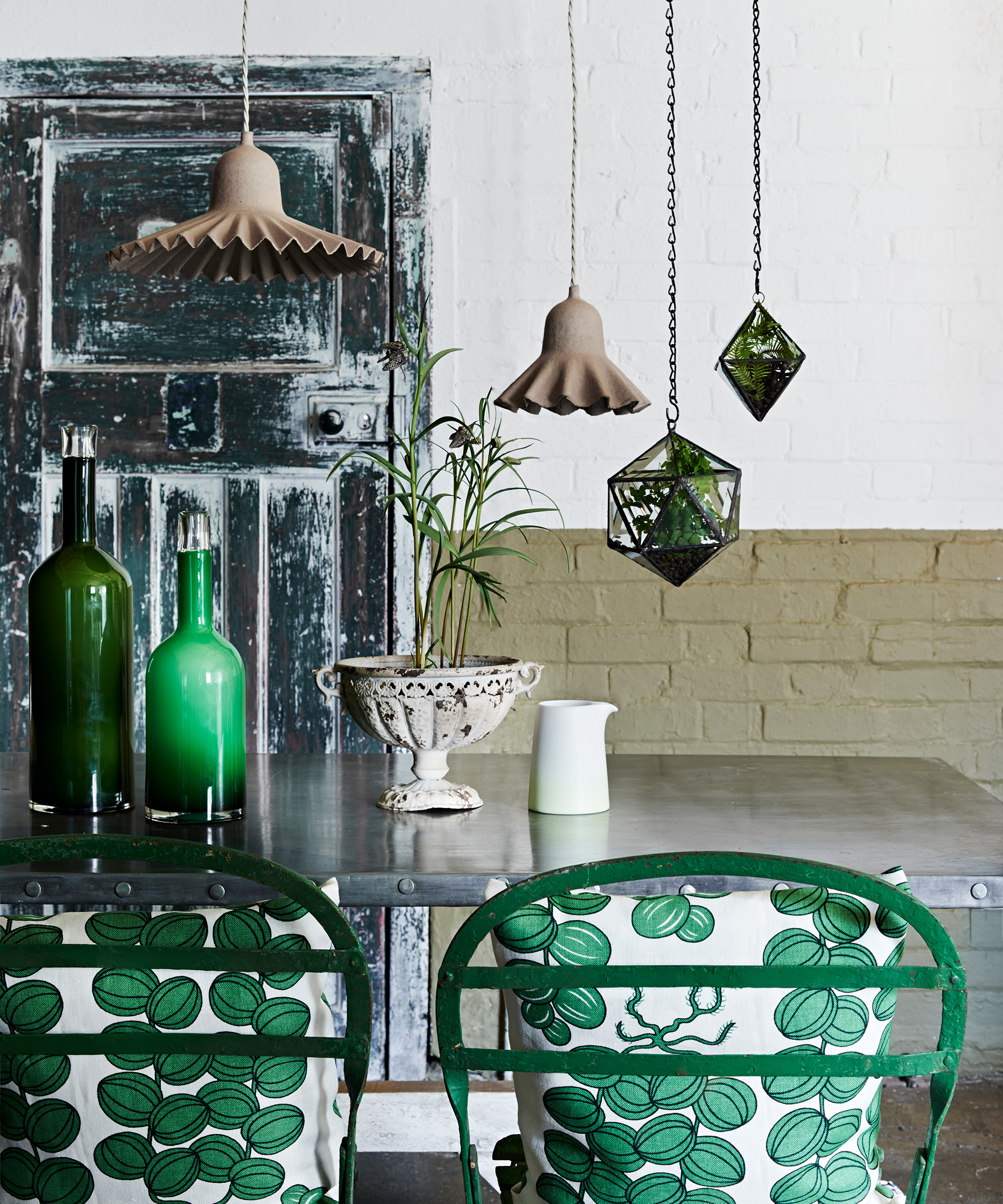
'In an area where warmth is key, such as your living room or bedroom, you should avoid metal furnishings at all costs,' advises Kane Hughes. 'Any type of metal décor such as a steel table or a bronze ornament should not be used in these spaces – they usually create a cooling effect that is not homely at all.'
The Homes & Gardens is a little more forgiving – we know what it's like to fall in love with a metal bedstead, an amazing piece of sculpture or a rustic shelving unit. And this is where it is vital to add luxurious layering – with cushions and throws on a bed, and rugs, throws or soft window treatments within a room with metal furniture – all to soften the harder material.
2. Under-sized rugs that 'float'
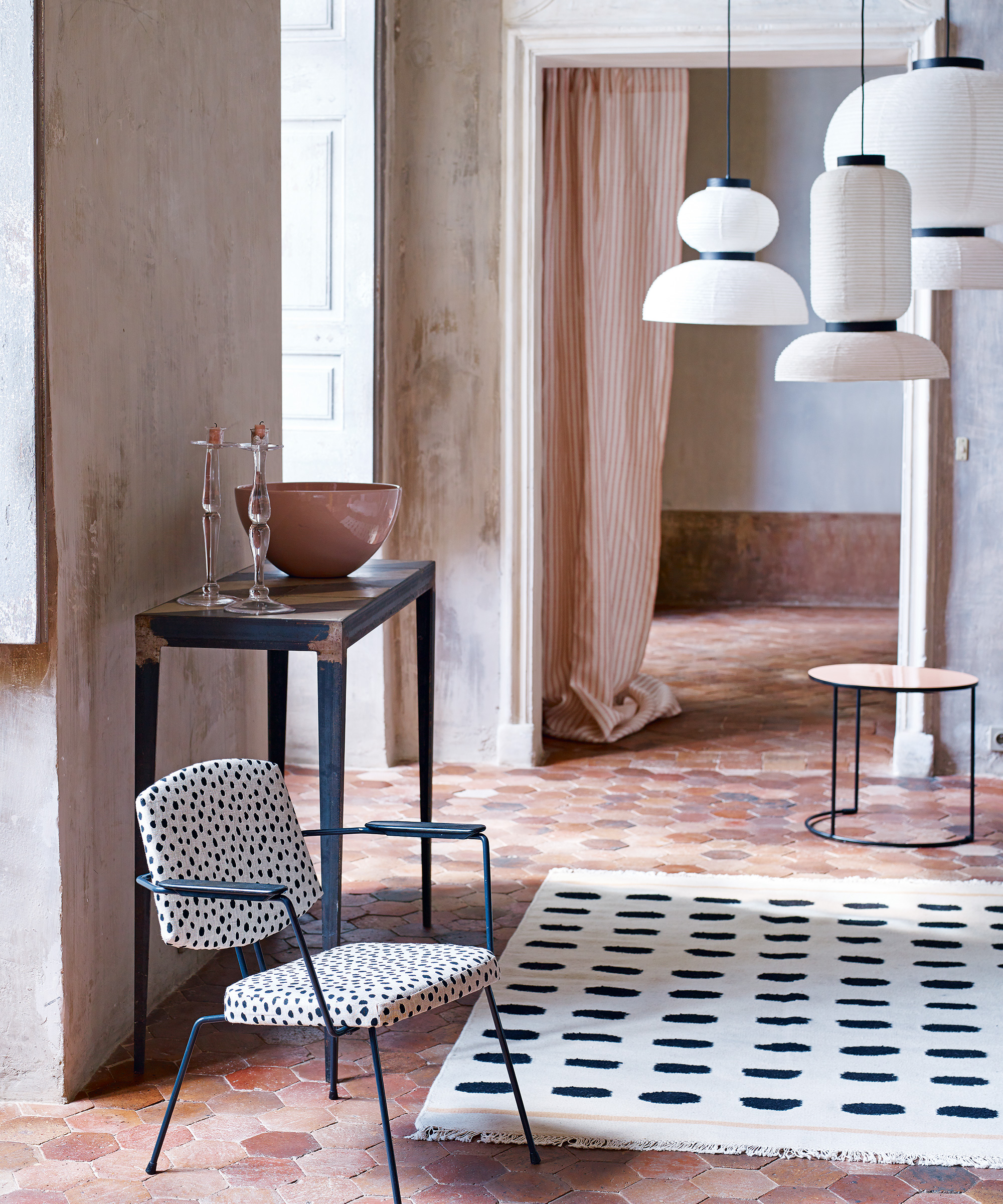
'When adding a rug to a room, it is important that the rug takes up as much of the floor space as possible,' continues Kane. 'Small rugs in large spaces to tend to condense the room and make it appear smaller, while also create an unbalanced feel.'
Sign up to the Homes & Gardens newsletter
Design expertise in your inbox – from inspiring decorating ideas and beautiful celebrity homes to practical gardening advice and shopping round-ups.
We agree whole-heartedly with this – particularly in a room where the rug might be the uniting, foundation piece, perhaps central to a grouping of armchairs within a living room.
3. A poorly thought-out lighting scheme
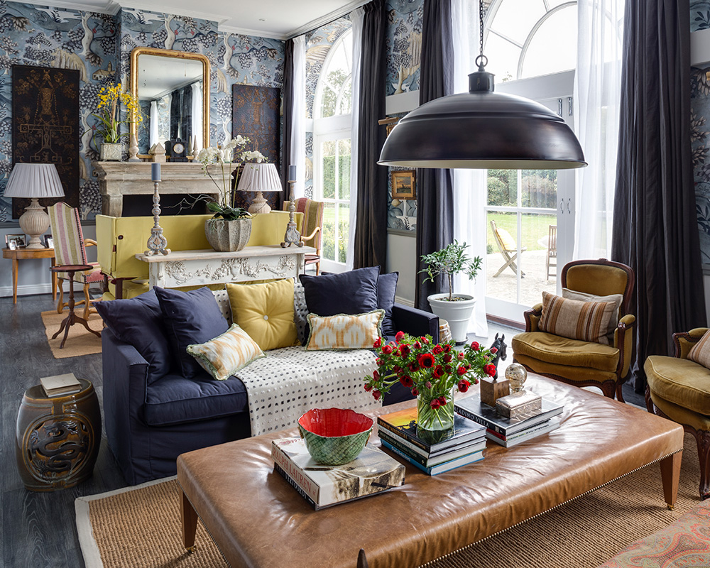
This is one of our biggest design mistakes: not all lighting is created equal and some is decidedly unflattering. When considering a lighting scheme, remember that you are not just looking at the design of your light shade or where it is in the room – it’s important to consider how it lights up various aspects of your living space.
Avoid harsh overhead lighting that attempts to blanket the entire room in a flat light, replacing a characterless central pendant with a show-stopping light fixture that can be dimmed. Think subtle accent or practical task lighting, too, to create pools of welcoming light around the room. Rule number one? No room should be lit by one light source only – you need to be able to control several sources for each room to adapt the lighting levels to the atmosphere you would like to conjure up.
4. Old-fashioned furniture placement – experiment!
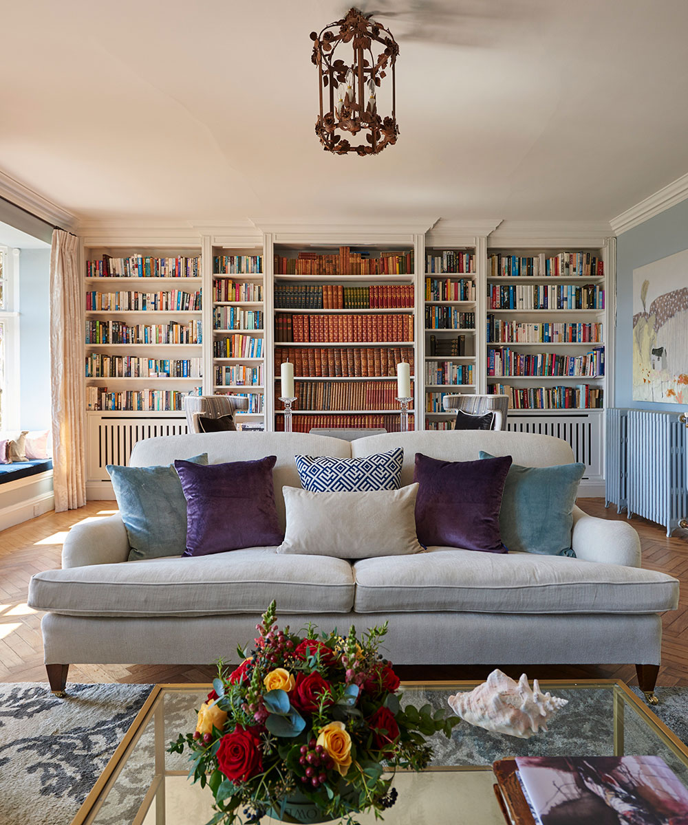
Traditional design would have all your sofas and armchairs placed firmly against the wall, creating a central space. However, times have now changed so consider placing your furniture in other orientations – experiment until you find what works.
Not only does this allow you to showcase your chairs, but you can use them to demarcate areas in a fresh design.
5. An all-white scheme
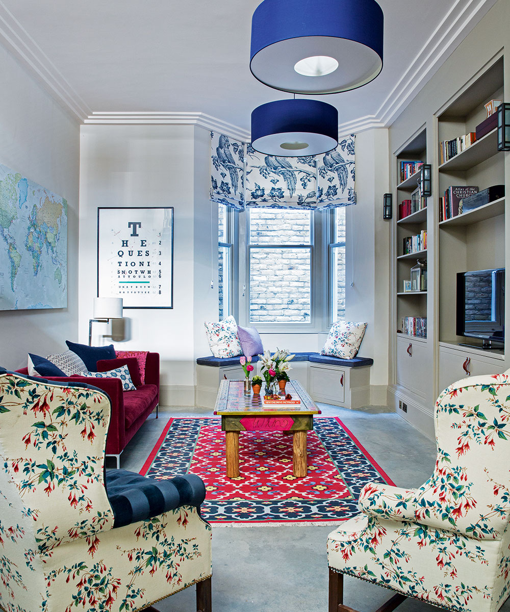
Having light, airy spaces is ideal, but having too many white walls runs the risk of creating a stark, almost surgical feel to your interiors. Experiment with whites but be sure to include hints of color or contrast with warmer shades and vibrant art, as in the room above.
6. Clutter – unless you can make it look curated
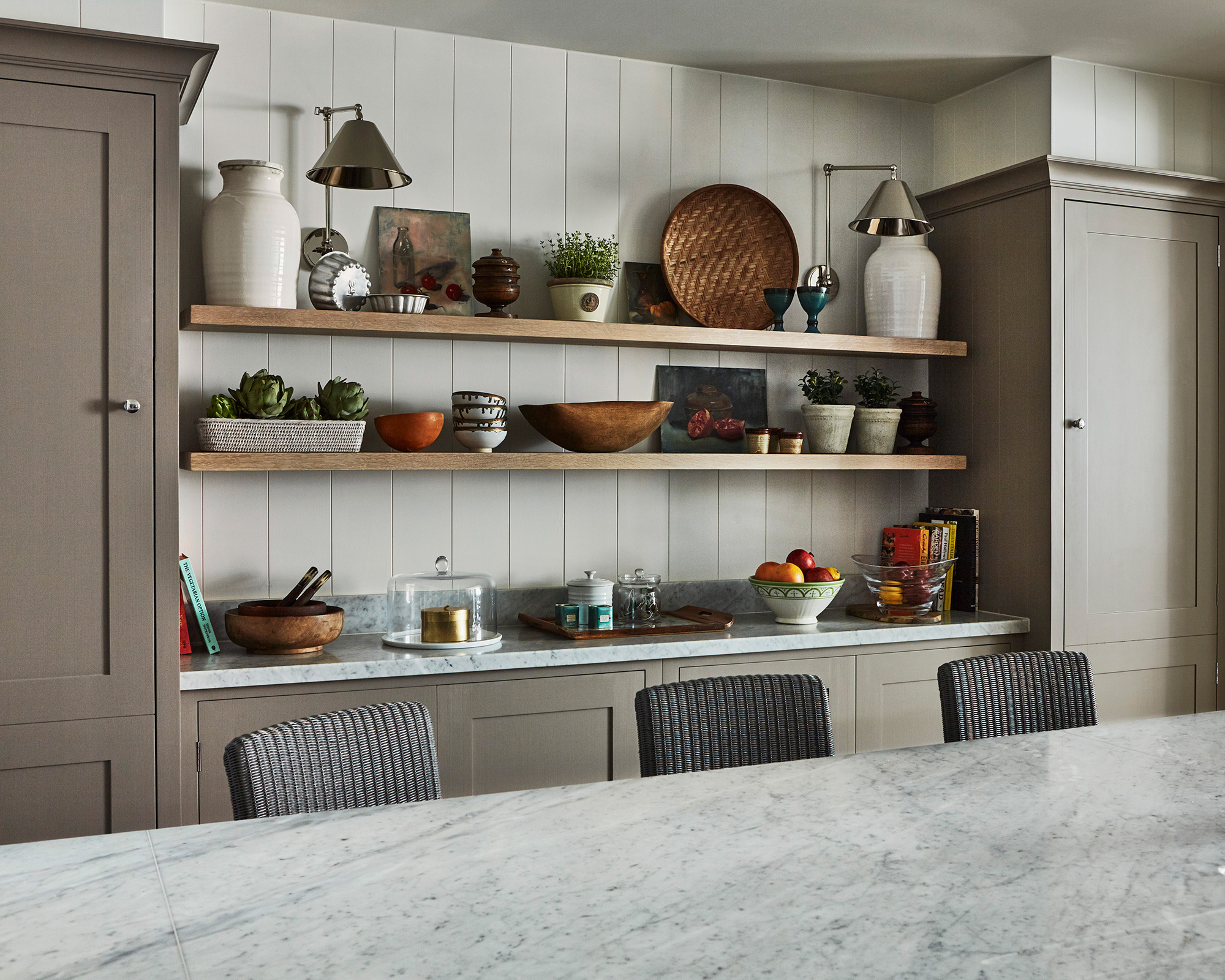
This may not seem like a design issue, but it can seriously impact the visual appearance of your room. Don’t be afraid to get rid of those had-me-downs you’re holding on to that don’t add anything to a room and just look odd or old fashioned. Be ruthless if you really want a modern and clean-cut design – it’ll be worth it!
7. Accent walls
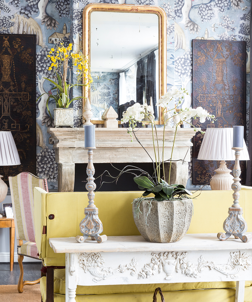
'At one point in time, accent walls were extremely popular, as they helped to add color in spaces where it was lacking,' says Kane.
'However, by using a block color one wall, you are creating the illusion of a much smaller room, especially if you use colors like red or black.
'If an accent wall is a must, then you should try to use textured wallpaper which will bring attention to the wall without condensing the space.'
8. Paint first, think later
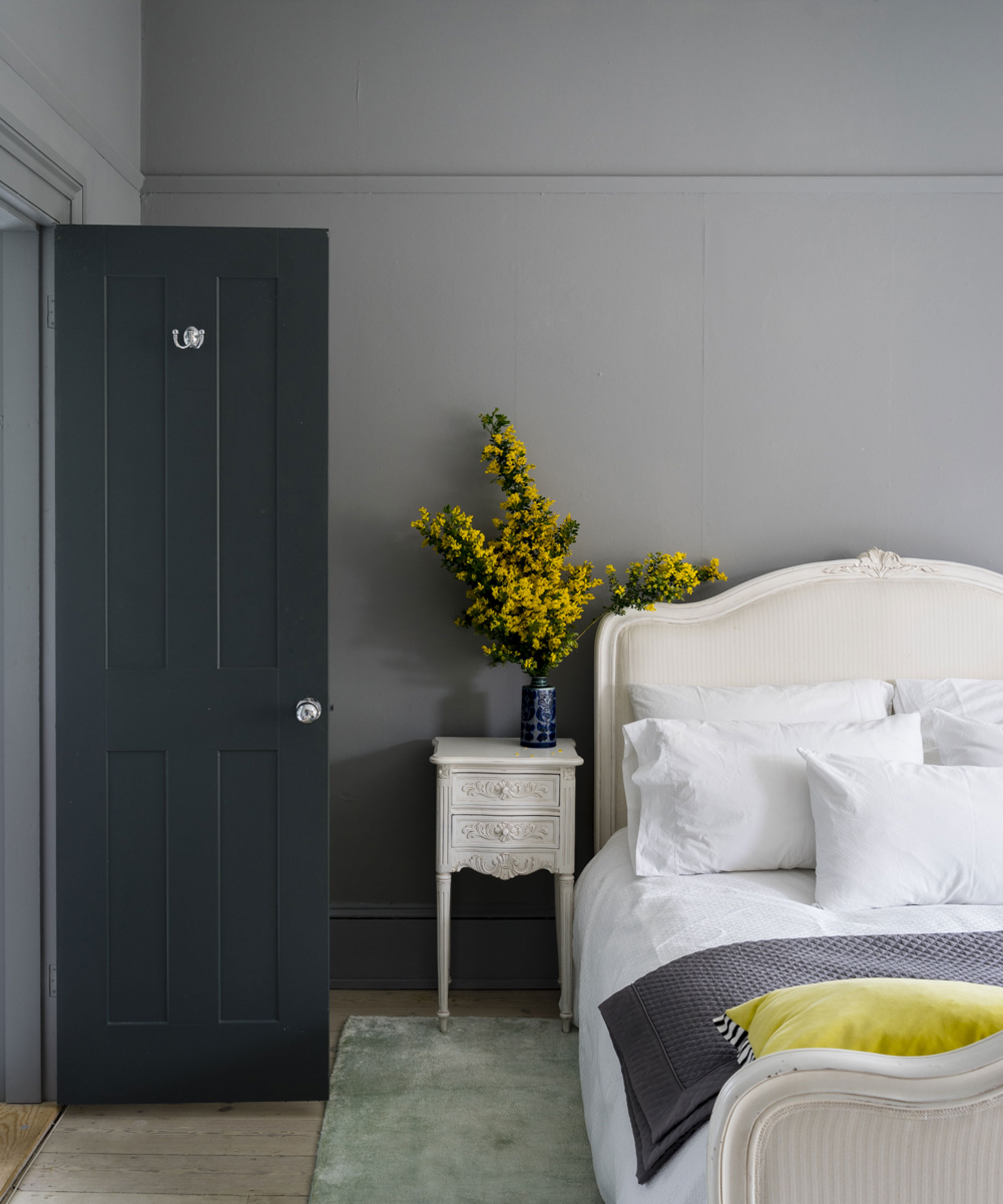
Put the paintbrush down. Before you set loose on your walls, you need to plan your color around your existing furniture, art, and soft furnishings – not the other way around. Or, choose new furniture ahead of carrying out that paint job.
Thanks to The Furniture Union and PriceYourJob for the tips and advice.

Jennifer is the Digital Editor at Homes & Gardens. Having worked in the interiors industry for several years in both the US and UK, spanning many publications, she now hones her digital prowess on the 'best interiors website' in the world. Multi-skilled, Jennifer has worked in PR and marketing and occasionally dabbles in the social media, commercial, and the e-commerce space. Over the years, she has written about every area of the home, from compiling houses designed by some of the best interior designers in the world to sourcing celebrity homes, reviewing appliances, and even writing a few news stories or two.
-
 How can you make an outdoor kitchen feel more luxurious? Designer tips on making this hardworking space extra opulent
Discover the strategies the experts use to give an outdoor kitchen luxury style
By Sarah Warwick
-
 Kyle Richards' unconventional styling encourages you to use shelves for more than books – it's a fresh twist on 'bookshelf wealth' for 2025
The Real Housewife of Beverly Hills intentionally decorated her shelf with ceramics and accessories that have enough room to breathe, and designers love her look
By Hannah Ziegler