'How do we live with less in a well-designed way?': Hello Tomorrow! production designer Maya Sigel cracks the code with her sets
Apple TV+'s new show's mid-century modern sets have made a splash with audiences – Sigel shares her tips for recreating the vibe in your own home


For the past decade or so, mid-century modern has been the top interior design aesthetic. But as tastes change, designers are constantly reinventing this era to work with more current tastes – and no one knows this as well as Maya Sigel, production designer for the new show, Hello Tomorrow!
In the Apple TV+ series, Billy Crudup plays a charismatic salesman from a futuristic version of the 1950s, hawking timeshares on the moon. It was Sigel’s job to create the mid-century modern homes and town of Vistaville, located on earth, as well as the futuristic homes in the moon community of Brightside.
We connected with Sigel to chat about her experience creating the retro-futuristic world on our screens, and how mid century modern decor principles can translate into our own homes.
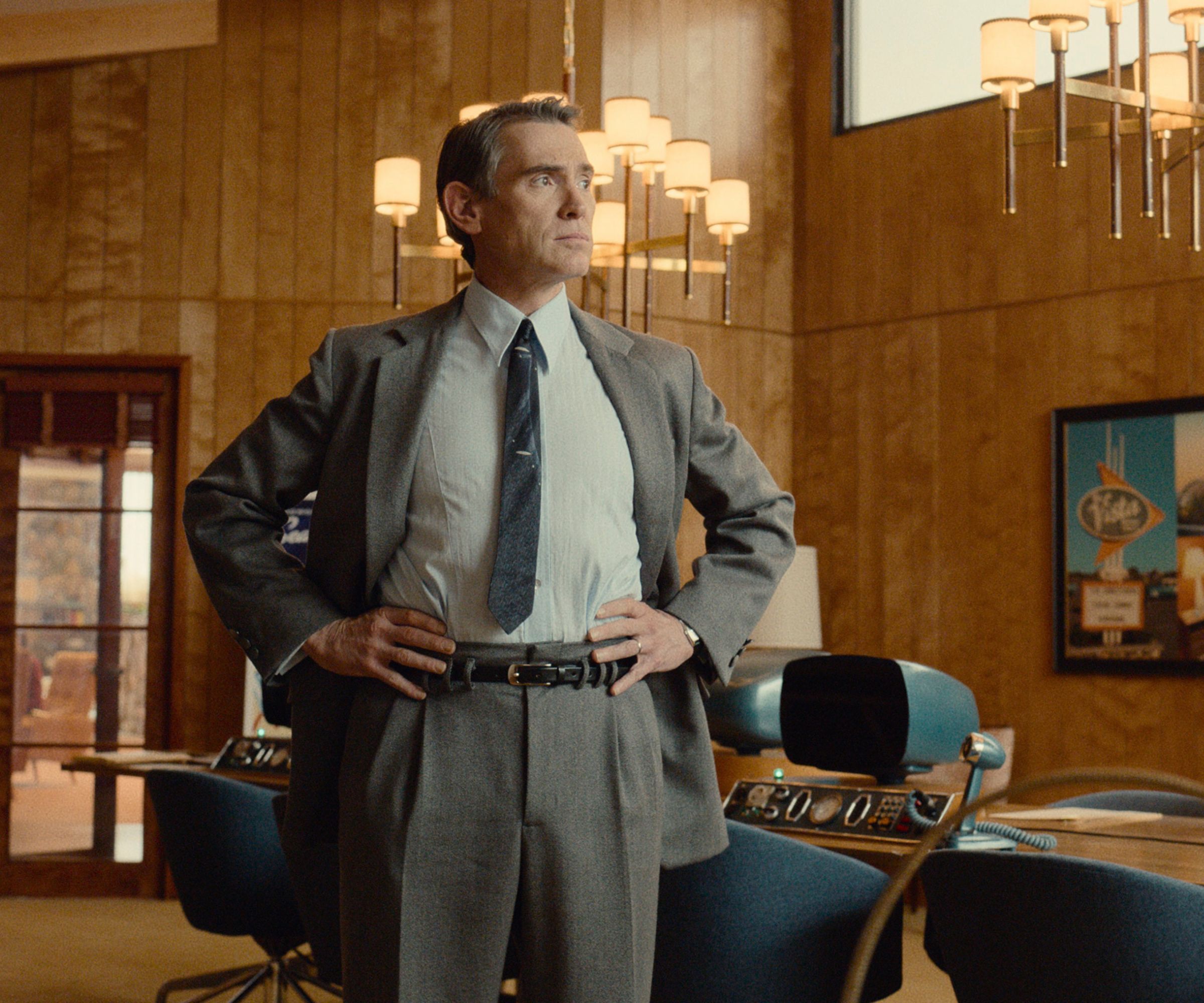
Billy Crudup in Hello Tomorrow!
When it comes to setting the mood, Sigel tells us that you should never underestimate the power of room color ideas. In order to create the two separate worlds of Hello Tomorrow!, Sigel first began by defining each one’s palette.
'From the beginning, my idea was to separate the two worlds in their color palettes,' she says – and a similar approach can be used to evoke a cozier, warmer feel at home. 'Vistaville is grounded in the earth with earth tones and a sort of autumnal palette. We used a lot of earth materials. There's the river rock and grasscloth wallpaper and a lot of warm wood tones.'
But if you prefer a sleeker, more contemporary vibe at home, look to Brightside – the show’s moon colony of timeshares. 'Brightside is the world of the future. The moon is a little bit cooler and sexier. The dominant colors are blue and silver,' Sigel explains. 'Start using metallics. [Think] chrome or aluminum metals.'
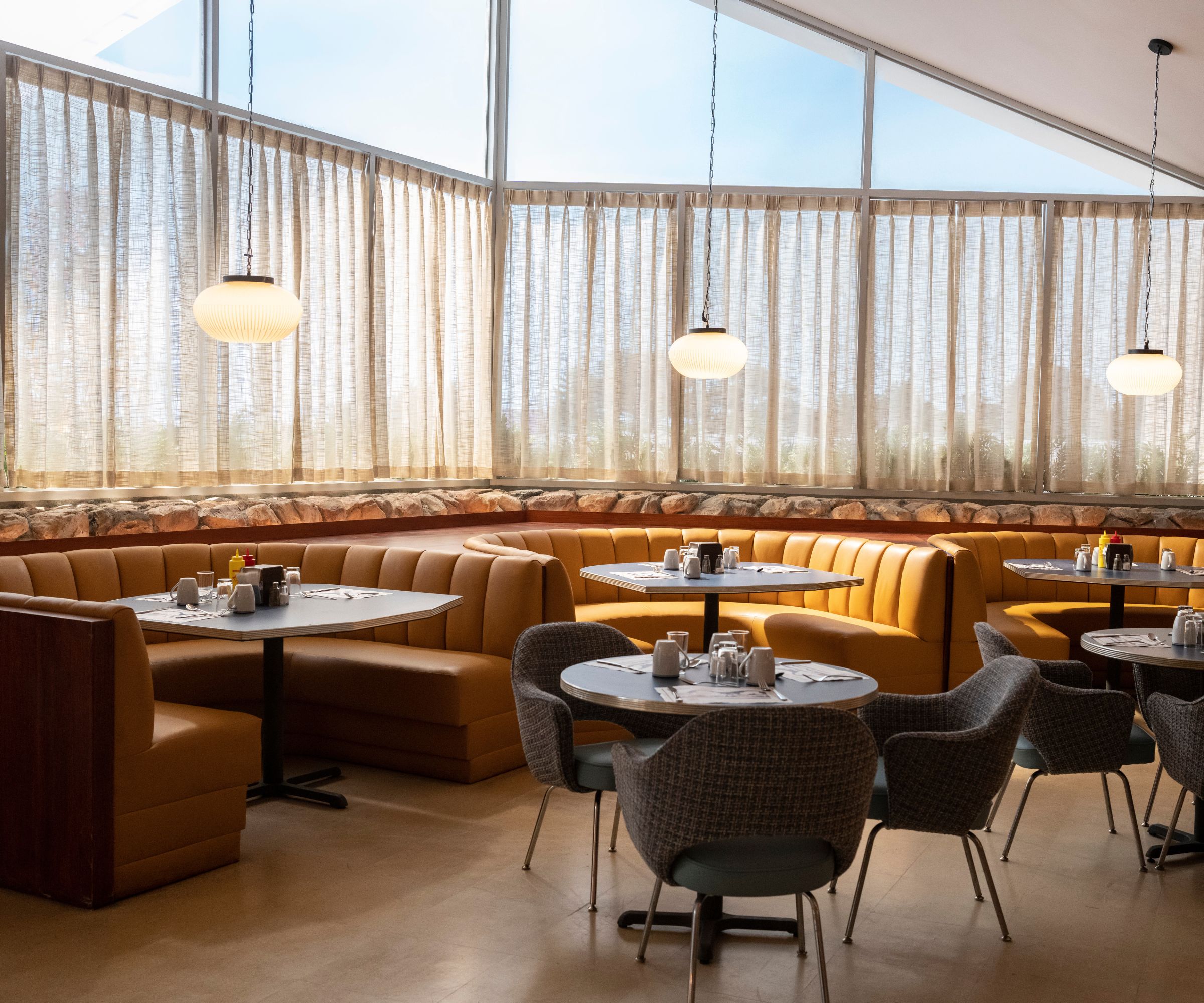
Hello Tomorrow! set designed by Maya Sigel
If you’ve designed your room but it’s still feeling a little drab, Sigel says there’s one thing that might fix all your woes: great lighting ideas.
Sign up to the Homes & Gardens newsletter
Design expertise in your inbox – from inspiring decorating ideas and beautiful celebrity homes to practical gardening advice and shopping round-ups.
'I think a lot about light and lighting,' she says. 'You always want good, natural light coming in, and we always want an option for it to be diffused in some way, whether that's with drapery or blinds or some other kind of window treatment.'
Along with natural light, Sigel also incorporates a lot of lamps into her designs, too. 'I think, with any of my sets you walk into, there's not a corner where there isn't a lighting source,' Sigel says. 'I always think about that – there can't be a dark corner. You have to strategically place things so that the lighting is even and evenly spaced.'
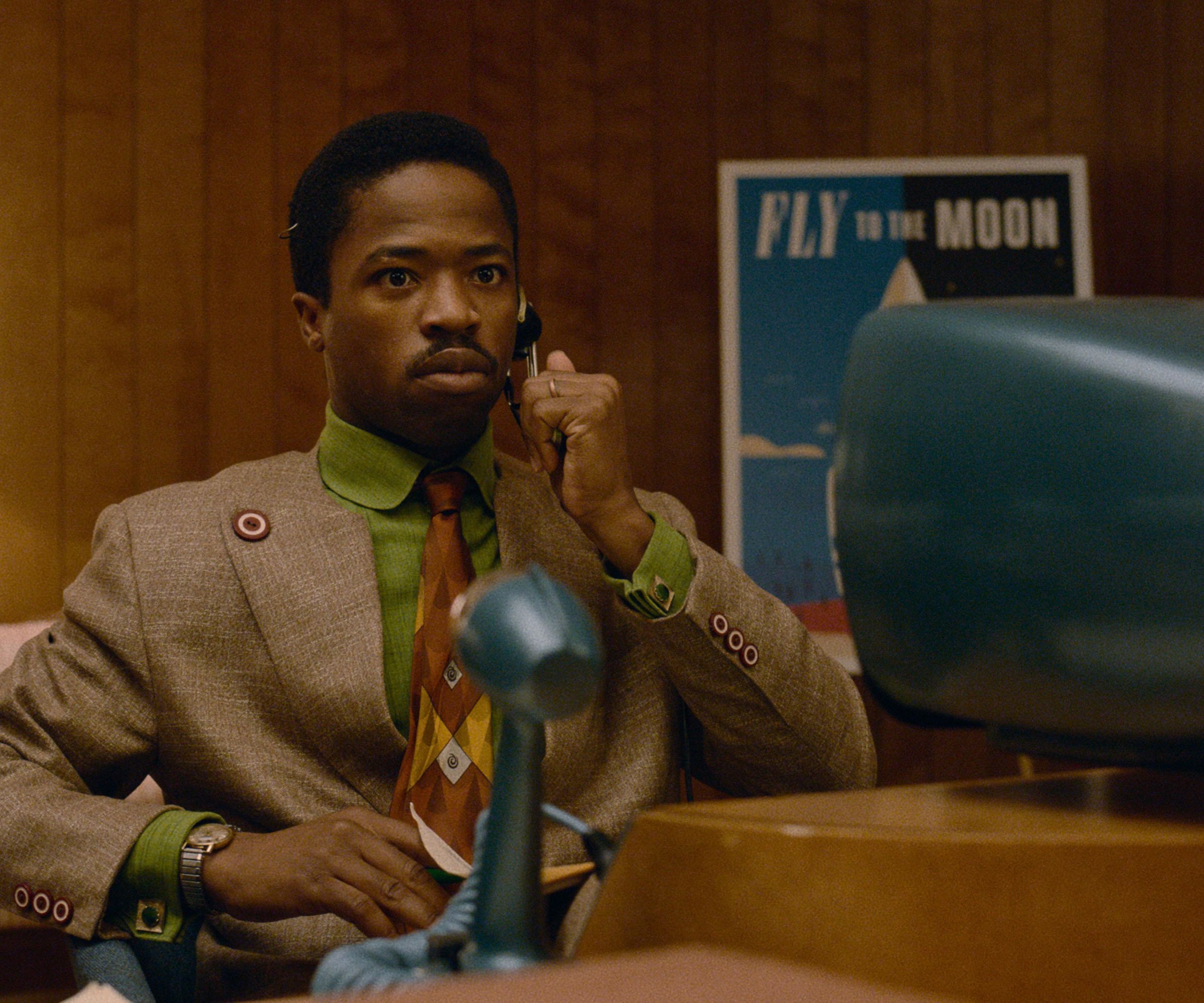
Dewshane Williams in Hello Tomorrow!
While window treatment ideas can be purely utilitarian, Sigel tells us that she puts careful consideration into how she dresses her windows.
'I always, and especially with this show, choose [window treatments] in natural fibers,' Sigel explains. 'I like having a weave that’s kind of loose, where you can actually see the texture as the light comes through. I think there's such a difference between that and synthetic shears.'

Billy Crudup in Hello Tomorrow!
No matter what look you’re trying to achieve, Sigel tells us that one of her favorite things to do is to incorporate one-of-a-kind pieces that will stand out. Striking the right balance will also help you create a space that feels authentic without feeling themed.
'I had an incredible set decorator on this show,' says Sigel. 'His name is George DeTitta, Jr. and he is a New York legend. He's been around forever. And he and his team just sourced the most amazing things really from all over the place – you can go on 1stdibs or Chairish... and a lot of it was thrifted.'
While many pieces were sourced for the show, Sigel tells us that she had quite a few things custom-made – and this isn’t something people should be afraid to do in their own homes.
'It really depends on where you live and what kind of materials you use, but I love it. I love the idea of my big bookshelf here [in my home],' says Sigel. 'I designed it, and then I found some really great carpenters that weren't very expensive. They used maple, which is not the most expensive wood, and I think it streamlines a room and gives you more storage and more space. I'm a big fan.'
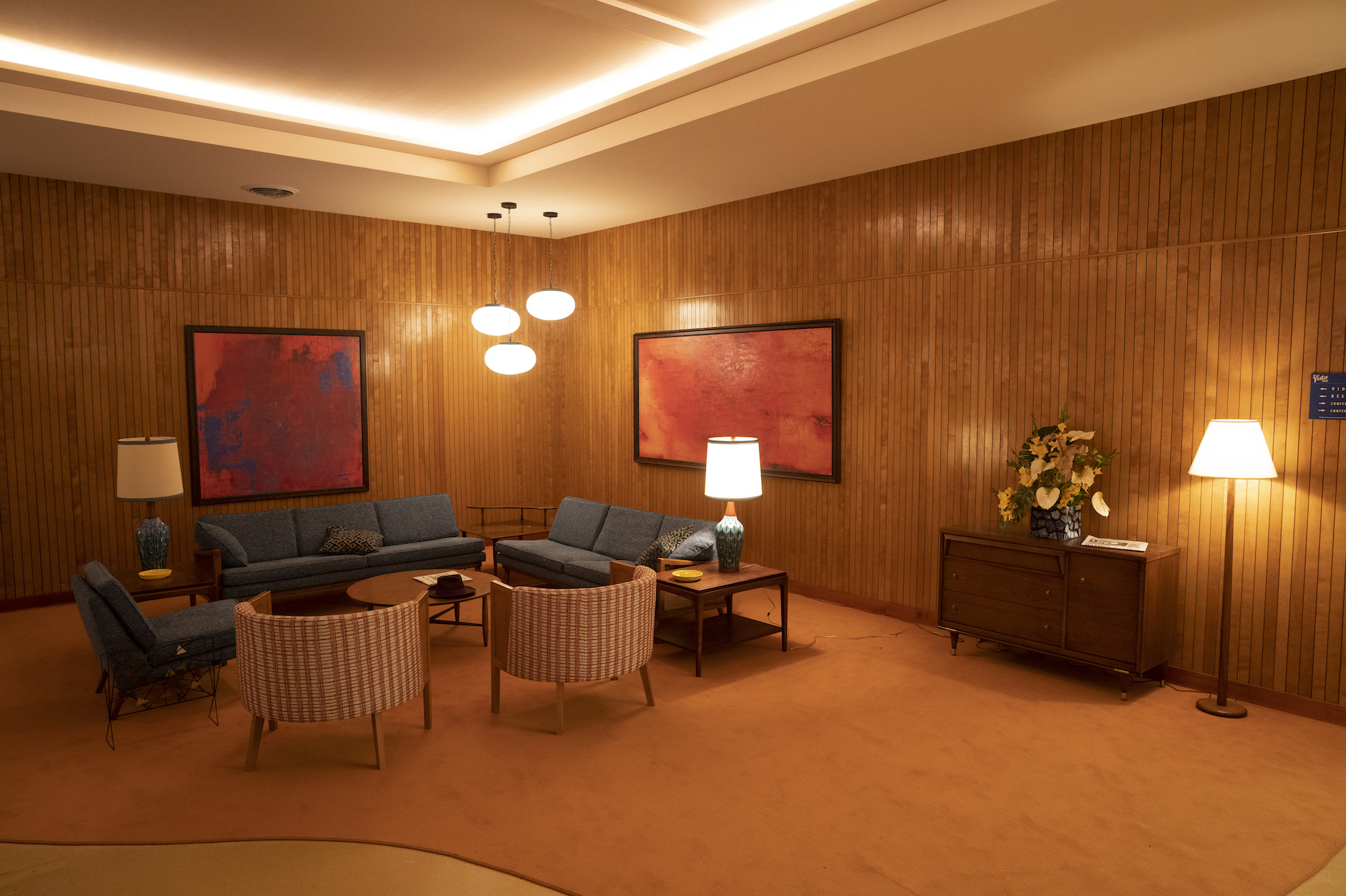
Hello Tomorrow! set designed by Maya Sigel
While bold patterns are making a comeback these days, Sigel said that for these sets, specifically, she used them sparingly – and this might be something worth considering at home, too.
'I really wanted it to feel very graphic and modern,' says Sigel. 'I stayed away from the typical pastel color palette of the '50s that you see in a lot of movies and shows, and I used patterns really sparingly.'
If you do prefer to use bold patterns, Sigel says wallpaper is a great place for it. 'In a couple of the homes in Vistaville, we used some wallpaper, and it was a bolder wallpaper. But other than that, I relied on textures and a lot of solid colors, which I think feels more modern, in general.'
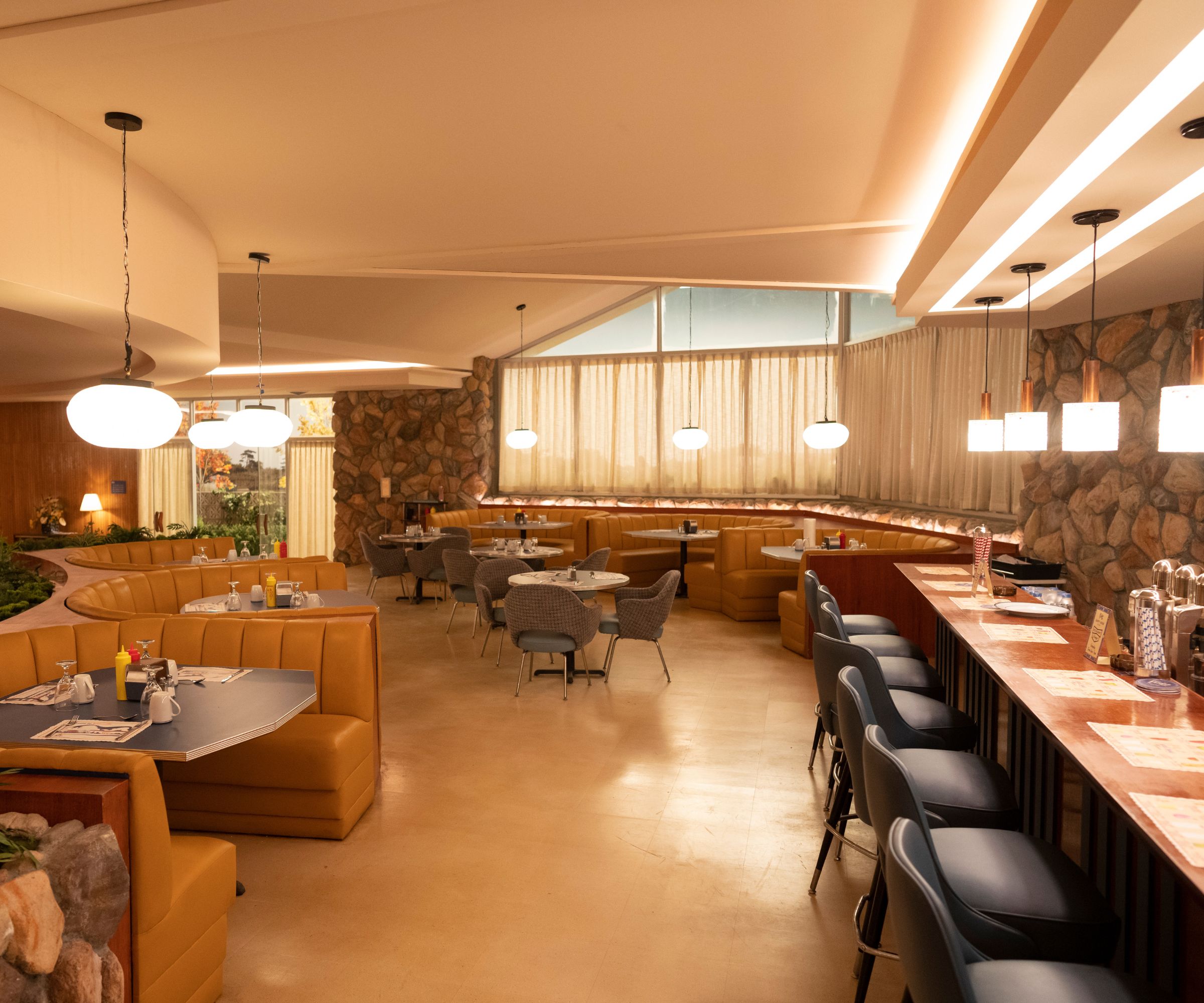
Hello Tomorrow! set design by Maya Sigel
While other eras come in and out of fashion almost cyclically, Sigel points out that mid-century modern is here to stay.
'That era never goes out of style,' she says. 'It was such an amazing period of design and art and architecture. There was so much creativity and a lot of money was put into fostering these ideas, so it was inspiring for me to look back.'
As Sigel researched the era, she noticed one thing she really adored: the small-but-functional kitchens of the time, which pointed to an admirable aspect of the time.
'One of the things that I loved is the kitchens, especially with their open shelving,' she explains. 'I personally prefer smaller functional kitchens. I think that there's been this trend where there’s a little bit too much excess. People have two dishwashers and two ovens and it's so spread out that you can't reach anything.'
Sigel notes that this points to a whole mindset that she appreciates about the design of this era. 'What I really love about the modernist movement and those architects is that it was about pulling away from the ostentatious designs of the past. It was about streamlining everything and thinking about what people really need to live – and to live beautifully, but also simply. I think that that's important for us now, too, with sustainability. How do we live with less in a well-designed way?'
If there’s one thing Maya doesn’t want you to take away from her production design for this show, it’s the lack of plant life and greenery.
'I love plants, I always have lots of plants,' says Sigel. 'I'm always telling friends, "Just add plants!’ Bring the outside in, it’s always a great idea – just figure out how much light you get, and then buy the proper plants". But in the show, I specifically did not use a lot of plants, because the world is a little bit artificial.'

Ashley Chalmers is a freelance writer for Homes & Gardens with over 10 years' experience as a digital writer and content creator. Ashley started her career in entertainment and fashion PR in New York, before moving to the French countryside and taking up travel blogging. Now, Ashley lives in London. Her passion for travelling is only matched by her love of making her house feel like a home, and she loves to include her finds from around the world in her decor.
-
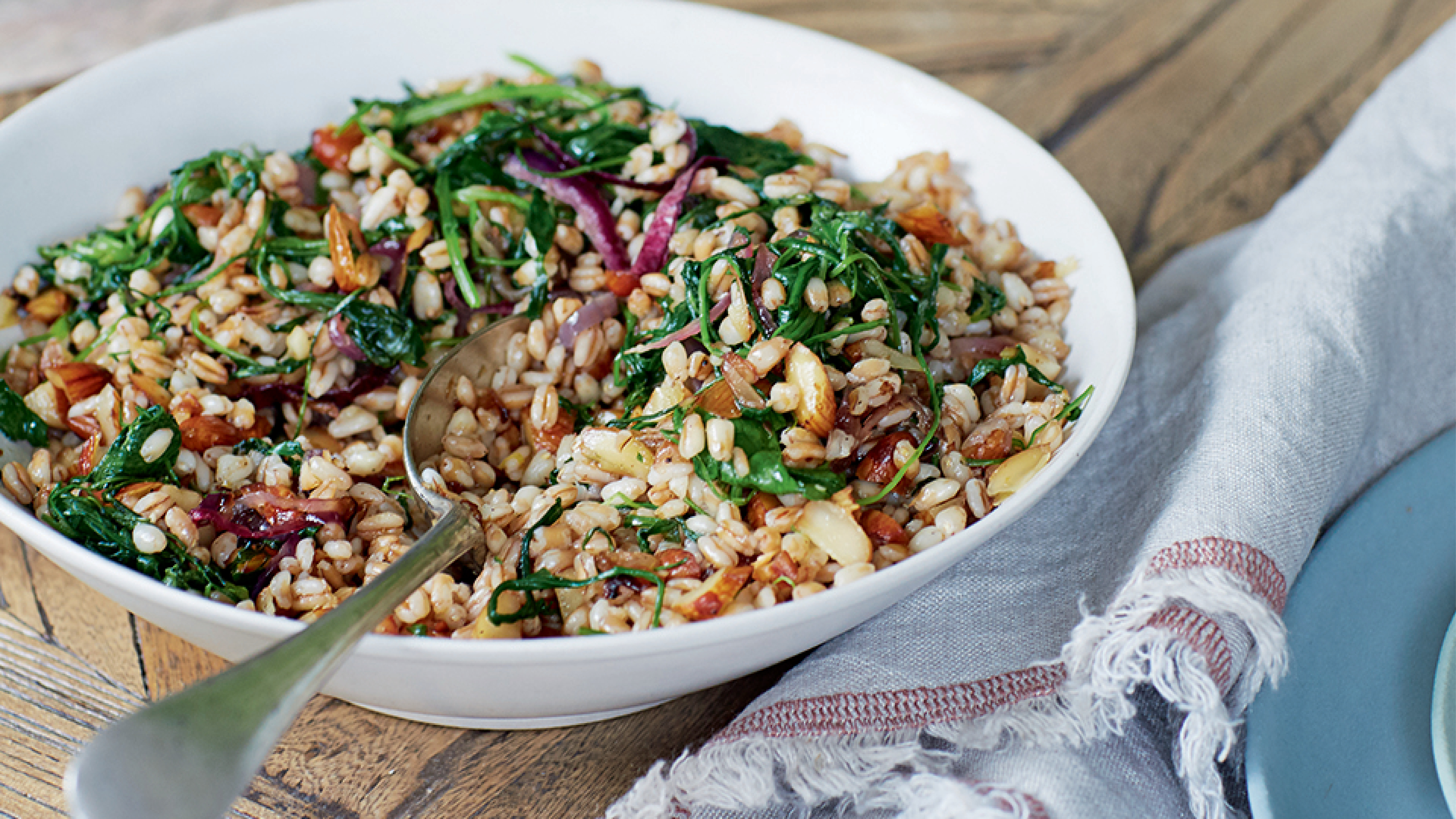 Spelt, almond and arugula salad
There’s a lovely bite and nuttiness to this warm spelt and arugula recipe. The perfect spring side, or as a healthy lunch year-round
By Alice Hart
-
 Roasted radishes and scallions
An easy, elegant side that brings out the softer, sweeter side of spring vegetables, it's the perfect addition to your spring table
By Alice Hart