Design house: A glamorous home in New York, designed by Caitlin Moran
This decorative apartment on the Upper East Side of Manhattan really shines.

Caitlin Moran employs artisans from around the world, imbuing her projects with a delightful diversity. 'Her rooms inspire good feelings,' said one satisfied client. 'There is a happiness there that comes through in her work.'
The spaces she creates are comfortable, useful, and stand up to the realities of daily life.
THE PROPERTY
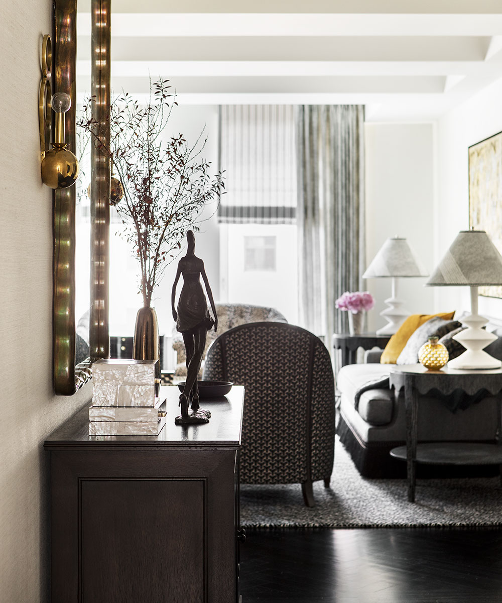
'When our clients purchased this glamorous home on the Upper East Side of Manhattan, it cried out for a decorative update in a major way,' says Caitlin. 'At the time, the walls were painted dark burgundy and deep hunter green, the furniture was outdated, and the overall effect was staid. The apartment was a long way from the 'chic New York City pad’ that our clients desired. We had our work cut out for us.'
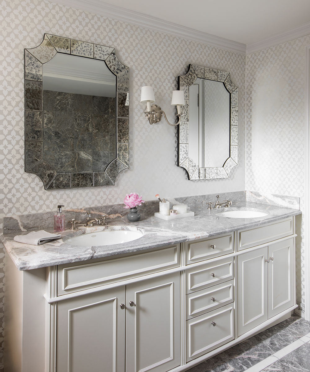
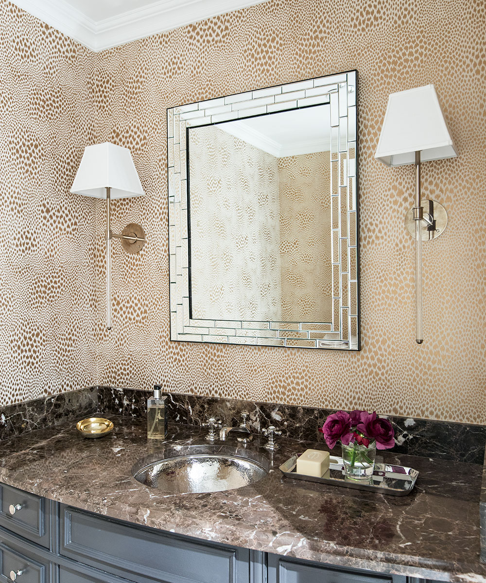
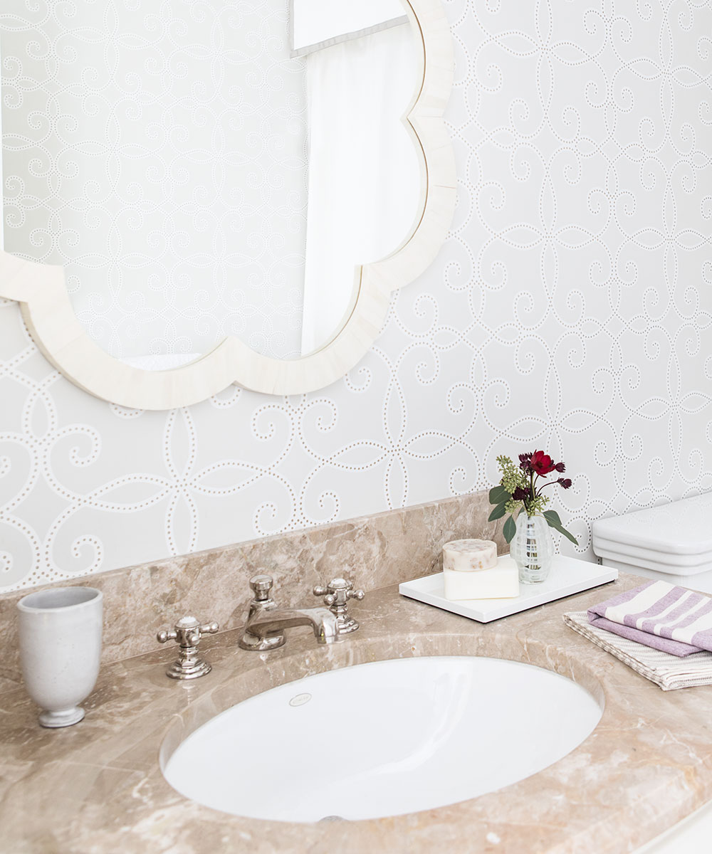
'We chose specific, but complementary, wallpapers for each room, which creates an overall unified effect for the apartment,' says Caitlin. 'We opted for white grasscloth for the living room and the dining room, two very ethereal shimmery papers for each of the two bedrooms, and more playful patterned wallpapers for the three bathrooms.'
SeeDesign house: A small, space-saving house in New York, designed by Corine Maggio
LIVING ROOM
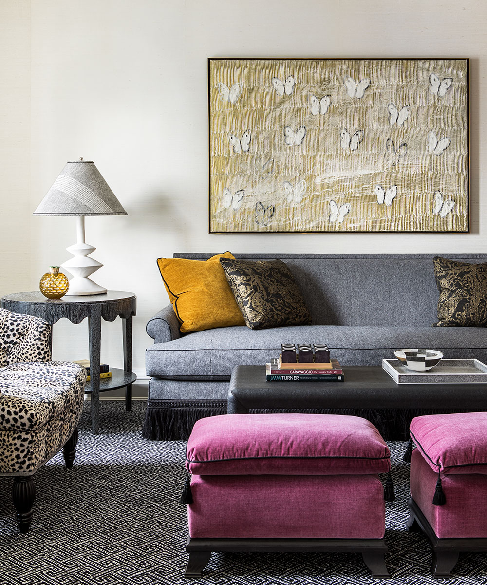
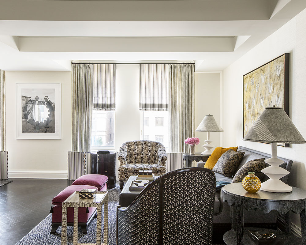
'When my clients visit this apartment, they come to enjoy New York City, to partake of all that the city offers, the theatre, museums, shopping, and other enticements. I picture this apartment as their nest for these busy visits. It is where they prepare to go out, and where they return after a busy day. It is a warm home to enjoy themselves and to share with their friends.'
'Every design element was to chosen to reflect the incredibly chic city that New York is,' explains Caitlin.
Sign up to the Homes & Gardens newsletter
Design expertise in your inbox – from inspiring decorating ideas and beautiful celebrity homes to practical gardening advice and shopping round-ups.
HALL
DINING ROOM
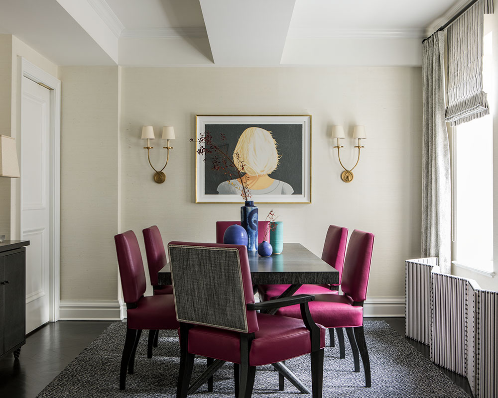
'For the dining room, not every client could be persuaded to upholster their chairs in a bright berry pink leather, but in this case, it didn’t take much convincing. The clients and I both love how the bright color pops against the dark wood and the black and white geometric rug. The Alex Katz piece, between the sconces, is one of my most favourite works from any design project of mine.'
KITCHEN
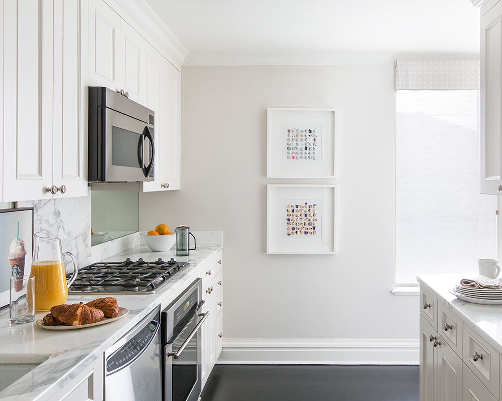
'The original kitchen did not demand much change, since time was of the essence. We brightened up the walls and added a window covering to give the room privacy from a nearby neighbor. The light can still peek through.'
MAIN BEDROOM
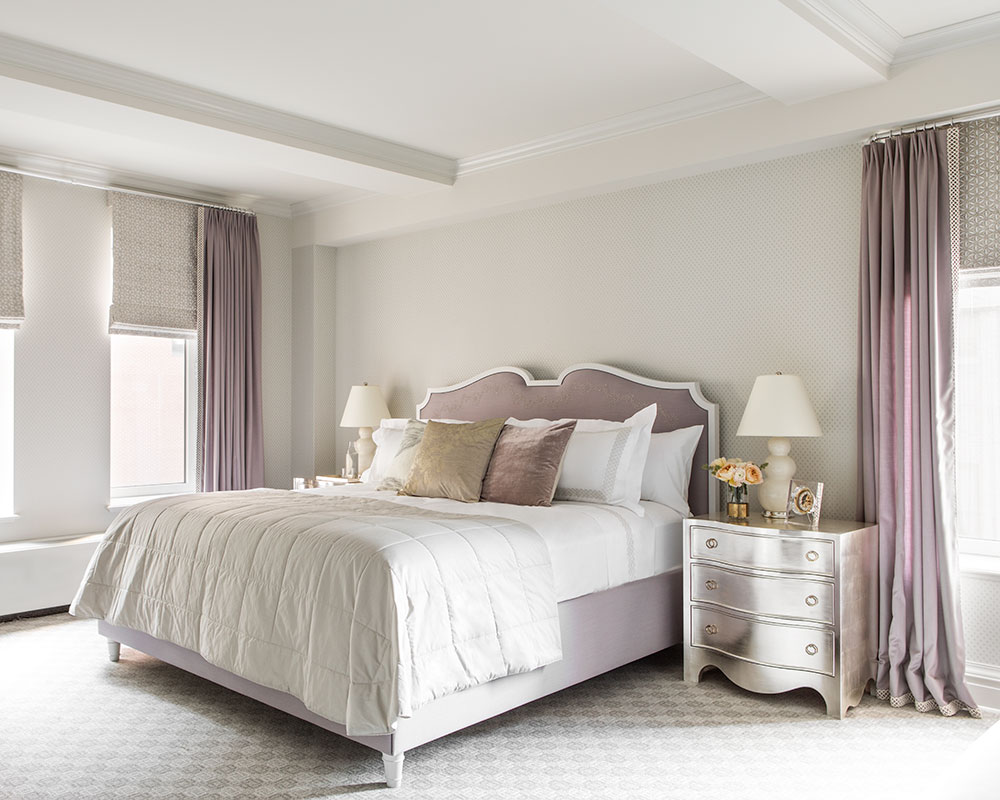
'For the bedrooms, we wanted them to feel like cocoons for rest and sleep, very important to sustain a busy stay in New York. We installed beautifully soft wall-to-wall carpet, something we don’t always chose to do in our bedrooms of other projects. However, in this instance, we wanted the clients to feel as if they were ensconced in a cushy blanket. The rooms say, “it is time for quiet". The palette in each of the bedrooms is feminine but not overly so, just enough to feel a tad decadent.'
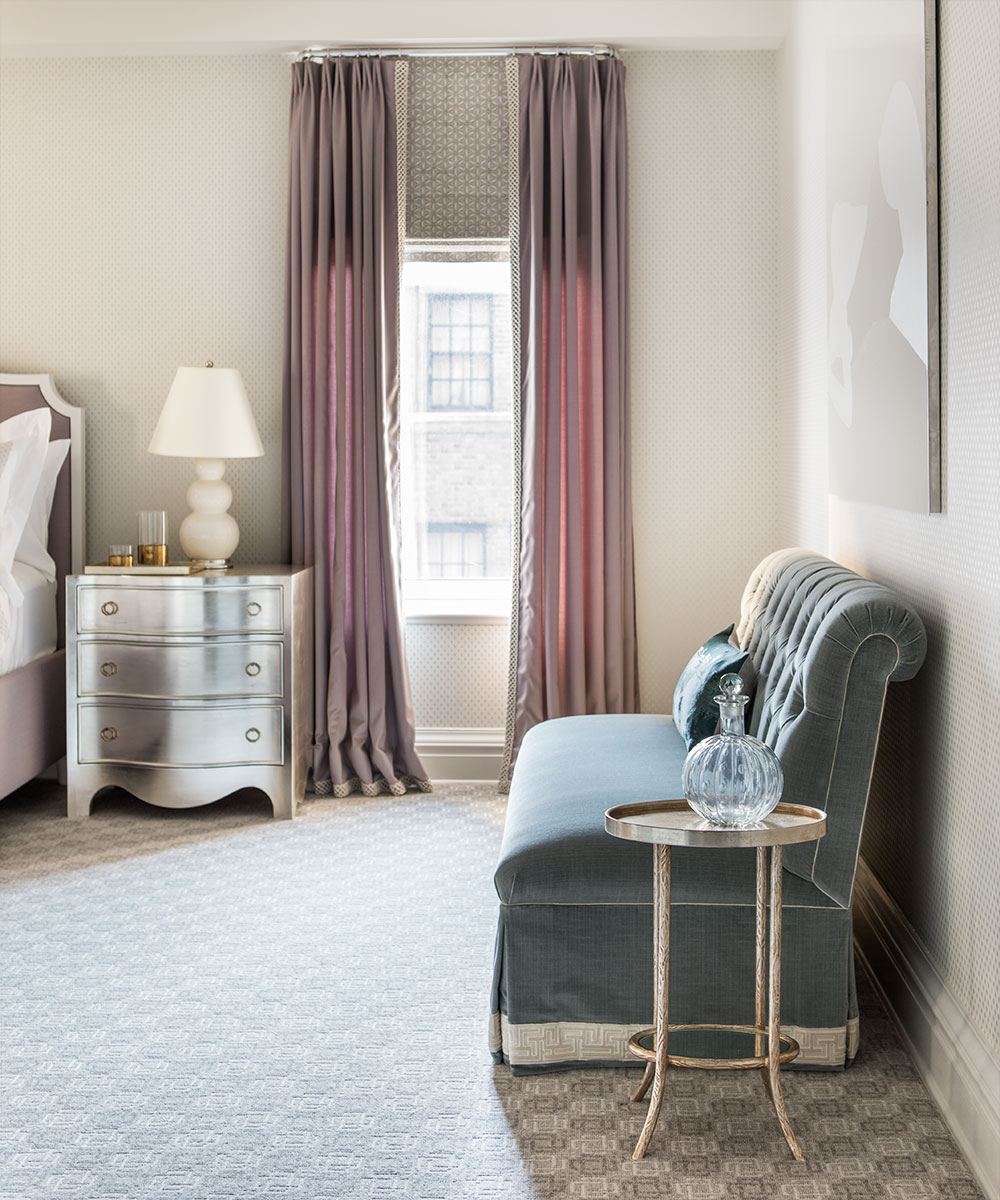
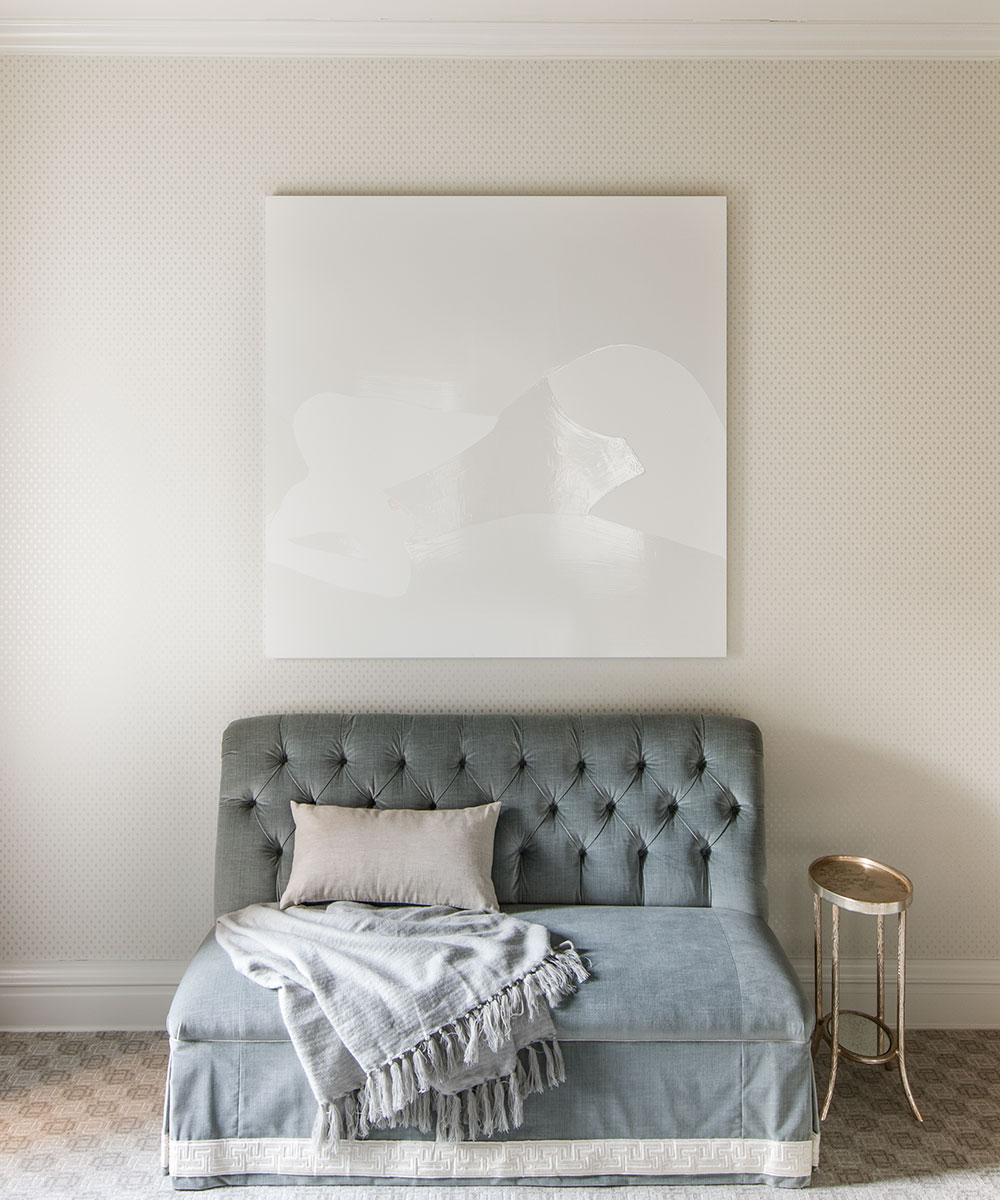
'In the master bedroom, we embroidered the material before we upholstered it on the headboard, and now I wish we could do so on every single bed we design. The tufted sofa is covered in a shimmery soft velvet, and we designed the bedside tables in an equally glamorous silver leaf.'
SeeDesign house: Urban chic home in New York, designed by Studio Laloc
GUEST BEDROOM
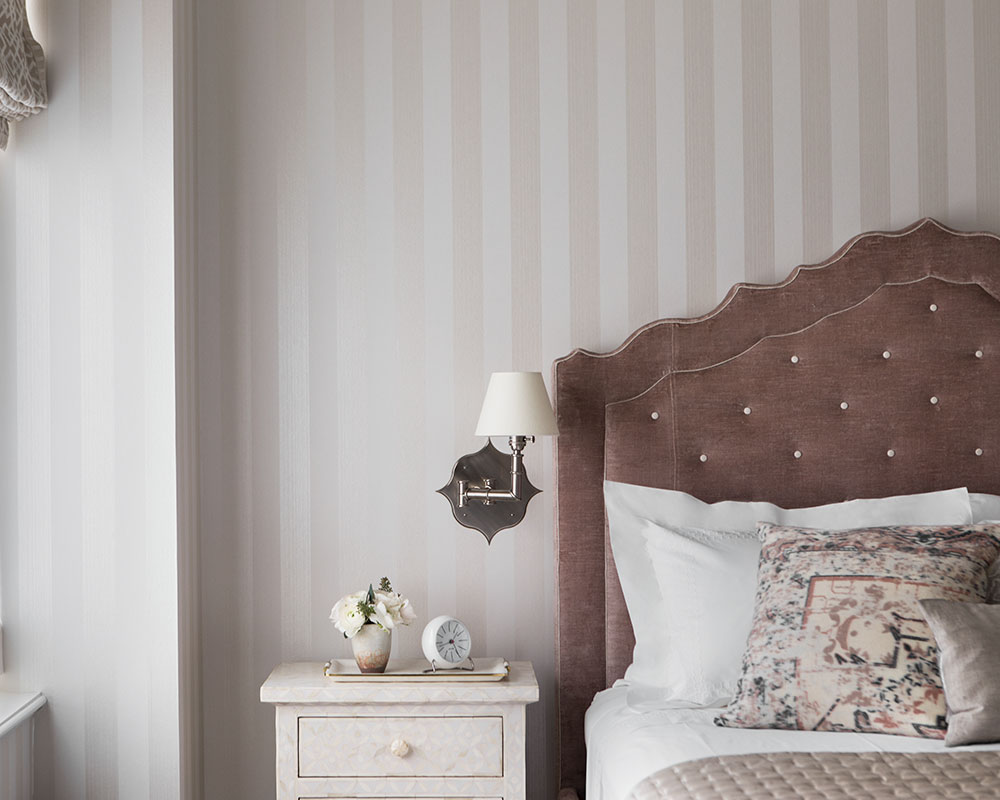
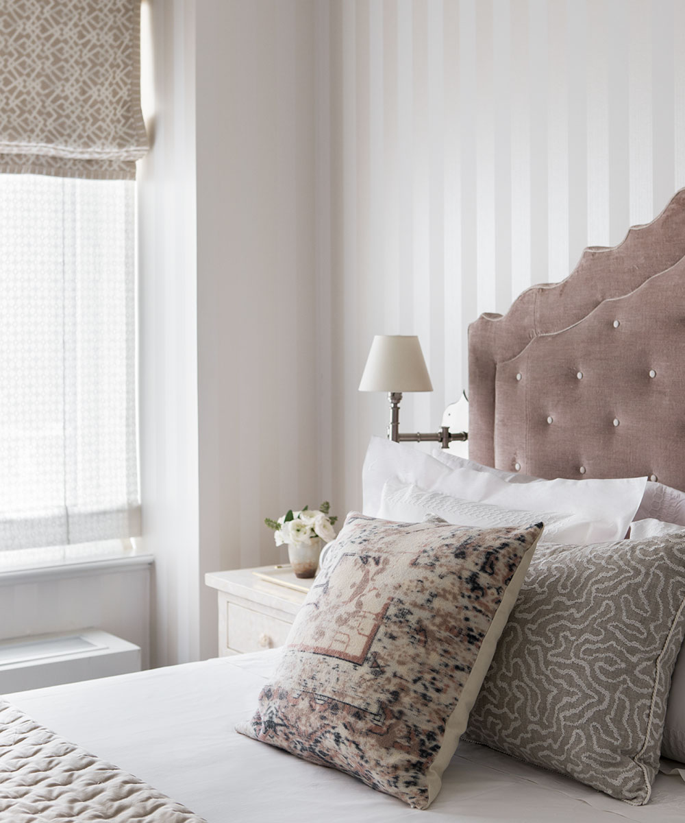
'The guest bedroom features a buttoned bed, with the soft sateen buttons fastened to a nubby dusty pink velvet. I adore how these colors play off against the ivory striped wallpaper. The sheer Roman shades on each of the windows filter the light, but allow our clients to enjoy the view outside the windows.'
'The bedside sconces have a slightly Moorish shape which relates to the painted design on the window shades. I cherish these subtle conversations in the apartment. One might miss the relationships at first glance.'
BATHROOMS
Photography/ Laure Joliet
Interior design/ Caitlin Moran Interiors

Jennifer is the Digital Editor at Homes & Gardens. Having worked in the interiors industry for several years in both the US and UK, spanning many publications, she now hones her digital prowess on the 'best interiors website' in the world. Multi-skilled, Jennifer has worked in PR and marketing and occasionally dabbles in the social media, commercial, and the e-commerce space. Over the years, she has written about every area of the home, from compiling houses designed by some of the best interior designers in the world to sourcing celebrity homes, reviewing appliances, and even writing a few news stories or two.
-
 Kris Jenner's favorite air fryer, the Ninja Crispi, is the perfect small kitchen solution – it deserves a place on the most compact of countertops
Kris approves of this compact yet powerful air fryer, and so do our own kitchen appliance experts, praising it for its multifunctionality
By Hannah Ziegler Published
-
 Ina Garten's storage pantry is an insightful window into all of the best cookware used by the chef – and it's easy to recreate on your kitchen shelves from $48
The beautiful dishware in The Barefoot Contessa's Hamptons pantry showcases the tools she uses most often to cook – this is exactly how you replicate it
By Sophie Edwards Published