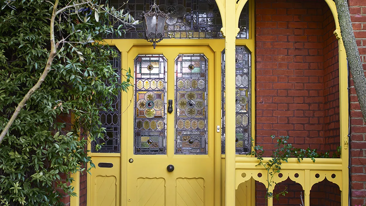

The study of color psychology is responsible for shaping current interior design trends – but there is one exterior feature that should not be overlooked. Your front door has the power to set the tone for your home even before you step inside, so it is important that get this hue right.
‘Front doors are protectors against the weather and unwanted visitors, but they also reveal your lifestyle and personality,’ explains Holistic Interior Designer and Colour Consultant Suzy Chiazzari. The color guru is not wrong – your front door ideas not only foreshadow your home’s style – but also exhibit your personality to all guests and passers-by.
To ensure you choose the correct tone, H&G spoke to the experts who reveal the colors you should avoid – and what you should use instead.

What you need to remember when painting your front door – according to color psychology
According to Suzy, unsuitable colors are those that contrast with the building style and materials. ‘If you live in a traditional building or heritage area, it would be better to stay away from bright synthetics such as hot pink, orange, bright purple, or lime green,’ she explains.
Her paint ideas are reinforced by Lick’s Head of Color and Interiors Expert Natasha Bradley, who agrees that you should pick a color that compliments the other tones and materials of your home’s exterior. ‘Take into consideration the color of the brick, windows, shutters, and the overall style of the front door,’ Natasha says.
‘It’s important to make sure that the first glimpse of your home is one that fills you with joy. So choose a front door color that reflects your personality and greets you with a smile,’ she adds.

When looking at how to paint a front door, Suzy recommends choosing a hue that ‘reflects your personality and family ethos.’ These colors are welcoming and joyful for your guests – and set the impression you want to portray to the outside world.
‘Green, brown, or black would convey a home that was a quiet retreat or haven, while bright red or yellow would suggest that the occupants enjoyed a busy, active lifestyle,’ she says.

It is also vital to get your front porch ideas right – they will ensure that your home makes the perfect first impression – and set the tone for what lies behind your front door.

-
 How to clean a patio – 6 different methods, and when you must use a chemical cleaning agent
From manual scrubbing, natural solutions or calling in the pros, industry experts reveal the benefits and considerations of each method
-
 Kris Jenner's favorite air fryer, the Ninja Crispi, is the perfect small kitchen solution – it deserves a place on the most compact of countertops
Kris approves of this compact yet powerful air fryer, and so do our own kitchen appliance experts, praising it for its multifunctionality

