Farrow & Ball paint colors: Grey paint
Struggling to pick a grey shade from the Farrow & Ball color chart? We’ve selected our favourite Farrow & Ball grey paint colors in real homes so you can see exactly what they look like in a real home

Mention the phrase Farrow & Ball and chances are names such as Pavilion Grayand Downpipe spring to mind. Since the early Nineties, the paint company synonymous with quirkily evocative nomenclature has been the premium brand for quality paints, as well as twice-yearly wallpaper collections. With a strong heritage values – a range of paints were developed for the National Trust, so helping it to restore period properties with palettes sympathetic to their eras – its colors adorn the walls of some of the most prestigious properties and art galleries worldwide. Their most recent being a collaboration with the Natural History Museum.
See: 10 most popular Farrow & Ball colors – the must-have, on-trend shades
We've gathered our favorite and your most-loved grey paint for your inspiration.
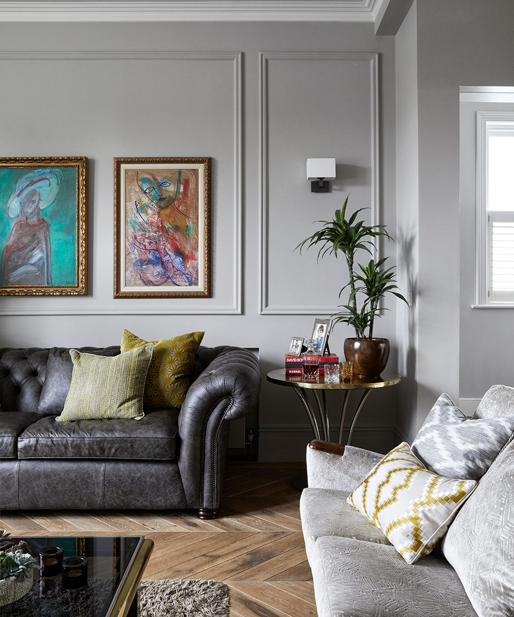
Purbeck Stone
This understated stone grey resembles the colour of stone found on the Isle of Purbeck, close to Farrow & Ball’s home in Dorset. Purbeck stone is a clean, mid grey that would work well with Conforth White, Wevet and Ammonite to create a scheme that is calm and relaxed.
Mole's Breath
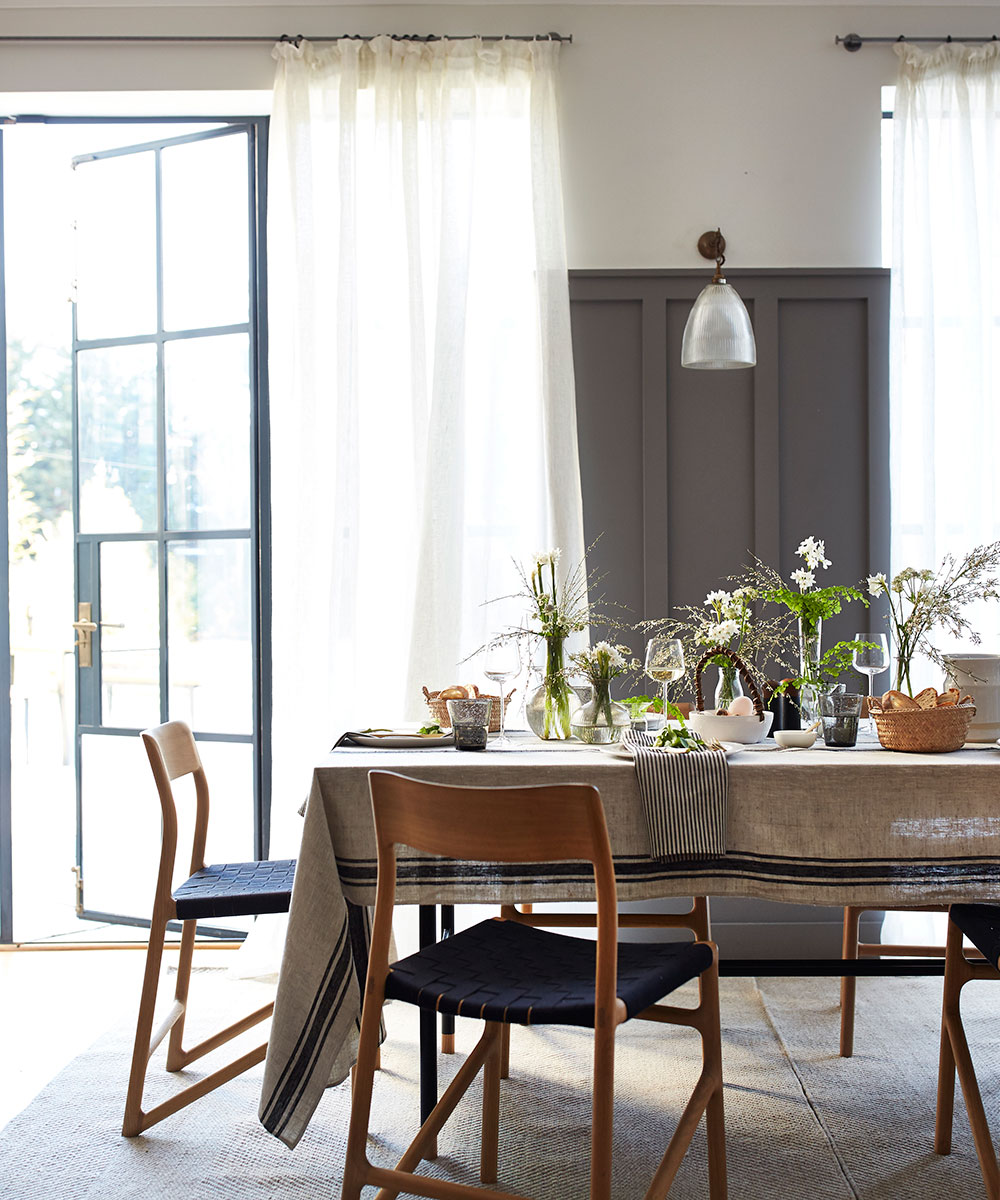
Mole’s Breath is a timeless, moody grey whose name takes its roots from the much loved Elephant’s Breath. This hue is incredibly versatile of the stronger accents as it can be used with a variety of colours for maximum effect. It is particularly delightful when used as an accent on kitchen islands, feature walls and smaller spaces to create sullen yet warm room.
Manor House Gray
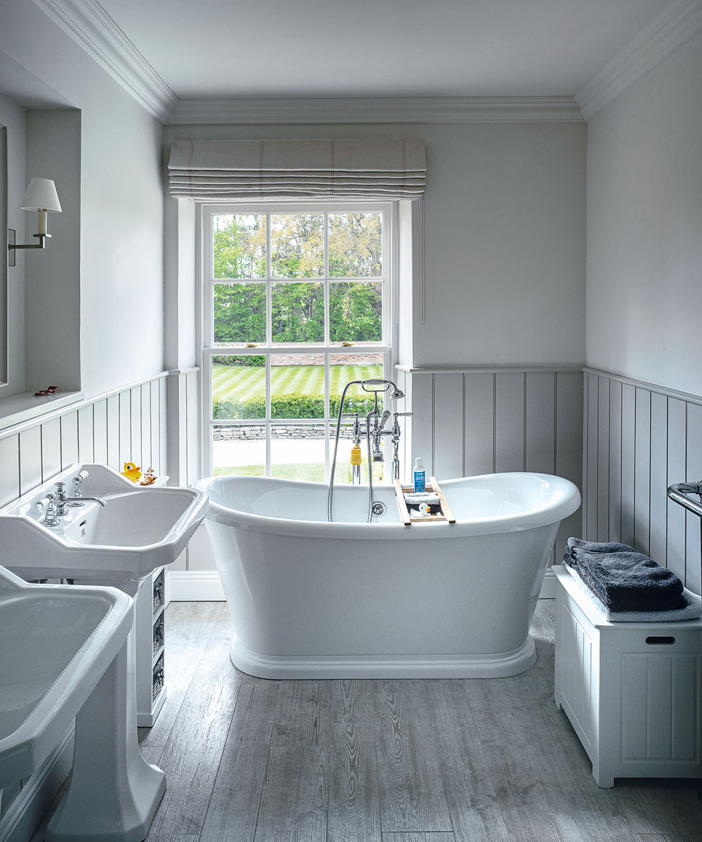
This cool architectural grey has been named after the houses traditionally inhabited by the local lord. This definite grey retains its colour in all lights, especially when contrasted with Wevet. Cooler and cleaner than most greys, this is a very popular shade for contemporary homes that are conducive to minimal living.
Plummet
‘This strong architectural grey is named after the lead often used by fishermen to weight their lines,’ explains Farrow & Ball. Plummet intensifies in colour when used in smaller spaces and has a uniquely modern feel. This shade is one of their most-hard edged and industrial feeling greys.
Sign up to the Homes & Gardens newsletter
Design expertise in your inbox – from inspiring decorating ideas and beautiful celebrity homes to practical gardening advice and shopping round-ups.
Pavilion gray
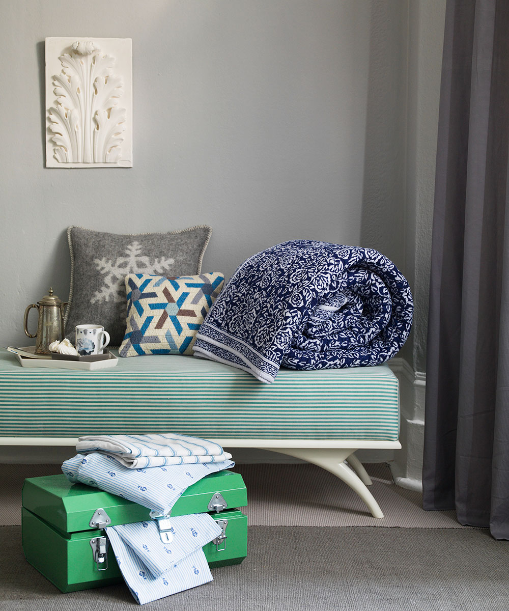
This classic mid grey was originally created for a bespoke pavilion, but is also reminiscent of an elegant 18th century Swedish colour. The blue undertones of Pavilion Gray add a contemporary touch and sense of spaciousness. Farrow & Ball recommend combining this shade with Dimpse, Blackened or Manor House Grey for a scheme that is perfect for a modern family home.
Down Pipe
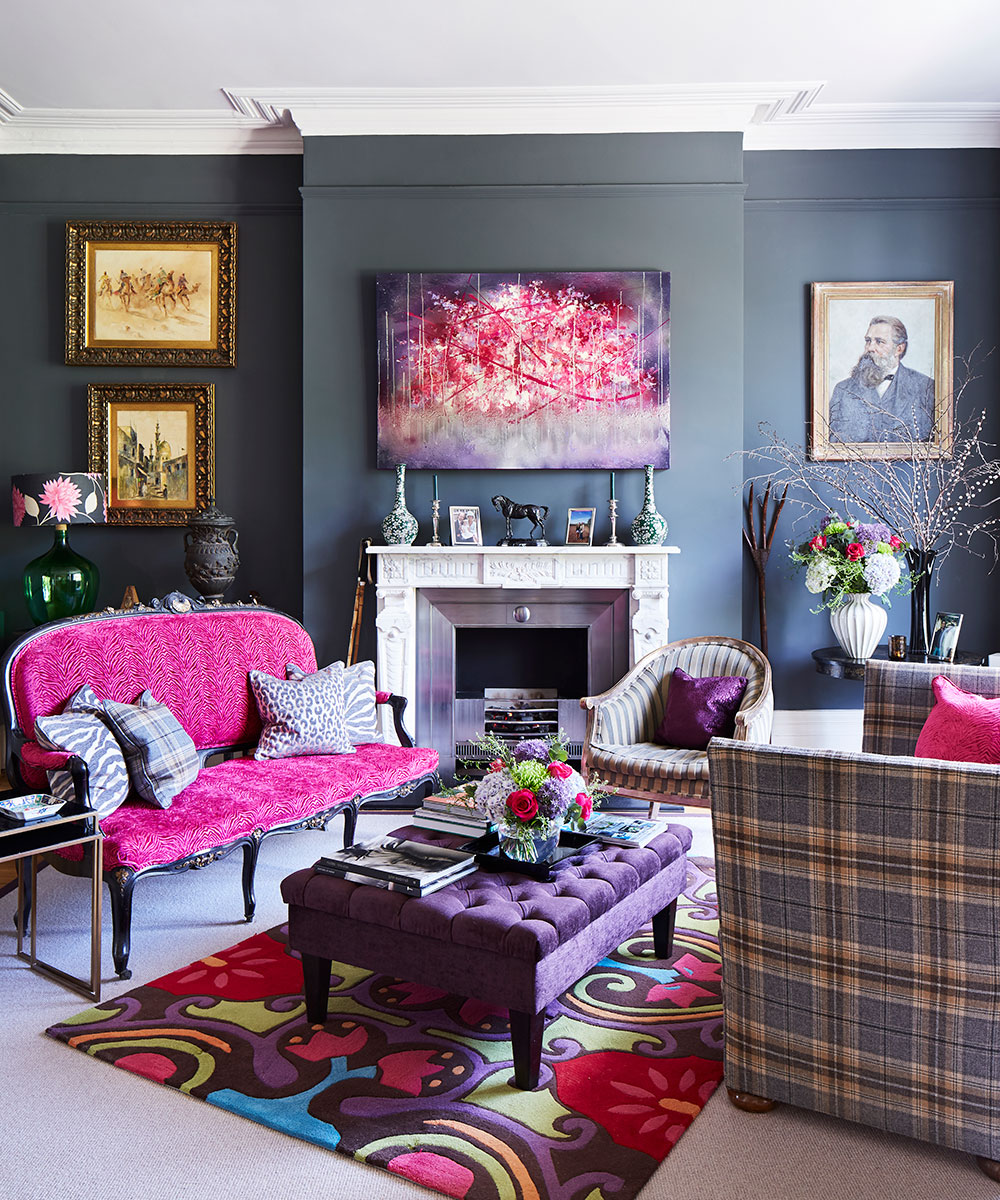
A dark, warm grey with blue undertones, this colour was inspired by, you guessed it, the look of drainpipes, which were often made out of lead. A flagship colour from Farrow & Ball, them of the clever names and iconic heritage hues fame, despite its dank origins, Down Pipe has become one of the world’s favourite decorating shades, used by interior designers on walls, floors and woodwork. In part, this is due to the change in domestic light sources: where once the ubiquitous tungsten bulbs gave off a yellowish glow – well suited to off-white shades such as magnolia – the LEDs and halogen bulbs that replaced them emit a cooler light, which, when teamed with dark surfaces, creates a snug, embracing feel. The rise in popularity of industrial materials – think concrete and steel – plays its part too, as layered greys add a cohesive, free-flowing look to a scheme. The fact that savvy guests at dinner parties can identify the colour of the walls not just by brand but exact shade is perhaps indicative of how finely tuned our design sensibilities have become.
About Farrow & Ball
Founded in 1946 by paint pioneers John Farrow and Richard Ball Farrow & Ball have a passion for producing quality paint and wallpaper. During the 1950s the company supplied paint for Ford Motor Cars, Raleigh bicycles and even the War Office. In the early 1990s it developed a range of National Trust paints, working closely with historical buildings, helping to restore them with colours sympathetic to their eras. This range grew into the distinctive collection of paint colours we know today. A selection of artisanal wallpapers followed in 1995, produced by using traditional block and trough printing methods with paint instead of ink to create the luxurious textures the company is famous for.

Jennifer is the Digital Editor at Homes & Gardens. Having worked in the interiors industry for several years in both the US and UK, spanning many publications, she now hones her digital prowess on the 'best interiors website' in the world. Multi-skilled, Jennifer has worked in PR and marketing and occasionally dabbles in the social media, commercial, and the e-commerce space. Over the years, she has written about every area of the home, from compiling houses designed by some of the best interior designers in the world to sourcing celebrity homes, reviewing appliances, and even writing a few news stories or two.
-
 ‘It leads to more headaches than it's worth’ – 4 reasons you should never store things in your oven, including fire risks and serious illness
Your oven is for cooking, and cooking only, experts urge
By Chiana Dickson
-
 Urban gardening ideas – 7 creative ways to grow in small spaces, balconies, containers, indoors, and more
Make the most of your space with these innovative ways to garden
By Tenielle Jordison