Homes & Gardens' Color of the Month: October – moody gray
Pause fall's firey hues: This month, we're admiring a gray that combines green and blue – the most stylish tones of the season
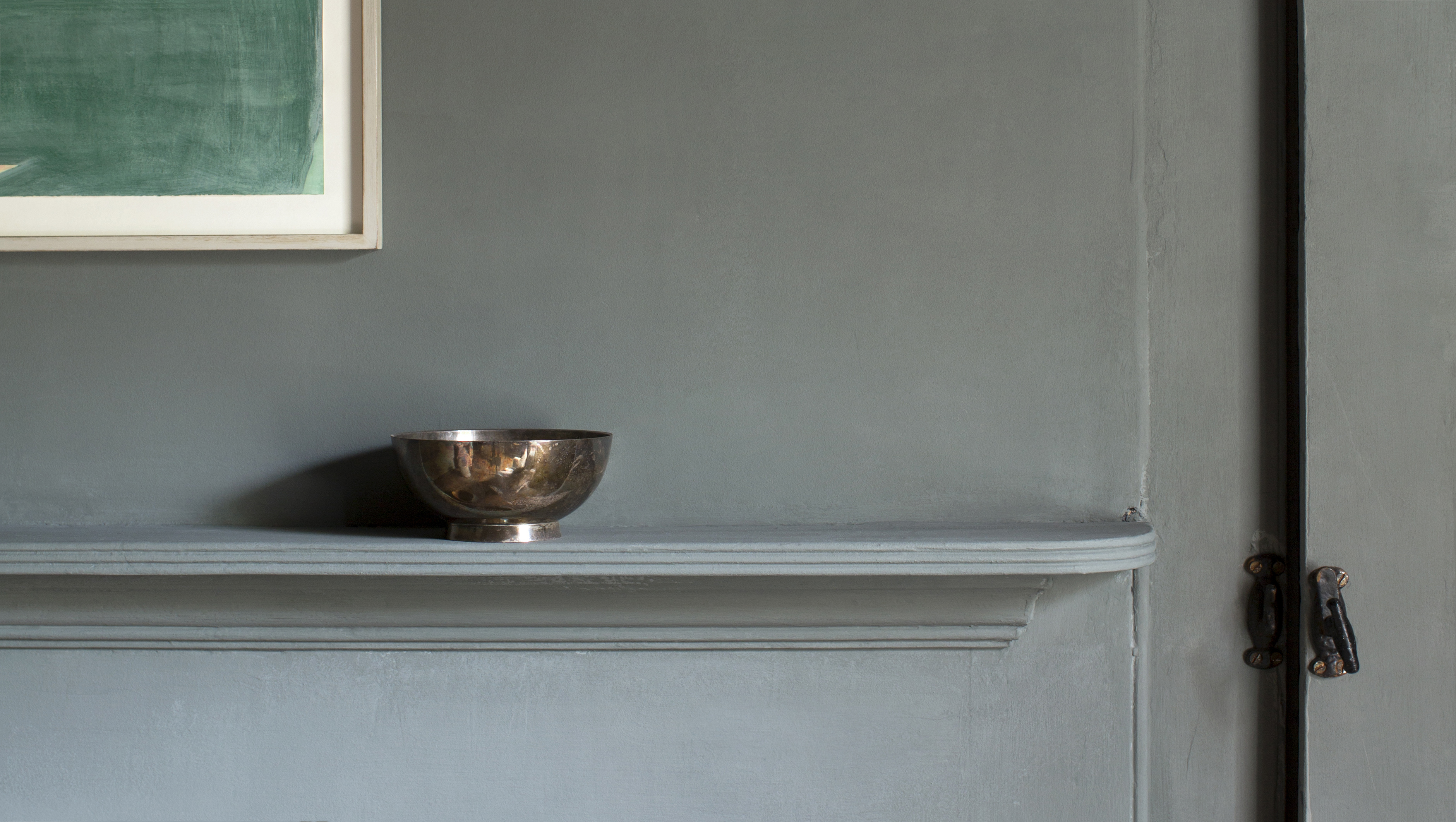

A gray that straddles the boundaries between blue, green, and gray can be many things: front and center or a chic background that shows off art and objects. However, beyond its versatility, this color has equal prestige in the trends department – as it combines three of the most sought-after shades of 2021.
What makes green-gray October's Color of the Month?
With their organic roots and eternal allure, we expect gray, green, and powder blue will continue to set color trends throughout the year ahead – but looks particularly beautiful this October – when dark and moody tones reign supreme.
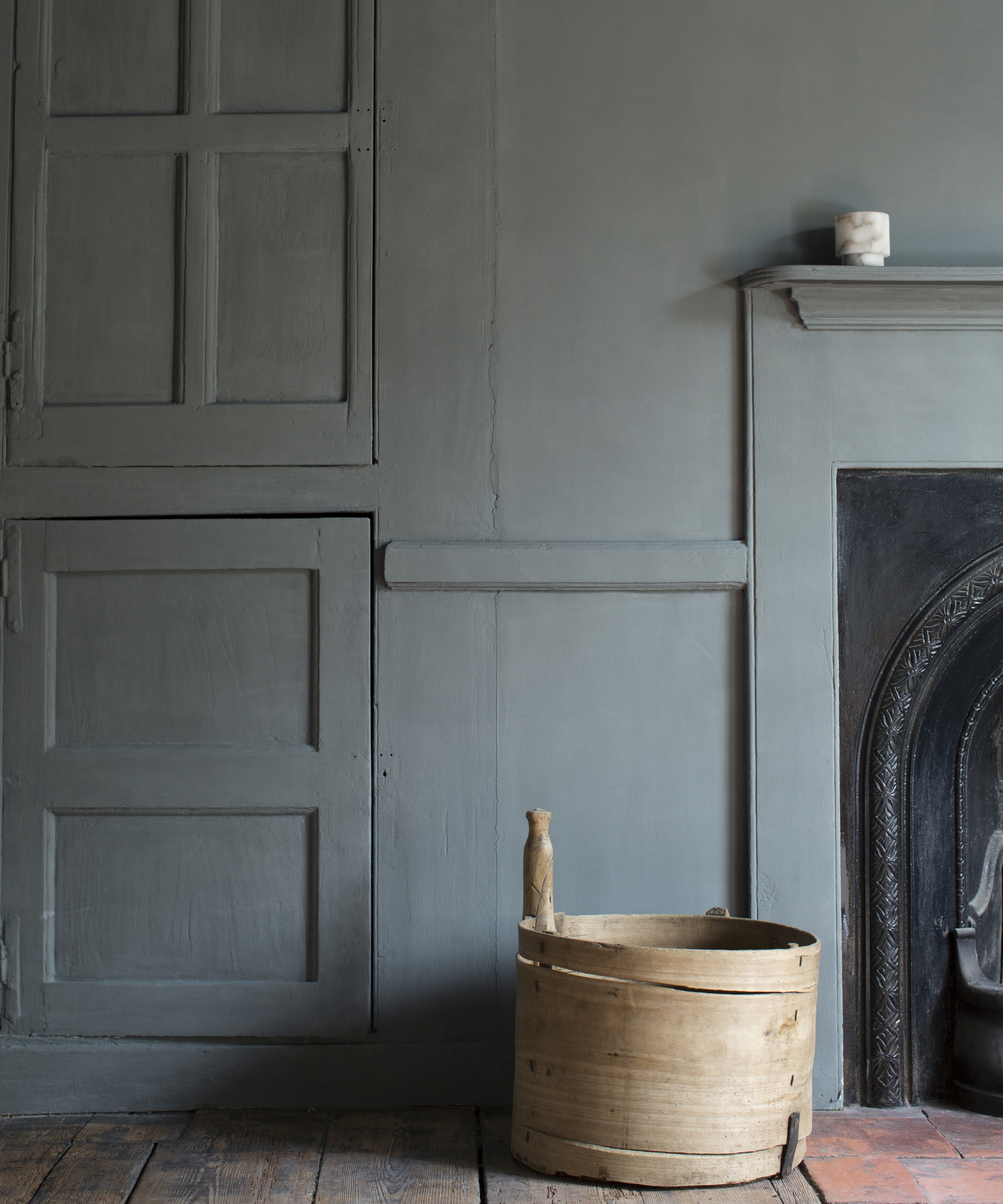
The color, which is easy to live with, looks beautiful in west-or south-facing rooms while being suitably moody in spaces with less light. The latter is important this month when signs of the season feel increasingly evident with the longer nights – fueled by the clocks falling back at the end of the month.
Here, experts share their styling tips – to fuel your monthly paint ideas.
How should we bring green-gray into our homes?
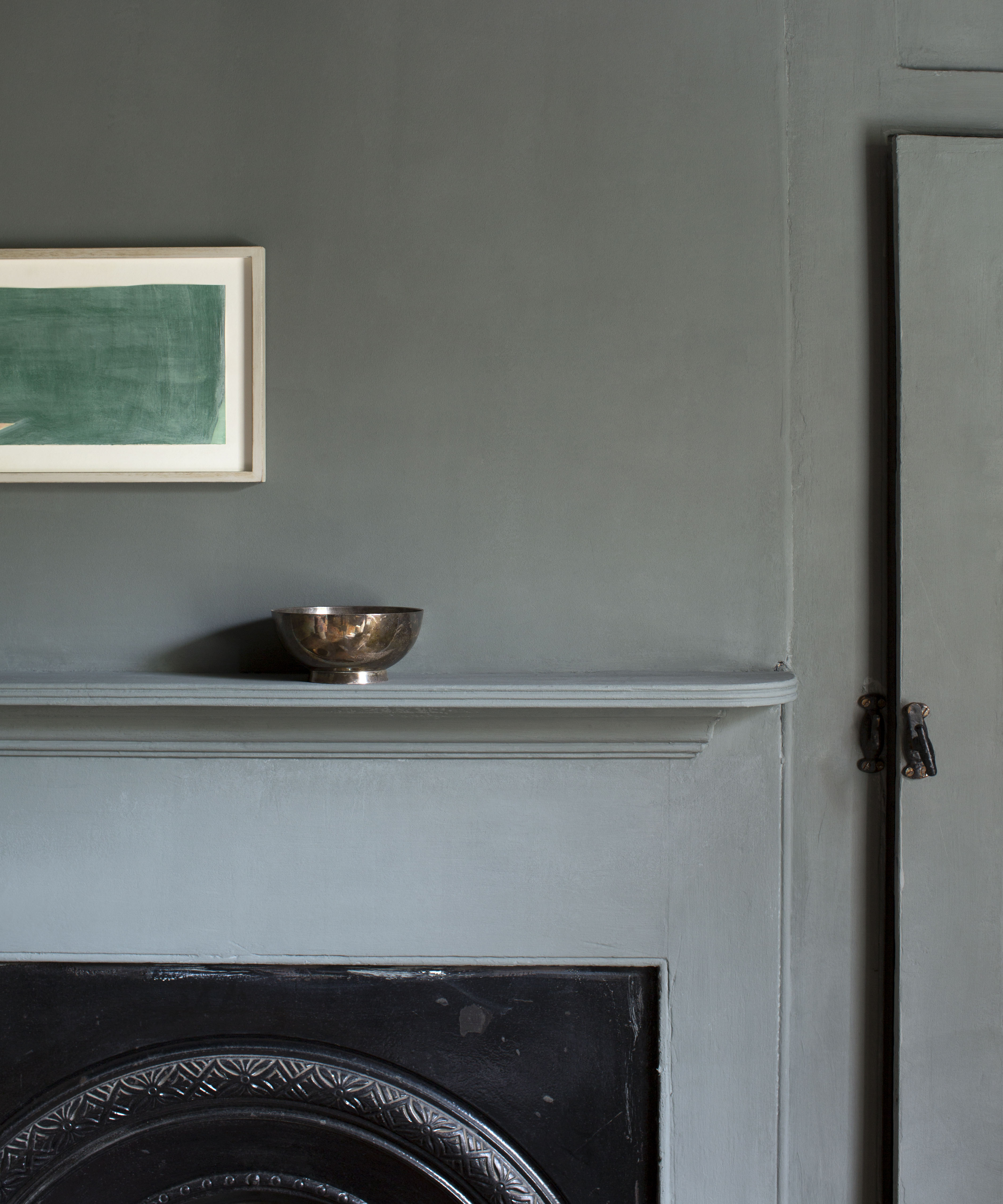
1. Drench your kitchen cabinets in the colors seasonal hues
'Plume by Atelier Ellis (above) is incredibly comfortable on kitchen cabinets: it's not blue for food, and it really likes being near a garden,' explains Cassandra Ellis, founder at Atelier Ellis. The color guru continues, explaining that despite its moody undertones, she designed the color to add a sense of mystery to your interiors – and reshape your kitchen paint ideas in the process.
'When I made the color, I wanted it to be almost magical. It contains almost no black but instead uses oxides and umber to make a color that will I think will bring a lot of people joy.' she says.
2. Use green-gray to accentuate architectural features
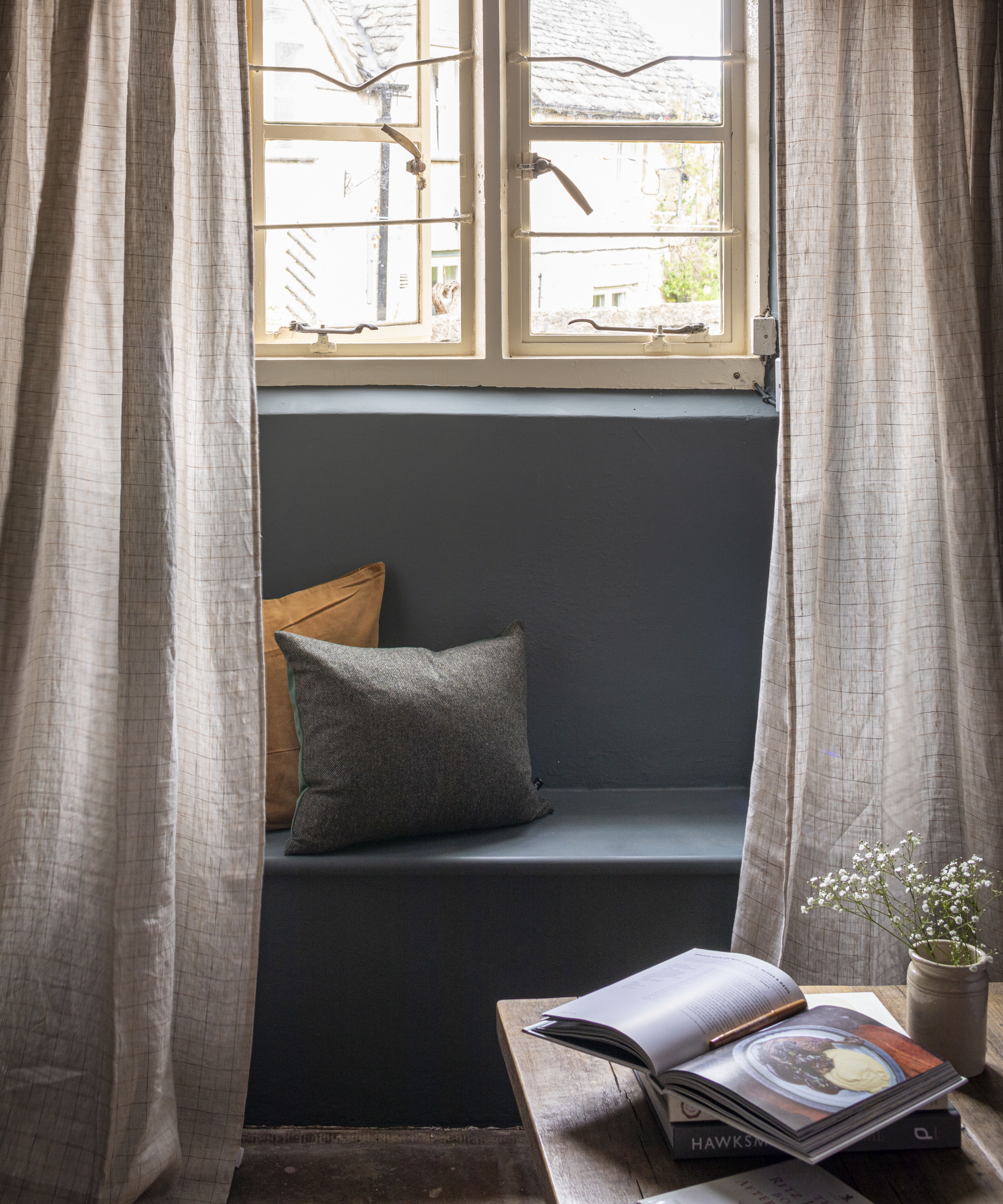
Clara Ewart, head of design at Kitesgrove, explains that she worked with paint powerhouse Farrow & Ball (above) to create an eponymous new tone that matches the Color of the Month perfectly.
Sign up to the Homes & Gardens newsletter
Design expertise in your inbox – from inspiring decorating ideas and beautiful celebrity homes to practical gardening advice and shopping round-ups.
'[It's a] blue-grey-green-hue that works really well on its own as a stand out color for a whole room, or as an accent to highlight a special piece of furniture, favorite artwork, or a room's statement architectural detailing such as architraves, doors or windows,' Clara explains.
3. Pair with pops of color
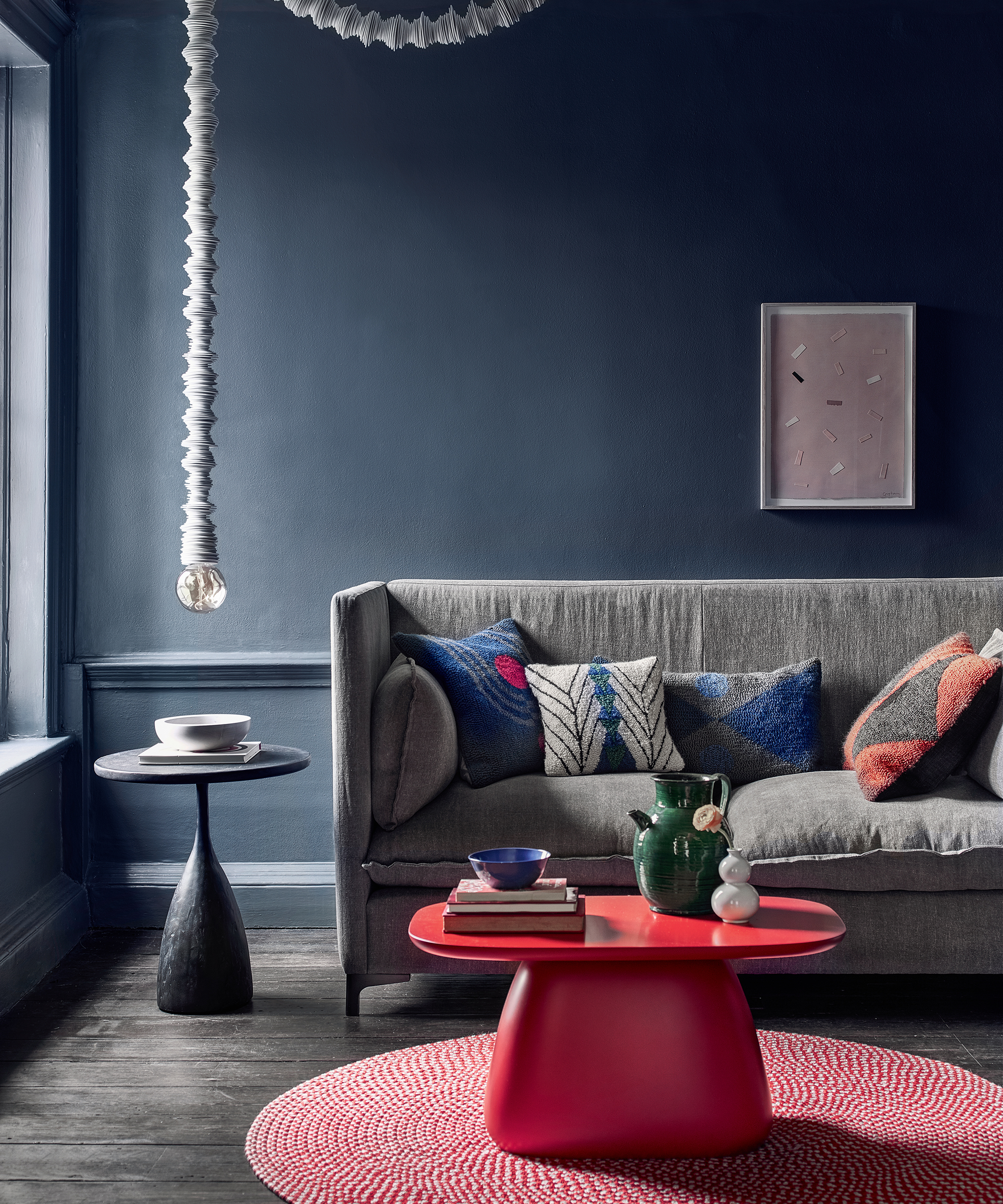
'Darker tones tend to work particularly well when combined with pops of strong color. I think this color really complements cobalt blue, bold reds, or bright yellow due to its warmth and fairly neutral tone,' shares H&G favorite and creative director of VSP Interiors, Henriette Von Stockhausen.
'It's also a great backdrop for strong artwork and antique gilt frames,' she adds.
4. Create a gallery wall – with a seasonal flair
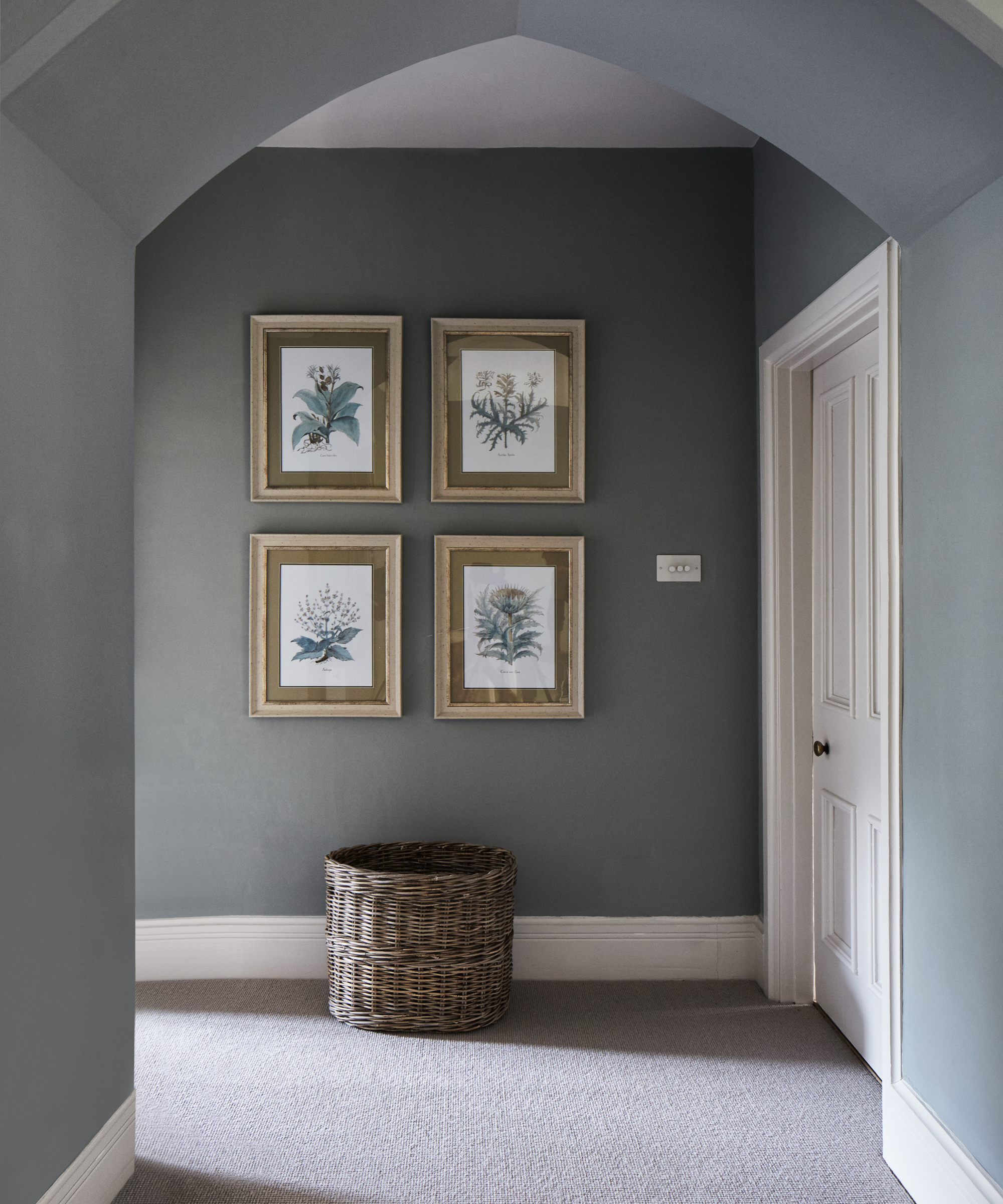
'I love using this sort of color on walls as it allows paintings and portraits to really sing out, explains Anna Haines, founder of Anna Haines Design. After sharing her gallery wall ideas, Anna also suggests pairing the 'calming and quiet' shade as a backdrop 'for a range of rich textiles, decorative antique rugs, and furniture.'
5. Curate a contrast by leading with lighter shades
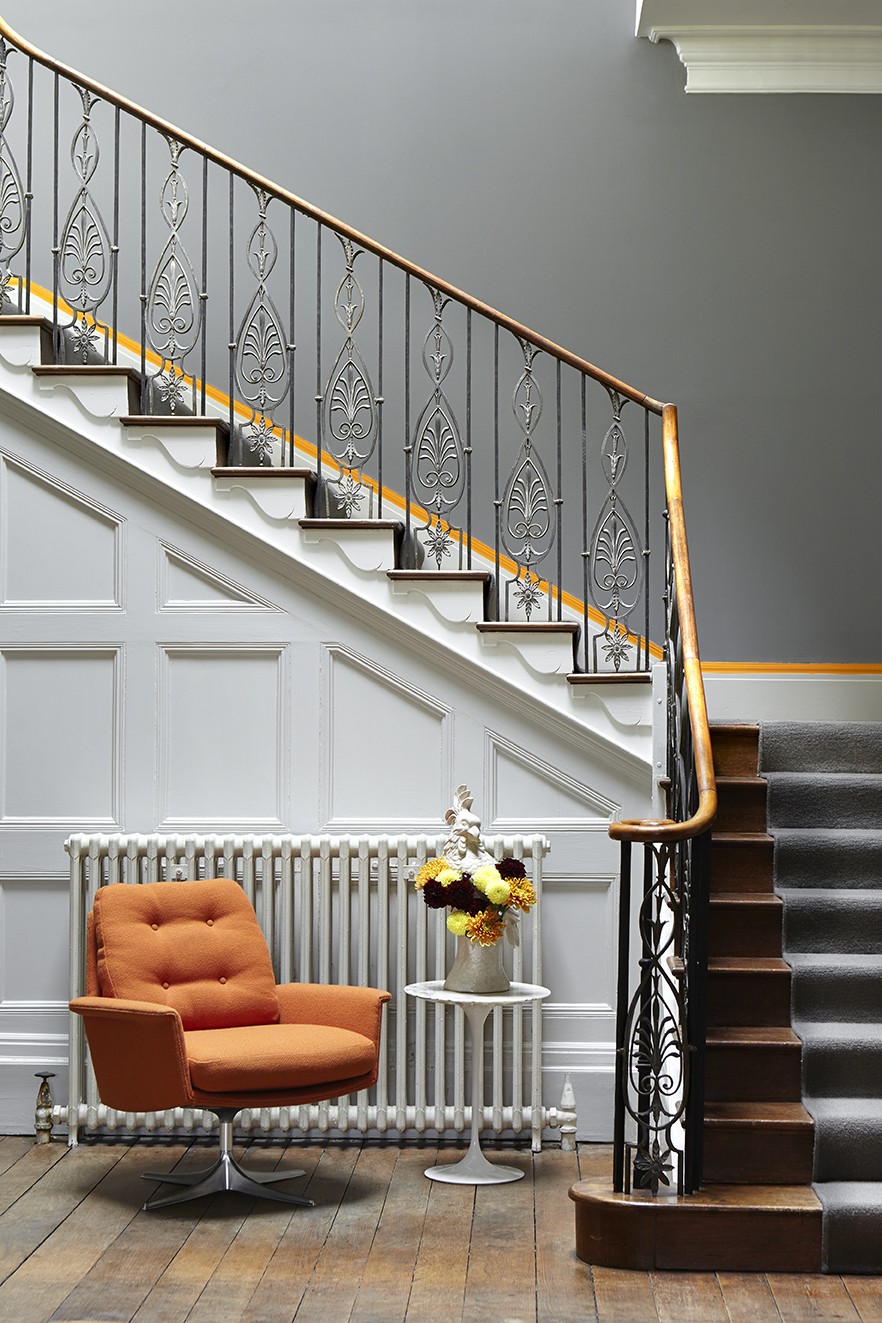
'Using dark hues on the walls can be extremely effective in a room, particularly if you use lighter colors in the approaching hallway,' suggests Caroline Inchyra, founder of Inchyra.
'In a room that lends itself to evening use or wintery days in front of the fire, curled up with a book, you want to create an enveloping feel, and this can be enhanced through the use of heavier-weight fabrics like linens and wools,' she adds.
Check back here in November for the next Color of the Month, or keep scrolling to read more about our previous selections.
September's Color of the Month: Optimistic yellow
Mood lifting and warm, yellow brings energy, confidence, and a sunny brightness to a space. It can be used anywhere in the home but is particularly effective in busy spaces, such as hallways and kitchens or north-facing rooms that lack light. Read on to find out more about this versatile hue.
What makes yellow September's color of the month?
The 22nd of September famously marks the last day of summer – but even once the sun sets on the season – you can keep it shining throughout your interiors.
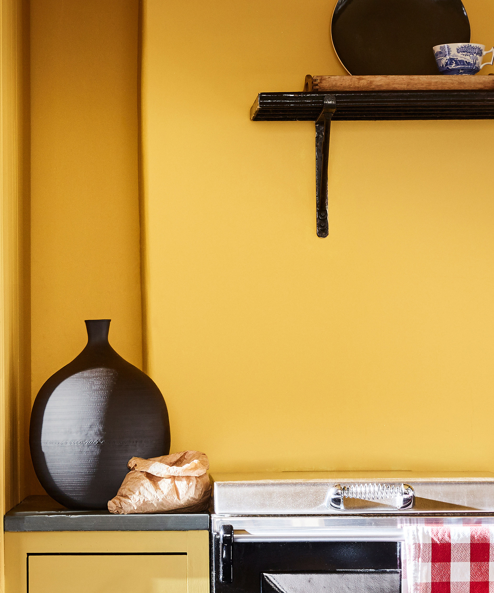
As perhaps the most optimistic color on the spectrum, its lemon tones will drench your autumn in the positivity you need to get through the cooler months – while looking indisputably stylish in the process.
From its ability to invoke Italian dinner party dreams – to its Pantone-approved relationship with gray (together, they are the power couple of the year), there is no better time to introduce this trending color into your interiors.
How should we bring yellow into our homes?
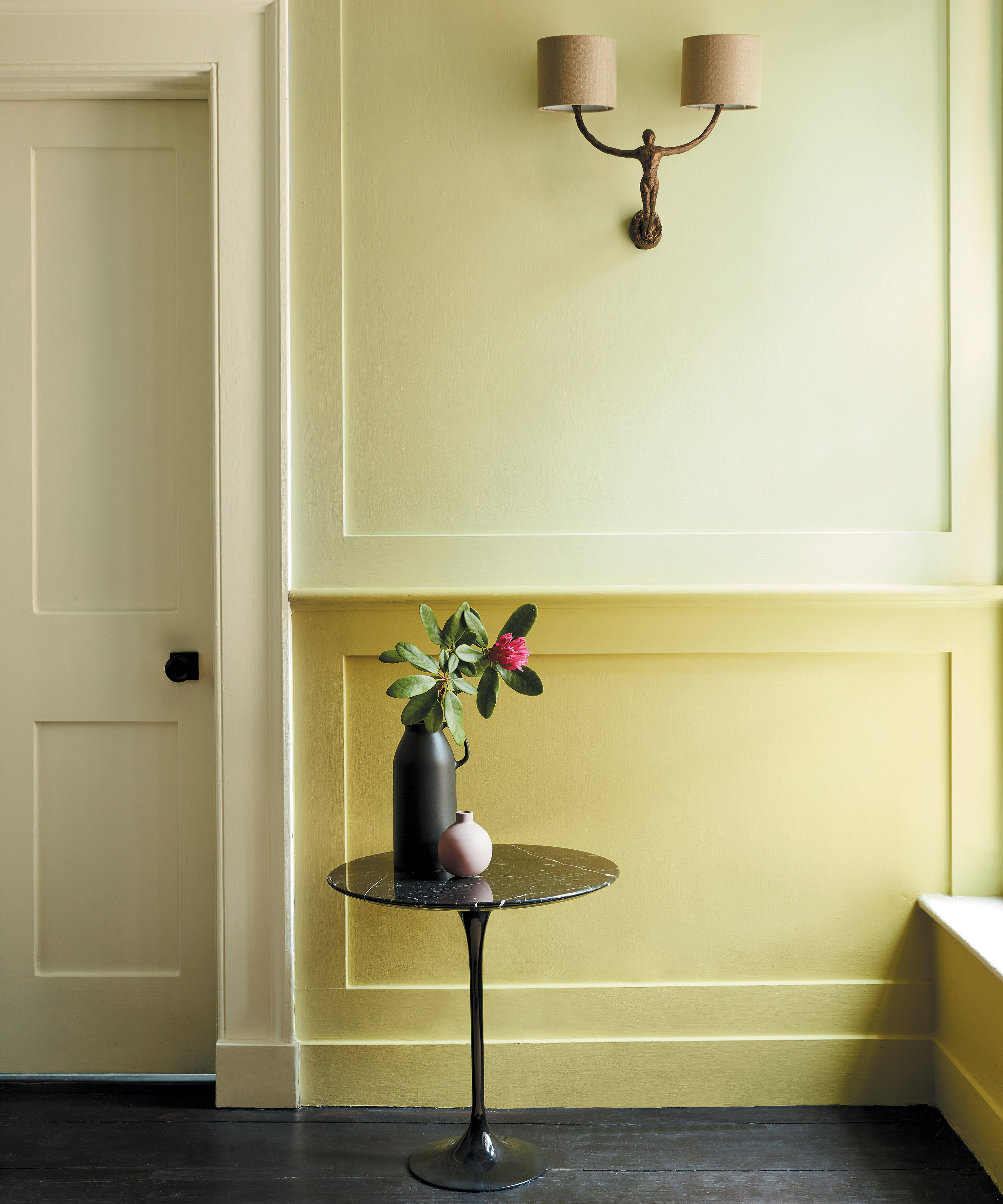
1. Combine its sunny hues with organic tones
'The kitchen, often seen as the heart of the home, is the perfect space to use bolder colors, such as Little Greene's Giallo, reminiscent of golden sun, which will bring joy and create an energetic scheme,' says Ruth Mottershed, Creative Director at Little Greene.
She continues: 'You can use this to highlight architectural details or pair it with soft greens and whites, such as the new shades Garden and Silent White, both by Little Greene, in the rest of the space, for a more elegant and paired pack scheme.'
2. Experiment with yellow as an accent color
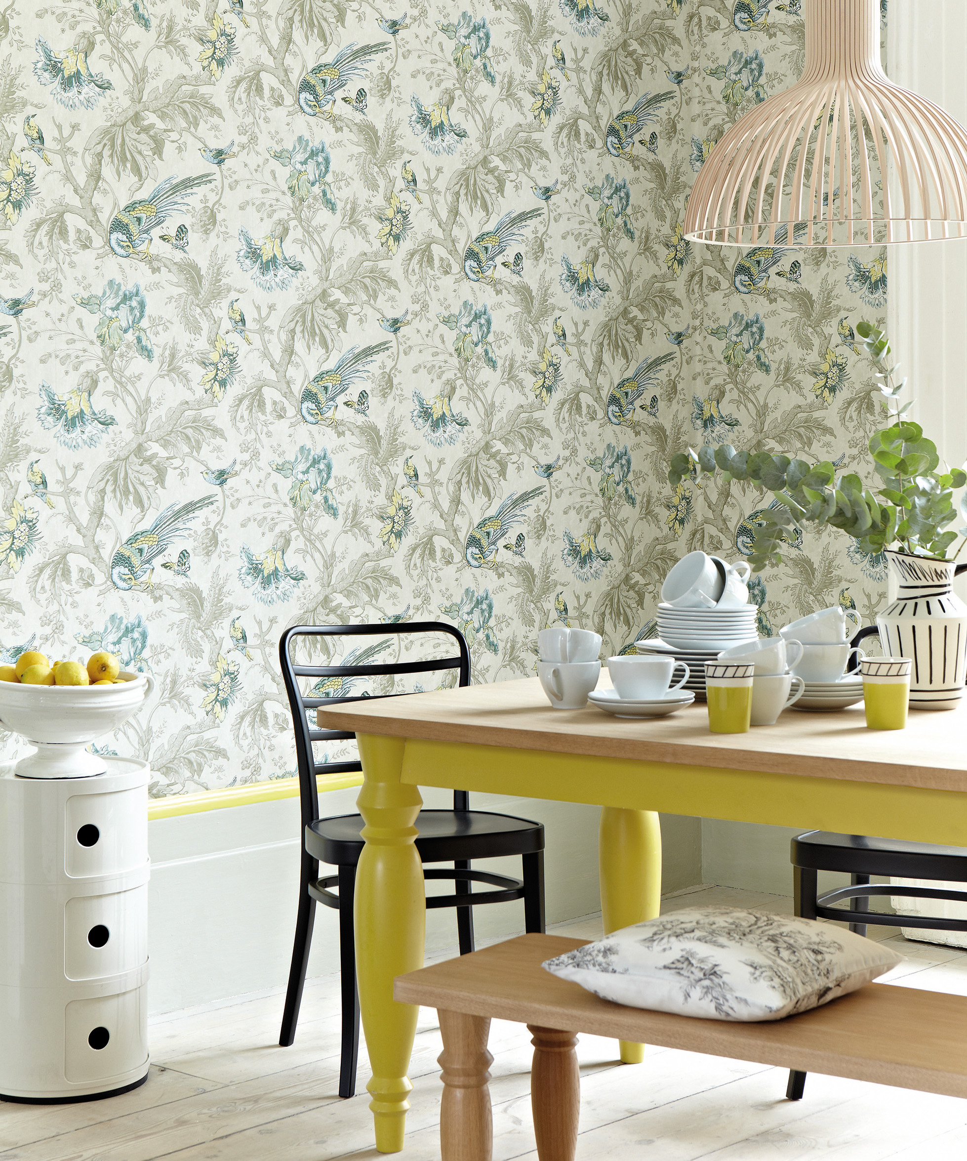
'Yellow is a great accent color for those less bold – use it as piping, fringing on cushions, and through your pictures. It always looks great with beige, browns, and grays, giving them a real pop. Put a yellow into a stack of anything from plates to cushions, and it will give it all a lift. A pop of yellow will always cheer up any scheme, says Emma Deterding, founder of Kelling Designs.
3. Indulge in yellow during an after-dark dinner
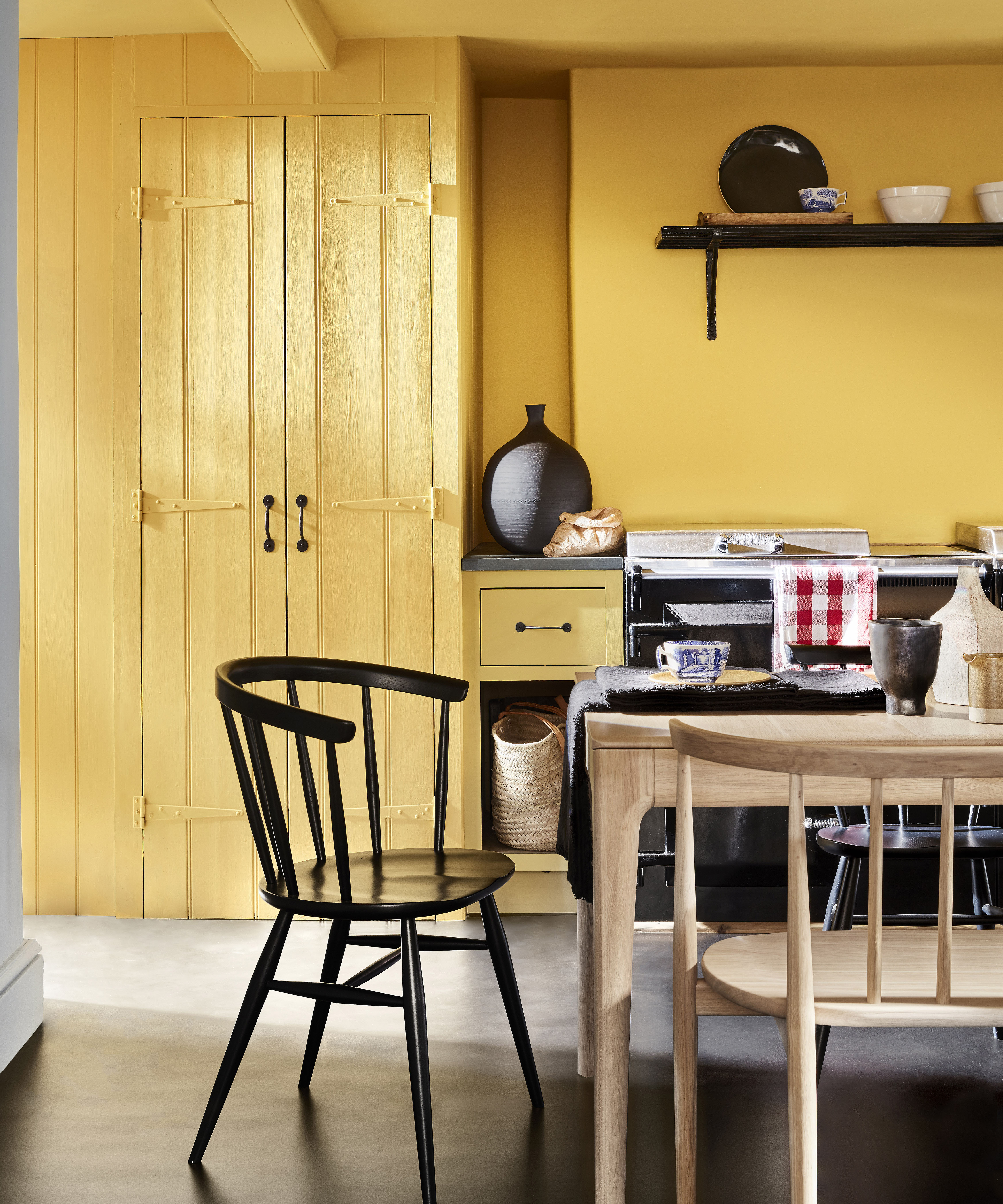
'I recently used a turmeric-yellow cotton linen on the walls of a London dining room. Made for me by Golborne Road-based Warris Vianni & Co, it took several attempts to achieve the right tone. The result is a pungent and rich base note which looks great at all times of the day but reacts particularly wonderfully with electric light at night,' explains Douglas Mackie, founder of Douglas Mackie Design.
4. Choose a grounding yellow – with a zesty twist
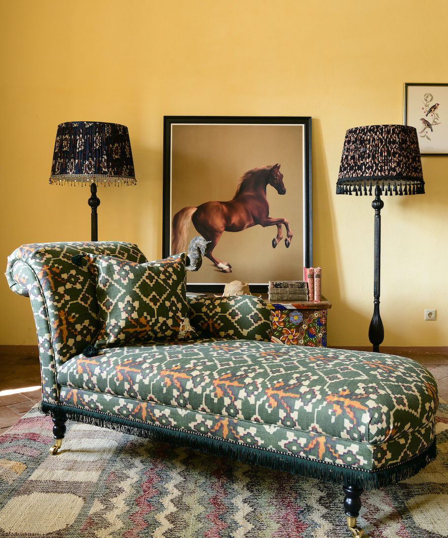
'Travel is one of my biggest sources of design inspiration, and visiting different places always clears my head brings me fresh ideas. I think a lot about the burnt yellow-orange hues of the South African landscape after sunset how all the landscape changes,' says Sophie Ashby, founder, Studio Ashby.
'For me, yellow strikes the perfect balance between zesty, invigorating energy, and grounding, earthy quality, she adds.
5. Use yellow to neutralize your space
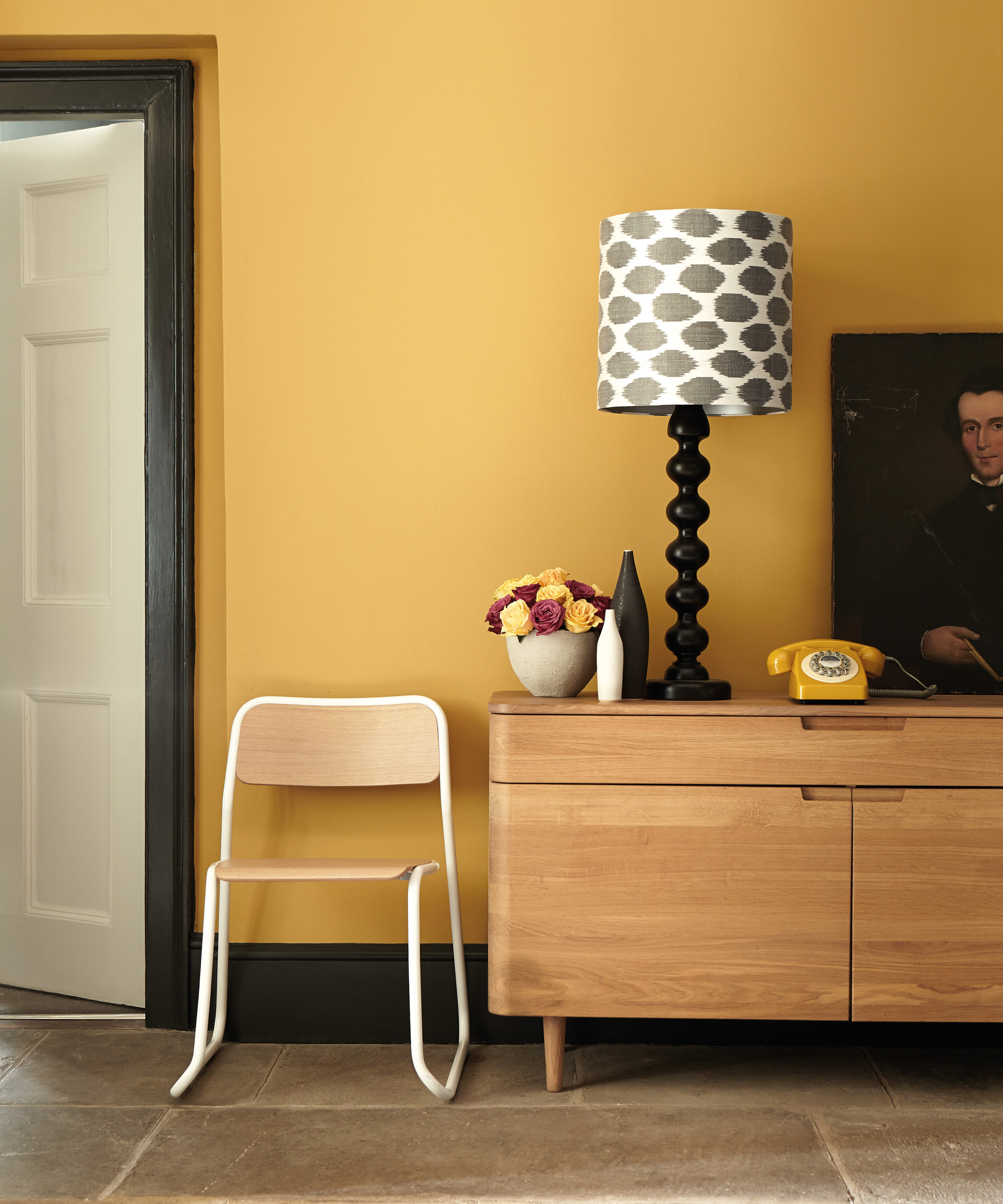
'To use yellow or ochre, you may need to think of it as the 'neutral' in the scheme; as a foil to set off other colors, not to overpower everything else,' instructs textile designer and interior decorator, Susan Deliss.
'Avoid anything that says canary or banana and go for something that sets off the architecture or warms up a cooler space.'
August's Color of the Month: Earthy Pink
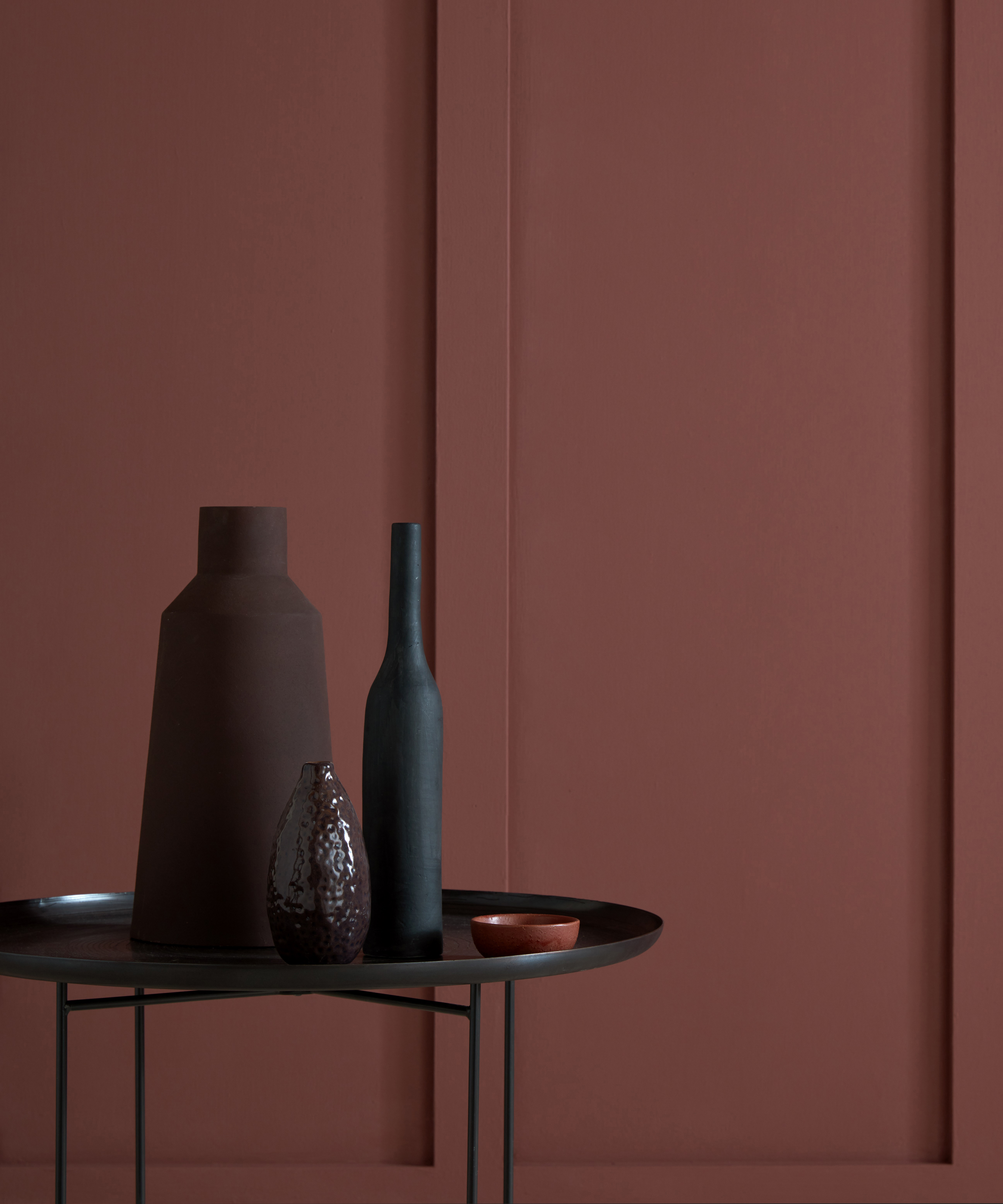
Rich and nuanced, an earthly pink has a depth that lends sophistication to a scheme. A versatile hue, it can veer into burgundy or brighten into a deep coral. The rare celebration of candy-cotton-infused tones with a rustic kiss – Earthy Pinks offer a grounded interpretation of the otherwise bold hue and make pink accessible throughout the most sophisticated of interiors.
Here, those in the know share their pink paint tips, so you overindulge in the vast spectrum of this shade that looks particularly alluring in the late August sunlight.
What makes Earthy Pink August's Color of the Month?
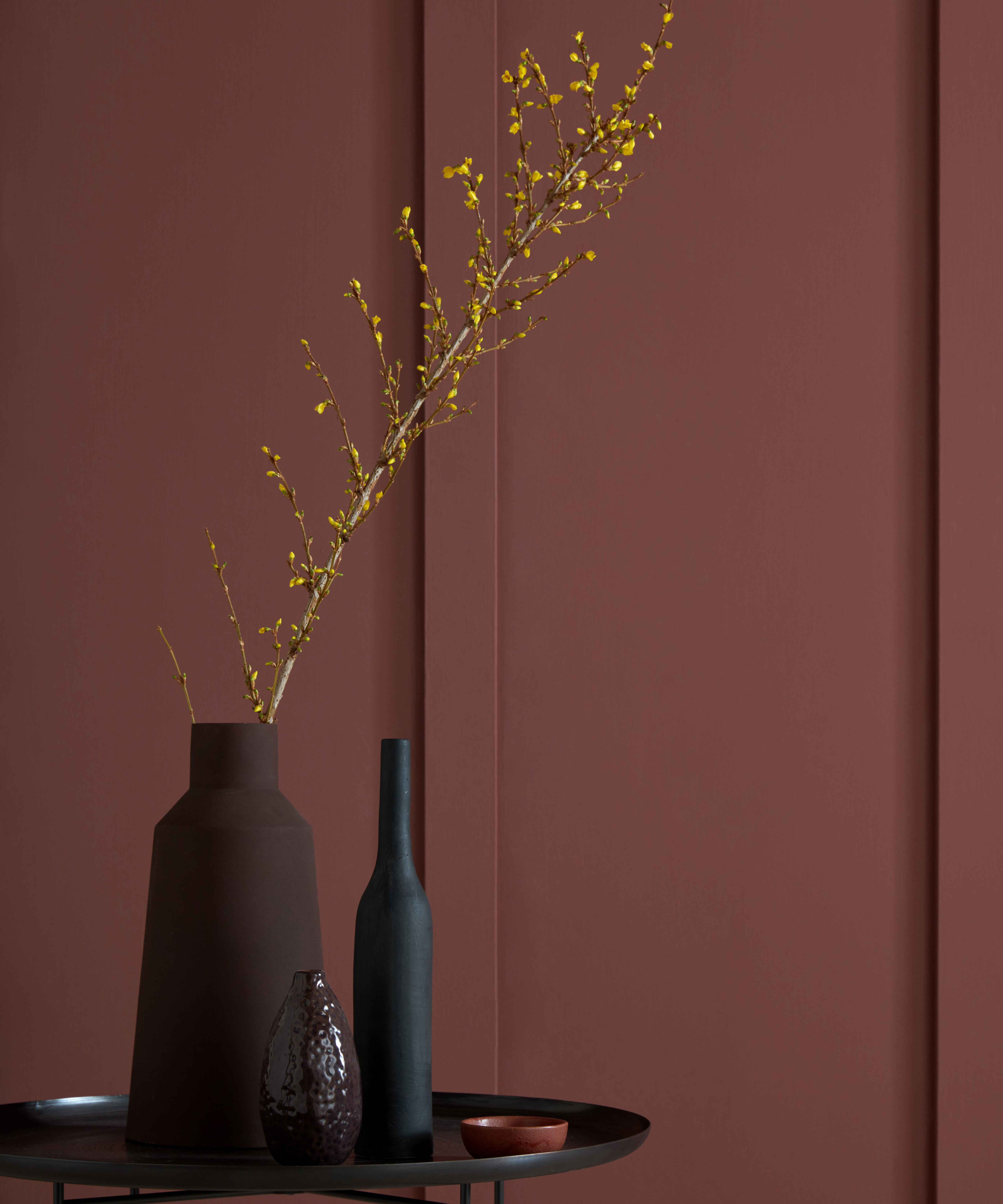
Spanning from tropical corals to almost-sandy tones, Earthy Pink's range is almost as diverse as this ever-changing month that blesses us with new settings and an ever-changing natural palette.
From the punnet of beachside strawberries on your staycation to the coral-kissed flower in your back garden, you don't need to travel far to immerse yourself in the variety of August's vast pink tones.
It is only fitting, therefore, that August's color of the month reflects the season's indulgent tones – with a nod to the more grounded, almost verdant colors, that are taking over our living room and bedroom ideas this year.
How should we bring Earthy Pink into our homes?
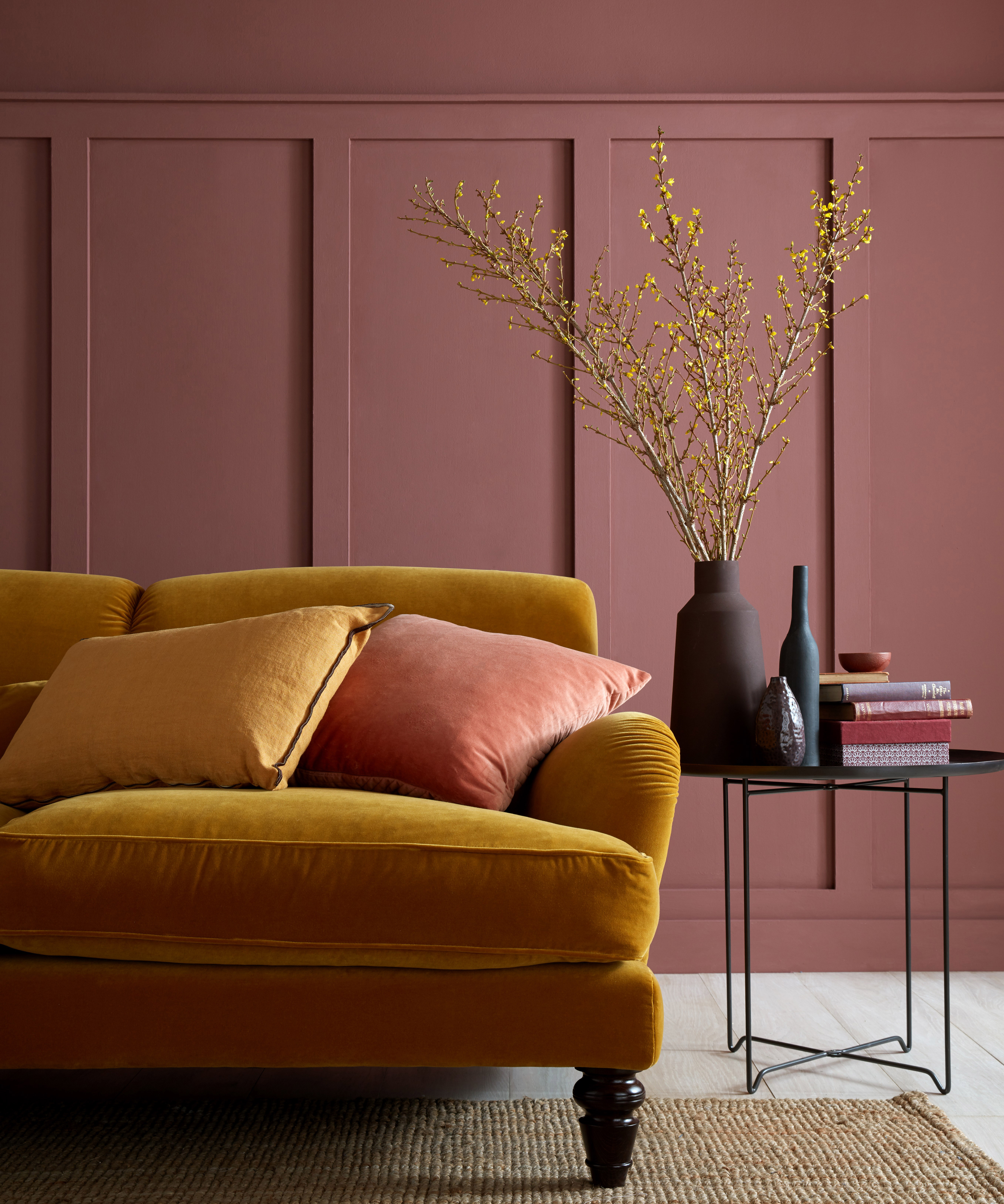
1. Break down bias's
'Soft pinks rely on red and yellow ochre pigments, whereas brighter, harder pinks require mineral or organic sources (this means Azo dyes in industrial paints.) They can be on the blue or red side and will pair with greeny or orangey-yellows accordingly. Kept, earthy, like our Nicaragua, pinks are distinguished and without a gender or age bias,' suggests Interior designer and paint maker, Edward Bulmer.
2. Pair a soft pink tone with a sophisticated gray
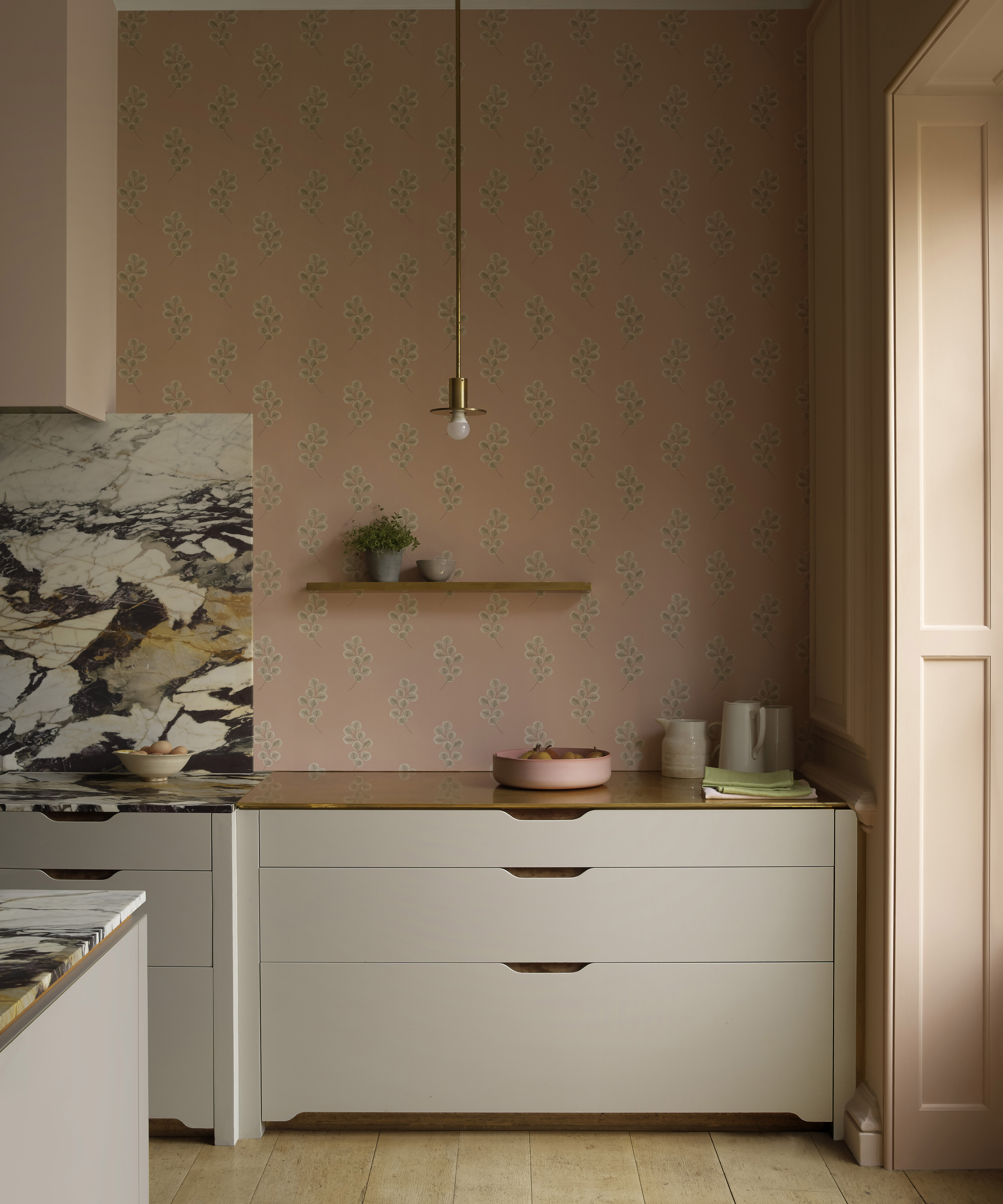
'When painting walls in pink, we usually use Temple from Paint and Paper Library (below) – it's a favorite brownish pink, characteristic of Famille Rose porcelain. It forms a great backdrop for all art and artifacts, as well as working with a lot of beautiful fabrics. It always creates a warm and comfortable room and looks incredibly smart with pale grey known as Slate II (also by Paint and Paper Library) on the woodwork,' says Sophie Eadie & Fi Crole, co-founders, Eadie & Crole.
3. Bring it into the bedroom – through textiles
'Pink is a truly wonderful shade to use as an accent color in a room. There is such an incredible range of shades to choose from, and dark pink can add depth and personality to a design scheme. It's bold and vibrant and works so well when used in upholstery in a headboard or bed base in a bedroom. I also like to use it for piping on a cushion to add a subtle pop of color to a sofa or chair,' explains Natalia Miyar, founder of Natalia Miyar Atelier.
4. Experiment with illuminating pink in a dark room
'This tone works perfectly in a scheme that is rather dark or which suffers from a lack of natural light. Not only does it inject a space with brightness and cheer, but it will also bring out and highlight any accent colors in the room,' says Elizabeth Hay, founder of Elizabeth Hay Design.
5. Go bold for unexpected hints of regency
'We love to use dark pink in more formal rooms, like drawing rooms, as it can actually add quite a masculine feel, especially when paired with olive greens or earthy browns. Simple classic shapes on upholstery also stop pink from feeling too fussy or overpowering,' suggest Nicole Salvesen & Mary Graham from Salvesen Graham.
July's Color of the Month: Olive Green
Inspired by the natural world, olive is restful with a touch of heritage. Strong yet soothing, it brings out an enveloping feel but can also sit quietly and allow bold furniture to shine with a summer-kissed glow. Below, the experts share how to drench your home in this nostalgic shade – so you can enjoy the delicious hues of midsummer – long after the month passes.
What makes Olive Green July's Color of the Month?
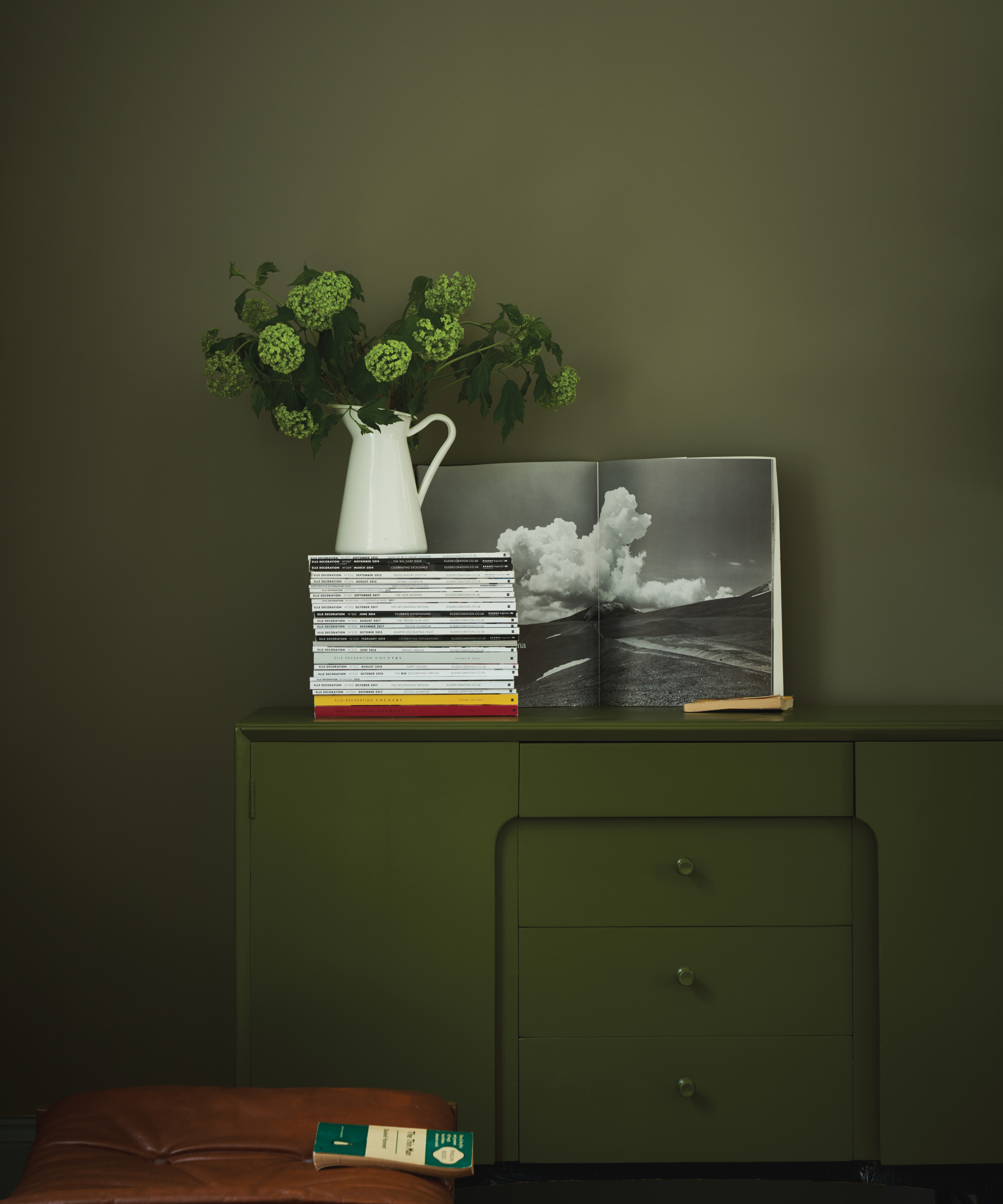
No shade encapsulates summer quite like the rustic hues of Olive Green. The shade is instantly reminiscent of long summers amongst Mediterranean olive groves and oozes organic tones that pay homage to the raw beauty of the sun-glazed season.
The shade is versatile enough to work in every room in our home – whether you are looking for living room paint ideas or a daring bathroom statement. However, it is equally as alluring throughout our exteriors. Bathe your outdoor home decor or garden fence in olive tones to bring this popular color into the sunshine – because this is July, after all.
How should we bring Olive Green into our homes?
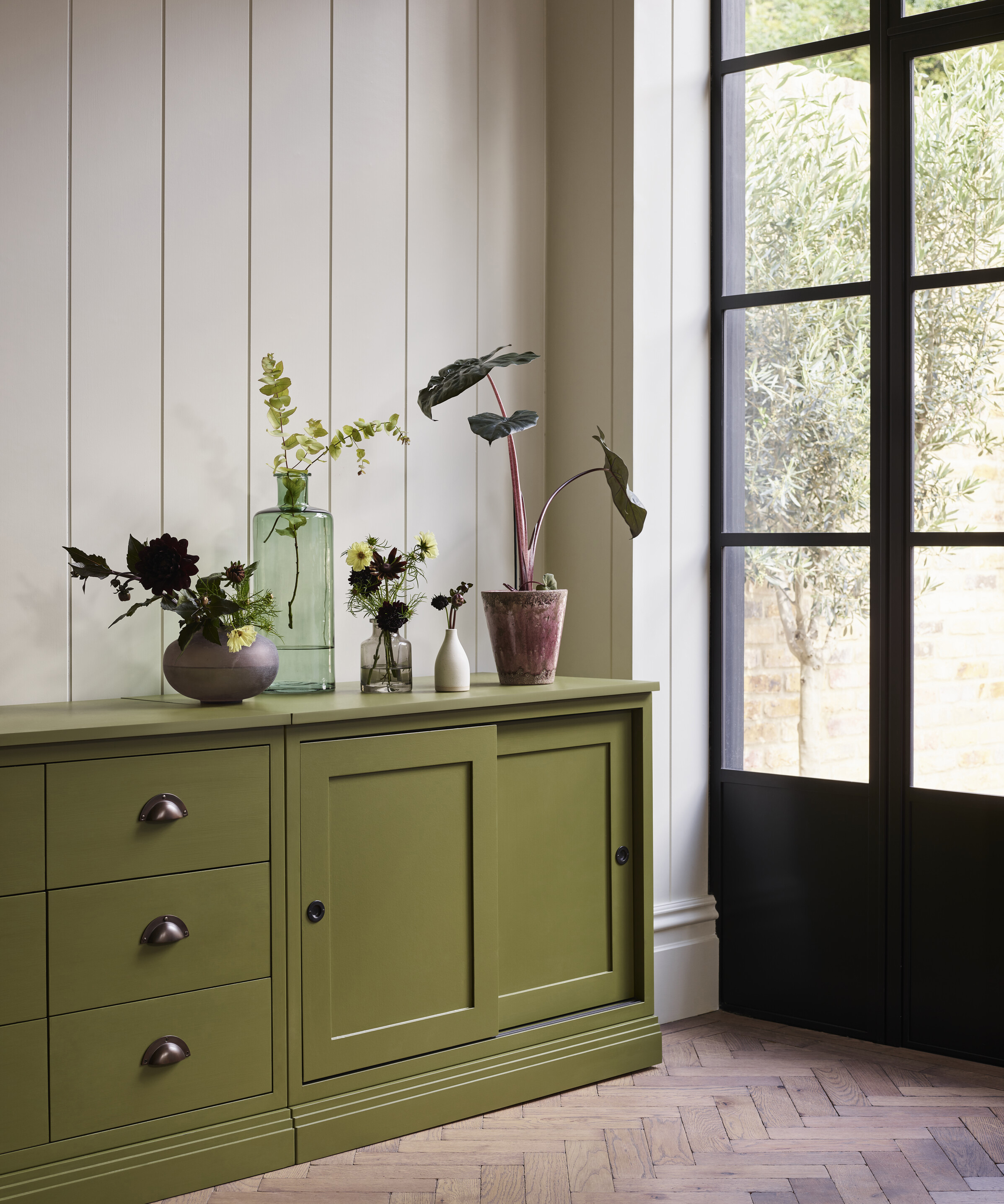
Dresser in Olive emulsion by Neptune
1. Design a flow between your interior and exterior space
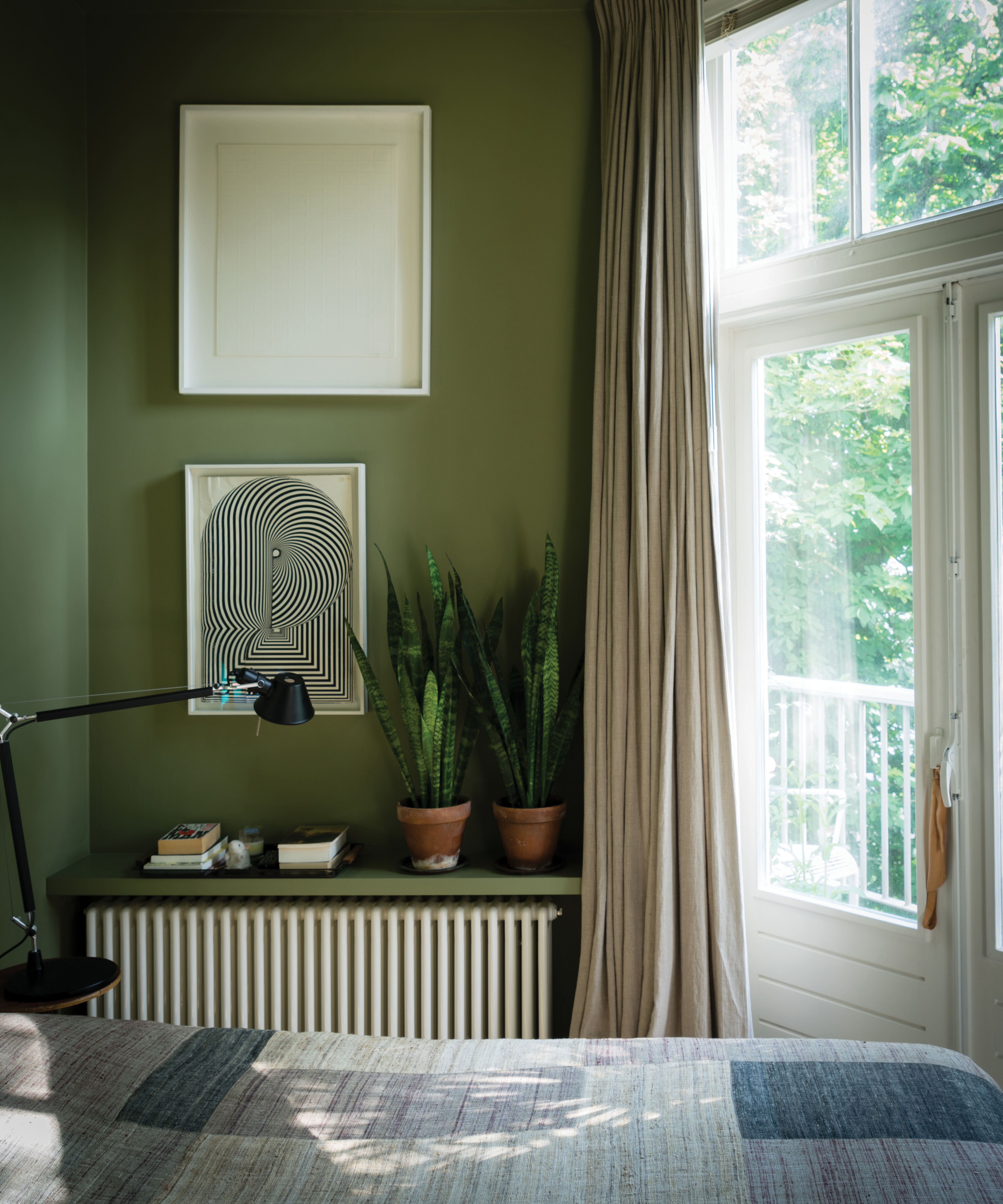
OliveNo.13 Estate Emulsion by Farrow & Ball
It is still possible to indulge in the glory of olive green in your exteriors without even stepping outside. As Founder of Sarah Brown Interiors, Sarah Brown urges us to curate a flow between the two spaces with this wholly natural shade.
'Olive green is a color I come back to often when putting together a scheme. I have used it in various different fabrics, including waves, velvets, and linens on sofas, window treatments, and lampshades,' she begins.
'Recently, I used the shade Hopper by Little Greene on a glazed screen in an ensuite room which overlooks the garden: it helps lead your eyes through the windows to the treetops and beyond,' Sarah adds.
2. Pair with a dusty palette – in every single room
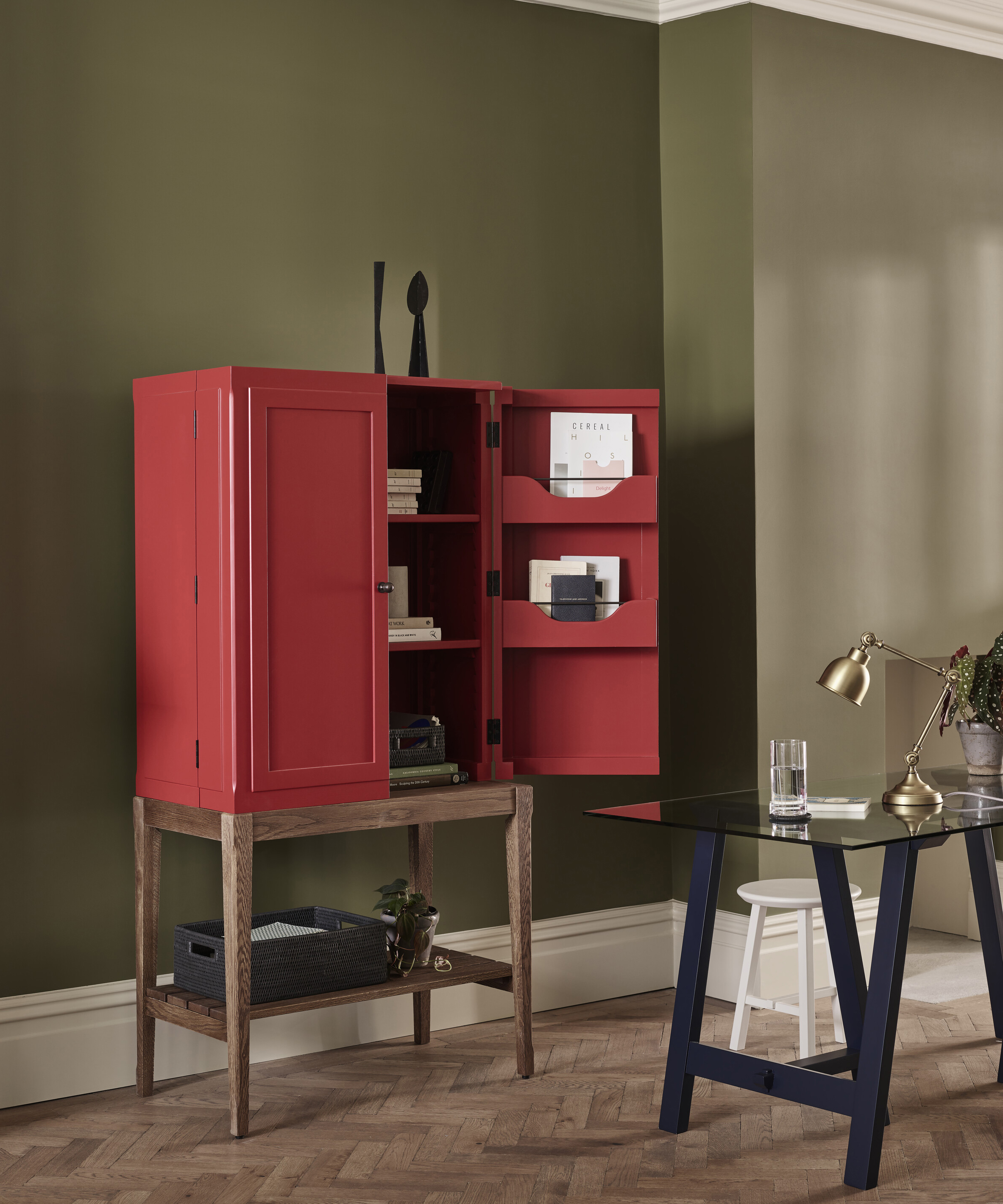
Wall in Olive emulsion by Neptune
We said olive green worked in every room, and paint master Francesca Wezel of Francesca's Paints agrees.
'A gentle shade usually made with yellow ochre, raw and burnt umber, olive is fresh but inviting, especially when compared to greens made with blue. It's one of the most neutral shades of green there is, and, as such, it's versatile and can be used in almost every room of the house. It looks great with dusty pink, red, off-white, or a soft blue,' says Francesca.
3. Inject classical hints into a modern urban paradise
'This is a wonderful color that works well all through the year and is ideal if you are trying to bring an element of nature or a heritage feel into a more contemporary city home. It's a restful and calming shade which not only works well on cabinetry but also looks great on walls,' explains Founder and Creative Director at Sims Hilditch, Emma Sims-Hilditch.
4. Combine with lighter tones instead of moody hues
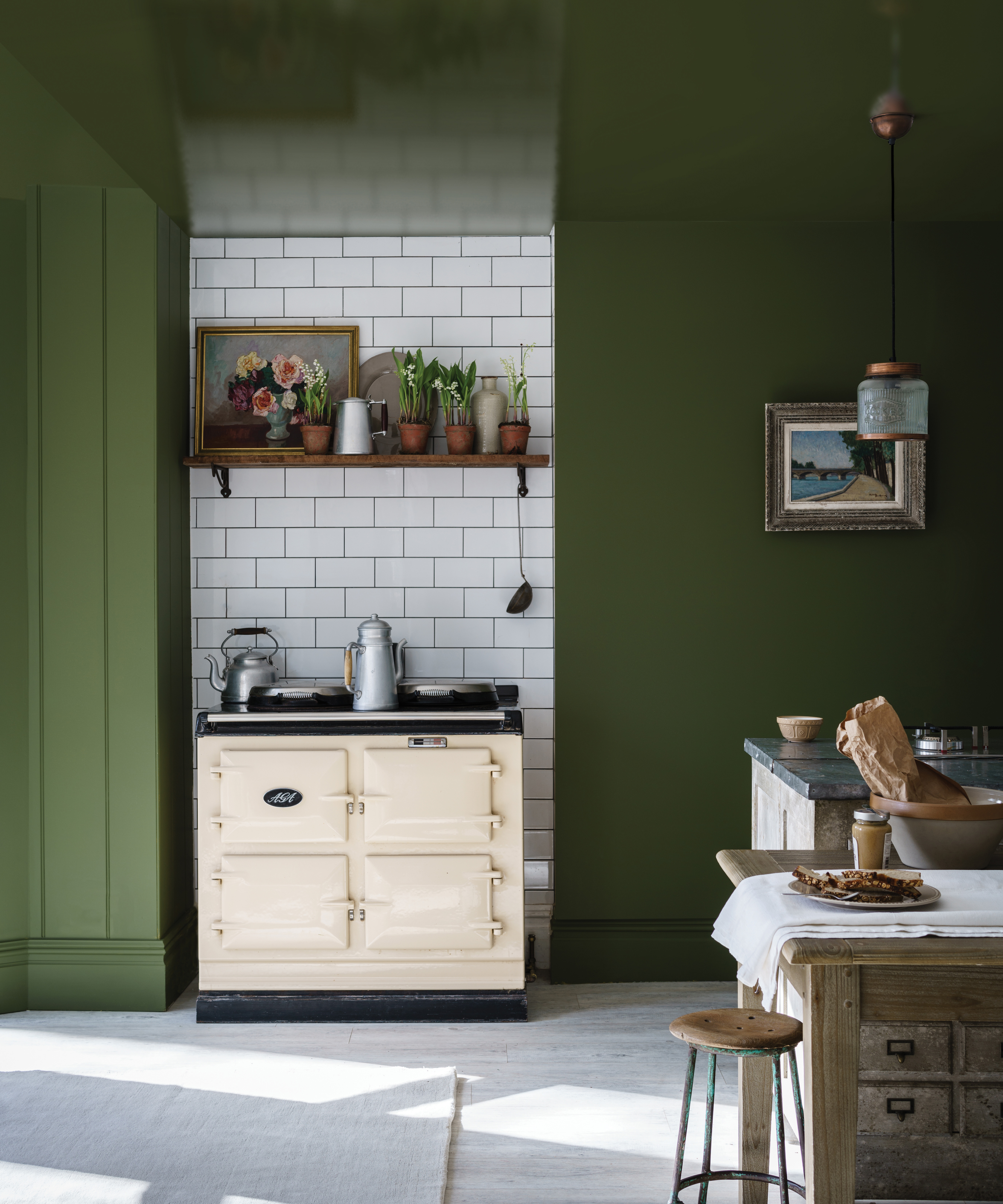
Farrow & Ball Bancha No.298 in Modern Emulsion
While we have already admired Francesca's dusty pinks and soft blue painting suggestions, Founder of Kelling Designs, Emma Deterding, similarly offers her color combination advice – including what to avoid.
'My favorite olive green on the color card is Fenouil No.110 from Designers Guild; it really reminds me of a ripe olive. Pair it with a color that is clean and bright that will lift and carry it and avoid putting against a darker color as it risks making a room feel somber,' she shares.
'Mixing different shades of olive green works surprisingly well. I personally love painting a combination of wall and woodwork in olive green. A paler wall, for example, in a matt finish with a high gloss olive green dado rail,' adds Founder and Director at Elicyon, Charu Gandhi.
5. Experiment with an olive sky
Yes, we love this shade so much; we're even following Charu's advice and taking the paintbrush to our bathroom ceiling. 'Another trick that works well is an olive green ceiling in a bathroom with a similar tone mixed into a tadelakt plaster sink and vanity counter,' Charu suggests.
June's Color of the Month: Potters Pink from Heritage by Dulux
It is, perhaps, only fitting that we celebrate June by over-indulging in the hues of its birth flower – rose. This month, we've chosen a color that combines the romantic hues of this ornate flower that also celebrates the summer solstice through its warmer tones.
Enter Potters Pink from Heritage by Dulux, a soft clay-like shade that brings sophistication to a living space but is subtle enough for a calming bedroom. The quiet chic tones of this elegant hue will add a certain grace to your walls and beautifully catch the long-lasting sunlight as it sets deep into the evening.
As a staple of the Heritage collection, Potters Pink is among the finest colors from important periods of decorating history, as Creative Director of Dulux, Marianne Shillingford shares.
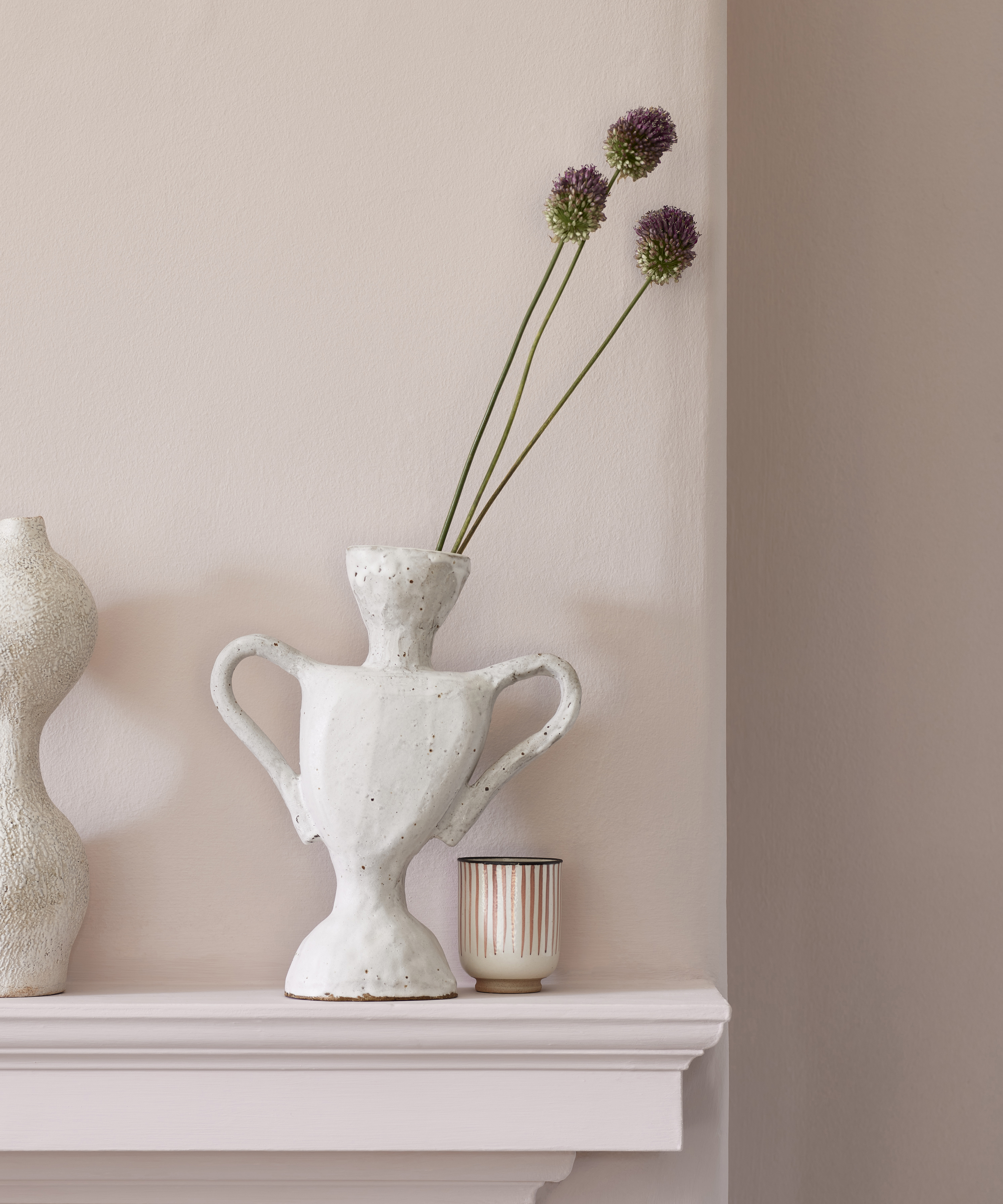
'Potters Pink is a pale, ultra-feminine shade that encapsulates the fragility of Edwardian cottage garden blooms like the fragrant peony. Petal pinks were also a favorite for the interior at this time, as they added a light, bright breath of fresh air, which we still long to create today.' Despite this legacy, however, we're here to convince you that there is no more perfect shade for the contemporary day.
What makes Potters Pink June's Color of the Month?
Alongside the shade's relationship with June's birth flower and its subtle nod to warm summer evenings, this color allows us to experiment with Pink – the new decorating neutral. Pink has a natural ability to deliver warmth and interest without overwhelming a space.
However, choosing the right shade can be a thorny task when you're faced with everything from soft rose pinks to peachy tones. Or at least, it was until we came across Potters Pink. In all its nostalgic beauty, this shade oozes hints of stylish optimism, and that's exactly what we crave throughout this warm and hazy month.
How should we bring Potters Pink into our homes?
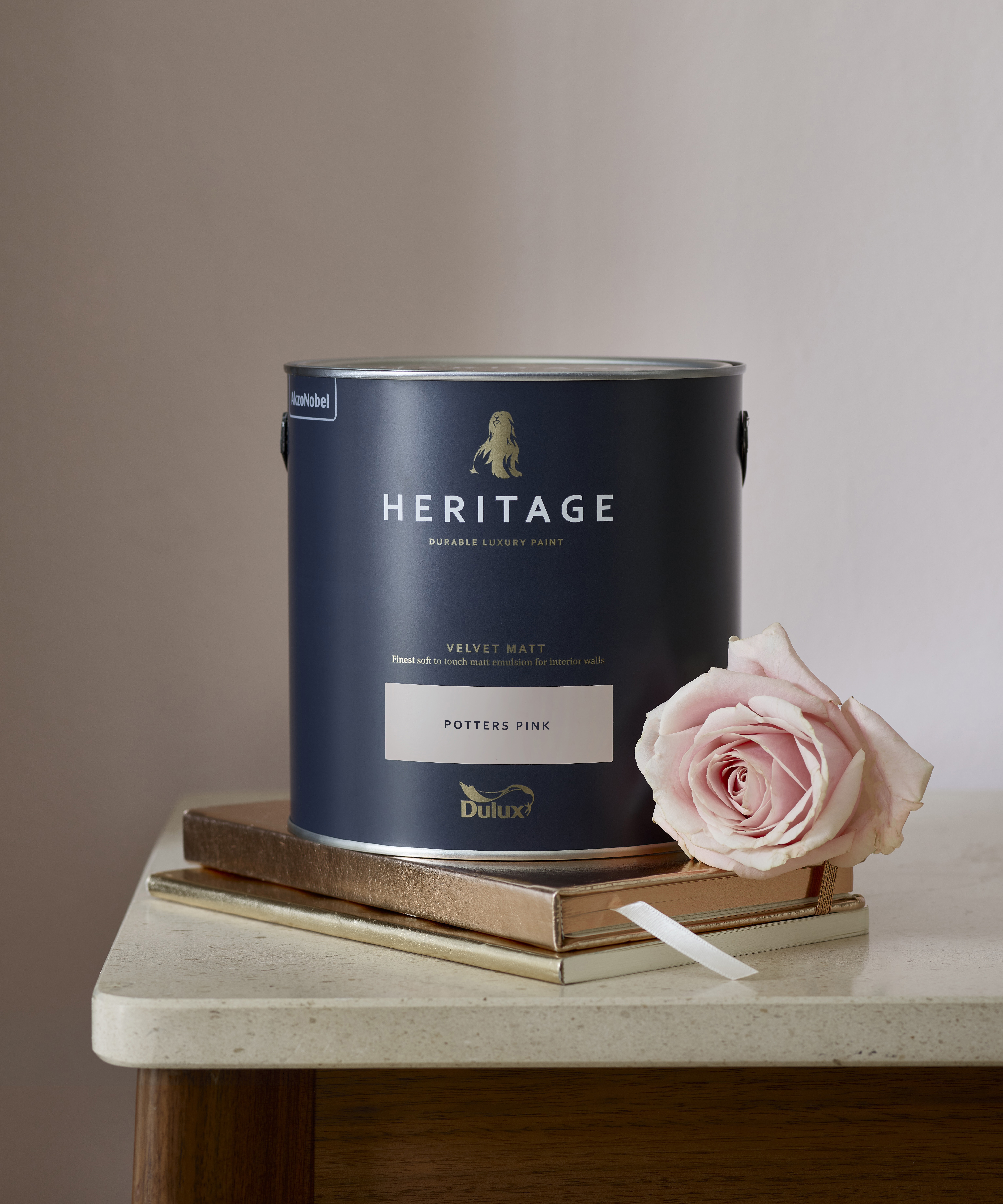
Pair with rich dark colors for a refreshing contrast
While Potters Pink will bless almost all color schemes, the shade looks particularly glorious alongside natural tones or deep rich hues. H&G's Associate Editor, Busola Evans, shares her interior design tips, recommending we pink with 'olive greens, rich browns and deep burgundy' that will create a timeless contrast and truly make your room sing.
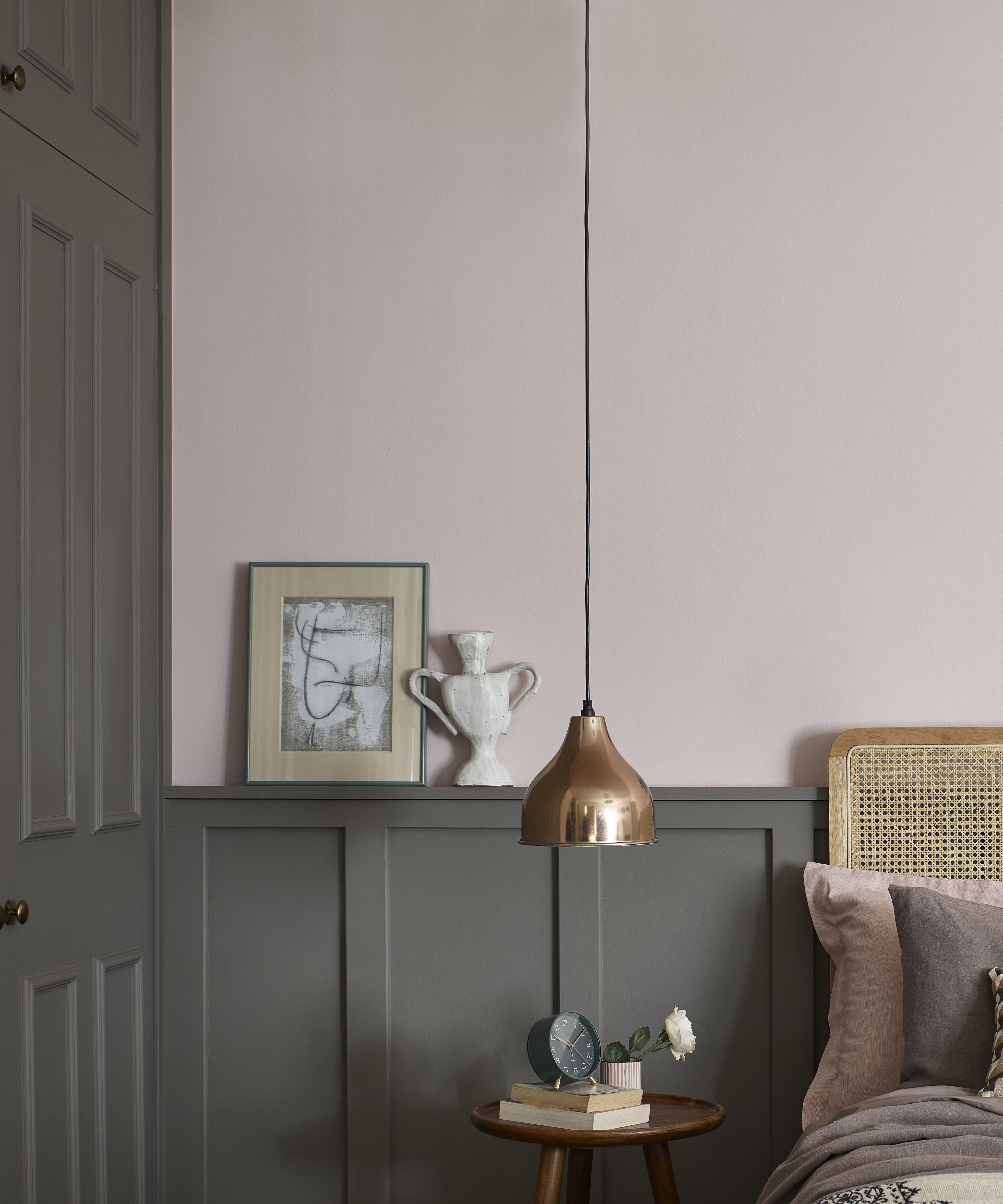
Accessorize with metallics to create a boutique hotel ambiance
Mirror the refined aura of a curated hotel room by pairing this shade with bold metallic accessories. From a gold mirror or statement lampshade to a selection of candlesticks – Potters Pink was made for metal – and your room will thank you for indulging in this ultra-luxe partnership.
Pay tribute to the past – in a contemporary home
Potters Pink, like all colors in the Heritage range, is designed to drench our walls in history without looking out of place in a modern home. So, to combine aging beauty with contemporary quality and style, experiment with this premium shade, which, according to Marianne, is 'tough enough to deal with everything real-life throws at it.'
'But the pure delight lies in how it feels to the touch. Soft and smooth like silk velvet. Now that is the kind of luxury every wall deserves. Who wouldn't want to drape themselves and their walls in the finest velvet?'
May's color of the month: Tigers Eye by Zoffany
May is the month of lush growth and rebirth. So, in homage to its warm and natural ambiance, we’ve selected a color that oozes sunshine without sacrificing its wholly sophisticated style.
There is no color quite so fitting as Zoffany’s Tigers Eye, the luxe but fun-filled shade that provokes a welcoming and energetic aesthetic. Zoffany curated this flavorsome yellow to mirror the ancient hues of a historical archive, but its full-bodied character has never looked quite so perfect as it does in the contemporary day.
Zoffany suggests that the ‘brave can use this color to open up smaller spaces and frame feature areas,’ but we’re here to convince everybody to bring Tiger’s Eye into their interiors.
What makes Tigers Eye May’s Color the Month?
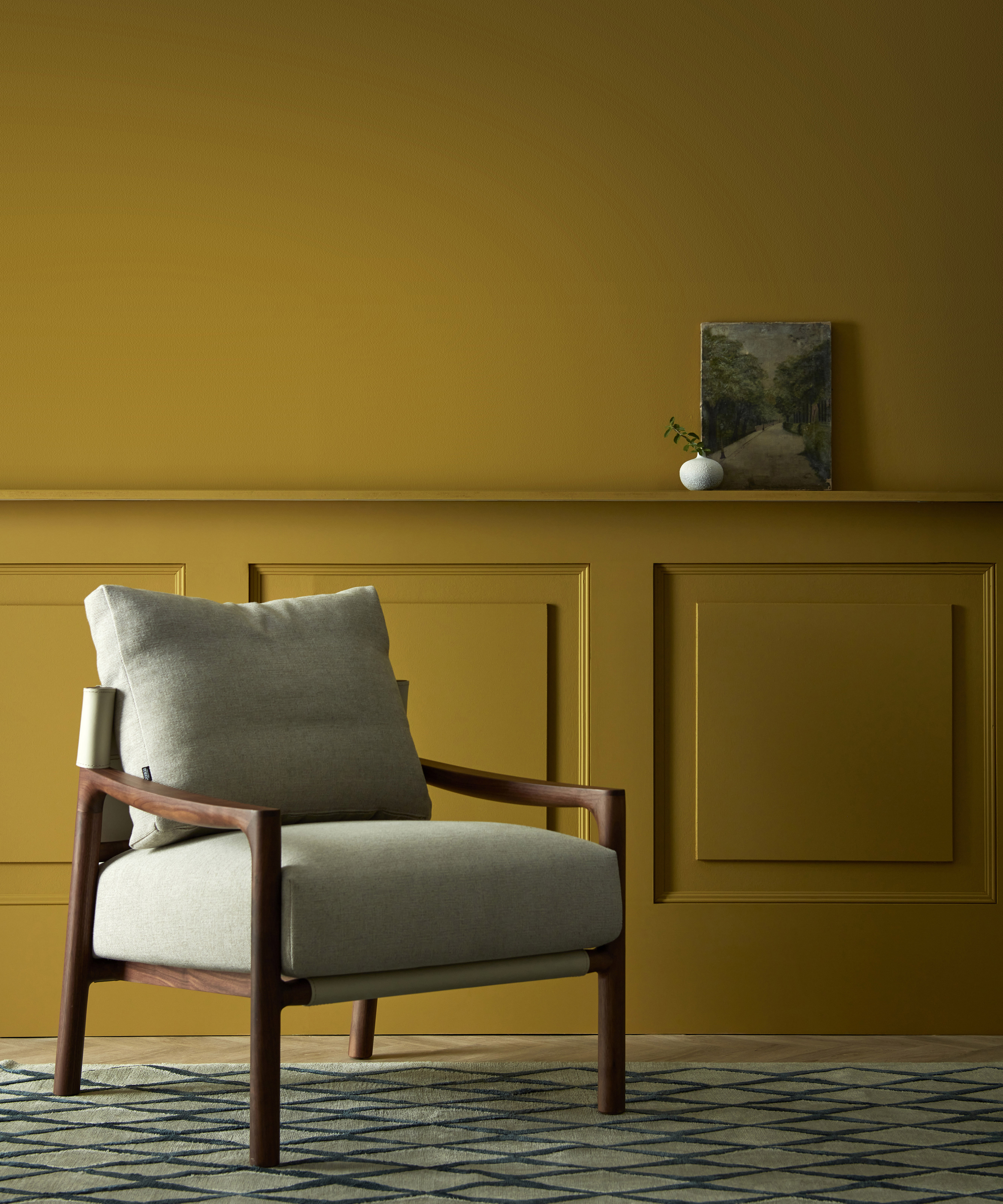
‘It’s the shade of optimism and joy, so after the global turbulence of the past year, it comes as little surprise that yellow is decorating’s color du jour,’ begins Busola.
‘But it is so much more than a flash in the pan – the right shade can have surprising longevity and add richness to more traditional schemes,’ she says. Beyond its alluring aesthetic, Busola praises the shade’s durability, meaning the golden tones will stay radiant, whatever the conditions.
‘It’s now available in a chalky-textured True Matt finish, which is wipeable so suitable for high-traffic areas,’ she explains.
How should we bring Tigers Eye into our homes?
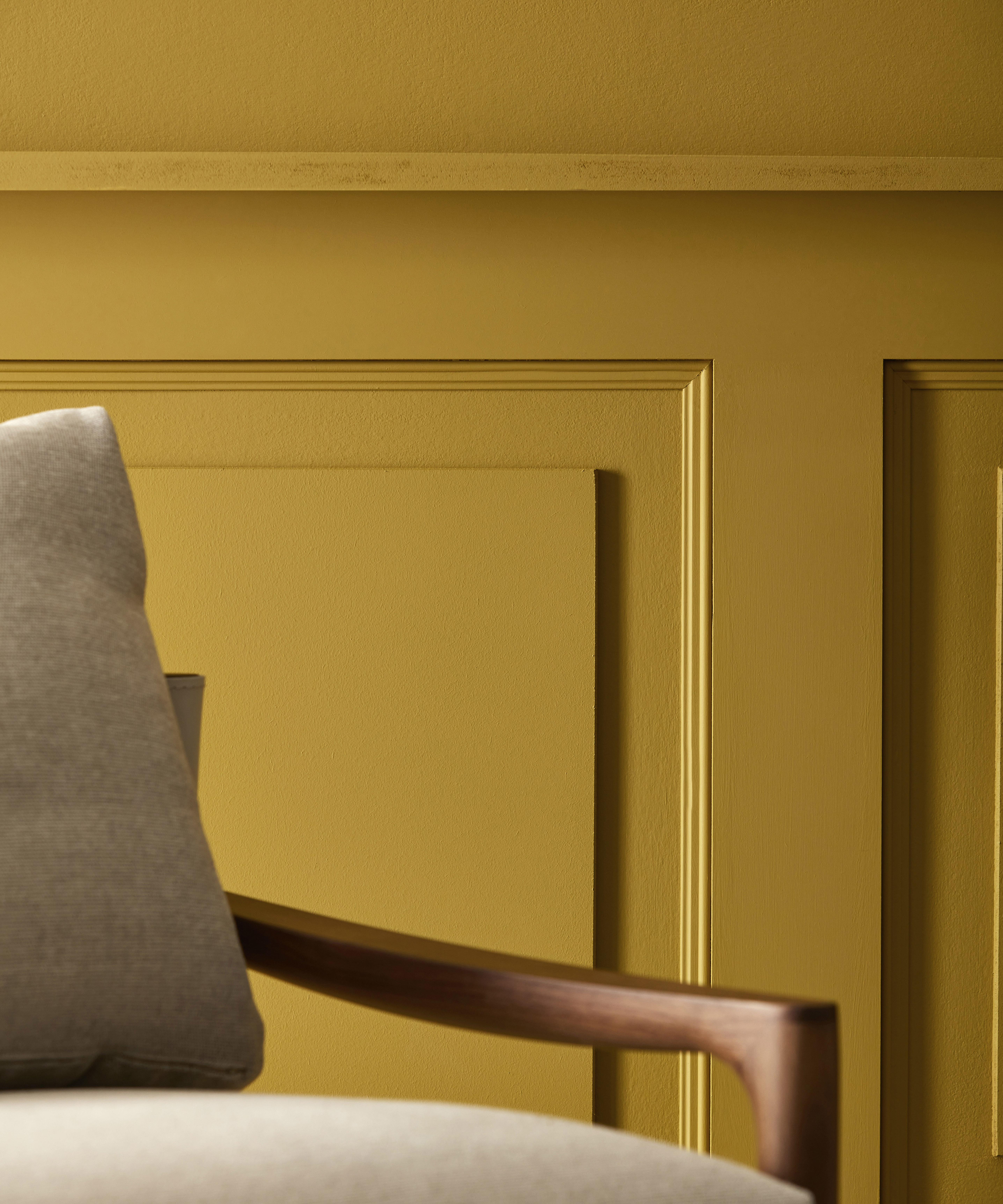
How to use Zoffany's Tigers Eye at home
Pair with nature-inspired colors for a therapeutic effect
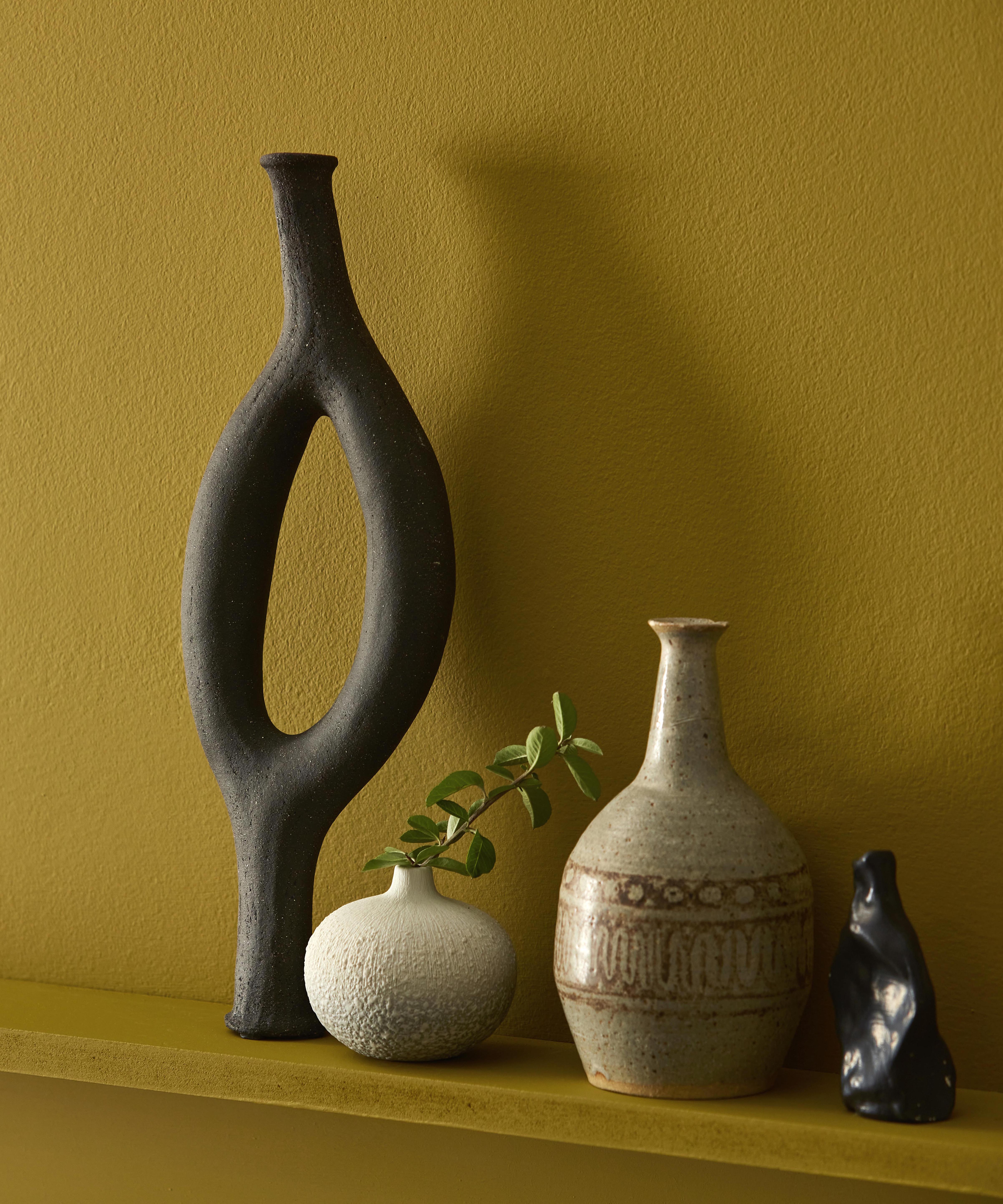
While the daring vibrancy of Tigers Eye is initially daunting, Busola explains that ‘color combinations are not as tricky as one may think.’
She expands: ‘Tigers Eye’s brown undertones pair it beautifully with forest green, while creams and beiges add more serenity.’
Or opt for a striking combination of color
Tigers Eye is durable, but it is versatile too. While the shade works alongside natural tones, it can certainly create an impact alongside colors of equal stature. Busola suggests ramping up the color ‘with coral or powder blue accents,’ which will be the talking point of any sized space.
Consider your finishing touches
After creating the perfect color combination, Busola encourages us not to neglect the finishing touches that impact the overall ambiance of the room. Zoffany pairs the shade with grey soft-furnishings and a minimal but impactful selection of plants in a nod to the shade’s relationship to nature. But if you’re still looking for tips, Busola suggests that we can’t ‘go wrong with brass, wood, and stone.’
April’s color of the month: Travertine by Little Greene
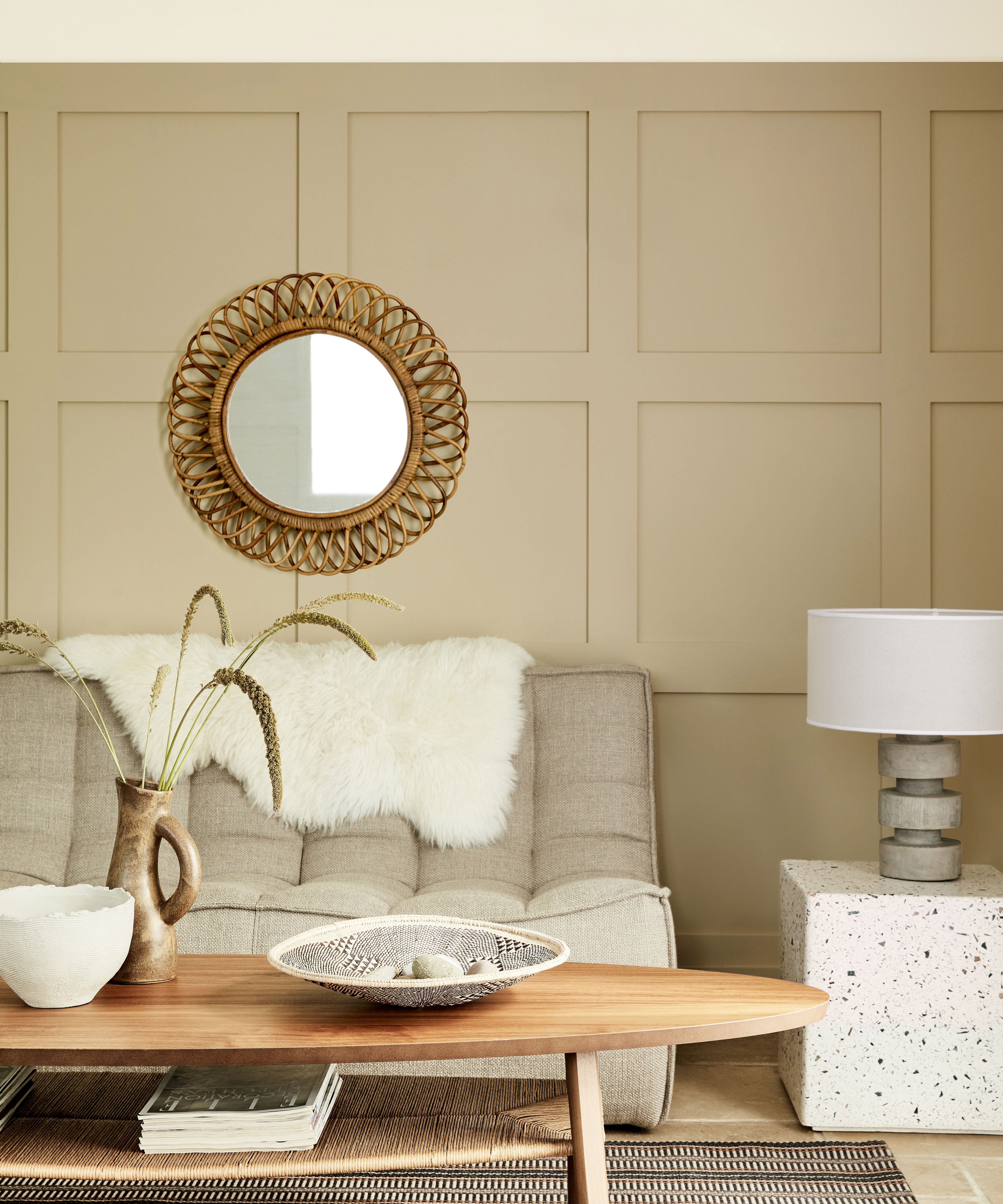
Travertine by Little Greene
Travertine, with its dune-line hue, is a calming neutral that feels more welcoming than white or grey, but what else made this color so appealing in April? And how should you bring this shade into your home? We spoke to Ruth Mottershead, Creative Director at Little Greene, to find out.
‘Travertine is a wonderfully warm neutral. Found at the National Trust’s Basildon Park, this welcoming neutral was used on the walls of the Staircase Hall, designed to feel more like a sitting room than a cold corridor. With the shift away from the cool, blue-toned greys that have been so popular in recent years and the yearning for warmer, natural tones, Travertine is fast becoming a favorite for homeowners searching for earthier tones with an inherent warmth,’ Ruth begins.
She adds: ‘Incredibly versatile, Travertine is at home in both contemporary, traditional or country interiors, as well as bold or softer, paired back design schemes; it offers a sense of timelessness, creating design schemes with longevity.’
How should we bring 'Travertine' into our homes?
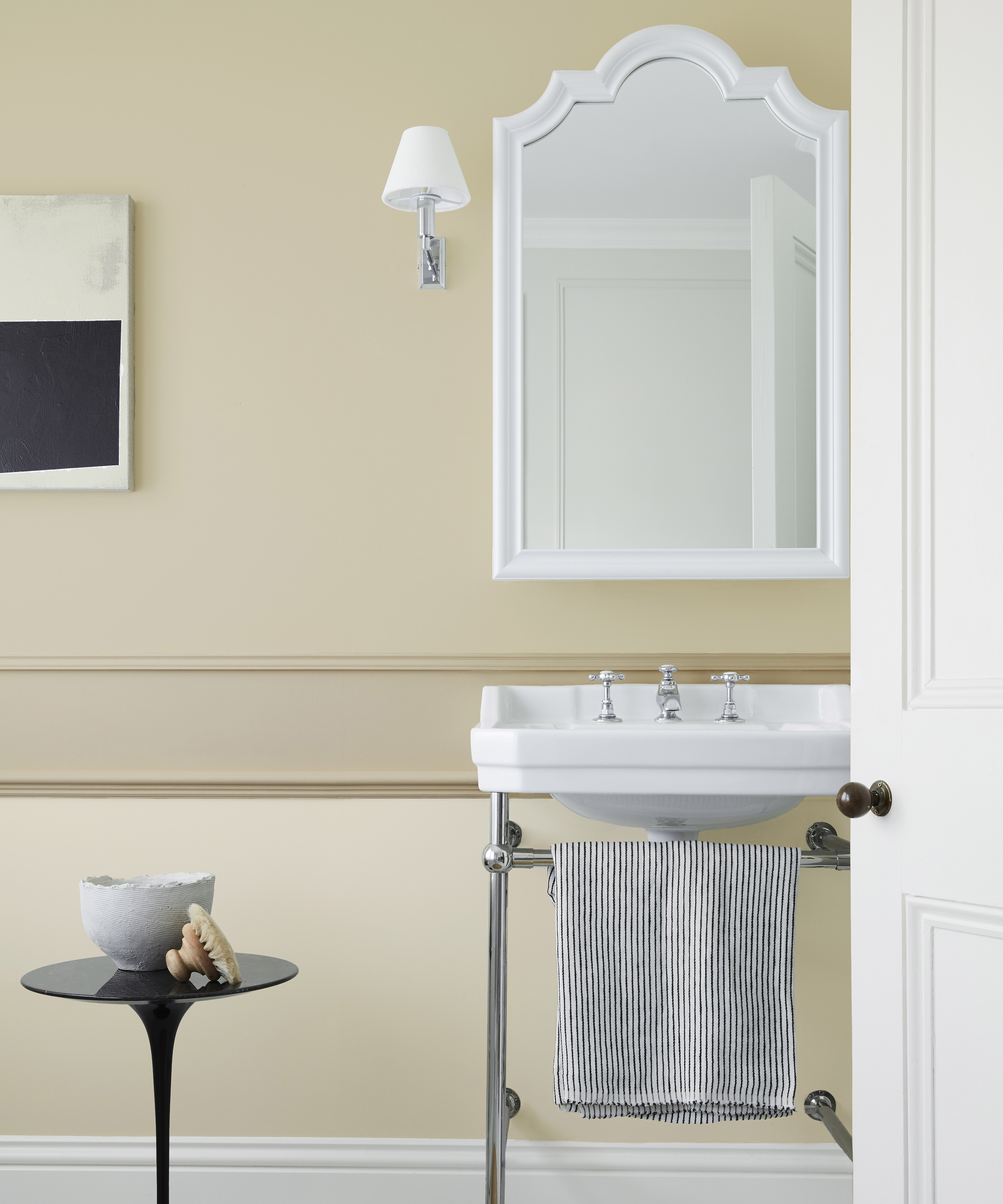
Travertine by Little Greene
Ruth then offered her suggestions on how to bring this versatile shade into any kind of home, whether you want a fresh off-white backdrop or to create a bold contrast.
Using Travertine in a neutral color scheme
Sharing her neutral room ideas, Ruth explains: ‘For a traditional scheme, use Travertine on walls, paired with the lighter Stock on the ceiling. For those looking for a contemporary way to use this shade, you could paint three-quarters of the wall in Travertine and the last quarter and ceiling in Stock to open up the space and give the illusion of height.’
‘The warmth of Travertine balanced with Stock feels incredibly soothing and works wonderfully with the addition of pale wood finishes, touches of rattan, and unglazed ceramics to add texture. This scheme provides the perfect off-white backdrop for decorative accessories and contemporary artworks in a light and airy setting’.
Pairing 'Travertine' with darker shades to create a statement
‘For a more dramatic scheme, create focal points with color blocking and use Travertine as more of a backdrop to contrasting shades such as Sage Green or Nether Red, which are related natural hues, or zone a space by using interesting color proportions,' Ruth shares.
‘Travertine and Travertine Light can be seen as white in bolder schemes or will read as colors in their own right if used alongside a pure white like Shirting and Loft White, she adds.
Using 'Travertine' for a continued color scheme throughout your home
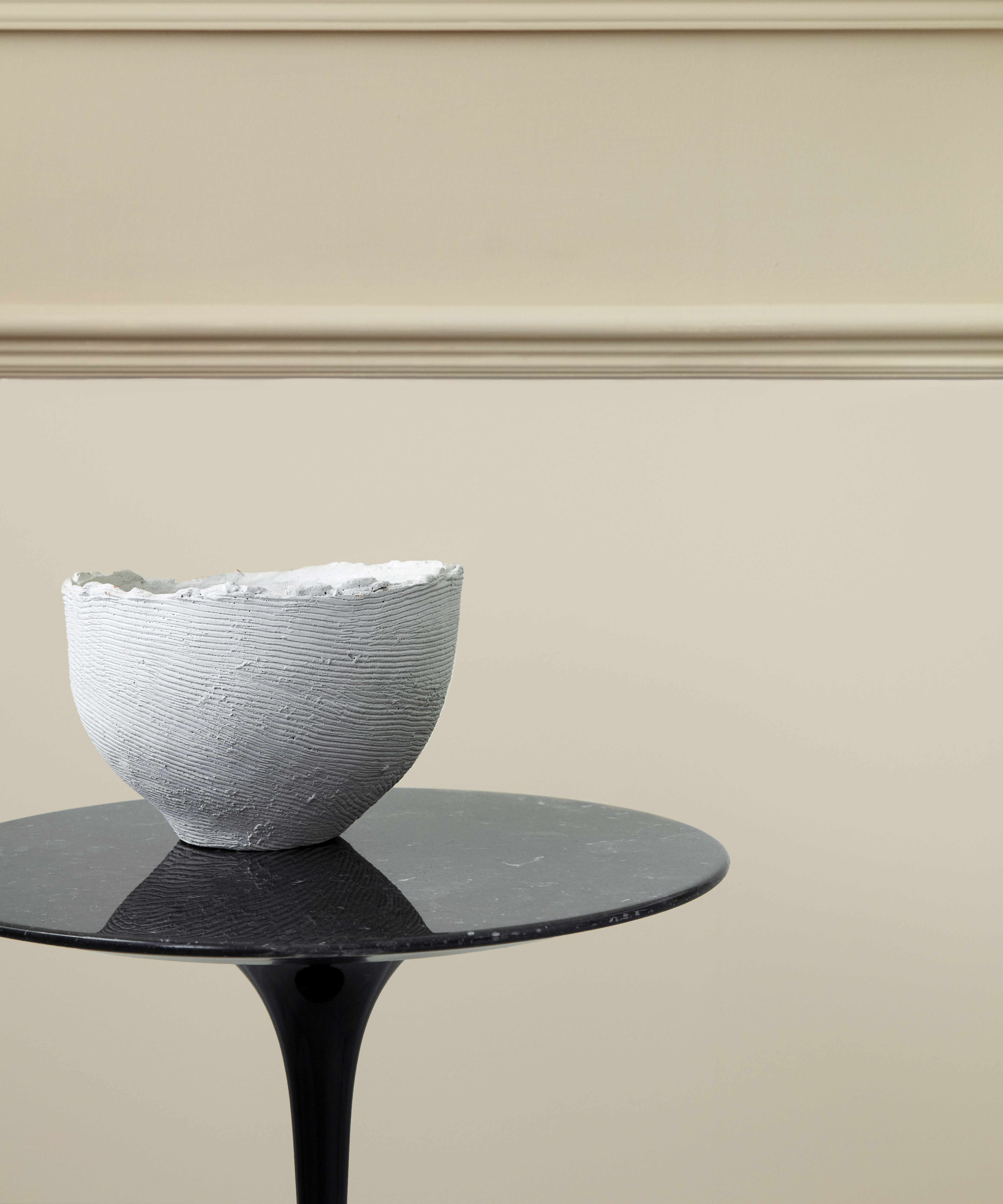
Travertine by Little Greene
‘For continuity and connectivity throughout the home, using shades from the same color family is a good way to add interest in a subtle way. The Little Greene Stone palette is separated into six tonal families, made using the same base pigment but in varying strengths. These groups of colors are a timeless choice if you are looking for soft, neutral tones to provide natural movement throughout the home. They are easy to use in combination on walls, ceiling, and trim as well as providing a seamless color journey from room to room,’ Ruth suggests.
She continues: ‘Pair Travertine with a lighter tone that has the same base pigment such as Travertine Light or Travertine Mid, as whilst you will benefit from a slight change in tone, the overall look will be harmonious. A useful and gentle way to use this system is to change the tone to a lighter or darker version at the turn of a corner in the room, whether that be at a window reveal, a doorway, or a cornice, the effect, at first not recognized by the viewer is a source of harmony and a little intrigue. Or, layer with either soft linens in gentle greens or muted plaids, wool, or bouclé. If you can, incorporate wood and stone surfaces for the ultimate calming and natural scheme.

Megan is the Head of Celebrity Style News at Homes & Gardens, where she leads the celebrity/ news team. She has a history in interior design, travel, and news journalism, having lived and worked in New York, Paris, and, currently, London. Megan has bylines in Livingetc, The Telegraph, and IRK Magazine, and has interviewed the likes of Drew Barrymore, Ayesha Curry, Michelle Keegan, and Tan France, among others. She lives in a London apartment with her antique typewriter and an eclectic espresso cup collection, and dreams of a Kelly Wearstler-designed home.
-
 There's a rustic cottage hiding on Wayfair – it may seem unorthodox, but this tiny home taps into a growing nomadic trend (and it's under $16K)
This 'wonderful' wooden farmhouse perfects a growing trend that's changing how we see our homes – it's tiny, but somehow, it doesn't sacrifice comfort
By Megan Slack
-
 5 freezer cleaning mistakes you must avoid – or risk compromising your food quality and shortening the lifespan of your appliance
Avoid these blunders for a safer kitchen
By Seraphina Di Mizzurati