9 top tips on styling a small space – from Queer Eye’s design expert, Bobby Berk
The Queer Eye design guru shares his style secrets to transform a small space exclusively with H&G
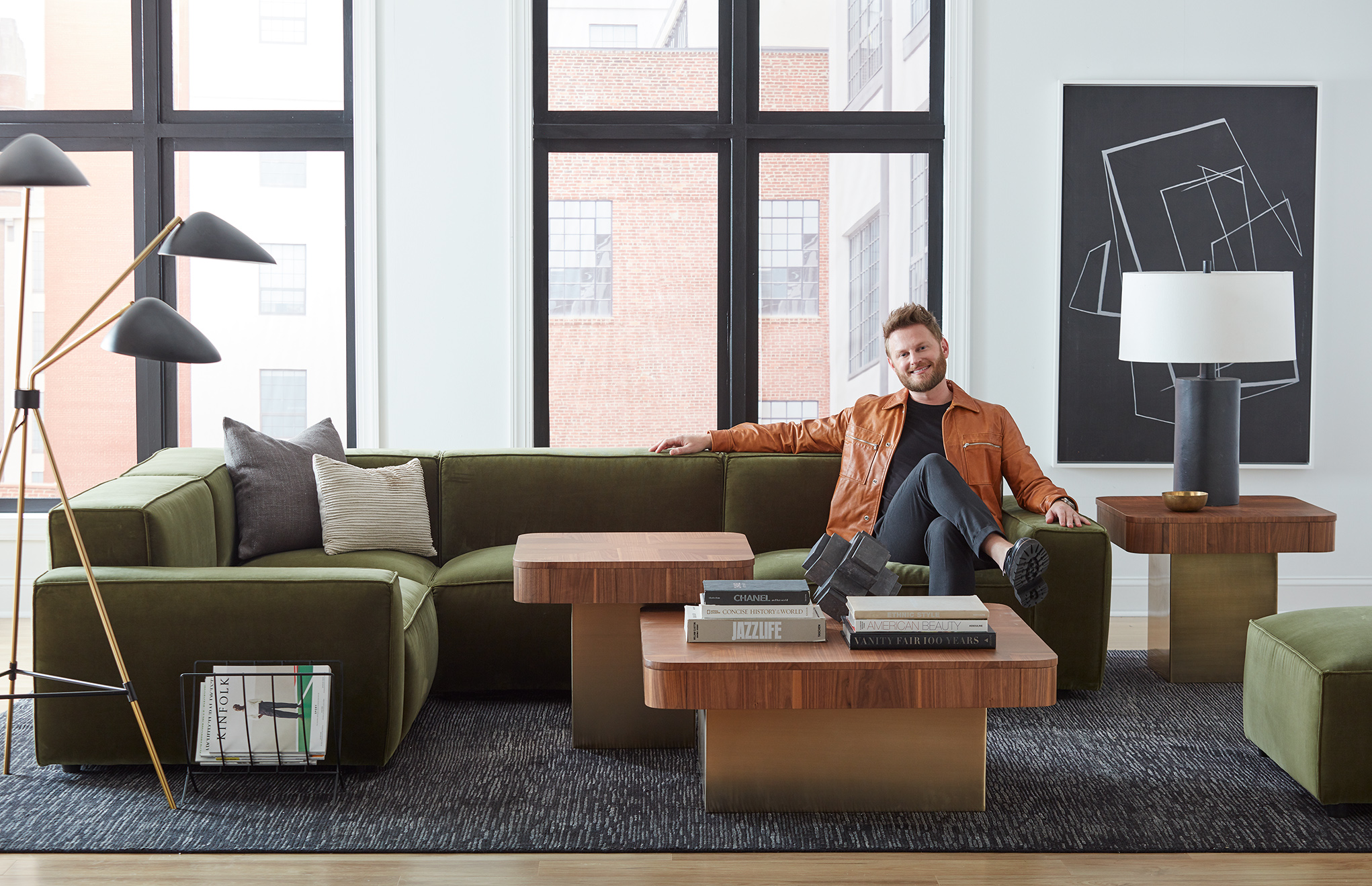
Bobby Berk believes that a happy space creates a happy mind. The Emmy-nominated television personality and host of Netflix’s Queer Eye sat down exclusively with Homes & Gardens to share his best tips for styling a small space.
See: Small living room decor ideas – clever ways to plan and decorate a small space
The 39-year-old interior designer, who is celebrating the launch of his debut furniture collection with A.R.T. Furniture (above and below), says the line honors the evolution of the design styles that have inspired his career.
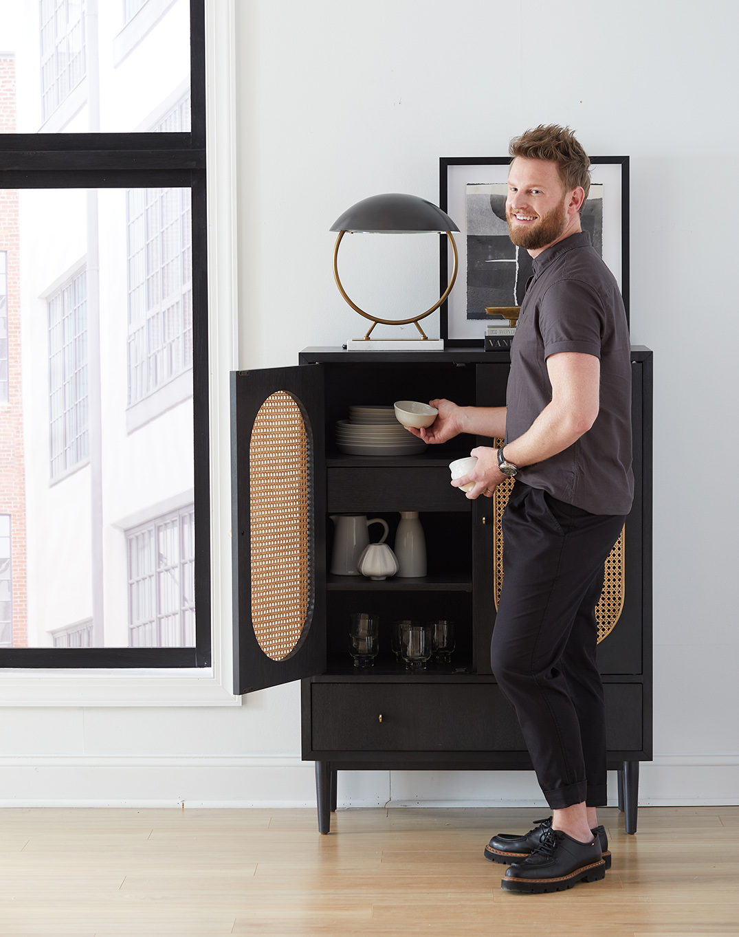
‘From mid-century styling, with an affinity for clean lines and tailored details to Art Deco touches that makes the collection feel playful, it is very much a collection that showcases so much of what I love about design,’ he tells H&G.
The star, who understands the challenges of living and working in a small space, adds that his collection is infused with everyday practicality and personal flair.
‘These are all pieces that I would have in my own home, and I wanted to bring this line to fruition to allow people to bring a little piece of Bobby into their own home,’ he gushes. ‘It is inviting, timely, and each piece in the collection can be mixed and matched to create a unique look together.’
Bobby Berk's tips for styling a small space
Follow his tips on transforming your small space below and check out Bobby's website for more style inspiration.
Sign up to the Homes & Gardens newsletter
Design expertise in your inbox – from inspiring decorating ideas and beautiful celebrity homes to practical gardening advice and shopping round-ups.
1. Go monochromatic
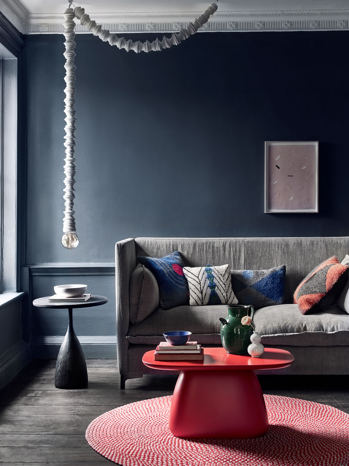
The best-selling author’s first rule for styling a small space? Maintaining a cohesive color palette – and limiting the colors in that palette to three or four.
‘I like to take it one step further and keep it totally monochromatic and tonal,’ he says. ‘That doesn’t mean that it can’t be colorful, but that does mean to stick to a tonal palette, whether that be cool tones like blues and greens, or warmer tones like terracotta, beige, and rusts. By keeping things within the same tonal palette, the space will feel larger and more cohesive, which will allow it to feel less disjointed.’
See: The monochromatic color scheme – ideas and expert advice for creating yours
2. Paint with bold colors
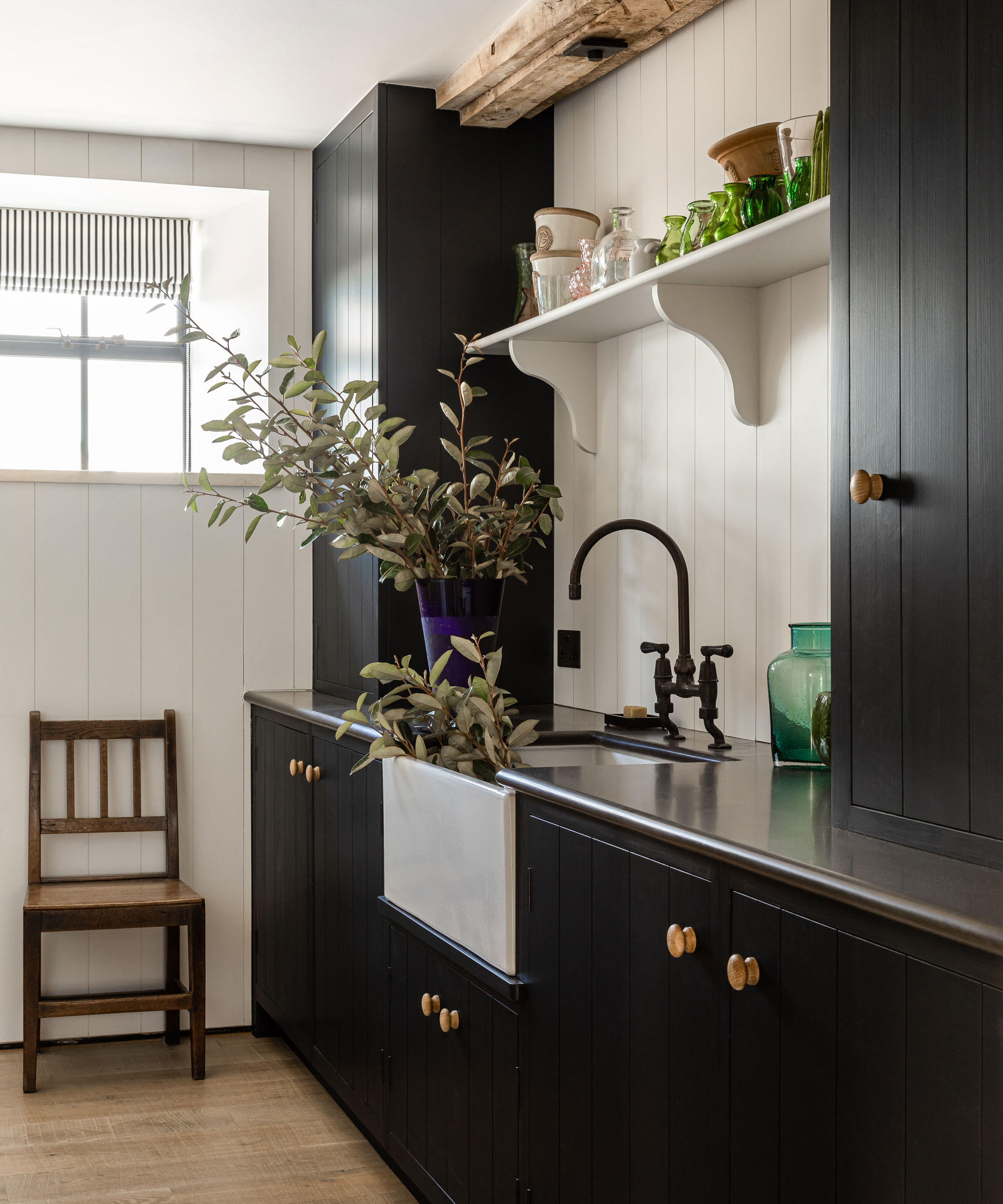
The Texas native dispels the myth that painting a small room in a dark or bold color will make it appear smaller. ‘It can sometimes even make the room appear larger and more dramatic. But there are a few things to pay attention to when going dark in a small space.’
3. Keep it tonal
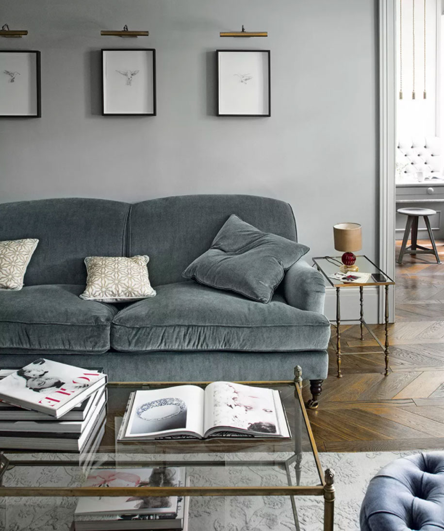
‘If you decide to go dark with your walls then keep things more monochromatic elsewhere. The drama will come in through the dark color on your walls so you don’t need to bring in a lot of other color or pattern,’ says Bobby.
See: Grey living room ideas – inspiring neutral schemes that you'll love for years to come
4. Choose the right paint sheen
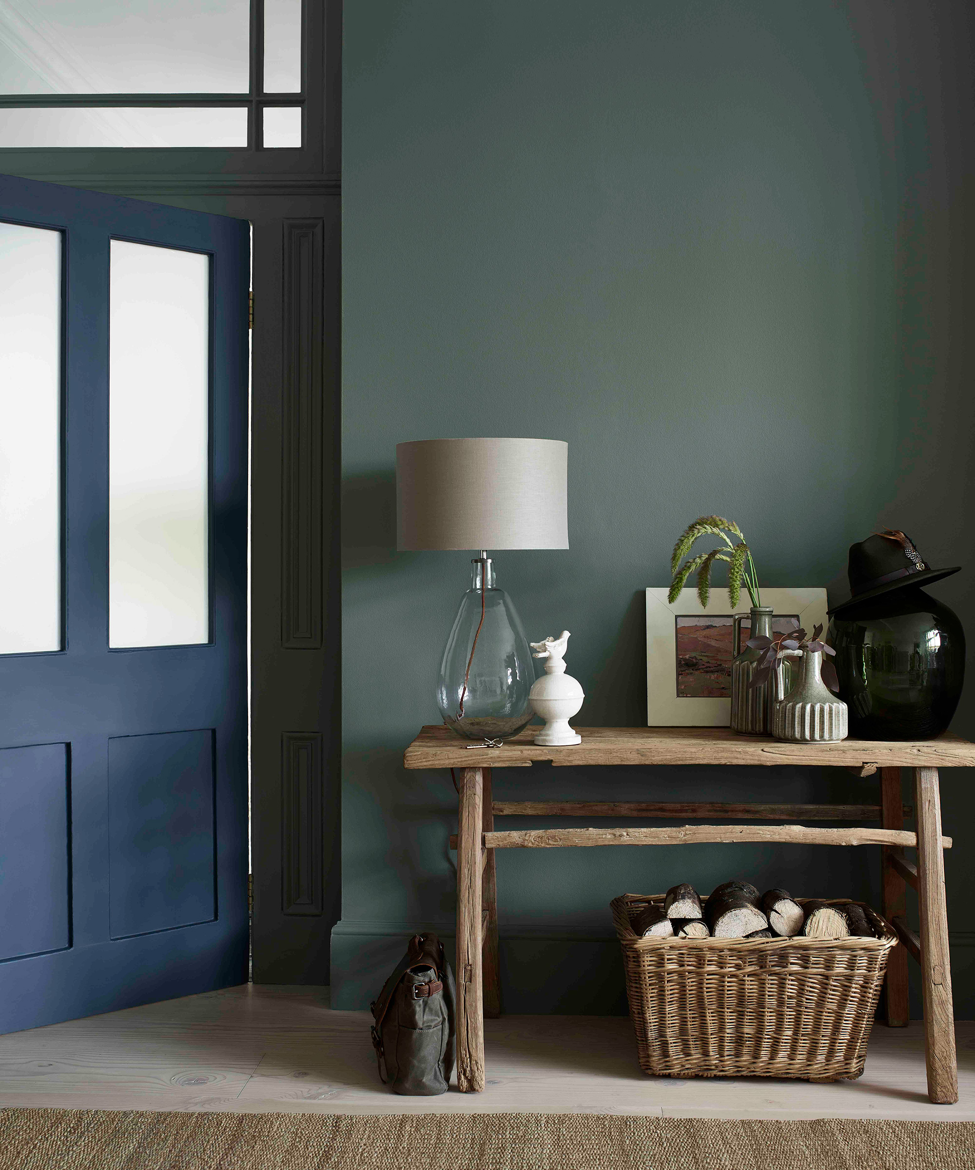
Dulux Heritage Velvet Matt Emulsion, Dulux
Bobby points out that not all paint sheens are created equally or will work for every room. ‘In a smaller space, we usually like to use a matte finish – anywhere from flat to eggshell – the matte finish will help to hide imperfections in the wall which will help the dark color feel more expansive visually.’
5. Pick slim storage
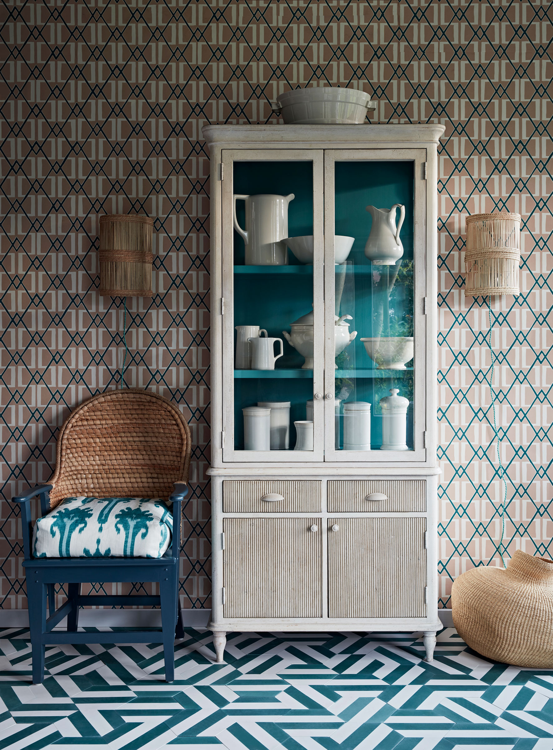
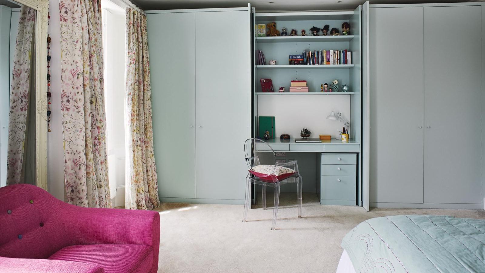
When styling a small space, the television personality says slim is in – especially when it comes to storage. ‘You’ll be amazed at how much you can store in narrow shelving units that tuck right into compact spaces,’ he explains.
‘Slim shelves are perfect for holding cooking supplies in the kitchen and can fit conveniently between a stove and counter.’
The designer also suggests investing in a leaning desk which you can tuck into a corner of a living room or bedroom. ‘They can provide plenty of storage without taking up much space, all while doing double duty as a workspace.’
See: Small kitchen ideas – turn your compact kitchen into a smart, organized space
6. Your bed – reimagined
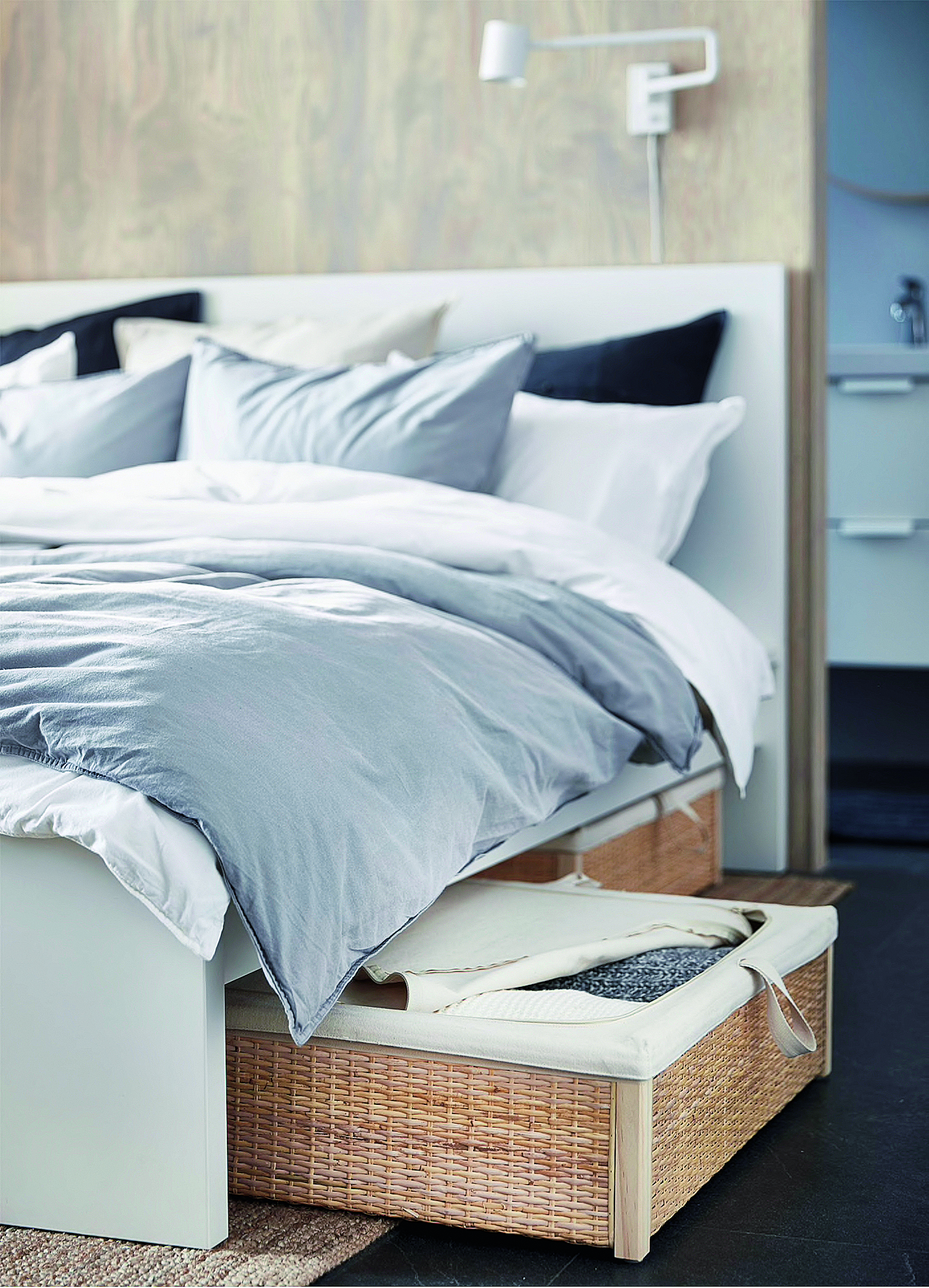
The design guru notes that if you’re short on closets or lacking drawer space, take a second look at the vacant space underneath your bed.
‘It’s the perfect place to look for extra space to keep clothing, shoes, or anything else that needs to be organized. With just a few extra inches below the bed, you can use boxes, bins with easy access lids, and bags to keep things contained.’
See: Small bedroom storage ideas – for a practical, smart and versatile scheme
7. Differentiating between spaces
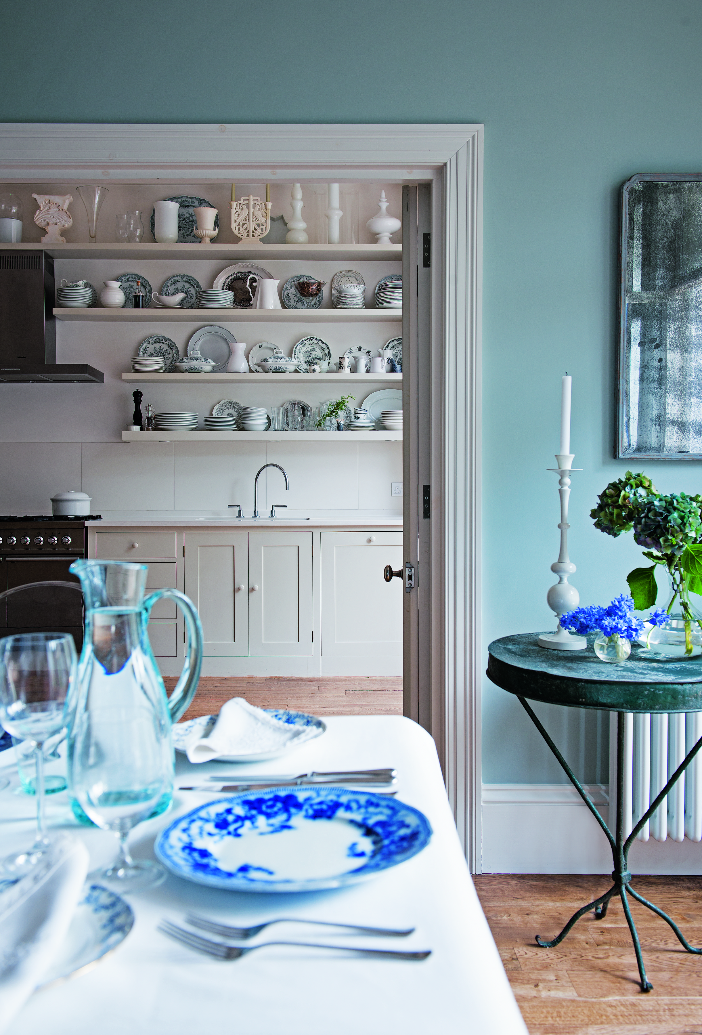
When it comes to a small open-concept space, Bobby notes the importance of creating distinctions between areas to avoid overcrowding.
‘Just because you have a small space doesn’t mean that you have to specifically designate each area visually,’ he explains. ‘It doesn’t need to appear that you have an office in one corner, an eating area in another corner and a bedroom in a separate corner. Let the spaces speak to each other, and you can always use one space for multiple uses.’
8. Mirror, mirror
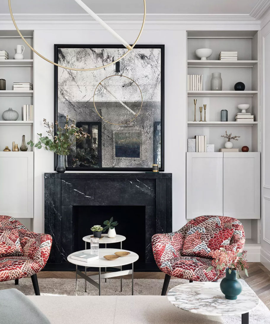
One of Bobby’s favorite tricks to opening up a small space? Incorporating a beautiful mirror to add depth. ‘You don’t need one on every wall, but an oversized floor mirror or decorative hanging mirror in place of art will trick your eye into thinking that there is double the amount of space. It will also bounce the natural light around the room making it appear larger.’
See: Mirror ideas – for brighter, bigger-looking rooms, instantly
9. Light it up
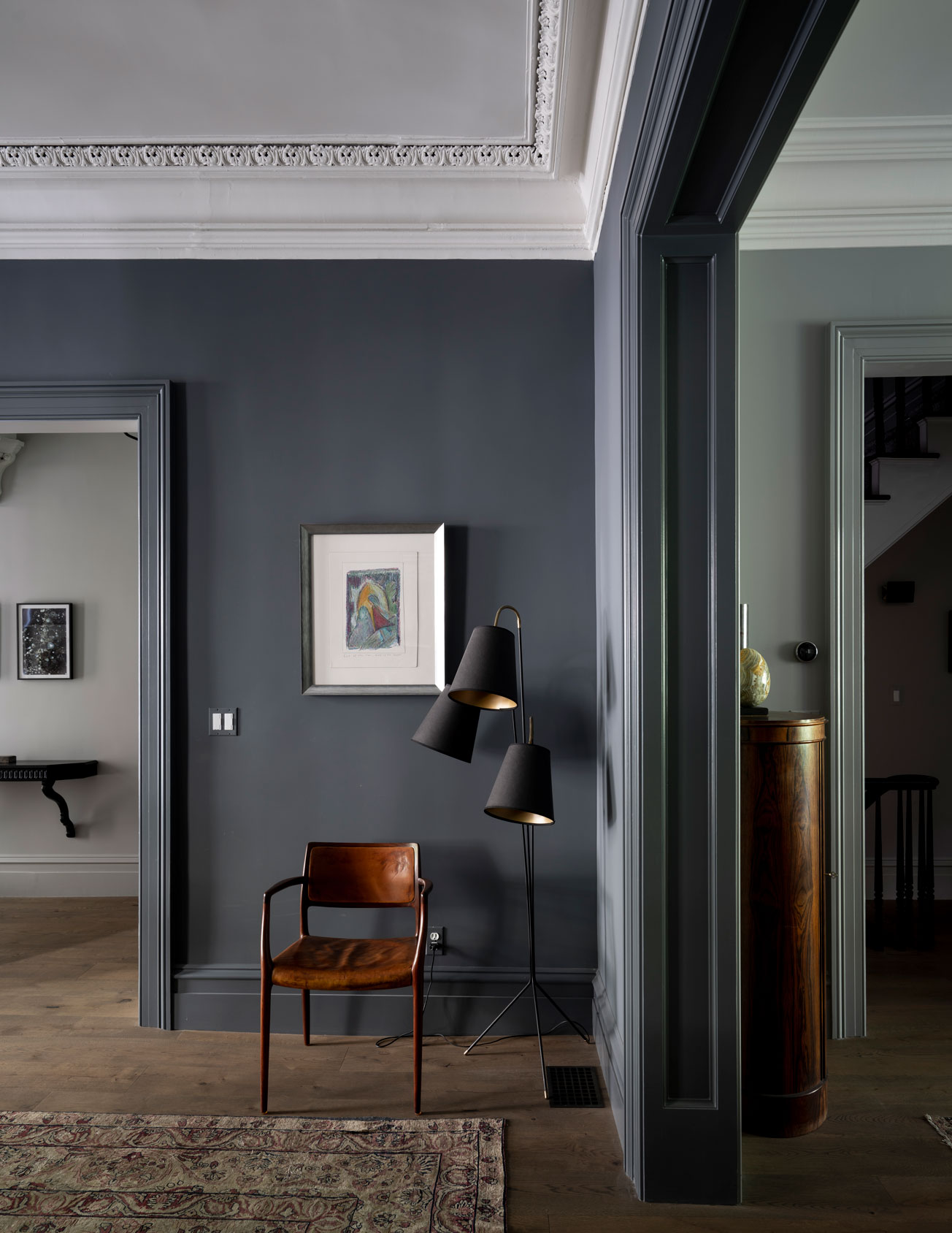
Bobby believes that investing in good lighting is key when creating a scheme for a space.
‘In every room, I like to have three different types of lighting. They typically will consist of “overhead lighting,” which will come from the overhead fixtures you have, “diffused lighting” which can come in through a fabric lampshade or opaque glass shade, and “task lighting” which will come from directional lamps or task lights,’ he explains.
See: Living room lighting ideas – ways to light your living space
‘Once all three are in a room, they not only will illuminate the space to seem lighter and brighter but will add multiple focal points to your room to keep eyes bouncing around so it appears much bigger than it is.’

Marc Lupo is an entertainment writer, producer, and host. In addition to contributing celebrity content to Homes & Gardens, Marc serves as a weekly co-host for iHeart Radio's 'Naughty but Nice' podcast. Throughout his career, Marc has conducted hundreds of interviews with celebrities including Helen Mirren and Hugh Jackman. A native New Yorker, Marc has covered some of entertainment's biggest events, including The Grammys, Met Gala, MTV’s Video Music Awards, VH1’s Trail Blazer Honors and Variety’s Women of Power luncheon.
-
 These are the 6 things designers say you should never put in a small living room
The items that should be banned from a small living room are right here along with what you should opt for instead
By Sarah Warwick
-
 I always get my small space storage from Wayfair – and these discounted $35 stackable Martha Stewart storage boxes are the perfect fix for my tiny vanity
I'm going vertical for tiny space storage success with this Early Way Day 2025 bargain
By Punteha van Terheyden