11 best white paints, chosen by interior designers
From warm hues to bright shades, these white paints are interior designers' most used colors
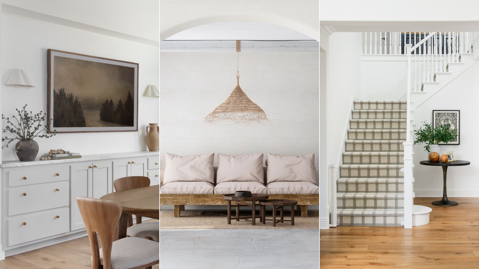
- 1. Simply White by Benjamin Moore
- 2. Alabaster SW 7008 by Sherwin Williams
- 3. Harvest Moon by Backdrop
- 4. Creamy SW 7012 by Sherwin Williams
- 5. White Dove OC-17 by Benjamin Moore
- 6. Ballet White by Sherwin Williams
- 9. Blank Canvas by Behr
- 10. Chantilly Lace OC-65 by Benjamin Moore
- 11. Pure White by Sherwin Williams

White paint is a staple in most interior design styles. Whether you keep things simple with light and airy neutrals or introduce white hues as a base for a more eclectic scheme, every home features a splash of this classic shade somewhere.
But a color in such high demand comes with a lot of shade variations – from warmer hues to different undertones, it can be tricky to find the best white paint color on the market. Whichever room color ideas you are considering, there is a shade of white to complement your color palette, it's simply a case of finding the right match.
Whether you're searching for a warm, soothing shade or something bright and pearly, these are the best white paints according to interior designers, plus how they look in a finished scheme.
Best white paints, chosen by interior designers
Decorating with white paint might sound like an easy project, but it's important to carefully consider which shade you choose. Every white paint features different undertones and finishes, so take inspiration from these spaces created by interior designers to find the perfect hue.
1. Simply White by Benjamin Moore
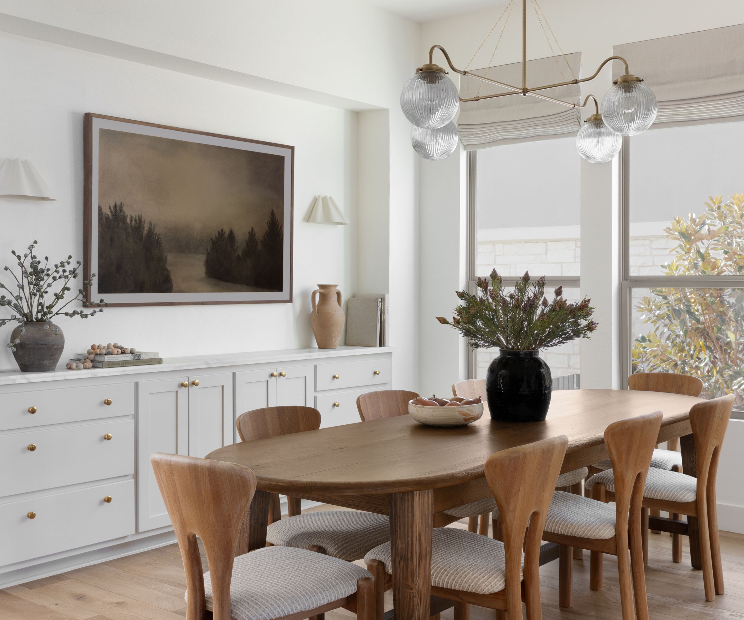
One of the best selling Benjamin Moore paints, Simply White OC-117 proves a favorite amongst interior designers. 'Simply White is a clean, crisp, true white that looks wonderful in any space in a home,' says interior designer Audrey Scheck.
Joan Enger, principal at J Patryce Design, also regularly uses this shade, explaining 'We are big fans of Simply White for the walls in a matte finish. It has the perfect touch of warmth but still feels fresh and modern.'
Not only is Simply White by Benjamin Moore a great color for a balance of warmth and freshness, but it also pairs well with a number of contrasting hues. 'We often pair it with a slightly deeper trim color – Farrow & Ball Pointing is one of our favorites,' Joan adds.
2. Alabaster SW 7008 by Sherwin Williams
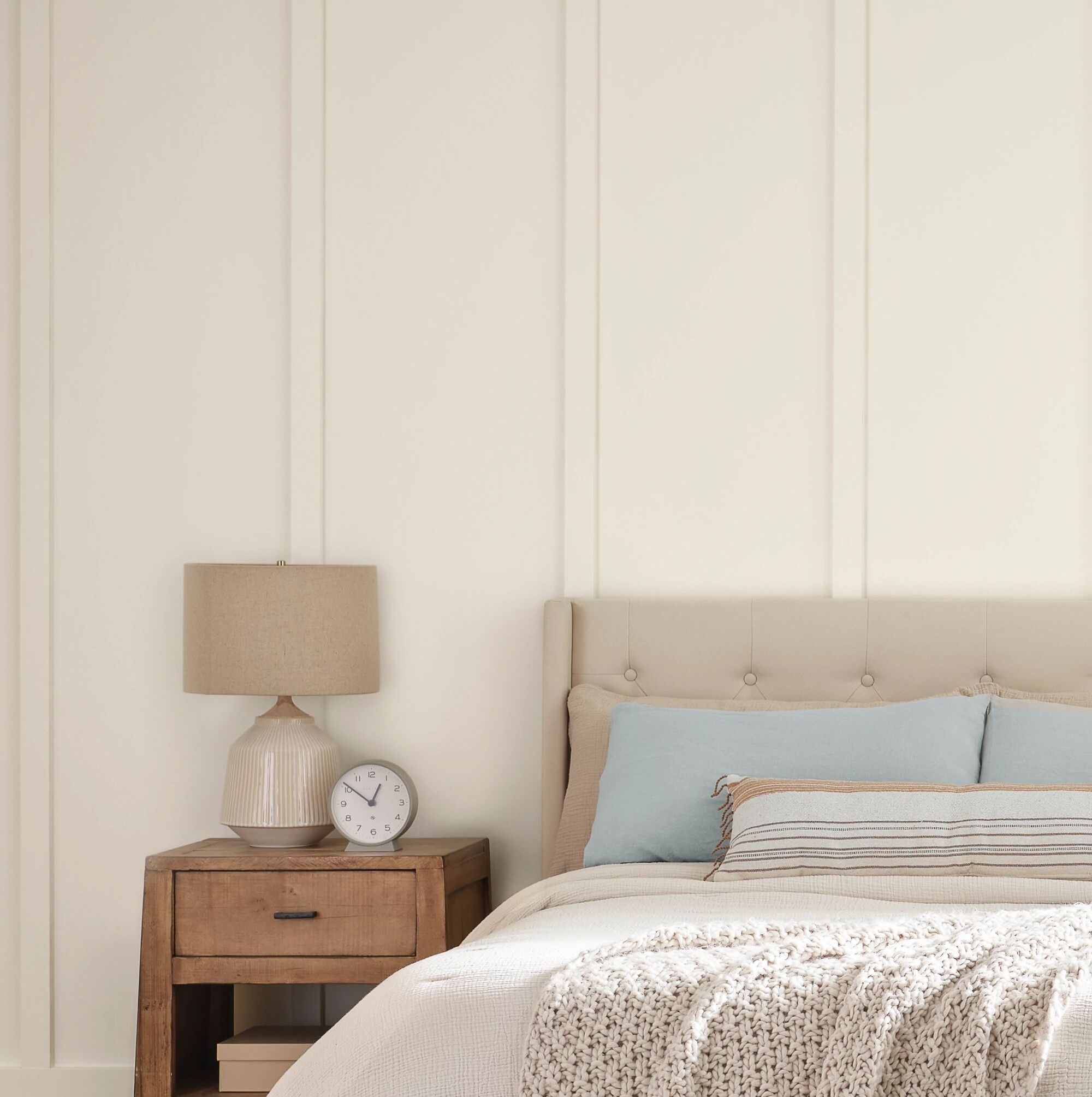
For a white paint color with a warmer, more creamy undertone, look no further than Alabaster SW 7008 by Sherwin Williams. This shade offers a light, airy atmosphere that still feels warm and cozy – perfect for living rooms and bedroom schemes.
'Alabaster is a popular choice for its cream warmth, allowing a gentle and friendly atmosphere with no yellow undertone of some whites. It is good for generating a calm and welcoming environment which tends to make spaces elegant but still cozy,' says Artem Kropovinsky, interior designer and founder at Arsight.
3. Harvest Moon by Backdrop
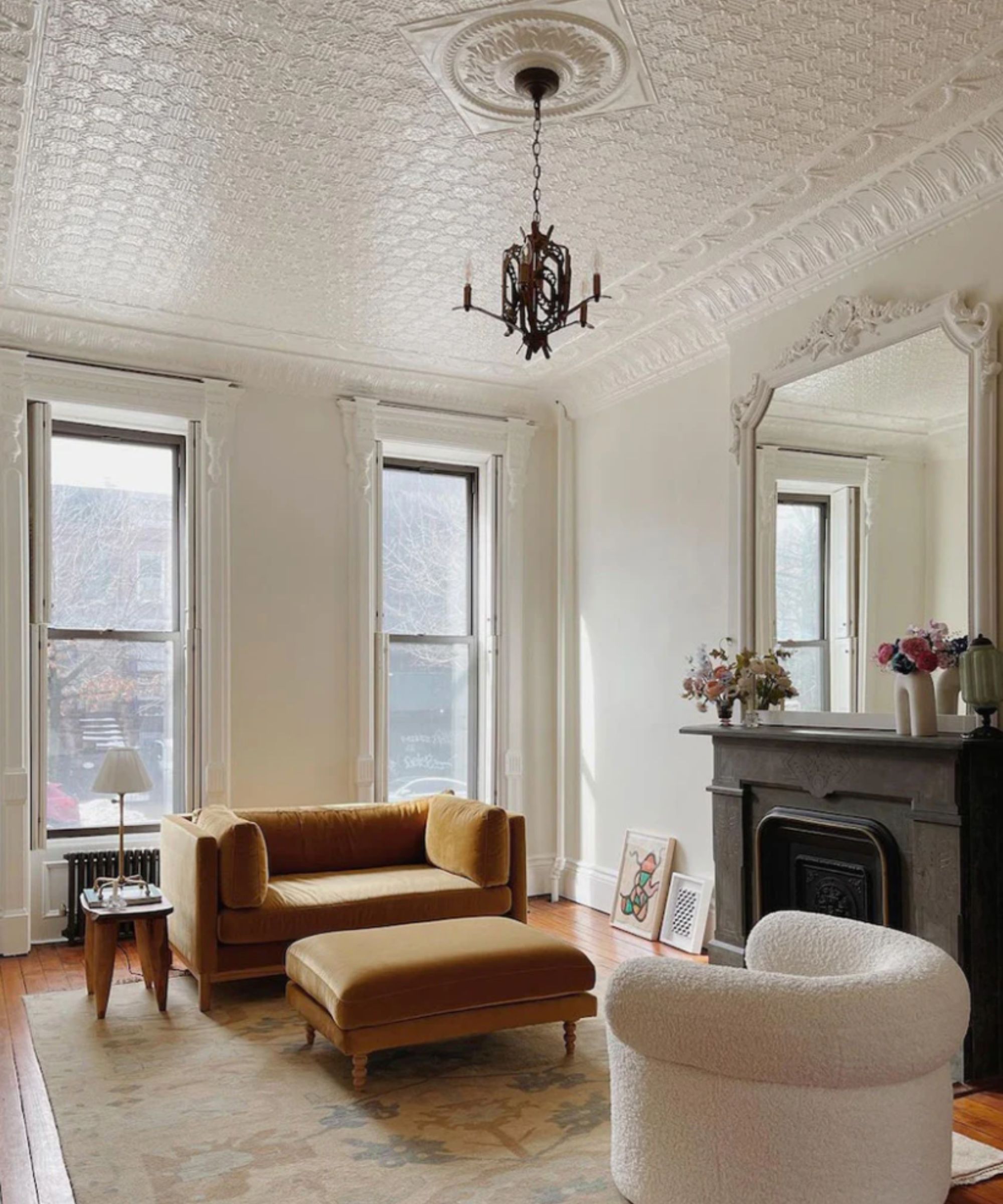
Another white paint color championed for it's warmth without the yellow undertones is Harvest Moon by Backdrop. Described by the brand as 'warm white' and 'semi-matte', it's no wonder this shade is proving popular.
'Our go-to white color for clients is Harvest Moon by Backdrop,' says Kristina Khersonsky, principal at STUDIO KEETA. 'It’s a subtle white that reads soft and warm, without the yellow or blue undertones you can often get with white. Although it reads warm, there is still the crispness to the white,' she adds.
4. Creamy SW 7012 by Sherwin Williams
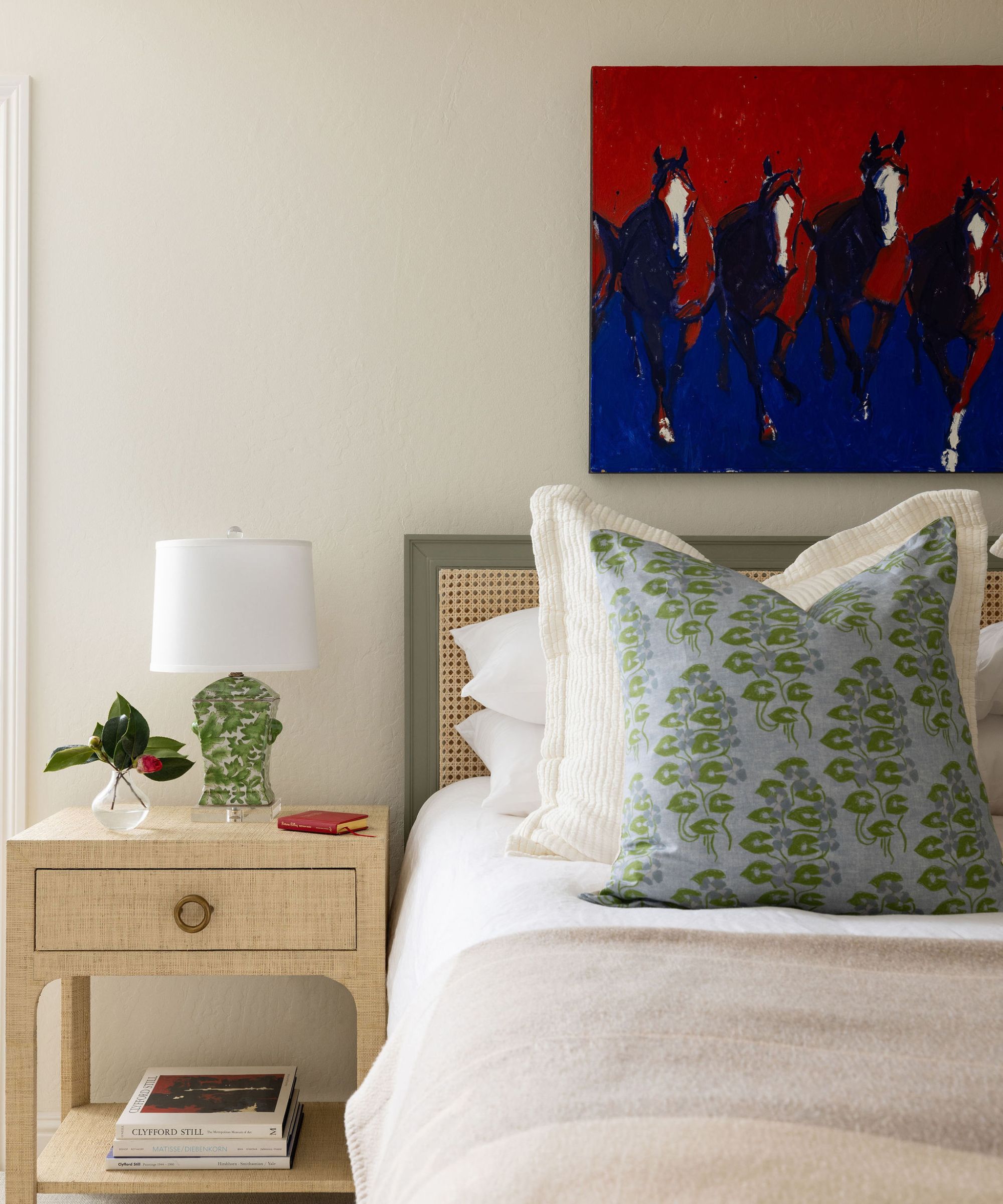
If stark whites aren't your style, Creamy SW 7012 by Sherwin Williams is a lovely alternative. This shade features a very subtle yellow undertone, so it adds warmth without reading yellow in a scheme.
'My current favorite white paint is Creamy by Sherwin Williams. It is a clean, warm white that is not too yellow and adds a brightness to any room,' says interior designer Tama Bell. 'It works in a room with or without natural light. A true neutral game changer that is like adding the sun to any room,' she adds.
This shade works beautifully when paired with other light neutral hues, and offers a wonderful backdrop for antique and vintage furniture. If you're feeling more daring, pair Creamy with more saturated colors such as warm browns or rust reds.
5. White Dove OC-17 by Benjamin Moore
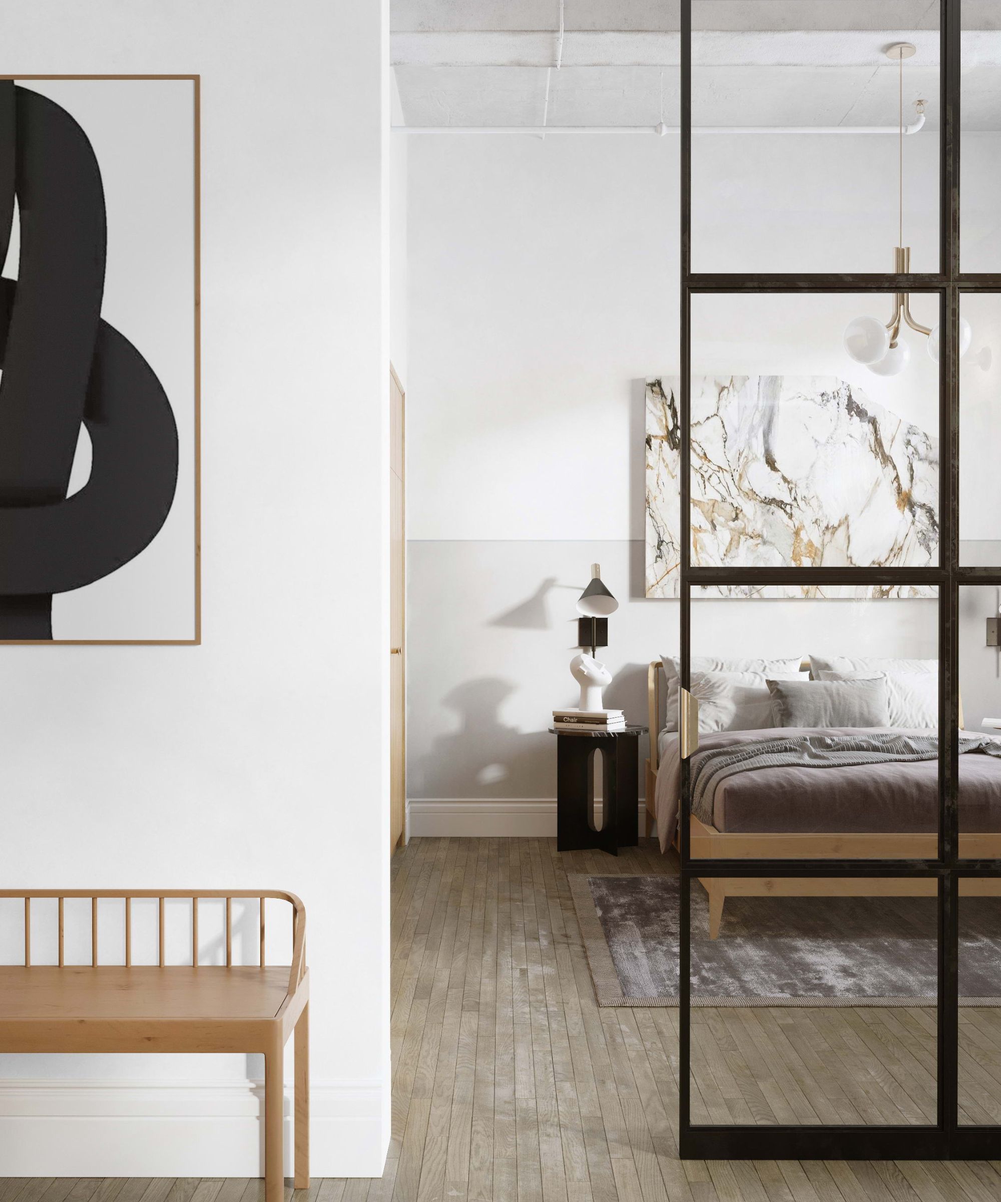
White paint colors come in many different shades and undertones. Warm and creamy hues aren't quite right for every style, but there are some great alternatives, such as White Dove OC-17 by Benjamin Moore, which reads slightly more gray than warm.
'This tone is preferred by many due to its flexibility and gentle heat. It prevents harshness, which is ideal for a warm but well-lit environment. The subtle hint of gray in its shade makes it perfect for both modern and traditional decors, providing the ideal middle ground between warmth and neutrality,' explains Artem Kropovinsky.
6. Ballet White by Sherwin Williams
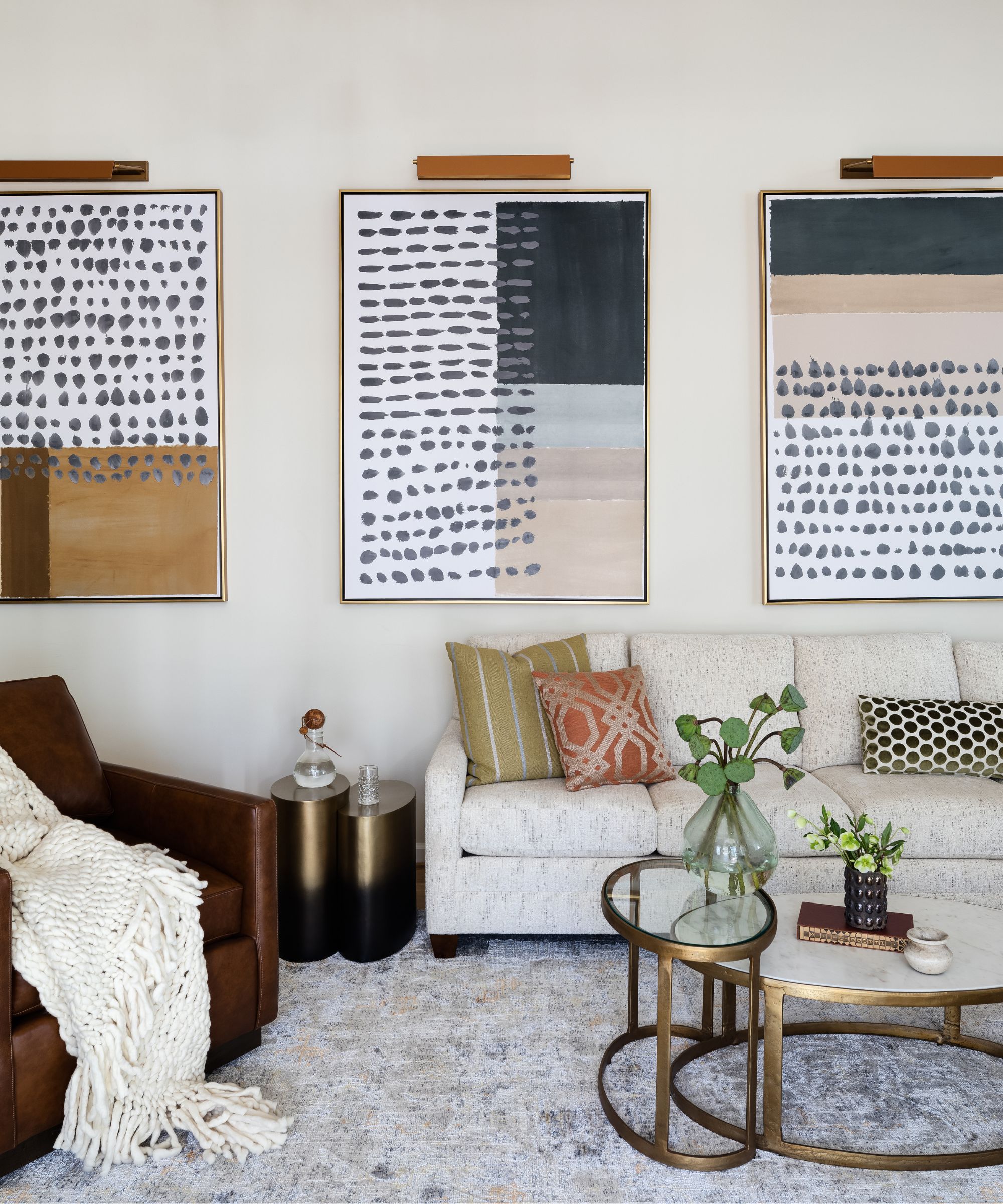
Liz Potarazu, CEO and principal designer at LP + Co, recommends Ballet White OC-9 by Sherwin Williams, a shade that embraces the colors introduced around it.
'It’s an off-white that is a true chameleon. It has a high LRV (light reflectance value), meaning that it will absorb the colors of what’s around it. Green sofa in the room? You might see a hint of a green cast,' she explains.
Although these characteristics are great for anyone creating a space that feels vibrant and eclectic, if you're curating a space that feels simplistic and minimal, this might not be the right hue. 'While it’s a great versatile color for that reason, it’s also something to be aware of if that’s not what you’re going for,' adds Liz.
9. Blank Canvas by Behr
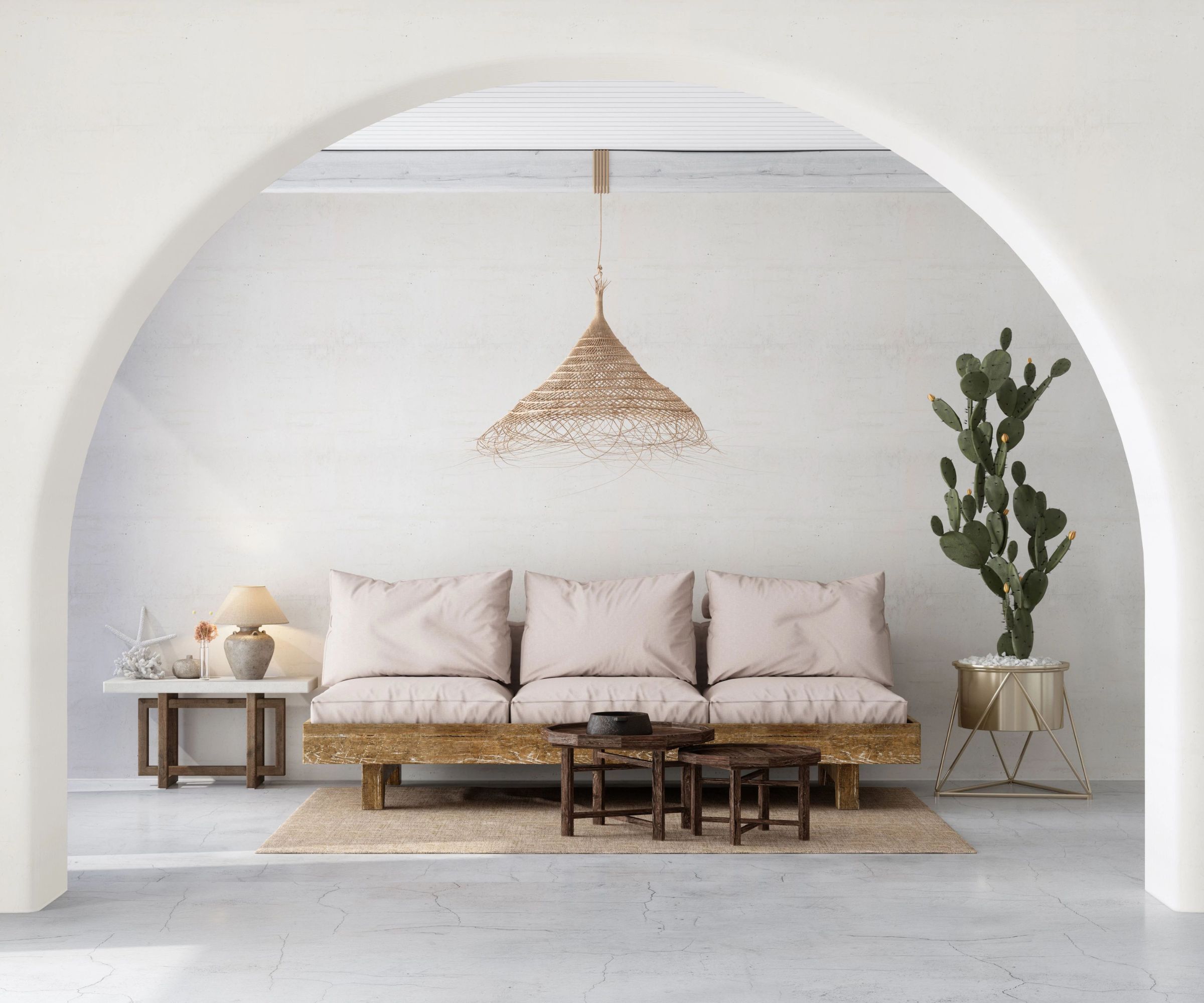
If you're designing a scheme that requires a sense of tranquility and relaxation, Blank Canvas by Behr is an ideal choice. A white paint that feels warm and inviting, this color works beautifully in any room of a home.
'Blank Canvas is a warm white that creates a welcoming and tranquil environment,' explains Erika Woelfel, VP of color and creative services at Behr. 'It is versatile in nature with limitless possibilities within a home ranging from an entryway and kitchen to a bedroom and living room,' she adds.
Blank Canvas pairs wonderfully with other neutral hues and earthy colors, but it also packs a punch when used in combination with darker palettes. 'This timeless neutral pairs nicely with dark, moody hues like Cracked Pepper for high contrast,' says Erika.
10. Chantilly Lace OC-65 by Benjamin Moore
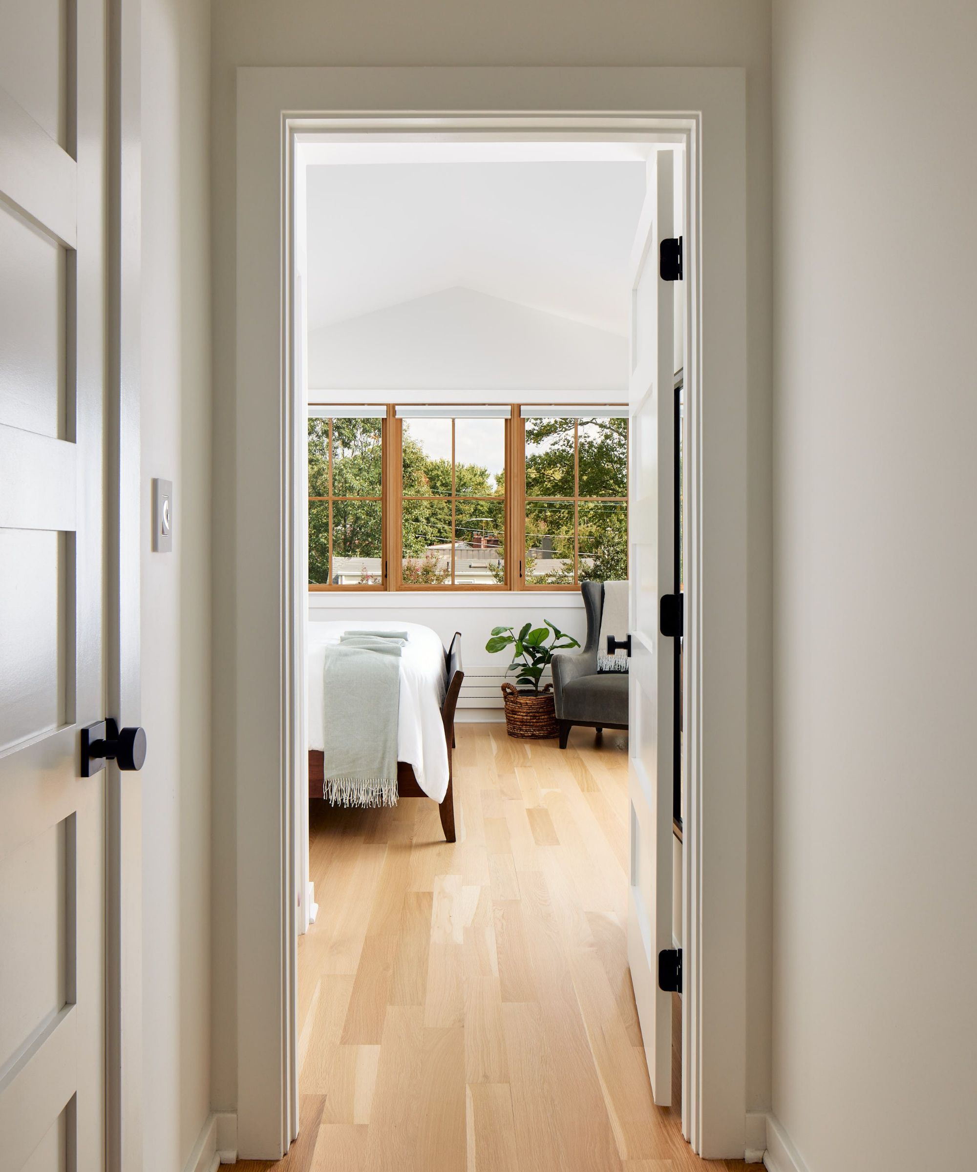
For a bright an uplifting white paint, a number of interior designers suggest using Chantilly Lace OC-65 by Benjamin Moore. 'My top white paint pick would have to be Chantilly Lace. It always keeps rooms looking bright and fresh, without being overwhelmingly stark, which I think most clients are nervous about when we recommend white paint colors,' says Cathleen Gruver, of Gruver Cooley.
Cathleen isn't the only one who favors this hue. Kate Donahue, project designer, and Tatiana Amundsen, architect, at Four Brothers Design + Build, both suggest this white paint color, too. 'It is great for interior trim in semi-gloss. A nice crisp white. I stole this go-to from Kate,' says Tatiana.
Arianna Barone, color marketing manager at Benjamin Moore, describes Chantilly Lace as 'one of our brightest and cleanest white paint colors, Chantilly Lace is a go-to of mine. It works with virtually any hue and creates a fresh, bright note in any color palette. This timeless classic works with any design style and is a quintessential bright white paint color.'
11. Pure White by Sherwin Williams
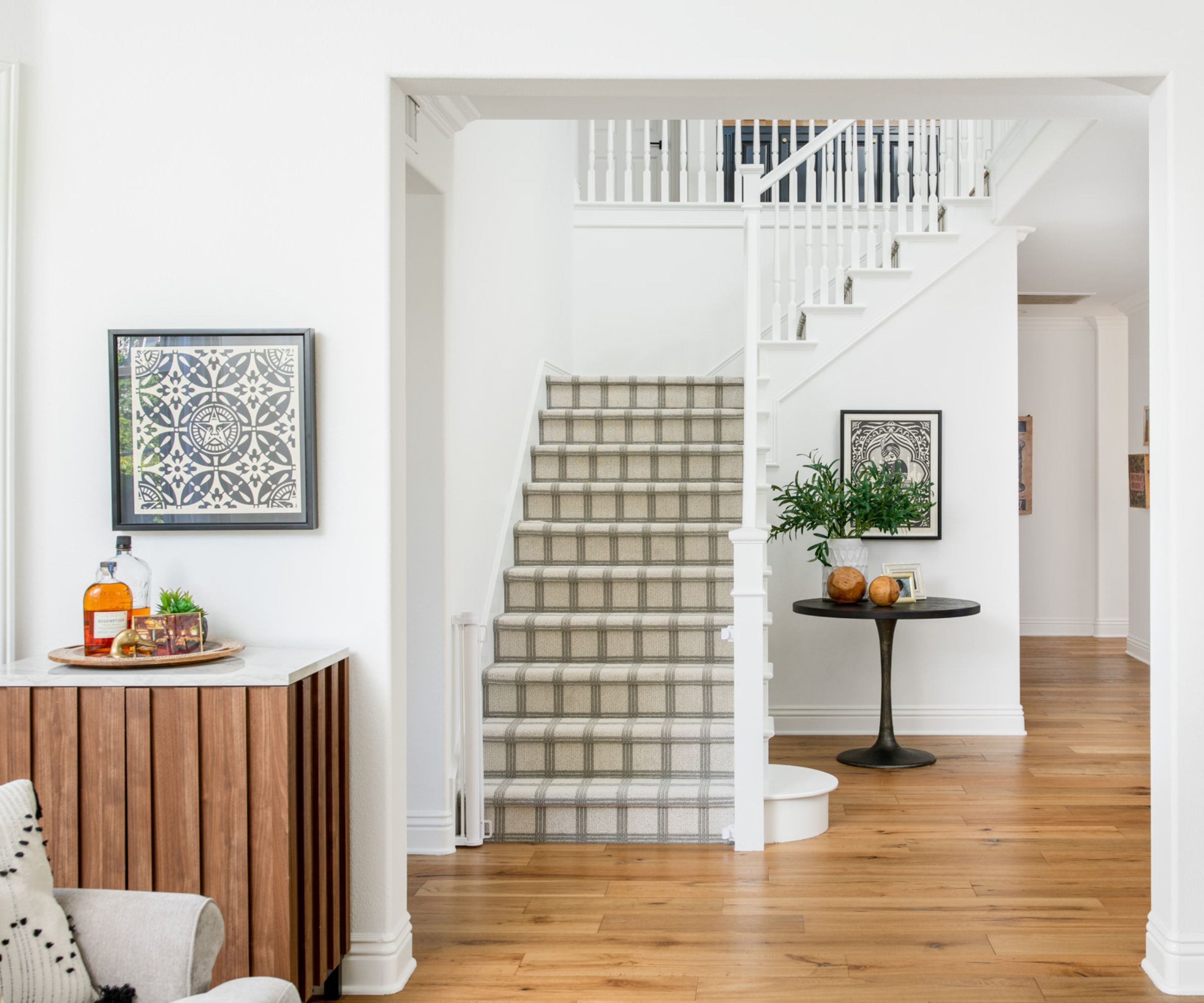
Whether you're decorating a period property or refreshing a contemporary home, Pure White SW 7005 by Sherwin Williams is a bright, versatile color that suits spaces of every style. 'Just like its name, Pure White is a pure and bright white which works well in many architectural styles,' says interior designer Mollie Ranize.
'We have used this color in a number of homes, mainly when the whole home is getting a base coat of crisp, bright white. It looks so clean and bright in modern spaces, but also when used for walls, ceilings, doors and trim in more traditional architecture,' she adds.
White paints come in different hues and carry different undertones, but for interior designers, warm shades are the winner when it comes to their favorites. Warmer neutrals offer an inviting atmosphere and offer a wonderful base for any scheme.
Of course, there is always space for more cool-toned whites, but take inspiration from these hues suggested by the experts – who better to trust than the people who use them every day?
Sign up to the Homes & Gardens newsletter
Design expertise in your inbox – from inspiring decorating ideas and beautiful celebrity homes to practical gardening advice and shopping round-ups.

I’ve worked in the interiors magazine industry for the past five years and joined Homes & Gardens at the beginning of 2024 as the Kitchens & Bathrooms editor. While I love every part of interior design, kitchens and bathrooms are some of the most exciting to design, conceptualize, and write about. There are so many trends, materials, colors, and playful decor elements to explore and experiment with.
-
 Nectar vs Layla – which mattress brand is best on test?
I've set the Nectar Premier Hybrid Mattress and the Layla Hybrid Mattress head to head to help you work out which mattress meets your needs
By Emilia Hitching Published
-
 Barack and Michelle Obama's neutral accent chair is the perfect living room focal point – you can recreate their serene style in any-sized home
This designer-approved essential fits into every modern living room – it's beautiful enough to stand alone, while pairing well with your favorite cushion
By Megan Slack Published