REVEALED: The Benjamin Moore Color of the Year 2021 – plus how to use it
Need some new decor inspiration? The Benjamin Moore Color of the Year 2021 has just been announced, together with a host of hot trends to see us through to next year and beyond
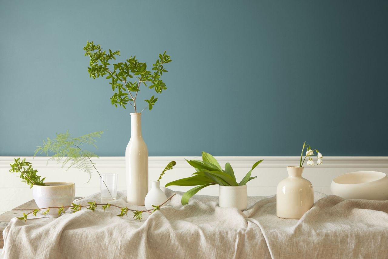

Introducing the fresh and delectable Aegean Teal, the Benjamin Moore Color of the Year for 2021. A warm blue-green with gray undertones, it has a unique quality wherein it lends a fresh, crisp feel to a scheme, while simultaneously creating a relaxed and soothing atmosphere - exactly what we need in the current challenging climate.
Keep reading to find out how to use this shade. And learn more about the color wheel – and how to use color in your home in our dedicated guide.
The Benjamin Moore Color of the Year 2021
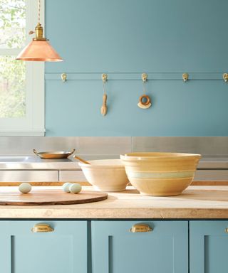
Aegean Teal 2136-40 as it is officially known was selected for its ability to add balance and calm to spaces, whether used on cabinetry, walls or woodwork.
Helen Shaw from Benjamin Moore says: 'As we spend more time at home, it’s important to create a space that feels warm and welcoming. This year's Color of the Year is a balanced and soothing hue, softened with a touch of gray to create spaces with a casual elegance.'
Aegean Teal teams beautifully with neutrals, like warm beiges and soft cream hues, while the gray undertones ensure spaces retain a sophisticated and super smart feel. The amount of natural light it receives will change the color, too, switching from a fresh, cool hue in bright light to a richer, muted blue-toned gray in moodier spaces.
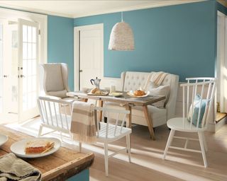
Alongside Aegean Teal, the brand has announced its Color Trends for 2021 - must-have hues for every home for this season and beyond.
Together, the twelve colors range from earthy tones to rich neutrals, aim to create a space that promotes relaxation, yet one that still retains a fresh and vibrant atmosphere.
Sign up to the Homes & Gardens newsletter
Design expertise in your inbox – from inspiring decorating ideas and beautiful celebrity homes to practical gardening advice and shopping round-ups.
'Our homes are a space of flexibility and multifunctionality and this palette correlates to that, ' continues Helen. 'On the warmer side of the color wheel, the twelve colors have an organic synergy and are reminiscent of faded rumpled linen sheets in the morning and perfectly ripened fruits on the windowsill. These are colors that make your home feel even more like home, so settle in and connect.'
The Benjamin Moore Color Trends for 2021 are:
Aegean Teal 2136-40 - a fresh blue-green hue
Atrium White OC-145 - a cool, serene off-white
Muslin OC-12 - a fresh natural linen tone
Foggy Morning 2106-70 - a pink-toned neutral
Rosy Peach 2089-20 - a yellow-toned blush color
Beacon Hill Damask HC-2 - an elegant, stately pale yellow
Potters Clay 1221 / CC-360 - a rich, orangey terracotta hue
Chestertown Buff HC-9 - a muted mustard yellow shade
Amazon Soil 2115-30 - a deep purple hue with black undertones
Gray Cashmere 2138-60 - a blue toned, pale gray hue
Kingsport Grey HC-86 - a nutty brown-toned gray shade
Silhouette AF-655 - a rich sultry gray, with red undertones
How to use the Benjamin Moore colors in your home
This season, be inspired to introduce the Benjamin Moore colors 2021 to your scheme
1. Make a great entrance
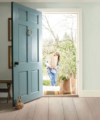
Door in Aegean Teal 2036-40 Aura Grand Entrance Satin; walls in Gray Cashmere 2138-60 Aura Eggshell; trim in Atrium White OC-145 Aura Semi-Gloss, all Benjamin Moore
An easy project and an instant home pick-me-up, painting your front door in a new color like Aegean Teal is the perfect way to ring the decor changes. Don't forget to give your hallway walls and woodwork a fresh coat of paint too so that the new door doesn't upstage the rest of the space.
- Find more easy paint ideas in our inspiring gallery
2. Add a dramatic backdrop
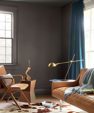
Walls in Silhouette AF-655 Aura matte; trim in Silhouette AF-655 and Atrium White OC-145 Aura Semi-Gloss, all Benjamin Moore
Silhouette is a super cosy rich brown with deep red undertones, that creates a cosy, matt effect when wrapped around a room on both walls and woodwork. Brighter shades of orange, red, yellow or green pop against a rich background like this, creating an elegant yet vibrant scheme.
3. Bring warmth to a neutral scheme
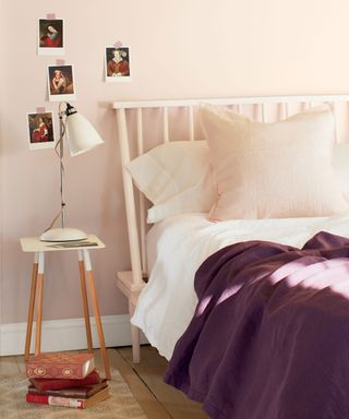
Walls in Foggy Morning 2106-70 Ben Eggshell; trim in Atrium White OC-145 Ben Semi-Gloss, both Benjamin Moore
Warm pink-toned neutrals like Foggy Morning will add a warmth to a pared-back space. Team the look with soft textiles in crisp whites and deep eggplant shades to add a layer of freshness and depth to a simple scheme.
4. Give your hallway a warm welcome
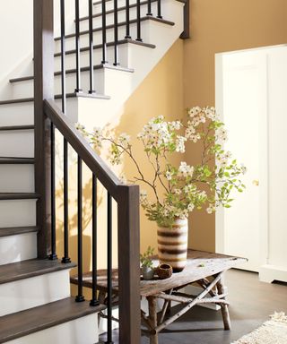
Walls in Chestertown Buff HC-9 Aura Eggshell; stairs and trim in Atrium White OC-145 Advance Satin, both Benjamin Moore
The rich maize hue of Chestertown Buff on a hallway wall provides a warm and sunny welcome to anyone who visits. Teamed with stair balustrades in a deep walnut wood shade and trims in crisp Atrium White, this color combination is a classic win.
- Find out how to decorate a staircase in our guide
5. Try color in unexpected places
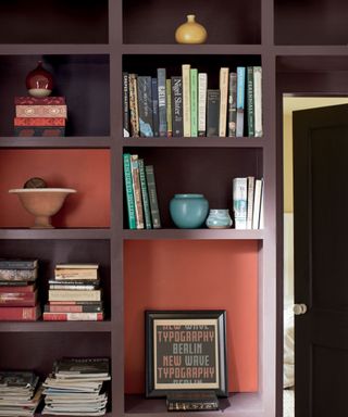
Bookcase in Amazon Soil 2115-30 Advance matte; insets in Rosy Peach 2089-20 Aura Matte, both Benjamin Moore
The deep baked mauve of Amazon Soil provides an excellent base on which to let brightly colored books, keepsakes and ornaments shine. The unexpected pop of contrasting color from Rosy Peach creates an eye-catching effect that can't help but make you smile.

Ginevra Benedetti is Associate Editor on the Homes Content Team at Future. She has been writing about interiors for the past 16 years on the majority of Britain’s monthly interiors titles, such as Ideal Home, Country Homes & Interiors and Style at Home, as well as Livingetc and of course, Homes & Gardens. This naturally lead her into writing for websites like HomesandGardens.com.
-
 Martha Stewart's multi-functional basement proves this room shouldn't be an afterthought – it's one of the most important spaces in her home
Martha's Bedford farmhouse features the most unconventional basement I've ever seen – it's stylish enough to reshape what I knew about this space
By Megan Slack Published
-
 You can't deny it any longer, retro bathrooms have made a comeback – and these 7 chic yet characterful ideas are a lesson in how to get the look right
Add a dose of vintage nostalgia to your space with these retro bathroom ideas
By Molly Malsom Published