Andrew Martin and Sophie Paterson collaborate on an inspired new collection
Introducing Brindisi and Salento, the first collaboration between Andrew Martin and Sophie Paterson Interiors, inspired by the glorious landscapes of Puglia


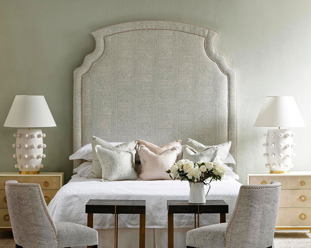
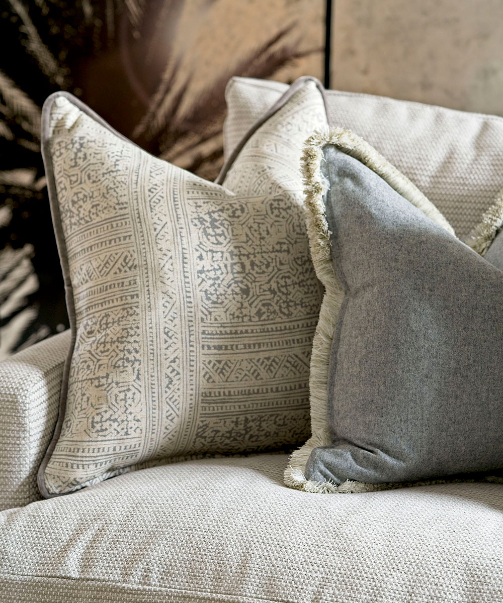
Taking inspiration from the picturesque town of Brindisi and Salento in Puglia, the first collection from Andrew Martin and Sophie Paterson features 34 neutrally coloured cushions, framed with luxurious trims and fringing.
- See: Interior design tips – decorating secrets for the world's top experts

The Brindisi collection is complemented by the Salento range of fabrics, featuring weaves and sumptuous printed velvets. Reminiscent of the delicate beauty and grace of the Adriatic Coast the colors have been chosen to mirror weathered limestone buildings, freshly baked focaccia and dusty olive groves, the collection’s use of earthy and sandy tones is elegantly complemented by accent colors of tan, celadon and dusty pink.

The collection has been designed with tranquility, relaxation and elegance in mind, and it really shines through. The neutral colour palette is sublime, and will go with any existing colour palettes, whether classic or contemporary.
Further inspiration has been taken from the Romanesque essence of the Brindisi old town and reflected in the use of textured weaves and velvet to reflect the unique architecture. Founder of Andrew Martin, Martin Waller says of the collection, 'drawing inspiration from the rustic charm of southern Italy, the collaboration mixes Andrew Martin’s adventurous traveller spirit, with the cool elegance and effortless sophistication of Sophie Paterson Interiors.'

See: Sophie Paterson shows us how to use grey in our interiors
Combining elegant and sun-soaked colours with bold gritty patterns, was key to the collection as Sophie Paterson, founder of Sophie Paterson Interiors explains, 'It was important to me that the cushion designs and palettes could be combined and would work well together. In terms of styling I would suggest creating an asymmetric arrangement of cushions to accessories a large sofa, using texture to contrast the more neutral prints.'
Andrew Martin, andrewmartin.co.uk
Sign up to the Homes & Gardens newsletter
Design expertise in your inbox – from inspiring decorating ideas and beautiful celebrity homes to practical gardening advice and shopping round-ups.

Jennifer is the Digital Editor at Homes & Gardens. Having worked in the interiors industry for several years in both the US and UK, spanning many publications, she now hones her digital prowess on the 'best interiors website' in the world. Multi-skilled, Jennifer has worked in PR and marketing and occasionally dabbles in the social media, commercial, and the e-commerce space. Over the years, she has written about every area of the home, from compiling houses designed by some of the best interior designers in the world to sourcing celebrity homes, reviewing appliances, and even writing a few news stories or two.
-
 5 times you should never paint a room gray – no matter how timeless you think this shade is
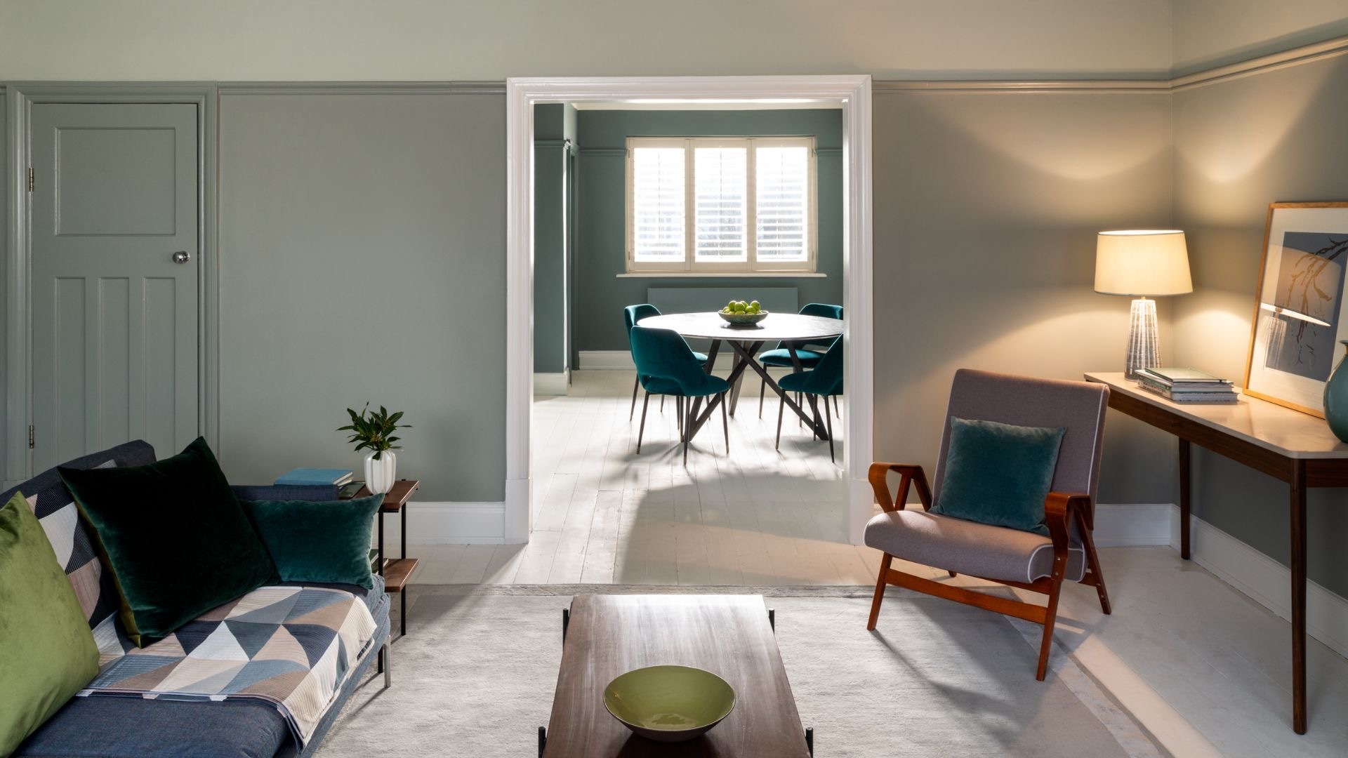
It might be dubbed a classic neutral, but gray isn't the right choice for every room
By Sophia Pouget de St Victor
-
 These 7 plants will excel and be pest-free next to rosemary – discover the best companion plants, plus what to keep away
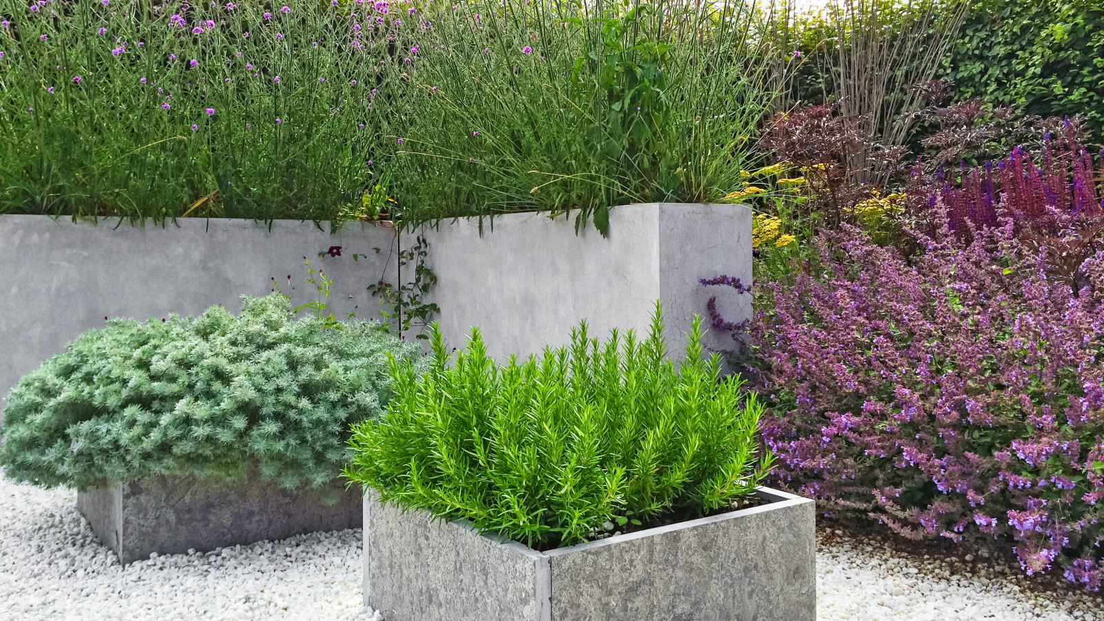
Rosemary companion planting keeps plants thriving, deters pests, and can even improve the taste of some crops
By Drew Swainston