13 interior design mistakes to avoid – and how to correct them, from a designer to the super-rich
Interior designer and architect Peter Sheehan has designed homes for multi-millionaires. Here, he shares the design secrets he uses, no matter how big – or small – the budget
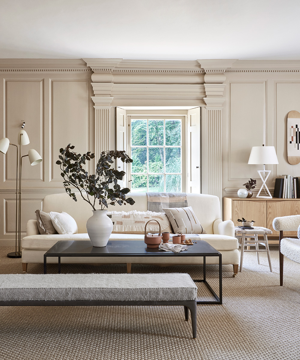

Architectural designer and owner of Spears-nominated prime property buying agency The London Resolution, Peter Sheehan works with the rich and famous to create beautiful homes. And he has let the Homes & Gardens team into a secret: he uses the same interior design tricks for billionaires as he does for those of us with a more... ahem... modest budget.
Better still? He's agreed to share his interior design tips with us here. The homes Peter has designed vary from one-bedroom apartments to opulent listed mansions, ski chalets, continental villas, city penthouses and far-flung estates. As a result, he knows a thing or two about how to use architecture and interior design to create timeless style revered by all.
Peter says: 'It is important that people understand that design is not just for people who can afford it. Good design can, and is, tailored to any person's budget. With a few pointers, people can start to see the potential of a room differently and be able to bring out their creative design flair with style.' Peter points out there are a number of common, but easily made, mistakes to avoid too.
We were intrigued – and we think you will be too.
1. Think of yourself as a stylist and your home as a classy, older lady!
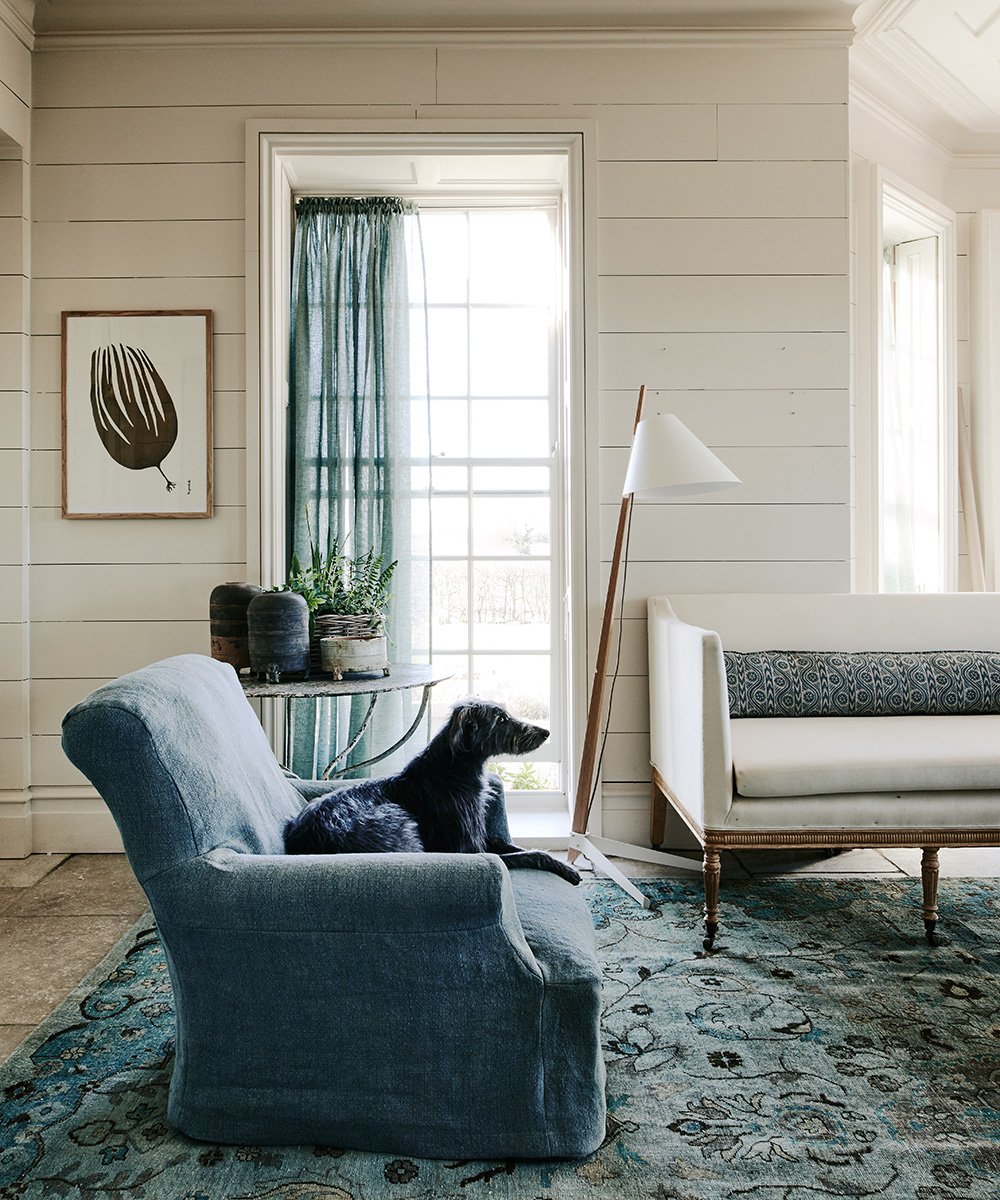
This is Peter’s number one rule. You wouldn’t dress an older woman in the same fads and fashions as you would a teenager, he says, so, in styling your home as you would a mature woman, you can ignore the whims of the fashion world and use long-lasting classic pieces and neutral colors.
Similarly to clothes fashion, he continues, you can use fashionable and trendy accessories in the form of soft furnishings such as cushions, lighting, rugs and bed covers. These are the pieces you can easily update to match changing fashions and inject punches of color and fun.
2. Neutrals don't need to be boring

When professionals advise the use of neutrals as a main colour, you don’t need to roll your eyes in exasperation! Neutrals create the perfect backdrop for the statement pieces to take the main stage. Neutrals are the canvas on which you can have fun with colors, patterns and textures, asserts Peter.
Sign up to the Homes & Gardens newsletter
Design expertise in your inbox – from inspiring decorating ideas and beautiful celebrity homes to practical gardening advice and shopping round-ups.
3. Make your home's structure the focus
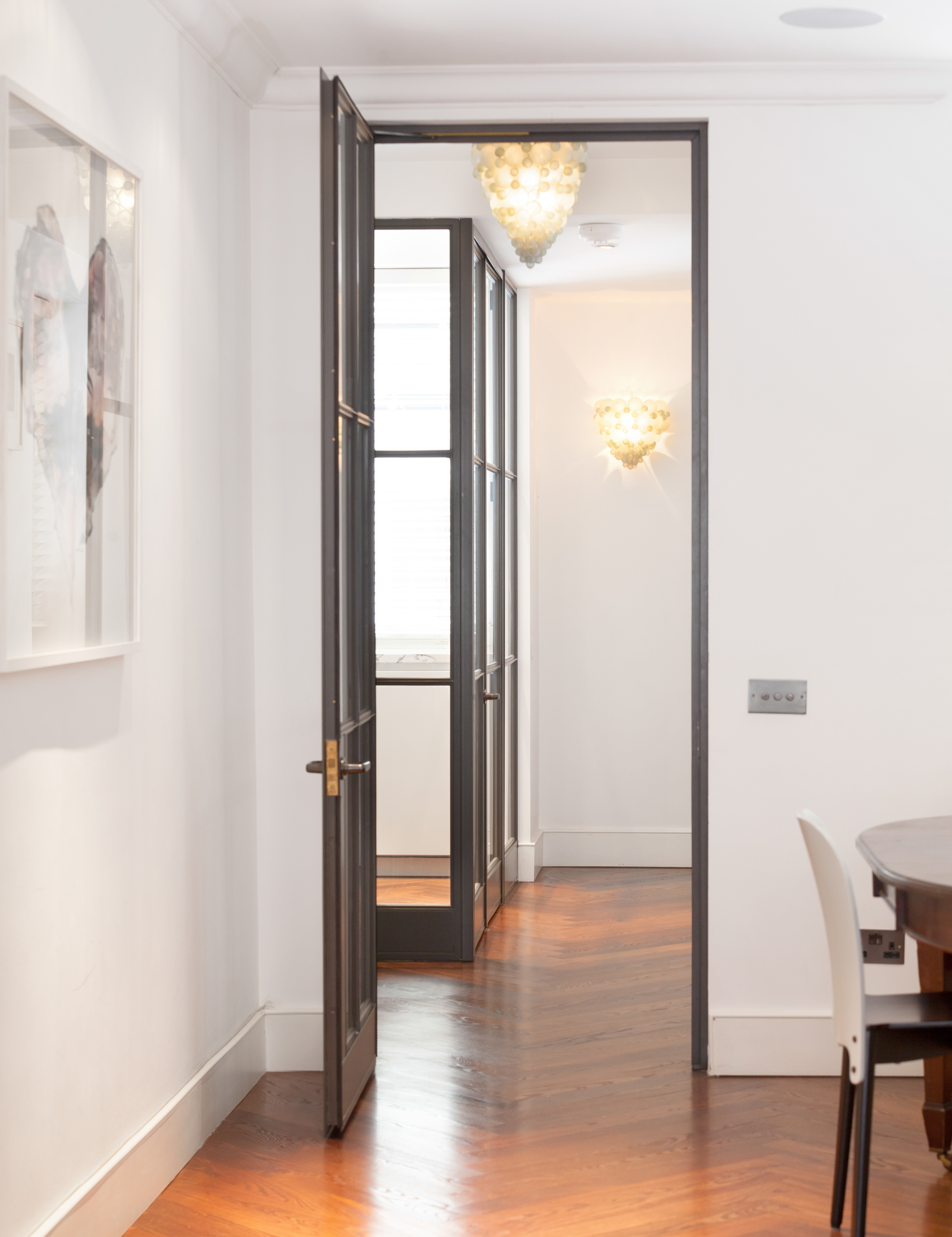
Designed by Peter Sheehan/The London Resolution
If you are working on a renovation or new build, Peter says that the building design should be able to stand up by itself without any furniture in it. With clever architectural design, Peter says 'the home is a statement in itself before you even start to decorate. I have created staircases that weave around a huge, highly prized and valuable chandelier light. I have designed flat hallways around a theme such as thinness to create consistency and something visually intriguing yet ultimately sleek and stylish.'
Another way in which architecture helps is by creating hierarchies. Doors are a prime example. In modern new builds all doors look the same and guests don’t know which door leads where; they could easily walk into a private space such as the main bedroom when looking for the bathroom. With good architecture, a door hierarchy is created; a visual clue leading guests towards the right door that is more prominent through height, how it is painted, the type of wood, or position.
Similarly, architecture should be about the least amount of lines in a space. A good architect will be all about removing unnecessary lines to not only make life
simpler but also help people 'read a space' more coherently. Peter says: 'There is real psychology to architecture and design. Our minds are reading visual clues all the time that we aren’t necessarily conscious of. Yet a good designer will know what works well to help a person feel comfortable in that space – that person may just not be able to specifically put their finger on why they like it.'
In regards to removing 'lines', Peter says: 'When I take on a project I’m always thinking – do I need that line there or can I get rid of it? That doesn’t mean everywhere is open plan living, a line might be an extra color in a color palette, or a door closing off a room. Having fewer lines might mean that when you’re in the hallway you can see through to the garden – presenting the full, airy length of the home. Or it could mean being able to see the children playing in the garden when you’re cooking in the kitchen.'
4. Create a moodboard you will keep
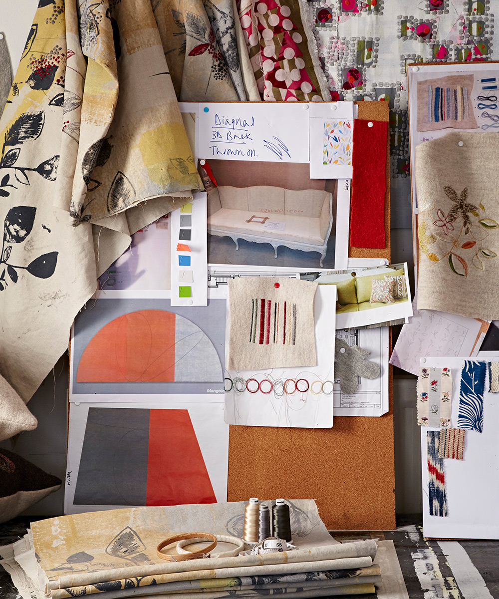
Moving onto what it is you like, it’s a good idea to create a long-standing mood board or scrapbook, advises Peter. A good architectural or interior designer will be able to look beyond the obvious and analyze what it is you like about those images. You may not even realize it yourself until they tell you, but then you’ll understand what connects everything in each image and be able to translate it into your own home design.
5. Don't be scared to get the professionals in
You may have an idea about what you like, but it is often worth investing in a color specialist who can look at the bigger picture and be able to turn your ideas into something that will wow for a decade to come. By investing a few hundred pounds up front, you may save yourself money in the long-term by creating a home that is a timeless masterpiece. In the modern world, having a longer-term view to home decoration is also far more sustainable.
6. Use shelves to curate a collection about who you are

Peter asks: Remember the old TV program Through The Keyhole, where you had to guess the celebrity by their home? Carefully curated shelves in a home can not only be showpieces in themselves, but by curating a collection of prized items, you can offer guests insight into who you are and your interests.
By using design in your shelves, you can co-ordinate or contrast with the rest of the room, for example black leather books complement the dark metal edges of mirrors, or a dark feature wall. Everything connects subtlety, carefully leading the eye on a journey around the room.
7. Think of 'the flow' and try to stick to only one trick in every room
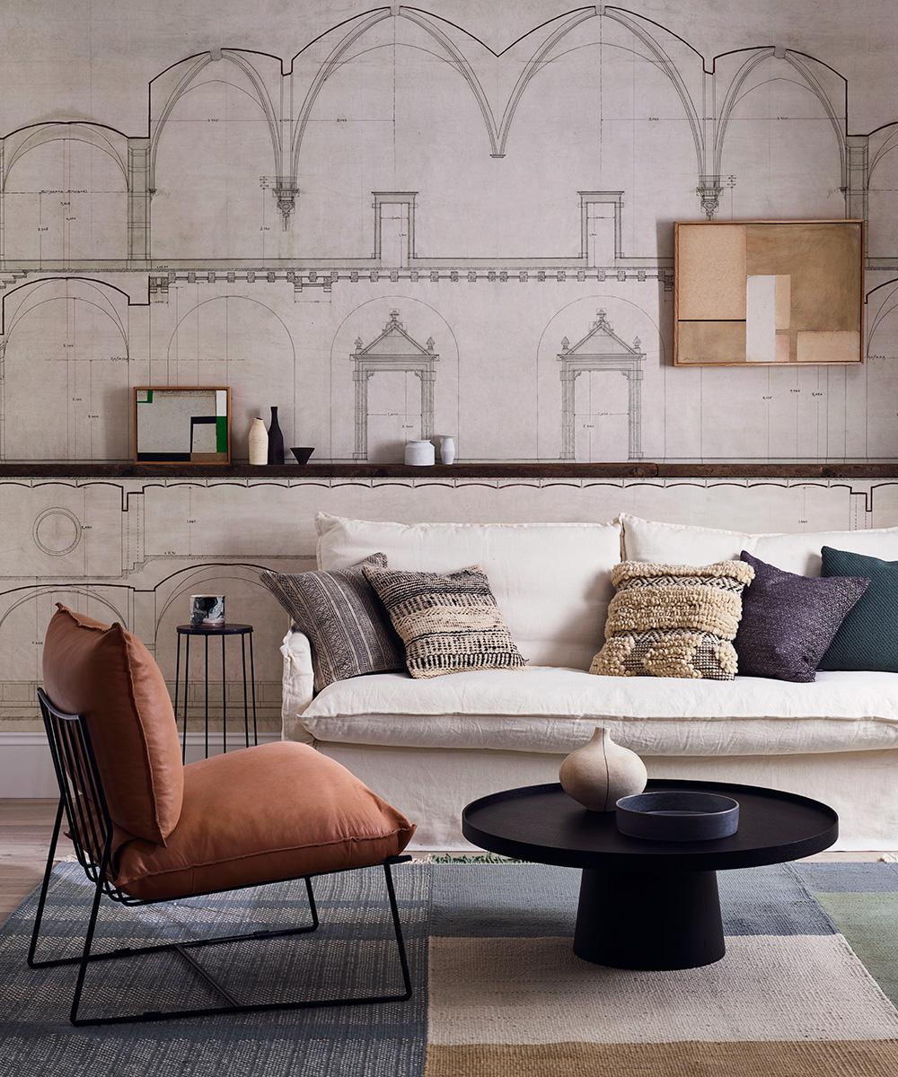
... and then be consistent, says Peter. 'For example, I know of one house which has a feature wall in every room, but on one wall it’s behind you as you walk in, in another it’s in front, and in another it’s to your side. What should be a consistent feature becomes confusing.
'Instead, the feature walls should be on the same aspect in every room to create flow and connection. When entering into a professionally designed home, you are reading visual clues all the time. Perhaps, in a small flat, in every room all the color is on one side, with the repetitive theme on lower floors as well.
'Another example are staircases. In a hallway with two or three floors, wallpaper or paint the whole wall as a feature wall – flowing up to the top of the house. It creates a rising, dynamic with a sense of space that draws the eye up the staircase – which is perfect.'
8. Use a theme throughout the house
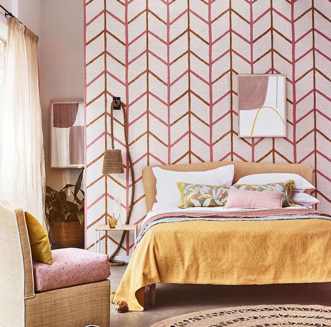
'Using simple unconscious devices that link rooms in a home helps people feel comfortable in a space they enjoy. We subtlety used chevron patterns in one house in every room, from chevrons on a wall in the lounge, to floor tiles indicating the way guests should walk, on the stairs in the hallway, to even to the bathroom tiles being laid in chevrons in the bathroom. It’s a simple device that often people don’t even notice, but as soon as they walk into the home they know they like it but can’t explain why.
'And it’s not just through colours and patterns; you can use this through textures as well. For example, using seagrass throughout a space – on the walls, using a seagrass carpet and in accessories such as baskets and rugs.'
9. Mix old and new
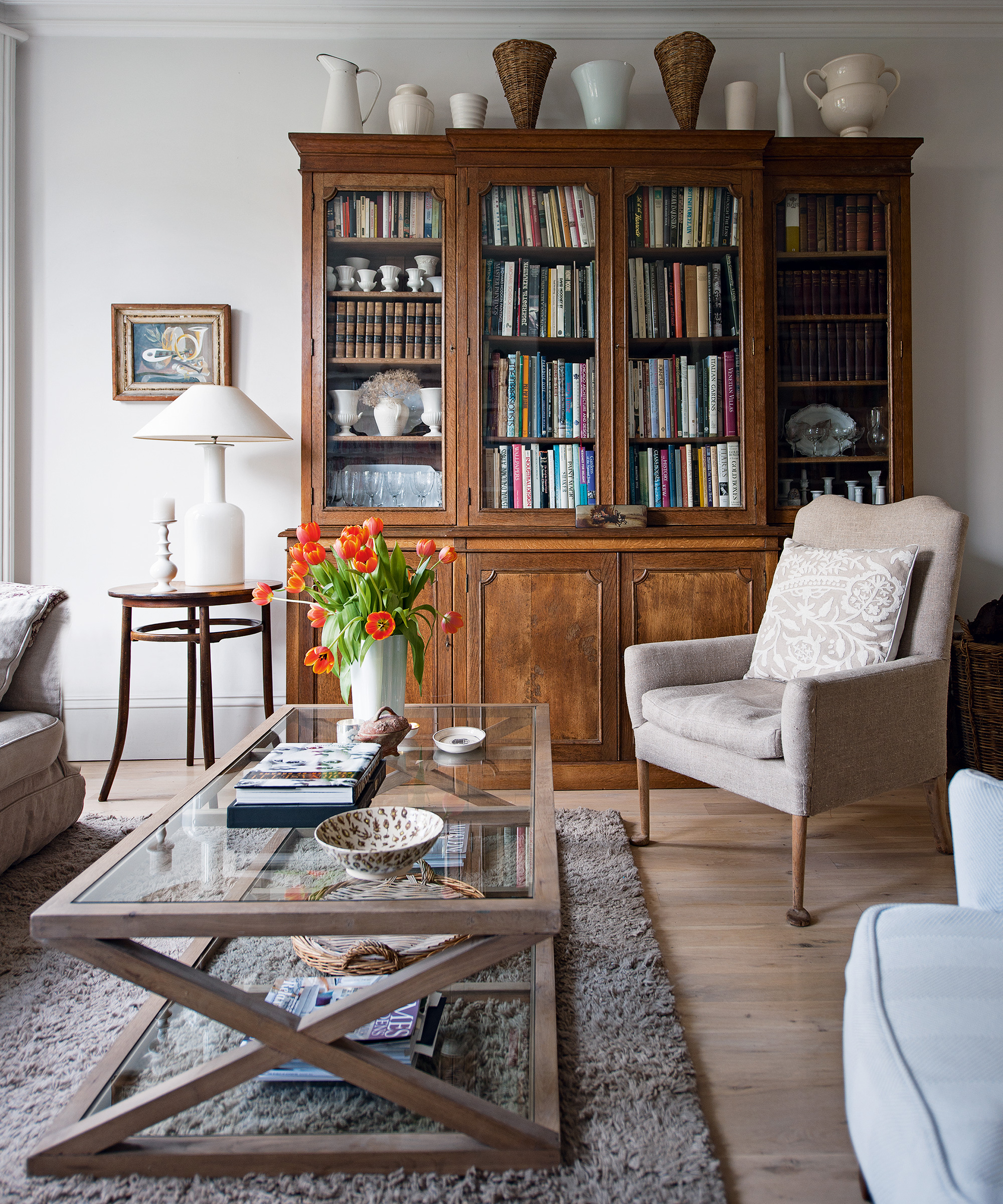
'As much as you can afford, invest in a few, high-quality pieces that have been designed. A few statement pieces such by designers will act as showpieces and last a lifetime. These will complement new, modern pieces.'
Don’t be afraid to mix and match. Peter recommends The Conran Shop which has many classic pieces, especially the Knoll furniture collection such as Saarinen, Florence Knoll and Barber & Osgerby. Heal's and Ligne Roset have great designer pieces and antique markets are also a great source of classics.
On a smaller scale, old leather-bound books, a vintage dresser, oversized gilt mirrors or antique pieces will contrast beautifully against stark, modern furniture. It is also easy to update and upgrade pieces of furniture; you can add a piece of marble top to most chest of drawers to give it an upgrade, but remember to also update the handles.
10. Do not allow yourself more than three pieces from the same shop
You don’t want your whole house to look like an Ikea catalogue, Peter says. 'Having said that, just because it may be an inexpensive piece doesn't mean it can't last or be a classic. In my home I have some amazing Ikea mirrors which have moved with us over the last 14 years and have been used in various guises. Equally, French Connection sofas have some great shapes.'
11. Never under-estimate the importance of good lighting
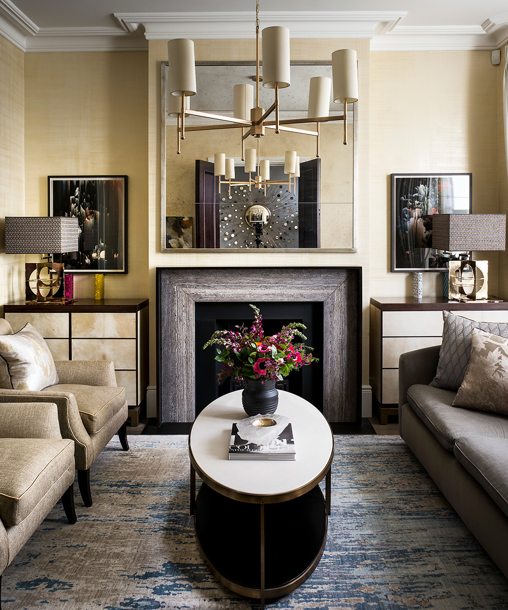
Overhead light, unless specifically installed for a task such as illuminating a kitchen work surface, lighting the curtains or a painting for example, can be very harsh and provide stark interiors, says Peter. Try to mix some lamp light with some shelf lighting and have lights at different levels throughout the interior, he says. For further reading and useful tips for homeowners, Peter recommends Sally Storey's book Lighting – Recipes and Ideas.
12. Restrict yourself to a limited palette of materials
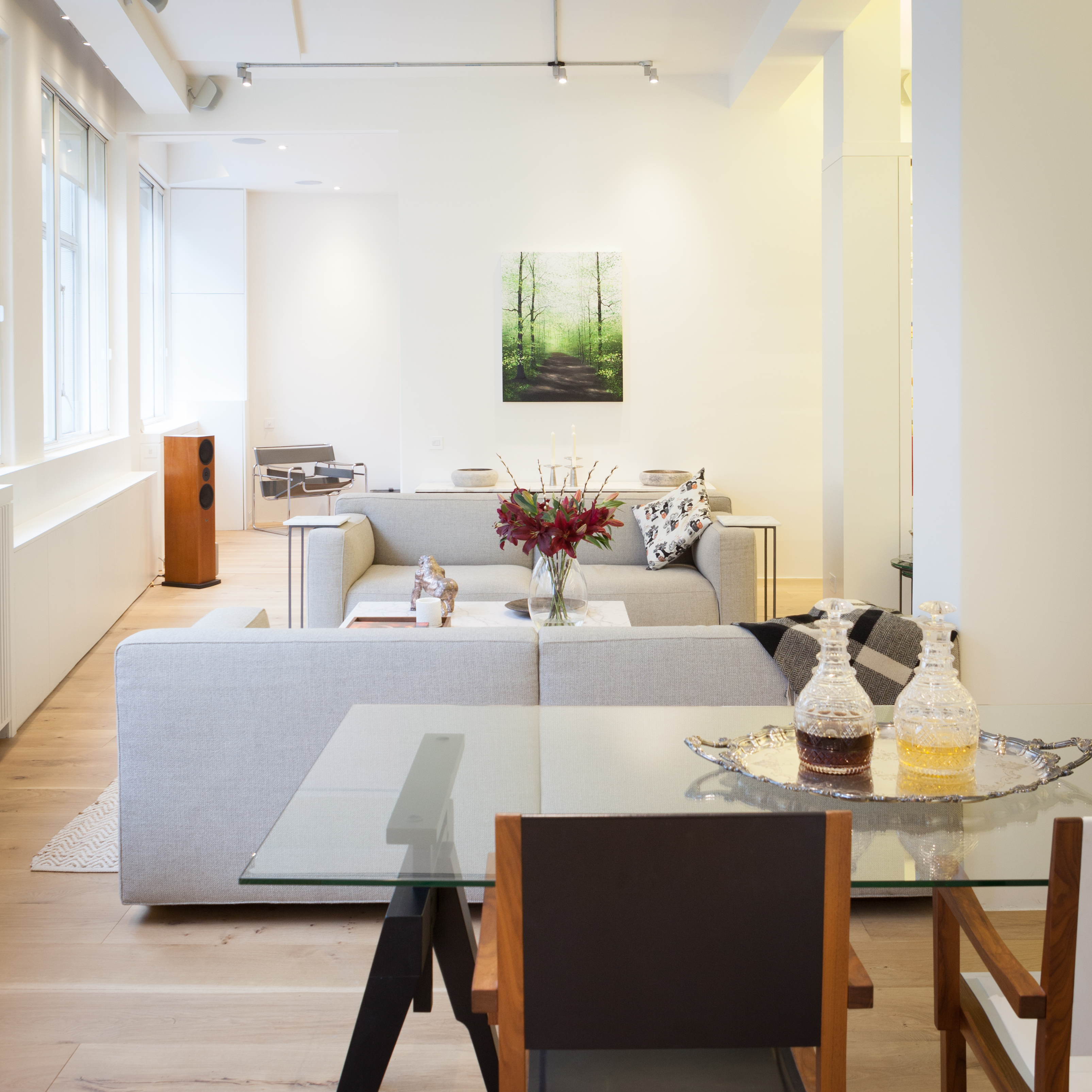
Designed by Peter Sheehan/The London Resolution
'As designers we often restrict ourselves to a very limited palette of materials. Choose no more than four types of materials for every scheme and stick to it. You’ll actually find that in limiting your options there’s fun to be had. It gives you an eye for what is available out there.'
13. Have fun in the toilet!
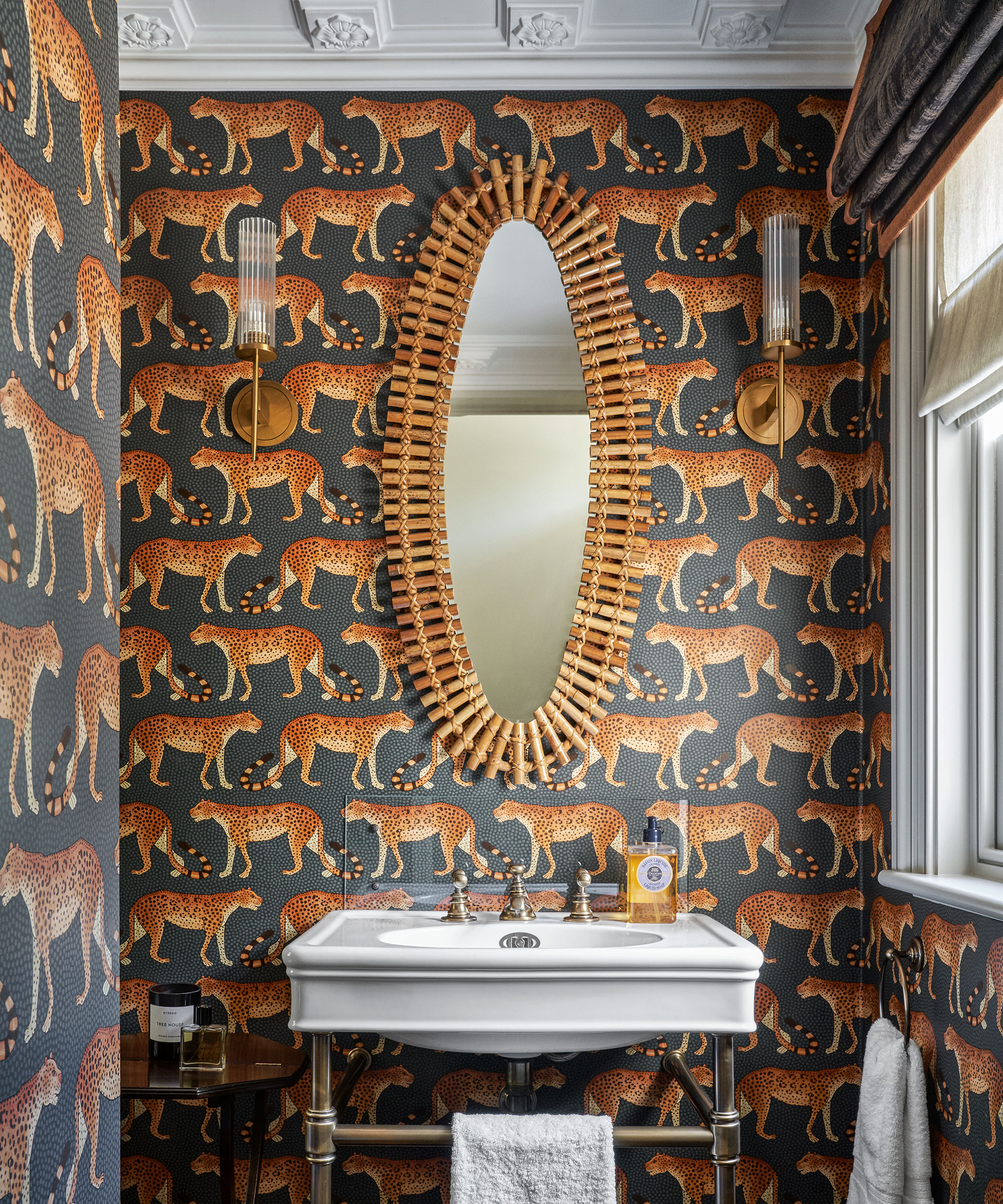
'Downstairs cloakrooms are where you can really unleash your creativity. These can be dark, extravagant places that allow you to make a wow statement. Don’t leave the cloakroom bland – it can easily and cheaply be the space that makes people go “wow” when they enter. If the rest of your home is light and airy, contrast it with dark.'
Thanks to Peter Sheehan at The London Resolution

Lucy Searle has written about interiors, property and gardens since 1990, working her way around the interiors departments of women's magazines before switching to interiors-only titles in the mid-nineties. She was Associate Editor on Ideal Home, and Launch Editor of 4Homes magazine, before moving into digital in 2007, launching Channel 4's flagship website, Channel4.com/4homes. In 2018, Lucy took on the role of Global Editor in Chief for Realhomes.com, taking the site from a small magazine add-on to a global success. She was asked to repeat that success at Homes & Gardens, where she has also taken on the editorship of the magazine.
-
 10 of the best plants for clay soil – experts recommend the flowers, shrubs and trees that can thrive in challenging conditions
Discover what varieties to grow if you want the best plants for clay soil
By Sarah Wilson
-
 The biggest curtain trends to follow in 2025 – 8 key looks to shop that will instantly elevate your rooms
These are the colors, styles, and materials to embrace in your windows this year if you want desirable drapes, plus our favorite places to shop the trends
By Lilith Hudson