These are the worst kitchen layouts according to designers (and the tips on how to work with them)
Awkward culinary setups simply will not cut it in the kitchen
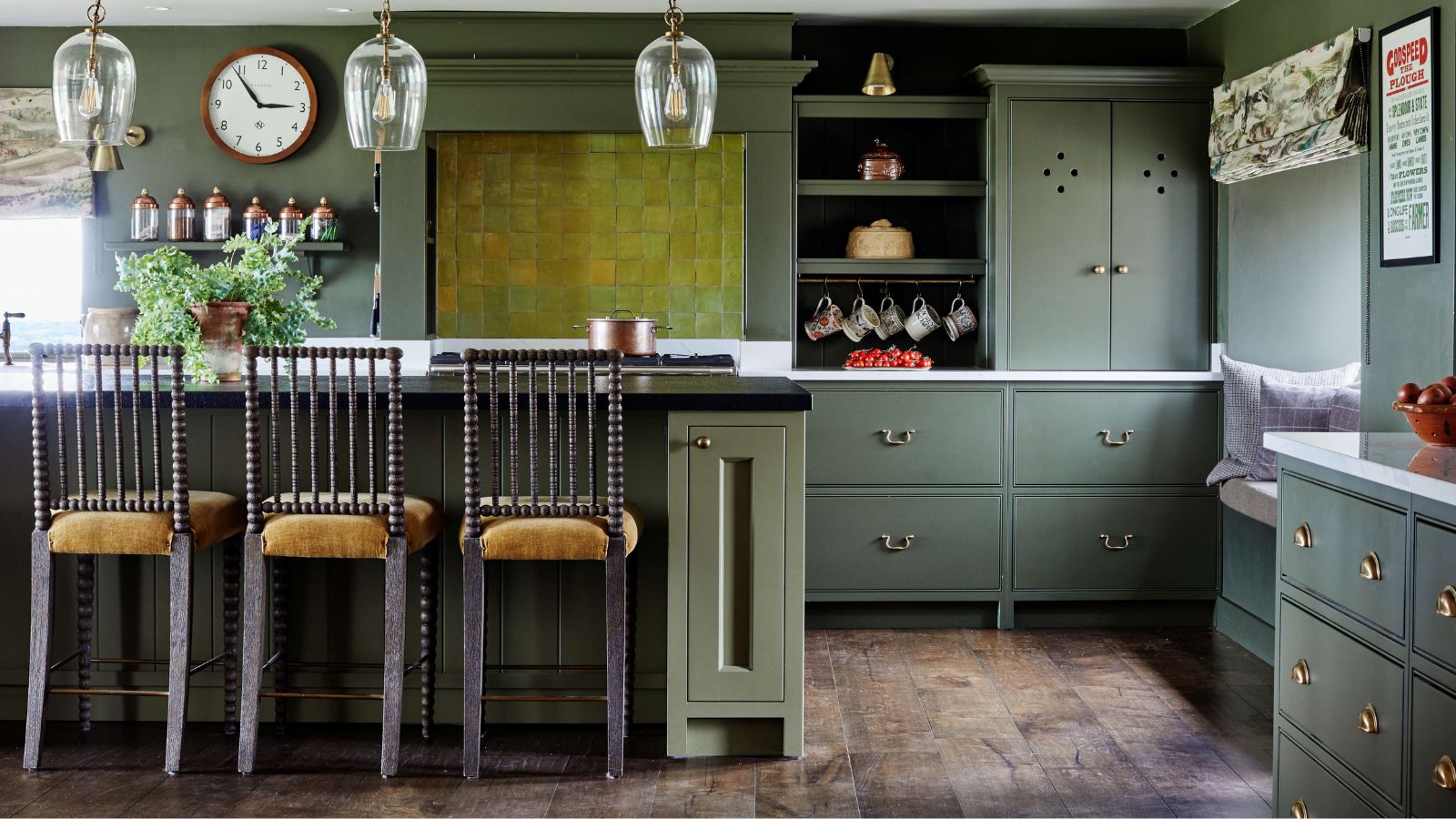

Seamless cooking and entertaining is made much easier with a thoughtful kitchen layout. But if you have just moved into a new home, or apartment, or if you are planning a new kitchen, you may be wondering not just which will be the best layout for your kitchen, but also which is the worst kitchen layout, to avoid at all costs.
Size matters, but in a kitchen space especially, the layout of the room will impact where appliances live and therefore, how the space can run day to day. Aesthetics come into play too, as a layout that feels cramped will not lend to simple and stress-free cooking, far from it. We spoke with some design experts to hear their thoughts on the matter.
What are the worst kitchen layouts?
What might surprise you here is that what our experts share as some of the worst, can also be the best kitchen layouts in some instances. Though they are not so desired, that is not to say that it isn't possible to remedy their awkward nature, politely making up for their inefficiency in other interesting ways. These are the kitchen layouts experts believe could work much harder:
1. A 'closed' L-shaped layout
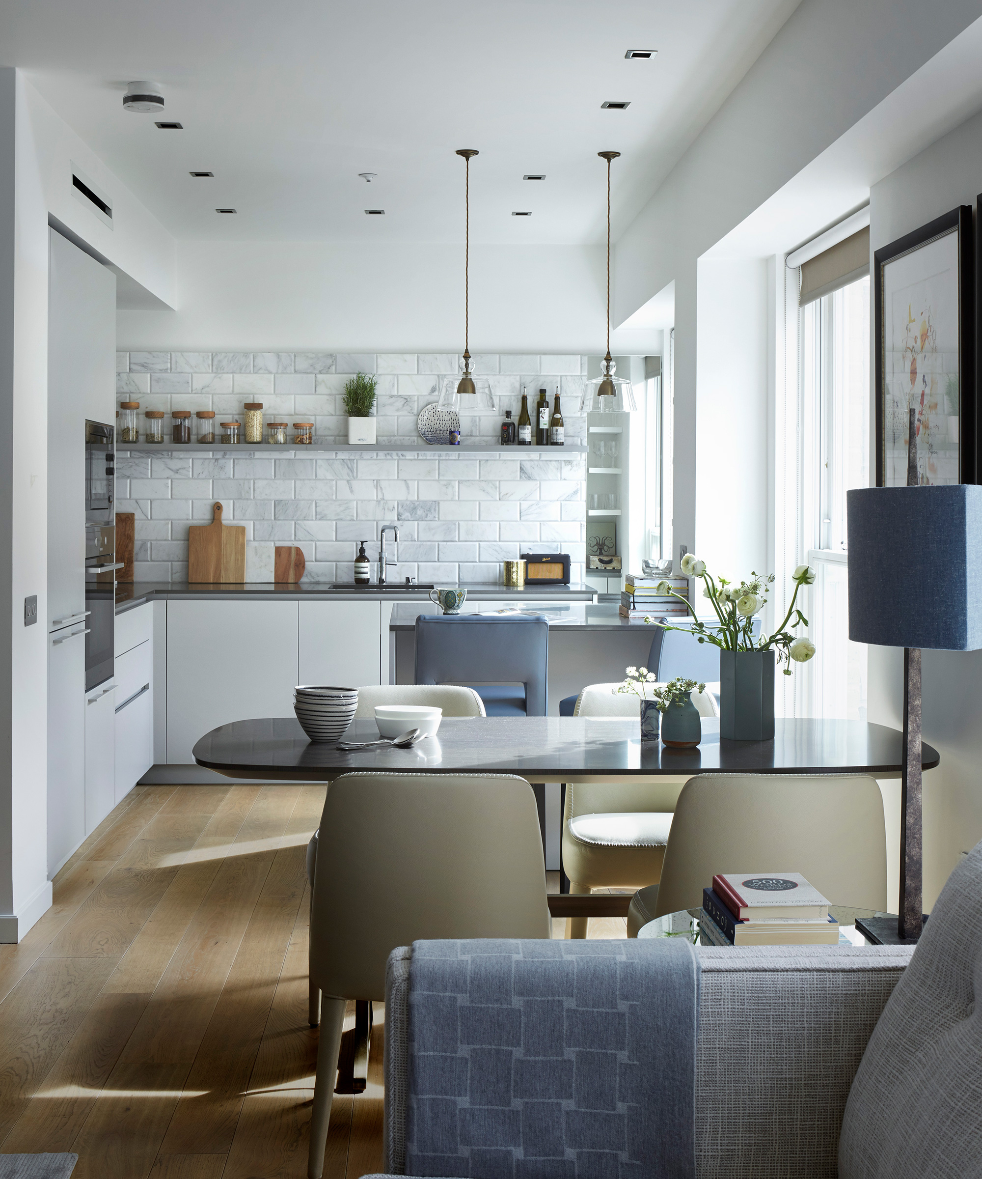
London-based interior designer, Rudolph Diesel tells us that one of the main traits of the worst kitchen layouts is that they minimize ease of movement and the openness of a space:
'A kitchen with a closed L-shaped layout can create a barrier to the flow of traffic throughout your space, and it can also separate your kitchen from the rest of the home,' says Diesel.
This does not mean that going open plan is the only remedy, but being more thoughtful towards the placement of kitchen appliances and other design features will help the layout work harder at being functional and a pleasure to be in.
'Because this layout isn’t the most social, knocking down the unnecessary walls can open this room up, turning it into an open concept. If you’re renting or renovation is not an option to begin with, I recommend focusing on where you place the appliances that you use the most. This will help to make the kitchen feel accessible, even if there are a few people using the space at once.'

Rudolph Diesel is a top London interior designer with a relentless passion for design and detail who has been featured in top publications such as The Times, Woman & Home, and Ideal Home. Rudolph Diesel has developed a keen eye for aesthetic home design throughout his career; his insights into interior design and space management are invaluable.
2. A U-shaped kitchen that feels unwelcoming
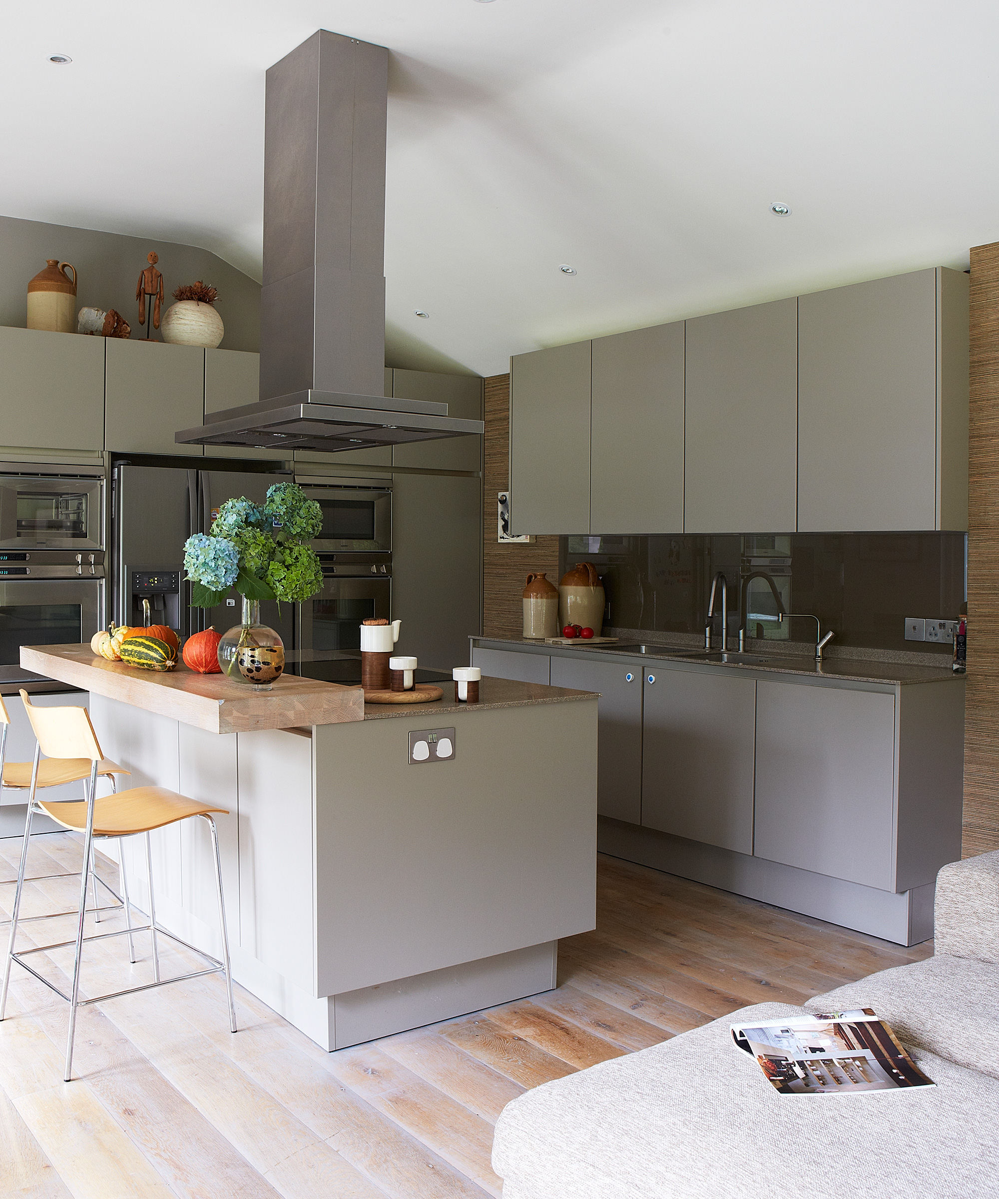
Though U-shaped kitchens are said to be best to accommodate a helpful kitchen triangle, Diesel stresses that this layout can be at risk of feeling a little 'cut-off' from the rest of the home if not given the right design thought.
'U-shaped kitchens can also prove to be a tricky layout, where the kitchen can feel like an isolated space in the home and prevent a functional flow of traffic.'
This would be a particularly undesirable kitchen layout trait for homes that are fond of hosting, or using the space for impromptu gatherings, so be considerate of this if buying new without the view of remodeling the kitchen. Diesel does offer some clever alternatives to those who want to avoid renovation work to remedy the layout.
'If possible, knocking down a wall here could also be the best way to open up this space, although there are other ways you can create a welcoming atmosphere if this isn’t possible.
'For example, try adding a kitchen island where people can group together, leaving more space for you to work functionally. A breakfast bar could also be a good solution in a U-shaped kitchen.'
3. An un-authentic galley kitchen
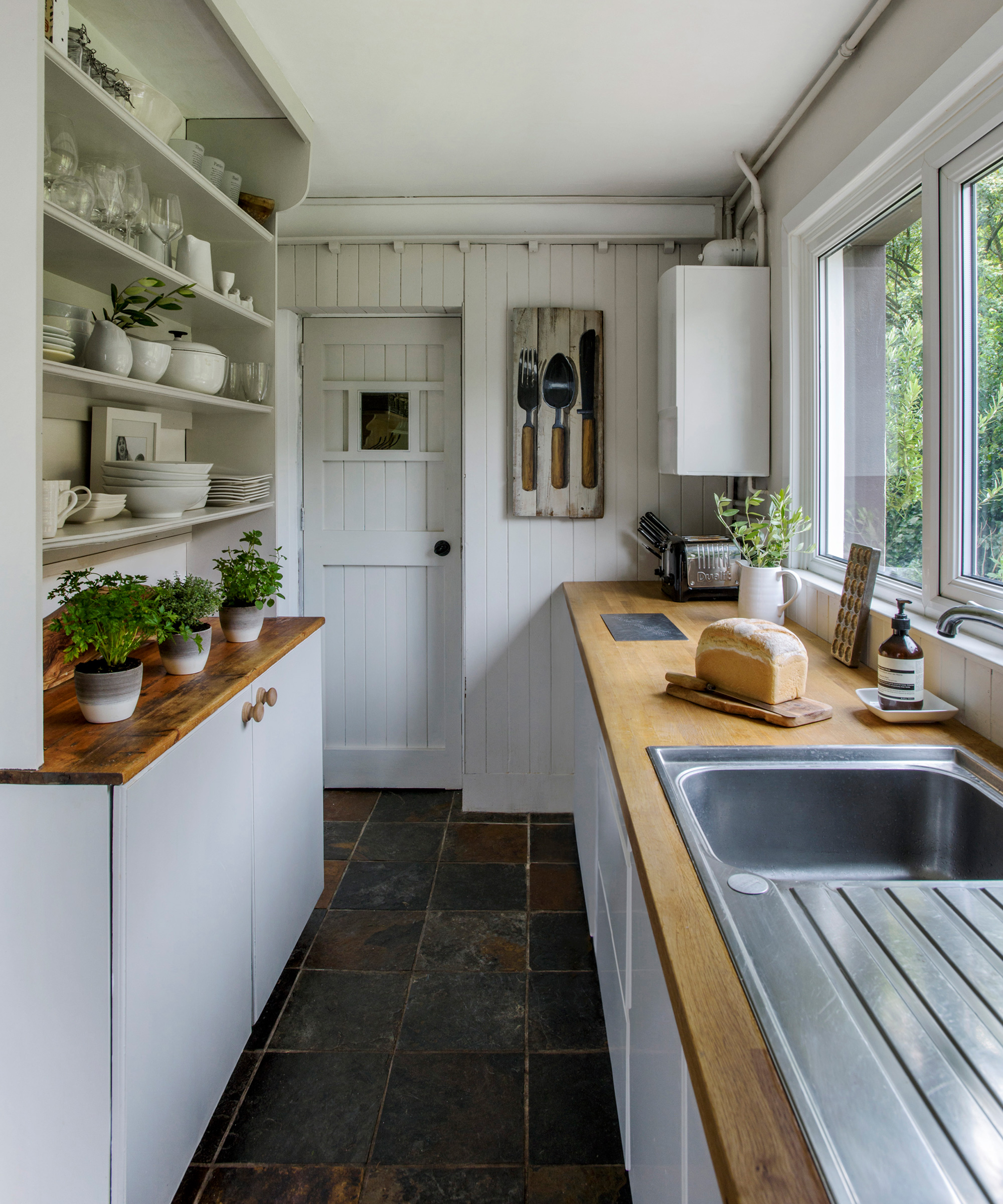
Though some may steer clear of a galley kitchen, this is actually an ergonomic design that when tackled thoughtfully will be functional, characterful, and simply quite a marvelous space in which to cook.
Moe Soloff, a Kitchen Specialist at Fabuwood says: 'The most problematic kitchen layouts often involve poor utilization of space, leading to cramped or disorganized cooking areas.
'Galley kitchens can feel claustrophobic, especially in smaller homes. They limit movement and restrict workflow.'
The key is to ensure the space is thoroughly optimized, much like a chef's kitchen, there is no room for underutilized surface area, cabinets, or misplaced kitchen islands in this layout. Keeping everything within just a few steps' distance is an art.
4. A layout that is technically flawed
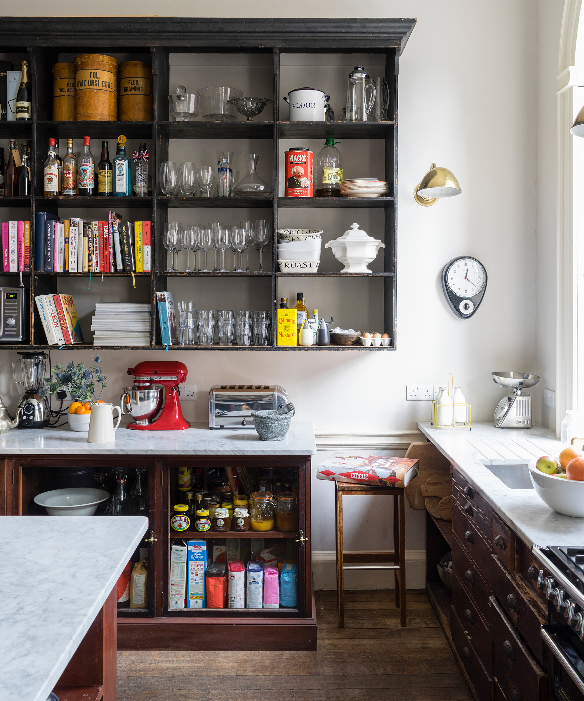
There is a reason they say measure twice and cut once; ensuring you are meticulous in your kitchen design planning should essentially avoid a layout that simply does not fit.
Matt Arguin, president of Southcoast Kitchen Designs says: 'The worst kitchen layouts are those that are technically flawed,' emphasizing the need to measure key fixtures very precisely.
'The most common flaw is designing a layout without taking the appliance specifications into account. One example would be a refrigerator that requires 10 inches of side clearance for the door to fully open being designed right against a wall. Another example would be the dreaded scenario where a drawer only opens 1/3 of the way because it hits the handle on the oven or dishwasher. To avoid this scenario be sure to hire a kitchen design expert and present them with your final appliance selections so they can design to the correct specifications. All appliances are not the same!'
Southcoast Kitchen Designs is a premier full-service design/build showroom, which for more than 18 years has been helping homeowners throughout Massachusetts and Rhode Island create spaces that suit their home, their lifestyle, and their budgets.
5. One that wants a peninsula over an island, or vice-versa
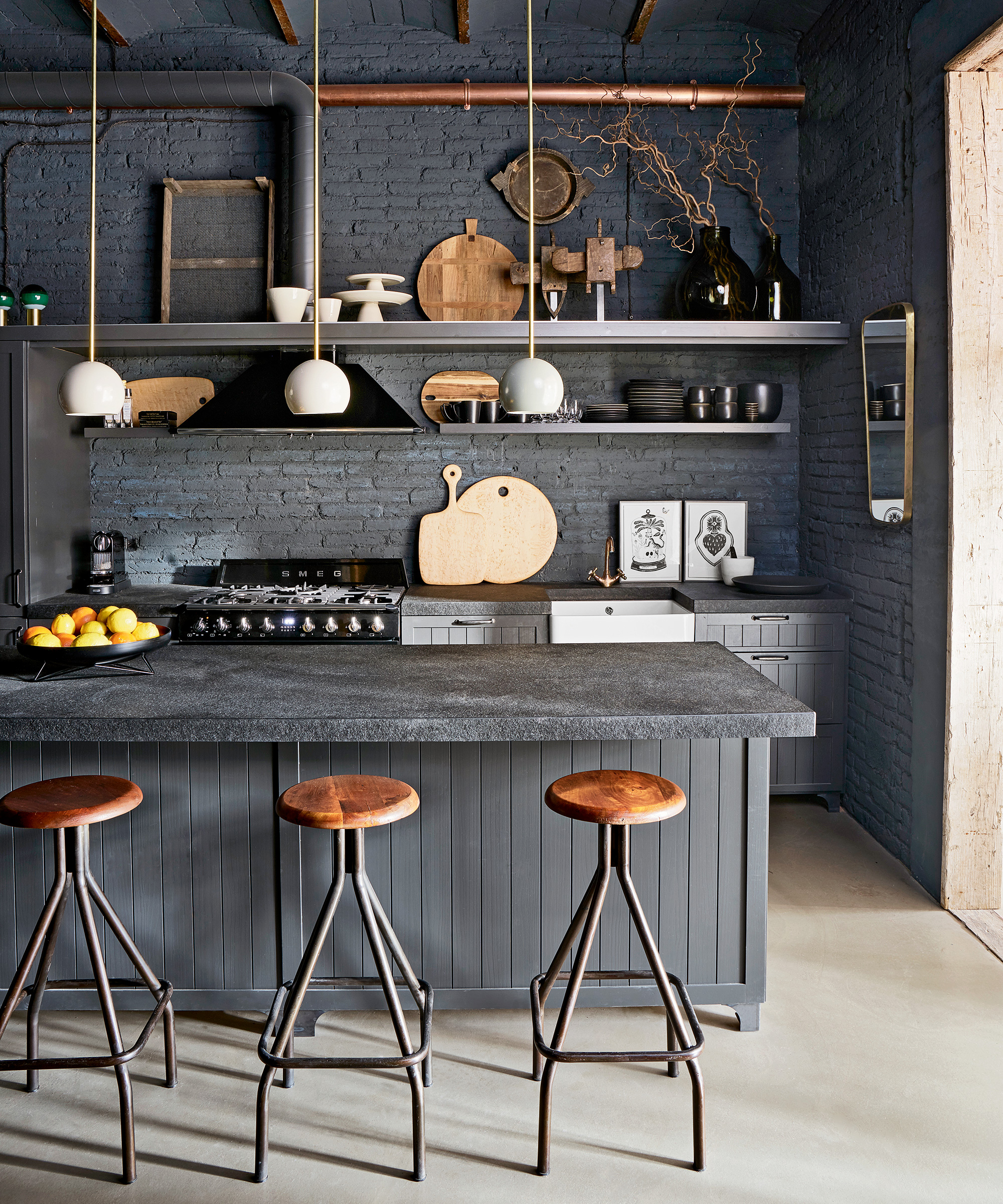
We all cherish the extra surface area, but it is easy to let our kitchen dreams run away with us and not keep the functionality of our space at the forefront of our design plans.
If you are questioning whether a kitchen island can fit into a galley, it might not be worth the squeeze, and a cleverly positioned peninsula could be the answer instead. Even if you have a bigger kitchen layout that might be better equipped to accommodate an island, you should be considerate of which sized island will be best if you don't want to impose the worst kitchen layout on your household as a result.
'Oversized islands can obstruct the kitchen's work triangle (the area between the stove, sink, and refrigerator). To fix this, resize or reposition the island to ensure a smoother flow and better accessibility or opt in for a peninsula,' says Soloff.
Diesel shares when a peninsula might not be the best feature: 'While there are benefits to extra counter space, peninsulas can leave most kitchens feeling congested and can even close it off. The good news is that peninsulas can be turned into an island fairly easily, which can open up the space and create more flow within. If you want a fully customizable experience, make a mobile island with this extra counter space, which can be adjusted to the amount of traffic you have in this room.'
An L-shaped kitchen however can be enhanced by a beautiful island to complete the kitchen triangle.
Moe Soloff is a Kitchen Specialist at Fabuwood, a renowned company that crafts premium kitchen cabinets.
FAQ
What else can hinder the flow of a kitchen layout?
A kitchen layout that feels streamlined often goes hand in hand with good kitchen storage. Diesel notes the importance of considering storage early on in the design stage: 'Many kitchens also tend to have poor storage opportunities, where cabinets are not installed thoughtfully, leading to frustration and clutter throughout the kitchen. If there is space, try installing cabinetry in the dimensions that you need it for. This cabinetry can create a perfect space for a cleaning closet, a shelf for your dishes, or even a vertical spice rack. If permanent installation isn’t possible, there are many shelves you can buy in the dimensions you need for more storage and counter space – perfect for a small kitchen.'
How can I make the most out of my kitchen layout?
Prioritizing the golden triangle is essential as Soloff shares: 'In my experience, rethinking the layout to prioritize the work triangle significantly improves kitchen functionality. For instance, a recent Fabuwood project involved transforming a cramped galley kitchen into a more open, L-shaped layout, greatly enhancing both the usability and visual appeal.'
You want to pay particular attention to less obvious areas that might be a means of welcoming more functionality when well utilized: 'Kitchens with corner sinks or appliances can disrupt the workflow. Optimizing corner spaces with innovative cabinetry solutions, such as lazy Susans or pull-out drawers, can enhance both functionality and aesthetic appeal.'
If you are buying a new home or looking at apartments to rent with one of the above layouts, do not be put off entirely, but, consider how you can counteract any issues to make the most of your kitchen space.
Sign up to the Homes & Gardens newsletter
Design expertise in your inbox – from inspiring decorating ideas and beautiful celebrity homes to practical gardening advice and shopping round-ups.

Camille is the former deputy editor of Real Homes where she covered a broad range of topics, including house tours, small space design, and gardens. She studied English language and Italian at the University of Manchester and during a year abroad studying linguistics and history of art in Bologna, Italy she started documenting her adventures and observations in a blog. Camille is always creating and spends her downtime painting, taking photos, traveling, and writing short stories.
-
 Orange and green is the bold color pairing quietly transforming homes in 2025 – here's 4 reasons why
Interior designers are making the orange and green combination work wonders – this is how you can too
By Sophia Pouget de St Victor Published
-
 This Michelle-Pfeiffer-approved chair is made of a forebodingly unusual material, opening the debate: Is it a rustic stunner, or a danger to sitters?
The actress took to Instagram with a chair made of a controversially sharp material – and fans are unsure of how they feel about it
By Sophie Edwards Published