Everyone told me to go for this practical kitchen lighting in my remodel – here's why I regret it, and what I would do instead
A year after having my kitchen remodeled, I'm noticing the downsides to recessed downlights

When you're remodeling, the kitchen tends to become your swan song. As the so-called heart of the home, it really is the piece de resistance of a renovation. So of course you want to get it exactly right.
While my kitchen isn't totally finished (I've got a long list of painting jobs to tackle), on this slow renovating journey I've discovered that there are a few early kitchen remodeling mistakes made that I'm now regretting.
Remodeling or upgrading a kitchen involves countless decisions, and lighting is one of the most pivotal. Here's why I think this practical and popular kitchen lighting idea was actually a bad move – and what I'd have done instead.
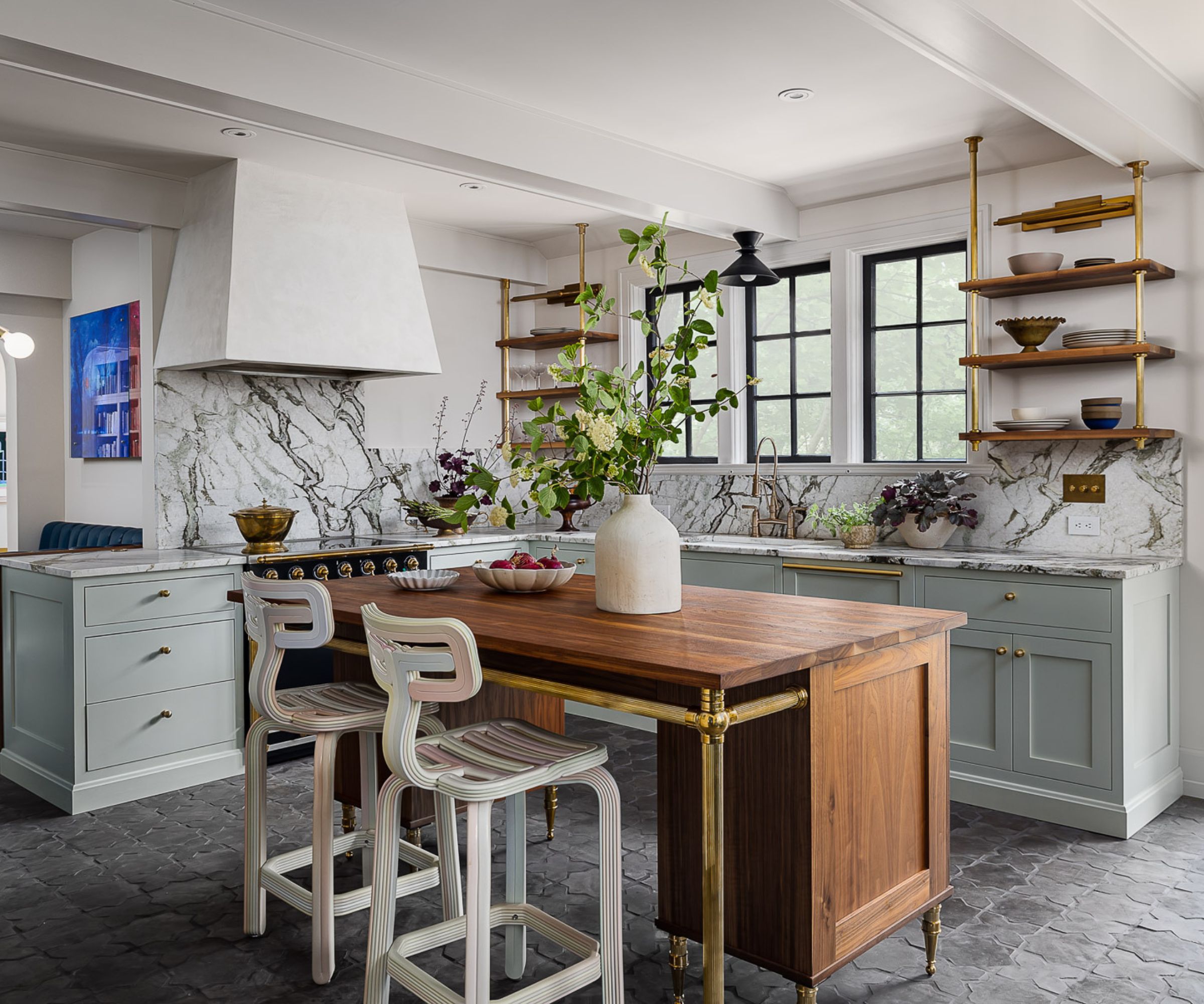
Hindsight is a wonderful thing; but when I started planning the kitchen, considering the lighting as an afterthought was such a rookie error on my behalf.
Of course, working in interiors I understood that I needed to create layers of light with alternative light sources. So I had scones installed that sit on either side of the range cooker and a pendant light to hang above our breakfast nook. And these were both great decisions.
The one kitchen lighting mistake I did make, however, is the 10 spotlights I had recessed into the ceiling.
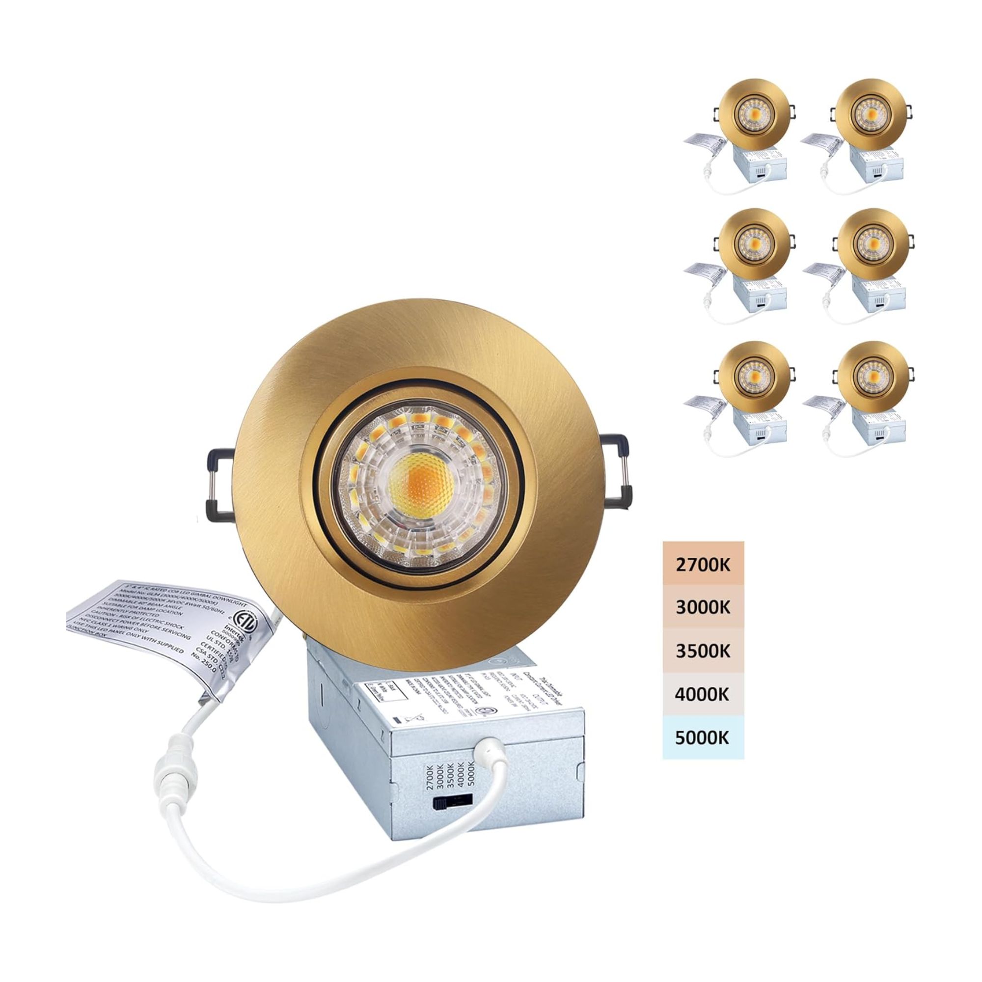
These LED recessed downlights from Amazon are under $100 for 6 which is a great price considering they can be directly and easily installed into the ceiling and are dimmable down to 5%.
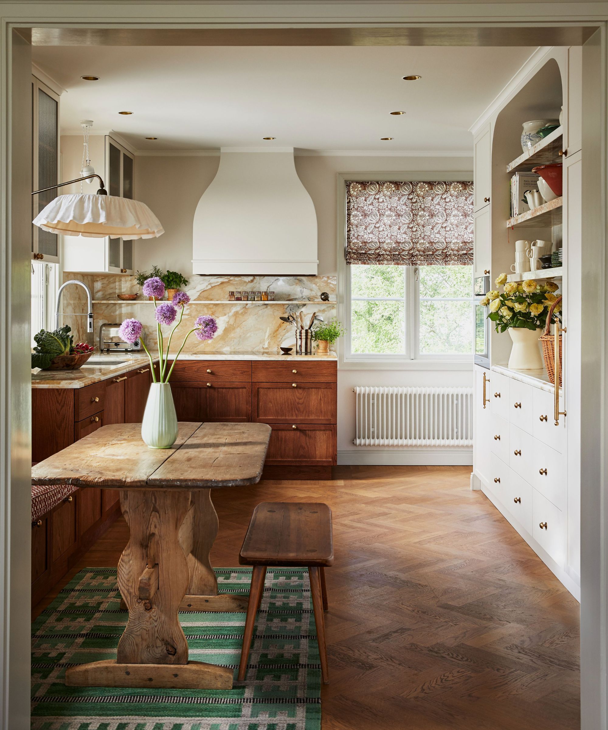
Typically referred to as 'can lights', my electrician took the liberty of installing rows of these builder-grade downlights into our kitchen on a day that I wasn't WFBS (working from building site).
Sure, they had a few good reasons. One: our kitchen doesn't benefit from a load of natural light. We have had a Velux window added in and have fairly large windows but they only run along one side of the kitchen so some artificial help was required.
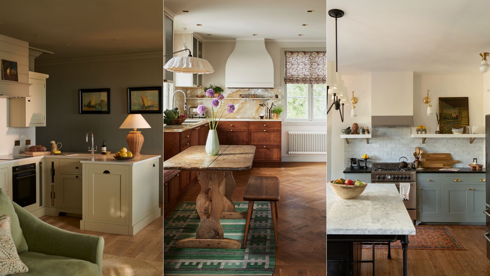
And much like the cozy kitchen in the home of textile designer Cathy Nordström, seen above, the small kitchen in my Victorian home is short on space and has low ceilings (lower than Cathy's) so we were fairly restricted on options.
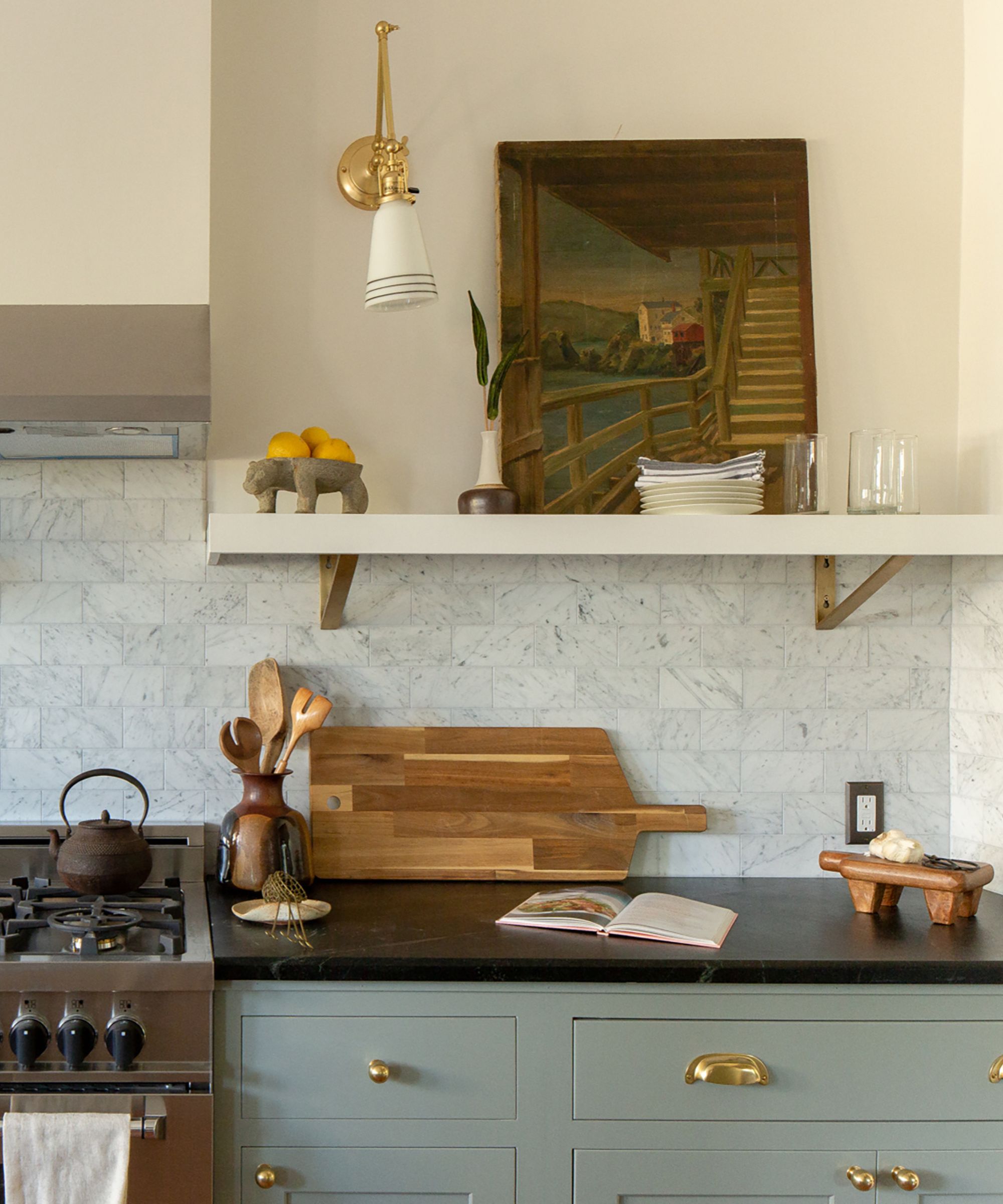
These small, modern lights are often praised for their clean design and ability to provide shadow-free light across a room, so even though I didn't ask for them, I did think they’d be a foolproof choice for such a functional space. But after living with them for a while, I began to notice the downsides to downlights.
My kitchen, despite benefitting from a mix of light sources, can feel a bit sterile and lacks the welcoming warmth I envisioned. Even while painted a soft butter yellow. And it wasn't until I did some further research that I realized how widely hated spotlights are in the interior designer community.
While most agree there is absolutely a time and place for them (mainly in low ceiling spaces, like mine), a lot of interior experts would prefer you to take a different and slightly more creative approach.
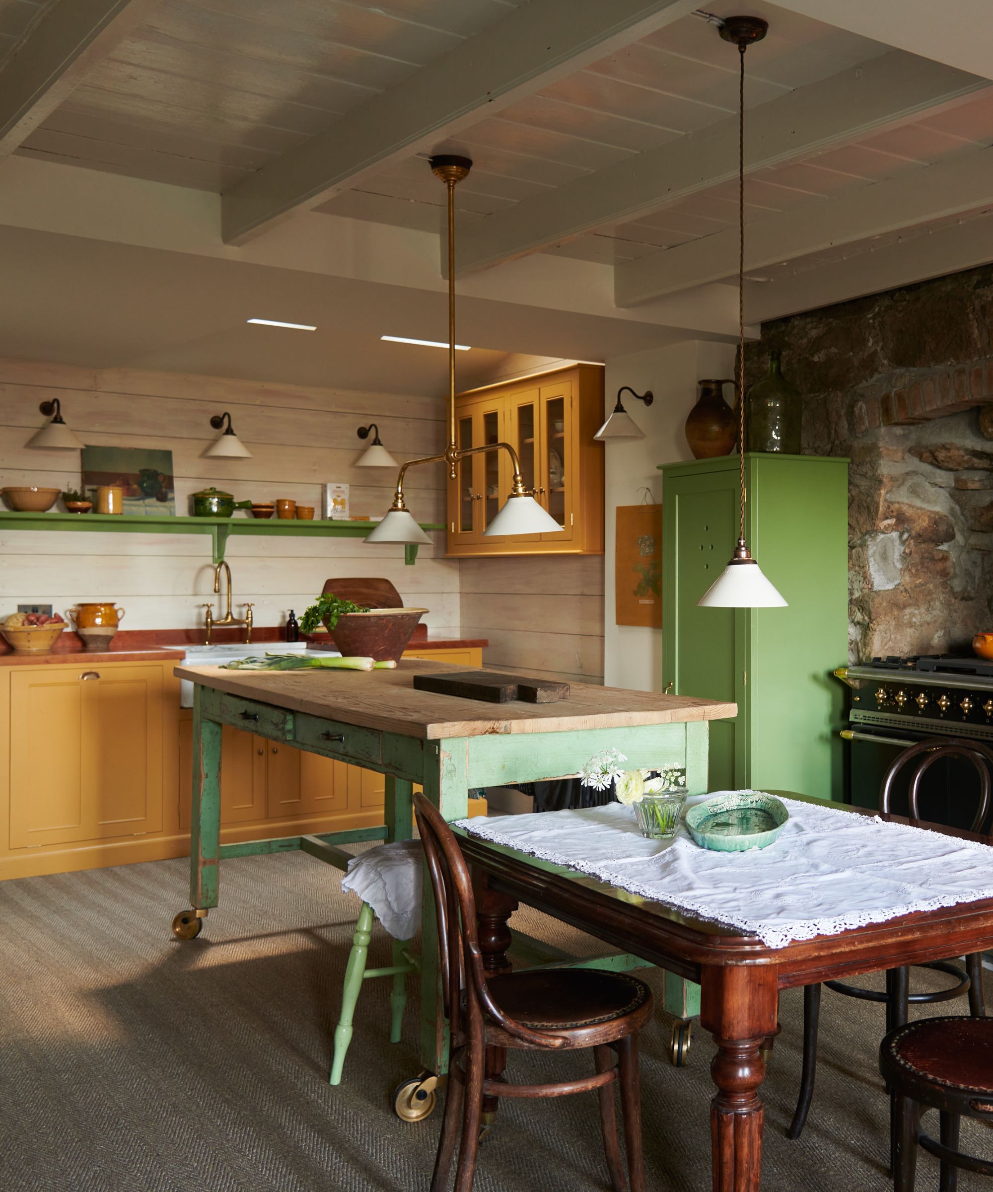
As interior designer Emily Henderson explained in a blog post, 'Designers don’t like generic builder grade anything, so there is a level of snobbery about these basic fixtures,' she suggests. 'But often without them, especially in certain rooms during certain times of the year there is frustration when you simply can’t see anything.'
'So, I’m a yes to recessed lighting in the kitchen just to light up your cooking spaces,' says Emily. Practical more than pretty, these task lights are designed exactly for that reason: to help you shine light on a task. And the grid of can lights in the middle of my ceiling aren't really living up to task, so to speak.
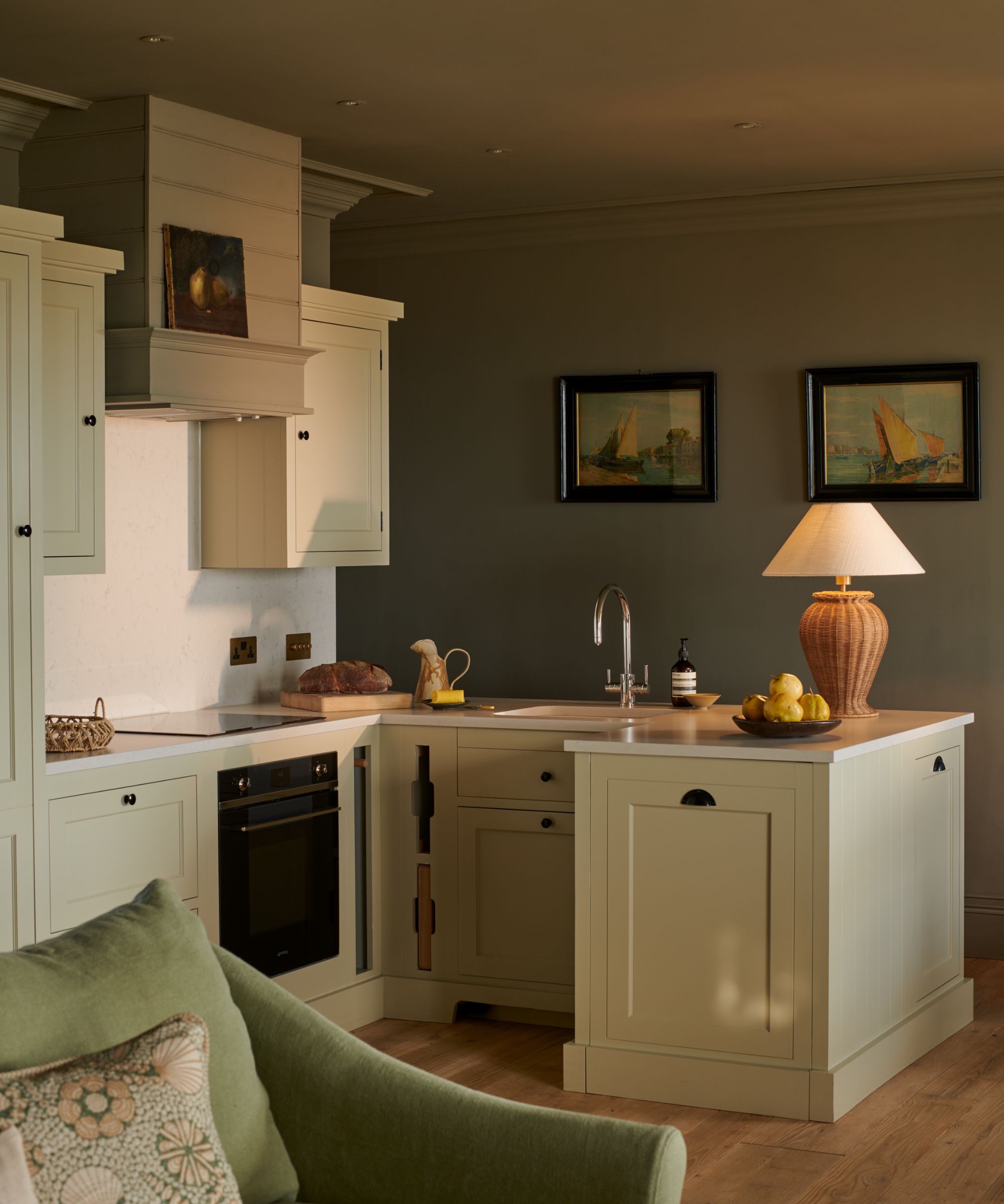
So how do you make recessed lighting work and feel better? In retrospect, there are a few ways I could have achieved both ambiance and functionality with a balance of different lights for different purposes and smarter thinking.
1. Better positioning
What would have been more successful is a trio of spotlights recessed directly over my countertops, rather than lighting the floor as they do currently.
This would have better dispersed the spotlights in my kitchen and instead of creating a grid (or rows of runway lights) would instead just perform as task lighting in the areas I need it most, like the cooker or sink.
And importantly, a combination of lighting sources is required.
2. Under-shelf or under-cabinet lights
If I had my time over, I would add some lighting underneath the open shelving in my kitchen to further light the countertops.
If you have cabinets rather than shelves, this works exactly the same way to add brightness and flexibility, allowing the kitchen to adapt to different activities and times of day.
Sure, the sconces work really well to light the shelf... but they're not really functional enough to help me chop vegetables. So some LED under-cabinet lights from Amazon are on order.
3. Lampscaping
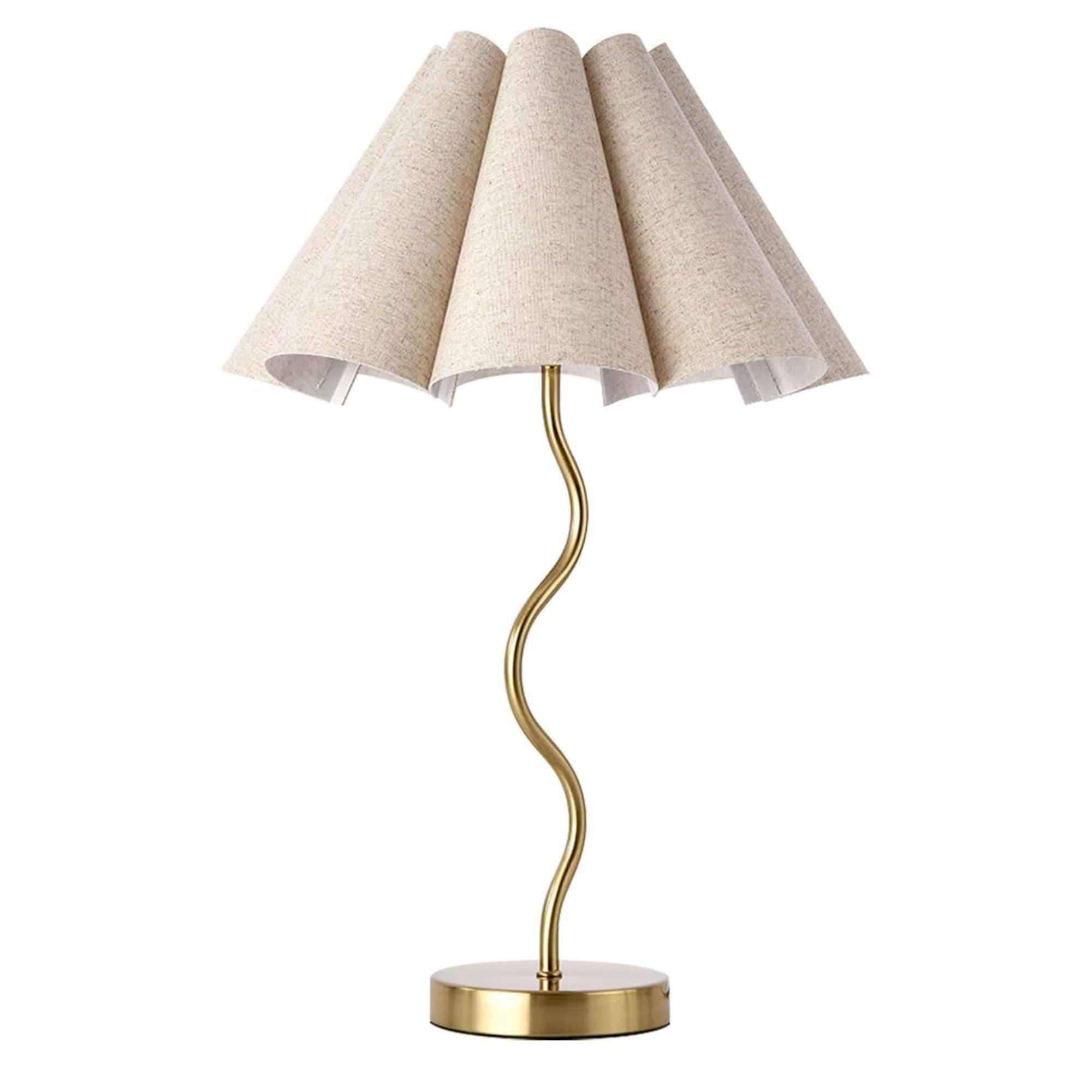
But for a quicker fix, I'm looking to introduce the lampscaping technique by simply placing some unexpected table lamps on the kitchen sides and island to cast pockets of warm and helpful glow.
Finally, I would also ensure all lights were on a separate and, crucially, dimmable circuit. This approach would have allowed me to create a space that adapts to different needs and moods, combining practicality with the warmth I'm craving.
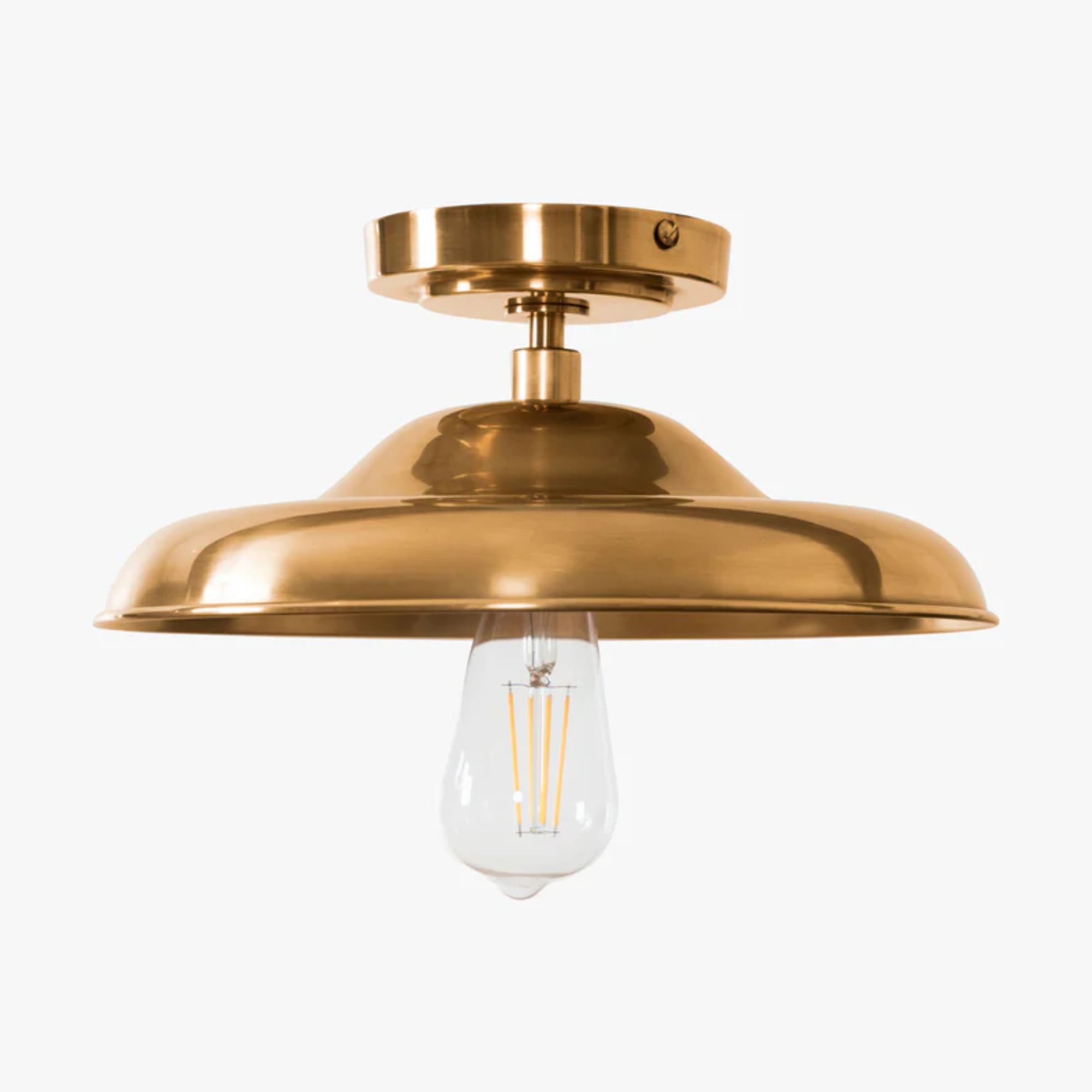
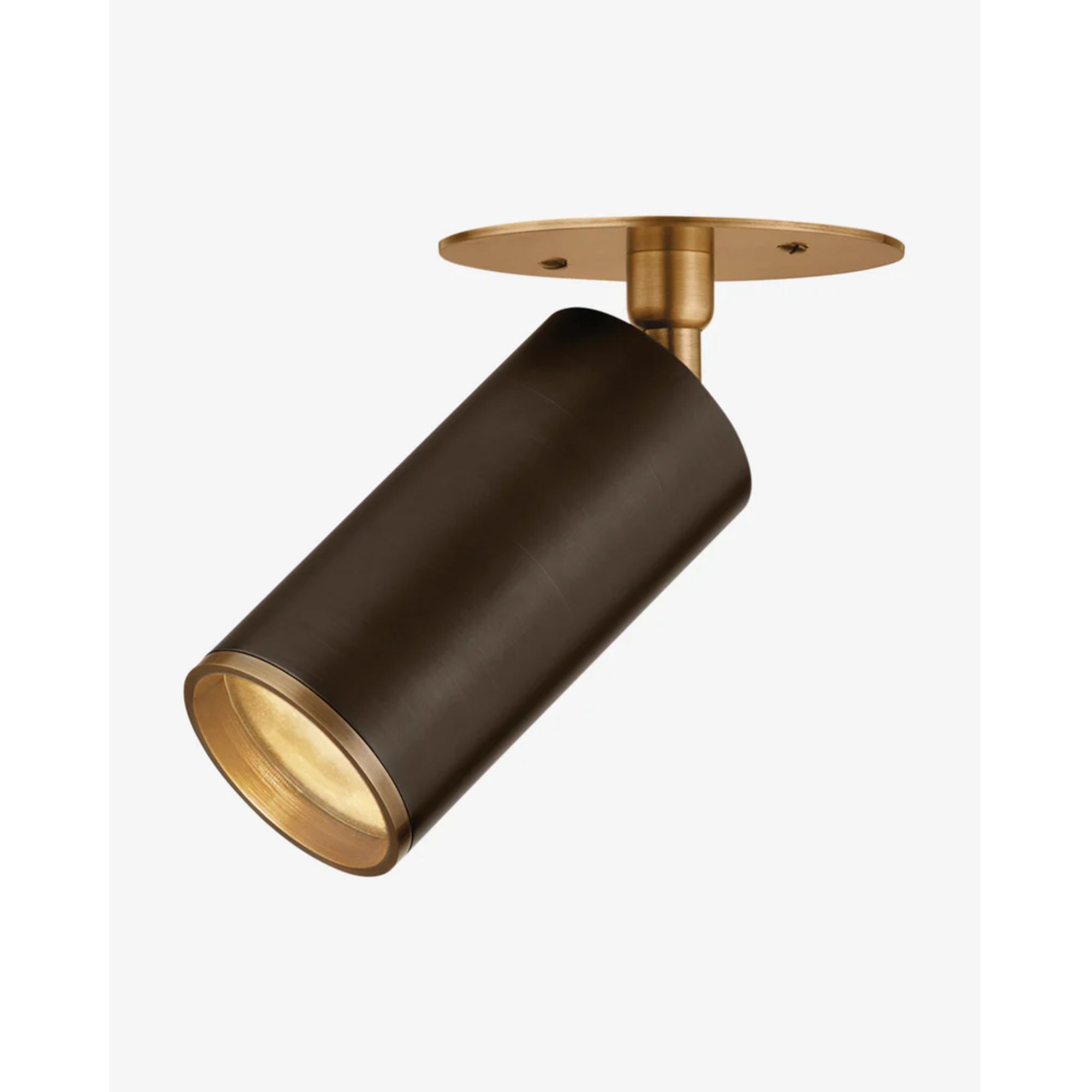
If you're lucky enough to have ample ceiling height and a flat roof, these antique-looking flush mount lights from McGee & Co would be a beautiful addition to a traditional kitchen.
While they have their merits, recessed lights alone can feel overly bright and clinical in a kitchen if not layered with other sources of light. If you’re considering a kitchen remodel, please learn from my experience and make lighting choices a fire thought and be sure to choice options that offer both style and practicality.
Sign up to the Homes & Gardens newsletter
Design expertise in your inbox – from inspiring decorating ideas and beautiful celebrity homes to practical gardening advice and shopping round-ups.

Charlotte is the style and trends editor at Homes and Gardens and has been with the team since Christmas 2023. Following a 5 year career in Fashion, she has worked at many women's glossy magazines including Grazia, Stylist, and Hello!, and as Interiors Editor for British heritage department store Liberty. Her role at H&G fuses her love of style with her passion for interior design, and she is currently undergoing her second home renovation - you can follow her journey over on @olbyhome
-
 Charred little gem with saffron dressing
This recipe with charred little gem is both easy to make and sure to impress guests. It's the perfect side for fresh spring menus
By Alice Hart
-
 Grilled asparagus with herb and pickled red onion
This grilled asparagus couldn't be easier, and it's a wonderful way to get the best flavor from our favorite spring veg. It's perfect alongside fish or lamb
By Alice Hart
