What should I avoid in a small kitchen? 8 mistakes to steer clear of when remodeling
Interior designers share how they ensure a small kitchen feels anything but – and what mistakes to avoid
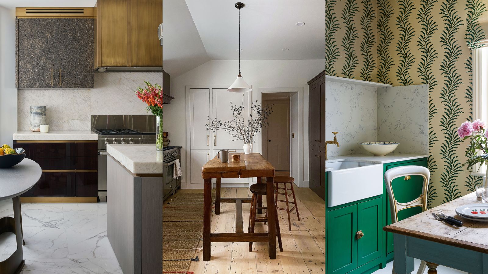

If you have a remodel on your mind for your small kitchen, it's just as helpful to know what to avoid as what to include. Whereas some design errors can be easily rectified or even ignored, small kitchen mistakes can be impractical to live with, disruptive, and costly to remedy.
Kitchen designers will often remark that small kitchen ideas can be difficult to get right, but it's not impossible. By making the most of the space’s architecture, highlighting objects on display and artwork, and, of course, creating a beautiful element of the room in its own right, you can turn your petite space into a room you will love forever.
So if you don't have an expert on hand to emphasize the importance of well-planned bijou space, it's easy to see how things unravel. Below we've asked the experts to reveal what you should avoid in a small kitchen, plus advice on how to fix any potential or existing disasters.
1. Not planning for the right kitchen layout
The best small kitchen layouts are crucial when designing a kitchen that makes the most out of a room with less space than you’d like. Planning a tiny kitchen can be tricky, as finding the optimum layout can make or break a compact room.
If you do put layout at the forefront, the time you spend in your kitchen will be much more enjoyable. Since the 1940s, the best kitchen designers and manufacturers, have used the kitchen triangle to determine placement. It is the space where most activity happens and which requires the most careful planning and access. However, it is often ignored.
'The kitchen work triangle is based on the three main work areas: the sink, the refrigerator, and the stove,' says Adrian Bergman, senior designer at British Standard by Plain English. 'According to the rule, these should be laid out to loosely form a triangle, enabling you to perform day-to-day tasks with relative ease and without obstruction.'
More recently, the five-zone kitchen is the newest layout that's informing our designs and renovation. While the working triangle is still a great basic layout, the five-zone kitchen caters to more modern needs, open-plan areas, and transitional spaces.
The modern kitchen is not just about cooking now; it's also often entertaining, dining, and even working. So the five-zone layout takes into account the shifting needs of the contemporary family and living situations.
When thinking about how to plan a small kitchen layout, it's best to make a list of your ‘must-haves’, particularly in terms of appliances, as they can swallow up a lot of storage space.
If in doubt, an open concept scheme is a good option for a small room. Open-plan kitchens aren’t just for vast properties. In a small kitchen, just removing one single wall can transform the sense of space.
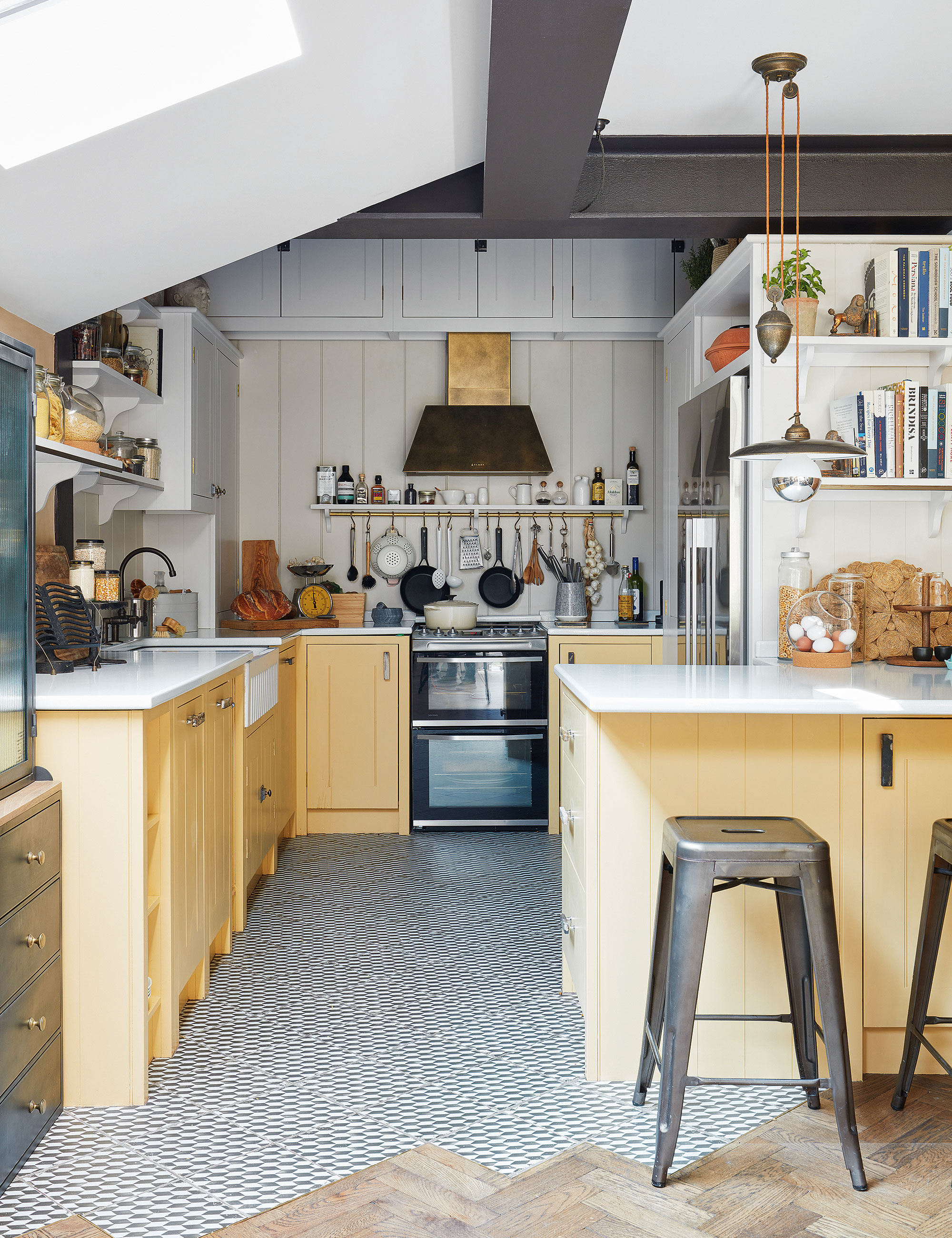
'In our own home, we removed a wall in the dark “middle room”, turning it into the kitchen and connecting it to our open-plan dining room, which has skylights,' says Anna Burles, co-founder, of Run for the Hills. 'The kitchen itself has no natural light, but we used sunny paint colors and lighting to make the windowless space feel bright. I’d also recommend a small peninsula and switch in flooring materials to clearly define your cooking zone.'
The Perfect Kitchen, Barbara Sallick | From $21.87 at Amazon
Learn more about the perfect kitchen design in this highly-rated book by Barbara Sallick. Inside you will find beautiful images and practical advice for your own kitchen remodel.
2. Not fully optimizing storage space
In a compact kitchen, there is one main ingredient that will maximize space and make it look beautiful – good kitchen storage ideas.
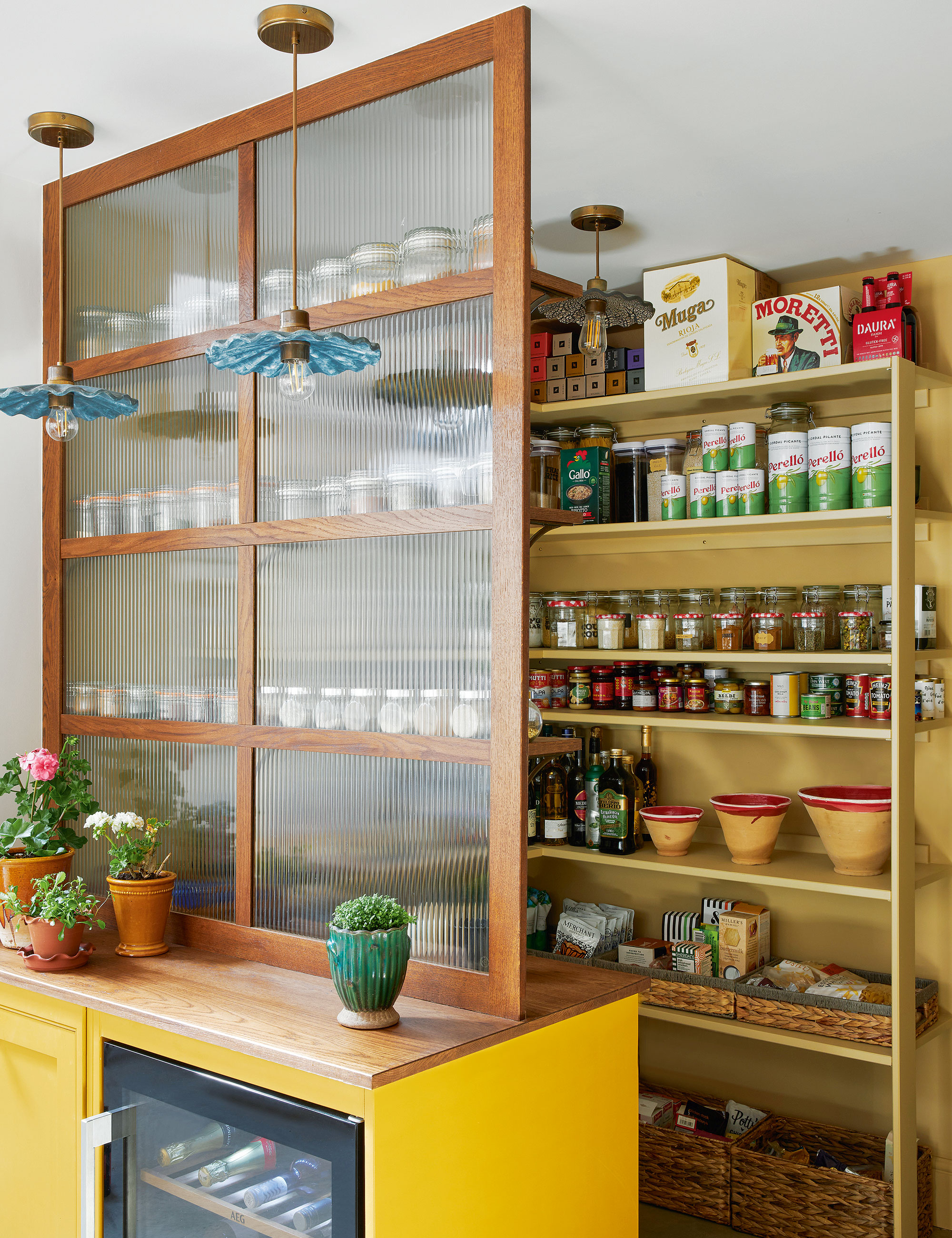
'Cupboard space is often the main sacrifice when space is tight, but a small pantry-style set-up can really pack in the storage,' says Laura Stephens, director, Laura Stephens Interior Design.
'Everything is visible at a glance; aim to plan each shelf height according to content size to get in maximum shelves. Attractive storage baskets make it easy to find small items and stash odd-shaped packaging. Food in attractive packaging helps when using an open pantry like this, as does the fluted glass screen, but it’s even better if you have the time to decant into neatly labeled jars!'
3. Not factoring efficient lighting from the start
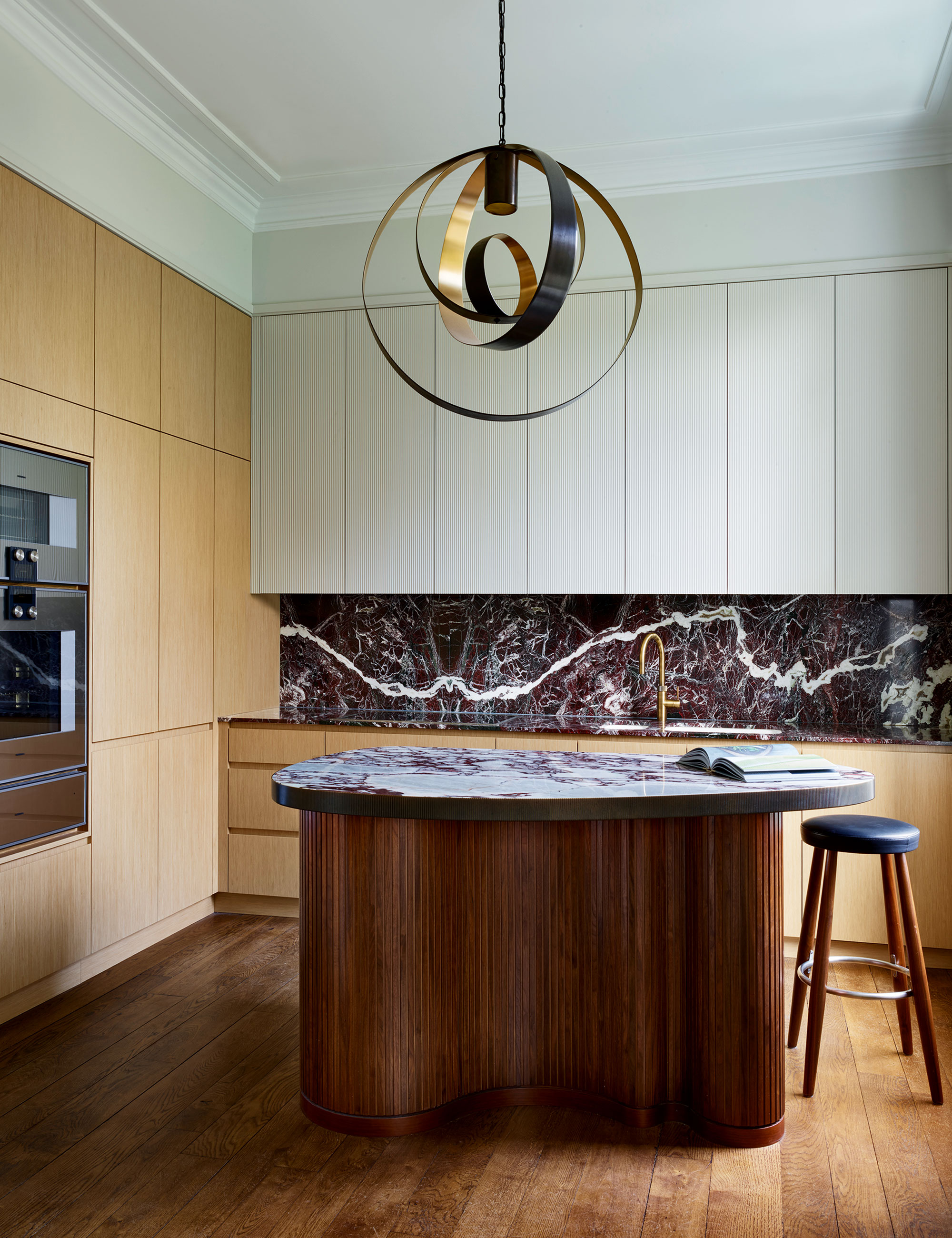
Lighting ideas for small kitchens have to deliver on a lot of fronts. They need to make the room safe and practical for preparing and cooking and, often, create the right atmosphere for dining and entertaining, too.
Sourcing lighting that shares a design dialogue with your kitchen furniture will help your scheme feel sophisticated and considered, especially in a small space.
'Lighting is one of the most important elements in a small room as it has a profound effect on our emotional response to space; it sets the mood and the surrounding atmosphere,’ says Simeon Chilvers, managing director of bespoke sculptural lighting company Cameron Design House.
A statement pendant, suspended from a central position, will make a wonderful centerpiece and is the perfect way to create a focal point in a small kitchen. Think about choosing a light fixture with a reflective metallic finish. They’ll add to the overall brightness of the space and provide sophisticated highlights.
Here, a single designer light poised above an island unit can be all it takes to unite a scheme, inject elegance and emphasize a focal point, especially in an open-plan space. ‘If you’re going for one lone fitting, it should be scaled in proportion with the island. Not so big it overpowers, nor so small it looks lost in the space,’ advises Mike Fetherston, design director, Hetherington Newman.
4. Keeping unsightly tech and appliances on show
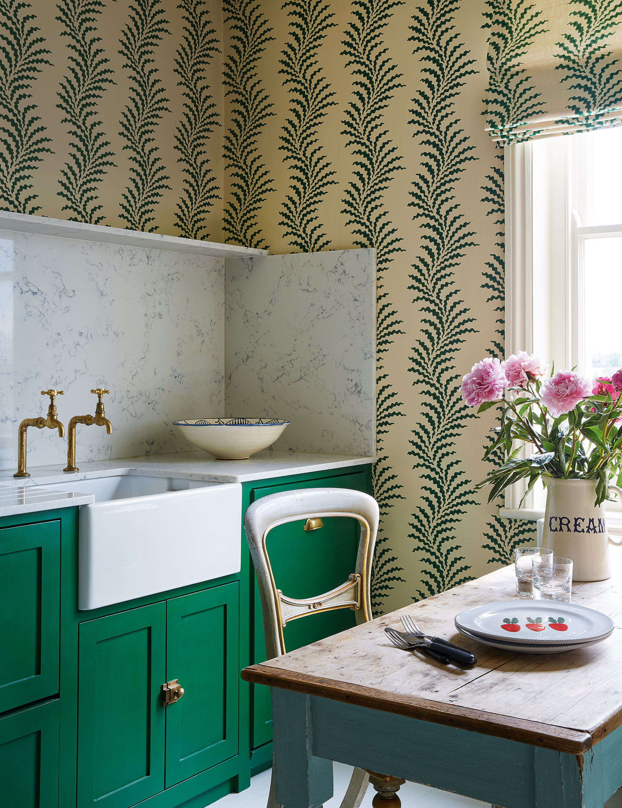
'Concealing the functional elements of a small kitchen works well, especially if it is also going to be used as an entertaining space,' says Emma Sherlock, founder, of Emma Sherlock Interiors.
'Fridges and freezers can be hidden in pull-out drawers beneath the work surfaces and dishwashers within cupboards. A high kitchen backsplash and a patterned wallpaper that climbs up the wall can add character and help accentuate the ceiling height. In this case, I also used the matching fabric on the Roman blind to continue the pattern around the room, and the palette of emerald green and cream keeps it simple.'
5. Forgetting about the flooring
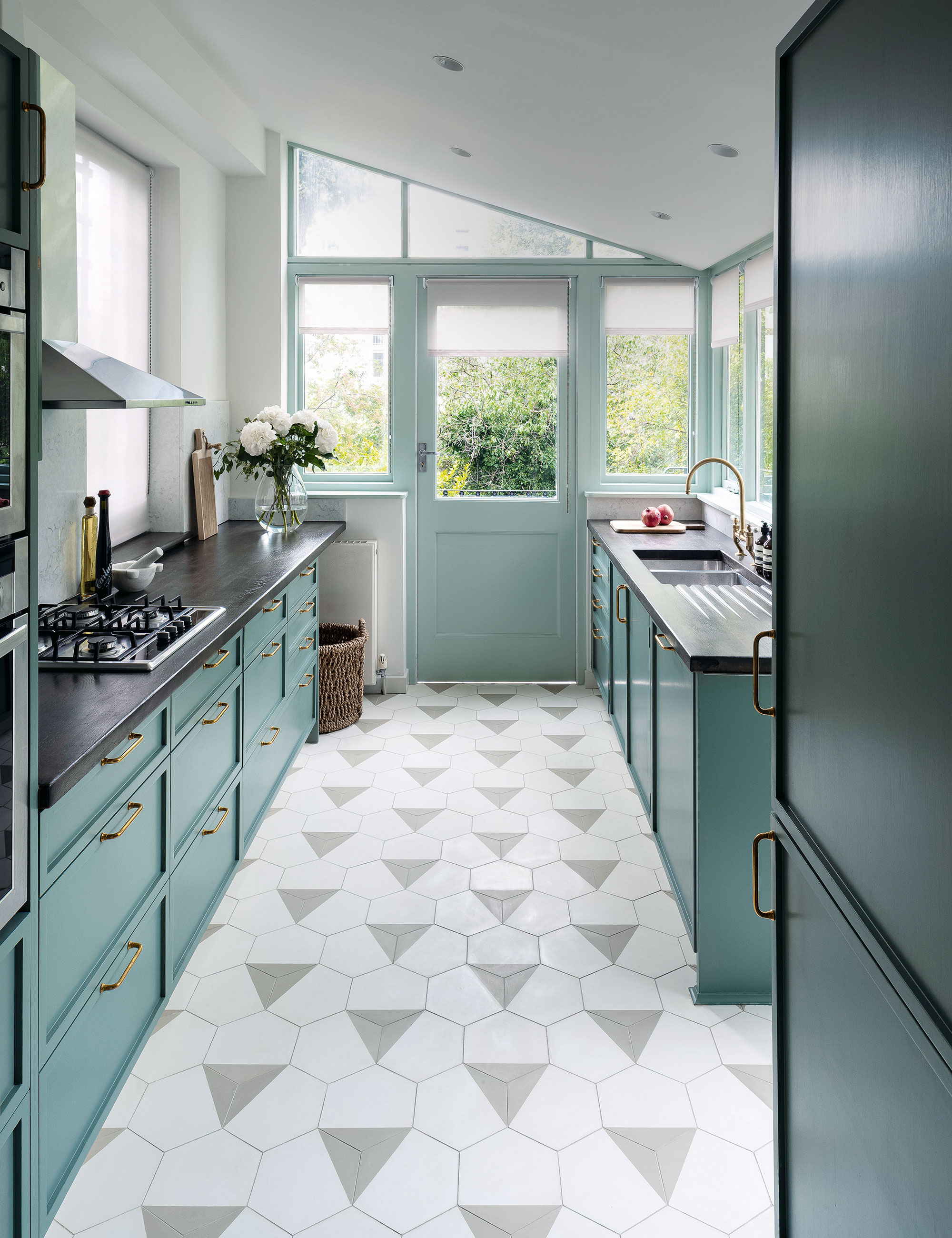
While a kitchen floor, with its heavy use, needs to be durable and preferably easy to maintain, it can also be a feature that enhances the style and success of your tiny kitchen. The choice of material depends on your budget and attitude towards character, beauty, and practicality.
'All too often, people think small tiles in a compact space is the best option, but generally, the larger the floor tiles and the finer the grout lines, the more seamless and expansive a room will look,' says Katie Glaister, founder, of K&H Design.
'However, here we chose an encaustic hexagonal tile with a triangle pattern. The triangles lead your eye along the galley kitchen and out to the backyard, enhancing the perspective and stretching the room. The hexagonal grout lines do the opposite as the diagonal lines deceive the eye into thinking the space is wider. Try to leave at least one or two areas where the flooring is visible wall-to-wall to appreciate the room’s full footprint.'
6. Forgoing textural details
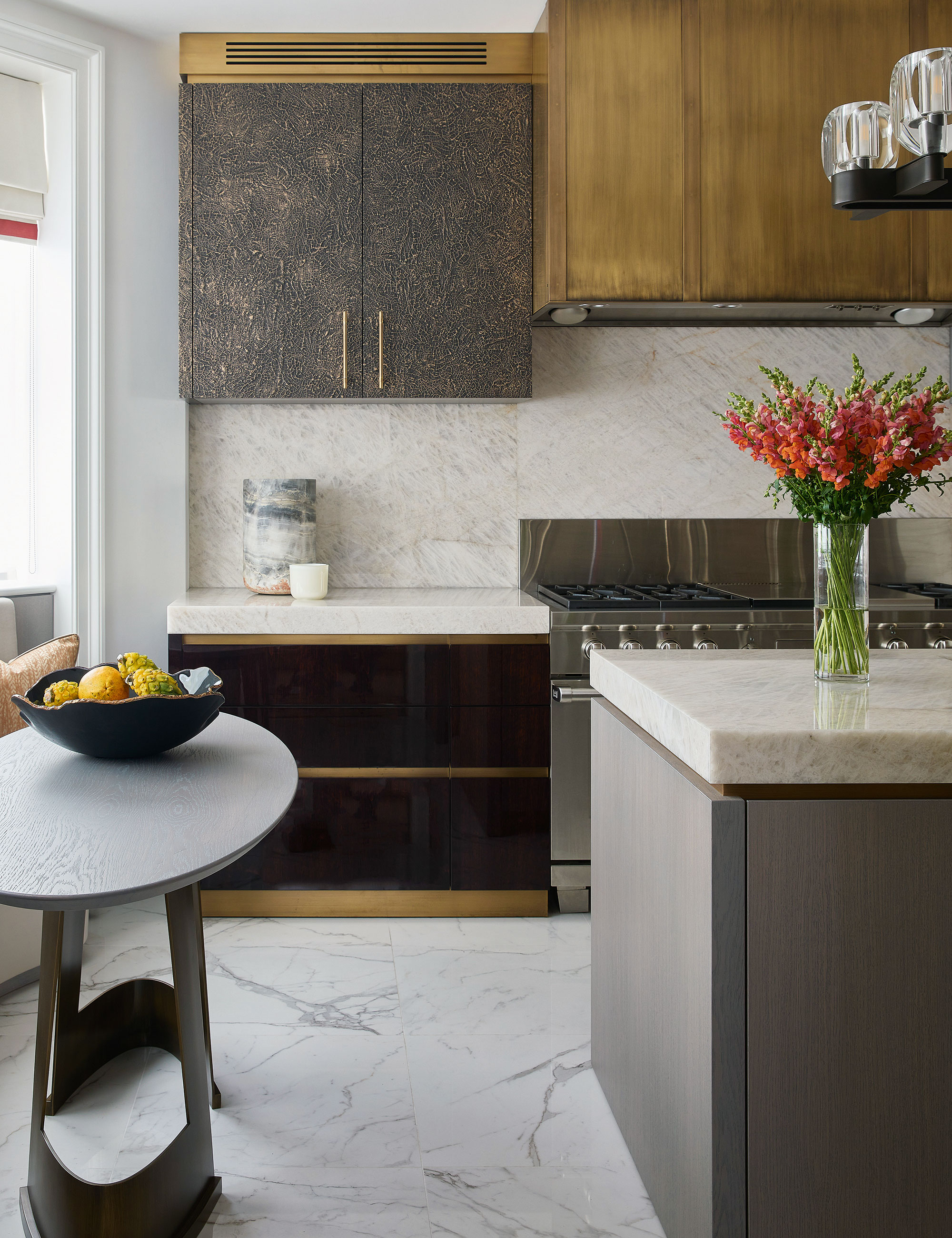
If you think a small kitchen should be devoid of decorative details to make it look bigger, you'd be sorely mistaken.
'Adding texture to a bijou kitchen is a terrific way to make it feel curated and luxurious, rather than just small and underwhelming,' says Katharine Pooley, director, Katharine Pooley. 'It means you can work in special finishes and detailing without too much expense. This is the time to seek out a really beautiful marble, poured resin, or textured metal for cabinetry, and pick exquisite handles and hinges.'
'Mixing up textures adds interest and can help make a small kitchen look bigger. I like to combine reflective surfaces with matt finishes for a layered effect. A different door finish on low and high cupboards looks particularly chic.'
7. Poor furniture choice and placement
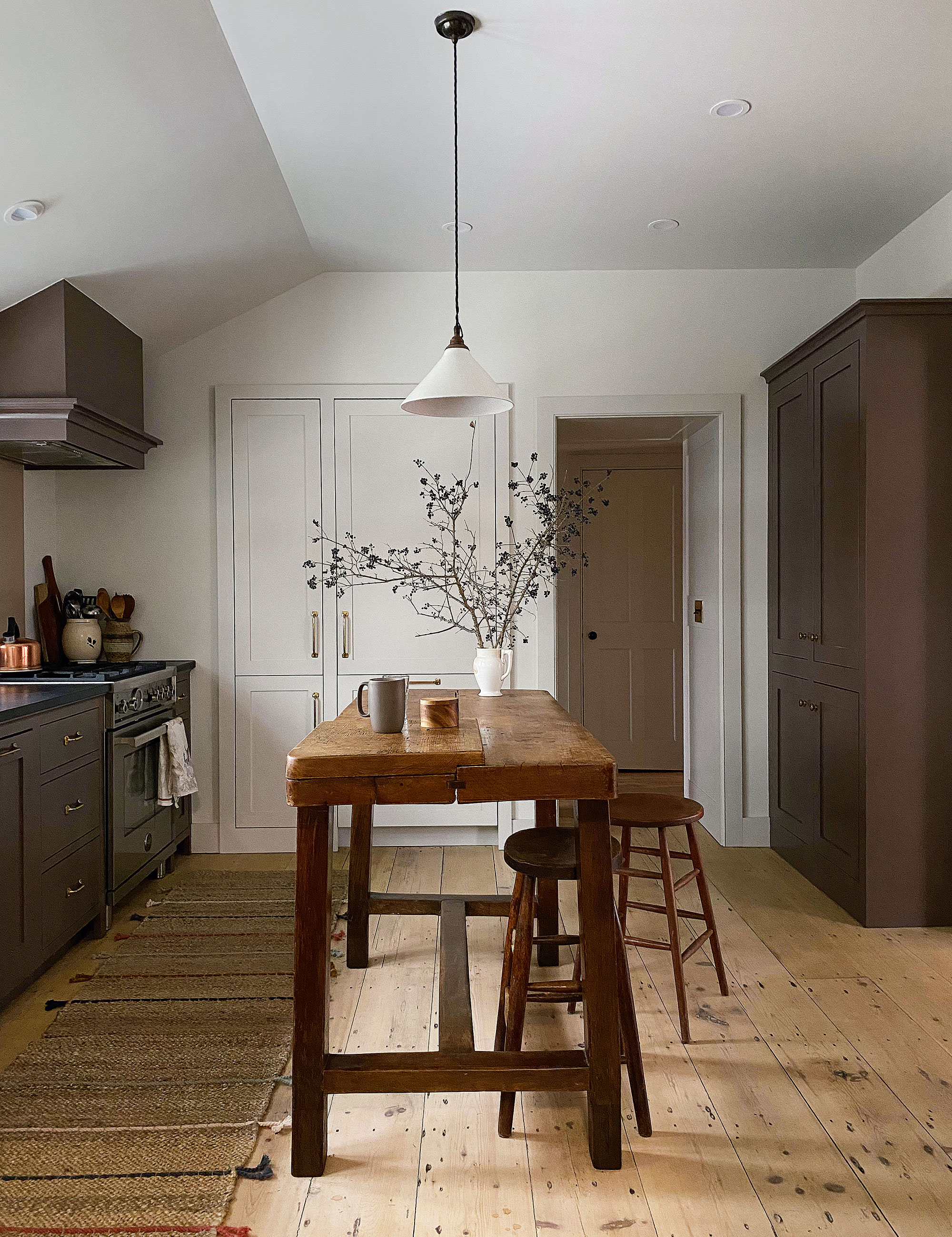
'In a small kitchen it makes sense to optimize storage with built-in cabinets on as many walls as possible, however, that can limit counter space,' says Heide Hendricks, founder, Hendricks Churchill.
'In this charming period house, we needed an island for vital prep space but realized a bottom-heavy design would make the kitchen feel cramped. We found this vintage French worktable with the perfect time-worn patina and worked with a craftsman to extend the legs to counter height to let the light through and allow more flooring to be on view.
8. Choosing the wrong color
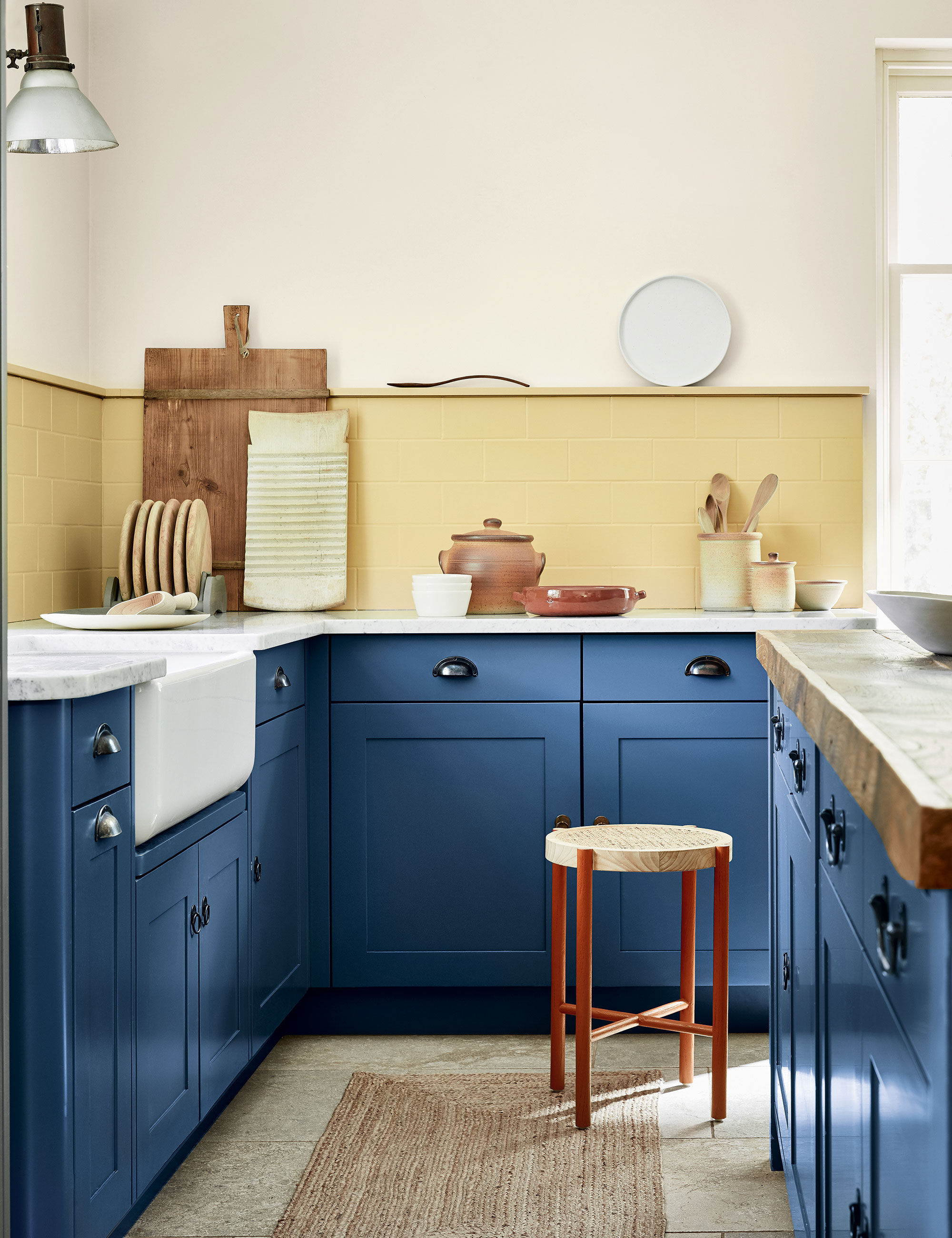
Forgetting about color in the kitchen is on par with forgetting to get dressed when you leave the home; it is a must and should be given as much consideration as fittings, fixtures, and furniture when planning a small kitchen.
'As well as the walls, consider your kitchen cabinets and storage: highlighting these essential elements within a kitchen is a fantastic way to deliver design impact,' says Ruth Mottershead, creative director, Little Greene. 'Are there architectural features or areas of interest to draw attention to? Color is a fantastic way to highlight a favorite feature. If you don’t want to use a bold color all over, highlight the back of your shelving in a contrasting color or opt for a dynamic two-tone kitchen color scheme by adding one color to the lower cabinets and contrasting colors for walls and upper cabinets.’
Sign up to the Homes & Gardens newsletter
Design expertise in your inbox – from inspiring decorating ideas and beautiful celebrity homes to practical gardening advice and shopping round-ups.

Jennifer is the Digital Editor at Homes & Gardens. Having worked in the interiors industry for several years in both the US and UK, spanning many publications, she now hones her digital prowess on the 'best interiors website' in the world. Multi-skilled, Jennifer has worked in PR and marketing and occasionally dabbles in the social media, commercial, and the e-commerce space. Over the years, she has written about every area of the home, from compiling houses designed by some of the best interior designers in the world to sourcing celebrity homes, reviewing appliances, and even writing a few news stories or two.
-
 Gwyneth Paltrow's quiet luxury kitchen is so beautiful, we almost overlooked her ultra-smart cabinets – they make the use of 'every inch' of storage space
The Goop founder makes use of dead space in her kitchen with customized cabinetry that reaches to the ceiling, providing ample storage
By Hannah Ziegler
-
 Martha Stewart's intelligent cabinets 'take every inch into consideration' – their 'visually light' style will solve your small kitchen storage problems
'Every kitchen can be beautiful and functional, no matter what the size': 9 years since sharing her clever storage, Martha's cabinets are just as beautiful
By Megan Slack
