What makes a kitchen look cheap – 5 things that you are doing wrong, according to designers
These design decisions could be making an impression in your kitchen – for all the wrong reasons
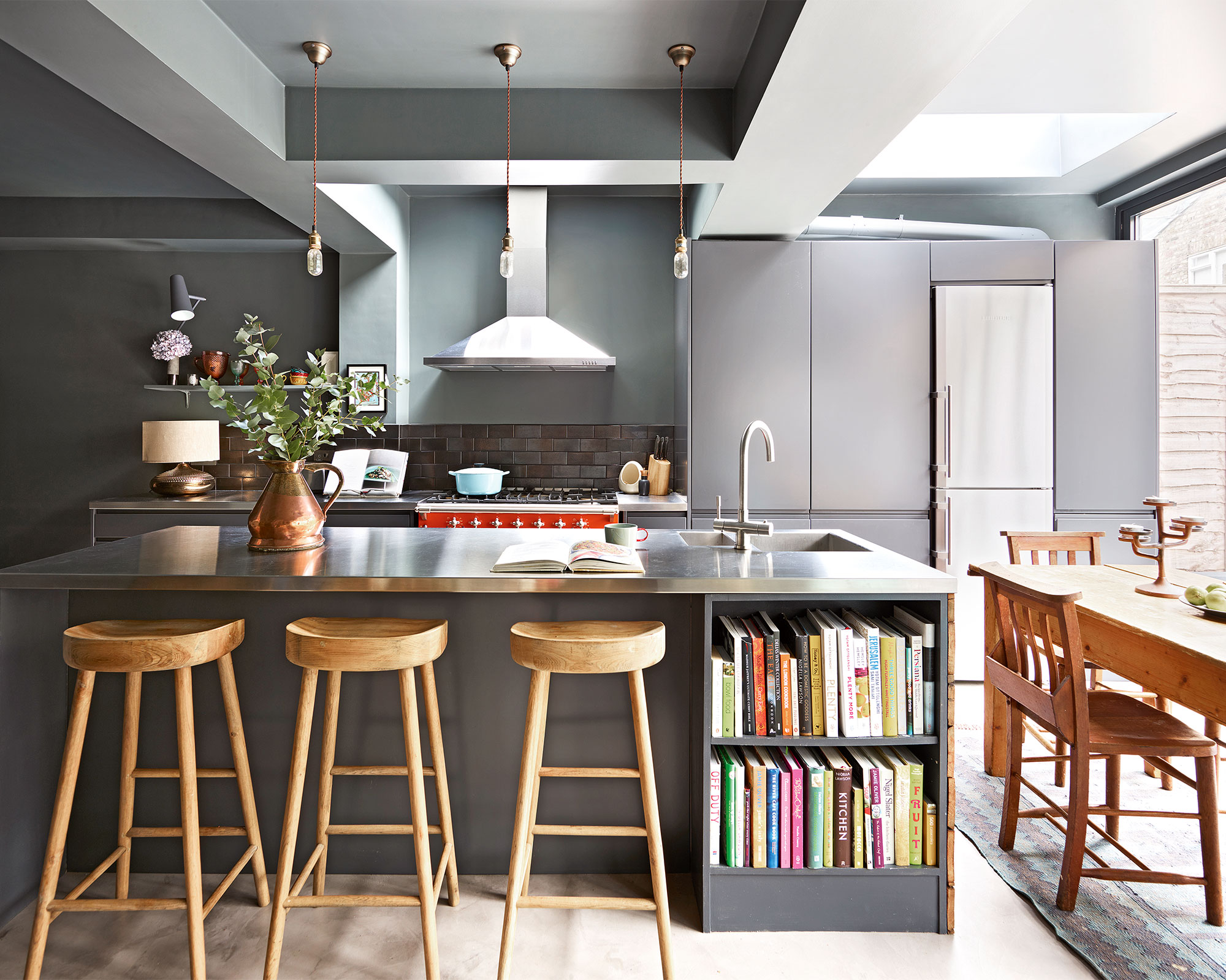

The kitchen is perhaps the most complex room in the home. Above all, this space needs to function as a workspace, meaning practical and durable elements are essential. However, prioritizing functionality can often feel conflicting – not least because this space is often one of the most sociable rooms in the home. Therefore, as the place where family and guests often congregate, it's important your kitchen looks good, too.
Knowing what makes a house look cheap is one way to ensure every room in your home is well-curated for all who live there and all who pass through. This is valuable in every space, but none more so than in your kitchen – the place where you are subject to the most hardware, appliances, and inevitable splashes and spills that come with cooking (and living).
In many cases, the things that lead to a house looking cheap aren't even a reflection of wealth, in fact, there are many budget-friendly ways you can make a home look expensive.
What makes a kitchen look cheap?
We asked top designers for the top five things to avoid or change – to be sure your kitchen ideas are as exclusive as the rest of your home.
1. Bulky under-cabinet hoods
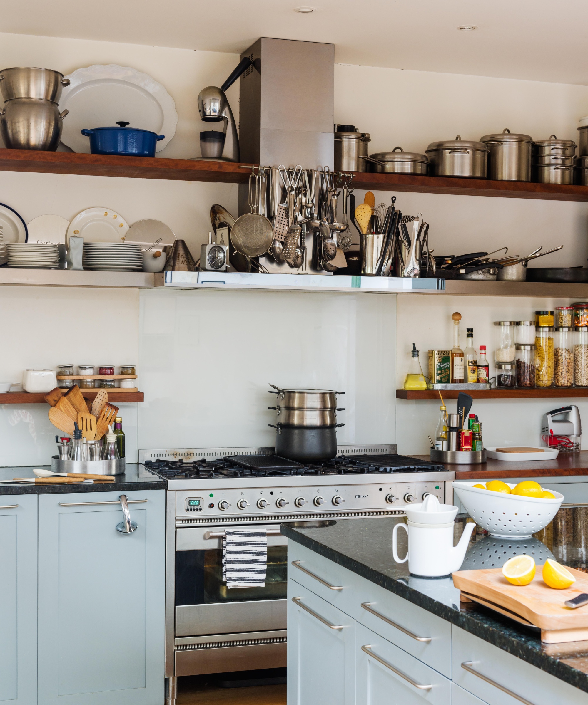
A cabinet-hoods is the perfect example of something that is necessary for practical reasons in a home. And while you certainly shouldn't get rid of it completely, designer J.R. Coffin from Studio Den Den in Brooklyn warns that you should look for a more discreet alternative.
'Not every kitchen has access to exterior exhaust – but large recirculating hoods mounted to the underside of your cabinets make your kitchen look more of a quick rental than a home,' J.R warns. Instead, she suggests investing in a minimal range hood that can be 'sleekly integrated into cabinets, millwork, or even your microwave.'
2. Mismatched appliances
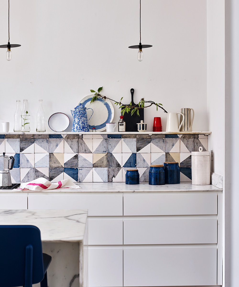
It is only natural that your kitchen is home to more appliances than any other space. However, J.R. warns that too many materials and colors can make a kitchen look 'hodge-podge and cheap.'
'We don't always need everything to be stainless steel, but appliances should match with - either each other or the environment around them,' she says. For example, you should choose a dark dishwasher if you have dark base kitchen cabinet ideas – or a panelized wood fridge with wood cabinets – for a more streamlined aesthetic overall.
3. Short backsplashes
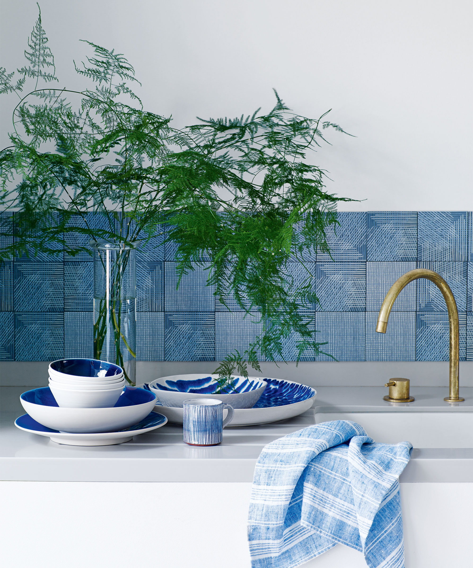
'No matter your counter material, a 4" tall backsplash – often matching the counter color – makes kitchens look small and outdated,' J.R says. 'This is a total missed opportunity to elevate your kitchen with an eye-catching wall tile that runs from the top of the counter to the bottom of the upper cabinet or shelf.'
Carla Bast from Carla Bast Design in Minneapolis agrees. She, too, cautions that a standard 4" backsplash in your countertop material will bring down the overall look and feel of your kitchen – and prompts you to look for more vibrant kitchen tile ideas instead.
'Tile is relatively inexpensive and easy to install; plus, it can really help to tie together your kitchen's overall look and feel, making it appear more expensive,' she says. 'Remove that 4" curb and replace it with a full-height tile backsplash from the countertop to the bottom of your upper cabinets.'
4. Laminate countertops
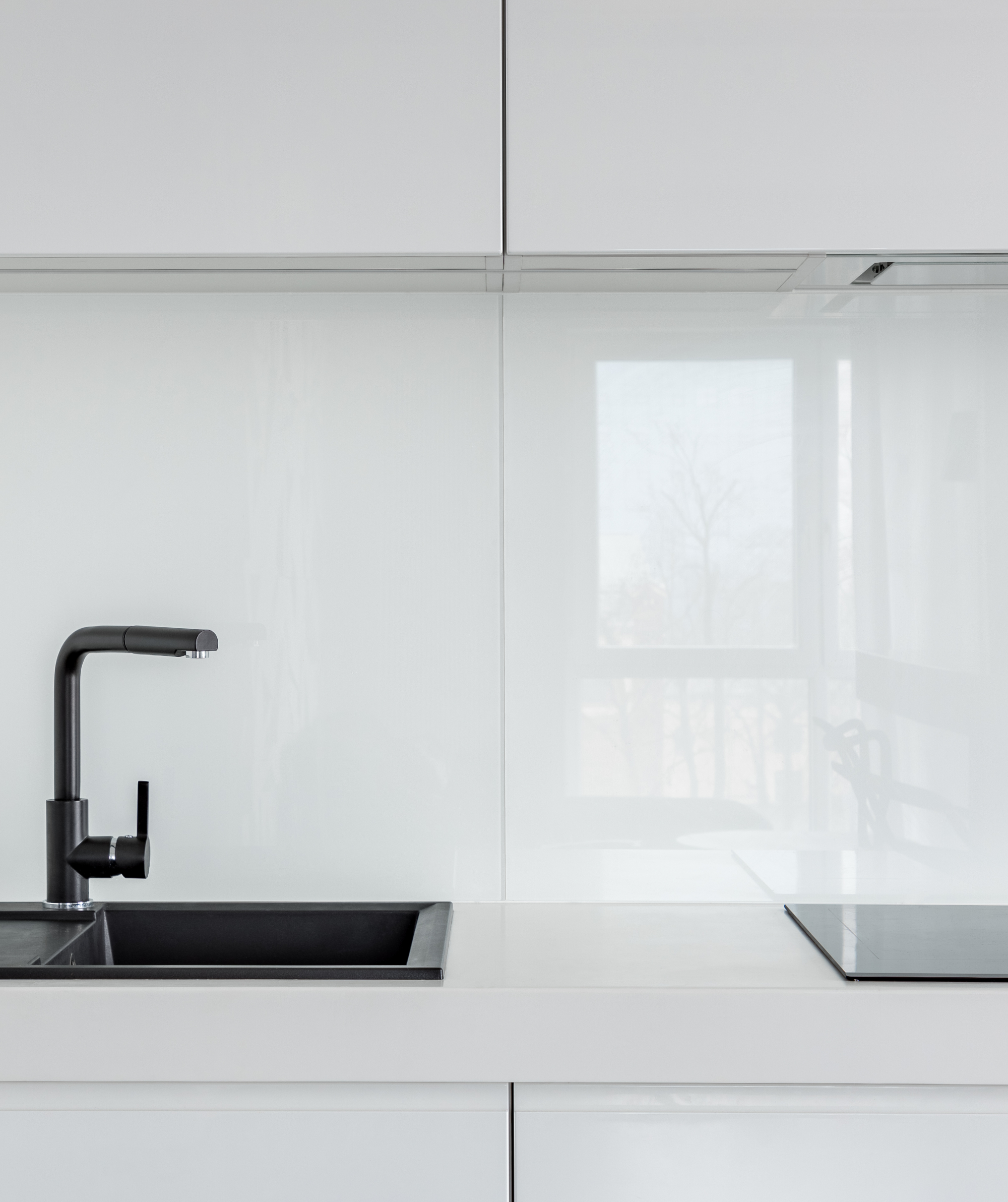
On the subject of countertop ideas, Carla also urges against laminate countertops (often referred to as Formica) – explaining that the synthetic material can have a less-than-desired impact on your kitchen.
'They don't have the natural beauty or depth of real stone or solid surface such as manufactured quartz,' the designer says.
'Additionally, they sound cheap because they make a hollow sound when you place an item on them. but rather a print or vinyl overlay. Laminate countertops also tend to make a kitchen look smaller due to their glossy finish, and they also produce a high-pitched sound when tapped.'
5. Fluorescent lights
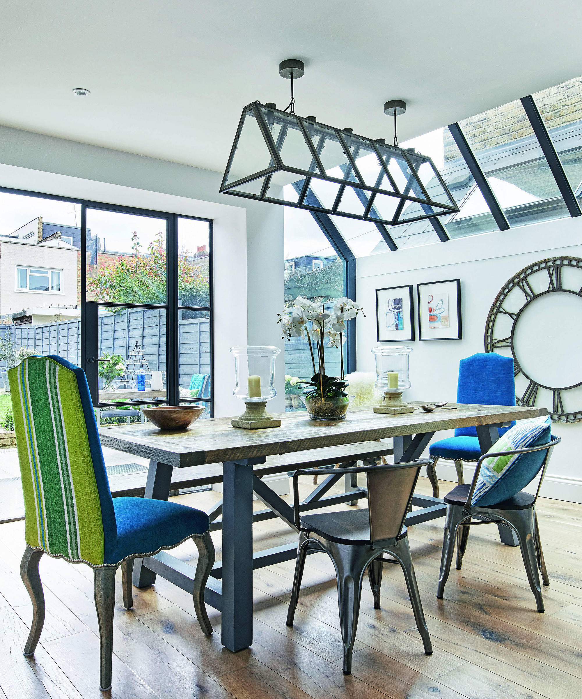
Mastering the most flattering lighting ideas can make or break any room, but none quite so much as your kitchen. And, arguably, the worst choice you can make in your kitchen is mounting a large fluorescent light on the kitchen ceiling.
'They're often harsh, unflattering, and just plain ugly,' Carla says. 'If you want your kitchen to look more elegant, install recessed lighting and add decorative lighting such as pendants over your center island and kitchen sink. They'll cast a softer, more flattering light and will make your kitchen look much more luxurious.'
Sign up to the Homes & Gardens newsletter
Design expertise in your inbox – from inspiring decorating ideas and beautiful celebrity homes to practical gardening advice and shopping round-ups.

Megan is the Head of Celebrity Style News at Homes & Gardens, where she leads the celebrity/ news team. She has a history in interior design, travel, and news journalism, having lived and worked in New York, Paris, and, currently, London. Megan has bylines in Livingetc, The Telegraph, and IRK Magazine, and has interviewed the likes of Drew Barrymore, Ayesha Curry, Michelle Keegan, and Tan France, among others. She lives in a London apartment with her antique typewriter and an eclectic espresso cup collection, and dreams of a Kelly Wearstler-designed home.
-
 Nectar vs Layla – which mattress brand is best on test?
I've set the Nectar Premier Hybrid Mattress and the Layla Hybrid Mattress head to head to help you work out which mattress meets your needs
By Emilia Hitching Published
-
 Barack and Michelle Obama's neutral accent chair is the perfect living room focal point – you can recreate their serene style in any-sized home
This designer-approved essential fits into every modern living room – it's beautiful enough to stand alone, while pairing well with your favorite cushion
By Megan Slack Published