What layouts always make a kitchen look bigger? Designers reveal all
Need to carve out more kitchen space? Discover six layouts that always make a kitchen look bigger according to the experts
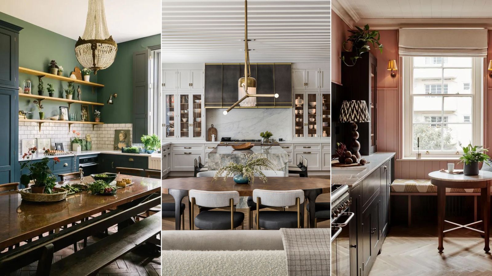
When planning your new kitchen, creating as much space as possible is a top priority, no matter what square footage you are dealing with. Kitchens are busy places, a central hub for cooking, eating, relaxing and socializing. So carving out enough space to fit in all of these different activities can be a challenge.
That’s why kitchen layout is so important. Even with your dream cabinets and color scheme in place, without the right kitchen layout, your kitchen can feel awkward, cramped and unusable.
With that in mind, we asked designers for their top tips on what layouts always make a kitchen look bigger.
6 Layouts To Make A Kitchen Look Bigger
We know that every kitchen space is different. Yours might be long and narrow, or wide and open-plan. But when it comes to kitchen layout there are lots of classic layout ideas that can be tweaked to make the most of every floor plan.
'One wall, L-shaped, U-shaped, island kitchens, and galley kitchens are the main types of kitchens used nowadays,' explains Al Bruce founder of Olive & Barr. 'You should always start your kitchen design process by understanding how you might use your space, especially when preparing and cooking meals.'
Here designers and experts reveal which layouts they go back to time and time again to make sure your kitchen always looks bigger.
1. Introduce a classic island layout
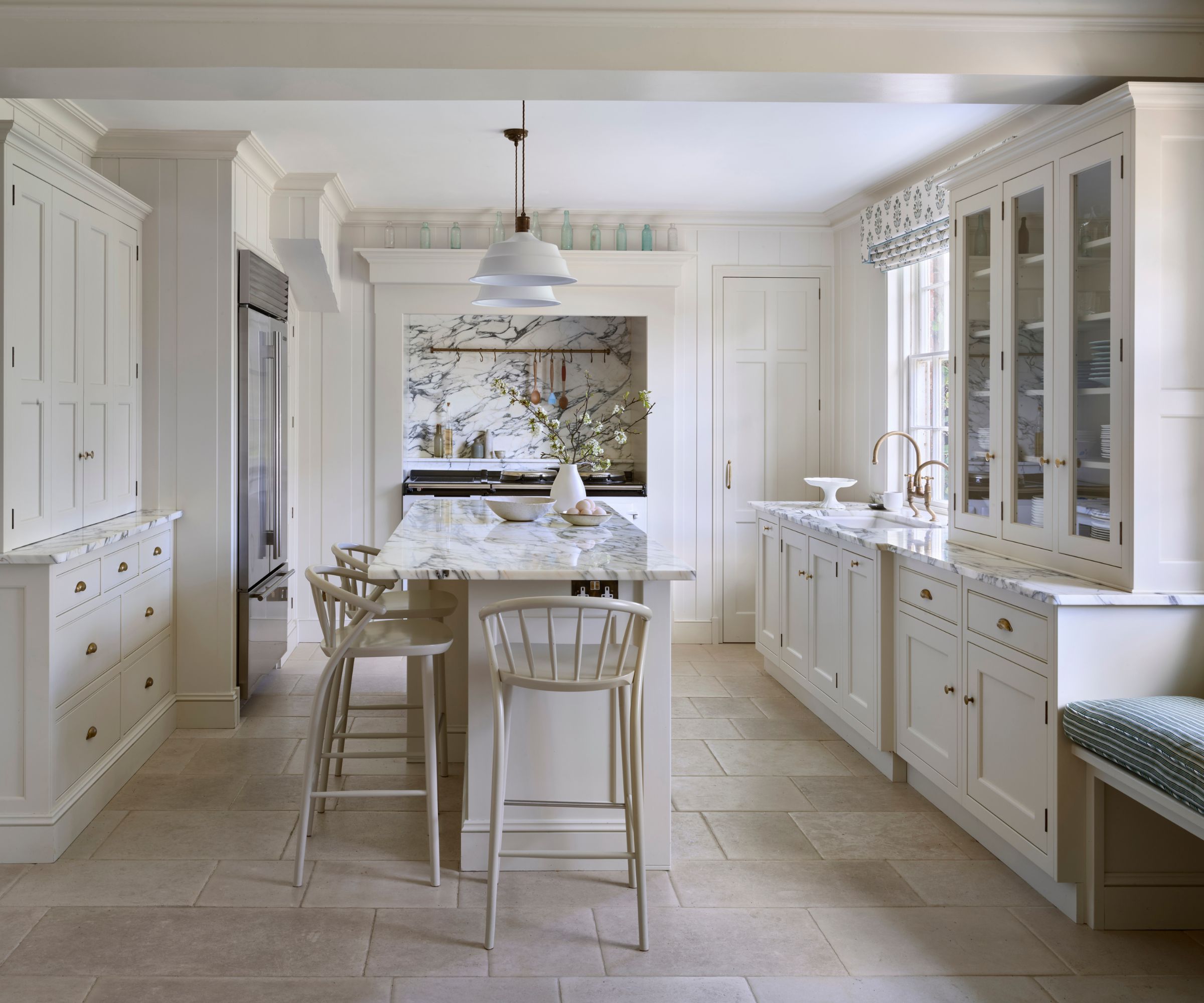
Kitchen islands continue to top many homeowner's wishlists when it comes to planning a new kitchen – and it's easy to see why. These workhorses offer extra storage and counter space, not to mention a place to perch for coffee if you add in a few bar stools. But crucially say the designers, adding a freestanding island into your layout can also enhance the spaciousness of your room.
'A classic layout of a central island with cabinetry runs on three sides of the space is a good, simple layout to produce a feeling of spaciousness in the kitchen,' says Richard Moore, creative director at kitchen designers, Martin Moore. 'Simplicity is best; adding too much furniture will make even larger kitchens feel cramped. Make sure the island is in proportion to the available space and is not overwhelming in size.'
Los Angeles based interior designer Amy Elbaum agrees a kitchen island layout can 'expand' space, but you must ensure there is enough room around it. She explains, 'Leave ample space around the island. A minimum of 42" should exist between the island and perimeter countertops although 48" is ideal. This will make the kitchen feel less cramped and provide enough space to easily move around. If you don't have enough room for these distances, omit the island and
consider a peninsula instead.'
2. Tweak a galley layout to open up the space
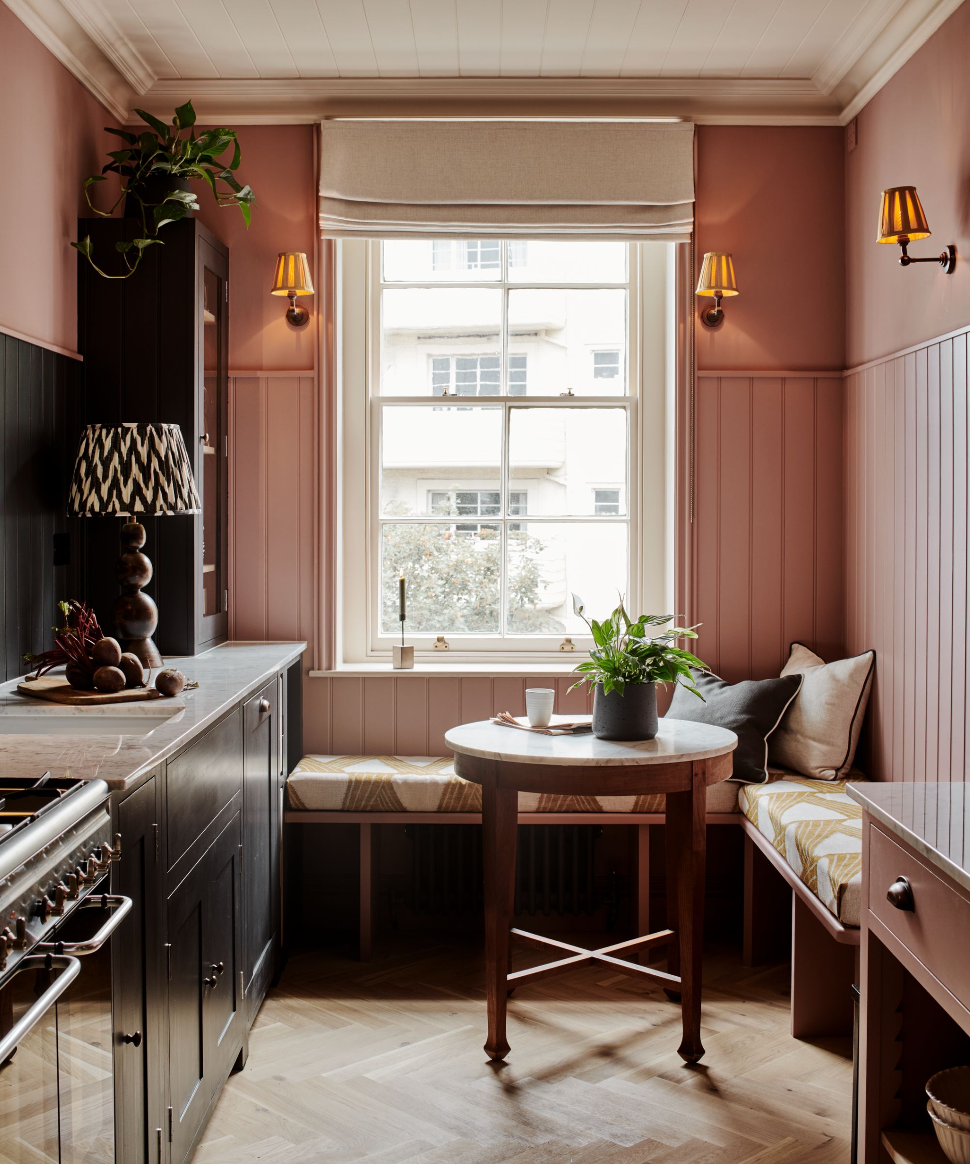
Designers have long praised the benefits of a galley kitchen layout for creating practical and efficient cook spaces. Comprising two rows of base and wall cupboards with a walkway between, these two-sided layouts are an ergonomic way to pack in storage and appliances in a smaller footprint.
'A galley layout with cabinets and appliances arranged along two parallel walls is a good option and will help to create a streamlined workflow with everything within easy reach,' explains Molly Chandler, kitchen designer at Willis & Stone.
But galley layouts can also make your kitchen look bigger with a few creative adjustments, say the experts. For instance, you can incorporate a galley kitchen layout into an open floor plan by introducing an island that forms one side of the galley opposite a row of built-in units.
However, even in a traditionally narrow kitchen, the galley layout can be used to a space-enhancing effect. 'A galley-type space can still feel spacious if the cabinetry layout is cleverly thought through,' adds Emily Pickett, designer at Kitchens by Holloways. 'Consider no wall cabinets if you can on one side, and then a run of cabinetry on the opposite side that can be closed to create a sleek appearance.'
3. Open up floor space with an L-shaped layout
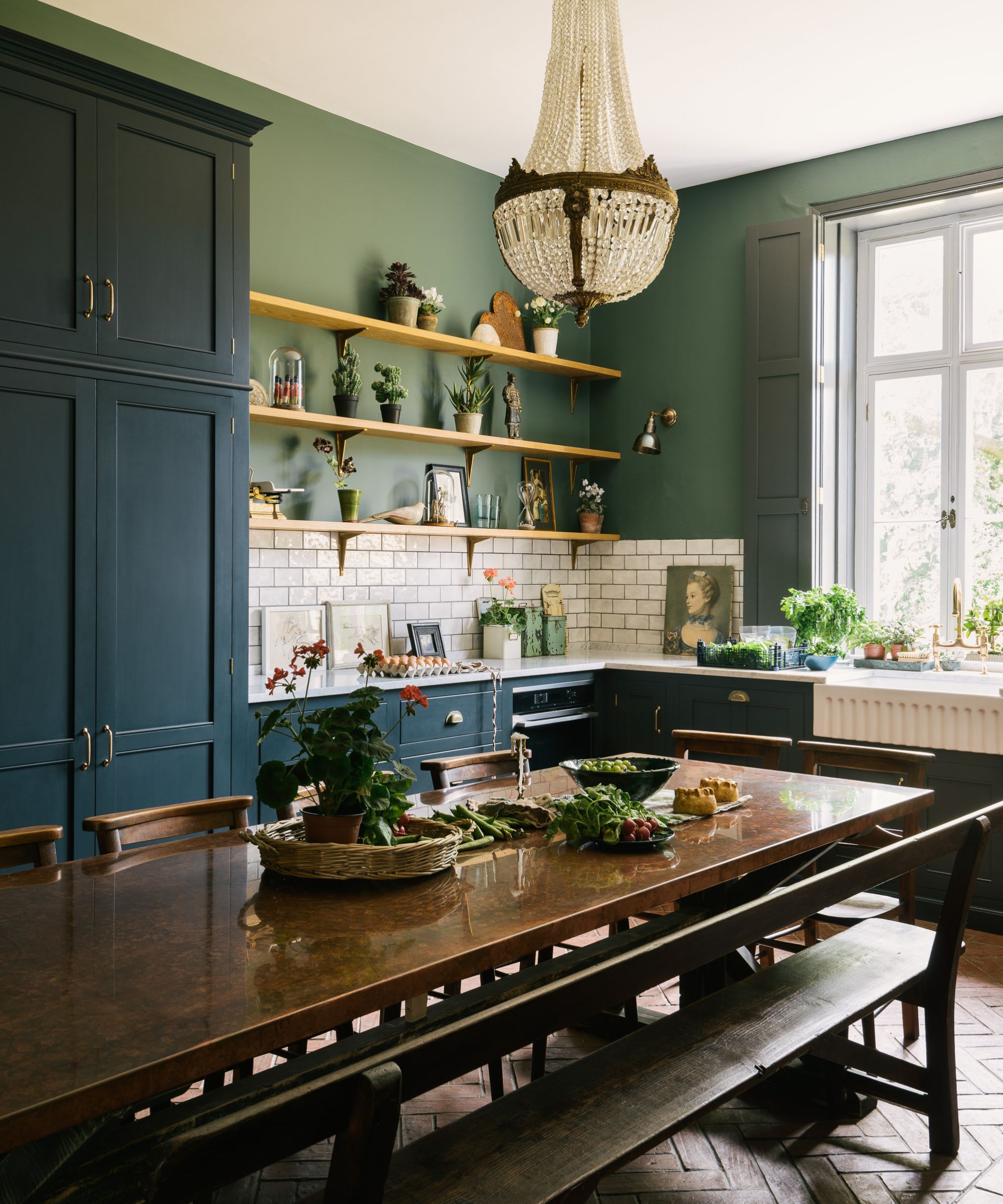
According to the designers, the simplicity of an L-shaped kitchen layout offers so many benefits. It is a practical and versatile option that can help optimize corner storage while still maintaining an open feel.
'These L-shaped designs minimize cabinetry and open up floor space, creating the illusion of a more expansive area,' declares Claire Garner, director of Claire Garner Interiors. 'I also recommend incorporating open kitchen shelving into an L-shaped layout to create more storage and to display beautiful crockery or pantry items, which adds both functionality and style."
4. Add an island into a L-shaped kitchen
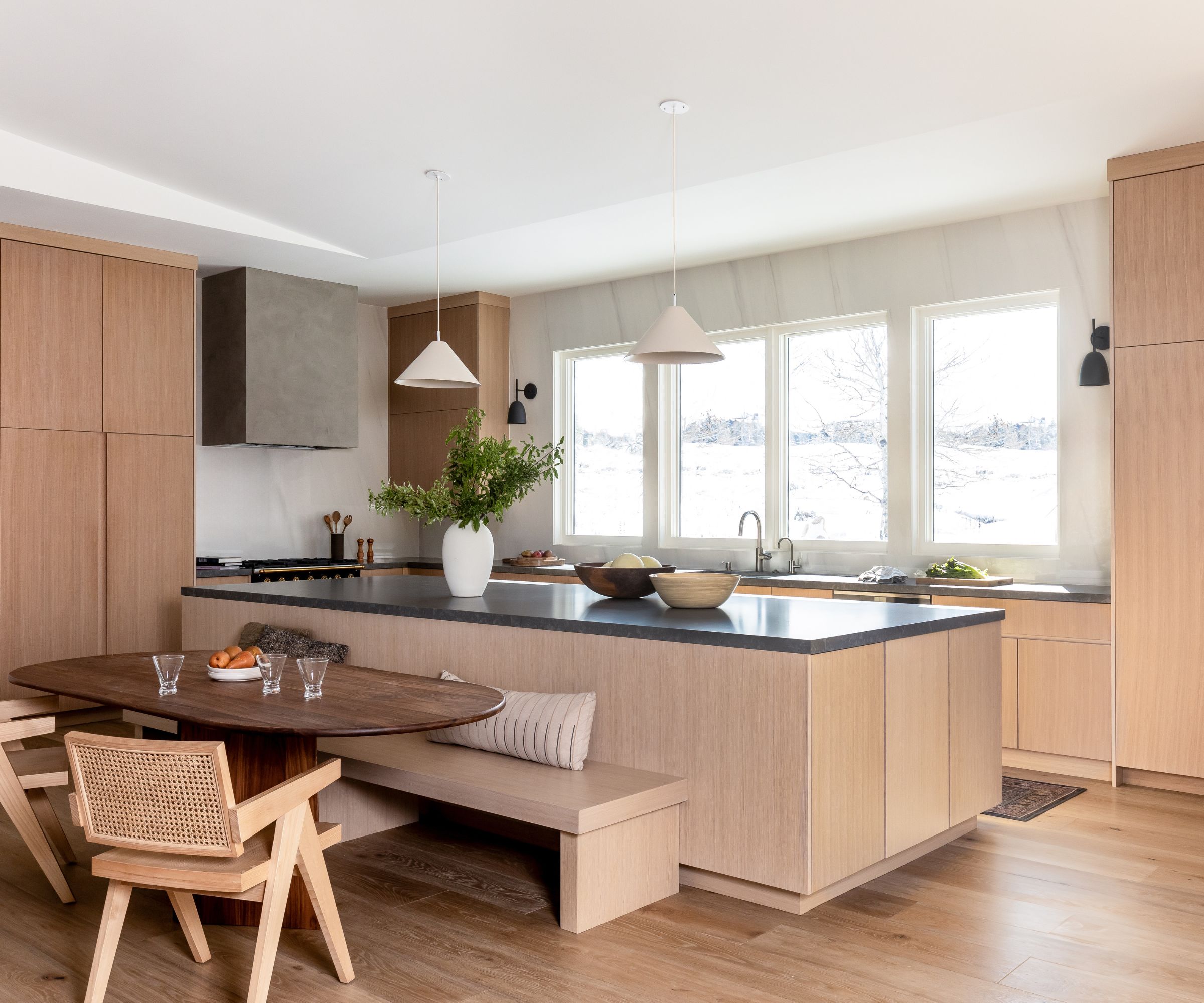
'If you want to make your kitchen look large, an L-shaped kitchen with a large island is one of the best ways to do this,' declares Texas-based designer Kim Armstrong.
'One of the reasons is because you don't have upper cabinets on walls opposite each other. So visually you are able to see more depth and space. Upper cabinets are usually around 12" deep, so if you visually take away 12" on both sides of a kitchen, you have instantly visually increased your kitchen by at least 24".'
Not only that, an L-shaped kitchen with a large island lets your eye flow across the island. Kim explains, 'This large surface draws your eye across the room and can really open up the kitchen and make it feel quite large even if it isn't an overly big space.'
5. Make space with a U-shaped layout
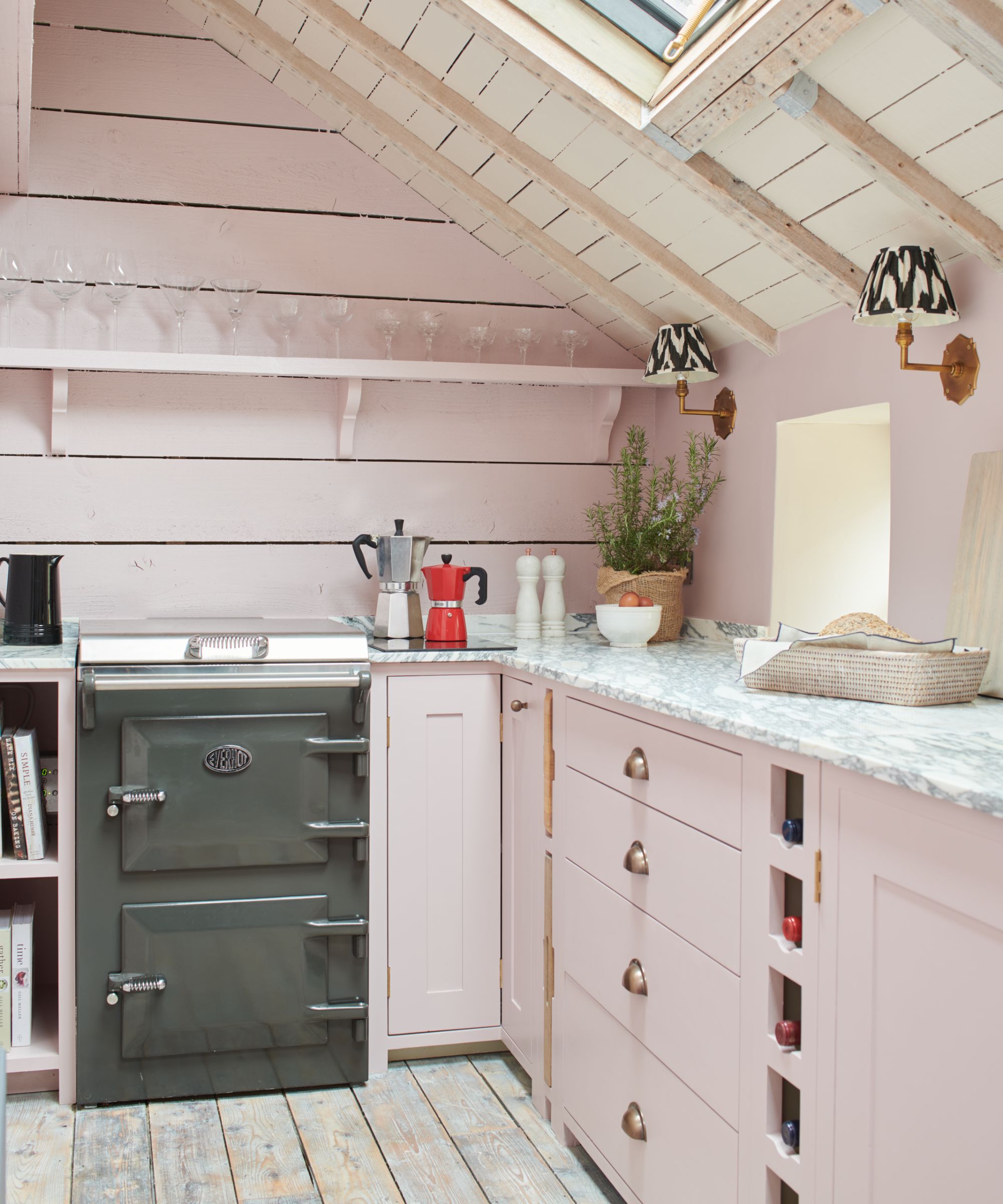
According to the experts in the know, U-shaped kitchen layouts are simple, hardworking designs that also make a space look bigger. U-shaped layouts work efficiently for small and big kitchens. Plus this is a great layout for enhancing the sense of space, says kitchen designer Tom Howley.
'By focusing the functional elements around the edges, these layouts create a natural flow, making the kitchen feel more spacious and less cluttered,' he says. 'The open center will also offer flexibility for adding an island or dining area without overwhelming the space.'
'Consider wall cabinetry carefully to ensure the walls don't feel too overwhelming, and choose integrated appliances to create a streamlined look which make even the smallest kitchens feel more spacious and inviting,' adds in Fred Horlock design director at Neptune.
6. Channel a roomy open-plan design
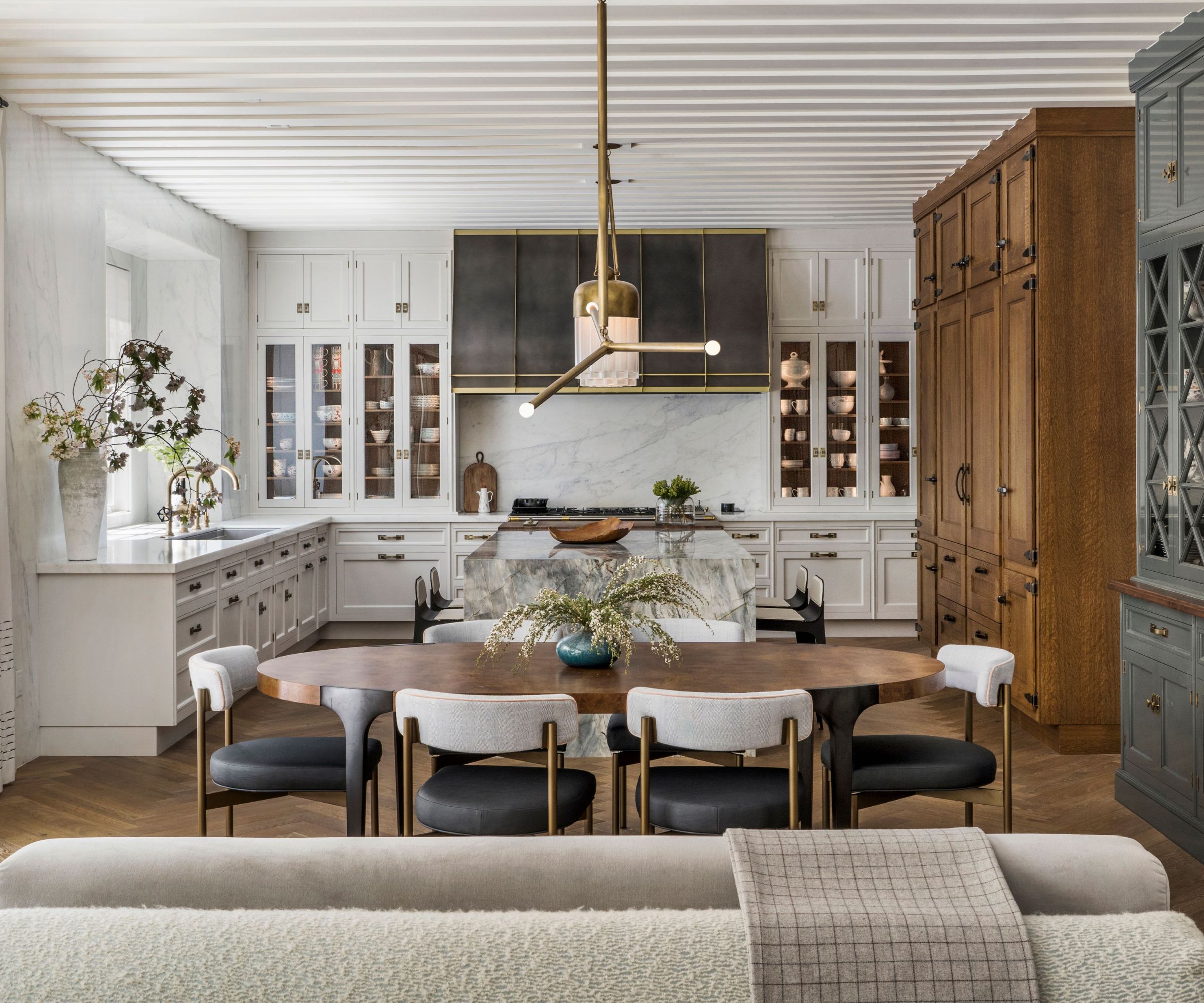
For an airy vibe and an overriding sense of roominess, open-plan kitchen layouts are difficult to beat.
That's the feeling of Californian-based interior designer Sabah Mansoor when she planned this open-plan kitchen, dining and sitting room for her client.
'The open floor plan allows for an informal dining and sitting area to be included and for the seamless flow of family life and/or entertaining,' says Mansoor. 'I also like to add kitchen cabinetry from the countertops to the ceiling in order to emphasize height and space.'
Nailing the perfect layout to make your kitchen look bigger will make such a difference to your home. We spend so much time in the kitchen, from cooking and eating to working and socializing. That's why maximizing space with the best layout can transform the look and feel of your kitchen.
If you're looking for more expert advice, we explain what is the most efficient kitchen layout with plenty of tips to also consider when choosing a kitchen layout
Sign up to the Homes & Gardens newsletter
Design expertise in your inbox – from inspiring decorating ideas and beautiful celebrity homes to practical gardening advice and shopping round-ups.
Lara has worked in the ever-changing world of interiors and lifestyle journalism for many years. She cut her teeth in a busy newsroom of a kitchen and bathroom business title where she gained vast product knowledge and industry contacts that would prove invaluable. She now freelances for a variety of magazines, newspapers and online blogs and relishes the changing landscape of the interiors world.
-
 Martha Stewart used this vintage-style pan to make cute bunny cakes for Easter – it's a real heirloom piece (and only $40 now)
It's not Easter without bunny-themed baked goods, and Martha set a precedent with a novel cake pan – it's American-made and has exceptional durability
By Megan Slack
-
 5 range alcove ideas that turn this awkward feature into the heart of your kitchen
These ideas are the perfect way to make a feature of awkward kitchen spaces
By Molly Malsom