What is the best layout for an L-shaped kitchen? 9 arrangements to maximize space
Nine expert design rules to make the most of your L-shaped kitchen
- What is the best layout for an L-shaped kitchen?
- 1. Work the kitchen triangle rule with an island
- 2. Take the architecture into account
- 3. Zone a large room with an L-shaped layout
- 4. Optimize a narrow kitchen
- 5. Choose an L-shaped island when wall space is lacking
- 6. Consider the placement of windows
- 7. Wrap around an awkward corner
- 8. Place tall refrigeration in the corner
- 9. Make wall units 'invisible'
- FAQs
The classic, L-shaped kitchen is one of the most tried-and-tested layouts say the experts: practical yet full of design possibilities to maximize every space. So whether you have a narrow, compact space or a large, open-plan room, the question is how do you get the most out of your kitchen with an L-shaped layout? What design tips and tricks should we be exploiting or avoiding to elevate the L-shaped kitchen into a thing of beauty and functionality for the entire household to use?
'A kitchen layout or, even a small kitchen layout, with an L-shape, is a modern and space-efficient solution,' explains Simon Taylor, managing director of Simon Taylor Furniture. 'L-shaped kitchens tend to feature one long run of tall cabinetry against the wall – with a bank of built-in appliances and plenty of storage – and a shorter run, either fitted against another wall at a 90-degree angle or as a peninsular with under-counter cabinetry beneath the worktop. If the kitchen is in an open-plan space, we always recommend including a kitchen island for additional storage and to zone the preparation and surface cooking areas, with the addition of seating to make it a social hub.'
Traditional L-shaped kitchens are also ideal layouts for incorporating the ‘kitchen triangle’ rule so the three essential functions of sink, refrigerator, and stove are within easy reach of each other, ideally no less than four feet and no more than nine feet.
'L-shaped kitchens are great for those who wish to have everything in close proximity and an adjoining worktop to help it flow,' adds Melissa Klink, creative director at Harvey Jones. 'Core appliances such as ovens should be sitting under the hob if in a compact space, or at eye level toward one end. The dishwasher should always be positioned close to the sink, and if the L-shape incorporates a peninsular with breakfast bar seating, I always recommend space for a wine cooler nearby for easy reach.'
What is the best layout for an L-shaped kitchen?
Finding the best kitchen layout for your space is imperative, so we've rounded up our favorite inspirational design tricks to make a classic L-shaped layout work for your kitchen, even if you only have a small kitchen to work with.
1. Work the kitchen triangle rule with an island

A simple way to optimize the flexibility of an L-shaped kitchen is to incorporate an island unit. This will offer more kitchen storage and countertop space and ensure the refrigerator, stove and sink all remain within easy reach – the three essential functions of the working triangle rule. Island units can be tailored to house whatever you wish, from extra storage to a second sink, more preparation surface, and a perch for family and friends to gather.
This beautiful L-shaped kitchen with an island unit from deVOL has a modern, vintage mood painted in a warm neutral called ‘Mushroom’. To differentiate the zones and create a centerpiece, the kitchen island features a bespoke, aged copper worktop in contrast to the pale stone with dark veining on the main, perimeter, and L shape.
2. Take the architecture into account

The strict lines and modern mood of this charcoal, L-shaped kitchen contrast with the simple, architectural bones of this old, Norwegian farmhouse and the light-enhancing simplicity of the rest of the kitchen. It is the ultimate lesson in how to renovate a property, adding a modern dimension while honoring the building’s past. The kitchen is made up of sleek, black cabinetry from IKEA, topped with a dark, crystal-flecked stone from Lundhs; the result is a stark, L-shaped, silhouette that will never date.
'Opting for all-black kitchen cabinetry, the homeowners chose to keep the upper walls free of cupboards to ensure the feeling of spaciousness was maintained,' says Hege Lundh, marketing and business development director of Lundhs Real Stone. 'Complemented by a brushed, brass tap, light wood flooring, traditional wooden furniture, and dark kitchen countertops, the end result is a perfectly balanced, welcoming space.'
3. Zone a large room with an L-shaped layout
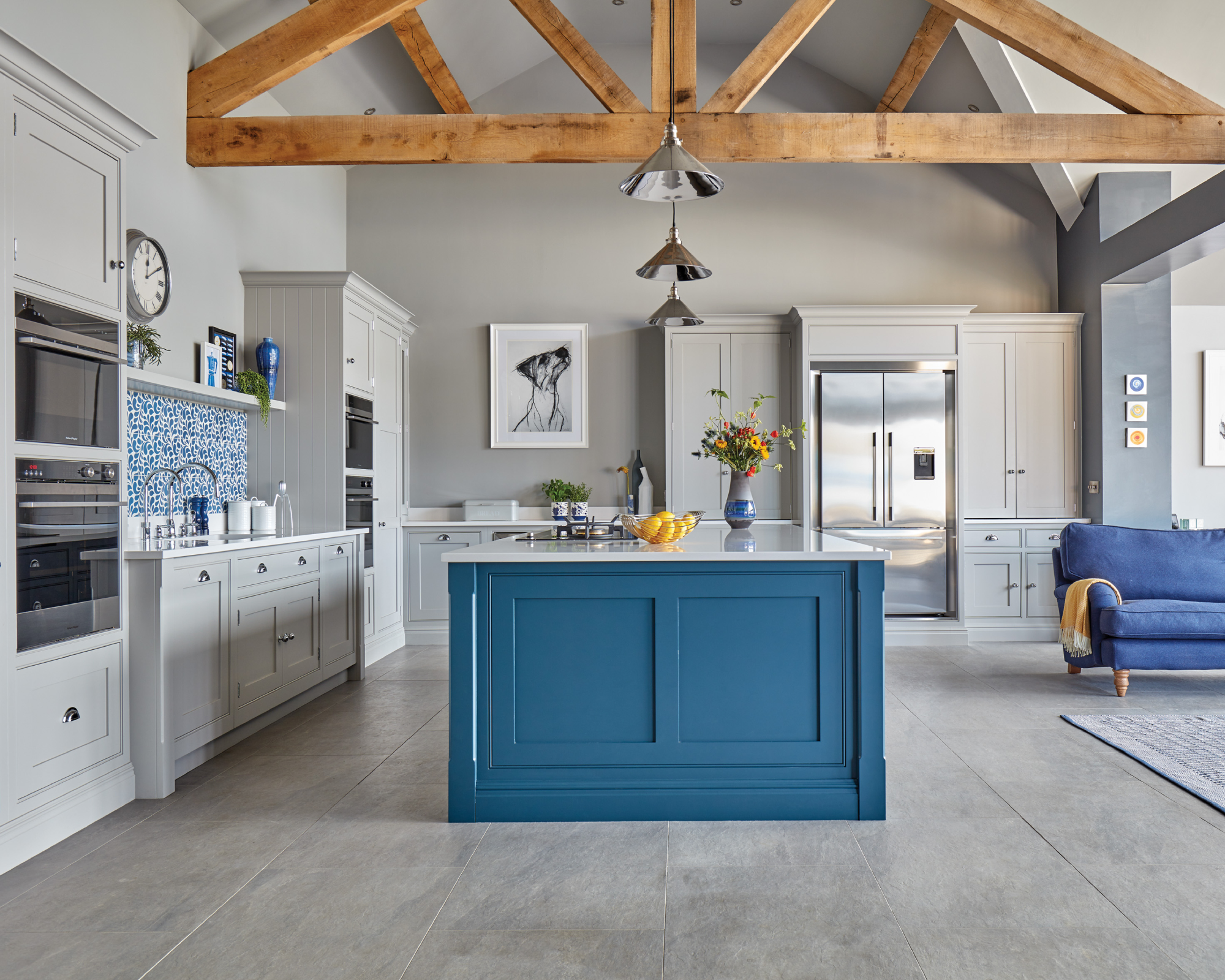
This classic, L-shaped kitchen in a large, open-plan space works on so many levels. The main run of cabinets includes ergonomic banked appliances and an abundance of practical storage while the addition of an island unit creates a casual dining spot, more storage and a design device to subtly demarcate the zones.
'The L-shape can be a social choice for larger spaces as the L can morph into a seating area and provide space for extra countertops and cupboards,' explains design director, Tom Howley.
'Using different kitchen cabinet colors or graduating shades can create interest and an illusion of extra space. The best way to pull an open-plan kitchen together is to view it as a whole, with multiple, separate zones within the space. Then break it down into dedicated areas, allocating functions to each zone: an area for cooking, a social dining area, a snug/lounge area and even a compact office space.'
4. Optimize a narrow kitchen
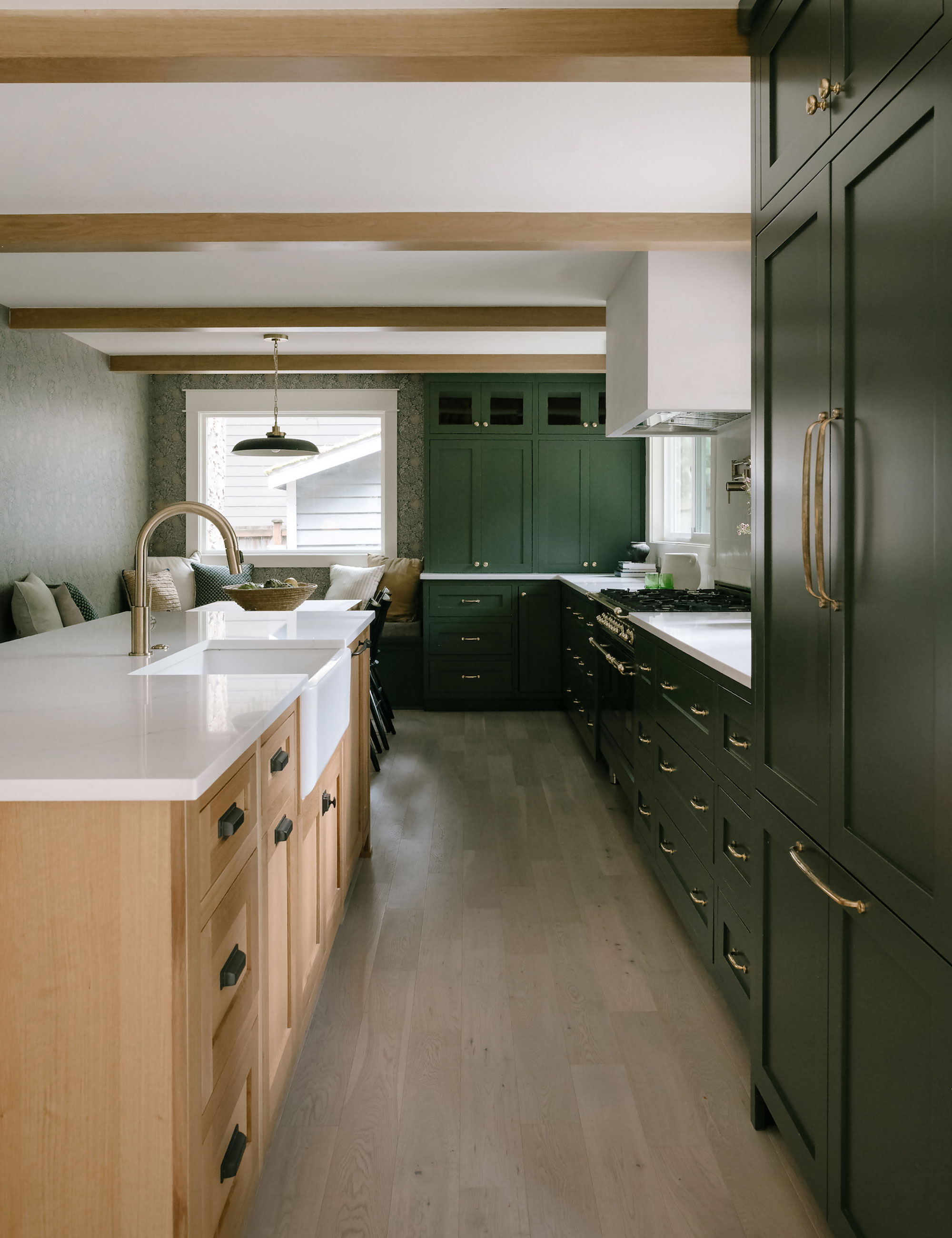
L-shaped layouts work particularly well in narrow kitchens, with one longer run of cabinets and a shorter return creating a functional layout. To maximize the potential of this design, consider adding a long island to mimic a hardworking, galley kitchen – this will boost storage and preparation possibilities. You could also extend the L-shaped return, as shown in this kitchen, to fit in a corner seating nook, transforming the narrow dimensions into a multi-zone space.
'We included the banquette dining corner to offer a nice landing space for family and guests in the kitchen,' says designer Jessica Nelson. 'Our client was excited about the idea of adding wallpaper here, which really elevated the coziness of this space.'
Do be aware that you will need at least 3ft (and more if possible) of walkway space between the island and the perimeter kitchen base cabinets. This will ensure easy traffic flow around the kitchen and enough clearance for cupboard and appliance doors to open fully without knocking into one another.
5. Choose an L-shaped island when wall space is lacking
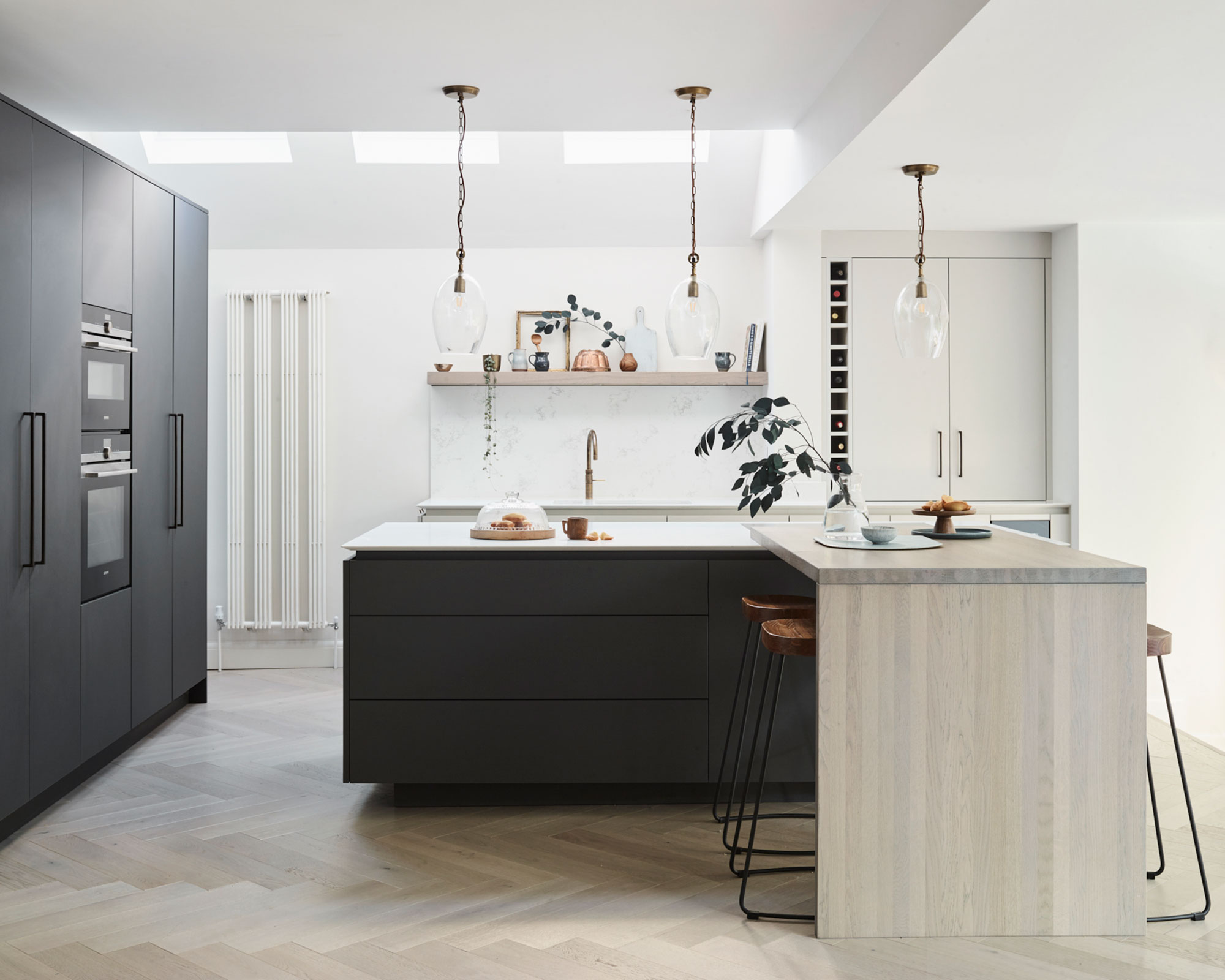
If wall space is at a premium and a traditional, L-shaped kitchen is out of the question, another option is to include an L-shaped island unit. This contemporary, pared-back modern kitchen has an elegant floating quality to it, so the cabinetry doesn’t over-clutter the airiness of the space. Paired with a simple, hand-stained timber bar and modern rustic stools, the L-shaped island becomes a central hub of the kitchen for cooking or enjoying a laid-back lunch or morning coffee.
6. Consider the placement of windows
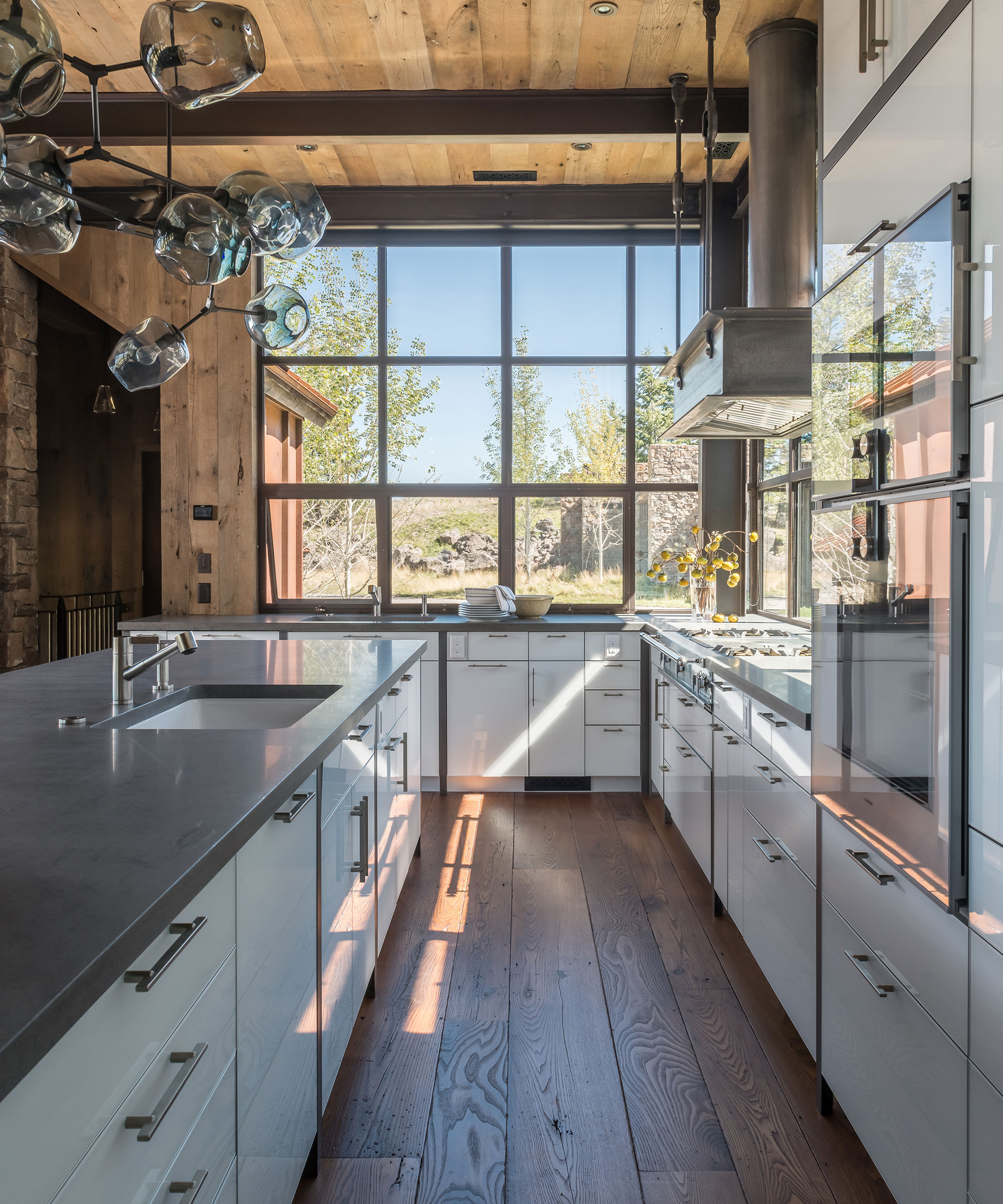
'In a house designed to take fullest advantage of breathtaking views, an L-shape was selected for the kitchen to allow for giant windows on two walls that take the place where upper cabinets might more traditionally be hung,' says Paul Bertelli, principal at JLF Architects.
'This floods the space with light while enjoying sweeping views of the Teton mountain range in Wyoming to connect the home’s interior with surrounding nature, as well as letting homeowners see and welcome arriving guests.'
The extended island balances the longer leg of the L, offering the high-functioning, efficiency of a galley-style layout for a true chef’s kitchen while providing plenty of casual counter seating and openness. The translucent glass white cabinetry and sleek lines balance the rustic warmth of reclaimed wood ceilings and rare American chestnut floors that help root the space in its regional context.
7. Wrap around an awkward corner
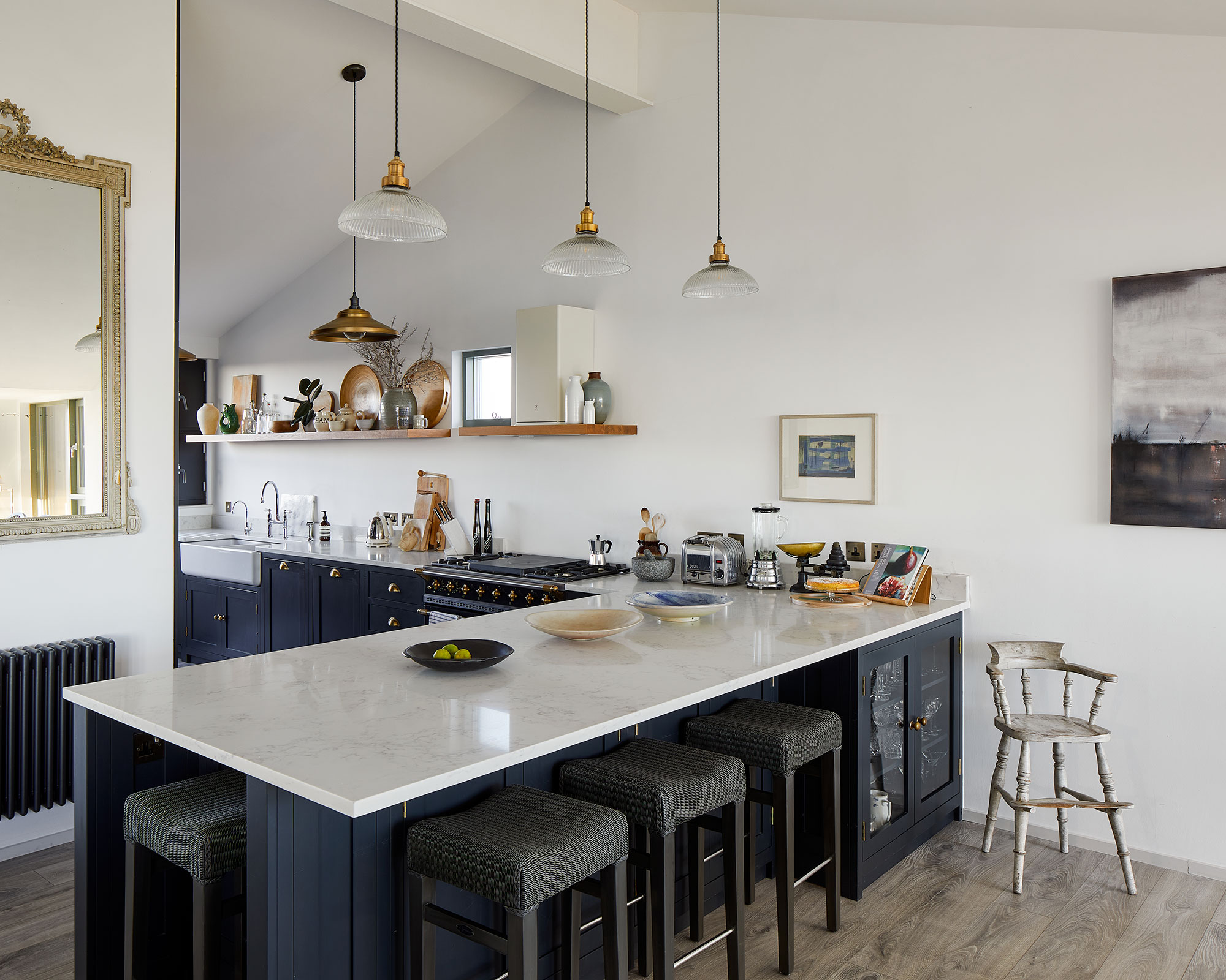
L-shaped kitchens are highly flexible designs that can work around awkward architecture or tricky corners such as this beautiful, bespoke kitchen set in a property on the picturesque English coastline. Drawing in the eye and creating a striking first impression, the L-shape run of cabinetry is painted in Little Greene’s Basalt, a deep, bold and sophisticated hue. The shorter branch of the L is the perfect peninsula linking seamlessly to the open-plan living zone while the longer run of units, around the corner, forms part of a narrow galley-style area with an ingeniously concealed pantry.
8. Place tall refrigeration in the corner
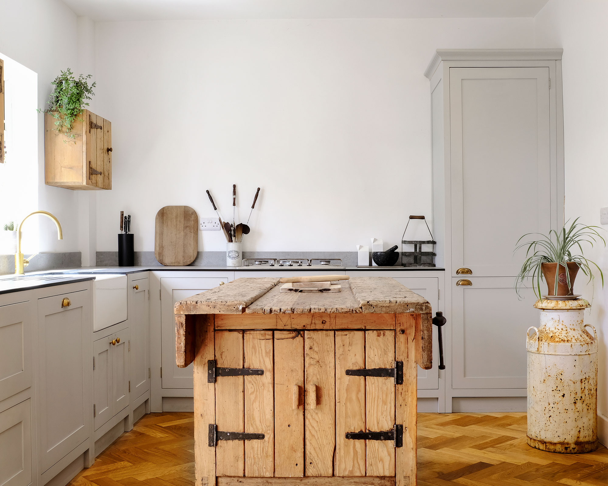
Tall refrigerators and larder units – either freestanding or built-in – are best placed at either end of the run of units in an L-shaped kitchen layout. This will ensure the flow of the kitchen isn’t interrupted, especially if your kitchen is made up mainly of base units. Just remember to install any cooling appliances next to a plug socket and water inlet if it has an ice maker and water dispenser.
9. Make wall units 'invisible'
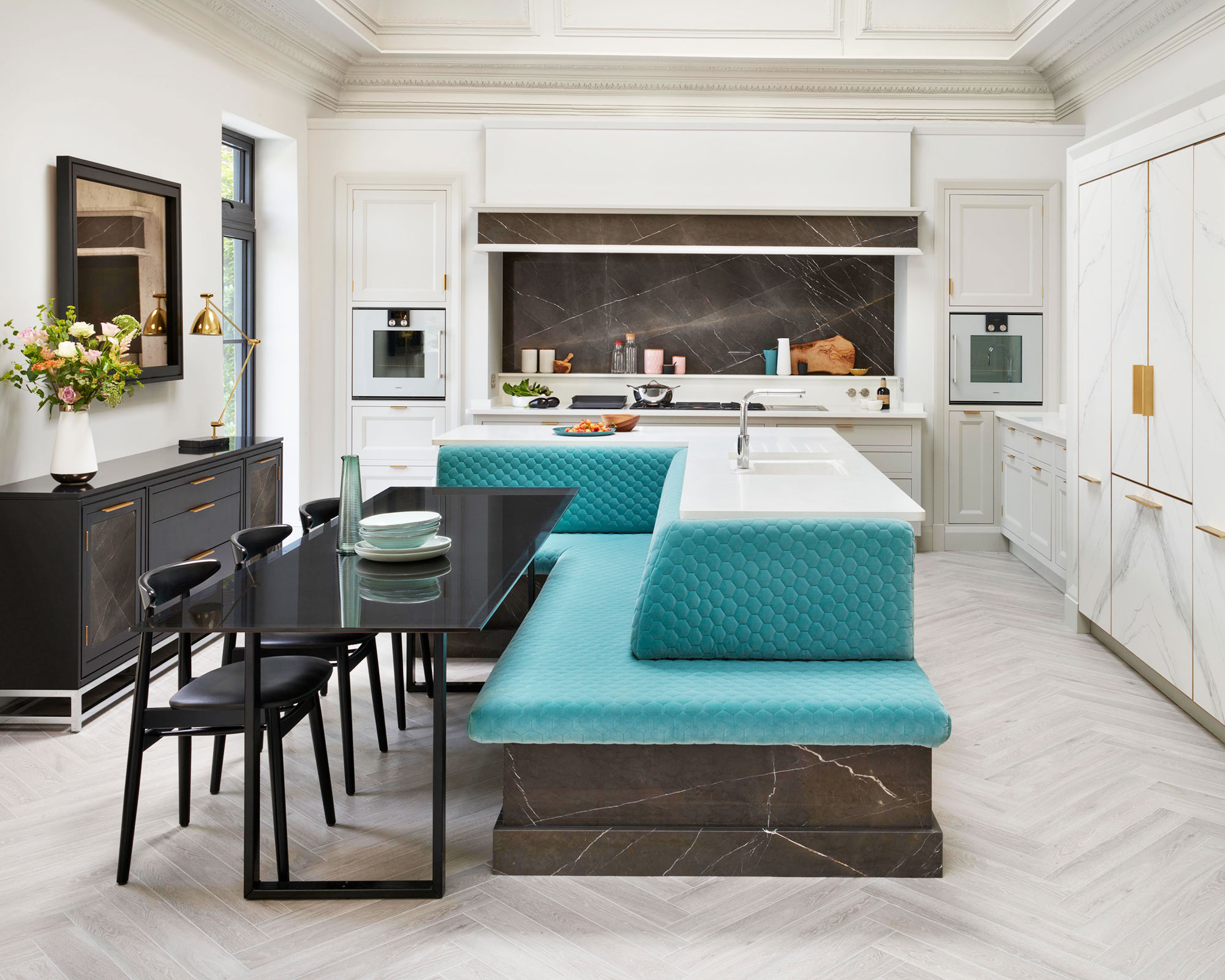
L-shaped kitchen layouts are generally made up of a bank of tall, floor-to-ceiling cabinetry on one run of units and then base cupboards on the other. If you have a mix of both and you don’t want the kitchen cabinets imposing too much into the room, try using colors and materials that meld into the surrounding walls. With rich, teal-colored upholstery, the star of this Art Deco-style kitchen is then the L-shaped island with built-in banquette seating.
'It forms the social hub of the kitchen and is a great solution for smaller spaces where a separate island and dining table is not possible,' says Richard Moore, design director at Martin Moore.
FAQs
How do you plan a small L-shaped kitchen layout?
L-shaped kitchens are a great fit for smaller rooms as they generally take up just two walls. This makes them ideal for smaller homes and apartments and also for open-plan, studio living as you can add an island unit or dining table to zone the space and keep it functional at the same time. To give you a rough idea of how much space you have, measure the room and mark out the position of windows and doors taking into account radiators and plug sockets. Consider wall height and any other awkward architectural features like sloping ceilings or stepped floors.
'I would recommend an L-shape kitchen for those who need to maximize worktop surface in a compact space and who prefer to keep the kitchen separated in an open-plan setting,' adds Melissa Klink, creative director at Harvey Jones. 'I always advise keeping tall furniture to one end of the run as this allows a continuous flow of worktops elsewhere. It is also really important to keep the cooktop zone and sink zone as far apart as possible to ensure sufficient and practical counter space in between.'
As with all kitchen layouts, your choices are to a great extent dictated by the shape and size of your room, but that doesn’t mean you have to be restricted when it comes to designing your ideal kitchen ideas.
Sign up to the Homes & Gardens newsletter
Design expertise in your inbox – from inspiring decorating ideas and beautiful celebrity homes to practical gardening advice and shopping round-ups.
Lara has worked in the ever-changing world of interiors and lifestyle journalism for many years. She cut her teeth in a busy newsroom of a kitchen and bathroom business title where she gained vast product knowledge and industry contacts that would prove invaluable. She now freelances for a variety of magazines, newspapers and online blogs and relishes the changing landscape of the interiors world.
-
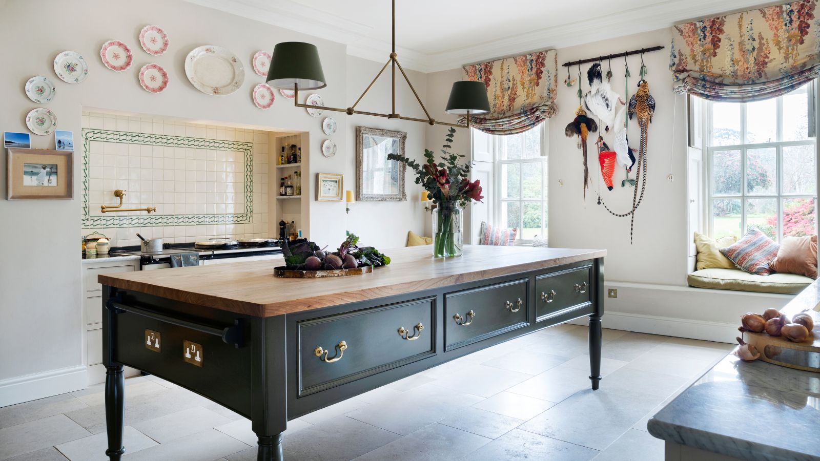 Step inside this British stately kitchen that's steeped in country charm – a kitchen built for now, with the soul of another era
British kitchen designers Guild Anderson reimagined the layout of this characterful kitchen, crafting a bespoke kitchen design that honours the heritage and enduring charm of this historic Cornish home
By Caroline Moratti
-
 How to arrange flowers like a professional – these 5 rules are all you need according to floral experts
We asked floral experts for their advice on arranging flowers, whatever the season – create stunning floral displays all year round with these rules
By Katrina Harper-Lewis