5 uplifting colors to paint your kitchen to make it a happier space
Colors can have a huge impact on your mood, so in a room where you spend so much time you want to feel it with the happiest of hues...
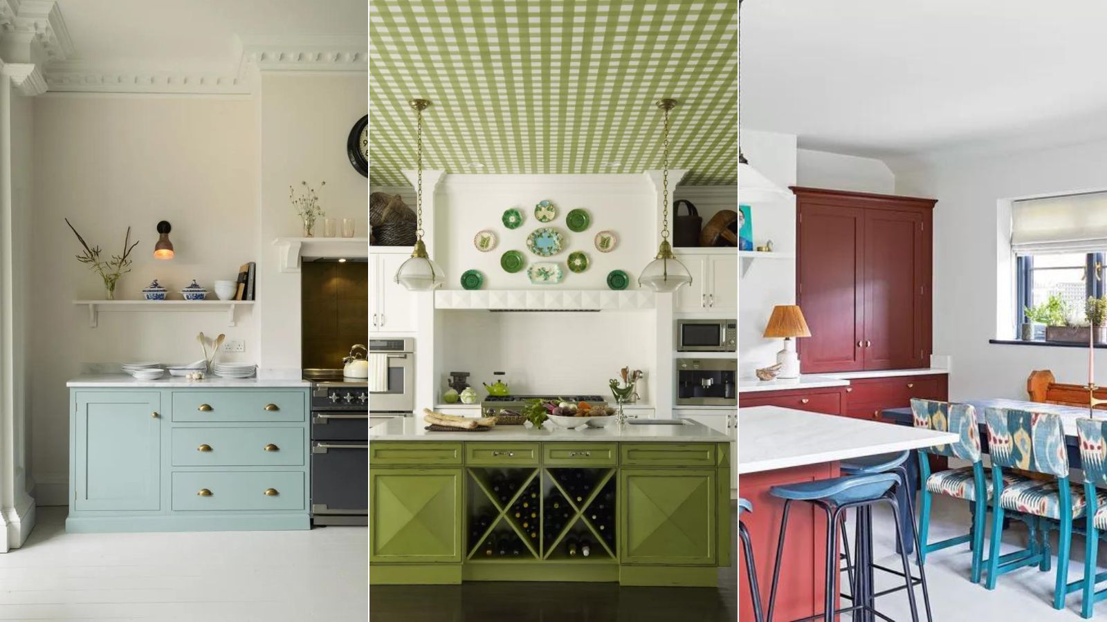

We all know how much colors can impact your mood. A blue sky day instantly gives you a lift, when you see someone dressed in a bold outfit, or you yourself wear a brighter color than usual, it makes a difference to how you feel – there's a little boost in your mood caused just by the colors you experience.
The same, of course, applies to the shades you use in your home but in an interior design world that so often favors grey and neutrals, we rarely choose these happier shades for our homes. However, over the last few years we are starting a slow but steady shift, we are moving away from these safe, subtle shades and choosing kitchen color ideas that are, well, happier. And the change in trends is particularly apparent with kitchen ideas. We now see more pink or green kitchens than we do grey or white, and we are very much on board with these mood-boosting hues. After all, the kitchen is one of the most used rooms in your home, so of course its color is going to have an impact on how you feel.
So we spoke with interior designers and color experts about the best shades to try if you want to create a kitchen that makes you feel happier at home.
What are the best colors to make a kitchen feel happy?
Choosing the best happy kitchen color for your will of course come down to what shades boost your mood. It won't be the same for everyone. As designer Jennifer Davis says, 'Happy kitchen colors can vary from person to person, as they are deeply influenced by individual preferences. Some might find happiness in serene pastel blues that are reminiscent of clear skies and calm waters, creating a tranquil cooking environment. Others may be drawn to vibrant yellows that infuse the space with a sense of sunny cheerfulness, evoking feelings of warmth and positivity.'
'For some, earthy greens might create a connection to nature, instilling a fresh and peaceful atmosphere. Ultimately, the happiest kitchen colors are the ones that you connect to personally, the ones that align with your own unique sense of comfort and joy.'
'One size does not fit all!' agrees Cathy Dean, founder of Studio Dean. 'You can start at home by looking in your closet – what color clothes do you feel drawn to? If it is all neutrals and browns, then these are your happy colors and you will feel fantastic in a space that reflects your vibe. If you love floral prints and bright colors, work with these. Just make sure whichever room color ideas you choose all follow the same undertone, then they will look great together.'
1. Soft yellows
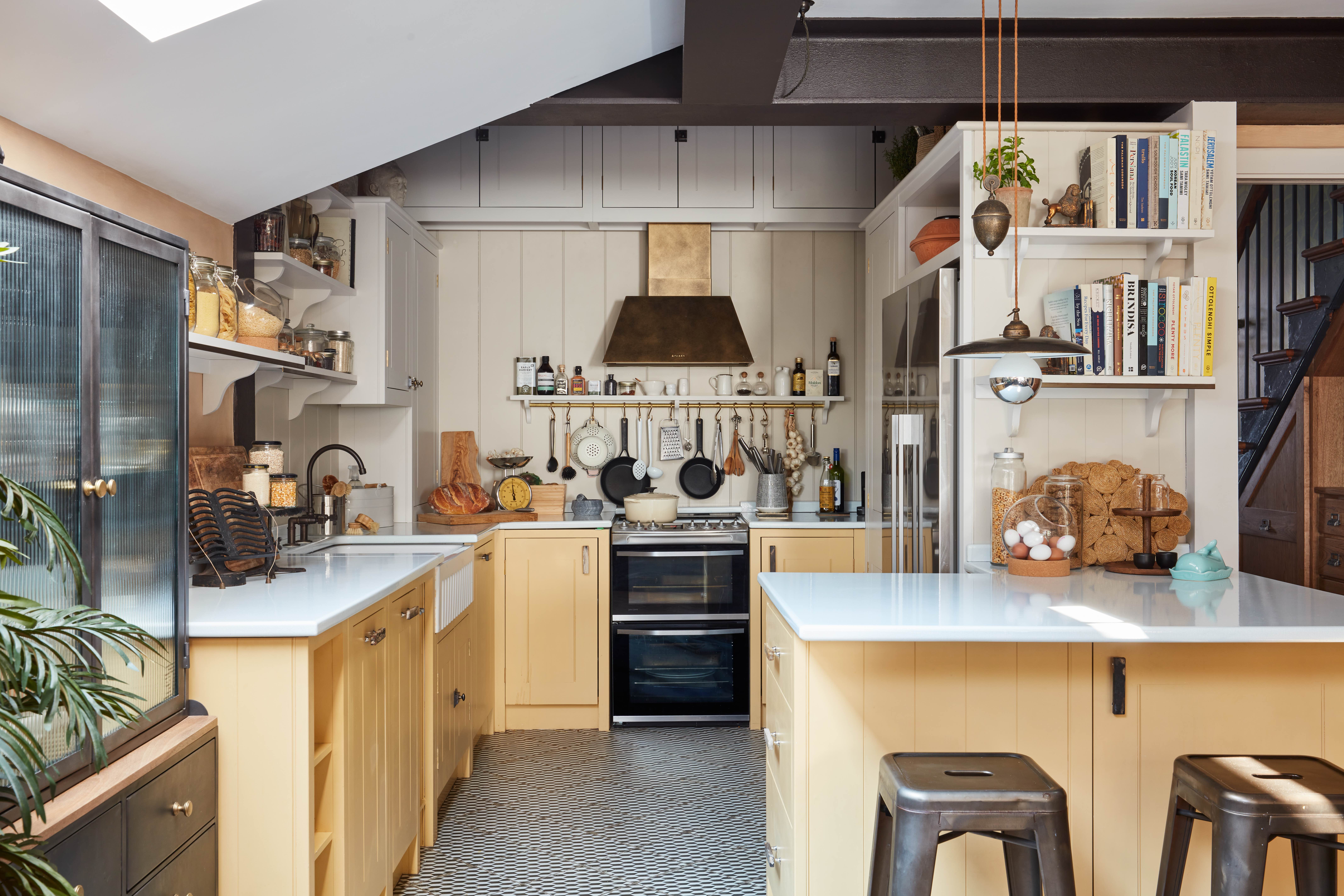
'We think the key to a happy kitchen is to have fun with color – whether that’s in painting the units an uplifting shade or using colorful, textured accessories. We simply adore color so we knew we wanted to make a bold choice in this yellow kitchen,' explains Anna Burles, creative director of Run for the Hills. 'The palette is a mix of several colors. Earthborn’s Donkey Ride (matchboard paneling), Tom’s Bakery (upper kitchen units and shelves), Humpty Dumpty Yellow (lower kitchen units), and Trilby (ceiling and walls above cabinetry). The yellow is a triumph and lifts the space.'
'The kitchen doesn’t have much natural light, so we also felt that a bold color would be the best way to ensure it felt happy and joyful, even during the darkest months of the year. I think the best colors for kitchens are tones from nature. The fresh, mustard tone of Humpty Dumpty we loved as its pure and unadulterated sunshine, but without being ‘yellow’. Mother Nature is never wrong.' adds Anna.
Helen Parker, creative director of deVOL, agrees that yellow is a super uplift color for a kitchen, she explains, 'The Shakers would use yellow to brighten up a dark corner of the room and bring a feeling of sunlight to a space. Mustard yellow is wonderful for transforming a room with its warm, cheerful, and uplifting tones.'
When decorating with any bolder shade, approach with a touch of caution. These sunny, happy hues can quickly overwhelm a room and potentially have the opposite effect. So take advice from designer Anna Elkington who says, 'When thinking of happiness, most of us automatically imagine the color yellow, however, this can be a bold choice within a kitchen. Incorporating yellow alongside darker accent colors is a good place to start. Yellow cupboards paired with darker countertops can bring positive energy to your kitchen without overwhelming the space. Dark grey is a good choice, it isn't as harsh as black but it still creates a good balance between the bright yellow.'
2. Sage greens
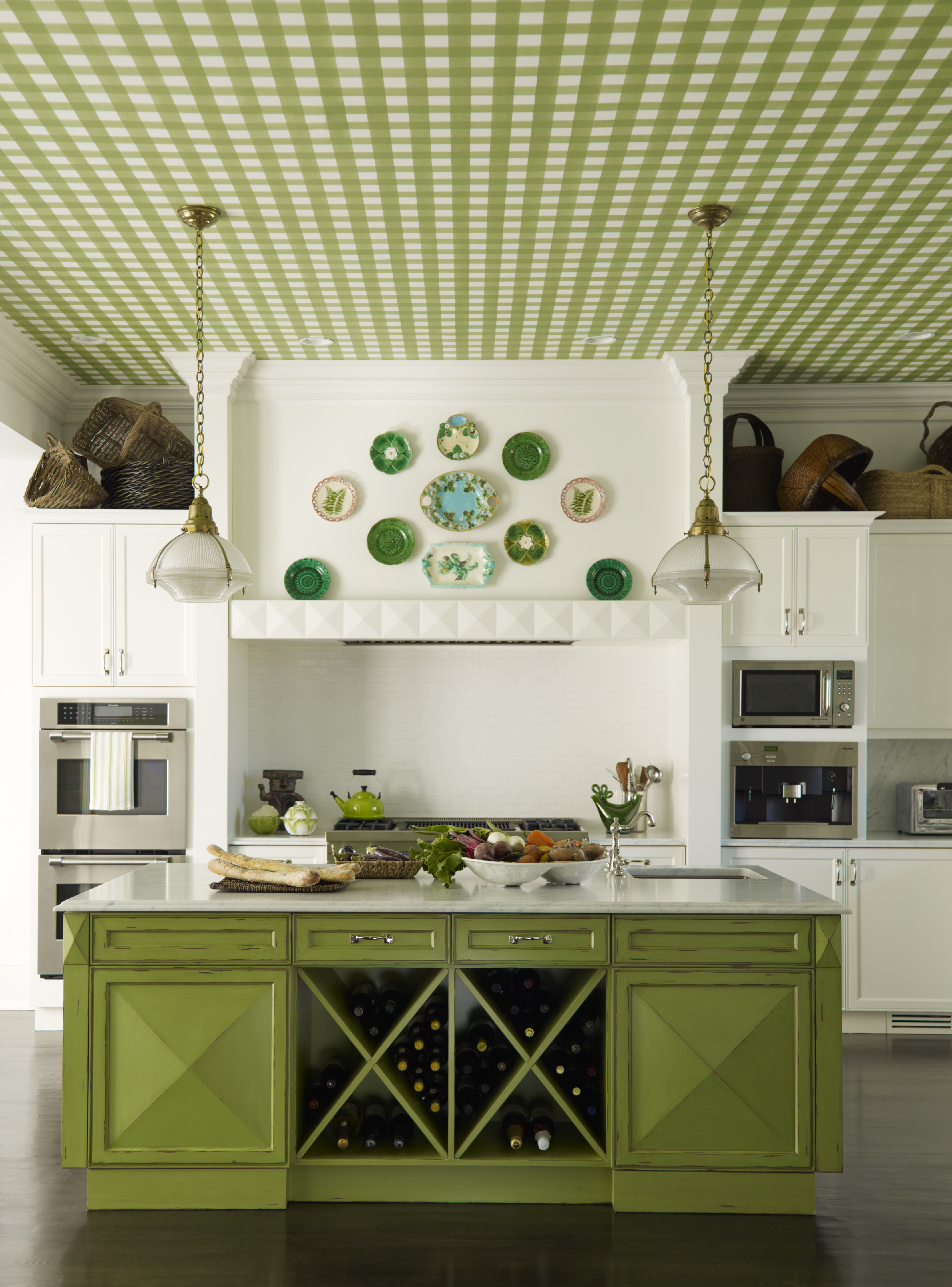
Green kitchens are known for their relaxing, calming qualities, and that comes up time and time again in dopamine design. It's a color that's reminiscent of nature, growth, and fresh beginnings, all of which are going to boost your mood.
Green color schemes needn't be a super bold choice, it's the palest, the more sage-toned form we think it acts almost like a neutral, no more dominant than a grey.
Kitchen designer, Richard Davonport, says: 'Color has the power to transform a room, and green represents nature, bringing to mind sloped hills, or if it has a blue undertone, rolling seas. There are so many variations of green tones and hues, from rich jeweled shades of emerald green through to soothing calm of sage, each of which evokes a different emotion and feeling when you enter the room.'
'Green also works exceptionally well when used in monochromatic form, using various shades of the same color to create a striking look. It works for larger spaces but also in smaller rooms, which is great for small kitchens, as using variations of the same color can make a room look bigger than it actually is.'
'As we’ve established that using the color green is about bringing nature indoors, using similar materials for a cohesive look is important. Choosing warm woods for your floor options, or a reclaimed wooden table for your seating area carries on this theme while also adding textural elements from both a visual and touch perspective,' he adds.
3. Warm earthy reds
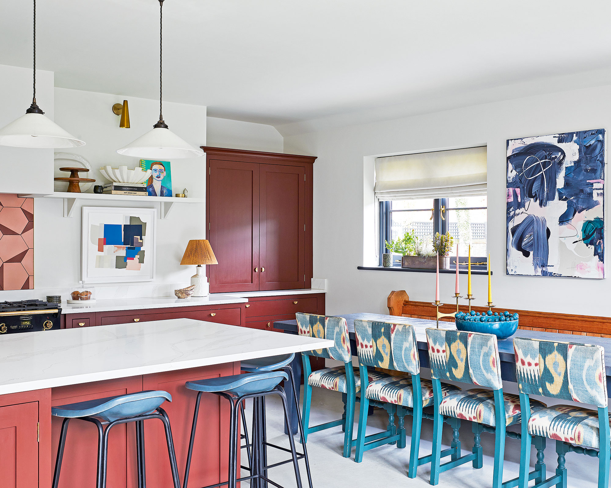
When you think of colors to avoid in a kitchen, at first we're sure red comes to mind. And we get it, it sounds like a really bold shade but down at the more orangey, brown, terracotta end of the red spectrum, you will find some gorgeous soft shades that will boost your mood without overwhelming the space.
'I always find that warm earth tones – think terracotta, russet, sienna, and coral – are natural fits for a kitchen design and just naturally exude a happy feel,' says designer Kathy Kuo. 'These cheerful neutrals are easy to mix and match and they're often natural pairings for a lot of common kitchenware materials like copper, wood, ceramics, and cast iron.'
'For a happy kitchen I would suggest going bold with the kitchen cabinets, have fun with it, and go for something like a bright green or a bold red. We are seeing so many people embrace red kitchens at the moment, specifically an earthy red with plenty of pink and brown undertones. And then go neutral on your walls so it doesn't overpower the space,' explains Tash Bradley, director of interior design and color psychologist at Lick.
And that is definitely the key with these slighter bolder shades, make sure you balance them out with plenty of neutrals, and don't let the color overwhelm the room as it will cancel out any of those happy vibes. As Tash explains, 'What you want to be mindful of when decorating with quite 'happy', punchy colors is that you get the proportions right and the tone right. So for instance if you decorated a whole room in a bright yellow actually what can happen is you get the adverse effect, it becomes irritating, rather than mood boosting.'
4. Pale pinks
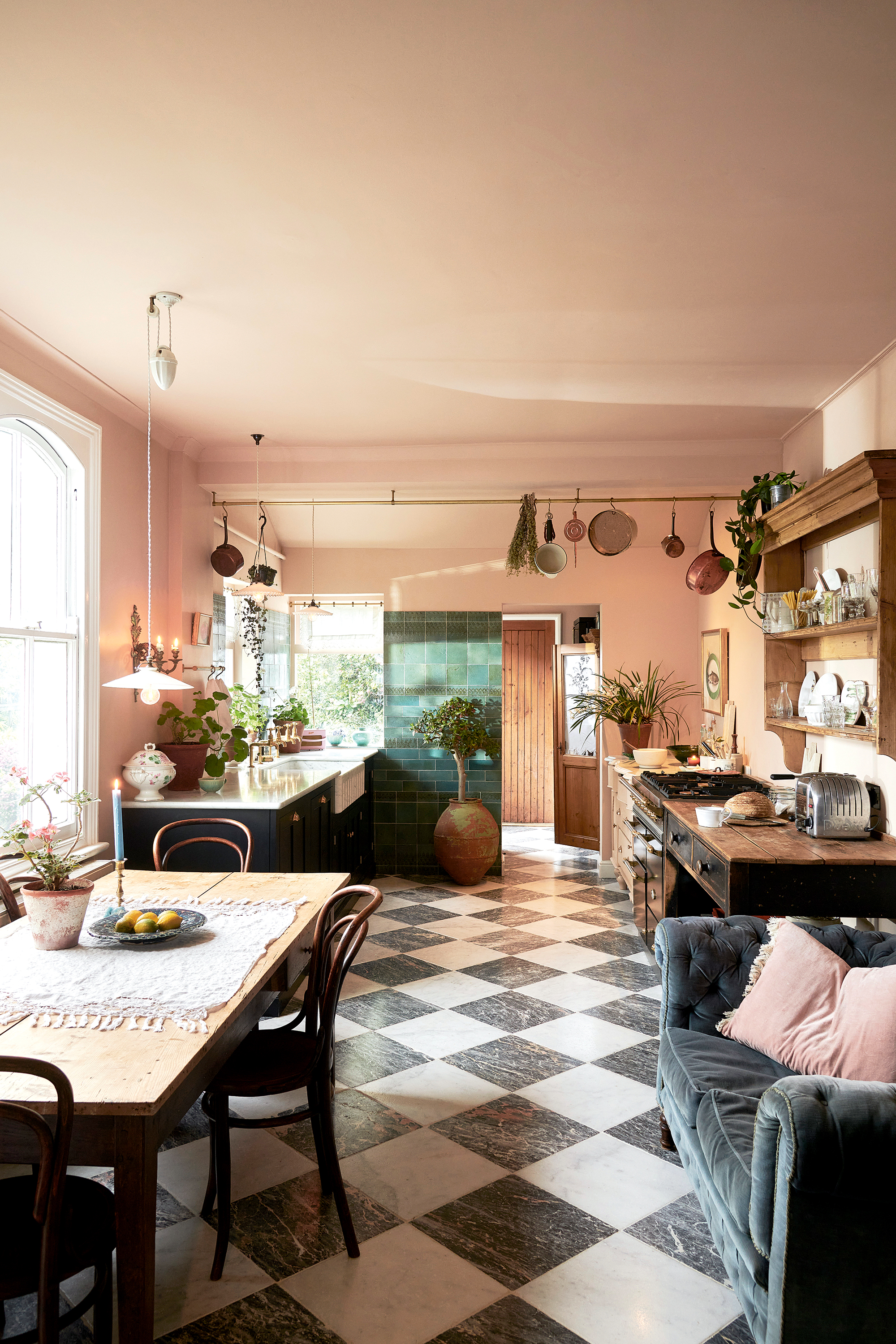
The effervescent pink kitchen. Just looking at these playful spaces fills us with joy. And honestly, a few years ago we would have warned against fully committing to a pink kitchen, thinking it could just be a short-lived kitchen trend, but they have stood their ground and have now become a classic shade for kitchen cabinets.
Plus, pink is the color at the forefront of dopamine decor, it's such a fun playful color that instantly boosts your mood. We would say if you are looking for a pink that's a bit more... liveable and has some longevity, go with those ever-popular pale, slightly plaster-hued pinks. They just feel a bit more grown up and less saccharine and ground those soft hues with some darker shades, like the pink and charcoal kitchen seen here.
'Pastel shades such as soft pinks can help to create a slightly whimsical feel in the kitchen, creating a really playful aesthetic. These colors are soothing to the eye and can create a light-hearted and joyful ambiance, making them especially suitable for kitchens where friends and family gather,' explains Anna Hill, color consultant at Fenwick & Tilbrook.
5. Sky blues
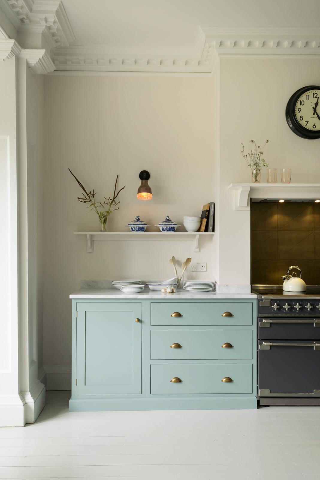
Walk into a blue kitchen and you'll instantly feel a lift in your mood. Similarly to green, it's a color that appears a lot in nature, it's a very calming and serene shade that's very easy for the eye to register.
It's also a really easy color to work with, there are loads of shades and tones to choose from and it pairs well with most other colors You can really adapt it to make it work in your space. We think the happiest (and most liveable) blues are soft, pale sky blues that instantly make a room feel brighter. However, these can be quite steely and cool so you'll want to warm them up slightly by pairing them with a warmer neutral like a soft warm or cream. Use brass, copper, or gold hardware too.
FAQs
How can you make a kitchen a happier space?
Kitchens are the heart of the home, the room you probably spend the most time in, cooking, working, and socializing, so it's so important that they feel like a happy space.
Color is one of the easier ways to ensure your kitchen boosts your mood. 'Colour can make a kitchen brighter, happier, and more reflective of your personal style. There are many ways to do this such as adding a big dose of color with painted cabinetry, or layer in small touches with fun accessories. These ideas for adding color to a kitchen will help you introduce your favorite hue to the hardest-working room in your home.' explains Rhiannon Phenis, head of design at Sola Kitchens.
'Cabinetry typically accounts for most of your kitchen's surfaces, so installing cabinets in your favorite shade will inject a huge burst of color. But another way of adding a happy color to the kitchen is by installing kitchen wallpaper. Choose a colorful pattern for your kitchen walls, backsplash, or even the ceiling. If you're not ready to go all-in on colorful cabinetry, try painting your kitchen island an accent color as this will allow you to experiment with a smaller dose of color.
Tash Bradley adds that making your kitchen feel more like a part of your home is a simple way to ensure it's a happy space too. She explains, 'Remember kitchens look great when they are an extension of the home so they don't feel too clinical. You want to bring in a lamp, bring in soft furnishings, bring in amazing artwork. All of these additional pieces of decor just bring in a little bit of softness that can allow you to go a bit bolder in your color choices too.'
So the best colors for a happier kitchen? Well, that's totally up to you. Consider what colors fill you with joy and then order plenty of paint samples to try out in your space. Don't just paint tiny squares either, try out a substantial patch or wall or cabinet so you can really notice how that color affects your mood before you commit.
Sign up to the Homes & Gardens newsletter
Design expertise in your inbox – from inspiring decorating ideas and beautiful celebrity homes to practical gardening advice and shopping round-ups.

I am the Head of Interiors at Homes & Gardens. I started off in the world of journalism in fashion and luxury travel and then landed my first interiors role at Real Homes and have been in the world of interior design ever since. Prior to my role at H&G I was the digital editor at Livingetc, from which I took a sabbatical to travel in my self-converted van (not as glamorous as decorating a home, but very satisfying). A year later, and with lots of technical DIY lessons learned I am back to writing and editing, sometimes even from the comfort of my home on wheels.
-
 What colors go best with butter yellow? 8 equally delicious shades to pair with spring's hottest color trend
Inspired to elevate your home this spring with chic pale yellows? Here are the best colors to complete your scheme
By Emily Moorman
-
 Sarah Michelle Gellar's entryway is tranquil and elegant thanks to white and wood accents – her neutral style is replicable from $33
The actress's entryway features a wood console table, wood floors, and crisp, white paint for a warm and inviting atmosphere
By Hannah Ziegler