What color cabinets make a kitchen look bigger? 7 space-enhancing colors
Making a kitchen look bigger (using only color) is a design issue everyone wants to solve. We spoke to a few of our favorite interiors people to find out their expert color solutions
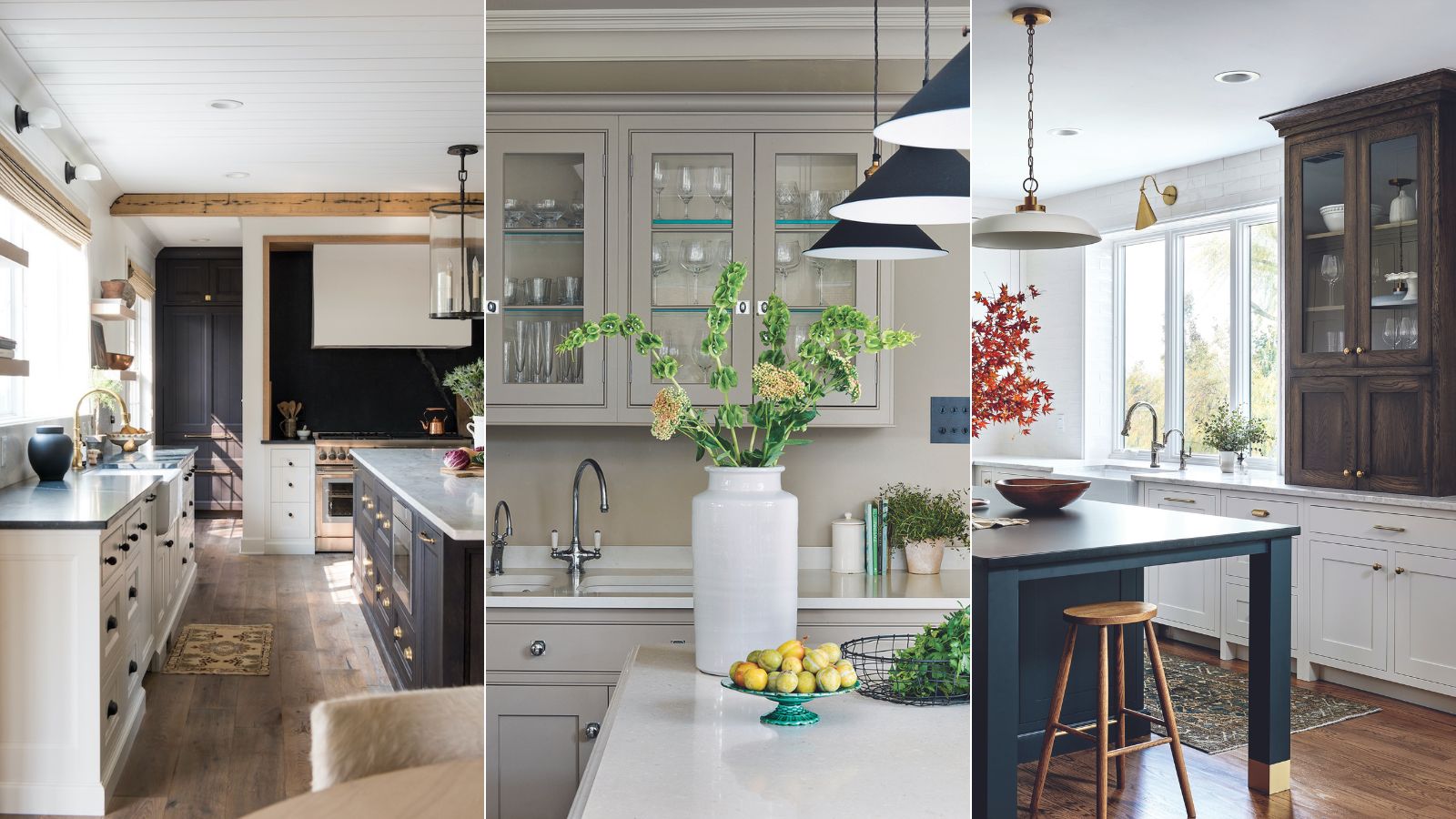

If you are wondering 'what color cabinets make a kitchen look bigger', you are certainly not alone in your desire to increase space, even if just visually.
Though kitchens, especially small or awkwardly-shaped ones, can present many interior design challenges, there are several kitchen cabinet color ideas that can makes a small kitchen look bigger, or help to reflect both natural and artificial light. A well-chosen kitchen color scheme can do wonders for small kitchens, and the right room color can make a kitchen look bigger, but with all the coziness and warmth you desire.
Naturally, you’ll want to select kitchen cabinet paint colors that you’ll be happy to live with for a while to come. But you might also want to consider the decorative and space-enhancing power of each hue. Being imaginative with color, a specialist finish or decorative effect is the perfect way to give to visually expand a small room.
What color cabinets make a kitchen look bigger?
Small kitchens may be limited in size but they can be big on style. We have curated our favorite color cabinets to make a kitchen look bigger – with paint tricks for small rooms to help turn that awkward, tiny room into something sophisticated and functional, whatever its shape and proportions.
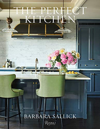
The Perfect Kitchen, Barbara Sallick | From $21.87/£30.45 at Amazon
Learn more about how to use color in kitchen design in this bestselling book. Find practical advice as well as hundreds of images of colorful kitchens to inspire your own remodel, and make your small kitchen look bigger and brighter.
1. Elevate with yellow
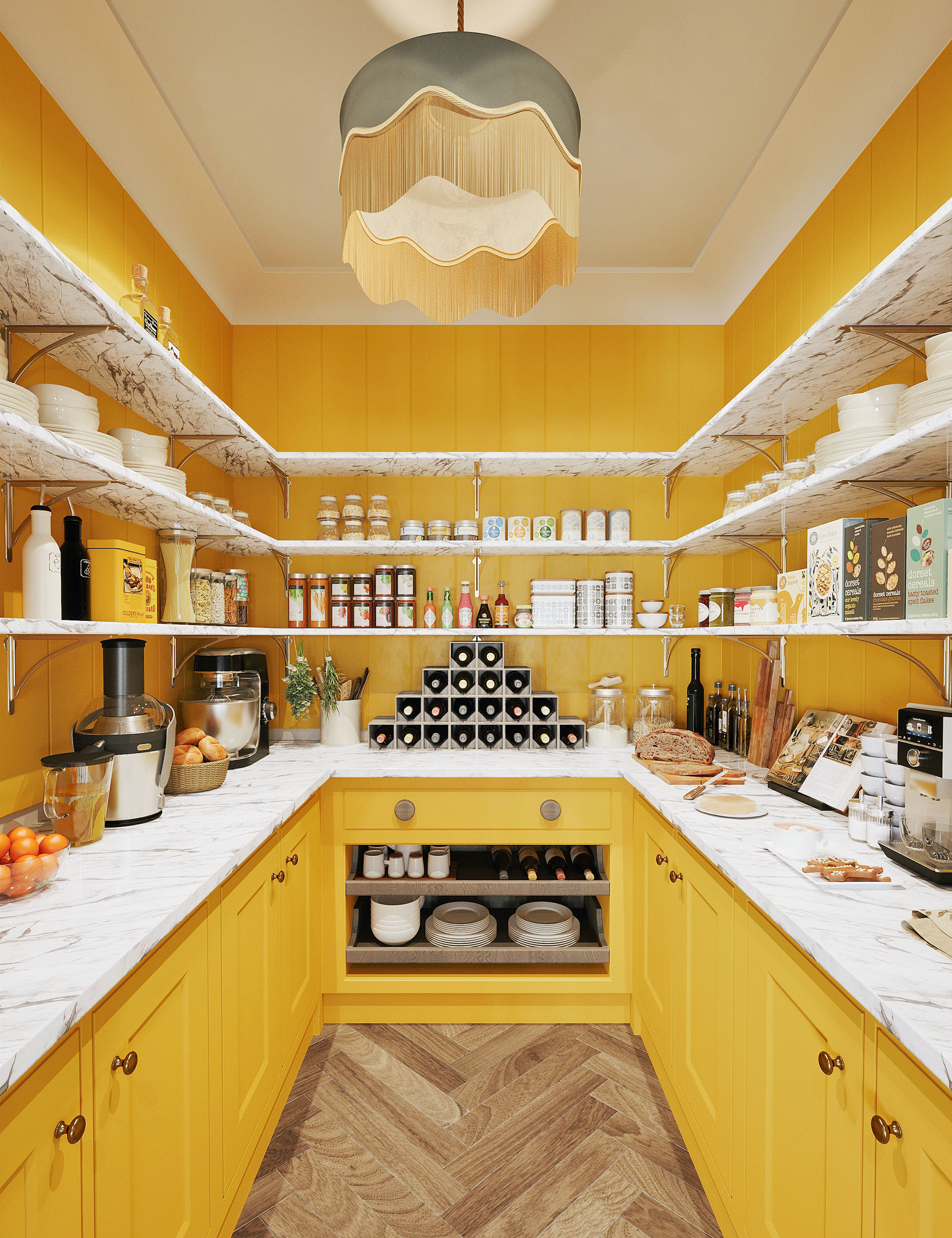
A bold kitchen color is an easy way to inject some fun into a pantry, so says Tom Edmonds, design director of Lewis Alderson & Co. Embrace the warmth and mood-boosting power of sunny tones for a happy, vibrant feel.
At the lighter, bolder end of the spectrum, yellow is a color of optimism. ‘Yellow can create a mellow and uplifting interior all at the same time. It transports us back to long lazy sun-drenched days in the Mediterranean and it can brighten (and expand) a small kitchen. It works brilliantly with blues, teals, greens, and reds, and for real crisp freshness use with white,’ says Martin Waller of global design brand Andrew Martin.
'Yellow kitchens work well in bright, south-facing spaces where they turn the air into something tangible and edible, while on a dull day, they can add a sense of cheerfulness,' says Mike Fisher, founder of Studio Indigo.
2. Add reflective shine with metallic surfaces
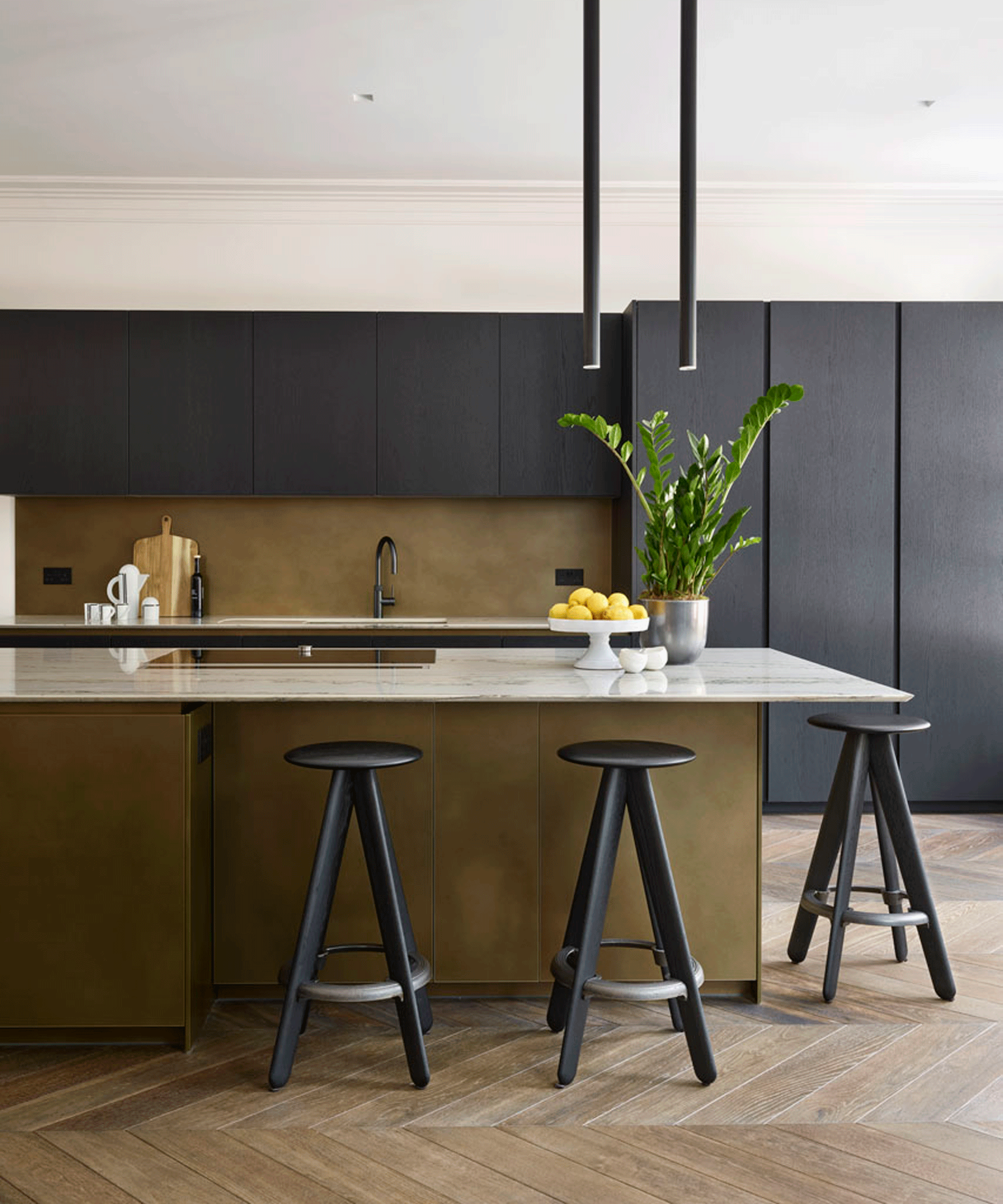
Using the same striking metallic on both the kitchen backsplash and cabinetry helps achieve design cohesion in this kitchen by DesignSpace London.
A metal kitchen cabinet can do more than look pretty and save your paintwork – it can actually make your kitchen look bigger too. Metallics and mirrored finishes are both handy for making all small kitchens feel roomier, but use one that stretches the length of your kitchen and the effect can be substantial.
‘The metallic surfaces are sheet aluminum with a patinated bronze dust finish,’ says managing director Richard Atkins. ‘As well as providing warmth and interest, it comes in large sheets, which avoids unsightly joints.’
3. Expand with a transformative white
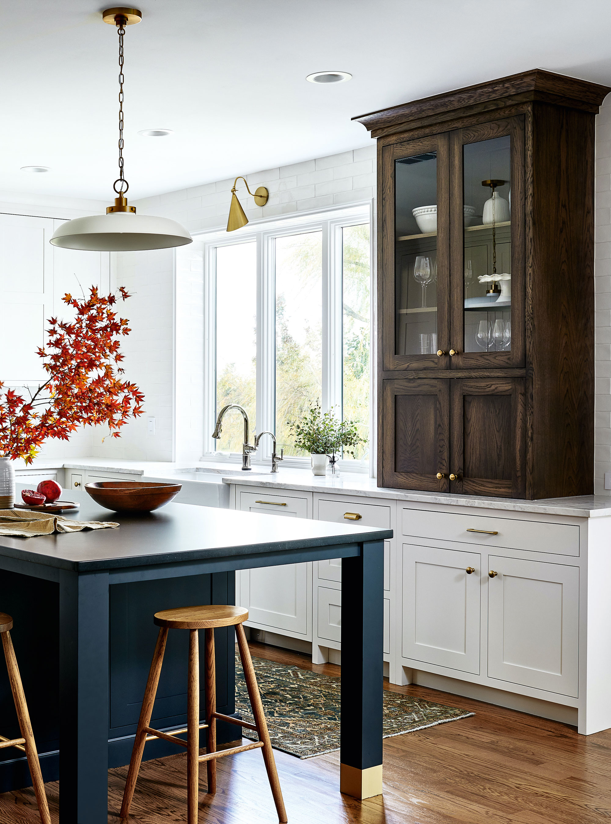
White is, of course, one of the most versatile shades in all of design – it instantly enhances space while evoking a sense of calm and flawlessness.
‘Most homeowners appreciate the benefits of testing paint colors in location but, with whites, it is crucial as they can be altered beyond recognition by light and shadow,’ says Ben Hawkswell, senior designer at Roundhouse.
For a masterclass in color mixology, Tanya Smith-Shiflett, the owner of Unique Kitchens & Baths has the skills. This three-toned kitchen, created in collaboration with interior designer Alison Giese, adds contrast to the space while allowing the island and cabinet to pop. ‘To elongate and make the room look bigger, we chose a brighter painted finish for perimeter cabinets, with a dramatic and enticing finish on the kitchen island. Finally, we went for a more furniture-like piece, using stained oak to bring warmth and add visual interest,’ Tanya explains.
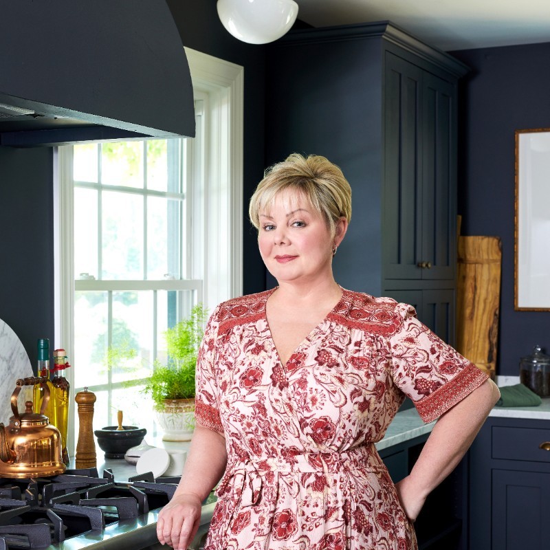
Tanya has always believed that the kitchen is, in fact, the heart of the home. She has always been passionate about balancing function and beauty in the rooms we use most. While working full-time in medical sales, she began helping her husband’s building company part-time with kitchen layouts and color schemes. Her innate ability to create beautiful kitchens promoted her to become the founder of Unique Kitchens & Baths.
4. Freshen up with pale blue
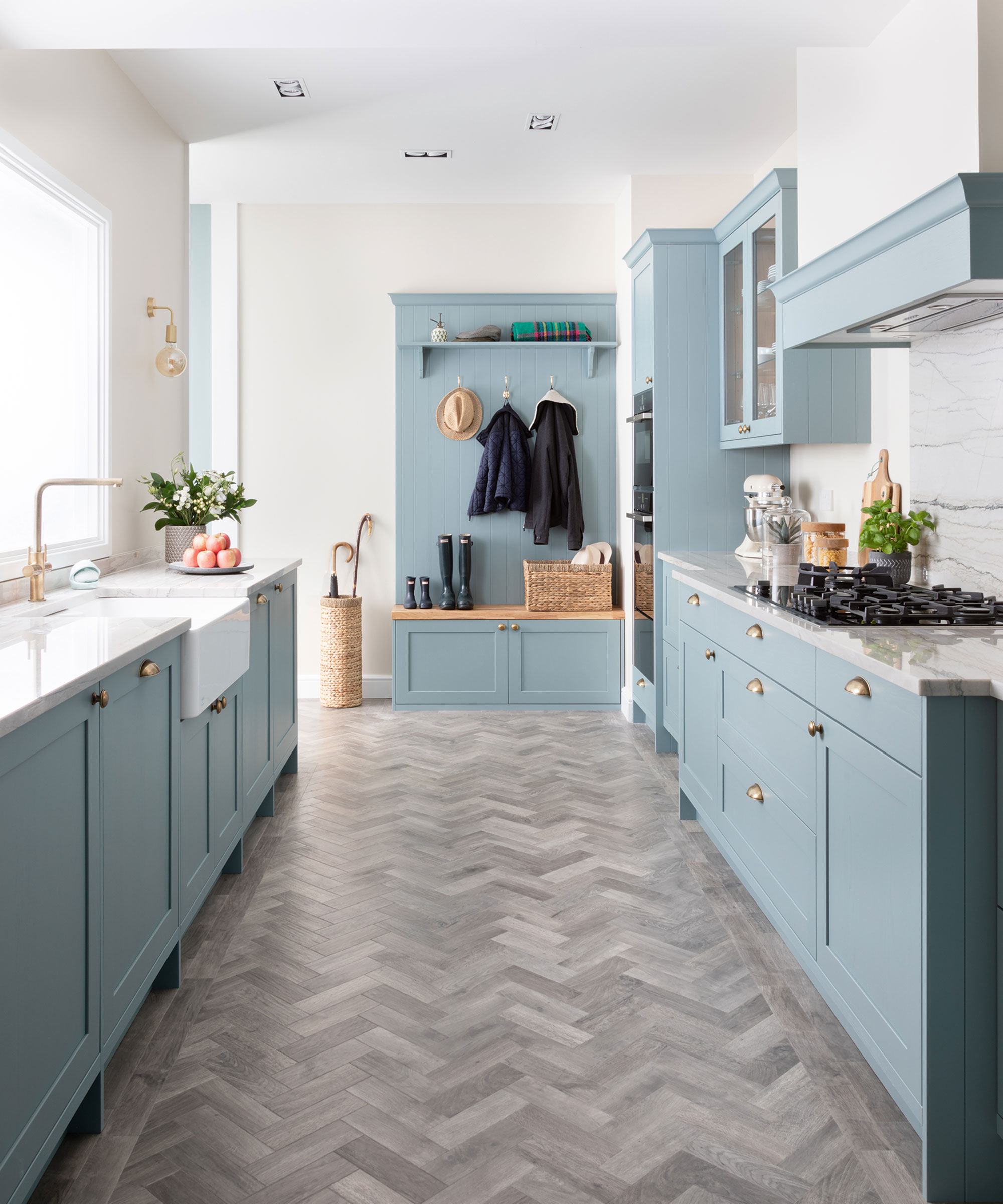
‘Using pale colors in a long, narrow kitchen is a great way to open up the room and helps to reflect and diffuse the available natural light,’ says Mark Mills, managing director of Mereway.
Blues with yellow or grey undertones are ideal; red undertones will take you towards purple, which is more moody than upbeat. Think sky blue, duck egg, and soft teal.
Polished countertops and backsplash, again in pale tones, also boast light-reflecting and space-boosting powers. Make the flooring your darkest choice and go for a warm white on walls and ceilings. This graduation from dark to light is an established way to square up elongated rooms.
5. Lighten up with pale pink
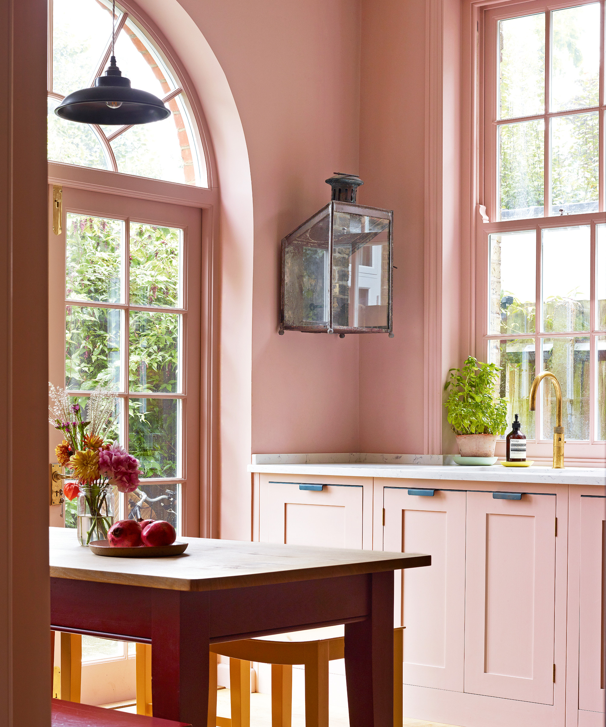
Pink may seem like a surprising addition, but rosy shades are impressively versatile and their capability to visually expand a room is unparalleled.
From the palest of confetti through setting plaster and deeper terracotta tones, pink can form not only a reliable background color but using it in its palest incarnations can result in a kitchen that looks bigger and brighter.
‘As well as the walls, consider your kitchen cabinets and storage: highlighting these essential elements within a kitchen is a fantastic way to deliver design impact,' says Ruth Mottershead, creative director, Little Greene.
To spark joy in her home, designer Sarah Brown used pink on both the walls and kitchen cabinets. This seamless flow of color requires commitment, but the payoff is certainly worth the risk.
6. Open up with green
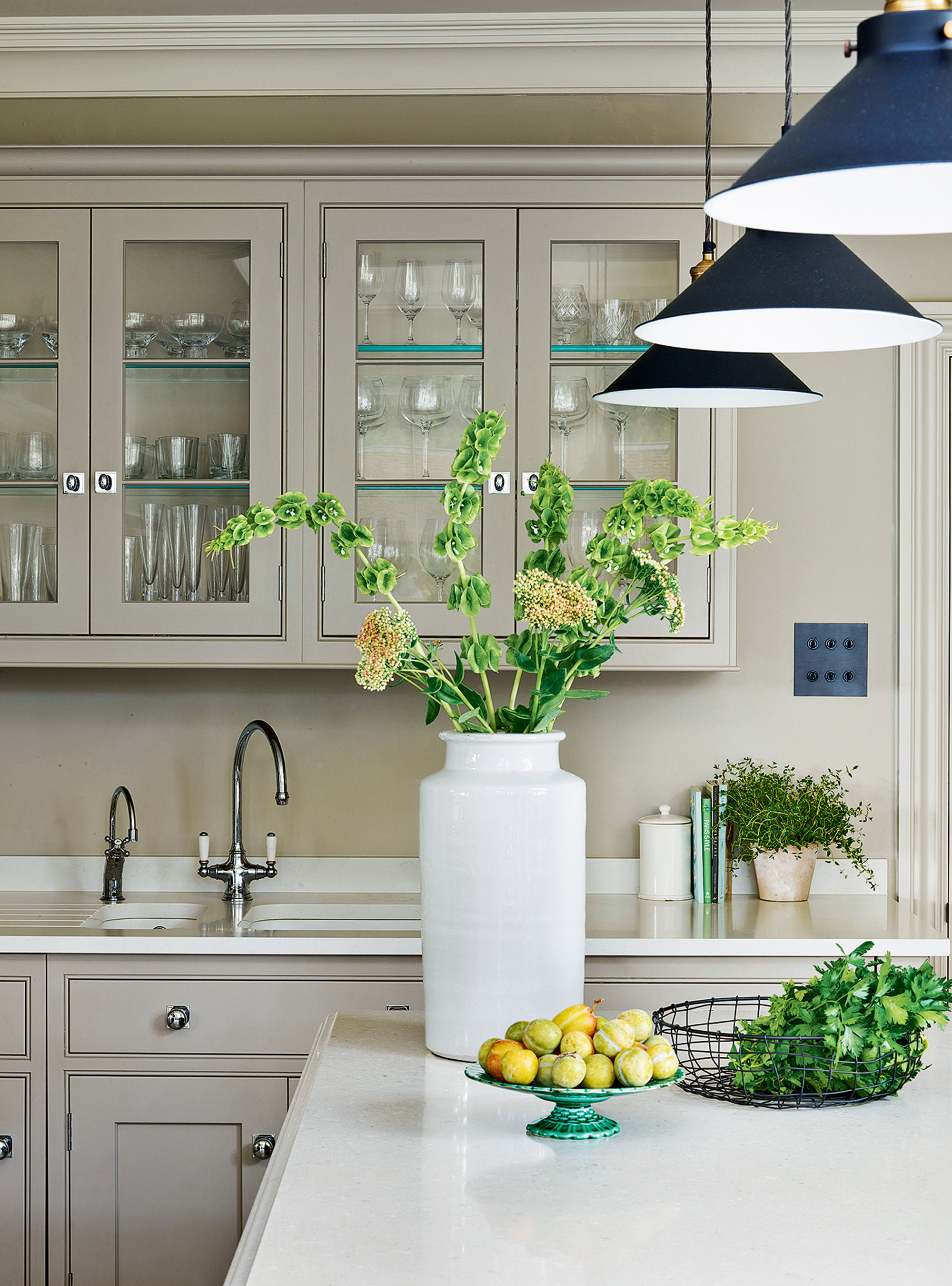
Green kitchens are in general a calming and relaxing color choice for diminutive spaces. Being the one color that represents nature, it’s one that makes us feel good and positive; it is these exact qualities that help to make a kitchen look and feel bigger and open. It comes to life with plenty of natural light but can also work in a dark or galley kitchen.
Green, like most shades, looks fabulous with white – and is perfect for cabinetry and backsplashes, if you are looking for classic painted kitchen ideas. You can’t beat the clean crisp feel that the two colors together create – especially in modern rustic or country kitchens with low ceilings.
7. Enlarge with beige and cream tones
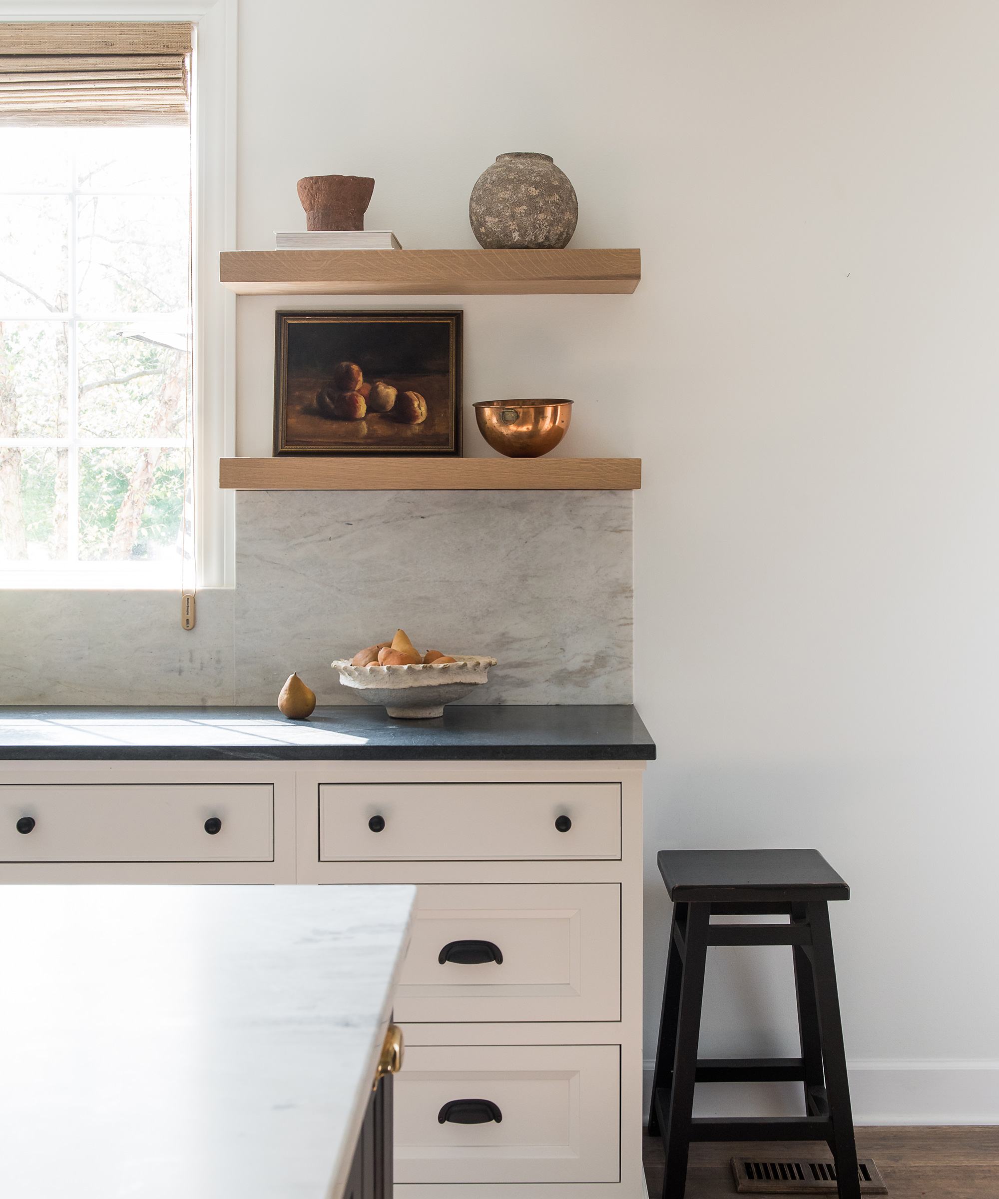
It goes without saying that beige is the color replacing gray, and for good reason. According to Chenise Bhimull, an interior designer at ZFC Real Estate, beige (and similar hues) reflect light (consequently making the space feel bigger) while providing a seamless finish to your room.
And Chenise is not alone in her adoration for the space-boosting qualities of beige and cream kitchens. Whittney Parkinson from Whittney Parkinson Design uses beige tones frequently uses in her designs. However, she adds that incorporating black or charcoal accents will make the space feel 'five times bigger than it actually is.'
The light-enhancing quality of beige cabinets, coupled with the textured, reflective surfaces and accessories – and a little pop of honed black granite for contrast makes the kitchen look five times bigger than it actually is,' she says. 'Pair that with light floors, and the space feels expansive.'

Whittney then began her career as co-owner of the architecture & interior design firm, MAWR Design, working with her father from 2008, until founding Whittney Parkinson Design in 2016. As a young designer in the field, Whittney designed projects varying from high-end residential to a vast array of multi-million dollar commercial projects around the Midwest.
FAQs
How can I make my kitchen look bigger with paint?
‘If you are short of space in a kitchen, it’s a great idea to paint the units the same color as the walls,' says Joa Studholme, color curator, Farrow & Ball. 'The walls should be painted in wipeable modern emulsion and the units in super-durable modern eggshell. This will make the space feel bigger but also less utilitarian – more like a living room than a kitchen.’
When choosing painted kitchen ideas, also consider also what will bring true enjoyment to the space. 'I believe that comes from the color, texture, and aesthetic of the room – and from a sense of soul,' says Designer Hubert Zandberg. 'It is important that a kitchen reminds you of a happy childhood memory or has a certain energy, even if it is subconscious.'
Sign up to the Homes & Gardens newsletter
Design expertise in your inbox – from inspiring decorating ideas and beautiful celebrity homes to practical gardening advice and shopping round-ups.

Jennifer is the Digital Editor at Homes & Gardens. Having worked in the interiors industry for several years in both the US and UK, spanning many publications, she now hones her digital prowess on the 'best interiors website' in the world. Multi-skilled, Jennifer has worked in PR and marketing and occasionally dabbles in the social media, commercial, and the e-commerce space. Over the years, she has written about every area of the home, from compiling houses designed by some of the best interior designers in the world to sourcing celebrity homes, reviewing appliances, and even writing a few news stories or two.
-
 What is your birth month herb? Discover the symbolic meaning behind yours
Herbs offer symbolic wisdom, and play to the natural rhythms of the season
By Lola Houlton
-
 Diane Keaton uses glass cabinets to cleverly introduce color to her white kitchen – it's one of the most inventive decorating techniques I've ever seen
The actress intelligently uses rainbow-colored accessories for a Mexican-inspired twist on her classic Californian kitchen – I'm following suit in my tiny home
By Megan Slack
