7 small kitchen layout mistakes – and the designer-approved strategies to avoid them
Swerve the traps that can make a kitchen feel cramped and create a spacious feeling room that belies its dimensions
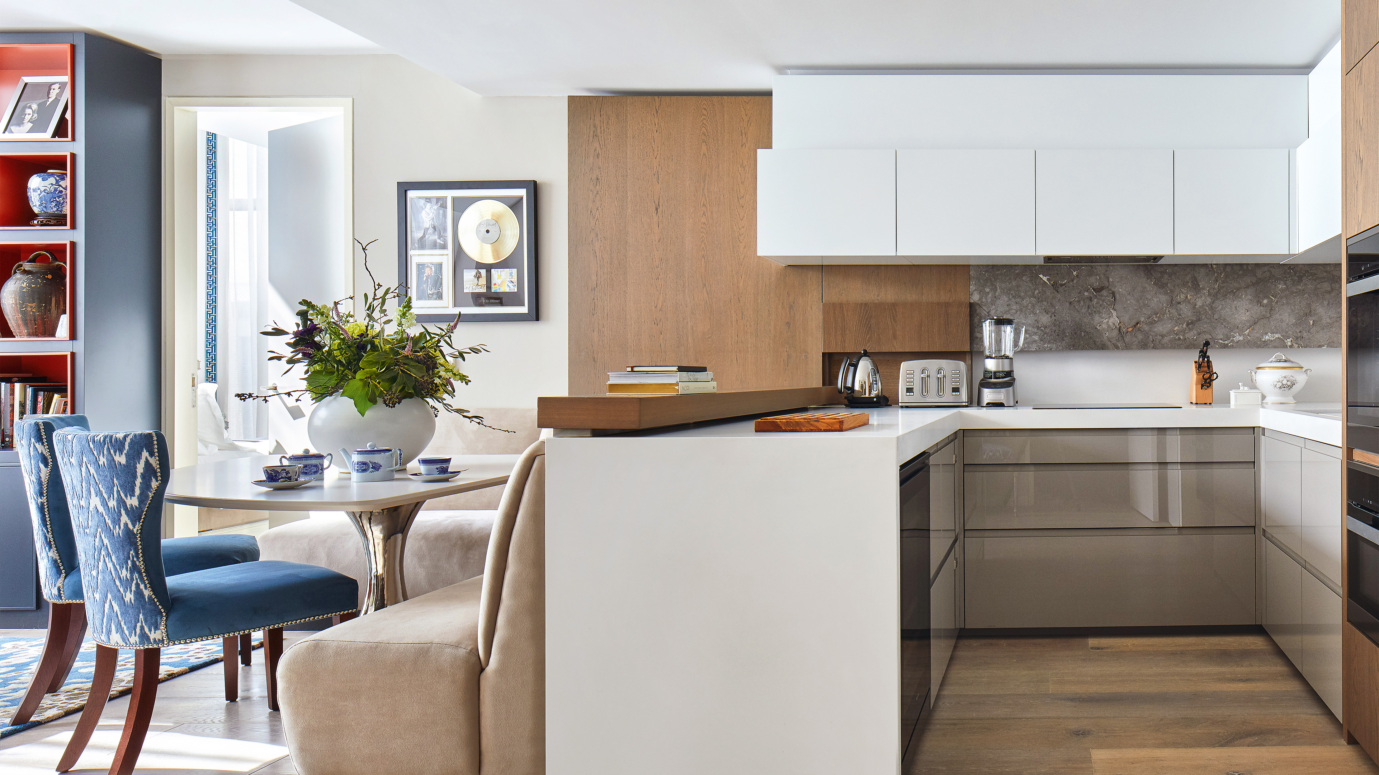

Space is precious in a small kitchen. The essential elements this room needs don’t diminish when its dimensions are less generous. And that’s why layout mistakes can mean ending up with insufficient storage and a room that’s awkward to use and feels cramped. Aesthetically, it won’t win any prizes either.
Successful small kitchen layouts mean swerving the pitfalls that can badly compromise the room’s functionality and its style – and they are achievable with interior designer knowhow.
Designers have seen it all before, so we’ve asked them to share these traps for the unwary plus the small kitchen ideas that will ensure you can avoid layout mistakes in your room.
Small kitchen layout mistakes to avoid
Common small kitchen layout mistakes are to do with proportion: get this wrong and the room will never function well or look good. Clever space planning is also a must with enough created to move comfortably around the room. Important, too, is where you locate items and the storage solutions you select. With great planning and the wisdom of designers, however, avoiding errors is possible. This is how to go about it.
1. Inefficient utilization of space
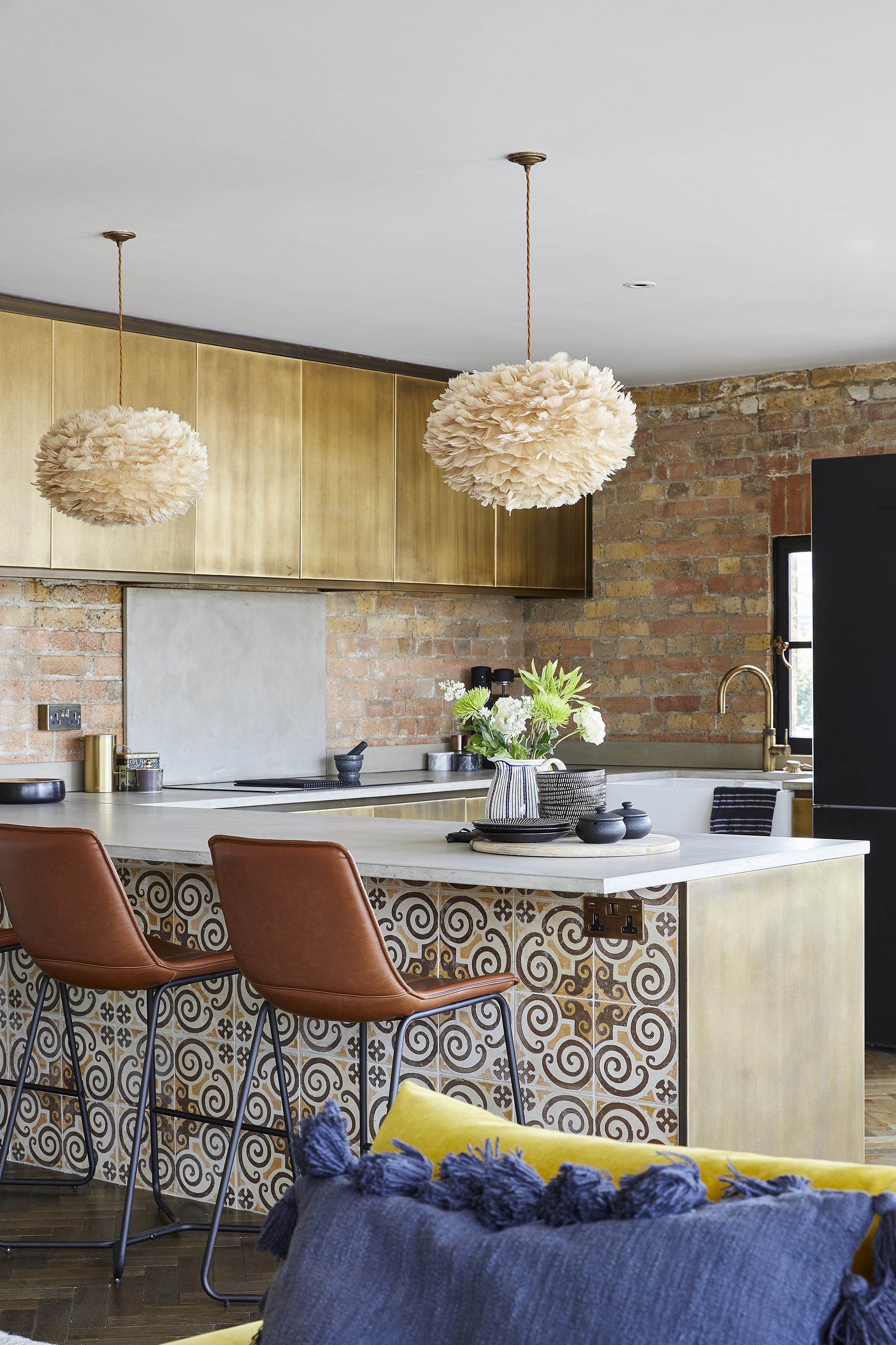
The layout for a kitchen has to be efficient for both ease of use and, vitally, safety. Getting small kitchen layouts right is particularly crucial because of their reduced dimensions.
‘A frequent misstep in designing a petite kitchen involves the improper utilization of available space, resulting in a congested and disorderly area that is difficult to navigate,’ says interior designer Artem Kropovinsky.
‘To circumvent this problem, it’s critical to meticulously plan your kitchen’s layout. Account for the dimensions of your appliances and their functionality. Ensure there's sufficient room around appliances and countertops to facilitate easy movement.’
The kitchen space distance rules are the ones to follow, allowing you to create sufficient space for walkways, appliances and counters.
2. Cluttered countertops
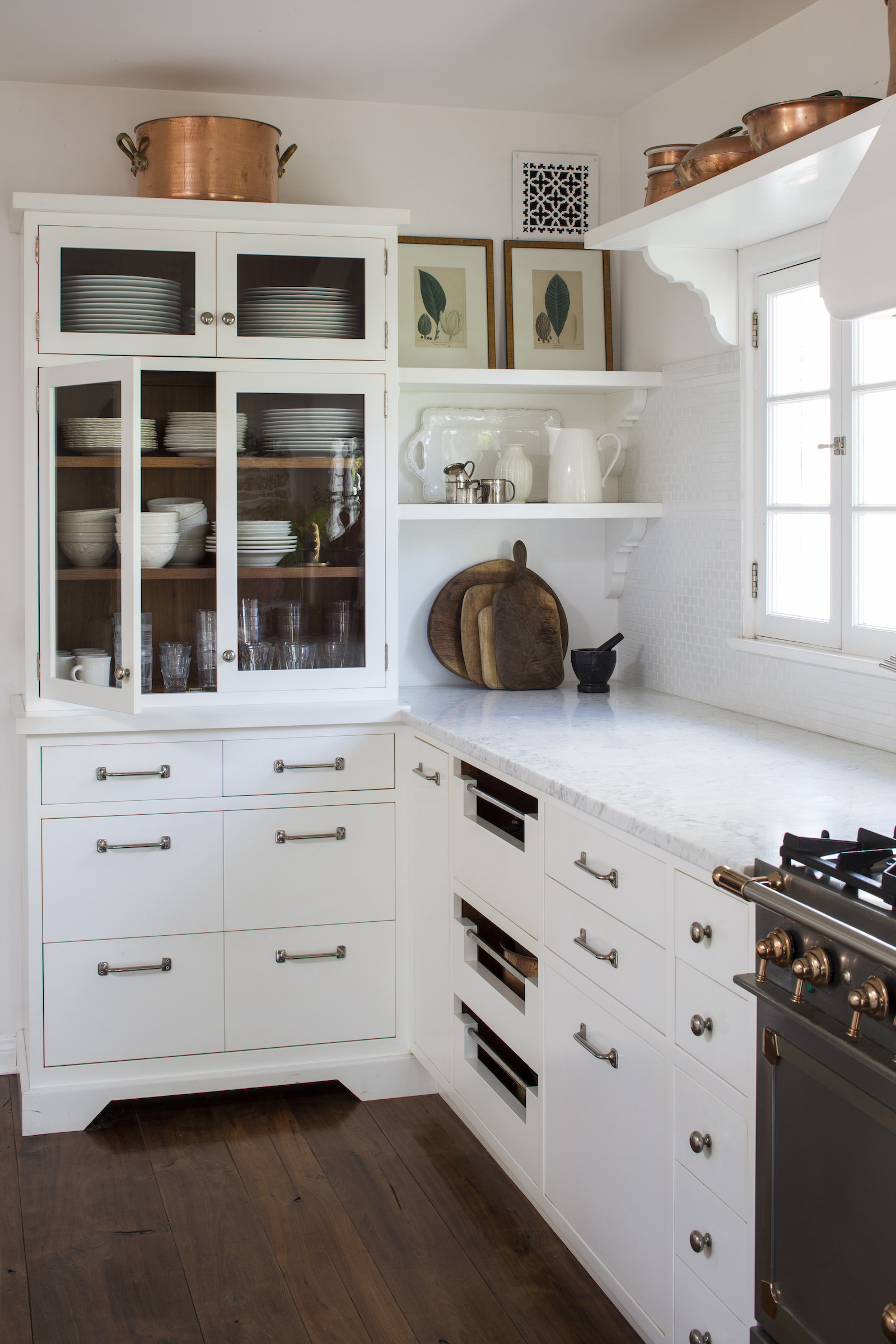
Keeping too much on countertops is a trap it’s all too easy to fall into in a compact room. ‘A big mistake we always see in small kitchens is letting appliances live on the counter,’ say Kiley Jackson and Aileen Warren of Jackson Warren Interiors.
‘If you can, plan a custom space for small appliances. The microwave, toaster, espresso machine – try to get that stuff off your limited counter surface so you can have more space for food prep.’
3. Oversized appliances

And it’s not just the small appliances that pose a problem. Thinking big for the refrigerator or another appliance is a mistake when yours is a small kitchen since oversized appliances can make the room feel crowded and get in the way.
‘In all of our kitchens, especially kitchens that are on the smaller side, we enlist a counter-depth fridge and other appliances,’ say Kiley and Aileen. ‘It makes a huge visual difference to have everything flush, as well as saving on space.’
4. Overbearing lighting
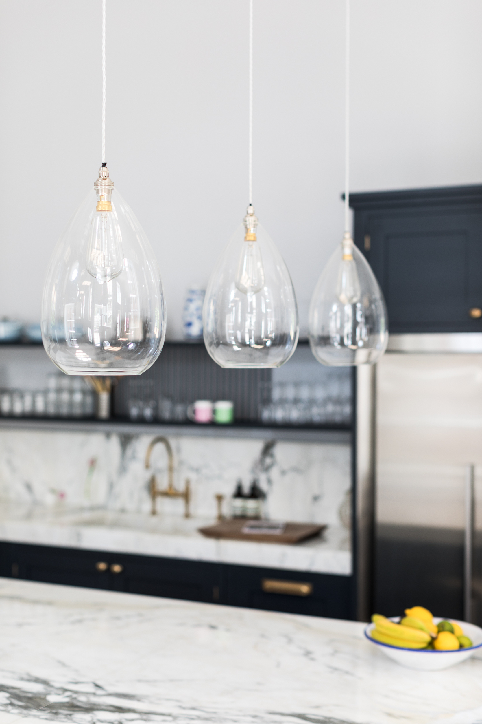
It’s not just selecting large appliances that's a sizing error in a small kitchen. Pay attention to lighting choices as well.
‘Oversized lighting can make a small kitchen feel very cramped,’ says Kristin Marino of KozyKasa. ‘It’s important to take scale and proportion into consideration when working with a small kitchen so that the space feels harmonious and well thought out.’
Of course, this doesn’t mean lighting ideas for small kitchens should lack style or presence. Look for elegant shapely lights made from beautiful materials whether they’re pendants or wall fixtures.
5. Blocking natural light
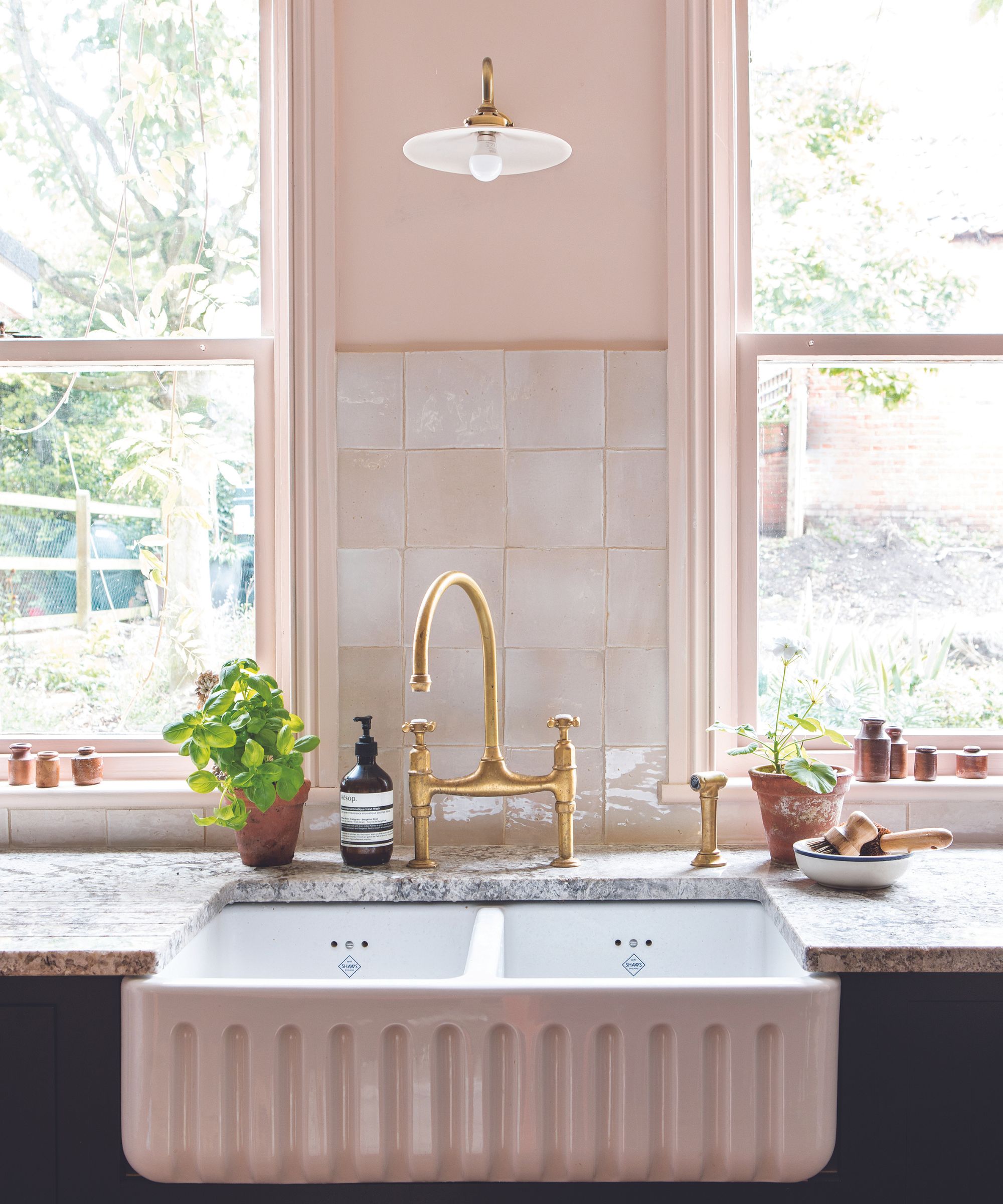
Beware a small kitchen layout that reduces the amount of natural light that can reach the room. Placing the sink under a window will keep the area open while, even if you don’t want an entirely open-plan design, you might think about a part-glazed wall between the kitchen and a dining room to borrow light from the latter space.
Bear in mind, too, that you may need to introduce additional features into the layout to boost the amount of daylight a small kitchen receives. ‘Capitalizing on natural light can render a compact kitchen spacious and well-lit,’ says Artem Kropovinsky.
‘Even if your kitchen isn’t blessed with ample natural light, there are alternatives to introduce brightness. Consider installing skylights or light tubes,’ he suggests.
6. Upper cabinet overload
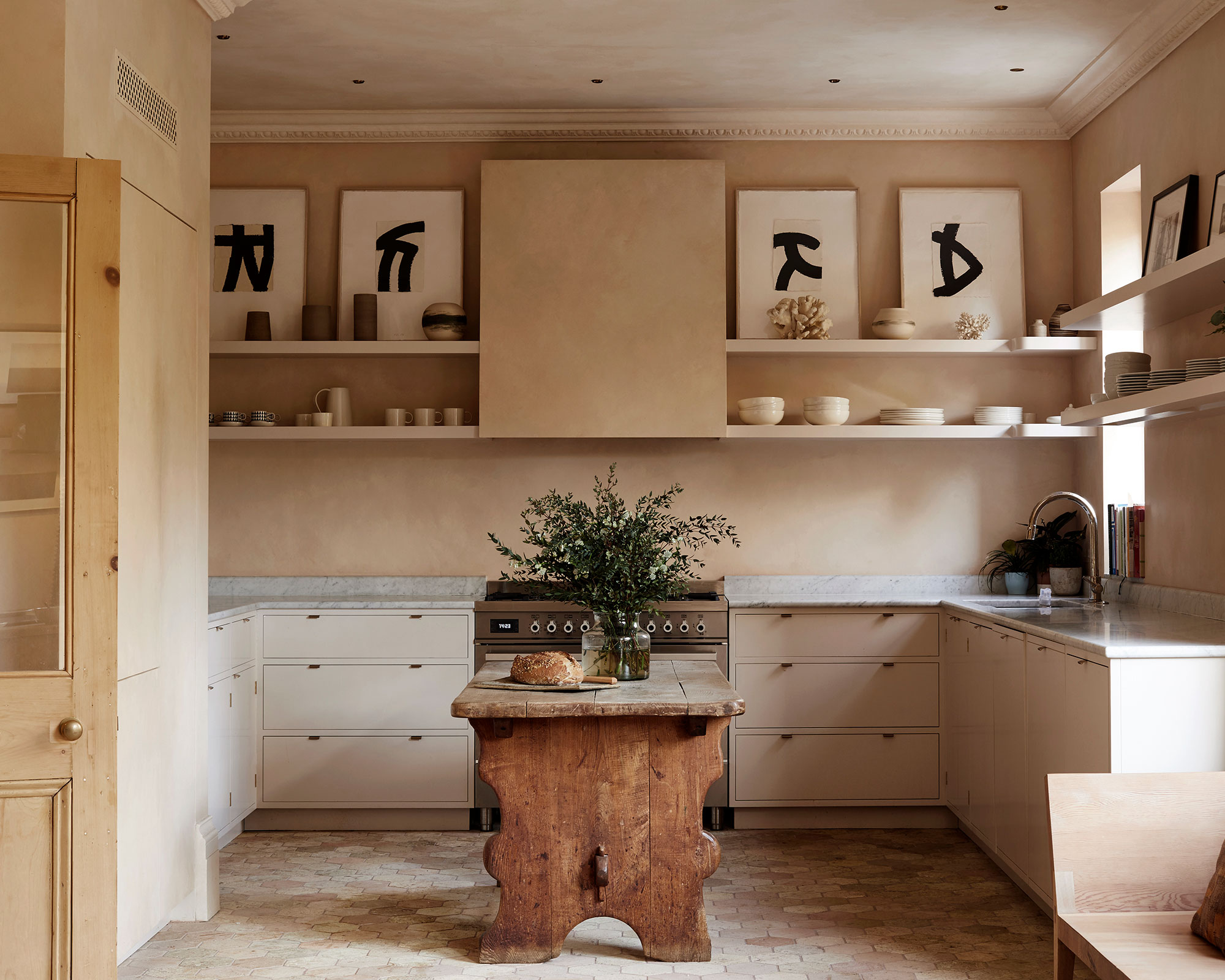
While incorporating as many upper cabinets as possible is tempting in a small room to gain storage space, it can be counterproductive. ‘An easy swap to make a small kitchen feel more roomy is incorporating some open top shelving. It lets the space breathe,’ explain Kiley Jackson and Aileen Warren.
NYC-based interior designer Kaitlin McQuaide of McQuaide Interiors agrees that wall cabinets can cause problems. ‘In a small kitchen, upper cabinets tend to feel heavy and overbearing,’ she says. ‘Really think through your storage and prep area needs and try to avoid doing a full wall of upper cabinets – instead use a few open shelves to display your prettiest pieces. If upper cabinets are a necessity, make sure to bring them all the way up to the ceiling to avoid that awkward space between the top of the cabinet and the ceiling.’
7. Leaving out a hood fan

While space-saving options can be winners in a small kitchen, there’s one Ami McKay, president and principal of Pure Design: Interior Design, Build & Shoppe, doesn’t recommend: ‘Putting a microwave hood fan over your range!’
‘The stove is the heart of the kitchen – you want to make it beautiful and unique,’ she says. ‘The hood fan should be a statement, it’s an opportunity to use tiles, brick, an old-world lime wash, or architectural shapes. Your kitchen is immediately elevated when you have a beautiful hood fan.’
FAQs
What kitchen layout makes the most out of a small space?
A galley can be the layout that makes the most of a small space out of the 6 types of kitchen layouts because it makes efficient use of a small area. ‘How much room you have will determine if it’s a single line of cabinets or there are room for two parallel runs in what’s called a double galley,’ says digital editor of Homes & Gardens Jennifer Ebert. ‘In a double galley, introduce the work triangle of refrigerator, range and sink, which makes prep and cooking extremely efficient in terms of your movement pattern.’
Bear in mind, too, that L-shaped kitchens can also suit small spaces as well as larger rooms and it’s easy to incorporate a work triangle into one of these. Alternatively, if the shape of the room accommodates a U-shaped kitchen, this is the option that will bring you good countertop space even if the room is small.
Where should a microwave be placed in a small kitchen?
To decide where to place a microwave in a small kitchen, consider your priorities. If there’s sufficient countertop space for food preparation and serving with it located there, then this can be the optimum position, and will preserve additional space for storage.
However, if the reverse is the case with countertop space limited and precious then you might want to fit in a microwave cabinet below counter level or above it. Alternatively, fit it above a wall oven to stack appliances and save space.
Sign up to the Homes & Gardens newsletter
Design expertise in your inbox – from inspiring decorating ideas and beautiful celebrity homes to practical gardening advice and shopping round-ups.

Sarah is a freelance journalist and editor. Previously executive editor of Ideal Home, she’s specialized in interiors, property and gardens for over 20 years, and covers interior design, house design, gardens, and cleaning and organizing a home for Homes & Gardens. She’s written for websites, including Houzz, Channel 4’s flagship website, 4Homes, and Future’s T3; national newspapers, including The Guardian; and magazines including Future’s Country Homes & Interiors, Homebuilding & Renovating, Period Living, and Style at Home, as well as House Beautiful, Good Homes, Grand Designs, Homes & Antiques, LandLove and The English Home among others. It’s no big surprise that she likes to put what she writes about into practice, and is a serial house renovator.
-
 How to fertilize magnolias – garden experts reveal the secrets to better blooming, and timing is critical
Magnolias are famed for their spring flowers, and feeding at the right time can give trees a boost
By Thomas Rutter Published
-
 Sarah Jessica Parker's spring tablescape epitomizes lived-in luxury with art deco candle holders and a statement tablecloth – it's easy (and affordable) to recreate
Kick off the season right with a warm table that invites guests into your home by emulating Sarah Jessica Parker's luxe and cozy scheme
By Sophie Edwards Published