

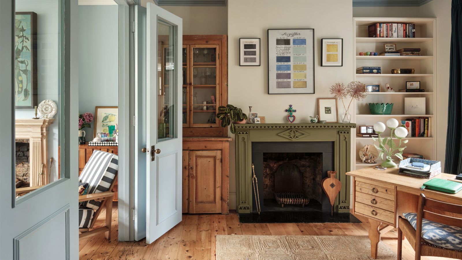
Your choice of paint color for your kitchen cabinets is a great way to add design appeal to this functional room. When selecting a shade, it's important to consider what goes well with the other elements in the room – while going for something timeless ensures longevity.
If you're looking for some expert help with your kitchen cabinet colors, Studio McGee and its founder Shea McGee have you covered. In a recent blog post, the celebrated design studio shared its favorite paint colors for kitchen cabinets, as used in many of its previously designed projects.
Below, we've rounded up five of them to serve you with some timeless kitchen paint ideas – ranging from light neutrals to richer tones from leading paint brands including Sherwin-Williams and Benjamin Moore.
1. Fawn Brindle, Sherwin-Williams

Lower cabinets: Sherwin-Williams' Fawn Brindle
In Studio McGee's Water's Edge project, Sherwin-Williams' Fawn Brindle was used on the lower kitchen cabinets. This is a greige paint color with undertones of gray and green. While still neutral, this hue adds more depth than commonly used lighter tones such as white kitchen cabinets, without feeling too bold.

Add more depth to your neutral kitchen cabinets with this soft greige paint color.
2. Creamy White, Benjamin Moore

Cabinets: Benjamin Moore's Creamy White
Benjamin Moore's Creamy White is certainly a favorite for Studio McGee, used on the cabinets here in the Tahoe Pines kitchen as well as in The McGee Home.
While white paints can come across as cool and stark, Creamy White has warm tones which give it a welcoming, cozy feel. Here, it perfectly complements the kitchen's modern rustic aesthetic and natural wood tones throughout.

Cabinets: Benjamin Moore's Creamy White
In the kitchen of The McGee Home, Creamy White was also used on the cabinets, creating a soft and elegant look while achieving that much-desired light and airy feel.

This warming neutral is a great way to keep things understated in the kitchen while providing subtle warmth.
3. Accessible Beige, Sherwin-Williams

Cabinets: Sherwin-Williams Accessible Beige
Sherwin-Williams' Accessible Beige is a popular beige paint with gray undertones that stop it from feeling too warm. Here, in Studio McGee's Spec Home project, it was chosen for the cabinets, creating a timeless look with just the right amount of warmth.

Accessible Beige is a go-to neutral, adding more warmth and depth than white.
4. Deep River, Benjamin Moore

Cabinets: Benjamin Moore's Deep River
Shea's favorite kitchen cabinet paint colors aren't just light and calming neutrals, but much darker shades too. In The Summit Estate, Benjamin Moore's Deep River, a dark gray-green paint, was used on the kitchen cabinets.
Sometimes, a darker color on cabinets can be the perfect way to add more depth to the heart of the home, and a rich gray-green like this one also sets a sophisticated feel.

While charcoal paints can sometimes feel too cool, Deep River has green tones which give it plenty of warmth.
5. Midnight Oil, Benjamin Moore

Cabinets: Benjamin Moore's Midnight Oil
Another of Shea's favorite dark paints is Benjamin Moore's Midnight Oil, which was used here in the butler's pantry of The Houston Estate.
This shows just how effective it can be to lean into dark kitchen cabinet colors and use them boldly throughout the room, creating a cohesive space that offers lots of design interest.

This rich, dark blue-black makes a bold statement – a great choice if you want to create a moody feel in the kitchen.
Which of these kitchen cabinet paint colors is your favorite? Whether you're most drawn to the soft and delicate neutral paints or the darker, moody hues, these are all timeless choices for kitchen cabinets that work well with many design styles.

You must confirm your public display name before commenting
Please logout and then login again, you will then be prompted to enter your display name.
-
 5 surprising but brilliant ways to clean with old socks – from perfectly buffing stainless steel to deterring pests naturally and more
Tackle dust in tricky corners, clean your mirrors and even banish bad odors with those rogue single socks
-
 How to grow astilbe – expert advice on cultivating this shade-tolerant flowering perennial
Shade-tolerant and pest-resistant - astilbe are hardy and tough perennials that can thrive in many settings

