Retro kitchen ideas – 12 ways designers create characterful spaces with a touch of nostalgia
Create stylish spaces that pay homage to Mid-century design with these fun retro kitchen ideas
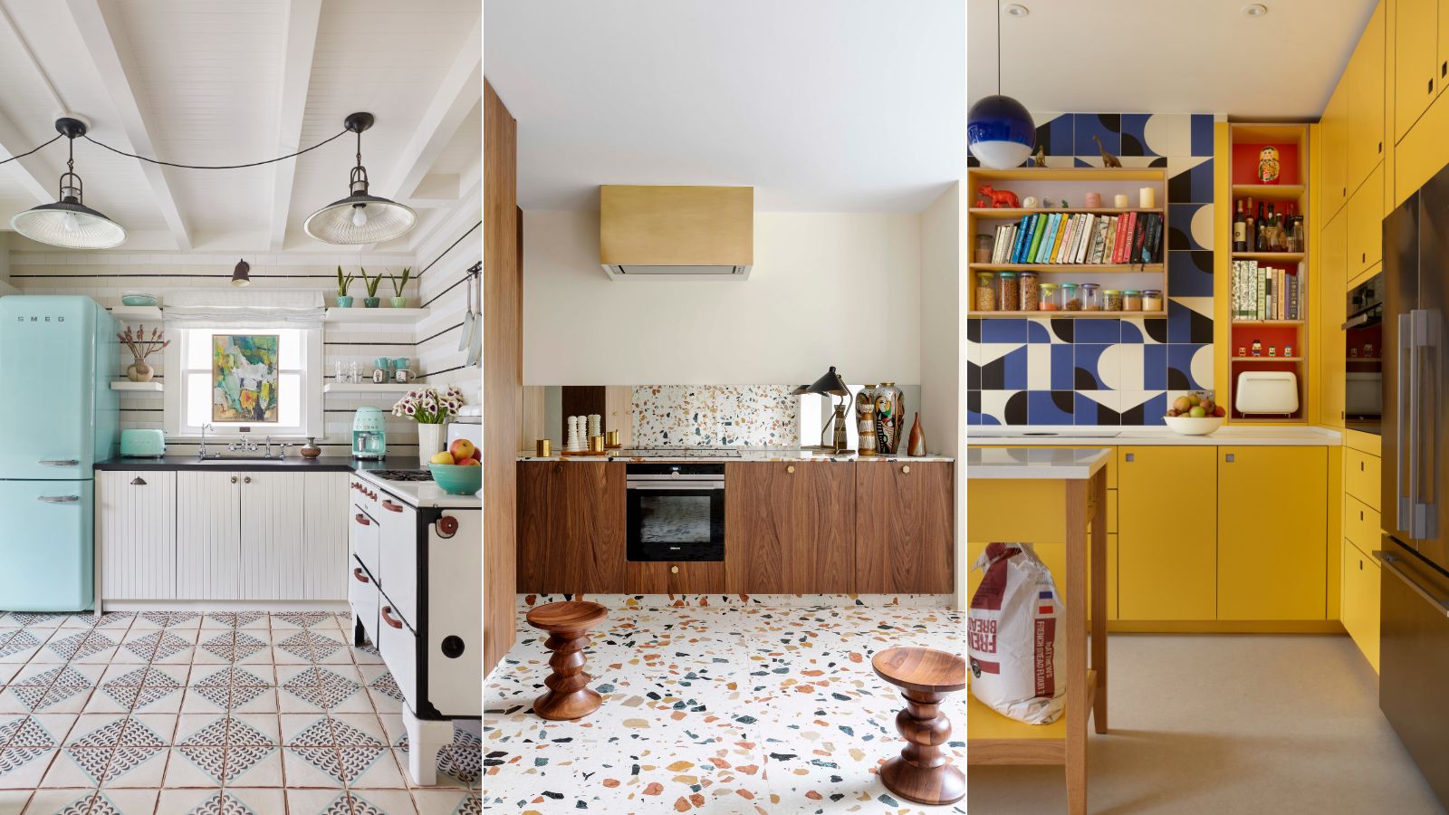
- 1. Choose simple, colorful cabinet doors
- 2. Embrace simple wood cabinets
- 3. Go for a design inspired by Mid-century furniture
- 4. Choose retro appliances
- 5. Channel retro diner style with a chequered floor
- 6. Mix primary colors with abstract patterns
- 7. Incorporate salvaged pieces
- 8. Choose industrial style furniture and fittings
- 9. Mix styles from across the eras
- 10. Create an industrial look with stainless steel
- 11. Add color and pattern with wallpaper
- 12. Introduce retro glamour with a home bar

While the term retro generally means ‘to look back’, in interiors retro is often used to refer to the Mid-century modern design period which spans from around 1945 to the 1970s. Retro kitchens take inspiration from the interiors of this period yet feature all the modern functionality of a 21st-century kitchen.
The beauty of creating a retro kitchen is that there are no design rules, in fact, the term encompasses a wide range of styles, from 1970s Palm Beach glamour to the simplicity of modern Scandinavian design with its focus on natural materials and organic forms. To help get you inspired we’ve gathered an array of retro kitchen ideas alongside some handy tips from the experts on how to channel the look.
What is a retro kitchen?
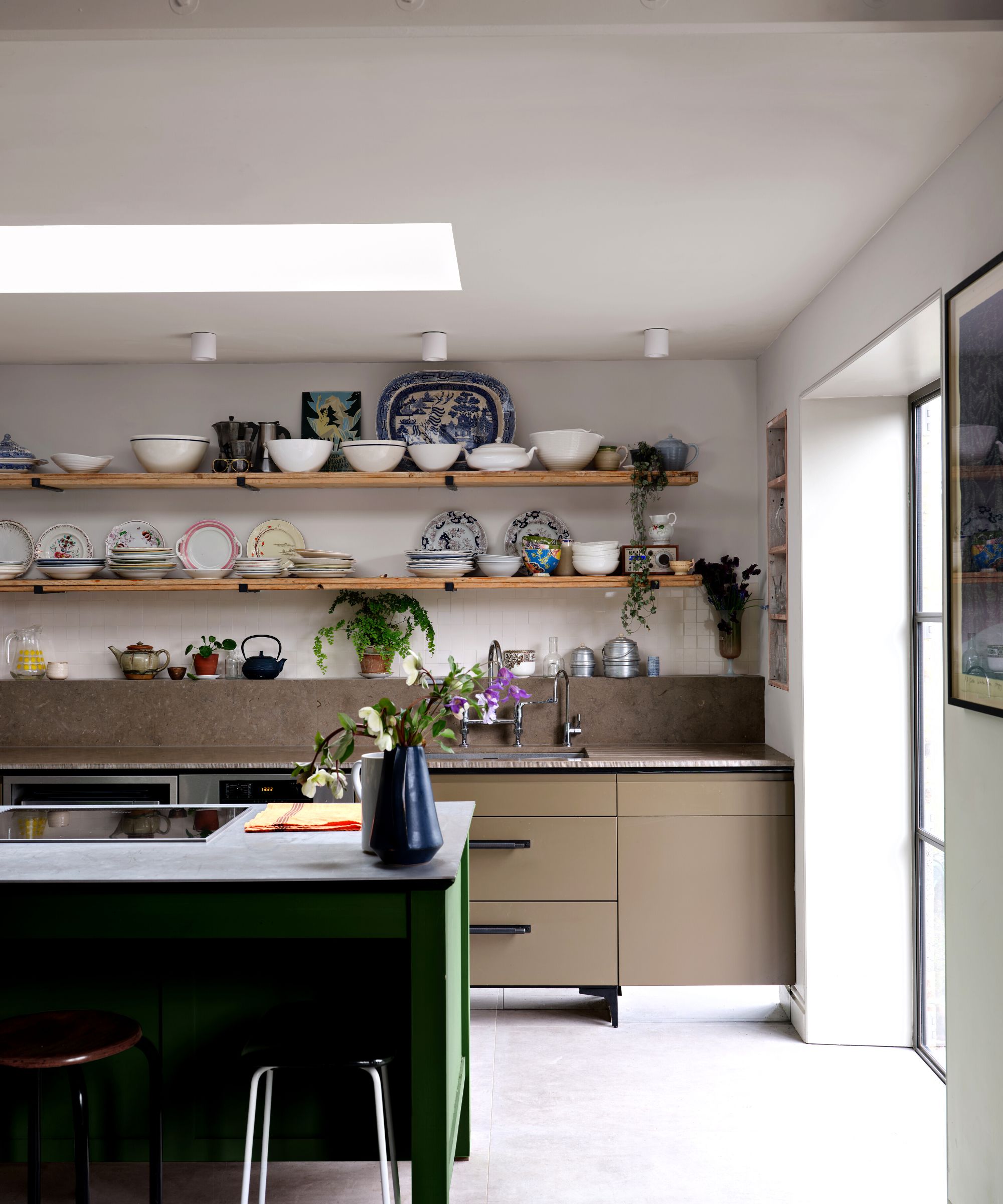
At the heart of the retro kitchen is an appreciation for vintage and Mid-century modern design. While some purists may seek to emulate kitchens of the past, interior designs say the key to creating a successful retro kitchen is to mix up styles from across eras and integrate vintage and mid-century pieces into kitchens designed for modern living.
Generally retro is a term used to describe the aesthetic of the Mid-20th century – a transformative design period in kitchen design. At the beginning of the century, kitchens were largely utilitarian spaces furnished with freestanding pieces such as dressers and prep tables and open shelving with hanging pots and pans. However, post World War II, advances in design and manufacturing, paired with a newly found sense of optimism, saw kitchens evolve into ergonomic spaces designed for living in rather than just preparing food. Functionality, layout, cabinet design and working triangles were carefully considered and the fitted kitchen was born. A focus on leisure time also saw the kitchen evolve into a more social space, and the breakfast bar is thought to be a key feature to have developed during the Mid-century period.
A focus on clean, streamlined design led to the development of sleek banks of kitchen cabinets designed to conceal clutter, while advancements in manufacturing also led to the introduction of materials such as Formica, plastic, steel and wood veneers into kitchen design.
‘The cabinetry in a retro kitchen that best reflects the design aesthetics of the mid-20th century includes features such as flat-panel doors, clean, uncomplicated lines, and minimalistic hardware. Cabinetry was typically made from wood in warmer tones or coated in pastel colors such as mint green, baby blue or pale yellow,’ says Mary Gordon, Vice-President at InSite Builders & Remodeling.
'Key features of this period include bold colors such as aqua, pink, and red or pastel colors such as light blue, mint green, or pale yellow. These bright and pastel colors were used on walls, cabinetry, and appliances. Chrome accents and fixtures were popular. Formica countertops and linoleum flooring with bold colors and patterns are also common in retro kitchens,' adds Mary Gordon.

Mary Gordon is Vice-President at InSite Builders & Remodeling a full service design-build firm in Bethesda, Maryland, working with homeowners in the Washington, DC region. Mary is responsible for the Administrative and Marketing divisions and works closely with the President and General Manager to develop and maintain the mission, vision and culture of the company. After graduating from George Washington University, Mary began her career working at The White House. From 1984-January 1989, she served as the Assistant to First Lady Nancy Reagan’s Press Secretary. Following this, she was at home raising a family and helping on a part-time basis with administrative tasks at InSite.
1. Choose simple, colorful cabinet doors
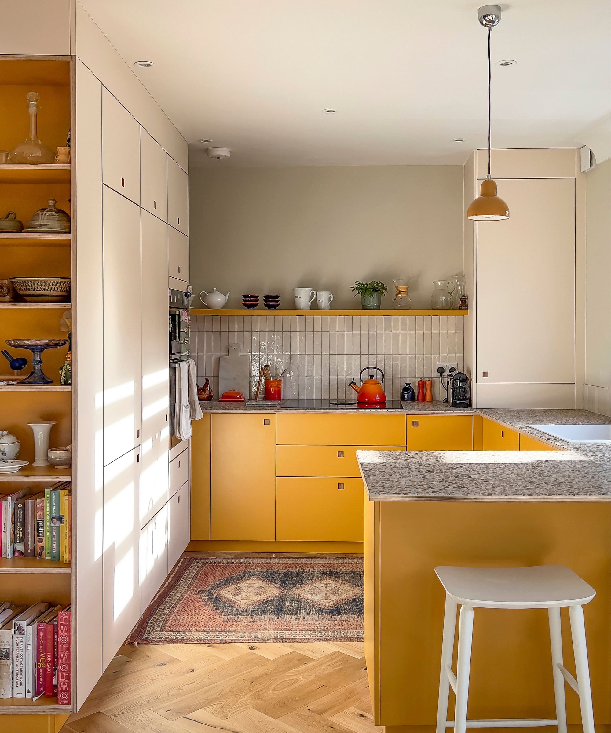
Alongside layout and appliances, cabinetry is one of the most important things to consider in kitchen design. Pared-back, colorful kitchen cabinet door designs made from high-pressure laminates with the ply edge still visible are a wonderful way to channel the retro look. Taking inspiration from Mid-century modern designs, but with enhanced functionality and durability for 21st-century living, these Pluck doors come in a wide range of Eco and Core colors including this Market Mustard yellow, perfect for bringing joy to everyday spaces.
‘Pluck’s pared-back cabinetry style is reminiscent of mid-century design, an era when utilitarian simplicity was celebrated – an inspiring ideology for us. In our homes now, we tend to mix different eras and styles, and that is the joy of this uncluttered design, it can be combined with personal flourishes, collections, and more elaborate furniture and it works beautifully,’ says Leila Touwen co-founder of Pluck kitchens.
‘This color, Pluck’s Market Mustard, can be used to evoke a mid-century palette, a time when yellow was popular for interiors. The blocking of color too, a run of kitchen cupboards in a bold hue, intended to make a high impact was happening then, the confident exploration of how color can make you feel.’
2. Embrace simple wood cabinets
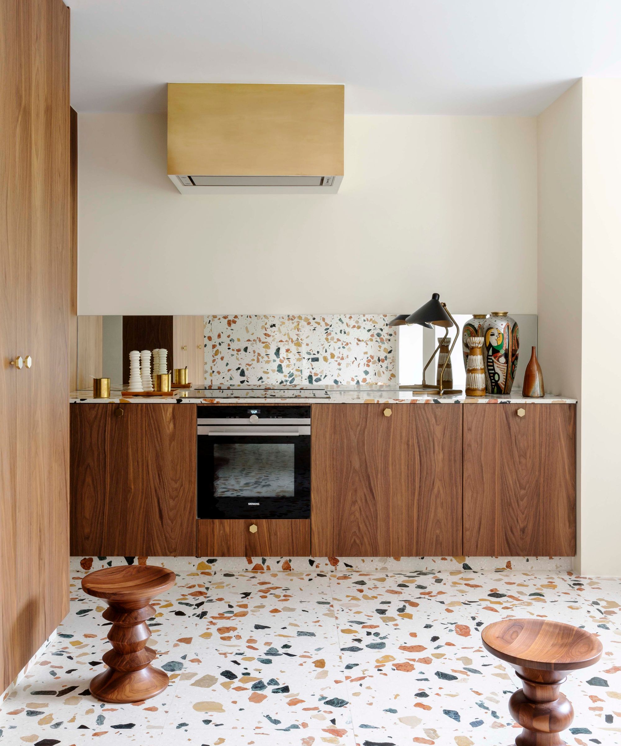
Wood was a hugely popular material in Mid-century modern furniture with teak, rosewood and walnut particularly favoured by designers of the period. In this kitchen by Victoria-Maria the run of simple walnut doors nods to classic Mid-century design while the turned Vitra walnut stools are 1960s pieces by renowned designers of the time Charles and Ray Eames.
3. Go for a design inspired by Mid-century furniture
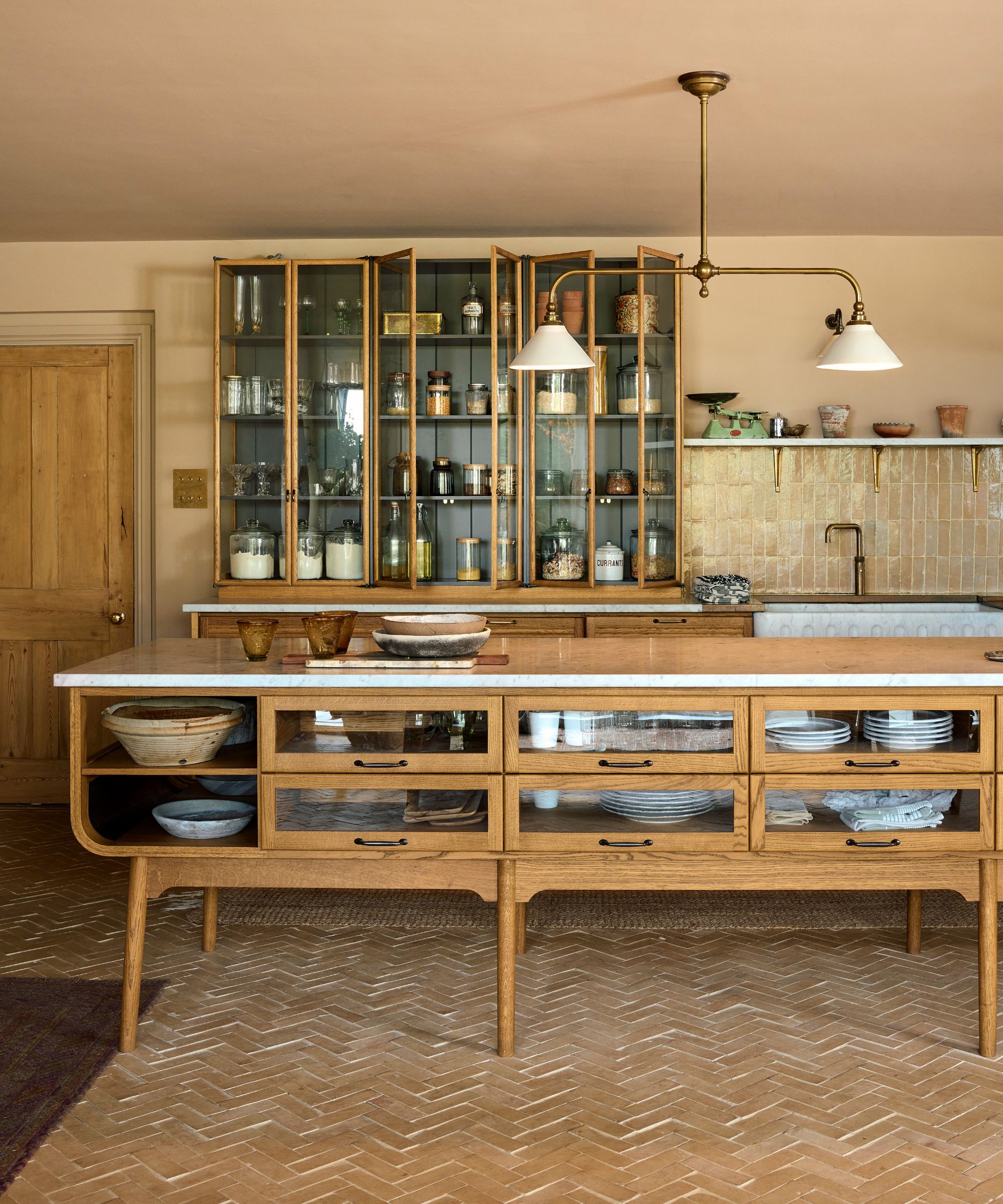
Perfect for channeling the retro kitchen look, the deVOL Haberdasher’s kitchen is modeled on vintage utilitarian haberdashery furniture reminiscent of gentlemen’s haberdashers and commonly seen in lounges, libraries, sculleries and studies. Featuring glazed wall and base cabinets made from oak, as well as prep tables with organic curves and turned legs, the kitchen has an open and freestanding feel that leans into the vintage aesthetic.
Founder of Bert & May, Lee Thornley and his partner Philip chose the kitchen design for their home, pairing it with wonderfully textured plaster walls and terracotta floors.
'We are biased, but the choice of our Haberdasher's furniture was such a great one, slightly seventies, and very LA, it has such a nostalgic feel to it. The warm wood, the gentle curves and the elegant slim glazed cupboards are all so chic and unfussy,' says Helen Parker, creative director of deVOL.'
'Handmade tiles from Bert & May for the floor, walls, and the fabulous statement fireplace looked so good, slightly rustic – full of texture and all of the tones that suits the mid-century deVOL kitchen.'
4. Choose retro appliances
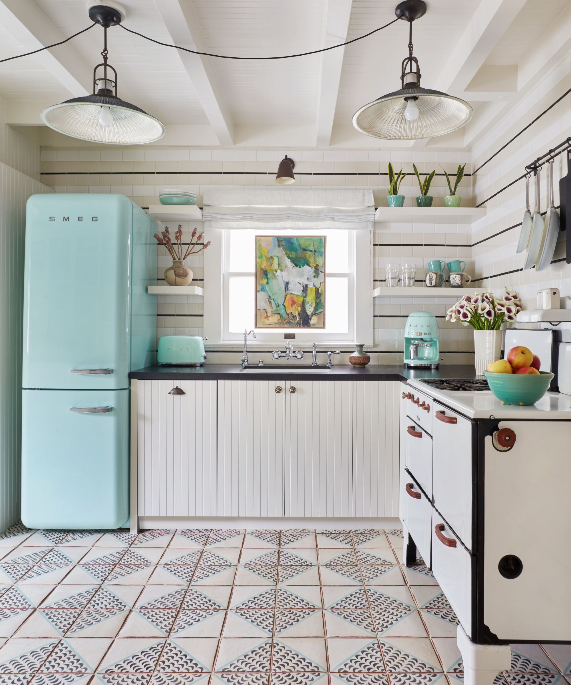
One easy way to give your kitchen a nod to retro style is to opt for retro kitchen appliances. The 1950s saw the emergence of the electric domestic home appliance with items like toasters, fridges, dishwashers and hand-held mixers developed to ease household chores and free up more time for leisure activities.
Today there are many designs available styled on curvaceous, colorful designs of yesteryear that can make a lovely design statement, particularly when used in a neutral kitchen as done here by Jeff Andrews Design. Try brands like Smeg and Cuisinart.
5. Channel retro diner style with a chequered floor
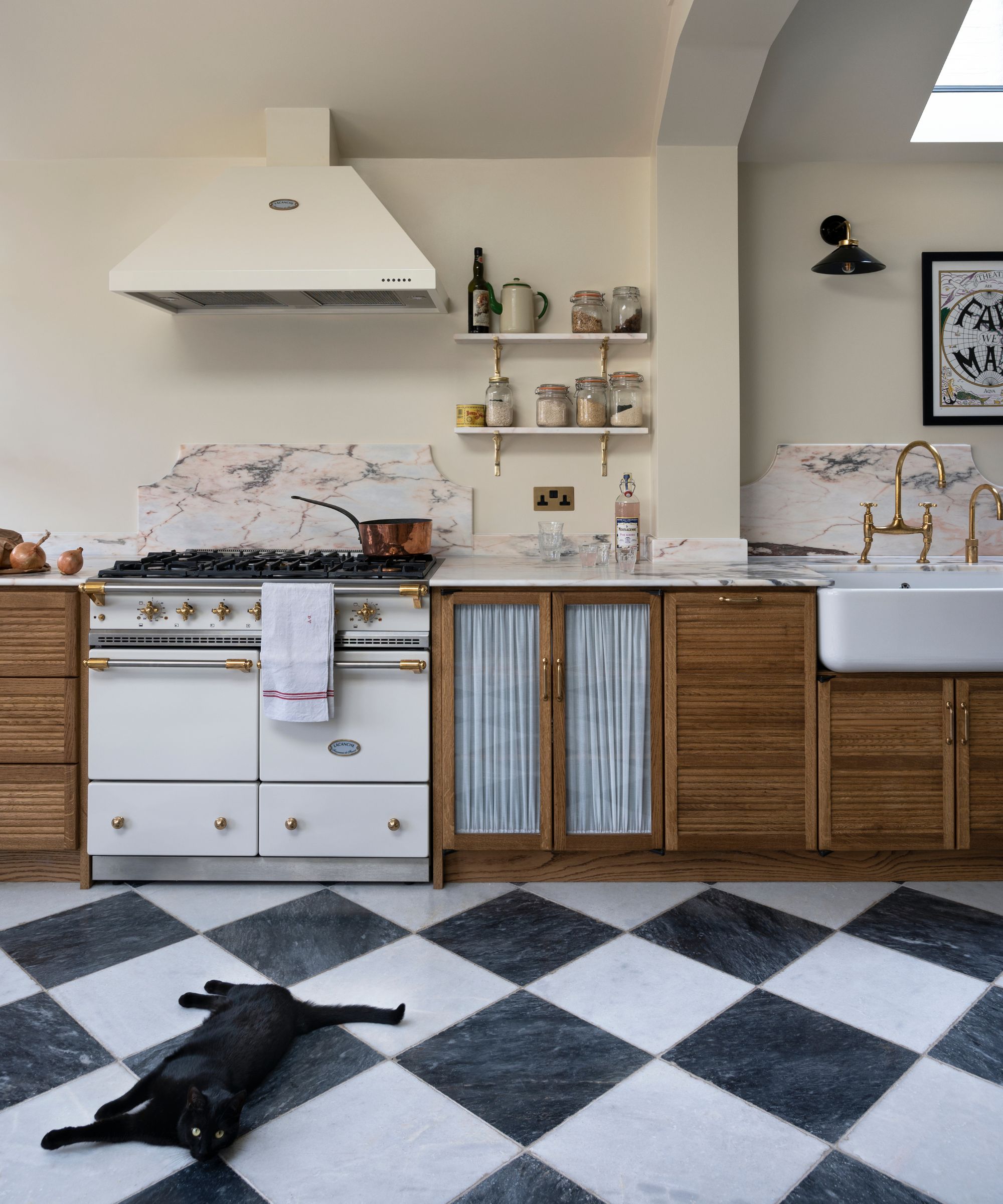
As practical spaces, it can sometimes be tricky to know how to inject personality into a kitchen – opting for a feature floor is a wonderful way to stamp a unique style on the space. For a retro look, you can't go wrong with chequered kitchen floor tiles reminiscent of old-school American diners. The look also nods to a European cafe feel which is very much on trend. When it comes to material, think about going for porcelain tiles as these are extremely durable and easy to maintain.
High-contrast black and white tiles are a bold look, so when it comes to cabinetry why not try a lovely warm wood design to prevent the space from feeling cold, such as deVOL's oak haberdasher's kitchen.
6. Mix primary colors with abstract patterns
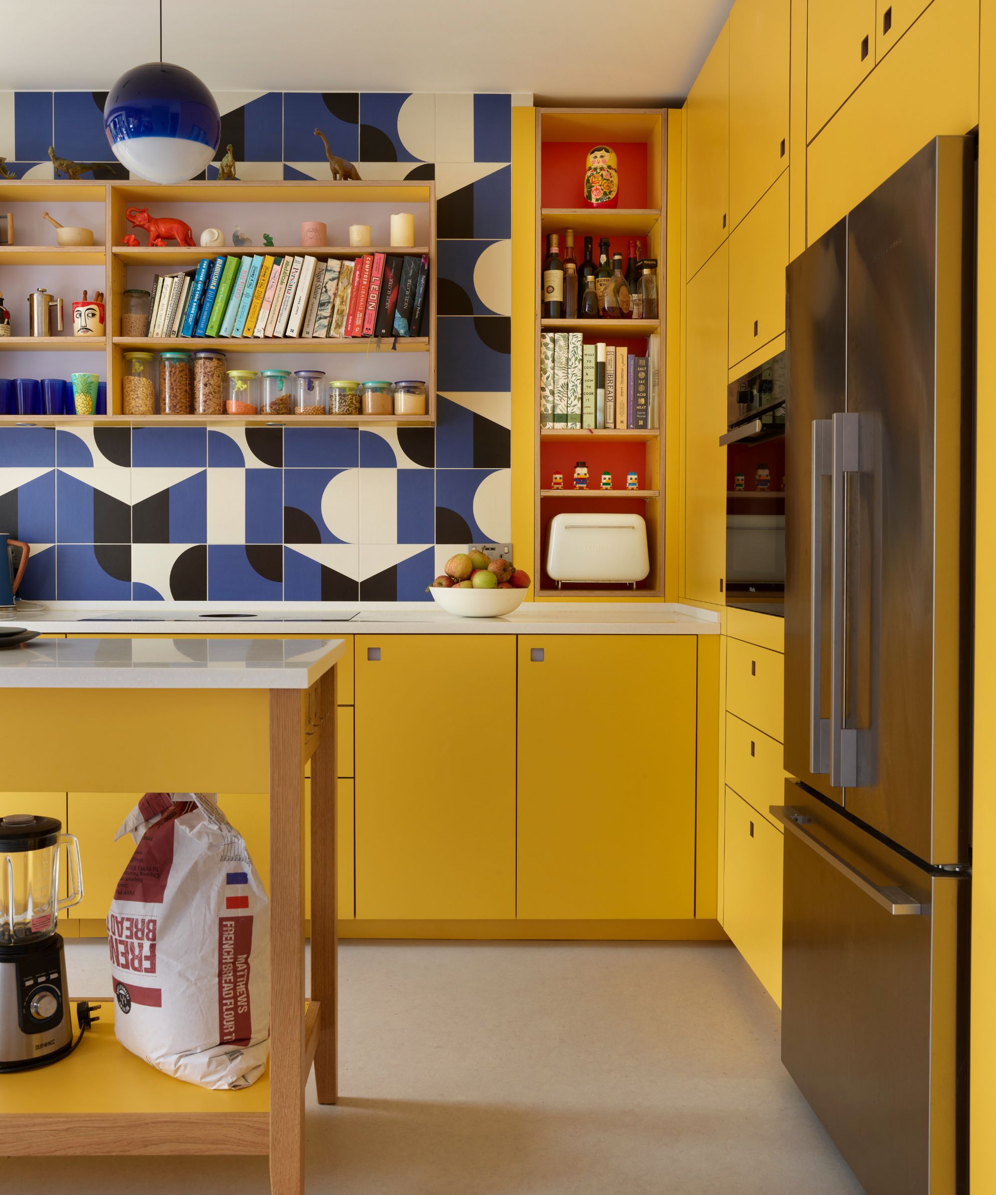
While simplicity in design was a core principle of the Mid-century modern design, color and pattern did have a role to play. Primary colors were commonplace and abstract patterns with curved forms and shapes came to the fore.
Designed by Stealth Design and Pluck Kitchens, this space pays homage to the Mid-century period with its vibrant high-pressure laminate doors and patterned Domus tiles.
'We always wanted the color scheme in the kitchen to be a rainbow of colors to tie in with choices elsewhere in the house. The key was to choose colors to compliment the yellow, not to overtake it but that wouldn’t be drowned out either,' says Zoe Murphy, founder of Stealth Design. 'The bright blue Puzzle tiles designed by Barber Osgerby (the guys who also designed the London Olympic flame) were an easy pick - the color was spot on and the pattern was retro but modern enough not to take the design into museum territory. A scattering of other brights - on furniture, lighting and accessories – bring the rainbow in.'
7. Incorporate salvaged pieces
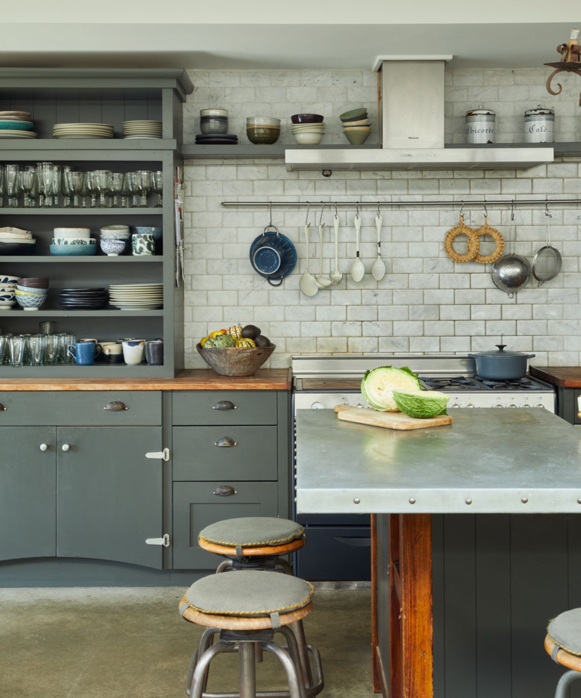
Introducing authentic 20th-century pieces which show the patina of age is a wonderful way to add unique character to a retro kitchen. Here Georgina Cave, founder of Cave Interiors opted for a zinc-topped kitchen island and bar stools reminiscent of school lab stools to channel an industrial look, while the subway wall tiles give a further nod to utilitarian design.
'Our clients wanted a kitchen that maximized the space without it appearing modern or built-in. It needed to be practical and withstand their young family life. Therefore we incorporated hard-wearing materials such as reclaimed school lab tops and distressed zinc countertop with metal studs to the island,' explains Georgina Cave. 'A dresser style unit was designed into the main run with a combination of cupboards and drawers, all hand painted in a rich dark grey with an array of reclaimed handles.'
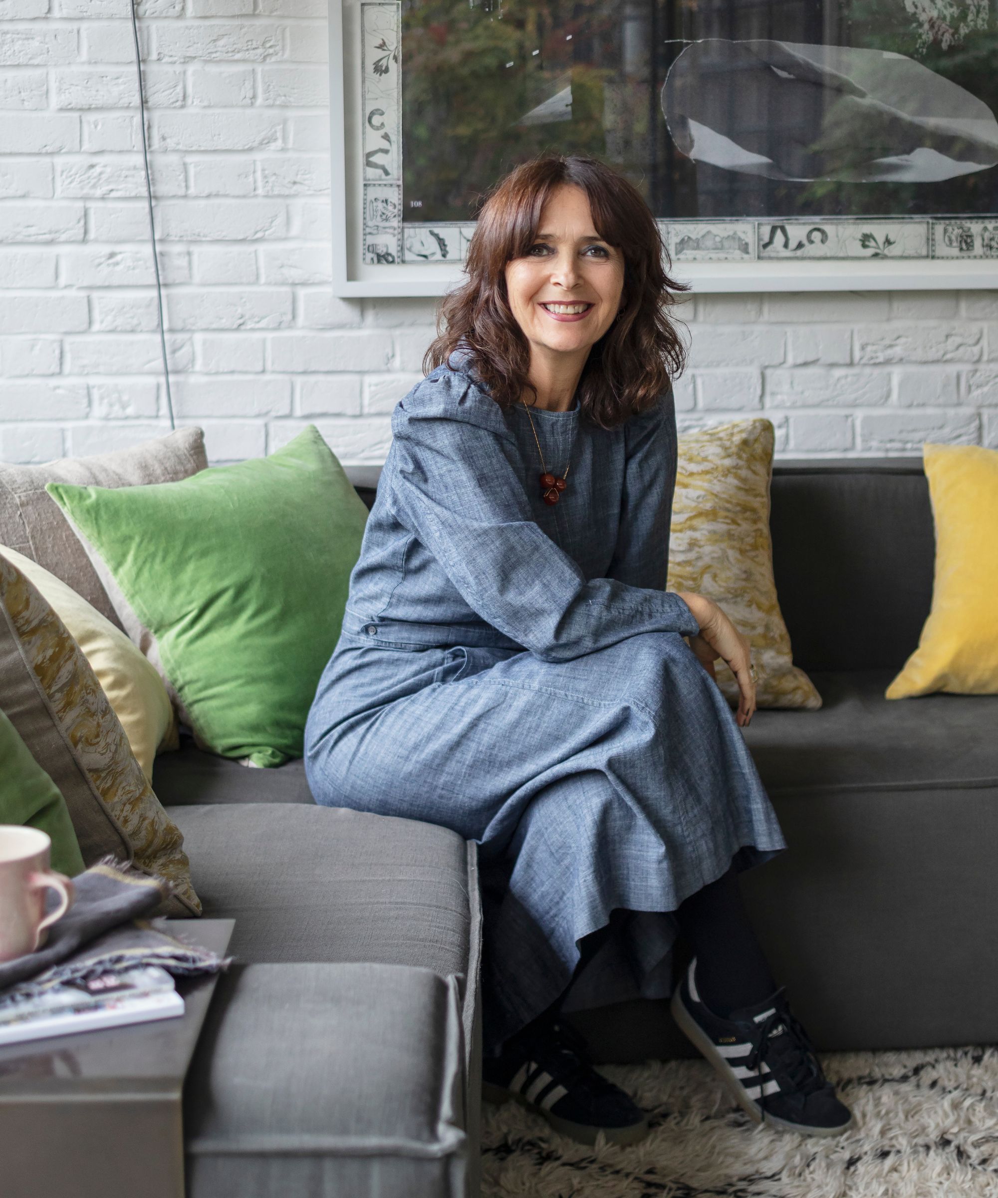
Georgina Cave is the founder and director of Cave interiors, which she runs alongside her daughter Anoushka at their North London studio. With a passion for architecture, interior design, art and antiques, they aim to create beautiful yet functional spaces built around their clients’ needs, working on everything from new builds to the full renovation of historic and listed buildings. Georgina is skilled and experienced in sourcing and enjoys hunting out the very best art, antiques, salvage and unusual items for each project.
8. Choose industrial style furniture and fittings
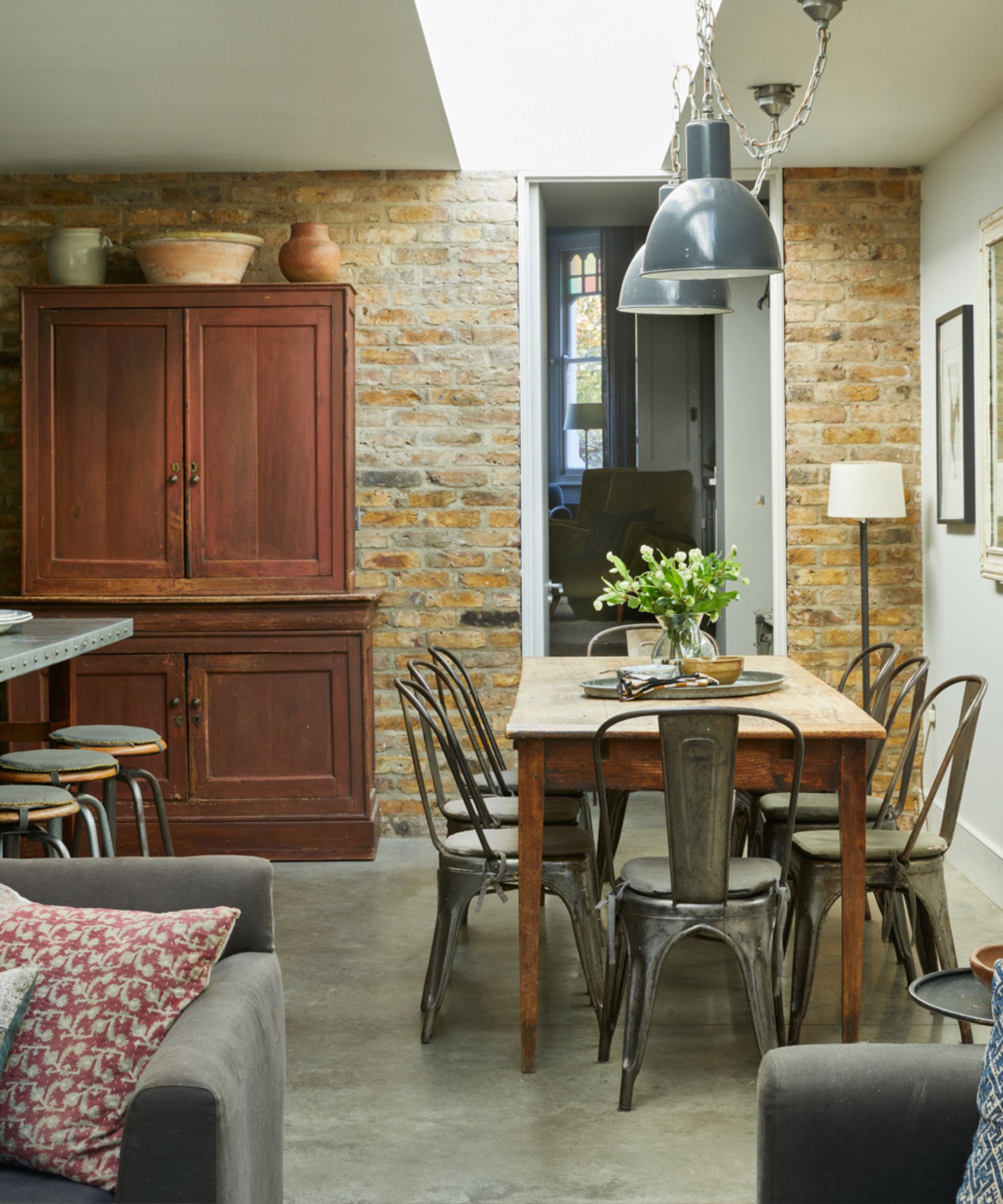
Georgina Cave has continued the industrial aesthetic through into the kitchen dining area of this project with the use of metal Tolix chairs and oversized industrial pendants. Originally designed by Xavier Pauchard in 1934, the metal Tolix chair has become a design classic. Designed for all weathers and commonly used outside cafes, they feature holes in the seat for drainage and stack neatly for efficient storing. Here they make a fitting partner to industrial pendant lights and exposed brick walls.
'The vintage Tolix chairs & stools were sourced from France, but Merchant & Found as well as Vinterior would be good places to look for similar. Whereas Skinflint are a good place to source industrial lighting,' explains Georgina Cave.
9. Mix styles from across the eras
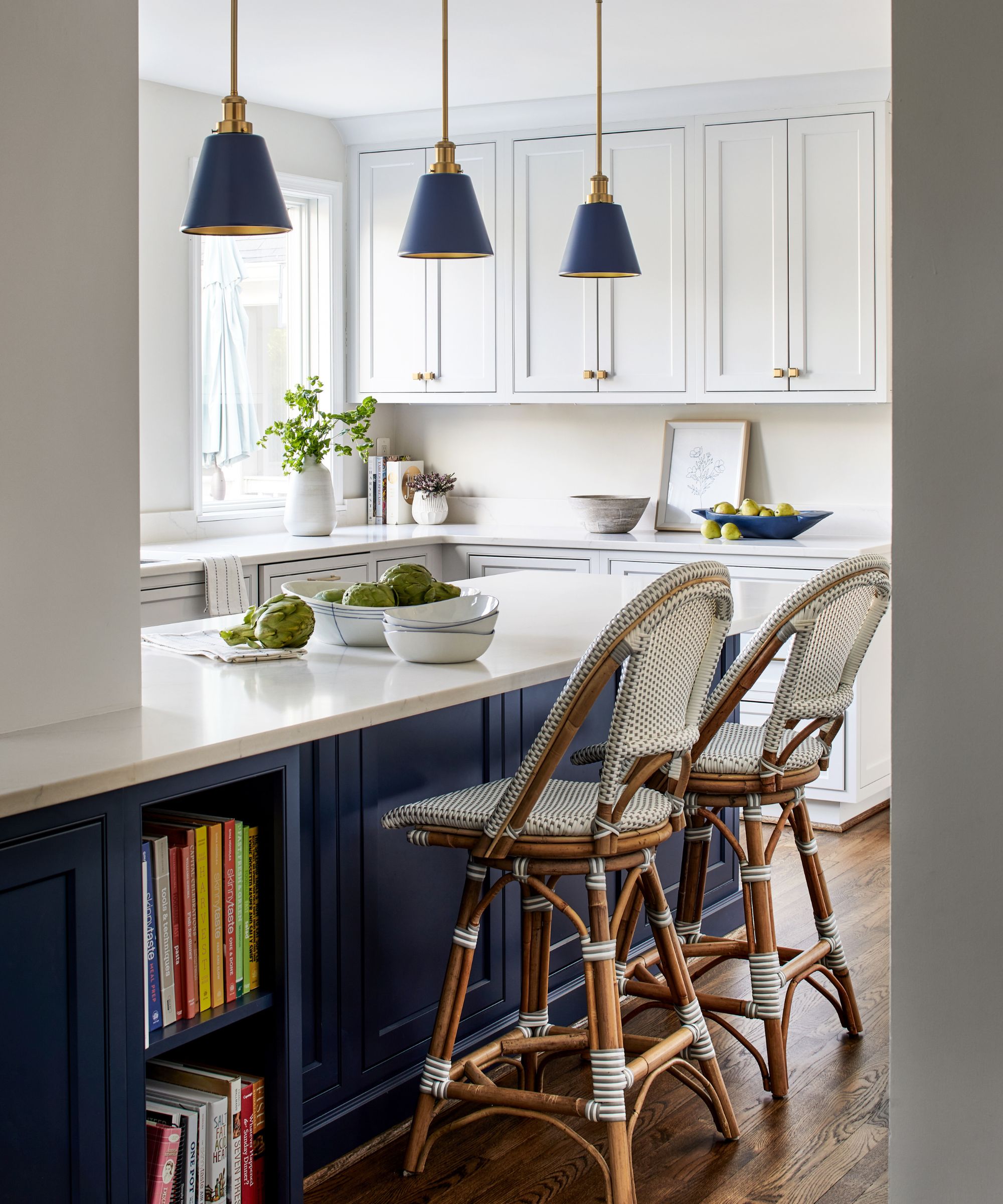
There's no need to go all out and with Midcentury-modern cabinetry to channel the retro vibe, sometimes just a few key pieces are enough to get the look. In fact, many interior designers argue the best approach is to mix styles from across the eras to avoid living in a Mid-century museum.
'To create a retro yet modern feel in a kitchen, integrate smart technology and modern conveniences into a retro design. Choose mid-century modern furniture pieces like tulip tables or chrome bar stools and incorporate vintage-inspired storage solutions like open shelving and glass front cabinets with modern organizational features,' suggests Mary Gordon, Vice-President at InSite Builders & Remodeling.
10. Create an industrial look with stainless steel
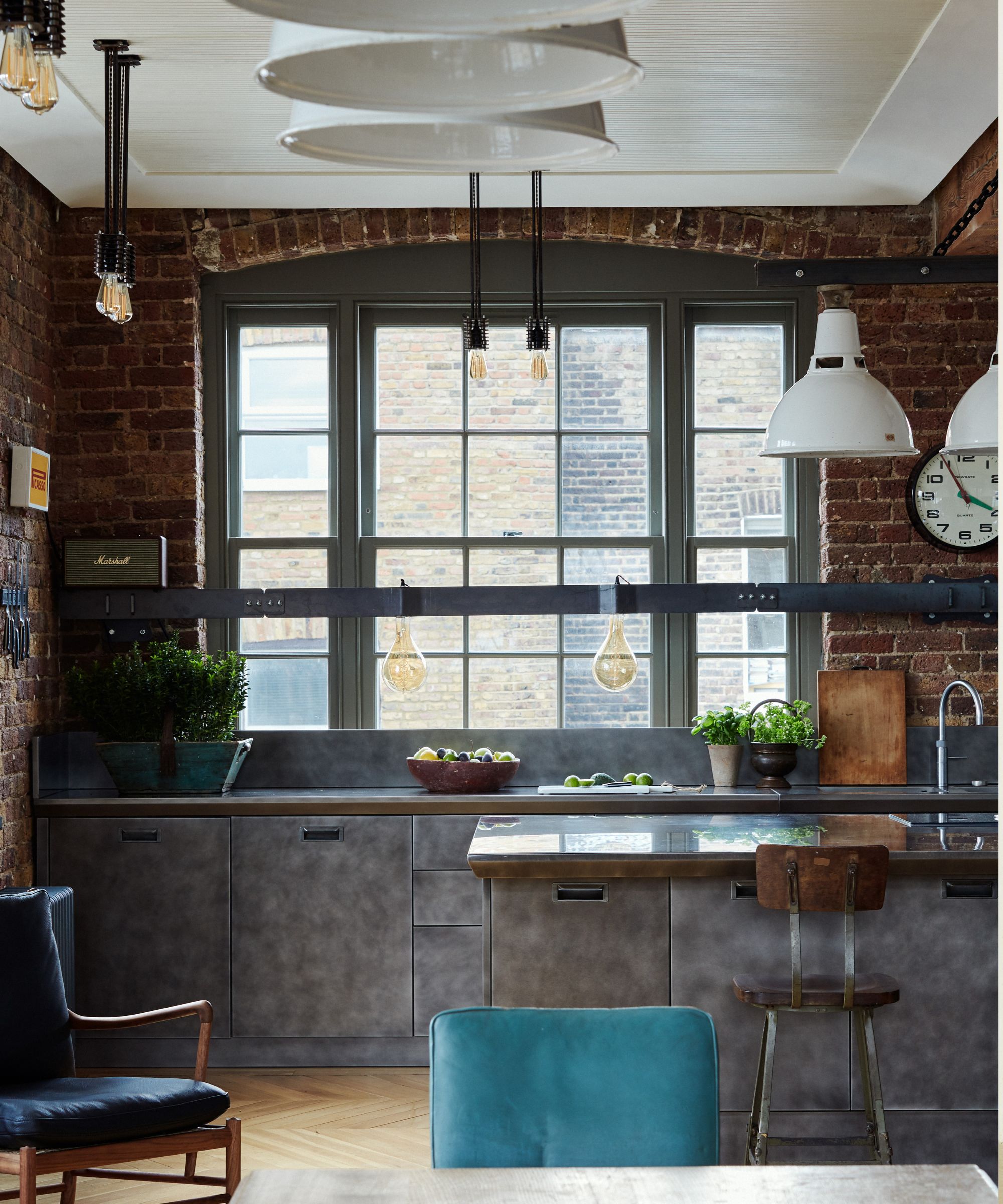
Up until the 1940s kitchen furniture was predominantly made from wood, however, post World War II, steel became far more commonplace in domestic design as it was seen as modern and sturdy. Today stainless steel kitchens are popular with those looking to mimic the industrial look of professional kitchens and they can work wonderfully in loft and warehouse-style spaces as demonstrated in this project by Sims Hilditch which is fitted with Sub Zero appliances.
As well as looking stylish, stainless steel has a number of other practical benefits, explains Ricky Davies, managing director, Sub-Zero & Wolf UK & Europe. 'Stainless steel has been the go-to choice for professional chefs for years, chosen for its anti-bacterial properties, durability and ability to withstand high temperatures. More recently, the trend has been embraced by homeowners looking for a flawless, polished aesthetic, a statement piece to wow guests.'
'Opting for a modest material such as stainless steel throughout the whole kitchen, from cabinets and islands to appliances and accessories, can create an unexpectedly luxurious feel,' says Gemma Holsgrove, studio director at Sims Hilditch. 'We recently worked on a London project to embrace the industrial aesthetic, complete with wooden girders, a steel kitchen, and lots and lots of exposed brickwork. We settled on an eclectic look with a selection of contemporary, mid-century furniture and then punched up the color palette.'
11. Add color and pattern with wallpaper
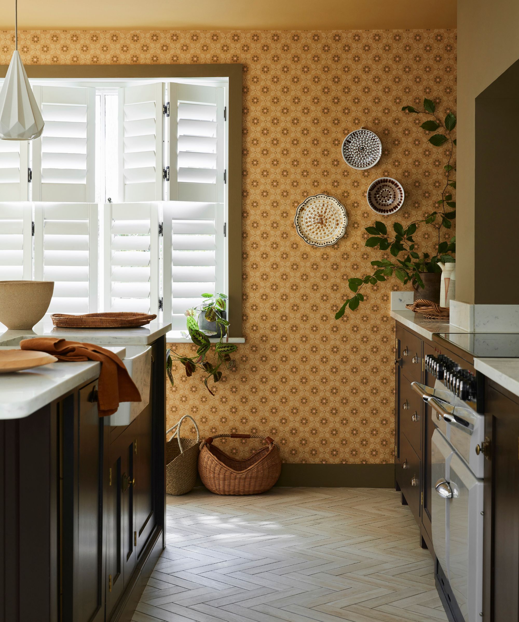
Wallpapers are a great way to inject instant personality into what can be cold, sterile spaces. A small-scale floral trellis pattern, this Ditsy Block design has a distinctly retro feel, especially in the Bombolone colorway. Opting for a small-scale pattern is a good way to add personality without dominating a space.
'Kitchens can be quite stark spaces, filled with hard surfaces and reflective finishes. Adding a wallpaper to a kitchen will create texture, softening hard surfaces, bringing pattern and design interest to a scheme. A versatile all-over, small-scale print such as ‘Ditsy Block’ will lend itself perfectly to busy kitchen environments, even when papering just a small section of wall,' says Ruth Mottershead, creative director and marketing director at Little Greene.

Ruth Mottershead, Creative & Marketing Director of Little Greene and Paint & Paper Library, has been working in her family’s business since 2011. Her role includes creating concepts for paint and wallpaper collections to overseeing marketing material and coordinating shoots. Passionate about the transformative power of color she also hosts talks and presentations within the industry with end-consumers, interior designers, architects, journalists and Little Greene staff.
12. Introduce retro glamour with a home bar
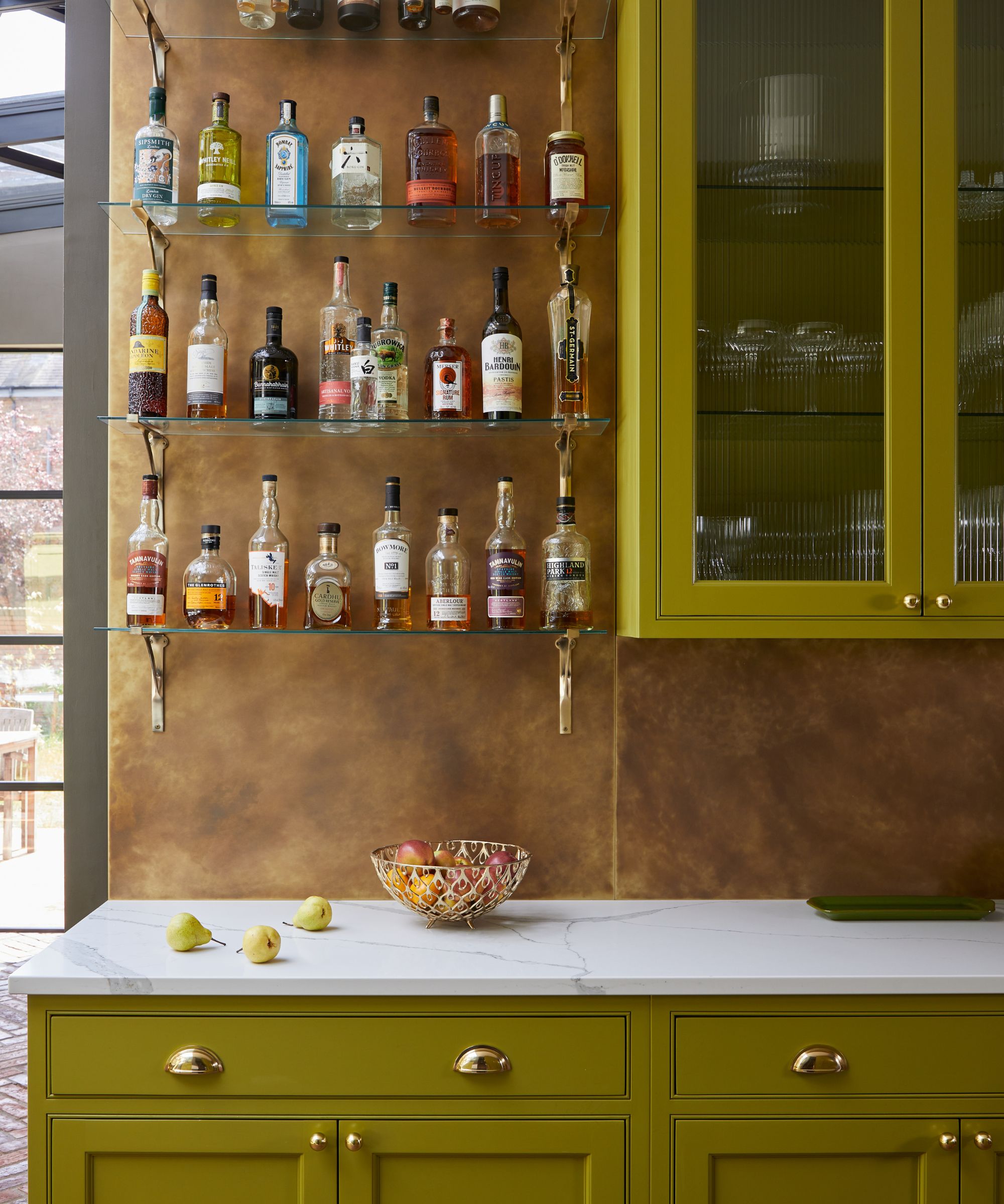
For those that love to entertain, creating an open home bar area in a kitchen can make a wonderful feature. In this kitchen by Main Company the aged brass backdrop combined with olive green on cabinetry has a distinct 1970s feel.
'As the homeowner prefers the finer things in life, we wanted to add a few opulent touches to the kitchen - so we created this feature bar wall to showcase their collection of spirits and wines. The aged brass splashback is what really draws the eye in, whilst beautifully complementing the other brass details in the room like the hardware and lighting,' says Alex Main, director of The Main Company.
'To create a retro kitchen aesthetic, color and texture play a key role. Don’t be afraid to be bold - think about choosing earthy tones and natural colors which were popular during this era. Olive greens and natural browns, in particular, will instantly create that retro feel. Combine these warm colors with interesting texture such as metal finishes to make the space pop. Chrome or polished brass are great options, especially when paired with fluted detailing on cabinet doors, as they both catch the light beautifully.'
How can I make my kitchen look retro?
To make a kitchen look retro the key is to introduce design elements from the Mid-century modern period but to use them alongside all the modern conveniences of a 21st-century kitchen. Simple, streamlined cabinets in colored high-pressure laminates or wood veneers in woods like walnut are a great way to capture the look, alternatively, try steel for an industrial feel. Alternatively, for a quick way to get a retro look you can’t go wrong with introducing a few key Mid-century pieces such as bar stools, dining chairs, appliances or accessories.
'My best piece of advice is to blend vintage pieces with modern amenities such as energy-efficient appliances or smart technology. This approach combines the best of modern conveniences with the charm of a retro aesthetic,' suggests Mary Gordon, Vice-President, InSite Builders & Remodeling.
‘Choose a color palette reminiscent of the 1950s or 1960s such as candy red, robin’s egg blue, or mint green. This will immediately give a kitchen space a retro look. Select retro appliances with rounded shapes, chrome details and bright colors from companies that carry vintage lines such as Smeg, Big Chill, or Elmira Stove Works,’ advises Mary Gordon. ‘Integrate retro patterns such as checkerboard or geometric design in flooring, countertops, or backsplashes.’
'Curate retro accessories from thrift stores and your grandmother’s attic! Retro-inspired dinnerware, glass canisters, clocks, toasters, cookie jars, and dish towels will add personality and authenticity to a retro-themed kitchen and can easily be switched out to refresh the look.'
Sign up to the Homes & Gardens newsletter
Design expertise in your inbox – from inspiring decorating ideas and beautiful celebrity homes to practical gardening advice and shopping round-ups.

Pippa is a contributor to Homes & Gardens. A graduate of Art History and formerly Style Editor at Period Living, she is passionate about architecture, creating decorating content, interior styling and writing about craft and historic homes. She enjoys searching out beautiful images and the latest trends to share with the Homes & Gardens audience. A keen gardener, when she’s not writing, you’ll find her growing flowers on her yard for styling projects.
-
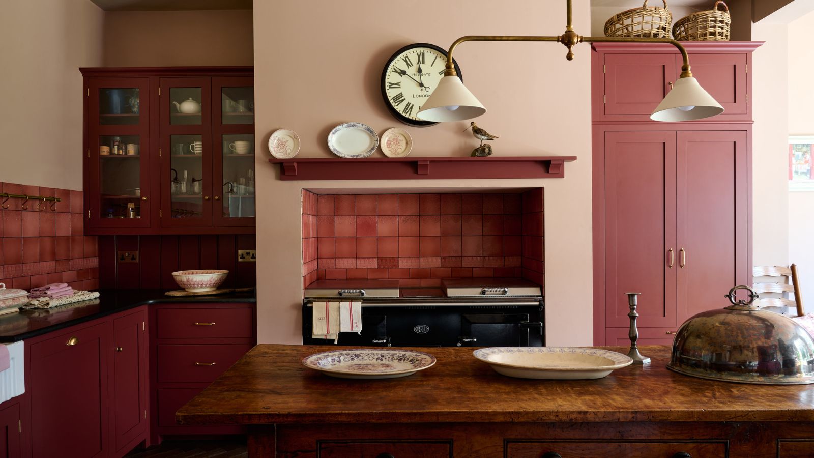 Everyone is obsessed with vintage tiles right now – bring the nostalgic charm of this classic design feature into your home with our 5 design ideas
Honor the past with our favorite ways to decorate with vintage tiles, as suggested by interior design experts
By Eleanor Richardson Published
-
 'It's a fast reset button' – using the 1, 2 ,3 ,4, 5 decluttering method cleared my persistent mess in seconds
It's easy, effective and so quick to do
By Ottilie Blackhall Published