7 design ideas from a reinvented cottage kitchen
Extending the space and introducing bespoke design solutions breathed new life into this cottage kitchen
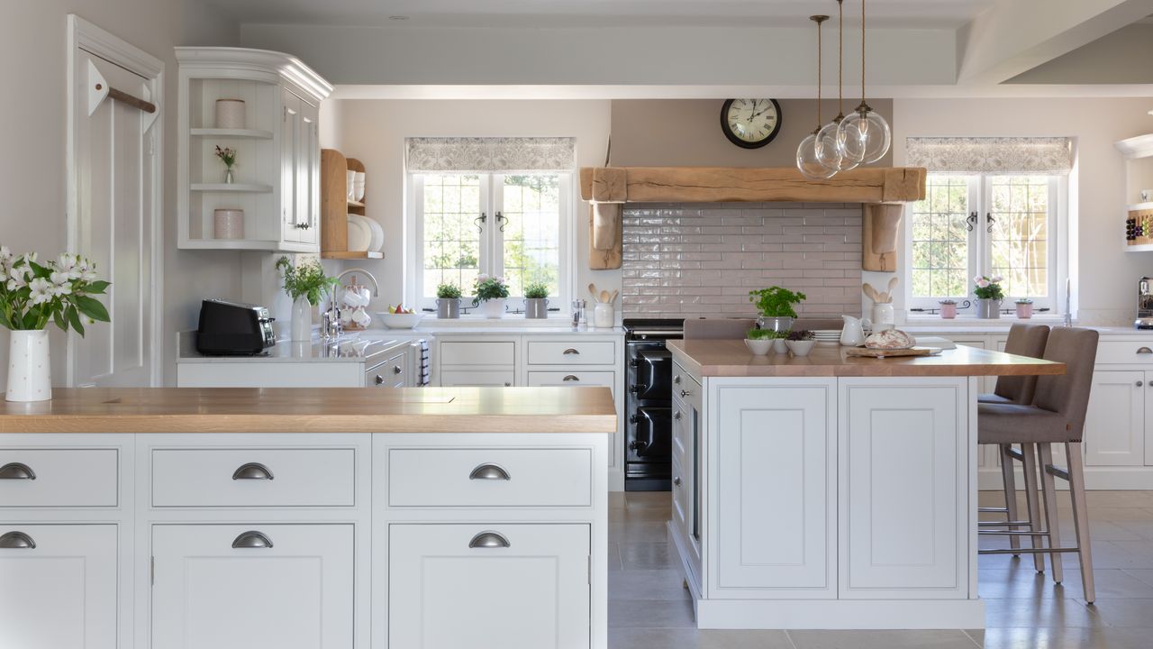

After 18 years of living in their cottage, Ian and Jane Atkins decided it was time for action – and to start work on the kitchen extension they’d been meaning to do for ages.
‘It was my retirement that did it,’ recalls Ian. ‘We were both suddenly here full time, and we were constantly bumping into each other as the kitchen was so small, and also a strange, impractical shape.'
The couple also wanted more space for entertaining, with somewhere to sit when friends came round for a cup of coffee or a glass of wine.
Looking for transformative kitchen ideas, they recruited architect, Chris Lelliott of MVL. His suggested solution was to extend the kitchen by about two metres across the front of the house, which also made space for a larger utility room.
At the same time, they had the wall between the kitchen and adjacent dining room demolished, to improve the connection between the spaces.
Creating a new design – the key details
Following up a recommendation from their architect, Chris Lelliott of MVL, they settled on The Myers Touch to perfect their cottage kitchen ideas and reimagine the space for their new stage of life.
The newly-enlarged square-shaped space has a central kitchen island as the sociable hub of the room, also providing the main preparation surface. A large AGA cooker is the focal point of the cooking area, with zones around the room for washing up, making coffee and storing dry and chilled foods. Finally, a peninsula zones the kitchen and dining areas, makes a serving station and conceals a pop-up TV.
Together, these features add up to harmonious design that works when guests come over, but functions perfectly when it's both Ian and Jane at home.
‘We love the the look of the design,' says Jane. 'And it's very practical, with additional workspace and storage ideas, and a more functional layout, so that it feels much larger too.’
1. Give a range cooker a modern upgrade
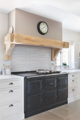
Replacing an old AGA cooker with a new, more energy-efficient model was key to the success of the project, allowing for better heat management in summer as the hot plates can be turned off.
It is next to the square-shaped central island, designed to be in proportion to the scale of the room with a clear walkway around all four sides.
The AGA has three cast iron ovens with four different temperature settings, as well as slow-cooking and warming ovens, two independently controlled hotplates and a warming plate
2. Install a faux chimney breast
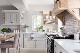
Built on to the new wall that forms the extension at the front of the house, the AGA cooker has been centrally positioned and balanced by windows on both sides.
To accentuate its statement presence and to highlight its role as the focal point of the room, it is built into a faux chimney breast. This also serves to conceal the built-in extractor.
The custom-made rustic oak mantel adds character to the room, as does the soft pink-grey backsplash – a great example of kitchen tile ideas bringing an extra decorative design element to a scheme.
3. Brew up a coffee corner

It's not always convenient to have your drink-making facilities close to the kitchen's main cooking and preparation zones. So the designers created a dedicated 'coffee corner'.
A custom-made curved wall unit has oak slots for storing coffee pods in easy reach of the machine below, with a shelf above for mugs.
A second, small sink fits into the adjacent worktop, complete with an all-in-one tap from Quooker to dispense ‘regular’ hot and cold, as well as boiling, chilled filtered and sparkling water, so it is also easy to make tea and all kinds of cool drinks from one spot.
4. Fit a concealed TV
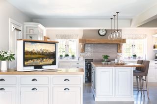
Inspired by a TV on their boat, which lifts out of the work surface to save space, Jane and Ian specified a similar design for their kitchen.
They chose not to have a wall-hung screen, as they felt this would be too obtrusive, and they also wanted to be able to view the TV from both the island and from the dining area.
Kitchen design company The Myers Touch created a bespoke slot in the peninsula top to hide the screen, which lifts up on a special mechanism when required. The screen can be rotated by 180 degrees to be seen from multiple areas of the room.
5. Set up a hardworking wet zone
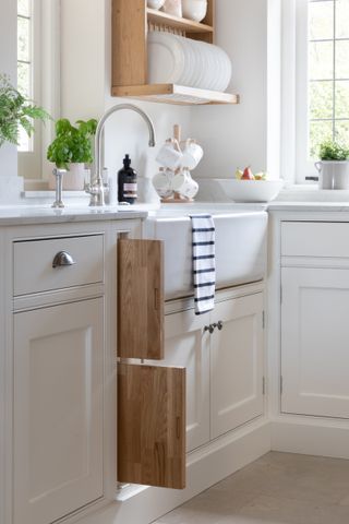
The wet zone features work surface on both sides, with chopping boards below, useful for preparing fruit and vegetables
The traditional sink by Shaws of Darwen has one and a half bowls and is made in the UK from robust fireclay, using the same handcrafted techniques since 1897. The faucet is from Perrin & Rowe.
6. Choose colors to accentuate light and space
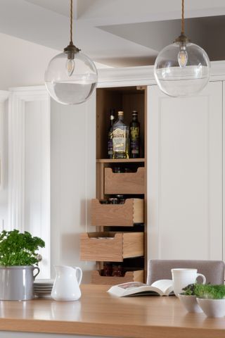
As the aim of this project was to increase the size of the kitchen and to make it the hub of home life, the choice of kitchen cabinets and colors was crucial.
Jane chose classic in-frame cabinetry to suit the age of the cottage. ‘The colors are soft and calm to accentuate the light and spacious feel, with natural wood shelves and drawers within to add a little warmth,’ she notes.
The Bespoke Lincoln in-frame kitchen was painted in Dulux Timeless, with the island painted in Farrow & Ball Elephant’s Breath.
Clear glass pendant lights accentuate the light and airy feel.
7. Add a mudroom with a pet pamper station
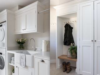
The newly enlarged mudroom has space for storing coats, boots and shoes, and well as dog paraphernalia and laundry equipment
Made to match the kitchen cabinetry by The Myers Touch, it also includes a bench, providing a useful spot for sitting down to pull on boots.
After a dog walk, the couple can dry their dog using a towel from the shelf, before throwing it into the bin to await the next wash.
‘The project has made a huge difference and we just about live in the kitchen now,’ says Ian. ‘I wish we had done it years ago.’
Sign up to the Homes & Gardens newsletter
Design expertise in your inbox – from inspiring decorating ideas and beautiful celebrity homes to practical gardening advice and shopping round-ups.

Amelia Thorpe is a specialist interiors and design journalist, covering every topic to do with homes from fabrics, furniture and lighting to surfaces, kitchens and bathrooms.
As the daughter of an antique dealer and a lifelong collector of old cookery books and vintage graphics herself, she also has a particular expertise in antiques, mid-century and decorative arts of all kinds.
Drawn to homes because of their importance in the happiness of our lives and the enjoyment they can bring, Amelia has been writing about the topic for more than fifteen years. She has interviewed some of the most influential designers of our time, from Piero Lissoni, Antonio Citterio, Jaime Hayon and Arik Levy to Nina Campbell and Robert Kime.
-
 7 snake plant problems – and expert advice to solve them
We breakdown common snake plant issues you might face – and how to tackle them, including recommended products, to keep your plant thriving
By Lola Houlton Published
-
 The living room in Joanna Gaines' stunning Castle project is so effortlessly transitional – embracing the home's stunning architecture and adding in her iconic modern rustic style
Joanna Gaines' Castle project is a timeless example of transitional style at its best. The living room embraces tradition and features a mix of old and new decor
By Eleanor Richardson Published