'The renaissance of this color is not surprising' – 11 pink kitchens that are timeless and soothing
Blush shades are blossoming in the home. Discover how pink kitchen ideas are surprisingly timeless – from hints of rose to on-trend raspberry tones
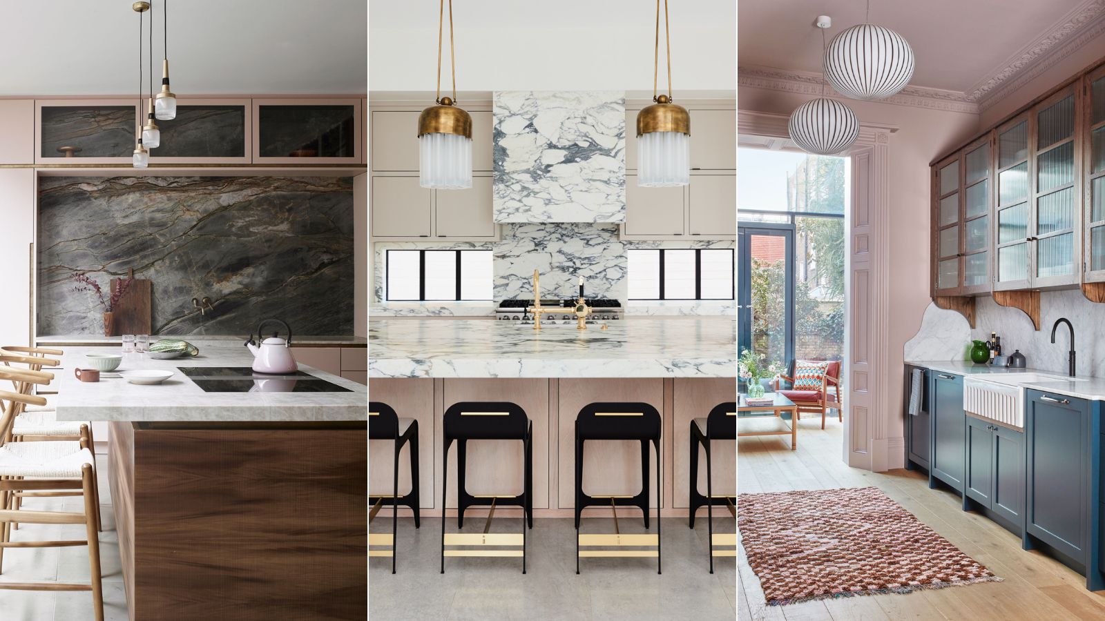
- 1. Commit and paint all the walls pink
- 2. Incorporate pink feature tiles
- 3. Soften a kitchen with a blush tone
- 4. Match with a contrasting color in a smaller kitchen
- 5. Use pink as a neutral
- 6. Contrast two bold colors
- 7. Use complementary pinks in one scheme
- 8. Vary bold design with soft pink
- 9. Connect multiple spaces using a pink palette
- 10. Bring out the brass
- 11. Choose two tones for warmth and depth
- FAQs
Blush, bold, rose, or cerise, the color pink is taking the kitchen design world by storm and a pinked-hued characterful kitchen style will certainly not fade away.
The color pink has many associations, in Japan the cherry blossom signals the arrival of spring, it is considered a color of celebration, rebirth, and hope and a tone that promotes natural beauty. In the west, pink is indicative of love and romance, femininity, and fertility, but there is far more to this beautiful color.
Pink is found in rose quartz, topaz, and tourmaline gemstones, it is used to decorate and embellish jewelry, and bouquets of flowers often reveal a myriad of pink tones from the world of floristry. The varied tones of this most beautiful kitchen color scheme are vast and brilliant and, designers believe, work with just about anything at all, making this one of the most versatile colors to use in your kitchen.
Pink room ideas are making waves in kitchen trends, and we predict they are here to stay...
Pink kitchen ideas
The renaissance of this color is not surprising. We explore the playful world of pink kitchen ideas and talk to expert interior and kitchen designers about the multiple ways of using this naturally accommodating hue.
1. Commit and paint all the walls pink
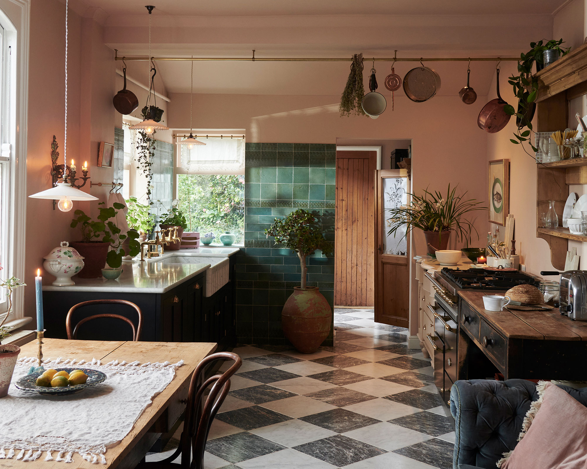
Pink is often seen as a bit frivolous, says deVOL’s creative director, Helen Parker, whose kitchen walls are painted entirely in pink. Parker believes that you should commit to painting the entire room pink and avoid painting just one accent wall.
She explains: ‘Accent walls always seem to be "dipping your toe in" rather than being brave, there is no better way to decorate and design than to commit to a look rather than just giving it a cameo role. It is surprising how many people love pink and wear it, or buy a cushion in pink but having their kitchen cupboards or their walls in pink is not so common, it's often seen as girly and best avoided but in reality, it is far from that.’
Parker has certainly committed to using a soft pink in her kitchen, all of her walls and her ceiling is painted in this color, which is, she says, ‘stylish and understated’. This soft note of pink creates a gentle warmth in the kitchen and provides an ideal backdrop to introduce a myriad of other colors and patterns that work beautifully alongside.
Including emerald green tiles, rich navy blue, black, and white floor tiles, the soft natural tones of wood, white window frames, crockery, lighting, and of course, brass details from the cooking pans to the hooks.
2. Incorporate pink feature tiles
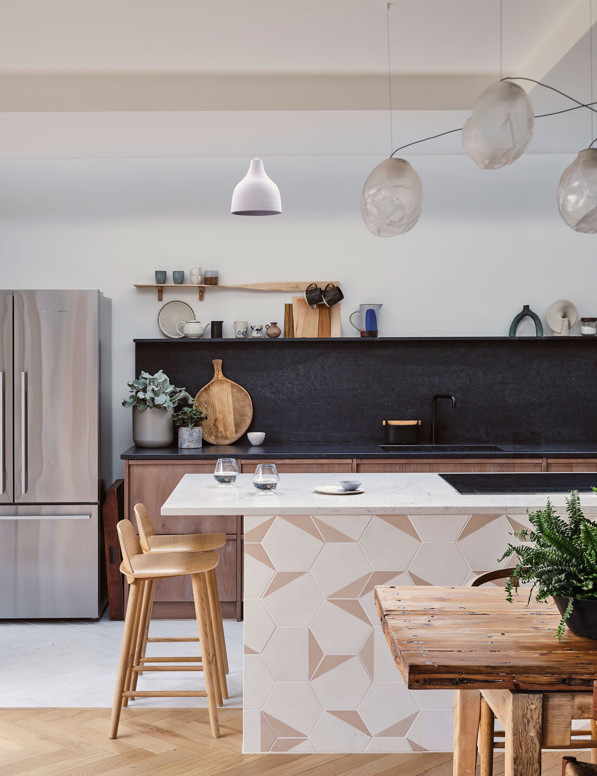
However, please do not feel any obligation to commit entirely to enveloping your kitchen with pink. If you would prefer to only dabble with this color, then consider adding the tone into your kitchen design through feature tiles or a splashback. Presenting this smaller area of pink will instantly add texture and softness in a simple and less overt way.
This kitchen design has incorporated a stylish two-tone pink-tiled unit into the center of the room. The partnering of the two pink colors from the tiles is a clever way to introduce this hue subtlety into the design. As pink is so versatile, the featured kitchen tiles naturally enhance the softer tones from the wooden floor, chairs, and cabinets. The color softens the black worktop and kitchen backsplash and enhances the delicate hues of the different light fittings, entirely and beautifully changing the look and feel of this room.
3. Soften a kitchen with a blush tone
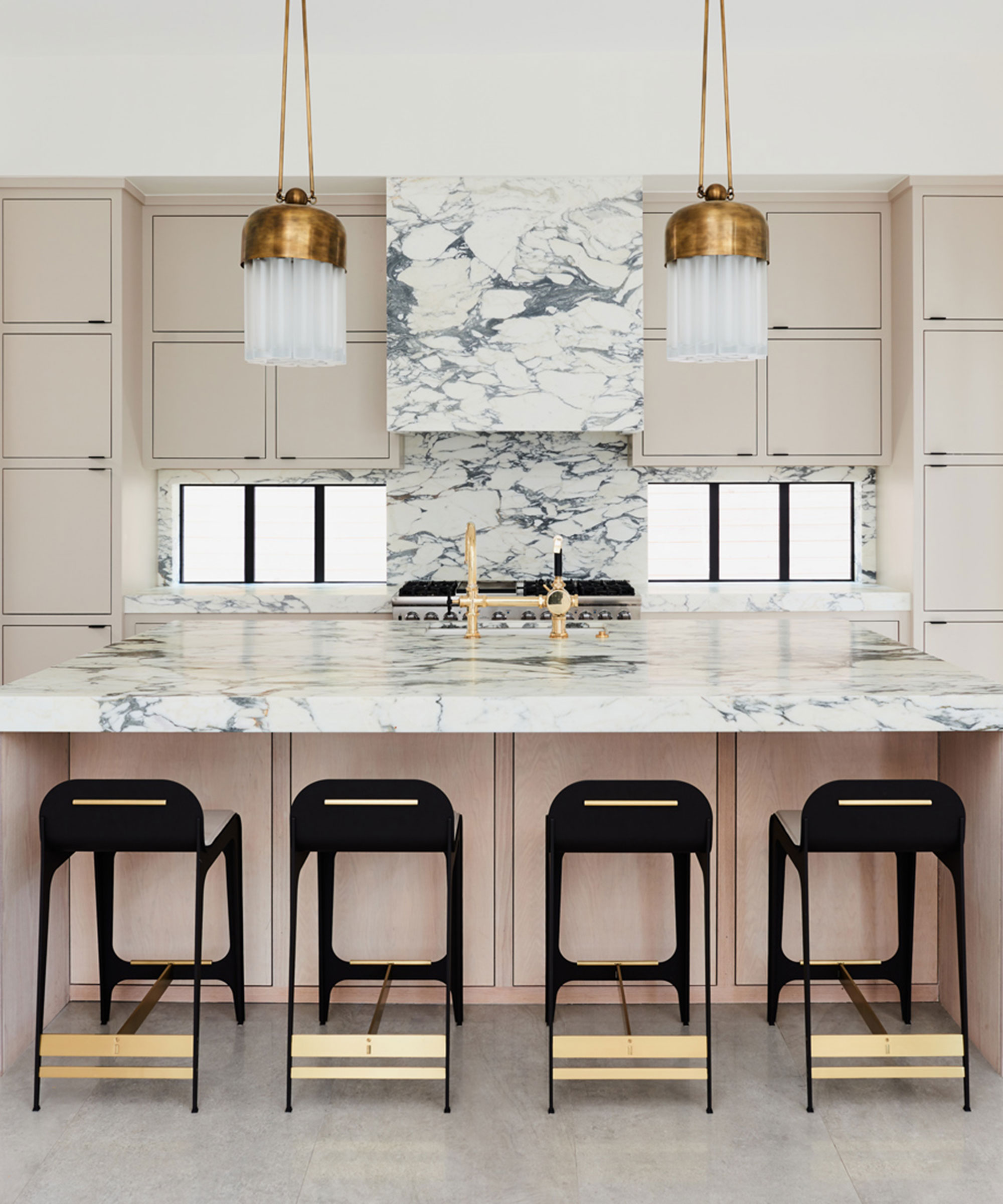
‘I advise you to use pink carefully,' says interior designer Jennifer Welch, expressing her choice to use pink as a delicate tone.
‘In my early design days, I was averse to using pink. Fast forward 25 years, and it is one of my favorite splashes of unexpected pop in design. I lean more toward blush tones than overt pink. I like colors that are so subtle they have a hint of a color, a hint of blush that is very appealing to the eye and the palette. The blush undertones in this kitchen add softness, warmth and balance.’
Indeed, the tone of pink utilized in this kitchen, designed by Jennifer Welch, is almost non-existent, but the elemental pink tone is without doubt there, supplying warmth in abundance and a sophisticated note to the overall kitchen, which is enhanced with the addition of black chairs and brass details throughout.
4. Match with a contrasting color in a smaller kitchen
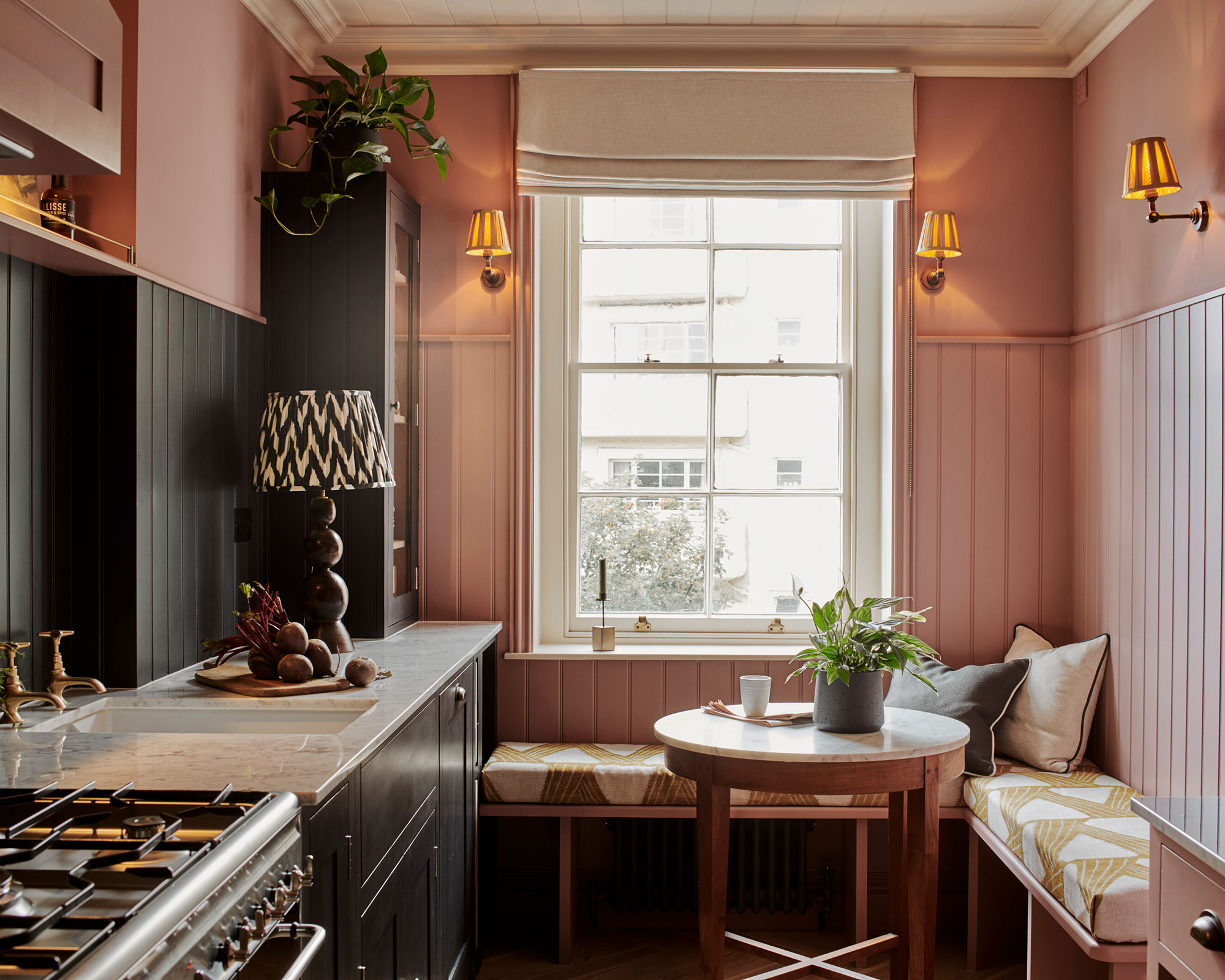
When designing a kitchen for a smaller room, many people will fall back on an all-white kitchen believing that it will make the room feel bigger. This is not always true, using bolder colors in a small space creates more depth and more interest.
However, consider adding a lighter color above the darker color and on the ceiling as this will ensure the room feels taller and broader overall. Splicing a dark hue with a range of pinks works fantastically well: smoky blacks, dark greys and greens and rich blues all compliment the color pink very attractively.
In this kitchen, dark olive green is paired with a sweet strawberry pink to a gorgeous effect. The clever use of the white ceiling and the cream blind fabric on the window, to add visual height, aids in the overall result to deliver a sublimely stylish and bold kitchen.
5. Use pink as a neutral
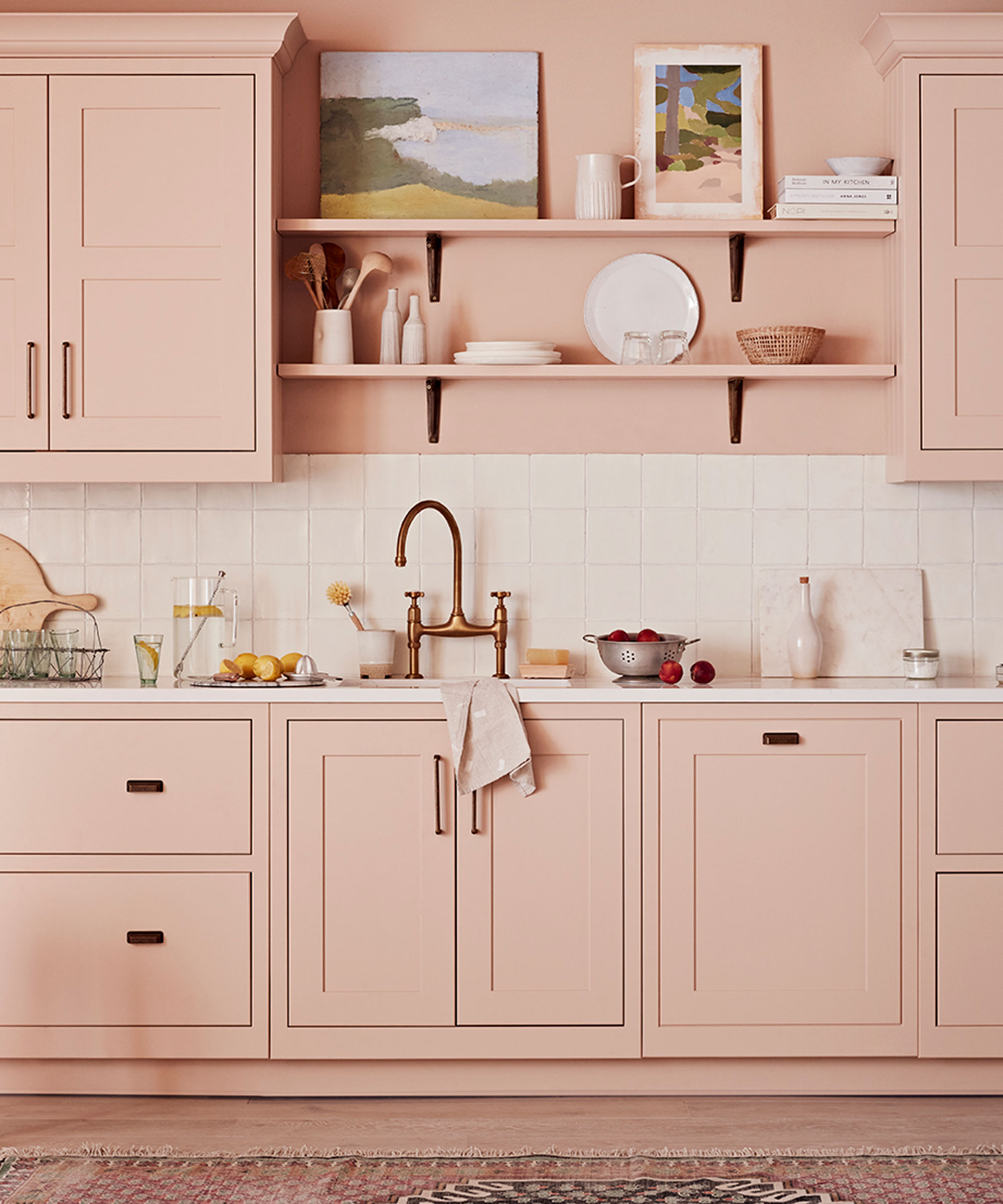
Pink today is often used as a neutral shade in a room, replacing white or beige, its warmth and natural shade ensure that it can without doubt be incorporated as the defining tone.
‘Traditionally, the kitchen is an area of the home where people are more conservative with their design and color choices, with many assuming it’s necessary to stick to lighter shades,' says Ben Burbidge, managing director of Kitchen Makers. 'However, over the past few years, we have seen an increase in color being used in the kitchen. This year, the trend has become even more adventurous, with pink increasingly used as a new neutral. Compared to plain white, this subtle hue softens the overall look of a space, making it feel warm and inviting.’
Adding thoughtful and stylish finishing touches including handles, backsplashes, textiles, crockery and rugs adds to a luxurious finish and considered design.
6. Contrast two bold colors
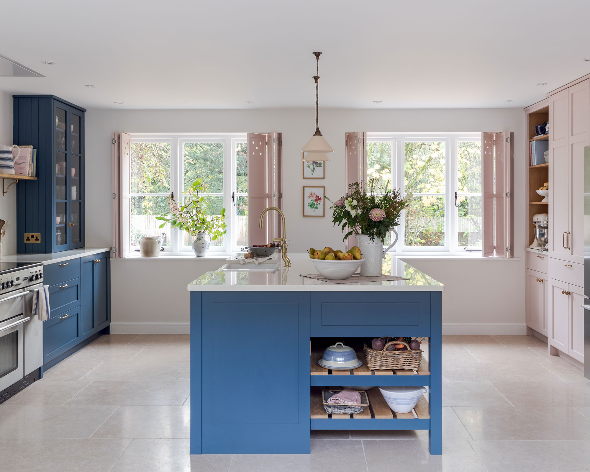
When choosing a color for your space you’ll want to select kitchen cabinet colors that you’ll be happy to live with for a while to come. But you might also want to consider the decorative potential of certain color combinations; not all colorful room ideas suit every space, depending on its size, makeup, and orientation.
Contrasting two bold colors in a traditional kitchen will give a contemporary feel to the design. Pink is a tone that allies easily with a host of bold and dark colors, and here you can see that blue is a very natural partner for pink.
The juxtaposition of a vibrant blue tone matched with a softer shade of pink creates a playful and convivial aesthetic.
Both colors work equally well with natural materials, wood and marble, and choosing to use one type of hardware across all the cabinetry will carefully and simply pull the two colors together.
7. Use complementary pinks in one scheme
In the 18th-century French court, pink was an extremely popular color, the richest and most influential were inspired by this flamboyant tone and employed it for fashion, artworks and within the decorative arts. Popularly known as the Rococo period, pink was adopted by those at the very top of social circles, royalty and aristocrats both men and women.
Today pink is generally considered a feminine hue, but the color is universal and should not be thought of as just a girlish color. Consider using a variety of pink hues together in a design scheme, each will complement the other, you can then introduce some shots of disrupter colors through the use of furniture, paintings and artworks, to create a full design solution.
Merlin Wright, design director at Plain English, agrees: ‘Pink is a particularly versatile color, or tint, to be precise, as in anything but its most shocking form it has elements of both warmth and coolness which makes it compatible with most color schemes.’
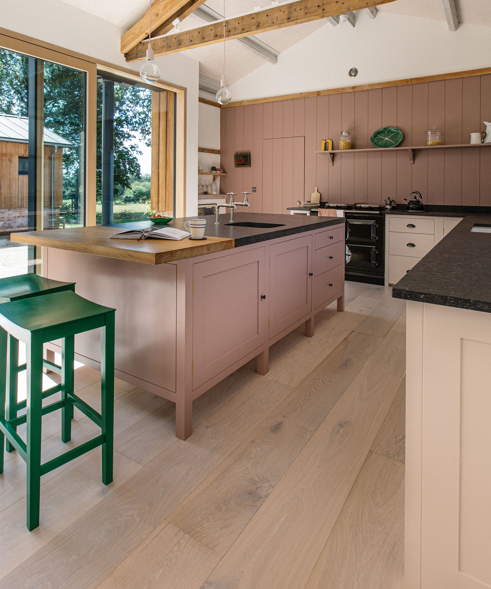
‘Tonal pinks can be a well-mannered compliment to a natural palette of greys, browns, and greens such as this scheme where the island is painted in Farrow & Ball, Sulking Room Pink, which works beautifully with the warm oak floor and the warm white of the perimeter cupboards painted in Mash. A dash of complementary color is supplied by the green stools painted in Pretty Pickle.’
8. Vary bold design with soft pink
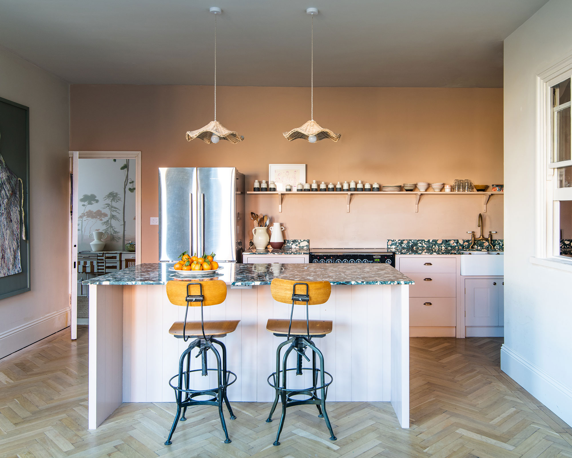
In the home of Farrow and Ball’s creative director Charlotte Cosby, pink has been chosen as the hero color to provide a warming kitchen.
Will Eaves, international design coordinator at British Standard by Plain English, explains his design process here: ‘Pink can be a great color choice if you are hoping to soften a kitchen's look and create a welcoming space.
However, when opting for lighter tones we suggest choosing bold countertops to add contrast to the space. In this case, we contrast the subtle and delicate tones of Farrow & Ball Setting Plaster Modern, with a mottled jade terrazzo and resin kitchen countertop creating a playful yet inviting space.’
9. Connect multiple spaces using a pink palette
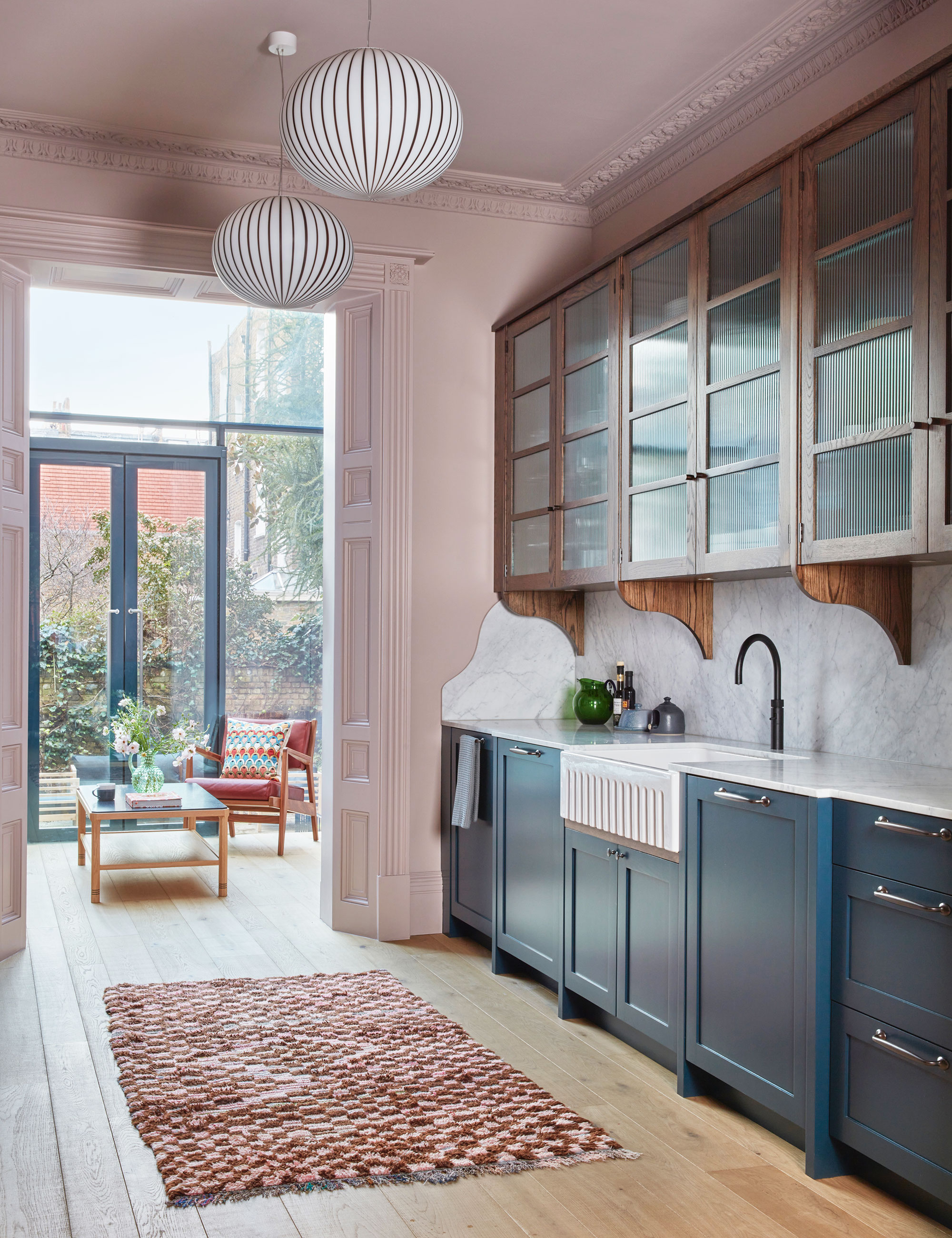
Interior designer, Kate Guinness wanted a color that would work for three different rooms, a kitchen, a sunroom, and a dining room. She chose a warm pink as the neutral tone for this house, and the color also provides an exceptional foundation, allowing Kate to bring in a variety of bolder colors, patterns and natural materials.
She explains: ‘This open plan kitchen leads on one side into a very light modern conservatory, and on the other into a much darker dining room. We wanted a color that would work for all these spaces. This warm pink does the trick, and we used a darker shade of the same color in the dining room to embrace the darker space.”
10. Bring out the brass
Brass is a natural design playmate to pink, alongside natural materials, wood, marble and quartz and many more.
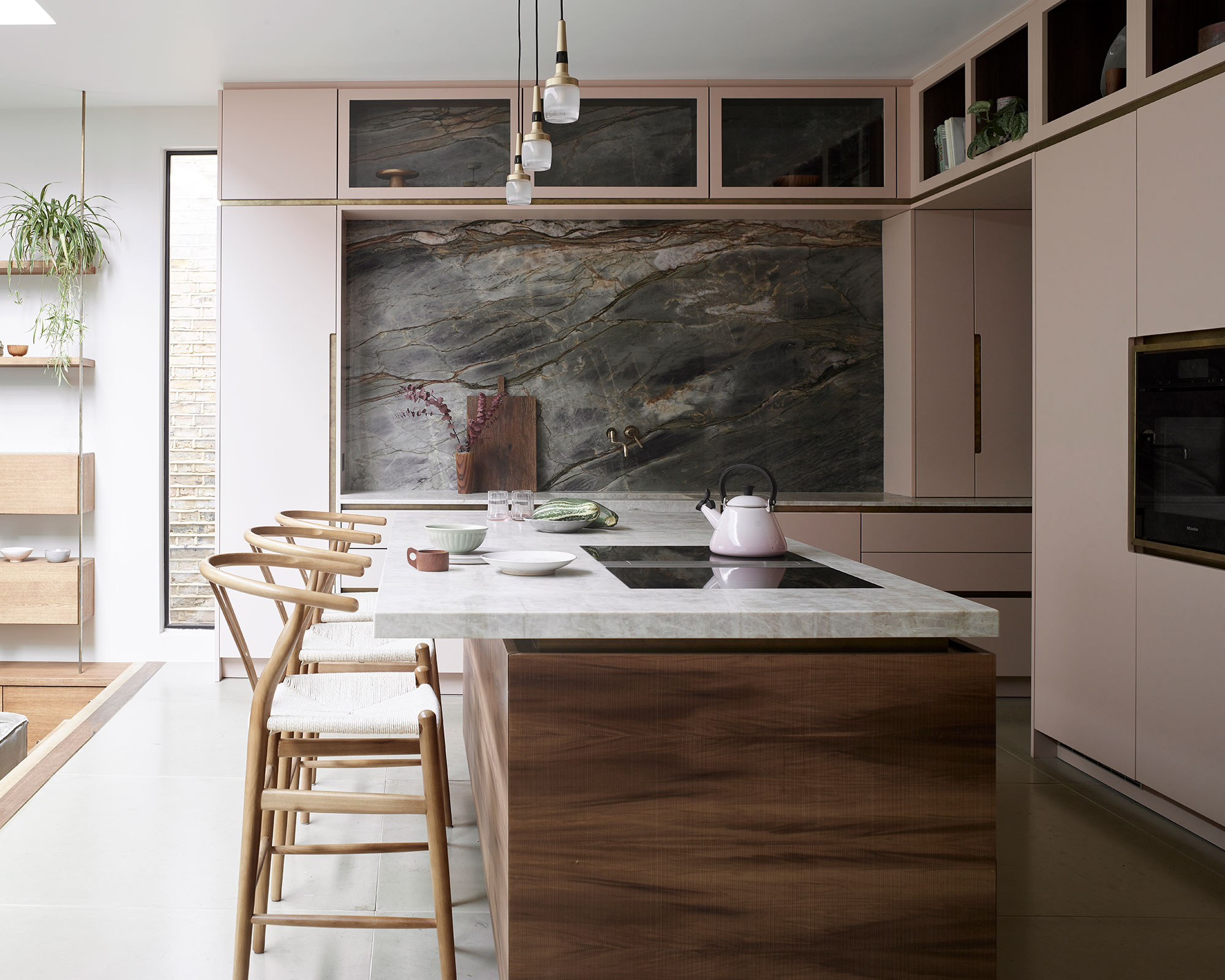
Utilize these materials as design details in a pink kitchen. In this kitchen design, brass is treated as the bedfellow to pink, the oven, cabinetry and drawers each have elegant brass trims around and brass is incorporated in the door handles and picked up in the lighting. These two tones are cleverly highlighted through the pink and brass notes found in the quartzite backsplash and worktops.
Ben Hawkswell, the senior design consultant at Roundhouse, says: ‘Using shades of pink or pink undertones results in an individual stand-out finish. As a warm color, it can be highly versatile, in terms of choosing the strength of tone - either to make it a striking feature in itself or use a light undertone as a new neutral. We chose Farrow and Ball’s Setting Plaster and pulled it together with the natural stone.’
11. Choose two tones for warmth and depth
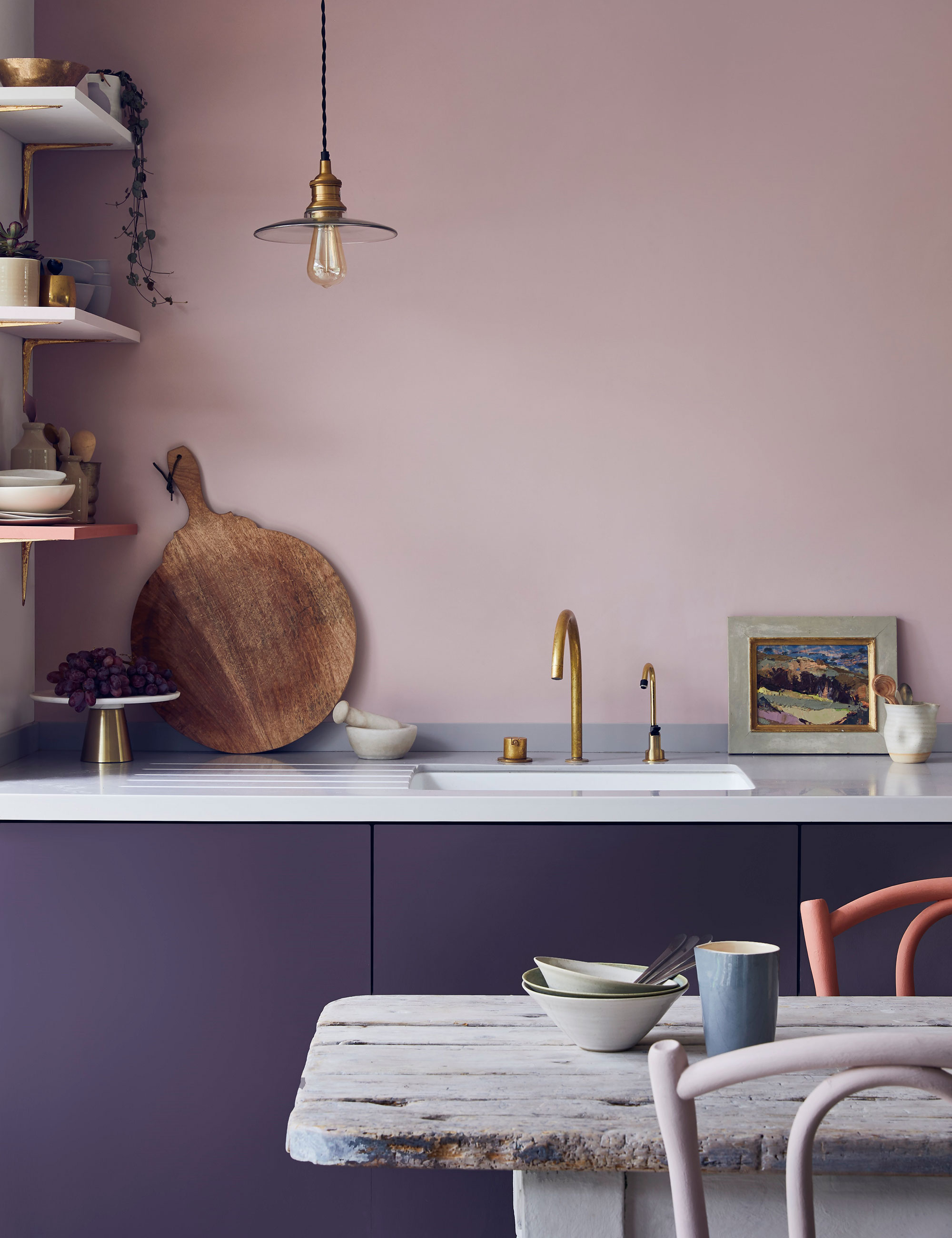
‘Pink shades are fabulous and instantly bring warmth and sophistication to a space when used correctly. Soft pinks are delightfully easy to work with and universally flattering, whilst hot pinks are directional and bold,' says color and paint expert Annie Sloan.
In this painted kitchen, a deep aubergine purple is offset with a softer pink tone on the walls, the pairing adds a sophisticated and bold edge to the design. Adding neutral shelving is a clever way to add further texture to this two-tone kitchen design, brass is often paired with pink as a natural element that partners faultlessly with this tone.
FAQs
Should you consider using pink in kitchen design?
Pink is an extremely versatile and beautiful color that can be incorporated into kitchen design in multiple ways. Designers agree that pink can be used as both a neutral color and as a tone to bring in warmth and texture. Pink can be easily matched with a multitude of natural materials and dark, bold, and bright colors making it an extremely useful go-to color in design.
As 2023 unfolds we are beginning to see pink dominating many design decisions, playing major and minor roles in the styling of kitchen cabinetry, painted on walls, on ceilings, and even as pieces of stand-alone furniture like kitchen islands and bars.
Do not relegate pink to the minor role of a plaything for little girls, this far-reaching tone can transform rooms with warmth, humor, and depth making it an attractive, multi-faceted color that should, without doubt, have a front-row seat in design.
Sign up to the Homes & Gardens newsletter
Design expertise in your inbox – from inspiring decorating ideas and beautiful celebrity homes to practical gardening advice and shopping round-ups.

Hannah Newton is a lifestyle, interiors, travel and design journalist and editor who has been writing for the past two decades, she has written for national newspapers including The Times, The Telegraph, The Guardian and The Observer as well as interiors titles Elle Decoration and Architectural Digest in the UK and across Europe, South Africa and Australia.
-
 I tried the Temptation Method to finally unpack the boxes I'd been ignoring after a stressful house move – I'm relieved it worked so well
With a pile of unpacked boxes clogging up my home office, it was time to get motivated
By Sophie Warren-Smith
-
 Martha Stewart's nostalgic gray-green kitchen cabinet color is having a revival – and I predict it will be a huge trend in 2026
A timeless choice for the future – there is a lot to love about a serene gray green
By Jennifer Ebert