Take a tour of this penthouse kitchen – it's a masterclass in 'functional, luxurious simplicity'
Designed by Roundhouse, the space features bold, expressive stone and elegant aerial storage. Have a look inside

Design expertise in your inbox – from inspiring decorating ideas and beautiful celebrity homes to practical gardening advice and shopping round-ups.
You are now subscribed
Your newsletter sign-up was successful
Want to add more newsletters?
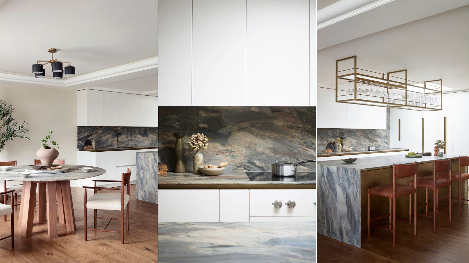
There's no competing with a sixth-floor outlook of the Thames, but Ben Hawkswell – senior design consultant at Roundhouse – knew that this kitchen 'had to be a showstopper.' Awash with natural light, the London penthouse called for a design scheme that would accompany its 'amazing wide-angle views' and 'fabulous terrace.' And with characterful blue-green stone and sleek, near-invisible storage, it's safe to say the final product fits the bill.
Proving that modern kitchens can be simultaneously streamlined and expressive, this space pairs lively, colorful stone countertops with classic white cabinetry. The space is earthy, airy, and, above all, welcoming. To hear more about the stunning kitchen, we spoke with Ben – here's what he had to say about designing the space, using natural materials, and working with an eye-catching view.
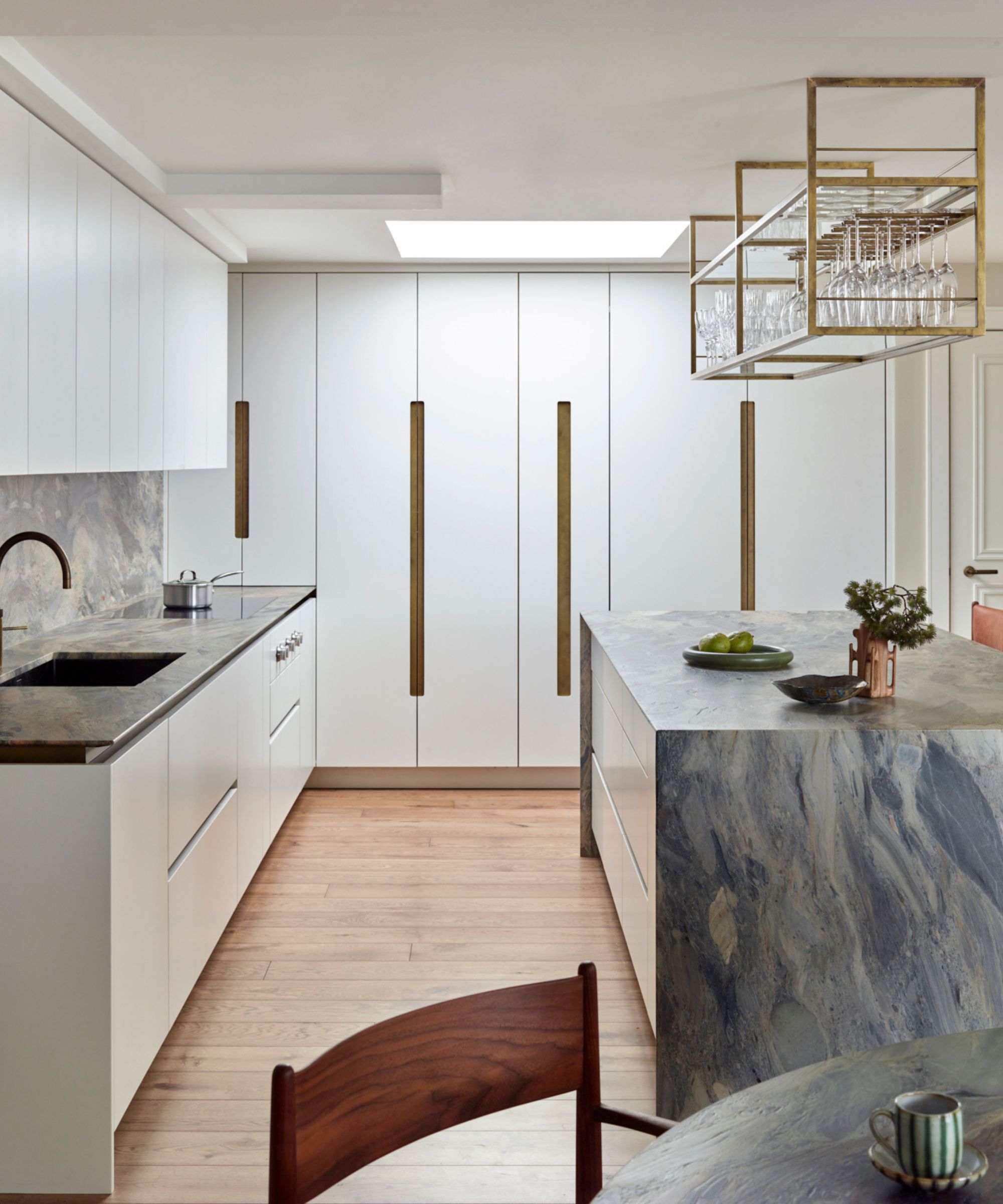
According to Ben, the brief for this kitchen was 'clean lines and a functional, luxurious simplicity.' And the open-plan space, which now features a large waterfall countertop and floor-to-ceiling cabinets, gave Roundhouse quite a bit of room to work with. With the bespoke, luxury kitchen brand's clever storage tricks, every detail is elegant.
Article continues below'The linear Urbo handleless detail, combined with our hand-finished antique brass, met this brief wonderfully,' Ben tells H&G. 'For vertical doors, our recess angled cutout with solid brass backplate inserts gave a distinct but correlating feature. The overall aesthetic is of amazing luxurious materials, but still understated.'
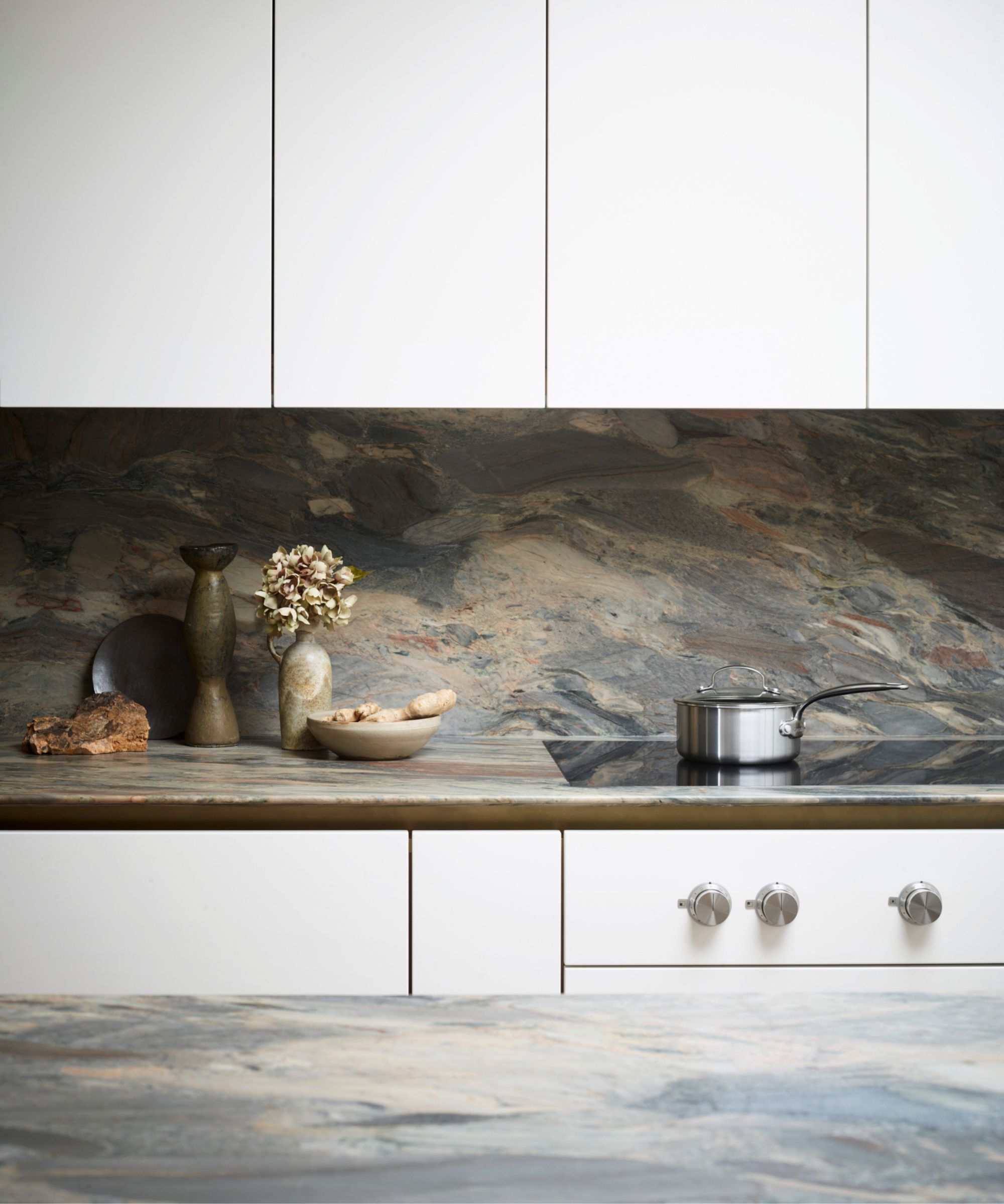
Natural materials play a large role in the finished space, and this was a priority for the clients all throughout the design process. Ben was told the stone kitchen countertops and backsplash in particular 'should have movement and bags of color.' Paired with large, understated white cabinetry and a matching shade on the ceiling, they play a starring role in the overall design scheme.
'With the neutral cabinet color, we were pretty flexible with exactly what to use, but a "fusion" type stone would fit the bill well. Fusion quartzites can be seen in many base colors, this one being Fusion Blue. It's an amazing type of stone to use – robust, practical and each batch completely and distinctly unique, with a very strong veining to it that appears to be almost moving,' says Ben.
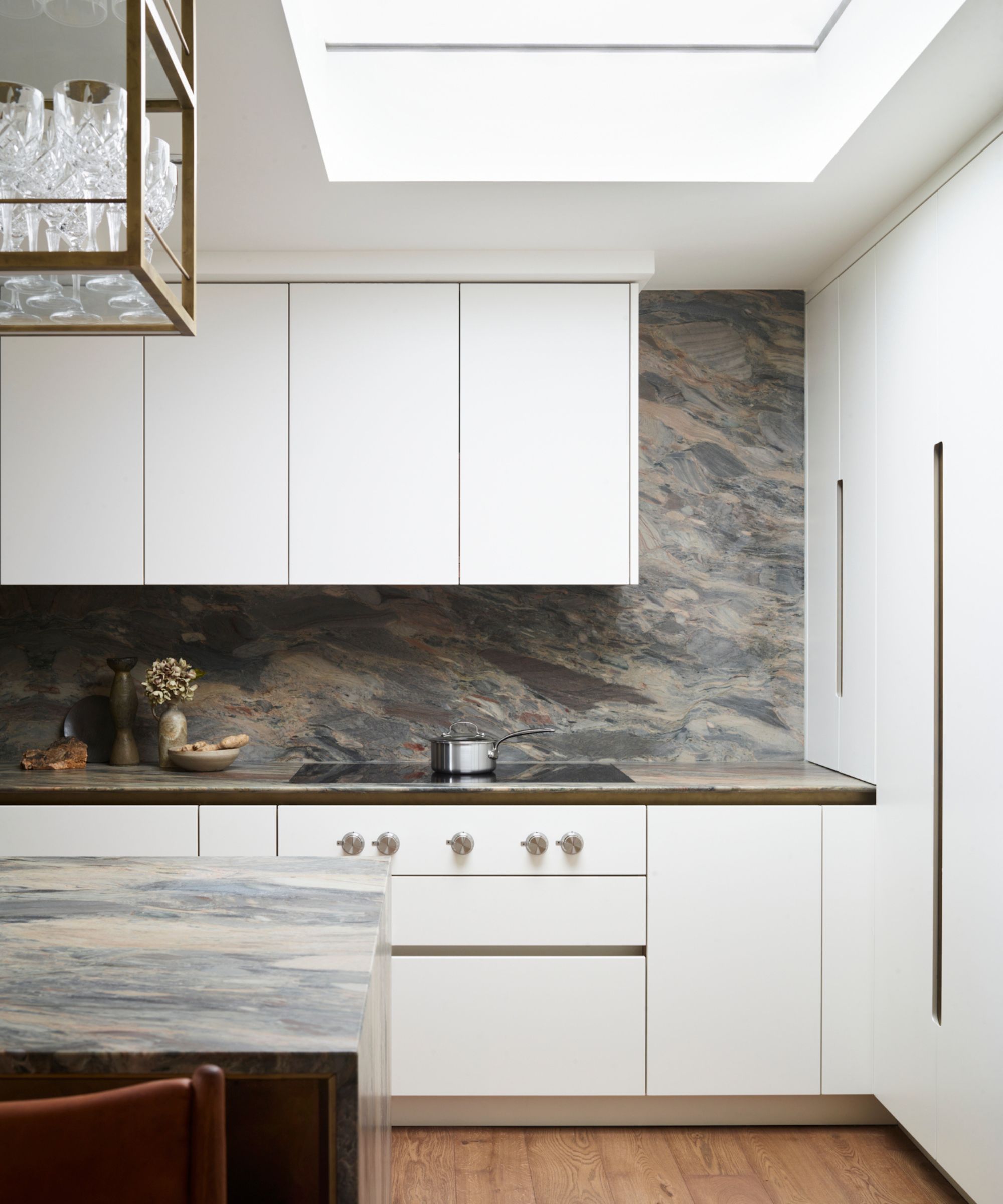
Finding the perfect fit wasn't simple, though. Ben shares that it took quite a bit of time and 'A few false starts' before the team landed on the 'amazing natural quartzite' pick at a stone distributor nearby. With a nature-inspired color palette and plenty of energy, the final selection is luxurious and captivating.
Design expertise in your inbox – from inspiring decorating ideas and beautiful celebrity homes to practical gardening advice and shopping round-ups.
After finding the perfect material, the Roundhouse team made a few adjustments to ensure it fit perfectly within the design scheme. Ben says that 'the clients had a preference for a leathered finish, which transforms the material into something you want to touch and feel and gives the veining a shallow 3D quality.' By applying a leather finish to the stone's surface, they added extra depth and dimension to the space.
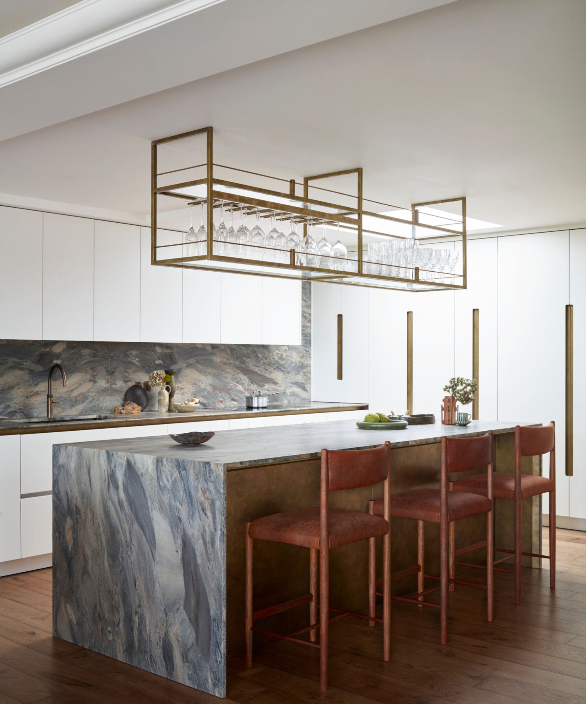
One of the kitchen's most notable moments is the sculptural, aerial glassware storage hanging above the island. Adding symmetry and a complementary gold finish to the space, the shelving is high-end and a piece of art in its own right.
'Aerial shelving can be a helpful storage complement – holding either frequently used items around an island or creating a part display for objects or cookbook storage. In this example, we created the shelving for glassware and combined the design with one of my favorite ideas, the solid brass wine glass rails,' says Ben.
'As the shelving was taking the place of a traditional pendant, lighting was to be considered and was included into the base of the unit – two full-length LED profiles offer a warm work light. The shelving was finished off in the same antique hand finishing as the other brasswork,' he continues.
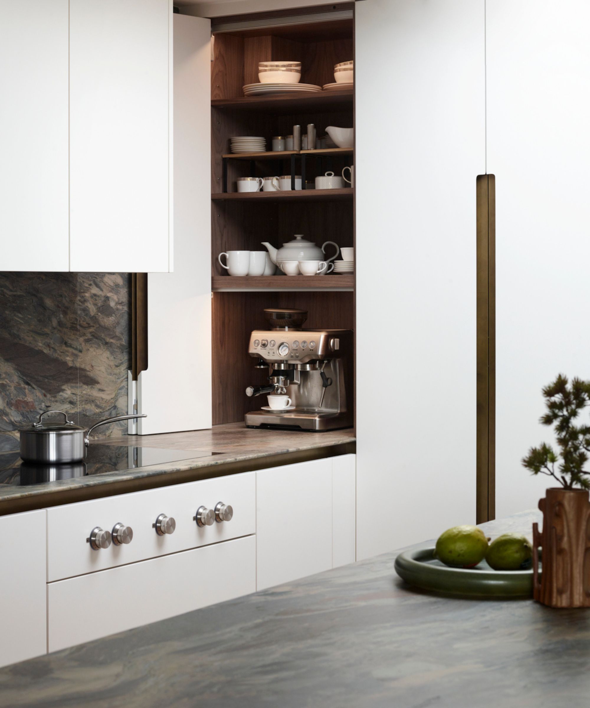
A hidden-away coffee station is nestled in the kitchen's corner, concealed behind the space's white bi-fold doors. Complete with a gorgeous silver espresso machine and shelves upon shelves of storage, it's a beautiful take on the at-home coffee bar trend that's taking off in 2024.
'The bi-fold door dresser is a neat solution to a worktop corner space. It helps complete the lines of the full bank of units of the tall appliance run. The unit can be made open to the worktop, with lighting, and power – highly practical for all manner of small appliances,' says Ben.
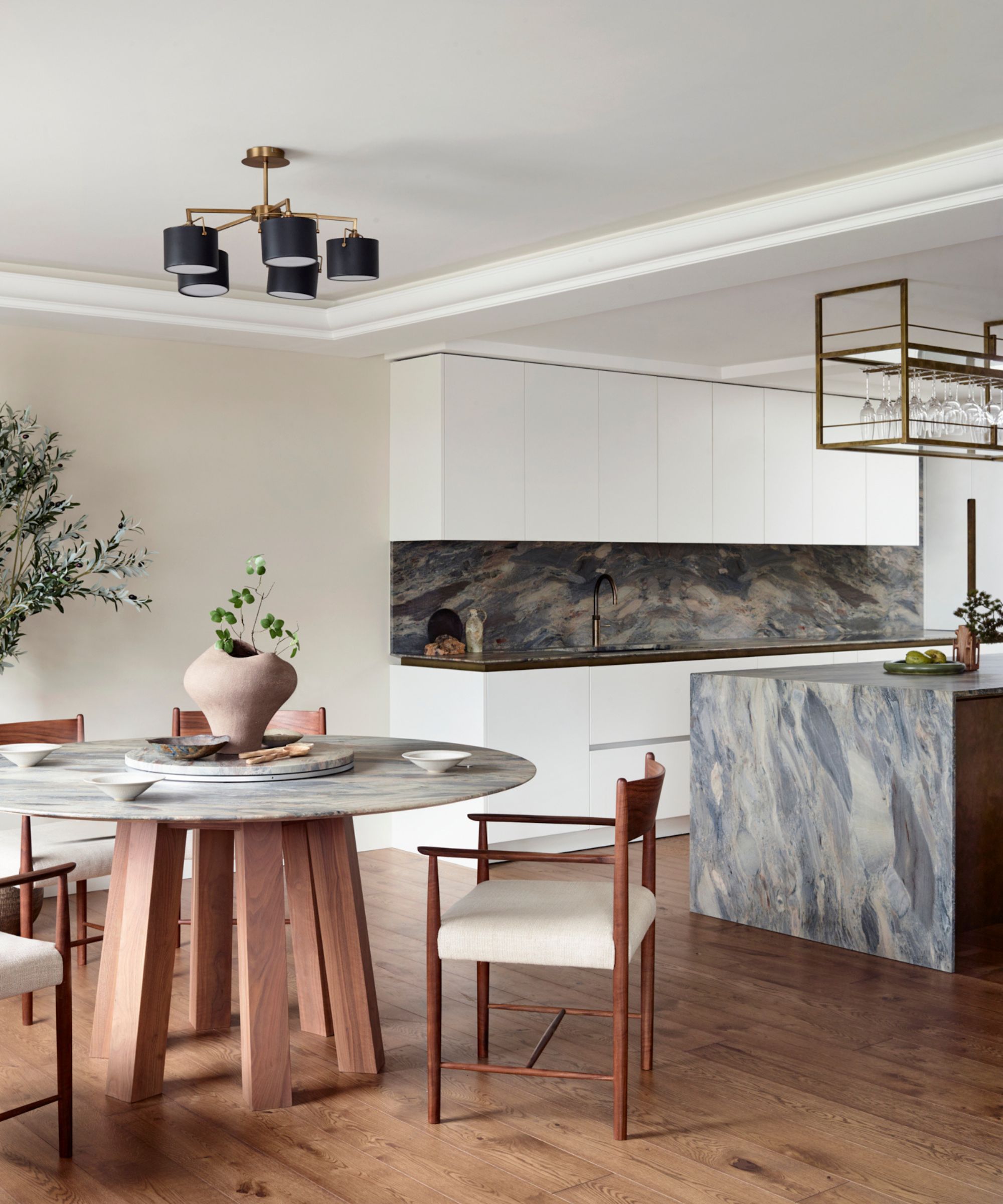
Because the kitchen is open-plan, opening up to a small dining area, the Roundhouse team decided to pull the design style through and keep the entire space cohesive. With the same stone as the countertops and backsplash, the team crafted a bespoke table with 'a lazy Susan disc [in the center] for added practicality,' says Ben. The natural wood details and white upholstered chairs blend in beautifully with the overall earthy look.
Get the look
It's clear that a contemporary kitchen doesn't have to be boring, or all white and gray. Roundhouse's sixth-floor penthouse packs character and charm into a streamlined design scheme with great success.

Abby was the Interior Design News Editor at Homes & Gardens and is now studying for her Master's degree in Journalism at City University, London. Prior to joining our team, she worked with Better Homes & Gardens, where she wrote and edited content about home decor, gardening tips, food news, and more. She studied Journalism and English Literature at New York University and moved to London to pursue her love of writing in 2023.
