Nate Berkus and Jeremiah Brent's kitchen redesign is sophisticated and sleek – these are the key tweaks they made to ensure a timeless space
The second rendition of the interior designers' New York City kitchen features antique lighting and stunning green-veined marble. Here's what Nate has to say about the room
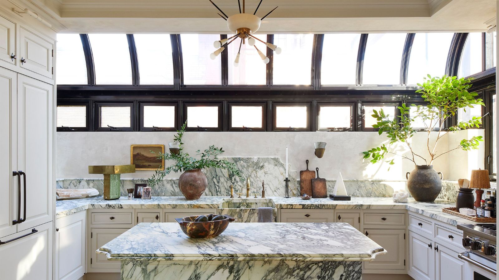

There's nothing like a light and airy kitchen to bring the family together, and this kitchen redesign fits the bill. Curated by interior designers, authors, and TV personalities Nate Berkus and Jeremiah Brent for their New York City home, the space is a masterclass in transitional design.
Defined by statement skylights, veined marble countertops and considered vintage light fixtures, the space is effortless and timeless – and serves the family's every need. We spoke with Nate about the kitchen design, how it's changed over time, and how it feels to live inside the space. This is what he had to say.
Nate says this is the family's second time living in the space – they sold the house to friends years ago, but recently bought it back. And since the first time designing the kitchen, quite a bit has changed.
'It was time for us – our style had evolved. And also our budget had evolved, in all honesty – we could barely afford to live there the first time we bought that place,' Nate tells Homes & Gardens.
Originally, designing the kitchen was an exercise in creating a gorgeous space while sticking to a budget. Though the room's bronze kitchen island was bespoke (and 'the only splurge in the entire room at the time,' according to Nate), the rest of the kitchen's features were price-checked and relatively inexpensive.
'We had sconces from CB2 on the backsplash, we used plain white subway tile, and we painted the existing cabinetry – it was beautifully made, but it was a dark mahogany when we bought the house,' he says.

Since Nate’s first appearance on The Oprah Winfrey Show in 2002, he has become one of the world’s most recognizable interior designers. He has authored two New York Times bestselling books and stars alongside his husband, Jeremiah Brent, in HGTV's Nate & Jeremiah Home Project.
A post shared by Nate Berkus (@nateberkus)
A photo posted by on
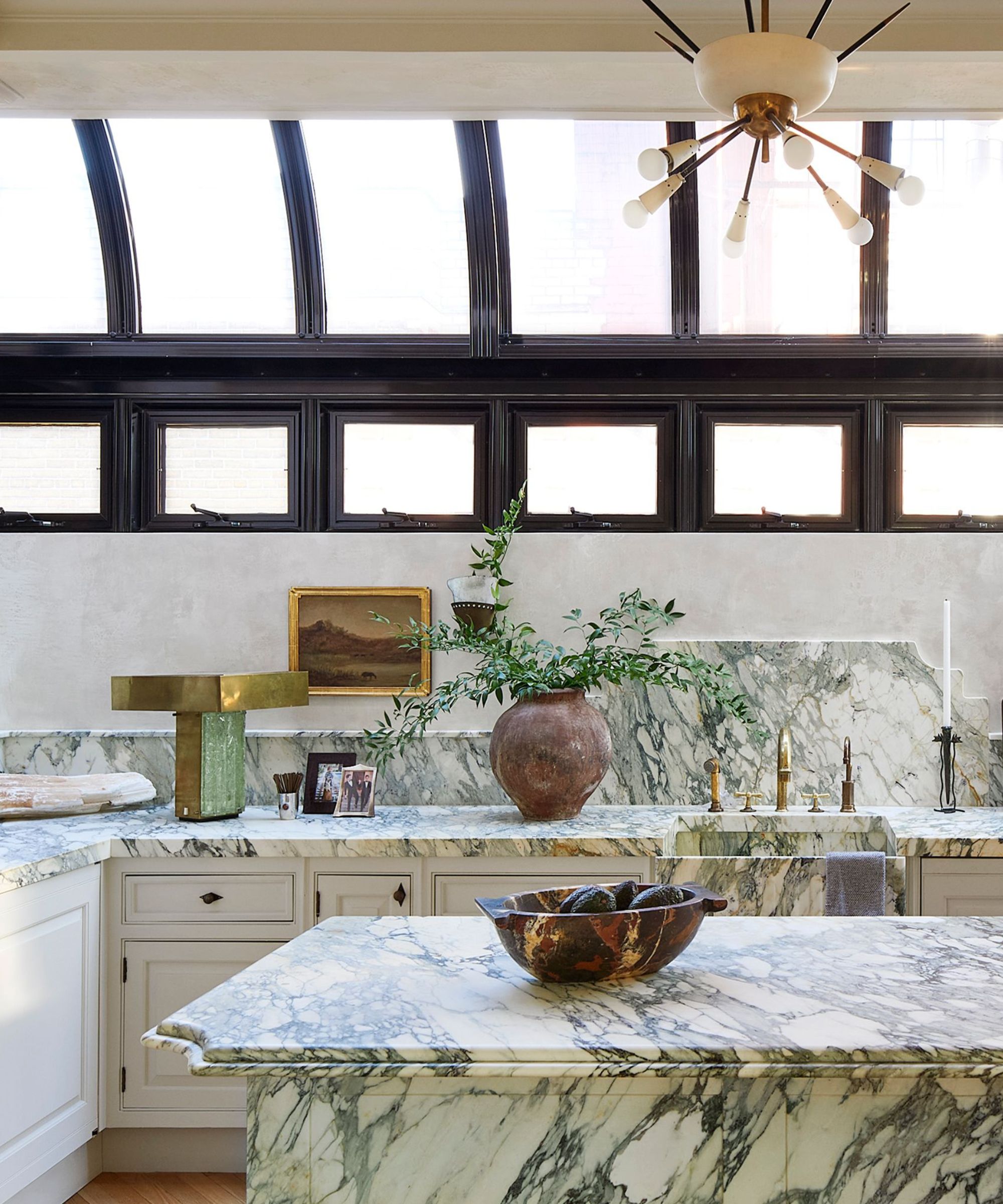
In 'evolution two' of the kitchen, Nate and Jeremiah had an opportunity to adjust the space to their developed taste – and an increased budget. The final product brings in a bit more vintage, and the classic marble countertop and backsplash introduce a splash warm, inviting color to the space. One of Nate's favorite elements of the space is the welcoming antique lighting.
Sign up to the Homes & Gardens newsletter
Design expertise in your inbox – from inspiring decorating ideas and beautiful celebrity homes to practical gardening advice and shopping round-ups.
'We replaced all the sconces on the perimeter, did a beautiful Italian fixture from the '60s over the island, and the most amazing vintage Italian sconces on the backsplash – where the CB2 ones used to be. We took [those] out of our previous home – we owned all that stuff. The thing over the island was in our bedroom and the sconces were in our parlor, so we just earmarked those for the kitchen because we knew we'd be spending so much time in there,' he says.
Though the marble adds a stunning touch to the room, it was a source of disagreement during the planning process, says Nate. While he wanted more whites, browns, and grays, Jeremiah pushed for the more 'busy' option, and ultimately won.
'I fought him on that, and I was wrong ... He was absolutely insistent, and he was right. I love it. It's really, really warm, ' says Nate.
The brass island was stripped and redone in the Calacatta Paonazzo marble, 'which felt more forever,' Nate says. An integrated sink made of the same marble material allows the color scheme and atmosphere to flow seamlessly throughout the space. And the cabinets? They got yet another refresh.
'We plastered the walls and the hood, and we covered a lot of the appliances, this time around, with cabinet-front appliances,' he says.
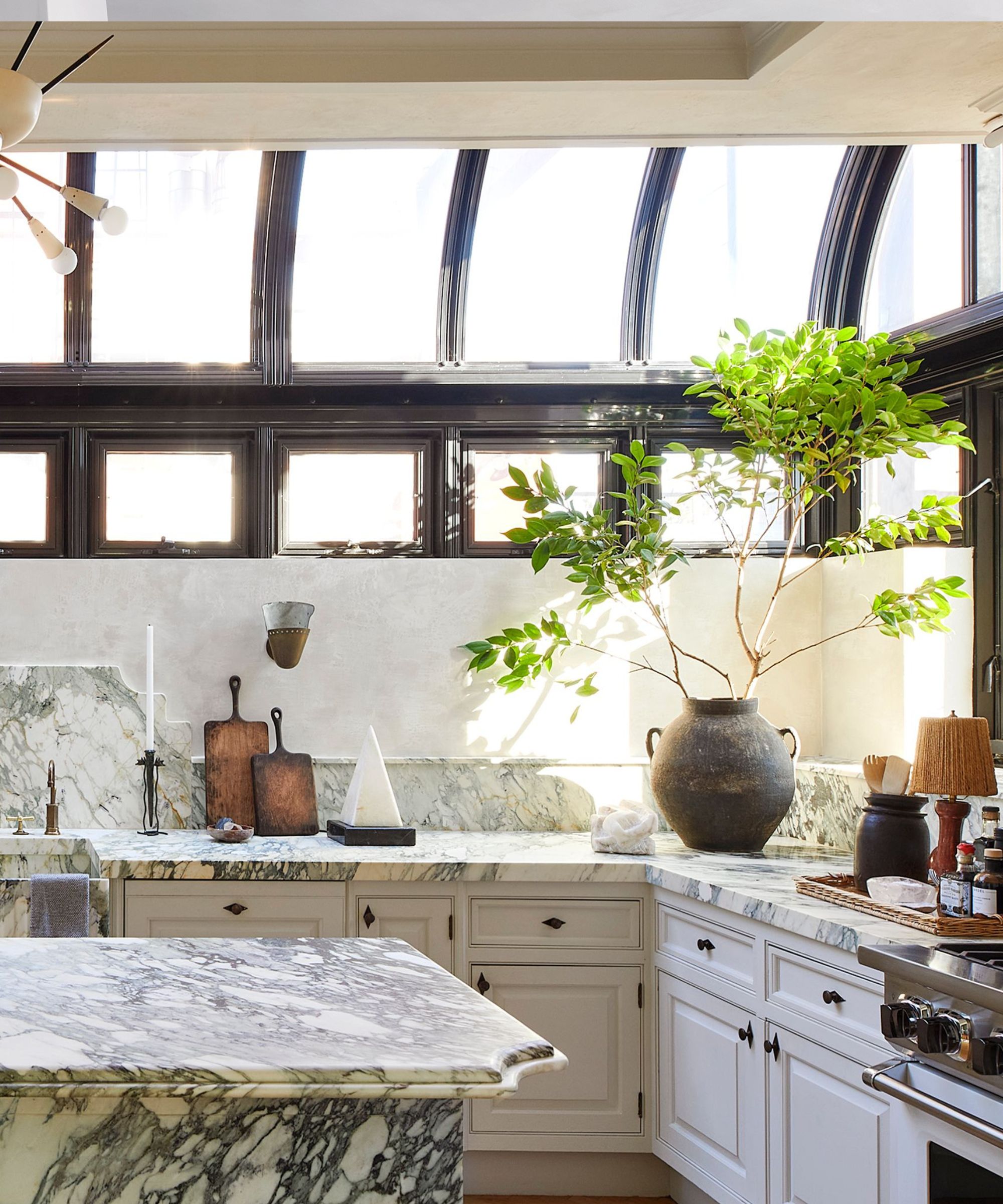
Nate describes the previous design scheme as 'a little bit more industrial in style,' noting its subway tile, butcher block counters and black cabinetry. The new space allows for an entirely different atmosphere.
'This feels a bit more European. A little bit more Venetian. A little bit more Romantic, and softer,' says Nate
The room's defining domed skylights steal the show, bringing natural light and visual interest.
'That was done by the person who owned the apartment before us who actually expanded onto some of the exterior terrace to create that atrium. And it's one of my favorite things in the house,' says Nate.
A kitchen is meant for cooking and sharing moments with loved ones, and the family's current kitchen makes much more space for daily use. Its vast countertop fits three different lamps, a spice tray and more.
'The island has a beautiful bowl from my husband's shop Atrio that we keep bananas and avocados for the kids in. The kids have breakfast at that island now, whereas before they couldn't really do that,' says Nate.
Functional and fresh, the finished kitchen is truly a success. With plenty of room for the whole family and a lot of natural light, it offers a serene escape that Nate and Jeremiah love.

Abby was the Interior Design News Editor at Homes & Gardens and is now studying for her Master's degree in Journalism at City University, London. Prior to joining our team, she worked with Better Homes & Gardens, where she wrote and edited content about home decor, gardening tips, food news, and more. She studied Journalism and English Literature at New York University and moved to London to pursue her love of writing in 2023.
-
 Extend the lifespan of your appliance with 5 simple but crucial washing machine maintenance tips
From cleaning the filters to keeping the door open, experts reveal the washer tips they swear by
By Andy van Terheyden Published
-
 These are the 6 must-have colors to decorate with in April 2025
What do retro-inspired yellows and beautiful blues all have in common? They're on our hot list for the season ahead
By Sophia Pouget de St Victor Published
