9 narrow kitchen layout rules – designers say these tricks make your space look wider and function better
Forget all the narrow kitchen layout tricks you know: these are what designers say will make all the difference
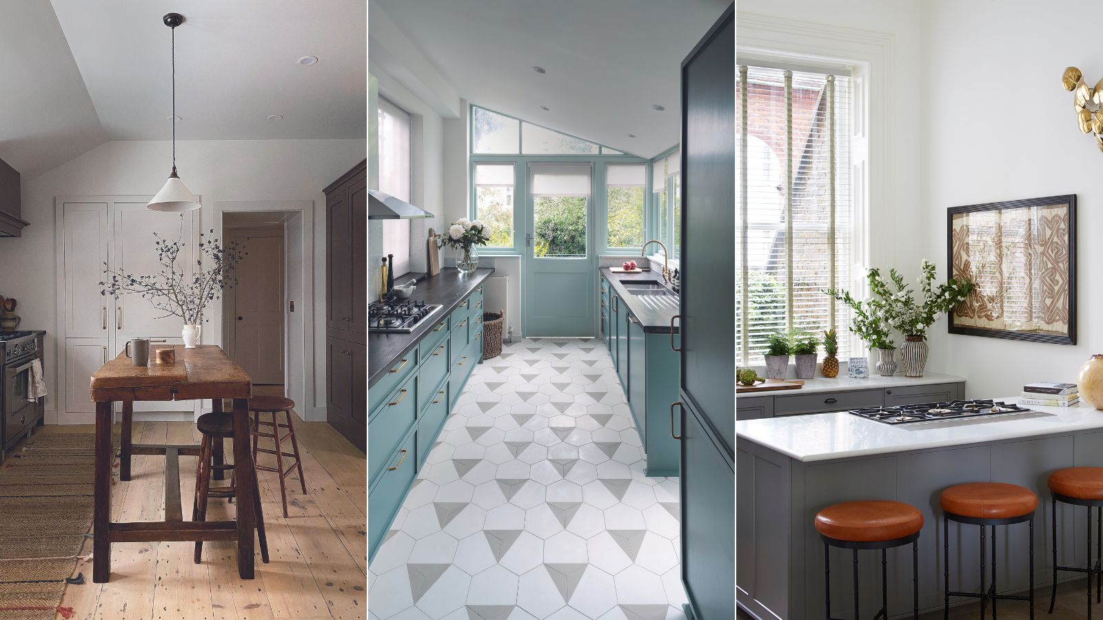
- 1. Forgo wall cabinets
- 2. Lift furniture off the floor
- 3. Swap a galley layout for a large island
- 4. Exaggerate width with flooring patterns
- 5. Create width with symmetry and reflection
- 6. Swap a U-shape kitchen for negative space
- 7. Use color tricks to draw the eye around the space
- 8. Minimize window treatments
- 9. Seek out half-depth cabinets
- FAQs

Anyone 'blessed' with a compact space will always be looking for ways to make it feel bigger.
And this is never more important than in a narrow kitchen, which can be tricky to lay out in a way that is truly practical but also looks incredibly stylish.
So, just how do you design a kitchen that's narrow specifically to correct its proportions? We spoke to kitchen design experts to discover their top tips for making it look wider and functioning better.
Narrow kitchen layout rules
Small kitchen layouts can be difficult to navigate: you need to ensure plenty of hidden storage to keep countertops clear, yet inevitably the small footprint will mean wall cabinetry that could make your kitchen feel narrower still.
Thankfully, there are plenty of tricks you can use to make a small kitchen look bigger while retaining functionality: here, we explore narrow kitchen layout rules that will make yours look wider while still creating a practical space.
1. Forgo wall cabinets
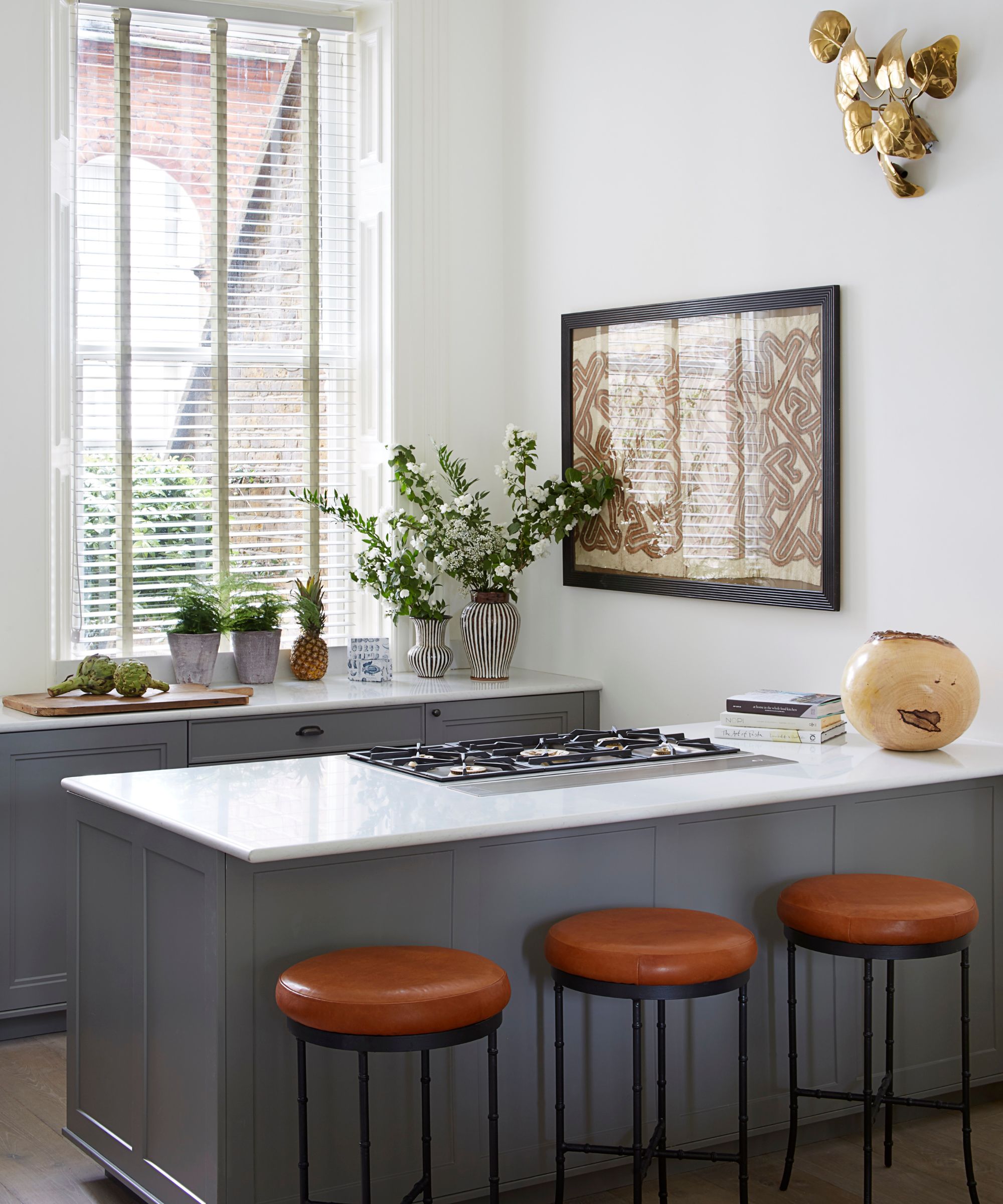
Kitchens without wall cabinets can feel instantly wider because all the visual weight is below your eyeline.
‘Wall units can overwhelm a narrow or galley kitchen. Sometimes less is more. In this kitchen (above) we decided not to hang wall cabinets to preserve the beautiful natural light and airy atmosphere and help the space feel much bigger,' says Katie Lion, senior interior designer, Kitesgrove.
'The eye is left free to wander above the base units towards the focal point, a large artwork full of pattern and color and a striking bronze wall sconce, which is both sculptural and functional.
'To compensate for reduced kitchen storage, we recommend drawers under countertops as they are easier to navigate in a tight space than cupboards, and a slim breakfast bar for additional seating without taking up too much room.’
2. Lift furniture off the floor
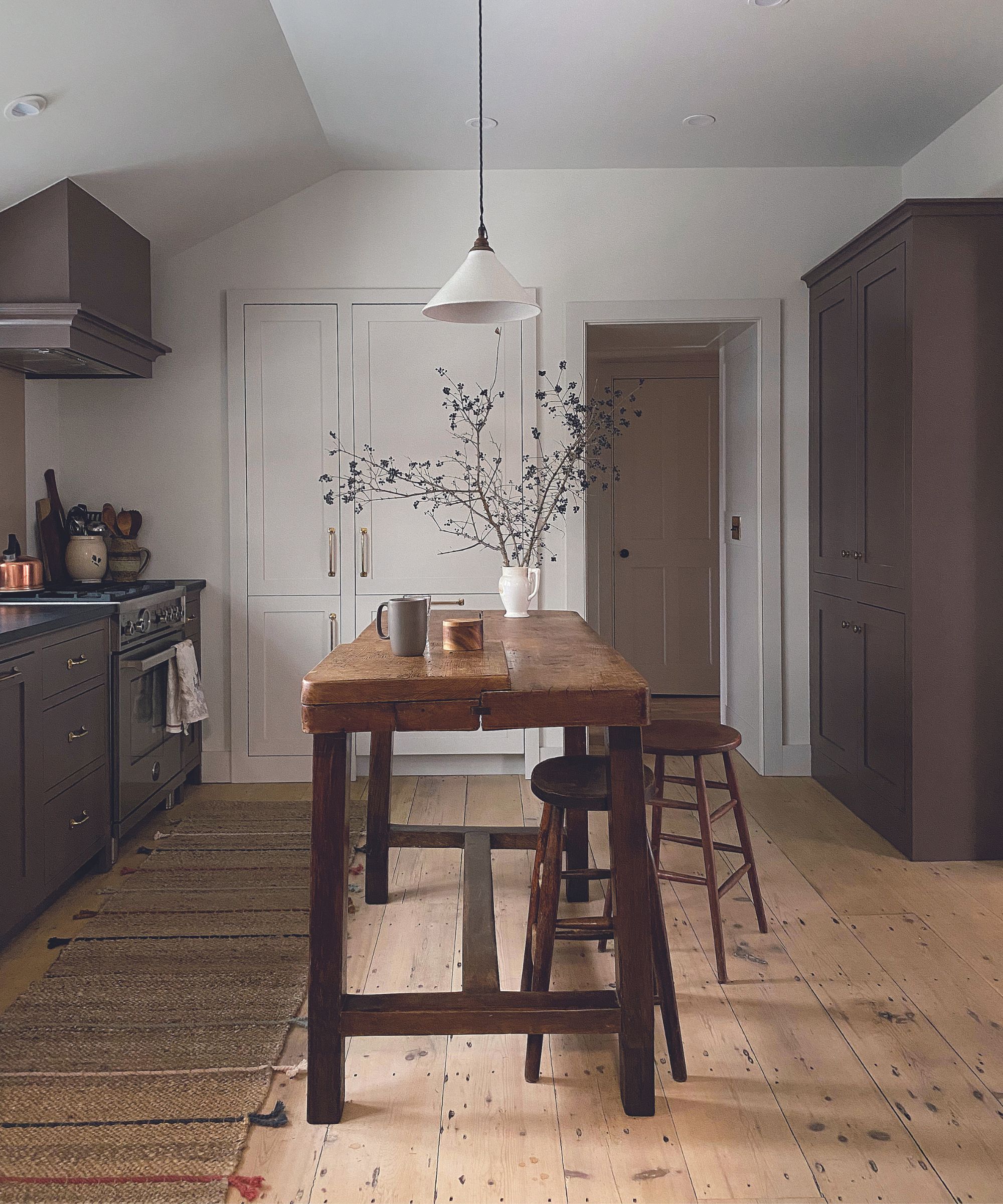
In any small room, being able to see as much of the floor as possible will boost the impression of space.
‘In a narrow kitchen it makes sense to optimize storage by designing built-in cabinets and closets on as many walls as possible, however that can limit counter space,' says Heide Hendricks, founder, Hendricks Churchill.
'In this charming period house, we needed a kitchen island for vital prep space but realized a bottom-heavy design would make the kitchen feel cramped. Instead, we searched high and low for the right size worktable with the perfect time-worn patina and, crucially, long legs to let the light through and allow more flooring on view.
'Eventually we found this vintage French worktable and worked with a craftsman to extend the legs to counter height using reclaimed antique wood.’
3. Swap a galley layout for a large island
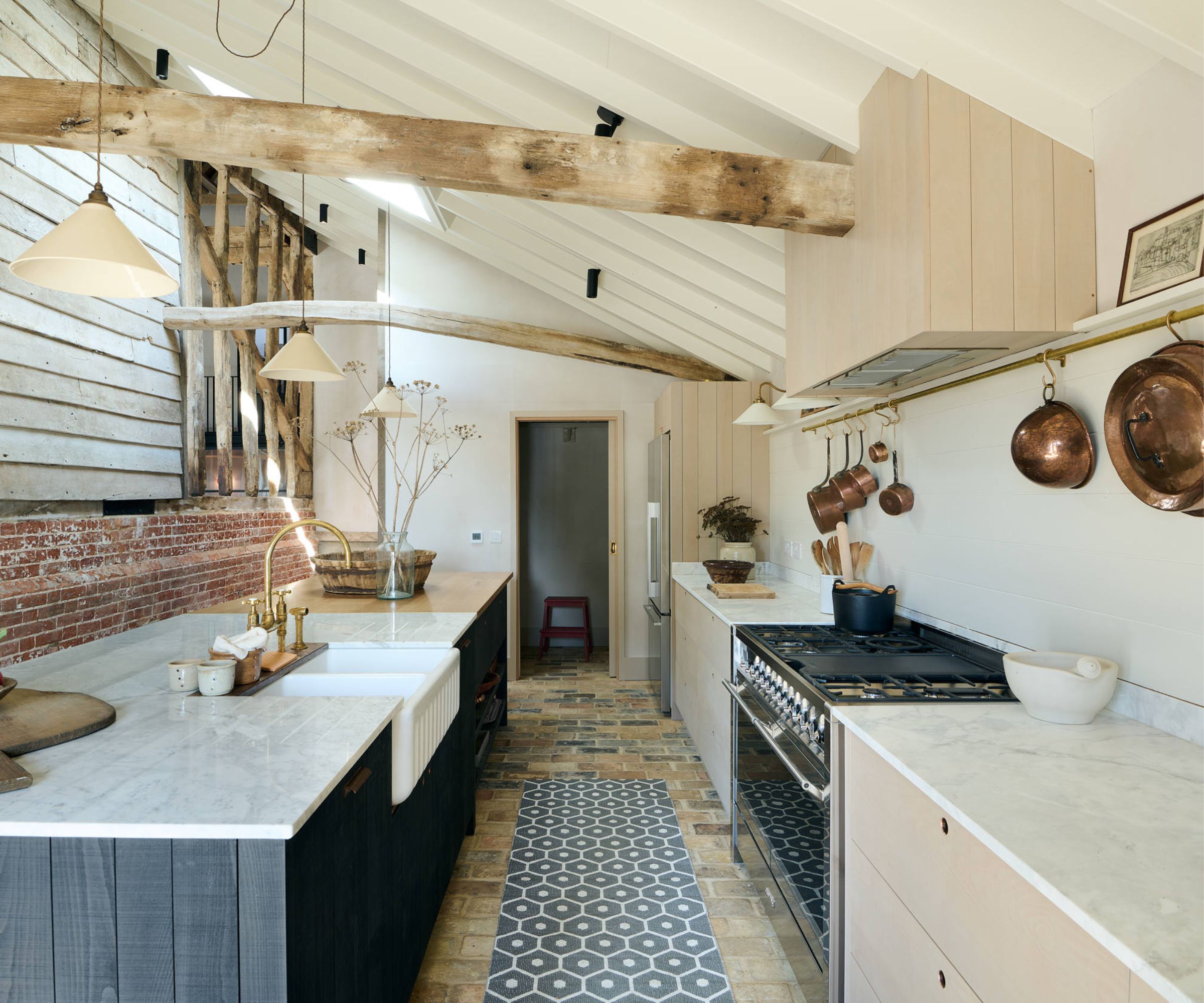
This Sebastian Cox deVOL kitchen, featured on Magnolia Network's 'For The Love Of Kitchens', is very long and disproportionally narrow. However, the addition of an off-center island makes for a storage-packed space that still has room for dining.
'The kitchen is tucked away at the end of the barn in the original milking parlor,' explains deVOL's Helen Parker. 'It is a simple layout. The massive island spans nearly 12ft and houses a double sink with integrated dishwasher and trash cans either side, as well as plenty of storage and a place to pull up a few stools.
'The run behind is straight and neat, containing the wonderful range cooker and fridge freezer. There are no wall cupboards, allowing the beauty of the ancient structure to shine through without hampering a modern lifestyle.'
4. Exaggerate width with flooring patterns
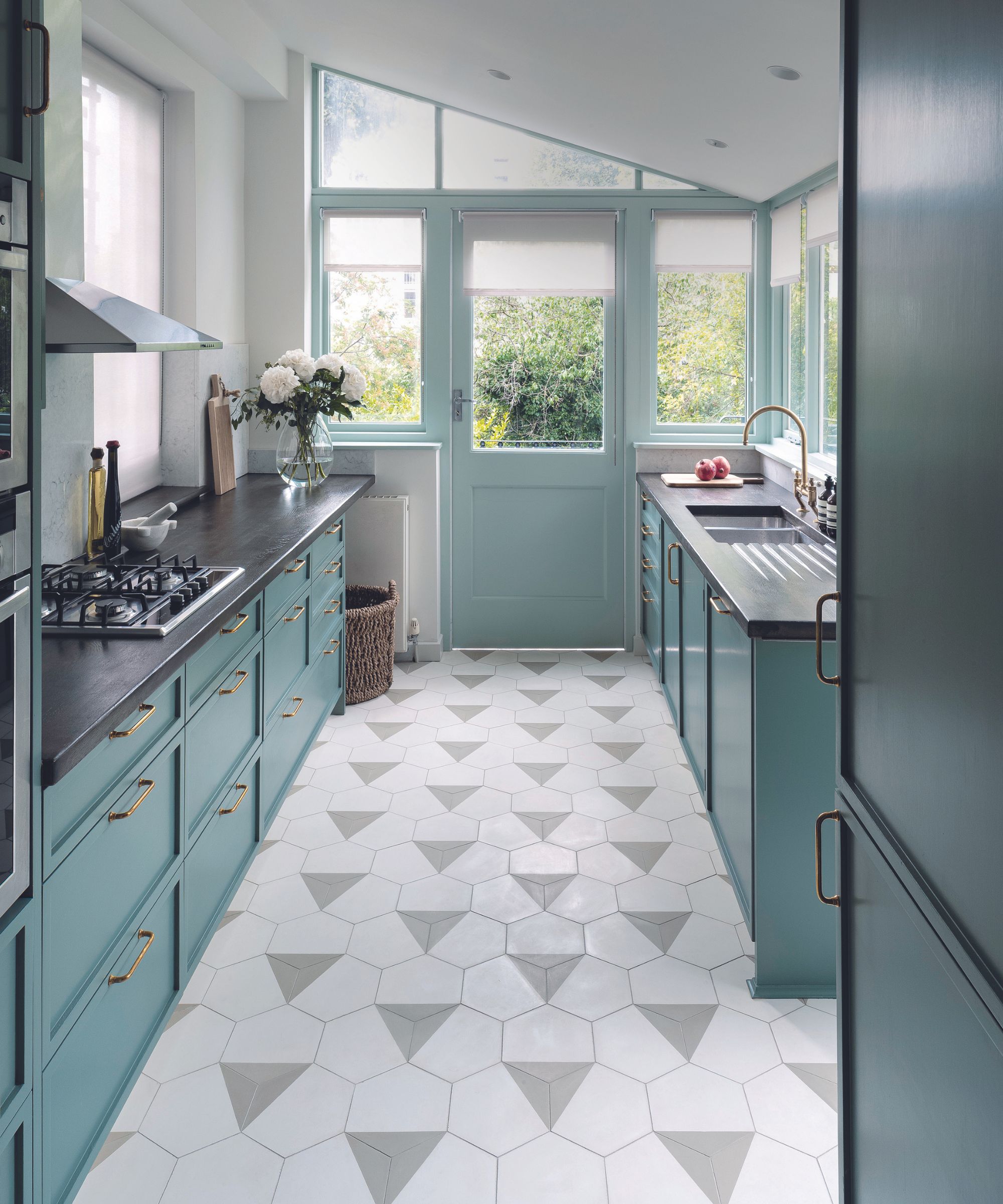
Visual tricks, used cleverly within the layout, can also make a galley kitchen look wider.
‘Generally, the larger the kitchen floor tile and the finer the grout lines, the more seamless and expansive a room will look. However, here we chose an encaustic hexagonal tile with a triangle pattern. The triangles lead your eye along the galley kitchen and out to the backyard, enhancing the perspective and stretching the room,' explains Kate Glaister, founder, K&H Design.
'The hexagonal grout lines do the opposite as the diagonal lines deceive the eye into thinking the space is wider. Try to leave at least one or two areas where the flooring is visible wall-to-wall as this allows the brain to appreciate the room’s full footprint.’
5. Create width with symmetry and reflection
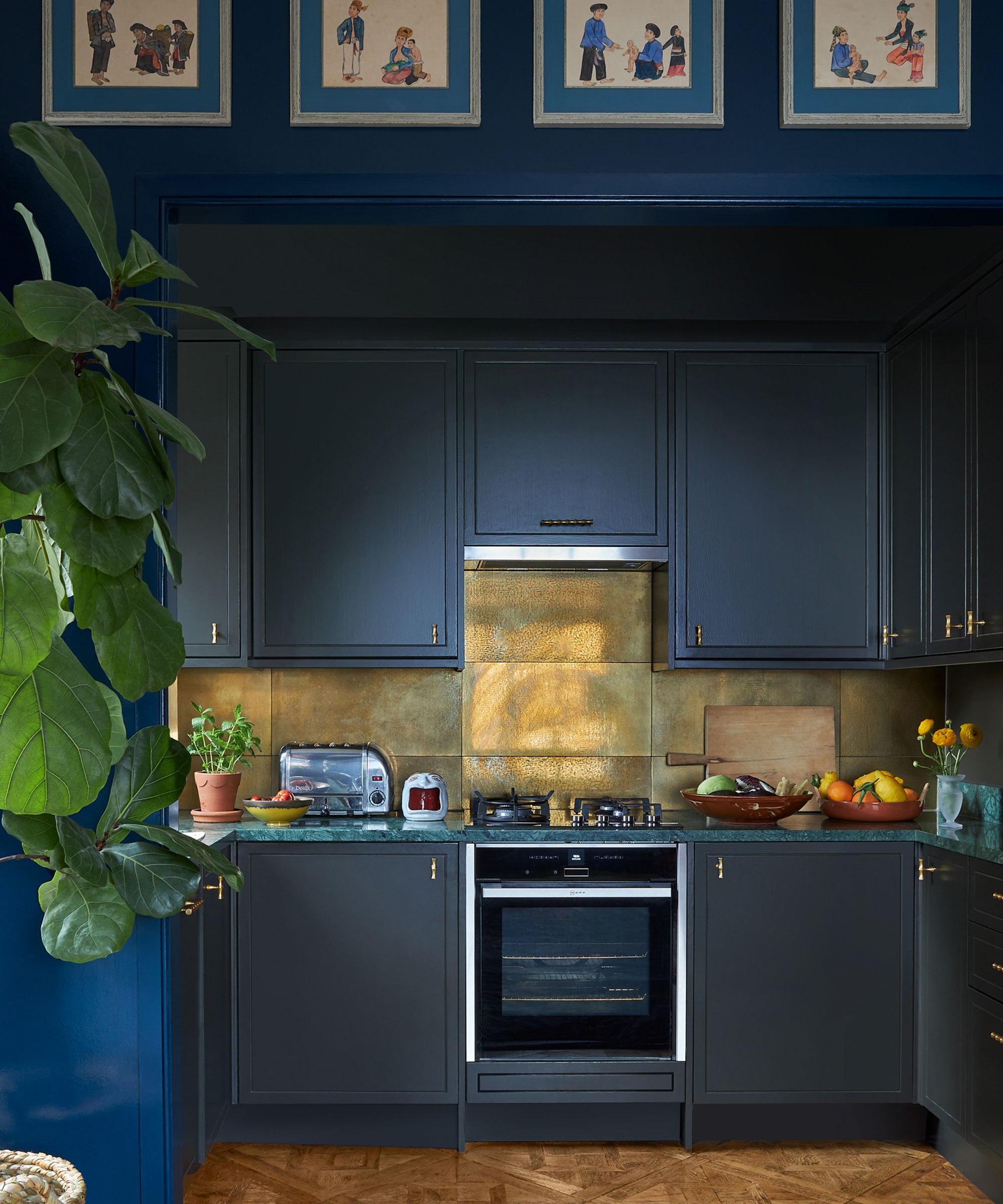
Using both symmetry in interior design and light reflecting surfaces are both well-employed tricks to make a narrow space, and in particular a kitchen, look wider.
‘Using the same strong cabinetry color on walls and ceiling is an incredibly effective way to trick the eye, enhancing the impression of depth and height,' explains Lucy Mayers, decorator, Sibyl Colefax & John Fowler.
'To help balance the dark walls and cabinets in this small kitchen, the color and strength of the backsplash was of utmost importance.
'These porcelain tiles look exactly like brass but are a much easier clean and have this brilliant reflective quality, which was beefed up with undercabinet lighting. The surface injects a real sense of glamor, while helping to bounce light around the space. Avoid overdoing statement surfaces, sometimes having less of something can make it feel even more luxurious.’
6. Swap a U-shape kitchen for negative space
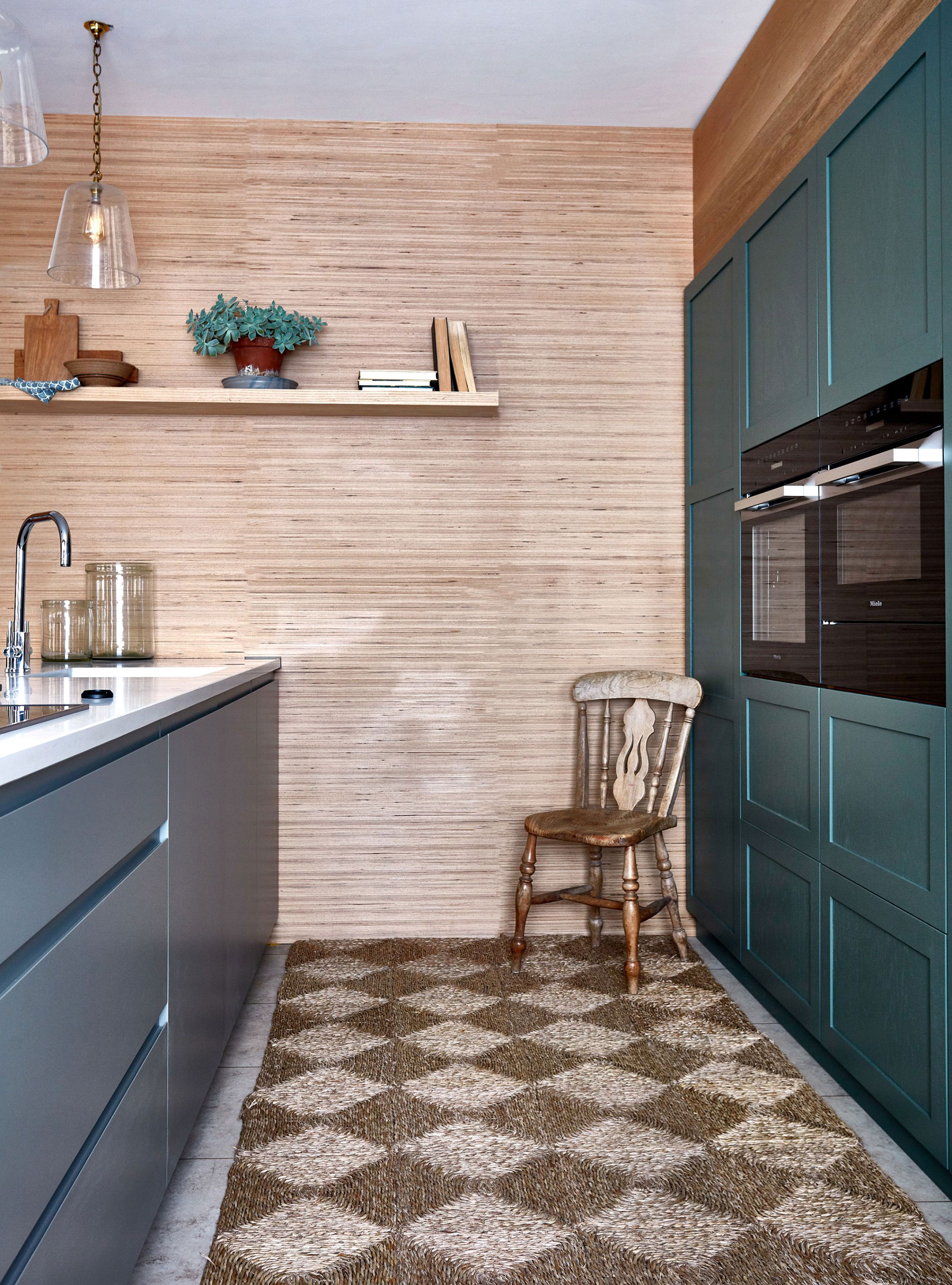
It's tempting to lay out a narrow kitchen in a U-shape, and while this can pack in more storage, it can also decrease floor space, and make the kitchen look smaller still.
'Working negative space into your interior design is a trick that experts use all the time to make small houses look bigger, but you just don't necessarily notice it. Essentially, it's all about designing spaces that have room to breathe, and that's really important in a narrow kitchen, where you will likely spend a lot of time,' advises Lucy Searle, Editor in Chief, Homes & Gardens.
'Boosting negative space can mean anything from swapping wall cabinetry for less visually dense open shelving, or even glass-fronted cabinets; or it can be leaving a wall free of cabinetry entirely, as above.
'Note how the wallpaper on the walls has a subtle horizontal stripe: this is a classic decorating trick to make any narrow space look wider.'

Lucy Searle has written about interiors, property and gardens for over 30 years, starting within the interiors departments of women's magazines before switching to interiors-only titles in the mid-1990s. In 2018, Lucy took on the role of Global Editor in Chief for Realhomes.com, taking the site from a small magazine add-on to a global success. She was asked to repeat that success at Homes & Gardens, where she has also taken on the editorship of the magazine, which is the UK's oldest interiors magazine at 103 years old. Lucy is a serial renovator and also owns rental properties in the UK and Europe, so brings first-hand knowledge to the subjects she oversees.
7. Use color tricks to draw the eye around the space
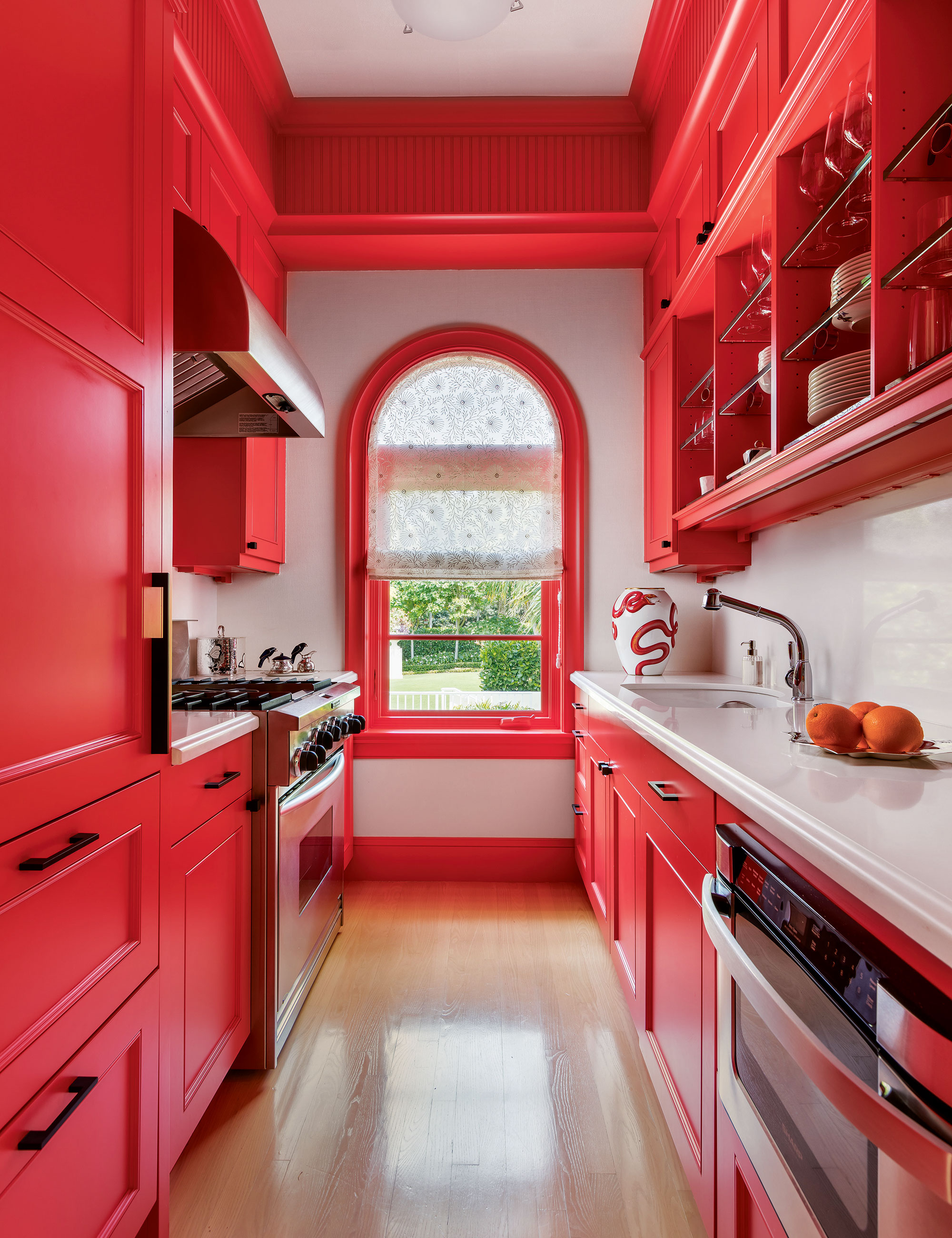
‘Using bold kitchen color is one way to grow a space that may physically have a small footprint. In this guest house, the kitchen is narrow and compact, so I wanted to make it a star,' says Matthew Boland, principle, MMB Studio..
'The color – Sherwin-William’s aptly named Energetic Orange – literally grabs your attention and allows your eye to travel the entire length and height of the space. The color is unexpected and generously applied, right up to the ceiling.
'The smallest spaces can be the most memorable if you keep the focus strong. In this space the focus was the paint color and we used it with vigor.’
8. Minimize window treatments
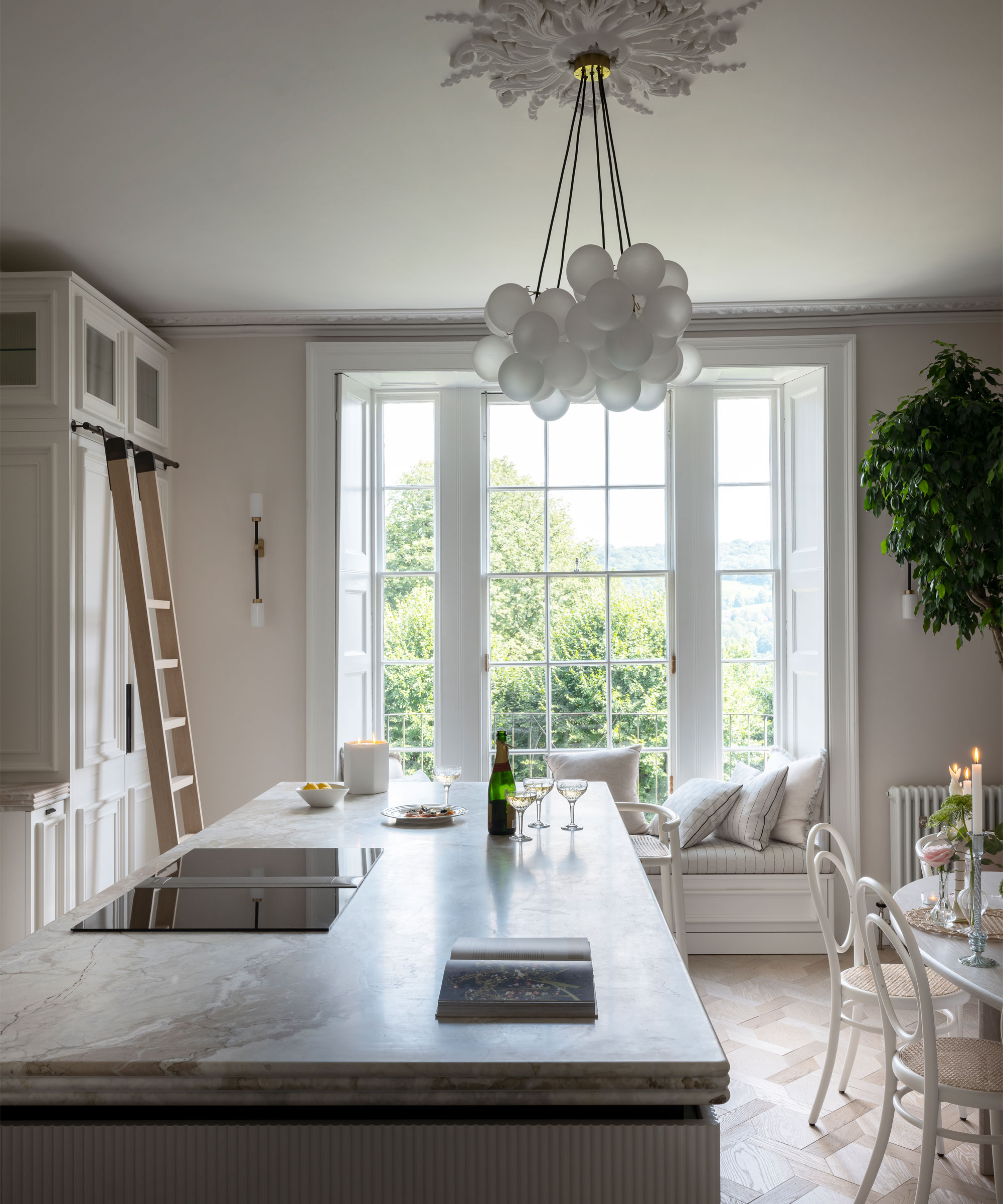
If you are wondering what to put at small kitchen windows, the answer, in a narrow kitchen, is that 'less is more'.
'Kitchen window ideas for narrow spaces need to be either pared back entirely, as in the space above, or have horizontal lines (think: Venetian blinds or striped fabric blinds), which will create a visual trick to make the room look wider,' advises Lucy Searle.
'The former option will allow as much light as possible into the room, which is always space-enhancing, while the latter is a good option for adding privacy and/or color and pattern to the space.'
9. Seek out half-depth cabinets
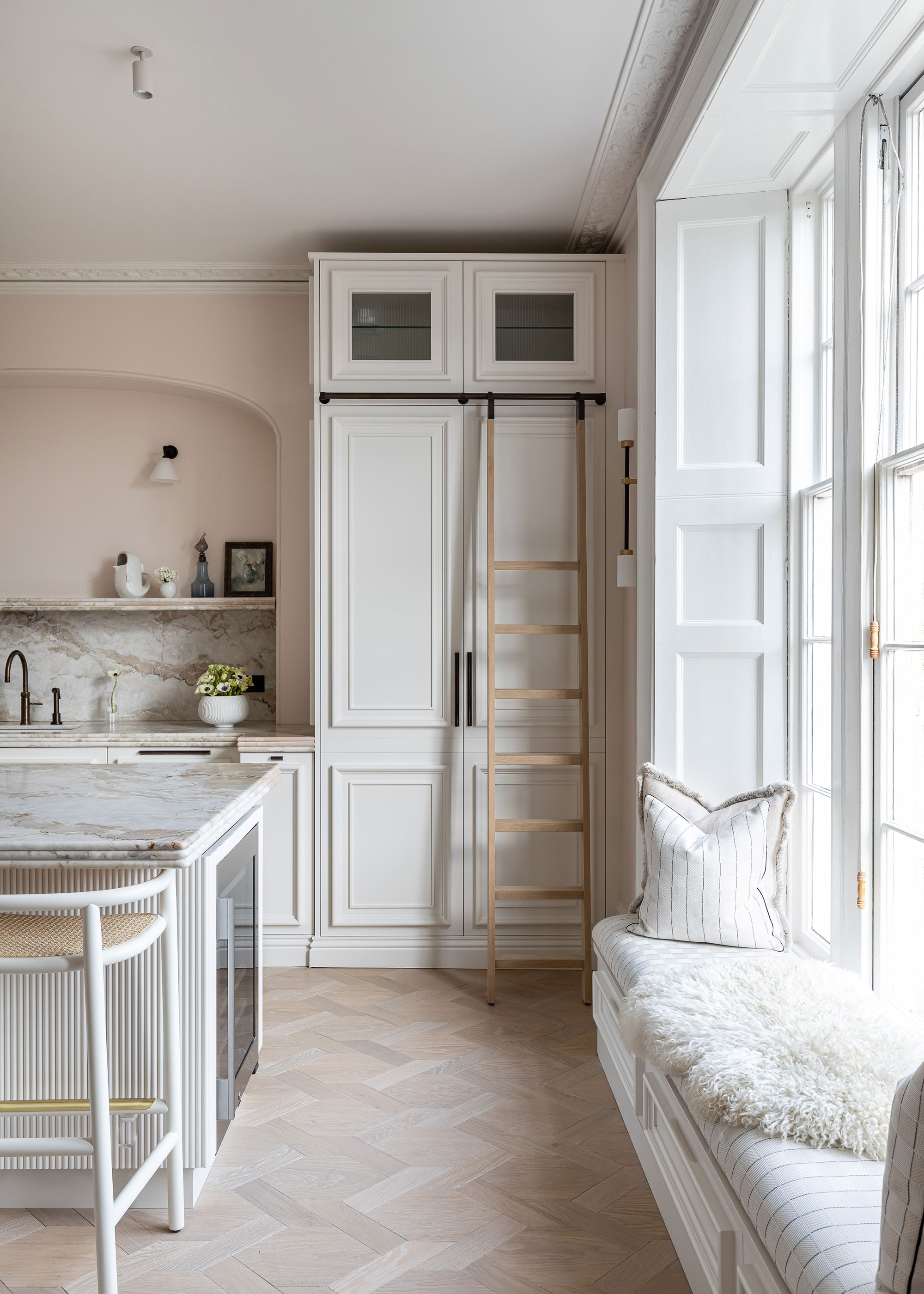
If you need plenty of cabinetry, it can be much more space-enhancing to install half-depth, light-colored, floor-to-ceiling kitchen storage over full-depth base and wall units.
You will need to find a balance between storage and the loss of countertop space, but you will create more floor space from a narrow kitchen layout with half-depth cabinetry on one wall, or along one section of a wall.
This type of cabinetry is super-practical, too, allowing all your dry goods and cookware to be easy to see and access.
FAQs
What is the best layout to make a narrow kitchen look wider?
A galley kitchen is the best layout to make a narrow kitchen look wider, though this can be further enhanced by either having no wall cabinetry, or having glazed cabinetry at eye level. Or, you can have full-height, half-depth cabinetry on one side, and a more traditional base and wall unit cabinetry layout on the other side.
How do you make a narrow kitchen look wider?
Layout is all: a galley layout can work to make a narrow kitchen look wider, but don't rely on layout alone. Visual tricks, such as putting a darker color or subtle horizontal stripe on the far wall, or exposing an unadorned window on the far wall will all work to make a narrow kitchen look wider, as will using light-colored countertops and reflective cabinetry materials.
One aspect we haven't touched on: kitchen lighting. Plan it carefully and you can further widen your space, at least visually. This means placing lights beneath wall units to create pools of light across backsplashes and onto countertops, and layering these with ceiling spotlights.
Sign up to the Homes & Gardens newsletter
Design expertise in your inbox – from inspiring decorating ideas and beautiful celebrity homes to practical gardening advice and shopping round-ups.
Linda graduated from university with a First in Journalism, Film and Broadcasting. Her career began on a trade title for the kitchen and bathroom industry, and she has worked for Homes & Gardens, and sister-brands Livingetc, Country Homes & Interiors and Ideal Home, since 2006, covering interiors topics, though kitchens and bathrooms are her specialism.
-
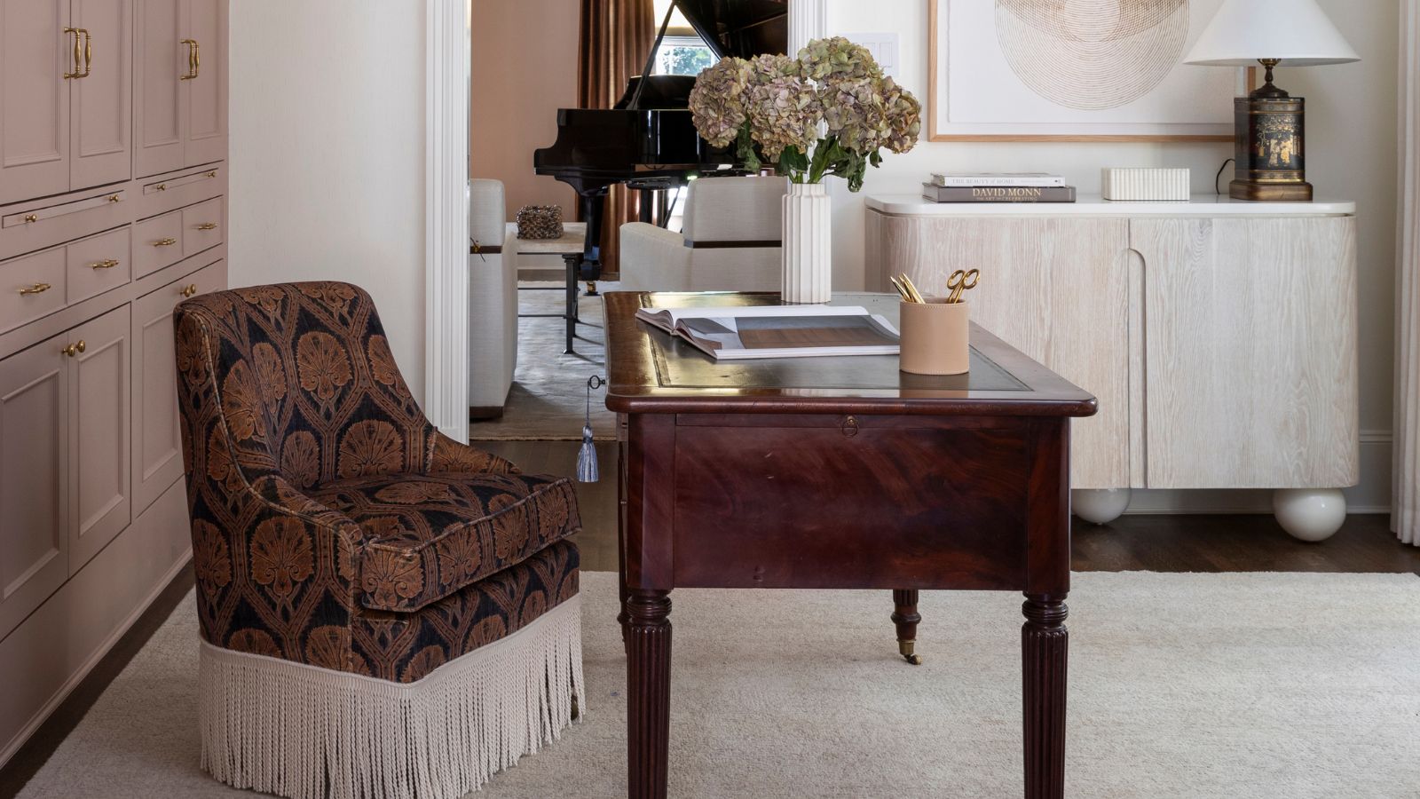 The rumours are true, the NYC trend for fringes and trimmings is actually happening – they are the secret weapon for making a room look expensive
A trim or a ruffle is the finishing touch that can take a scheme from ordinary to the extraordinary in an instant
By Jennifer Ebert Published
-
 How to grow impatiens – garden experts reveal the secrets to growing this shade-tolerant, sparkling summer plant
Both 'Busy Lizzie' and 'New Guinea' impatiens can thrive in shady yards
By Ellen Wells Published