How can you add texture to a kitchen? This designer's kitchen is a lesson in adding tactile touches
Designer Marie Flanigan talks us through her own kitchen remodel, and how adding texture was at the center of every design decision
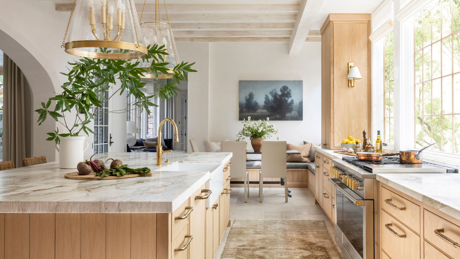

Kitchens of course have to be very practical spaces. They have to be multifunctional, workable, and hygienic – all qualities that aren't often associated with softness and warmth. However, as kitchen trends shift and we are looking to create kitchens that feel like cozier, more lived-in spaces, there is a simple answer to balancing a practical working space with a more inviting, characterful one – texture.
And add texture wherever possible was the main focus of this kitchen project by Marie Flanigan, which also happens to be her own home. Here, she talks us through why texture is so key in kitchen design and the different ways she brought it into this space.
'When designing my kitchen, I wanted to create a space rich with texture, where soft and hard finishes worked together to achieve a perfect balance of elegance and warmth,' begins Marie. 'Texture, in many ways, became the defining element that made the kitchen feel tactile and inviting – a space that’s not just functional but thoughtfully layered with detail.'
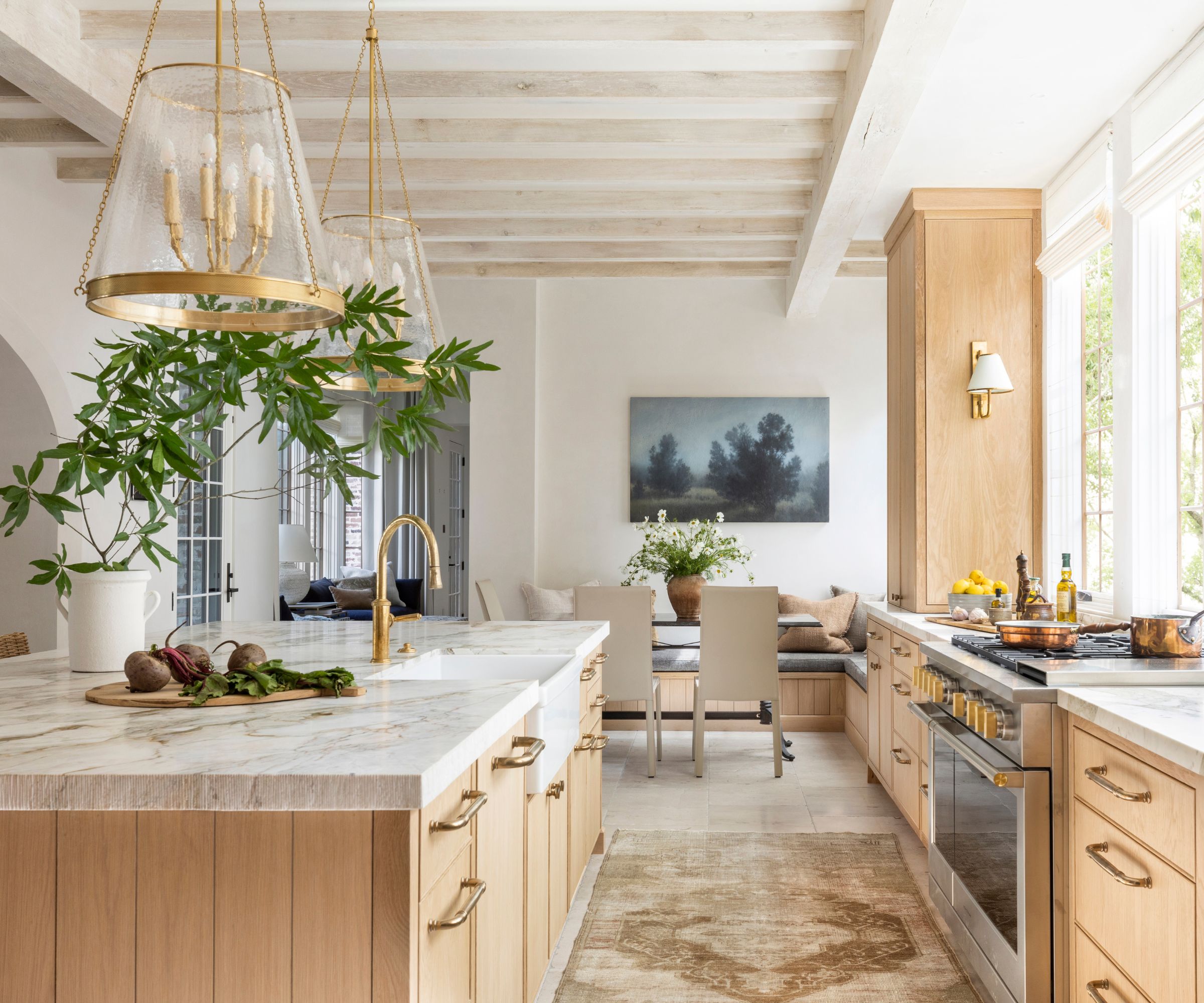
'The foundation of the kitchen is the bespoke Paloma limestone floors. Chosen for their natural, worn texture, these floors immediately bring character and a sense of grounding to the room. The French Quarter finish adds a subtle roughness that gives the space a historical feel, providing depth and richness. This textured stone grounds the kitchen, lending a sense of permanence and durability – key qualities for a room that serves as the hub of our family’s daily life.'
'Complementing the textured kitchen floors are the Michelangelo Arebescado Dolomite countertops. This polished stone, with its soft veining, introduces a more refined texture. Though the surface is smooth to the touch, the natural movement within the veining adds visual depth, creating a beautiful contrast with the rougher stone beneath. Together, the limestone floors and dolomite countertops create a harmonious dialogue between rough and smooth finishes, each playing off the other to balance texture throughout the space.'

Marie Flanigan is an award-winning interior designer whose passion and achievements in design have positioned her as one of the nation’s best. She is classically trained and practiced architect, and her trademark style is evident through the sophisticated use of color, texture, and light. Every home she designs receives her personal signature of timeless elegance and innovative simplicity.
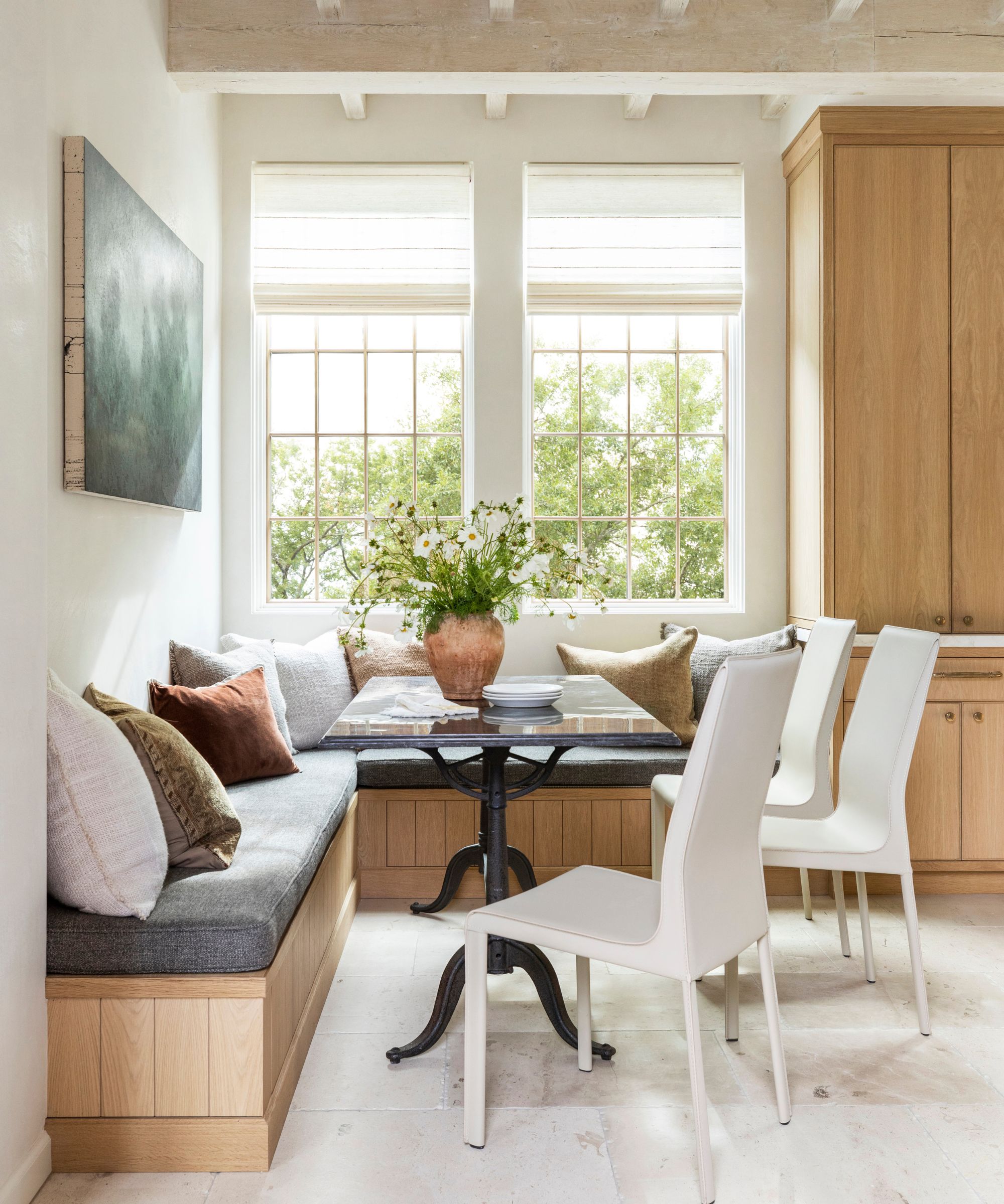
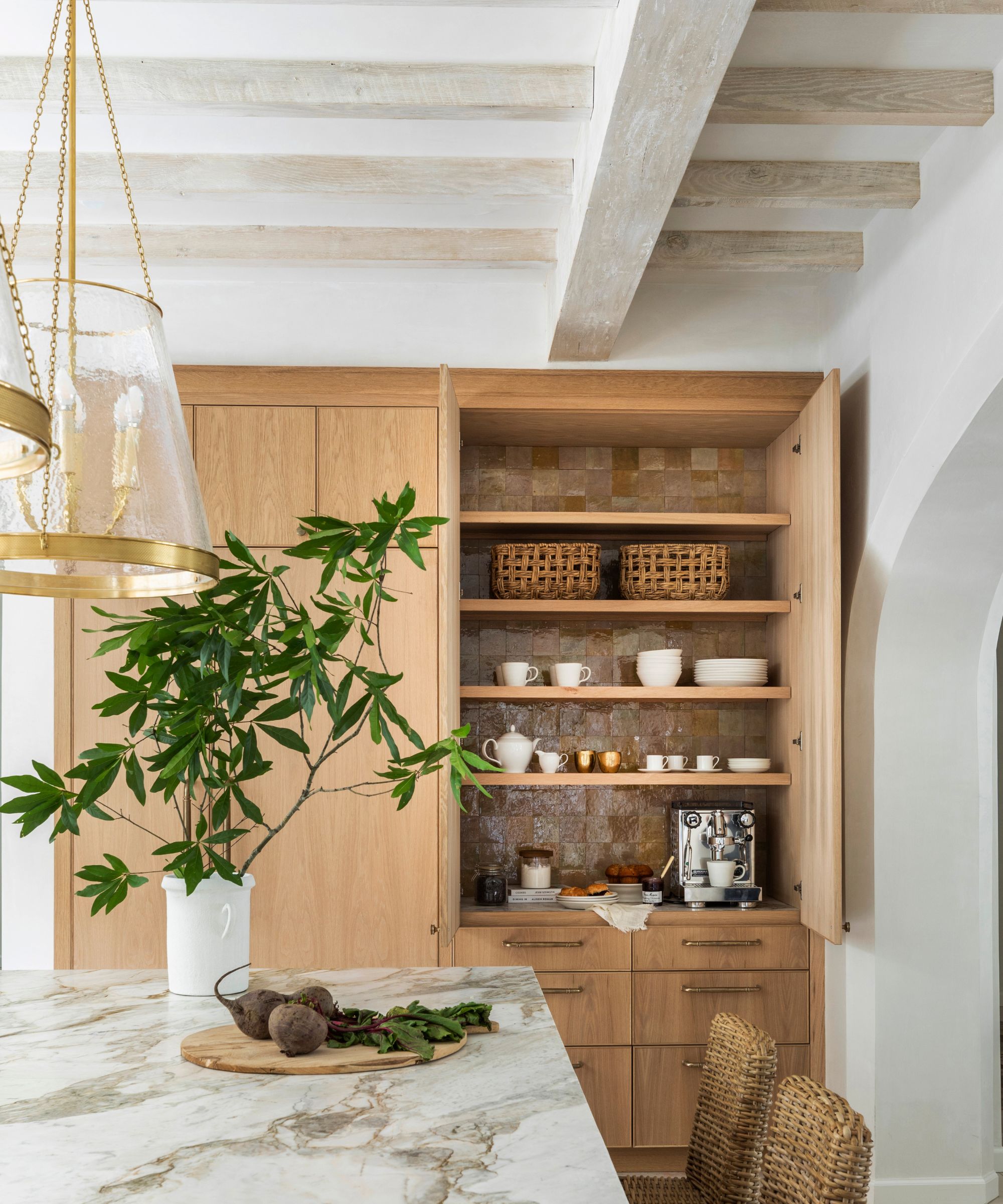
'The kitchen cabinetry is another key textural element. Made from stained white oak, the natural grain of the wood introduces a tactile quality that adds warmth and richness. The smooth, matte finish of the oak offers a visual softness that contrasts with the cool, polished stone of the countertops. At the same time, the cabinetry’s earthy tones complement the limestone floors, creating a continuous flow of natural materials throughout the space. The oak cabinetry bridges the gap between the harder elements, like stone, and softer, more organic materials, adding both visual and tactile warmth.'
'To further counterbalance the hard finishes, I brought in softer textures through the use of woven materials. The custom grassweave shades are one of my favorite additions, introducing an organic, earthy texture that softens the room’s overall look. Their slightly irregular weave adds a layer of imperfection, bringing a sense of ease and comfort to the space. The way the shades filter light also adds to the welcoming atmosphere, providing a soft glow that contrasts beautifully with the more structured lines of the cabinetry and countertops.'
'The Sherwin Williams Greek Villa paint on the walls serves as a calming, neutral backdrop, enhancing the layered textures throughout the kitchen without competing for attention. This creamy white creates a serene environment, allowing the natural wood tones and stone finishes to shine.'
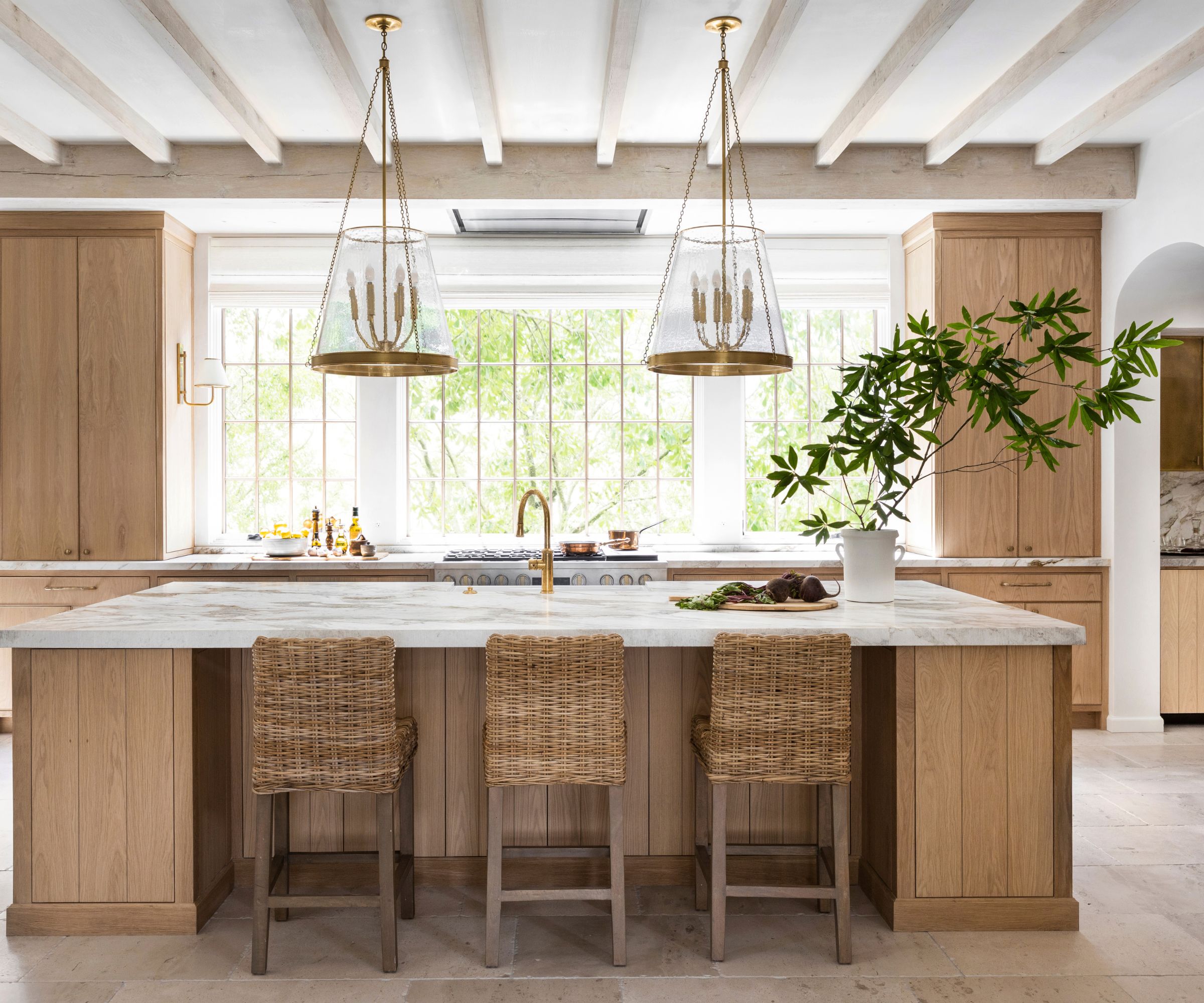
'Natural elements were key in bringing texture to the space. The light fixtures, such my own Reese pendants and Rigby sconces, combine brass with natural oak, adding an extra layer of tactile interest. The oak in the sconces connects back to the cabinetry, while the brass adds a sleek, polished contrast that echoes the hardware and faucet choices.'
'Even the smallest details, like the light bronze cabinet pulls, were selected with texture in mind. Their handcrafted finish brings an artisanal feel to the room, adding character and depth to the cabinetry. Paired with the natural wood and soft kitchen lighting, these elements enrich the room’s overall textural narrative.'
'While aesthetics were a priority, practicality was never sacrificed. The limestone floors are durable and perfect for family life, while the smooth dolomite countertops offer elegance without compromising ease of maintenance. The woven shades, along with the warm oak cabinetry, make the kitchen feel cozy and inviting, creating a comfortable space for both quiet family meals and entertaining guests.'
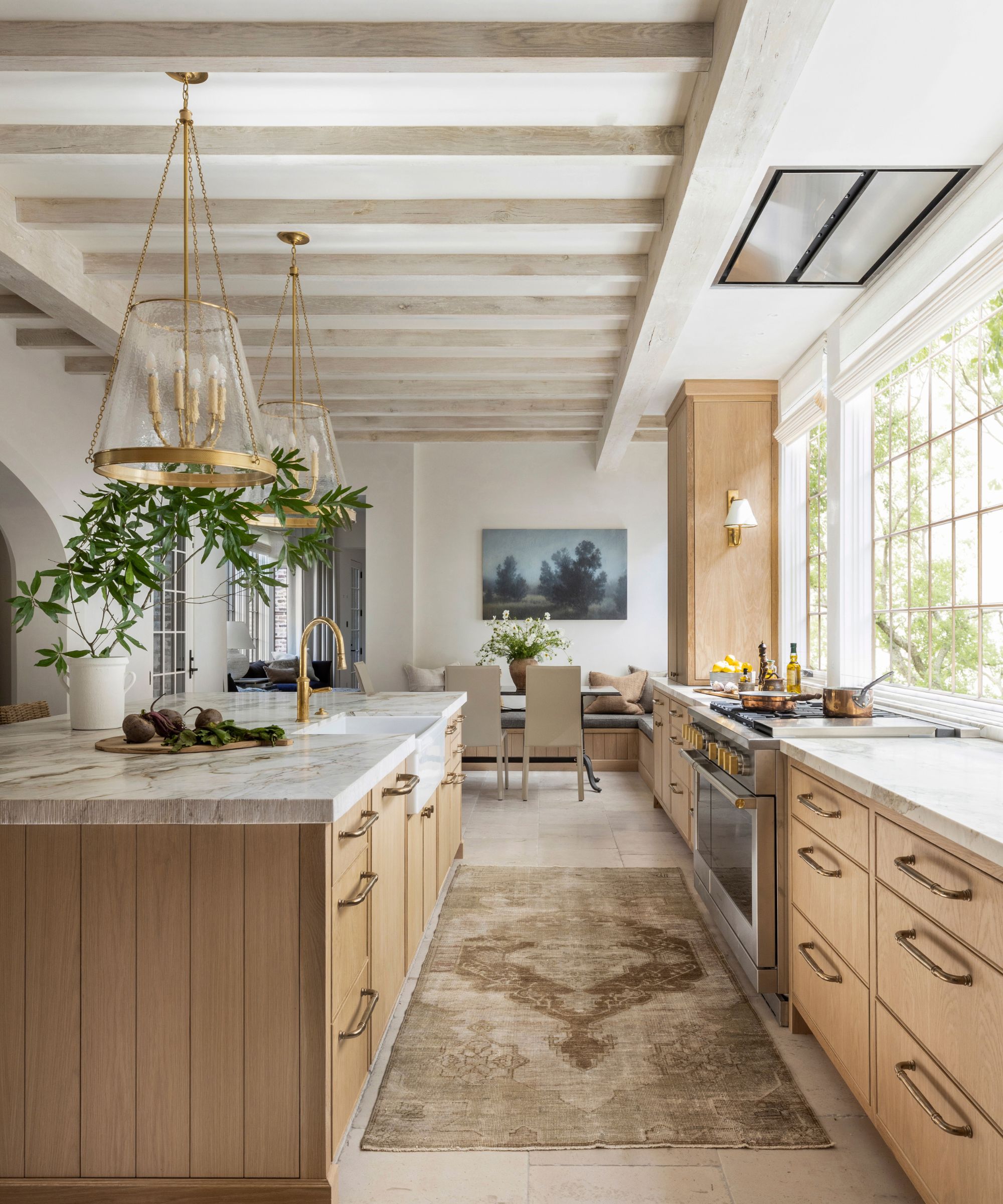
'By thoughtfully layering textures through hard finishes like stone and wood, and softer elements like fabric and lighting, the kitchen becomes a space that feels both luxurious and lived-in. Every surface and detail work together to create a tactile experience that reflects the true heart of our home.'
Sign up to the Homes & Gardens newsletter
Design expertise in your inbox – from inspiring decorating ideas and beautiful celebrity homes to practical gardening advice and shopping round-ups.

I am the Head of Interiors at Homes & Gardens. I started off in the world of journalism in fashion and luxury travel and then landed my first interiors role at Real Homes and have been in the world of interior design ever since. Prior to my role at H&G I was the digital editor at Livingetc, from which I took a sabbatical to travel in my self-converted van (not as glamorous as decorating a home, but very satisfying). A year later, and with lots of technical DIY lessons learned I am back to writing and editing, sometimes even from the comfort of my home on wheels.
-
 Apple and elderflower martini
spring cocktail — light, floral and easy to batch for a crowd
By Alice Hart
-
 Elton John's home fragrance collection is 'a tribute to the optimism and beauty that spring brings' – and it's under $45 to scent your home this April
Slatkin + Co. teamed up with Elton John to create a home scent inspired by his historic Woodside Estate – they're beautiful, affordable, and selling quickly
By Sophie Edwards