These homeowners didn't want 'just another white kitchen' – so the designer gave them the most interesting and elegant neutral space
Designed by Charla Ray, the space is filled with warm hues, organic materials, and modern finishes – take a look inside
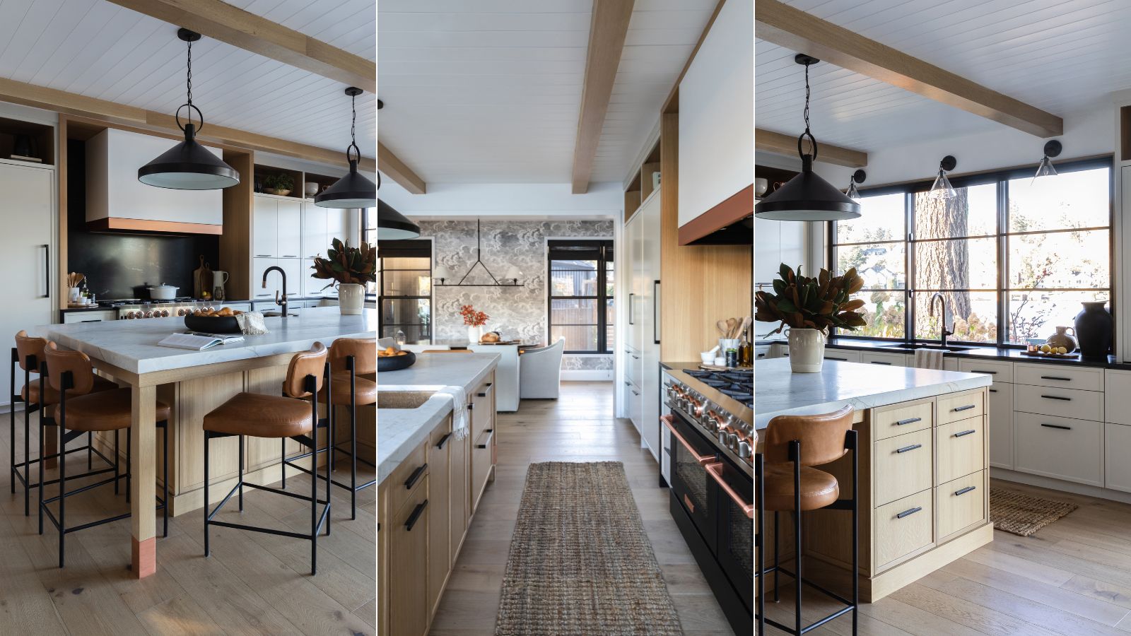

There's an undeniable charm to cottages – with their characterful features and low ceilings, they're the epitome of homey interiors. And when interior designer Charla Ray was tasked with the remodel of this lake cottage kitchen in Oregon, it required a careful balance of honoring the old while embracing the new.
The homeowner's brief for the remodel was really rather simple: they didn't want just 'another white kitchen', so the right colors and finishes were required to add a light, breezy atmosphere while ensuring the space remained warm and welcoming. And that is exactly what has been achieved.
To find out exactly how this once outdated cottage kitchen was brought back to life, we spoke to Charla to find out how she approached redesigning the space using organic materials and luxurious finishes.
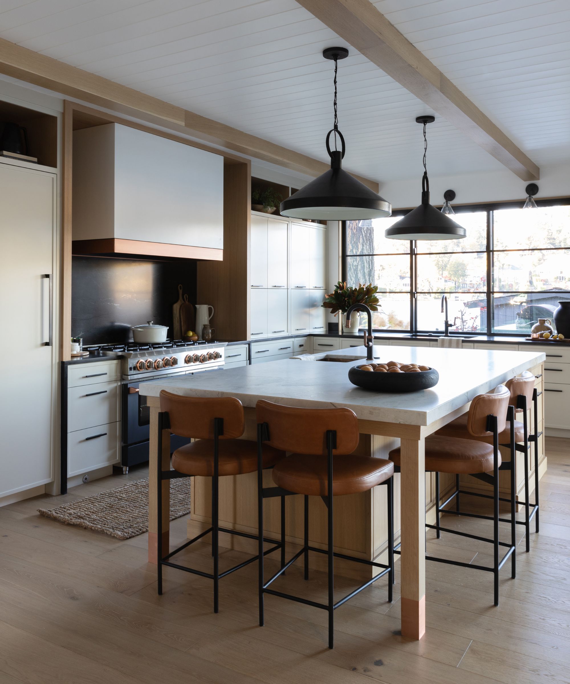
'The original home was a 1940s lake cottage and we wanted to pay homage to that, though we were taking the home down to the foundation,' Charla tells H&G. 'We settled on the concept of a comfortable and welcoming modern cottage and kept that as our North Star throughout the project.'
Stripping the space down to the bones – which was necessary to raise the ceilings – offered up the opportunity to reconfigure the layout. The new kitchen was extended into what was formerly the dining room, and a dividing wall between the kitchen and family room was also removed, creating a larger, open-plan space with a cozy banquette forming the new dining area.
While this reimagined layout was integral to creating a more spacious kitchen, it wasn't without its challenges. 'We had to try to accommodate all of our modern conveniences and the way we live these days into a relatively compact space since we were dealing with the same 1940s footprint,' says Charla.
'So, we lost a little bit from the dining room space, but I think the banquette was a great solution and the trade-off to have a larger kitchen aligns more with how we use space these days.' To help zone the dining area, and give it its own identity, a monochrome cloud mural has been applied to the walls, adding visual interest and dimension to the large expanse of wall space.
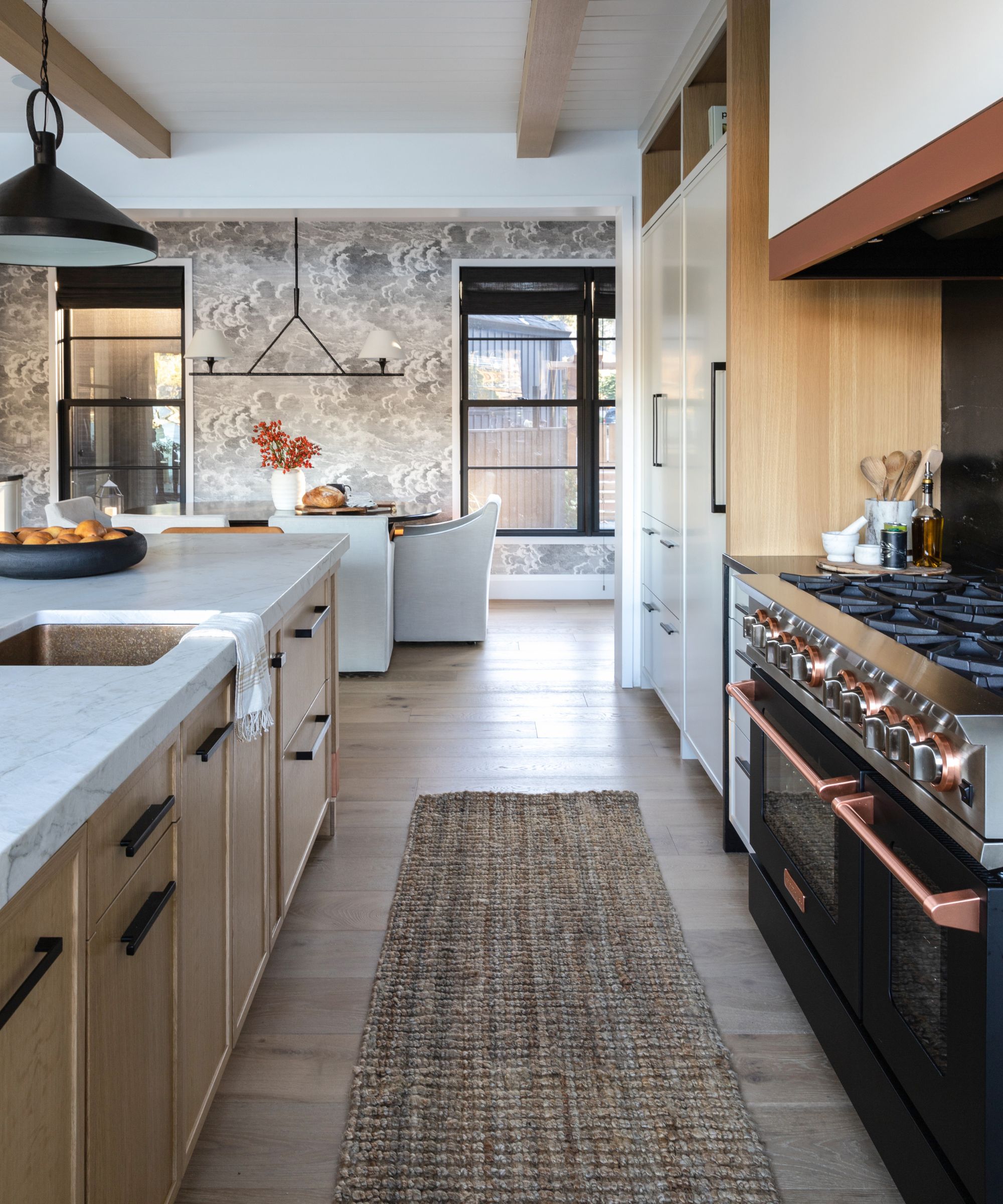
Designing the new kitchen saw the concept truly come to life, blending different textures and finishes to achieve the homeowner's desired aesthetic. And it started with a range cooker.
'I knew very early in the design process the client wanted to do a black and copper BlueStar range. This helped set a palette direction and brought in warmth through the copper finish and contrast via the black tones,' Charla explains.
Stark whites were out of the question, so a soft taupe hue was selected for the cabinetry to introduce a more organic finish, which instantly softened the moodier tones of the range. 'We did a very minimal shaker profile on the door and drawer fronts to bring in some modernity,' she adds.
To add further contrast and warmth, wood tones were introduced throughout the scheme. 'The warmth of the oak found in the beams, island, inside the open upper cabinets, and accent at the range alcove helped balance our other materials and create a repetition throughout the kitchen and home.'
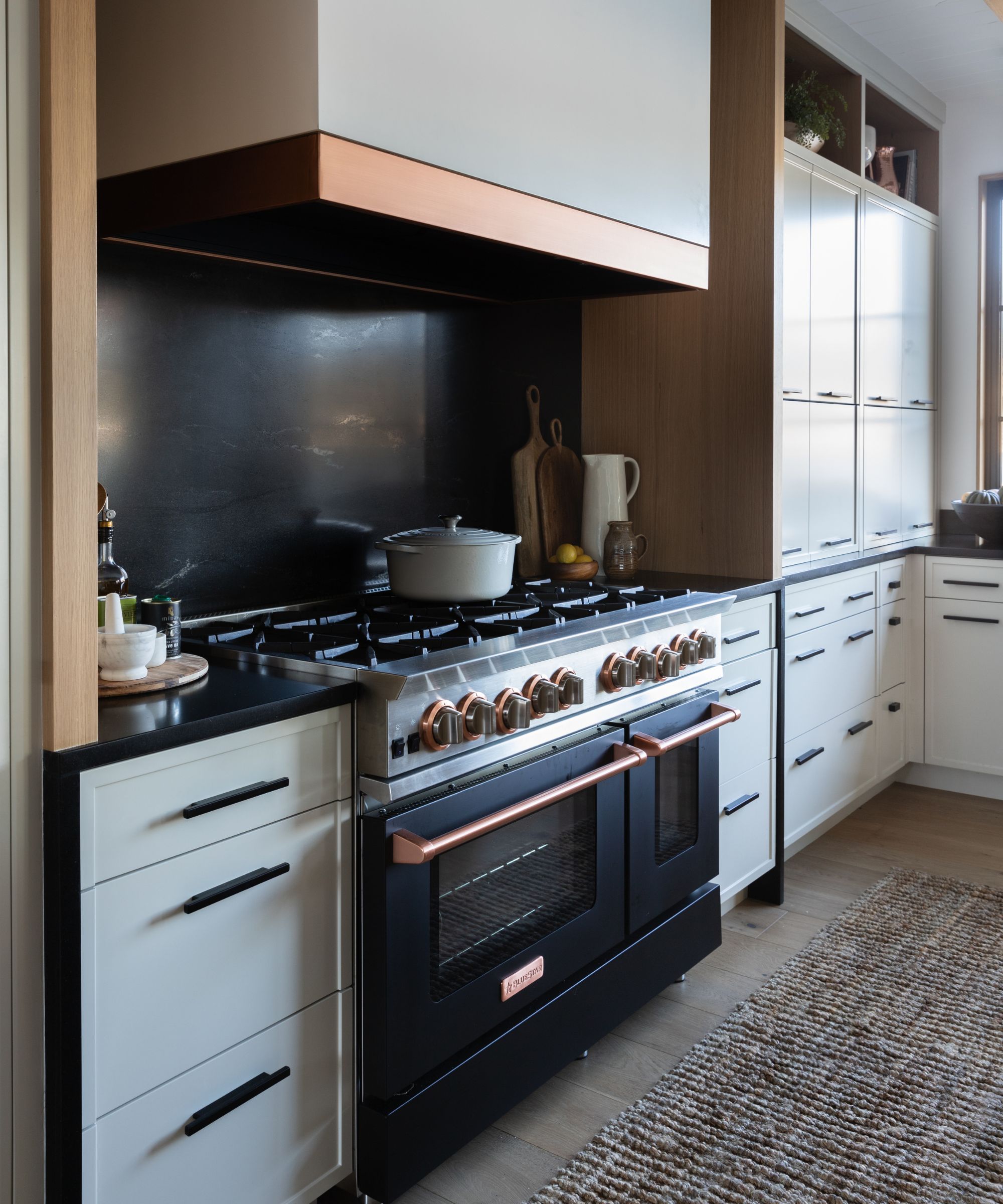
A lot has been packed into this kitchen, but with a thoughtful layout and carefully integrated features, the space feels calm rather than overcrowded. The BlueStar range is the obvious star of the show, and fast became the focal point of the whole scheme.
But it's the integrated appliances that give this kitchen a seamless finish. 'We have lots of functionality hidden behind beautiful cabinetry. Paneled refrigerator drawers just to the side of the large folding door system create easy access to beverages when outside enjoying the lake,' says Charla.
'We’ve hidden a second dishwasher next to the island sink. We were able to hide a microwave, toaster, and blender all behind the cabinets that run down to the countertop right of the range. The doors can open and slide in so these small appliances are readily available and then easily close to hide away any clutter or crumbs,' she continues.
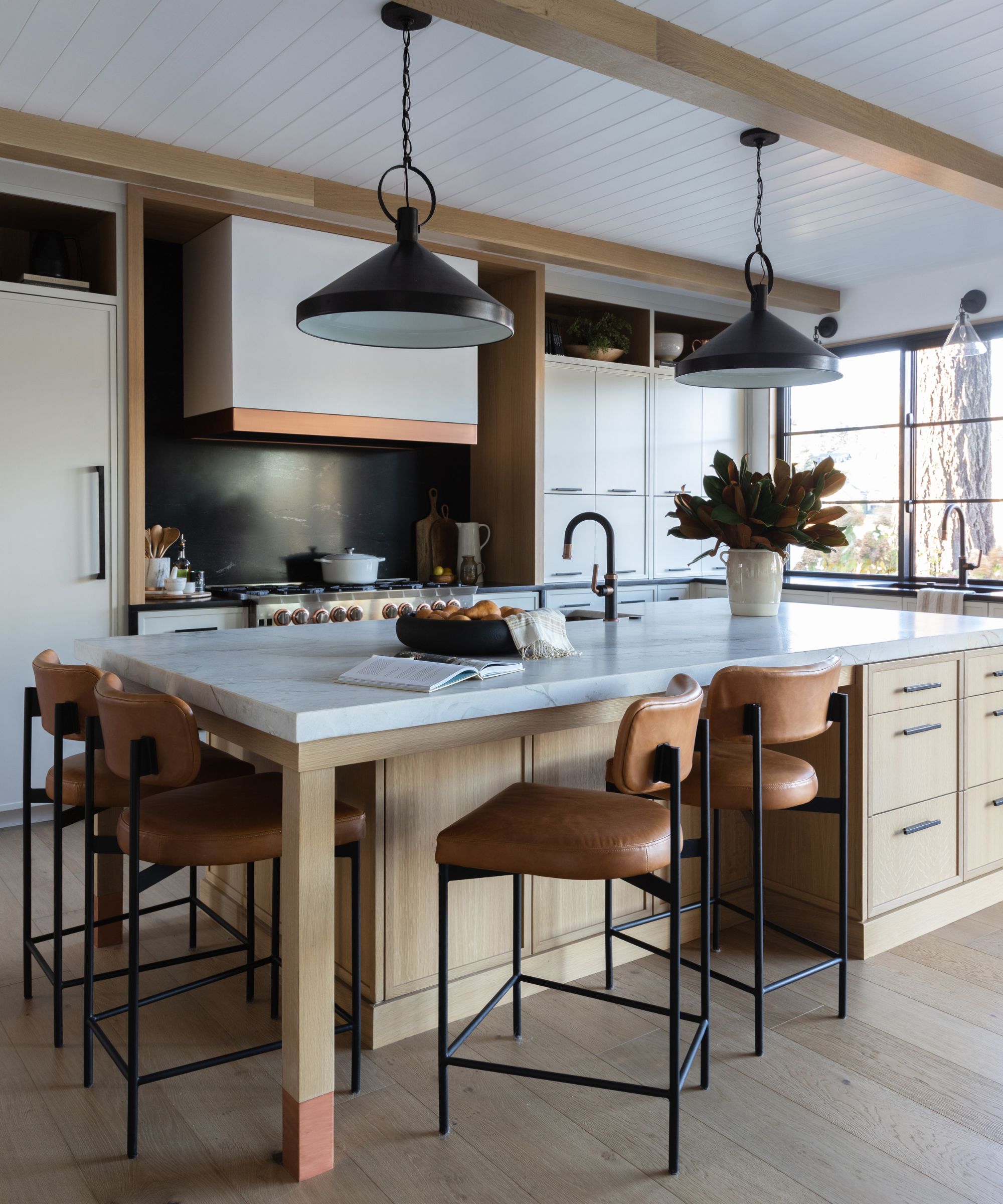
The finishing touches tied everything together and gave the kitchen those homey additions. 'I think the copper finish on the plumbing fixtures, prep sink, range hood, and island legs lends a thoughtful, custom touch,' Charla finishes.
Black kitchen cabinet hardware creates much-needed cohesion with the pendant lights and the window frames, while brown leather bar stools offer a nod to the copper finishes, adding a comfortable spot to perch when the banquette seating feels too formal. These finishes paired with the taupe hues and wooden details complete this organic modern masterpiece.
Get the look
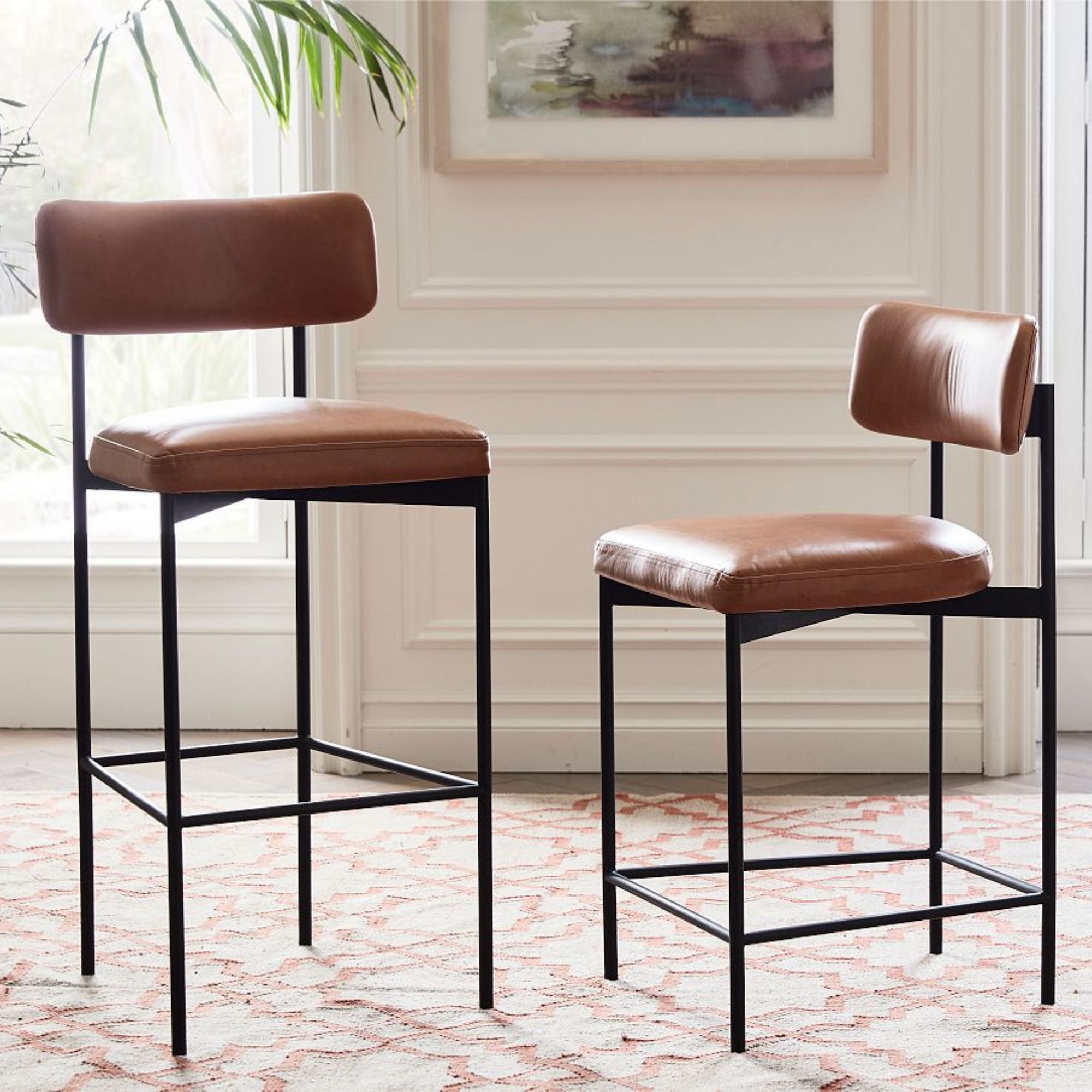
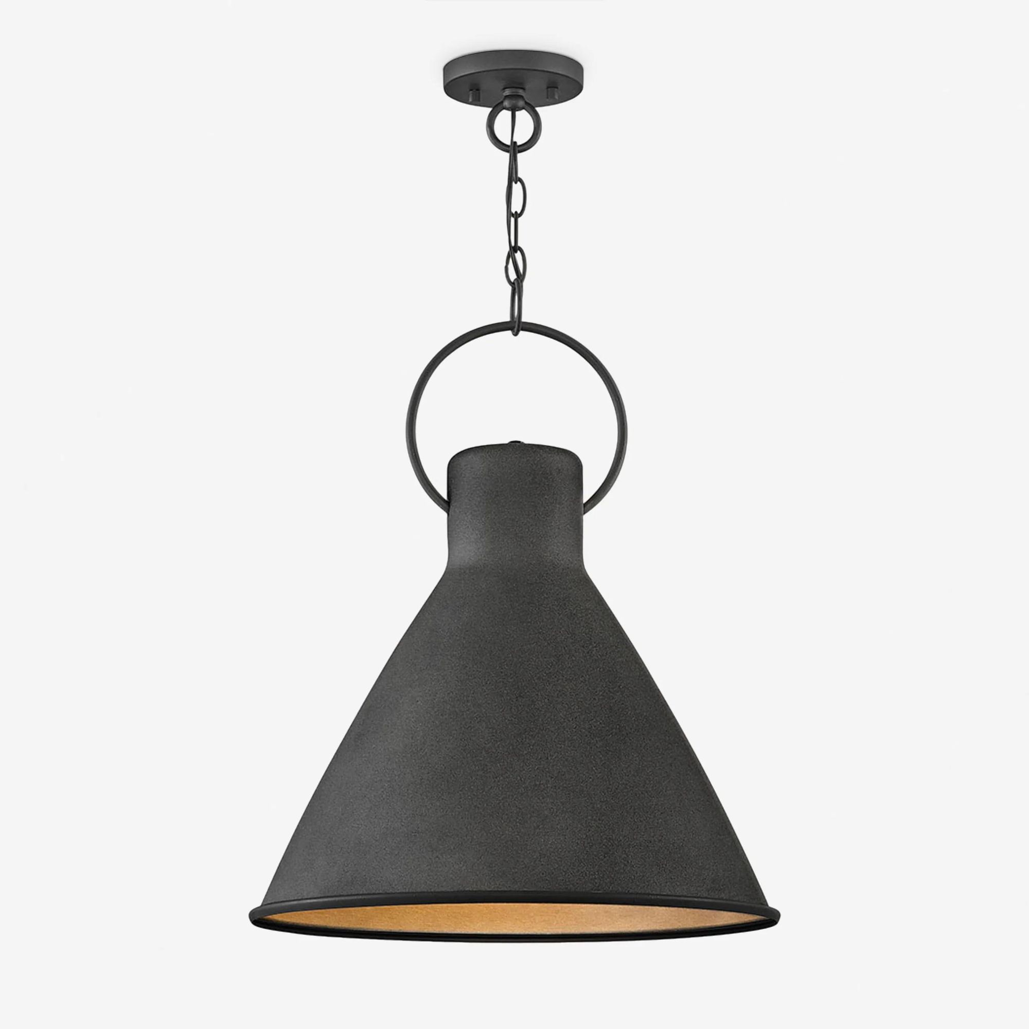
These brown leather barstools are so similar to the ones used in this kitchen project, and they're a super timeless design. They come in two heights, so you can choose one that fits with your kitchen island height.
The remodel of this lake cottage's kitchen proved contemporary schemes can still be filled with warmth and character. The blend of finishes gives the space an organic finish with modern luxuries – the perfect combination for an enduring kitchen design.
Sign up to the Homes & Gardens newsletter
Design expertise in your inbox – from inspiring decorating ideas and beautiful celebrity homes to practical gardening advice and shopping round-ups.

I’ve worked in the interiors magazine industry for the past five years and joined Homes & Gardens at the beginning of 2024 as the Kitchens & Bathrooms editor. While I love every part of interior design, kitchens and bathrooms are some of the most exciting to design, conceptualize, and write about. There are so many trends, materials, colors, and playful decor elements to explore and experiment with.
-
 Ina Garten's storage pantry is an insightful window into all of the best cookware used by the chef – and it's easy to recreate on your kitchen shelves from $48
The beautiful dishware in The Barefoot Contessa's Hamptons pantry showcases the tools she uses most often to cook – this is exactly how you replicate it
By Sophie Edwards Published
-
 Extend the lifespan of your appliance with 5 simple but crucial washing machine maintenance tips
From cleaning the filters to keeping the door open, experts reveal the washer tips they swear by
By Andy van Terheyden Published
