I don't like to copy designs, but these 4 beautiful kitchens are filled with inspiration you will want to recreate
These kitchens are sure to inspire a refresh – and it's the timeless style you've been searching for
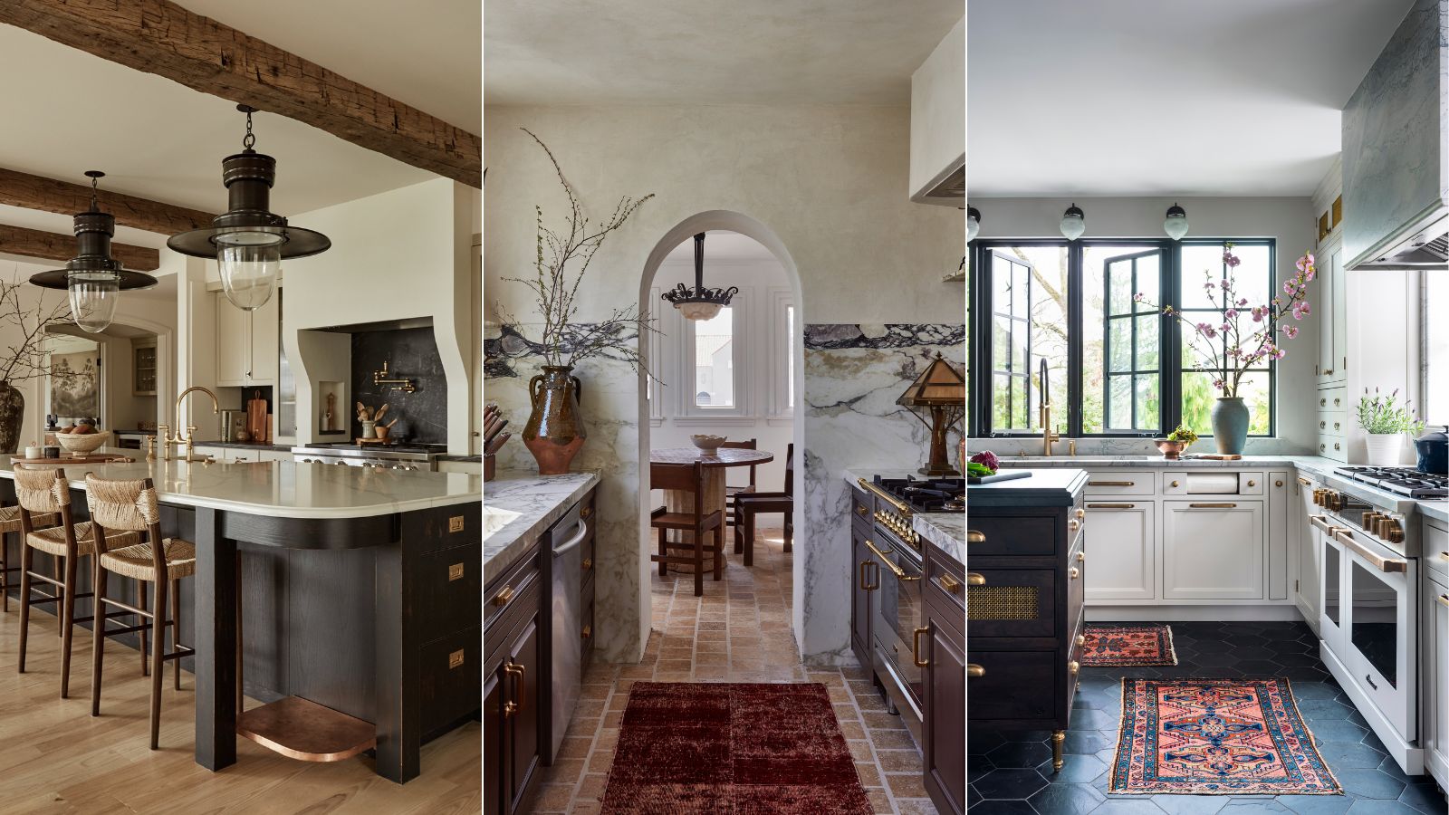

Designing a kitchen is never easy. Balancing function and style can be a tricky task, which is why we so often turn to spaces created by interior designers to gather some much-needed inspiration. And while we never advocate copying their kitchen designs, there are certainly lots of cues we can take from them.
If there's anything we can learn from interior designers' kitchen ideas, it's that long-lasting schemes are the anti-trend to embrace. But coming up with timeless kitchen design elements for your kitchen can sometimes feel impossible, especially if you don't have an experienced or expert eye.
Here at H&G, we're no strangers to beautiful kitchen designs – in fact, we see them everyday. But of all the enduring designs we've come across, we've found a few that you're probably going to want to recreate in your own home. We certainly do!
A 'refined, collected' kitchen by Becca Interiors
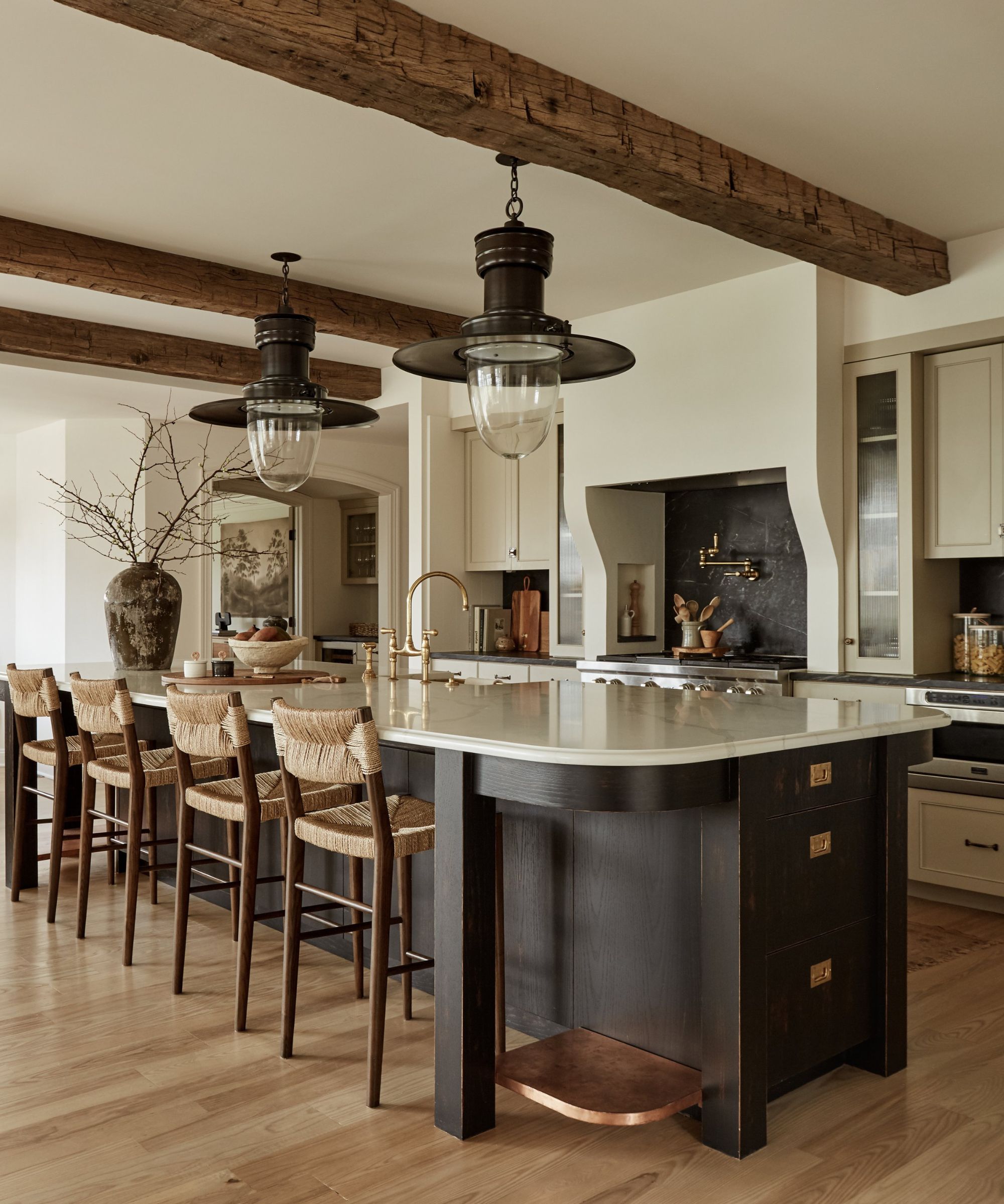
The kitchen in this Colonial home required a total renovation to create a tasteful and timeless heart of the home. Gutting the entire space allowed the designers to reimagine the space, introducing a warm neutral palette, a statement island, and feature details throughout.
'I would describe the style of this kitchen as refined, collected, and expansive,' says Becca Casey, owner and principal designer at Becca Interiors. The warm neutral cabinets offer a subtle contrast against the brighter white of the statement range hood, while a mix of Shaker cabinets and glass-fronted cabinet doors add enduring appeal to the space.
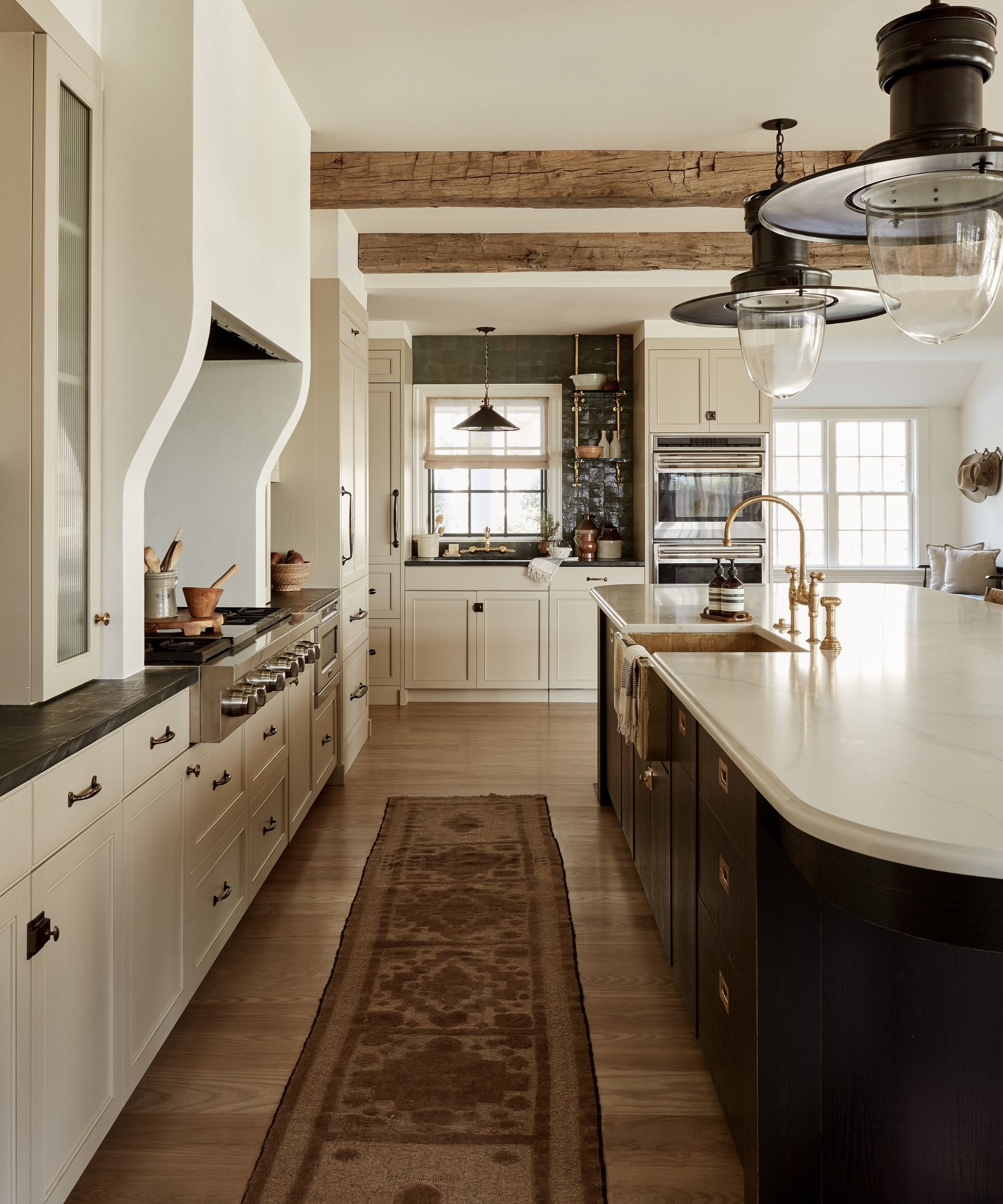
'We sought to connect the kitchen with the adjoining breakfast area and family room. With the kitchen acting like the true heart of the home, we intended to create a harmonious relationship between each space allowing you to flow freely from one room to another,' she explains.
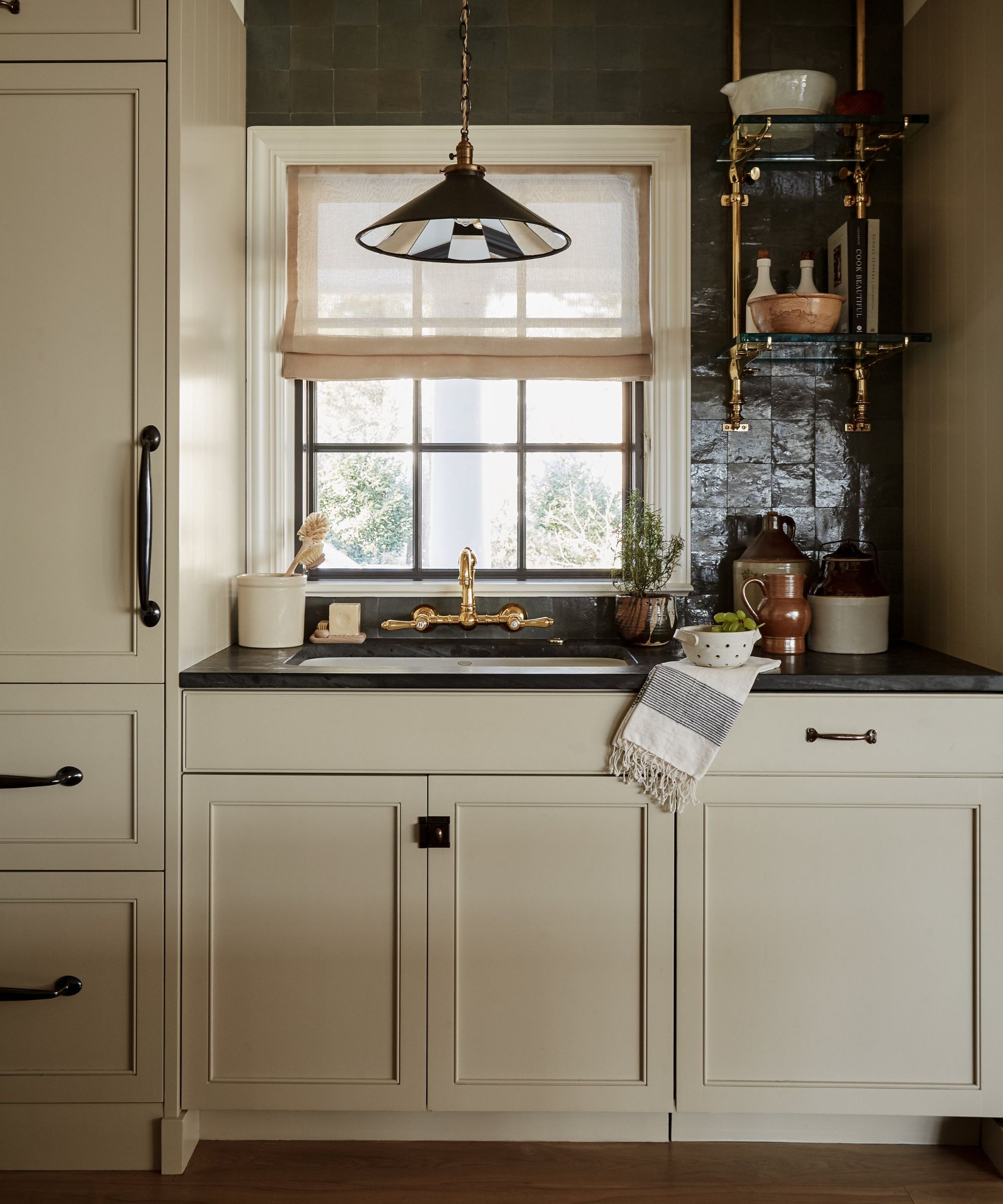
The curved profile of the kitchen island instantly adds a softer finish to the space, while hints of black throughout the different zones of the kitchen create a common thread, from the black hue used on the island's base, the lighting, and the tiles, while gold hardware adds a warmer finish to the scheme.
There are several standout features in the space, but for Becca, the center of the space has a true wow factor. 'The station lantern pendants are show-stopping, and the design of the island is uniquely grounding.'
To ensure the sink area feels cohesive with the rest of the design, a gold faucet has been chosen, and black tiles add depth and textural interest to the far wall. This area has also been utilized to display decor that is both aesthetic and functional, finishing off the scheme perfectly.
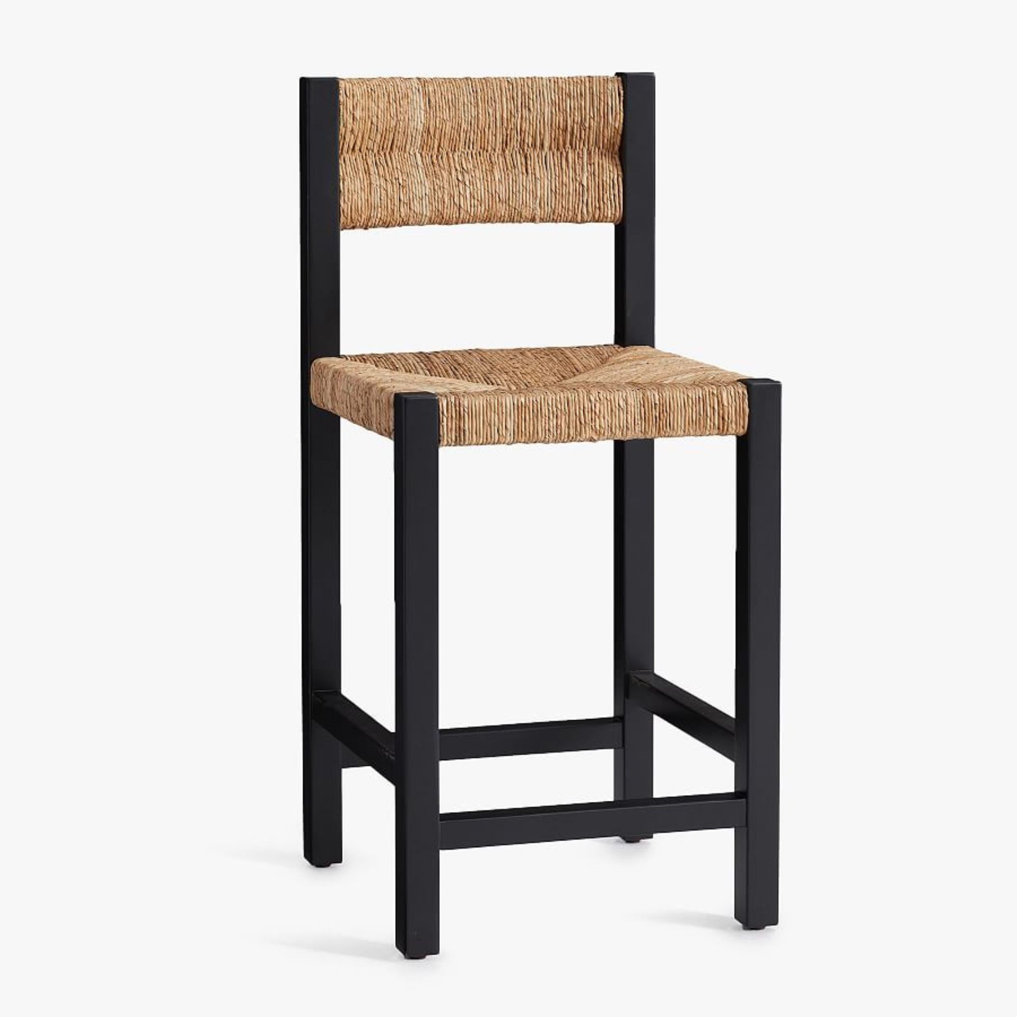
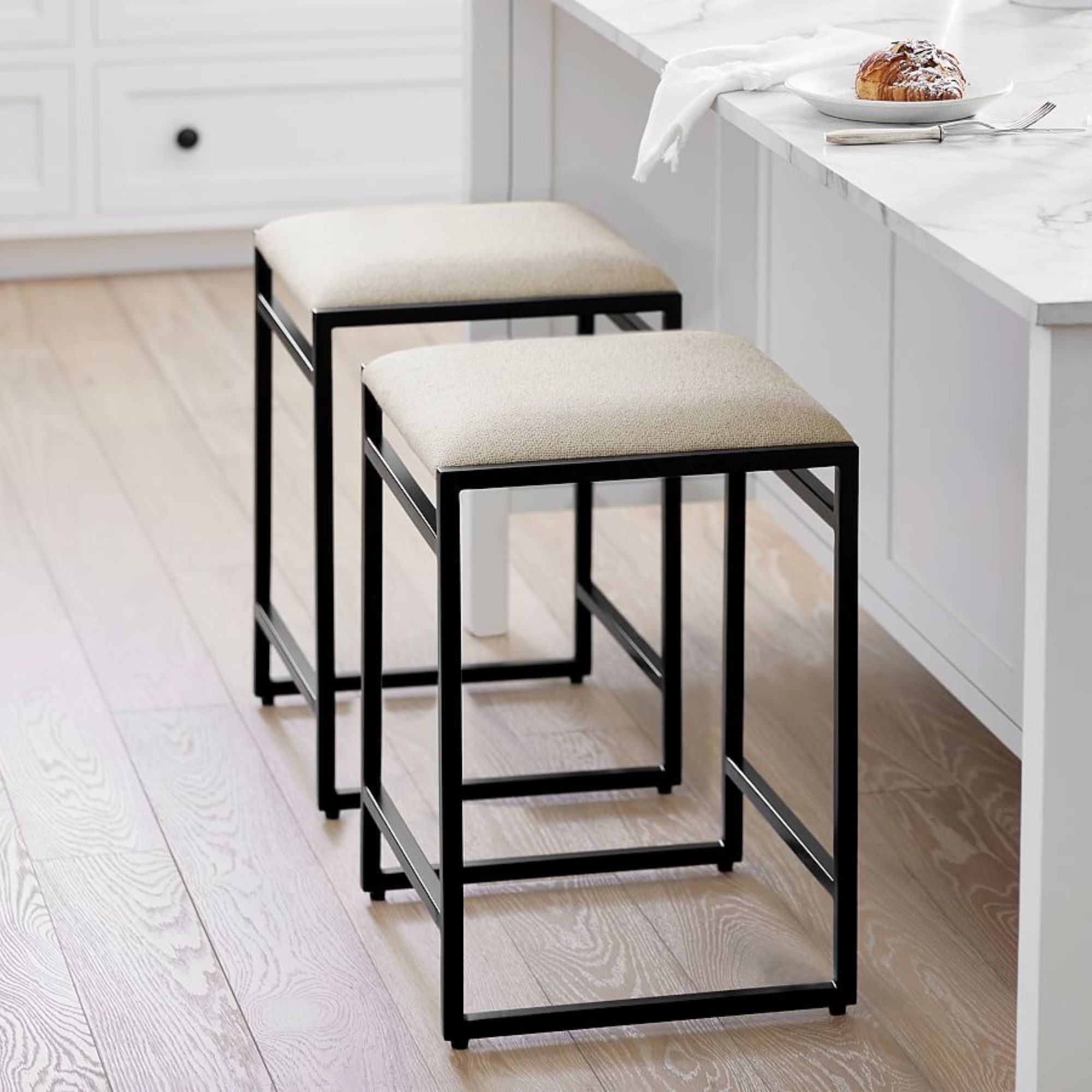
The striking contrast of this woven bar stool adds interest and a natural, organic element to every kitchen scheme.
Drew Michael Scott's Spanish Revival kitchen
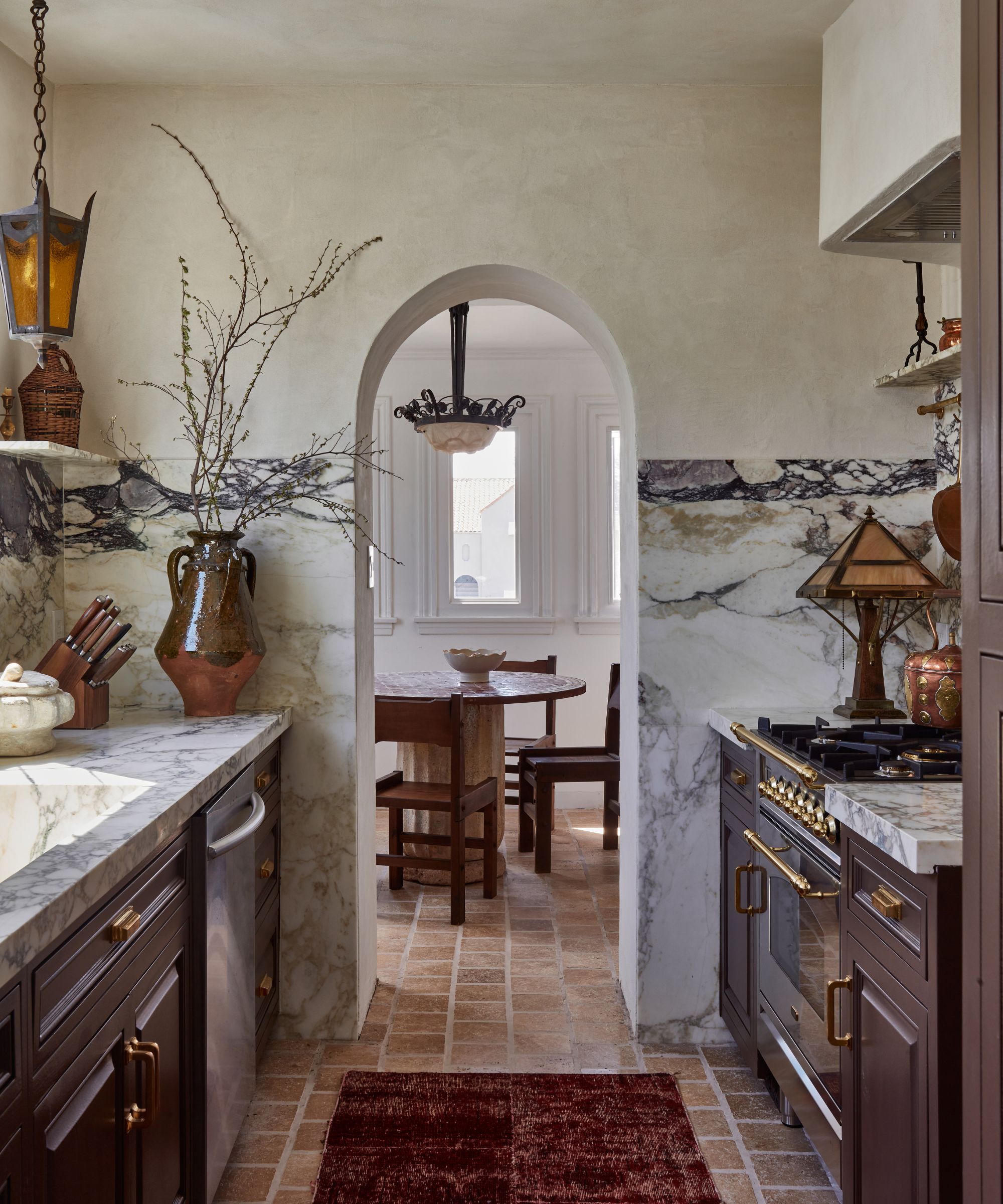
You don't need a sprawling kitchen to create a scheme that feels luxurious and elevated, and this kitchen is proof. With beautiful materials, timeless colors, and a curated yet lived-in style, it's a design with visual impact.
'My home is a 1920s Spanish revival, so I knew I wanted to carry that tone into the kitchen and infuse the space with that character and charm,' says Drew Michael Scott, a.k.a Lone Fox, of his design.
'I wanted to create an atmosphere that felt warm, lived-in, and accurate to the period of the home. I plastered the walls and ceiling to have a stone-like finish with Meoded's Tonachino Firenze and mixed metals throughout the space to create a more gothic-style Spanish feel,' he adds.
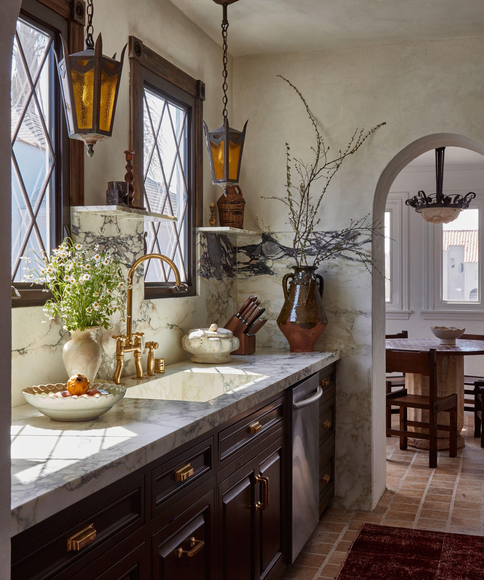
The kitchen has been expertly decorated with collected vintage and antique pieces, which has aided an authentic period feel to the scheme. One area in particular that infuses that historic charm is the finishes chosen.
'I love the two antique sconces and I knew copper (as seen on the dishwasher and cabinet pulls) would bring a lot of warmth to the kitchen. I love the juxtaposition of these materials against the marble countertops,' says Drew.
To bring in a moodier feel, typical of Spanish revival interiors, the color palette was key. While the walls have been kept a warm neutral hue, dark brown cabinetry has been chosen, which is one of this year's most coveted kitchen color trends.
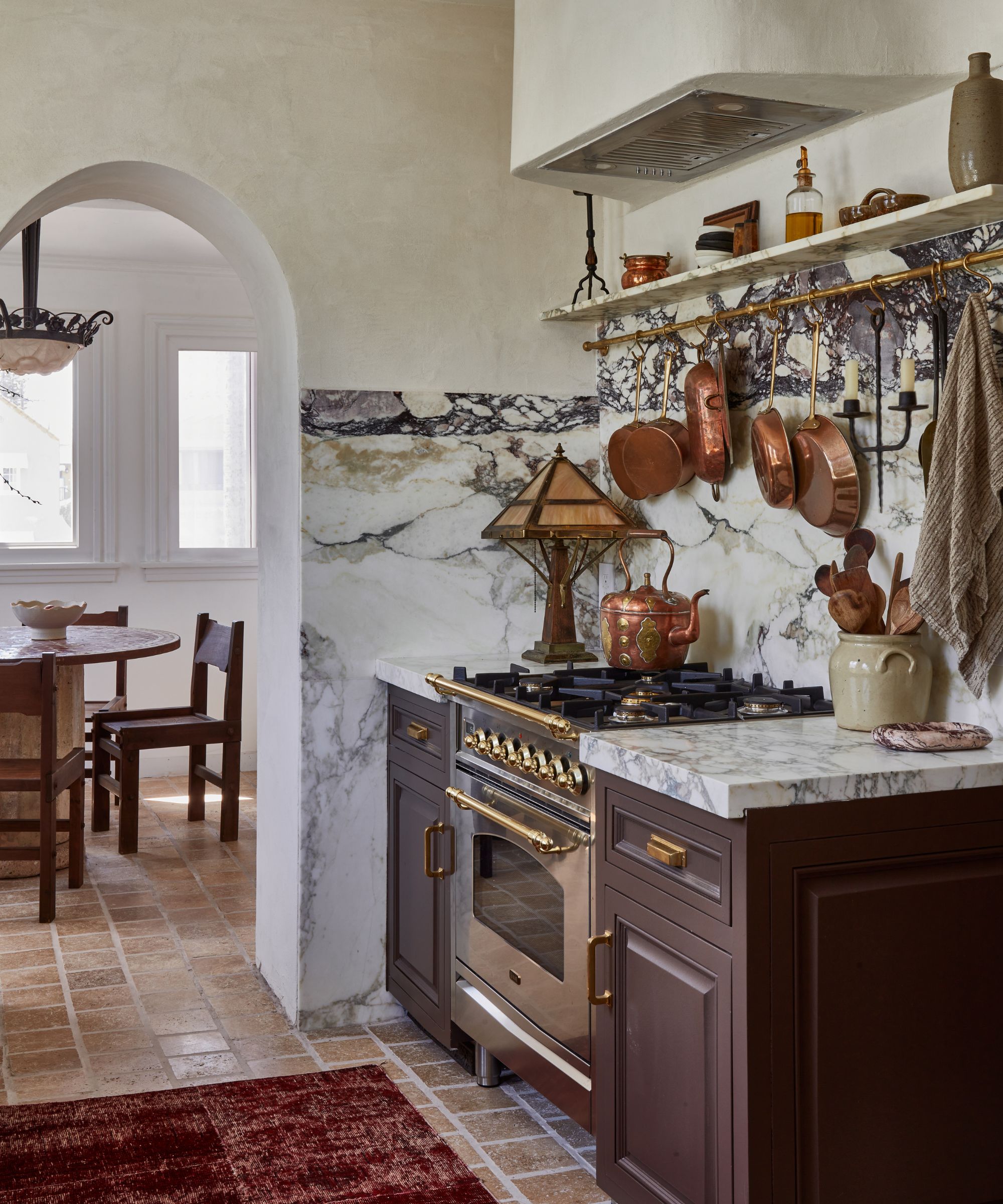
'There are a few features that really stand out to me. The cabinets were brand new so I decided to keep them, but paint them Benjamin Moore's Van Buren Brown, which felt unexpected,' he explains.
To keep the kitchen from feeling too dark, contrast has been added through the floor tiles and countertops – the latter becoming the focal point of the design. 'I wanted the countertops to be the main focal point, and I love the grain pattern in the Calacatta Monet slab.'
It was important that nothing in the kitchen felt too perfect or new, so Drew chose designs and finishes that had an aged, vintage feel, which is something he has achieved through not only the floor tiles but the decor too. 'I laid the Cle floor tiles in a traditional offset brick pattern with piped-in grouting to give a hand-done look, and I love the aged, authentic look they give off,' he adds.
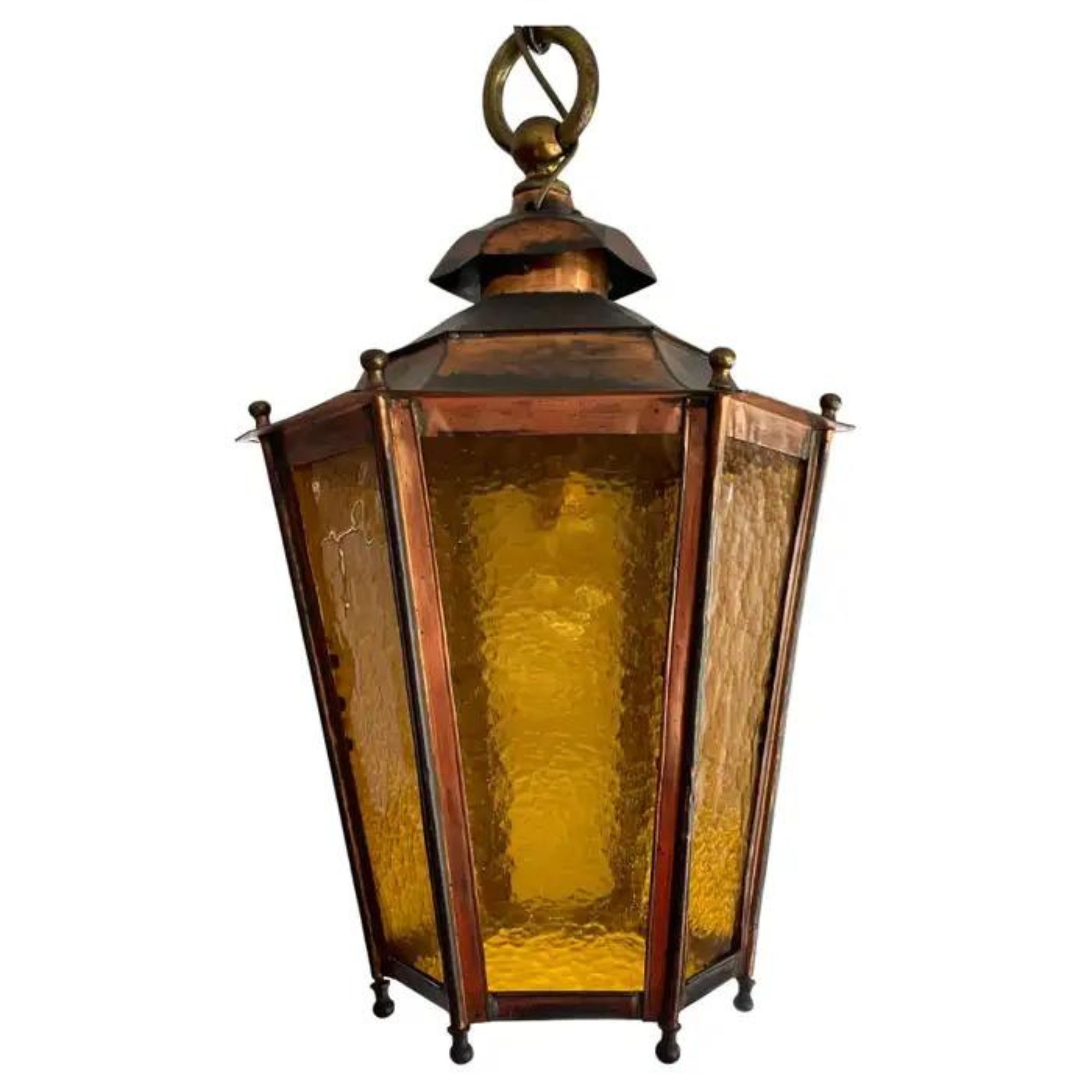
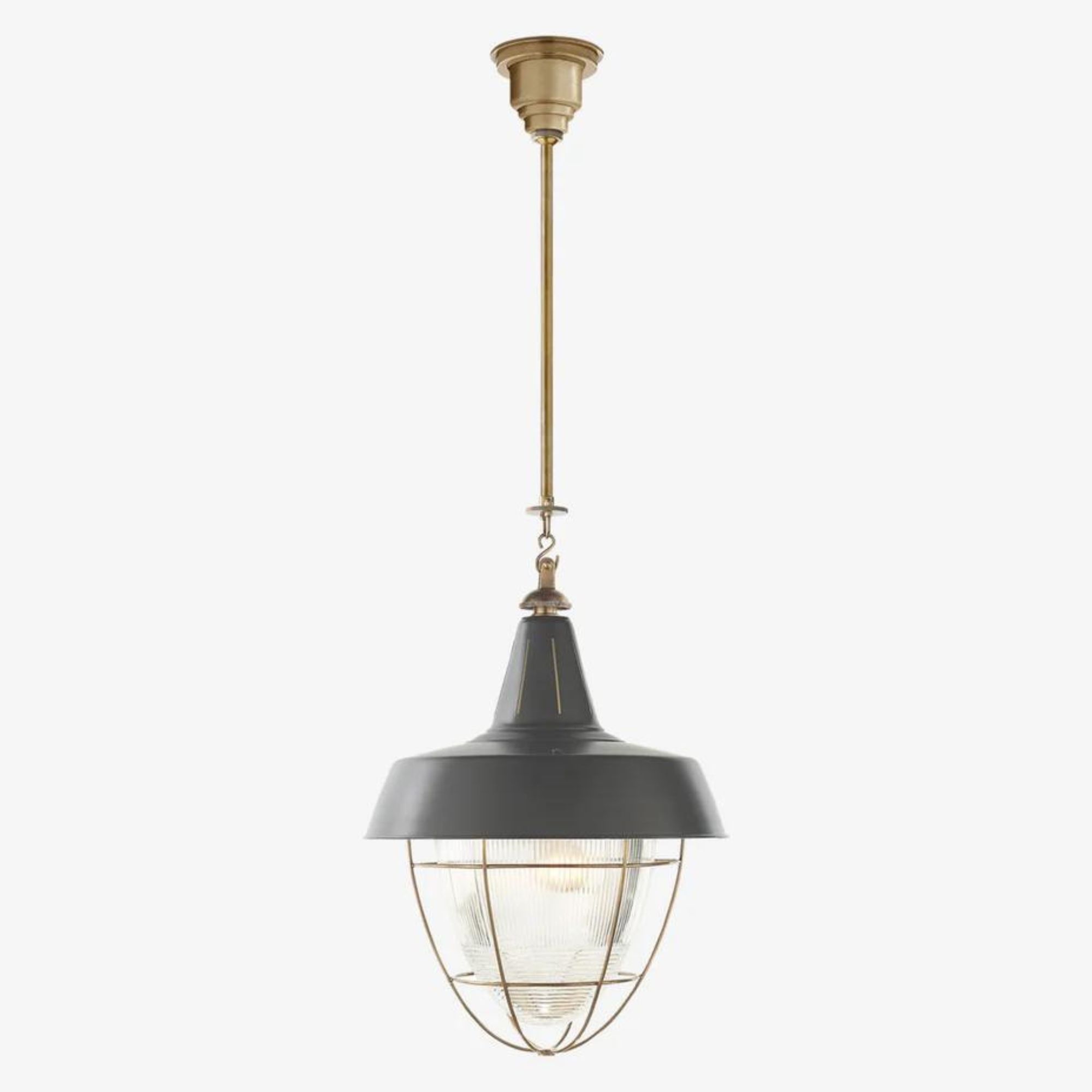
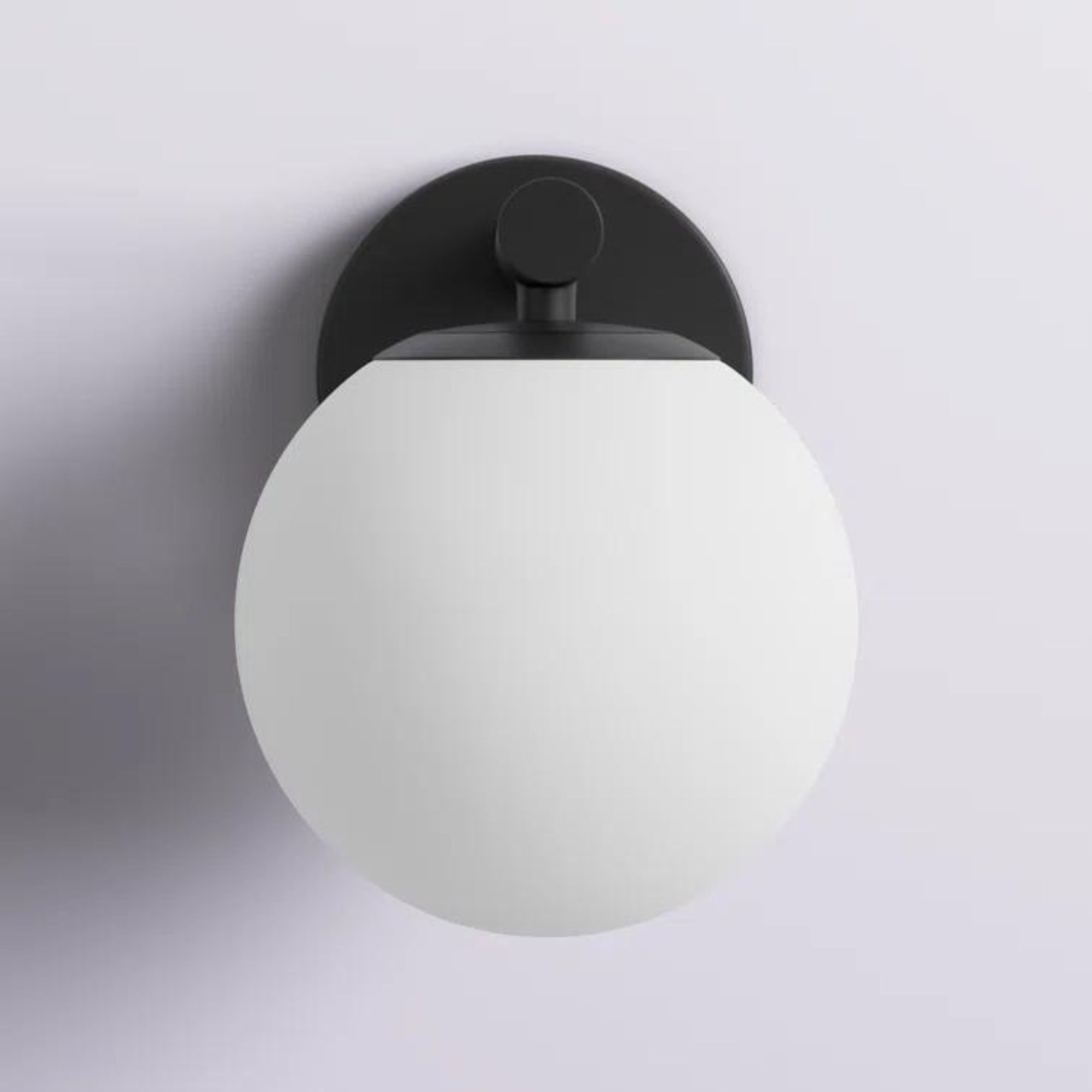
Antique lighting adds so much interest to kitchens. This lantern pendant is from the late 1800s and is in a style similar to Drew's.
A Tudor Revival kitchen by Studio Dearborn
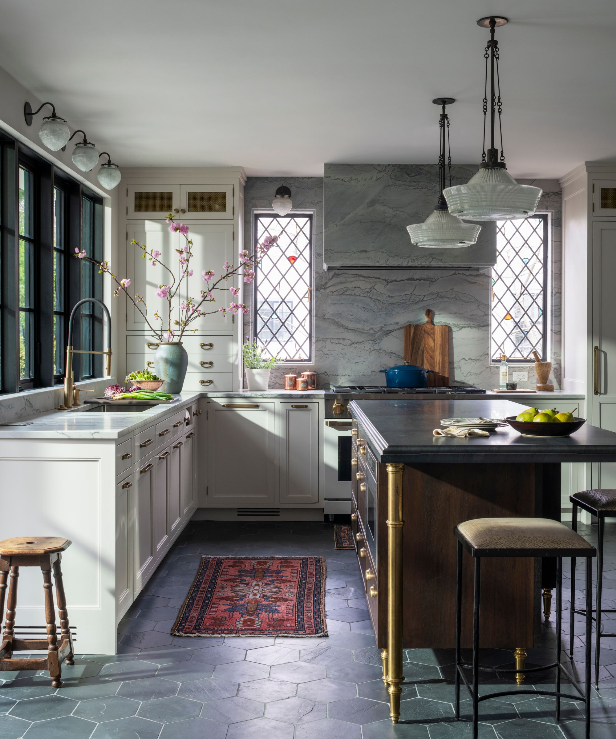
When you think of Tudor Revival properties, you likely picture dark interiors. But in this kitchen, which is at the heart of a 1920s home in the period style, a lighter take on the classic look has been achieved.
'We wanted the kitchen to stay true to the personality of the home, but much brighter than a typical Tudor room. We also wanted to inject some reflective surfaces such as the bright brass fixtures and mirrored backsplash, and have multiple displays of heirlooms,' says Sarah Robertson, founder and principal designer at Studio Dearborn.
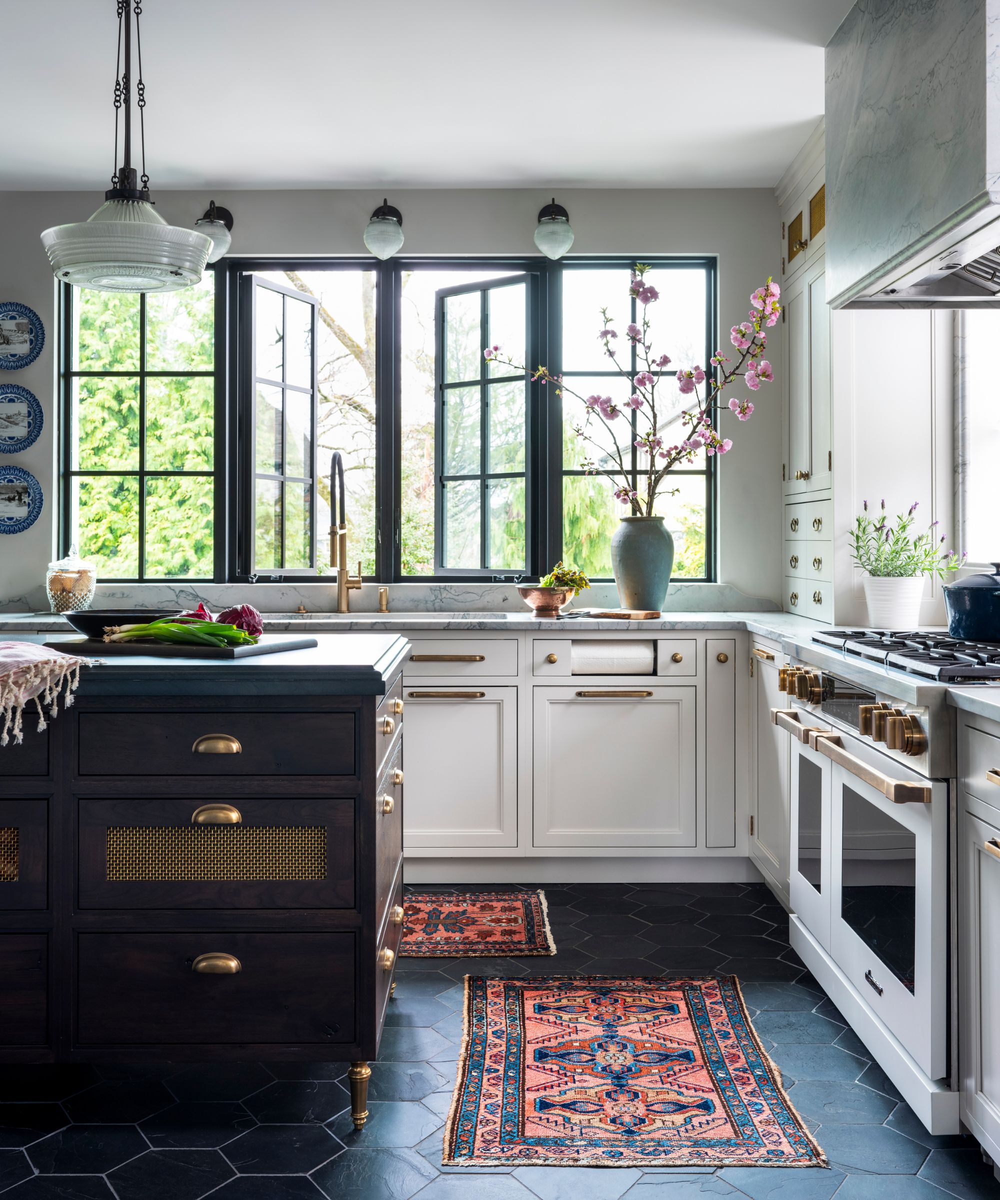
'We wanted to create a bright and airy atmosphere that felt comfortable holding cherished items that had been collected over generations and felt perfectly in tune with the home's substantial Tudor presence,' she explains.
White kitchen cabinets instantly brighten the overall look and feel of the scheme, while black hexagonal floor tiles nod back to the moody colors typical of a Tudor home. But it's the windows that truly pay homage to the property's heritage.
'We loved the process of designing two new leaded glass windows for the kitchen, which perfectly matched the other original leaded glass in the home,' says Sarah. Not only do they tie the kitchen in with the rest of the home, but they create an authentic feel to the kitchen that has a more unexpected design.
To reintroduce darker hues, a bolder approach was taken on the island, creating a beautiful contrast with the white cabinets. 'We also spent a lot of time designing the island, which is elevated slightly to create a feeling of lightness, and has brass legs we custom-designed, that reflect all that sunshine,' says Sarah.
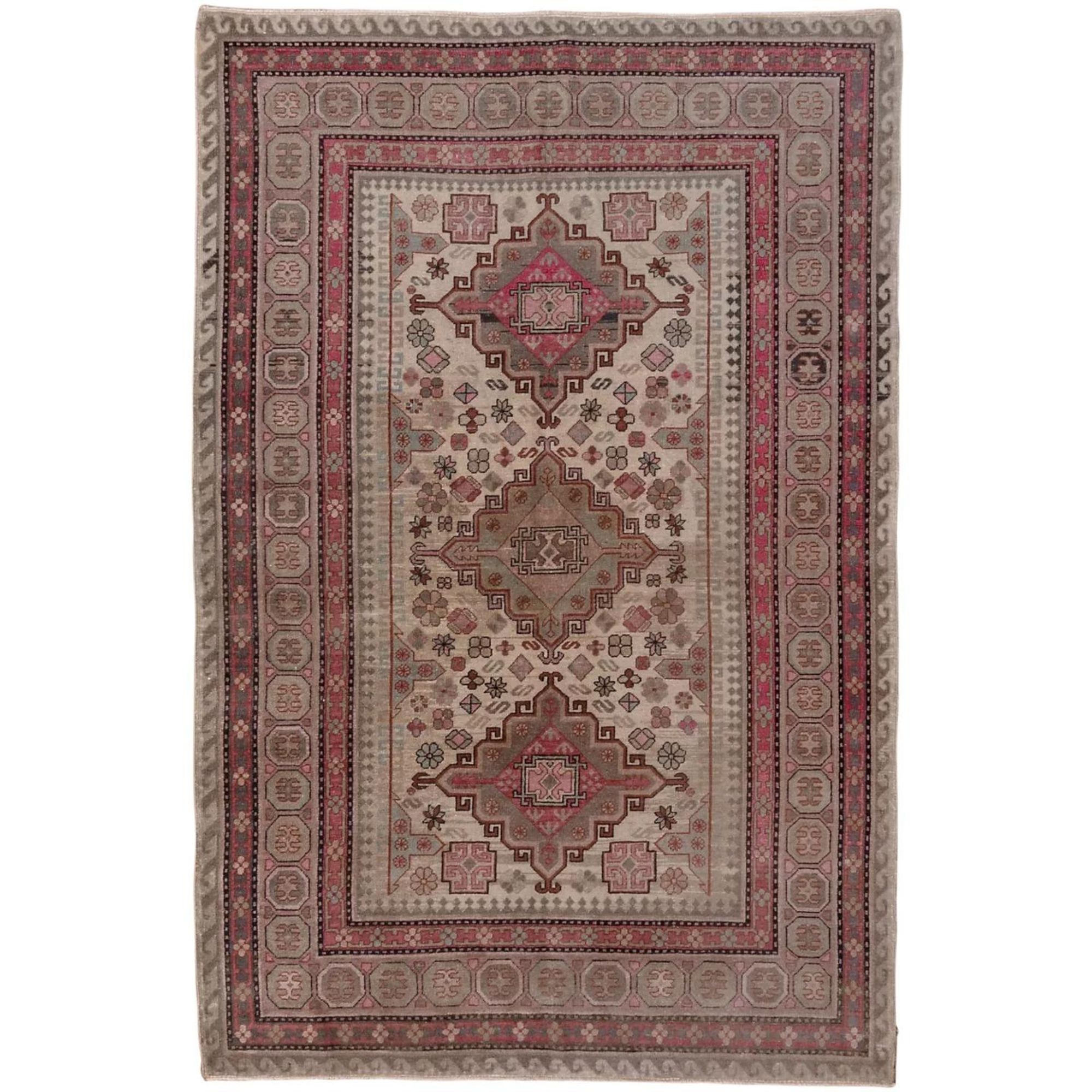
It's the decorative details in the kitchen that give it a cozy, lived-in feel to balance the elevated, elegant design. Colorful runners on the floor infuse warmer hues to the space, vases of seasonal branches bring the outside in, and black light fixtures tie in with the window details.
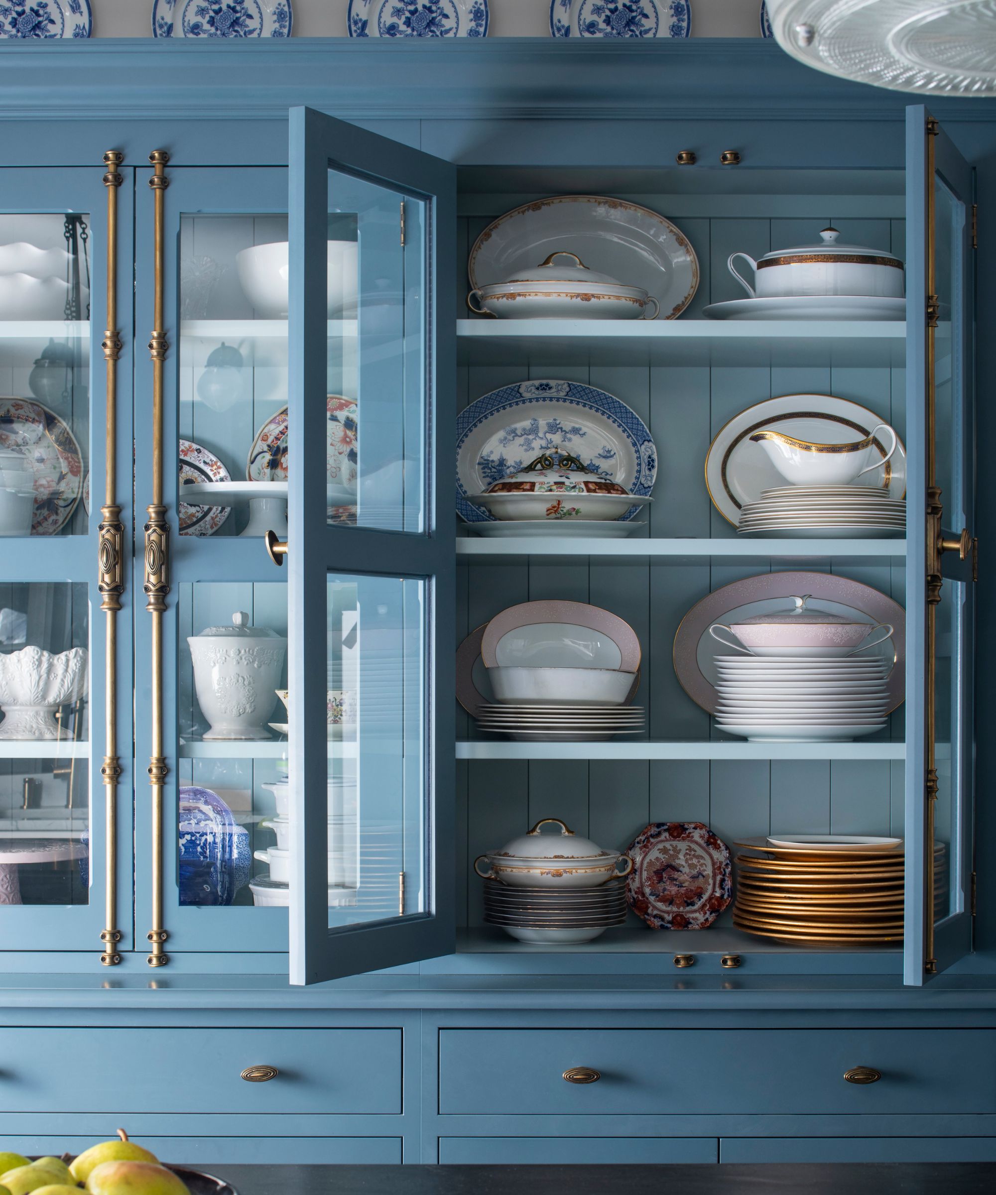
'But my favorite element has to be the china hutch, where the client keeps all her heirloom china on display. I could stare at that cabinet all day long,' Sarah adds. As well as the hutch filled with china, throughout the kitchen, blue and white plates have been displayed on the walls, creating a truly cohesive and striking kitchen design.

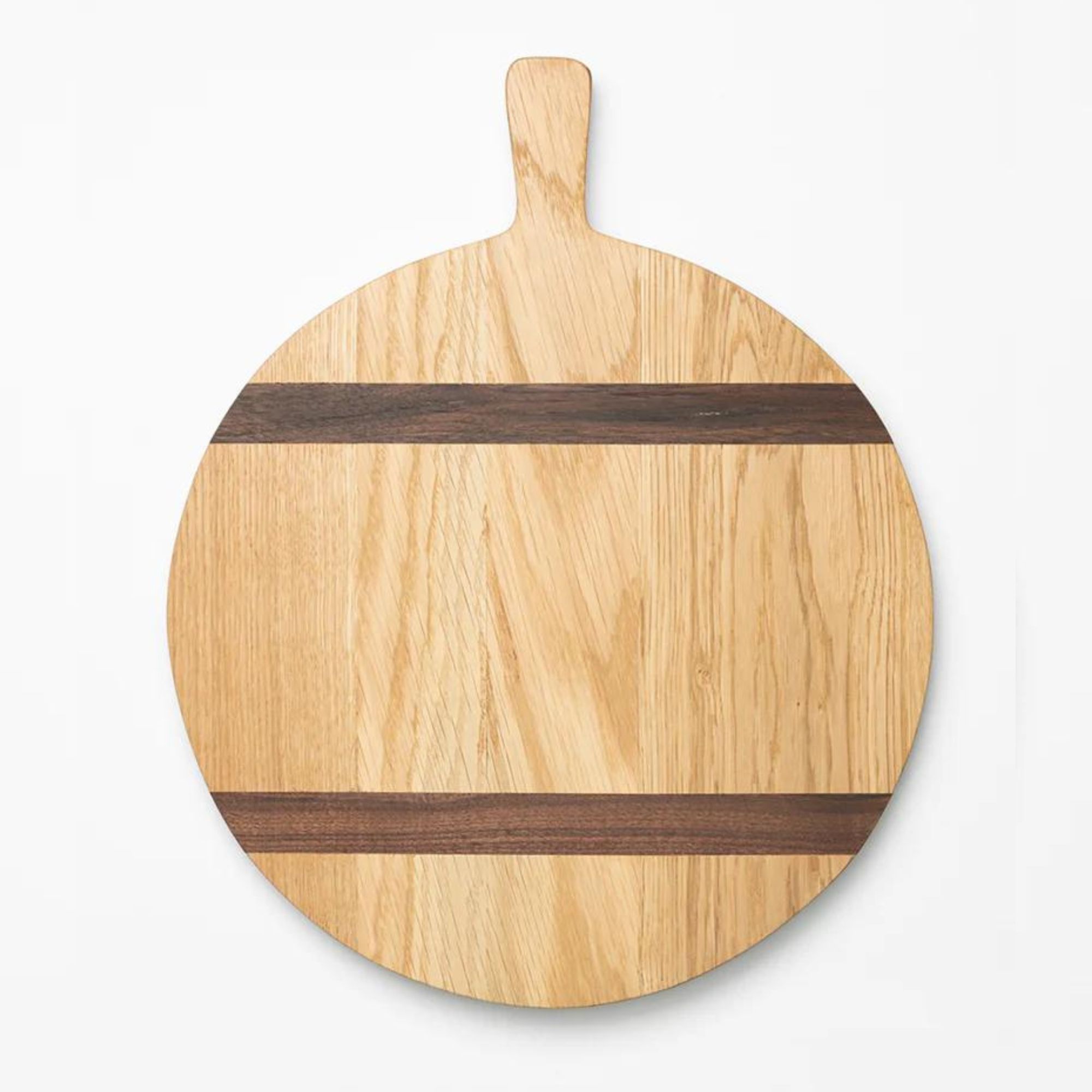
Fresh flowers aren't for everyone. These statement branches are a beautiful alternative to display in a vase.
A Georgian-inspired kitchen by Marie Flanigan
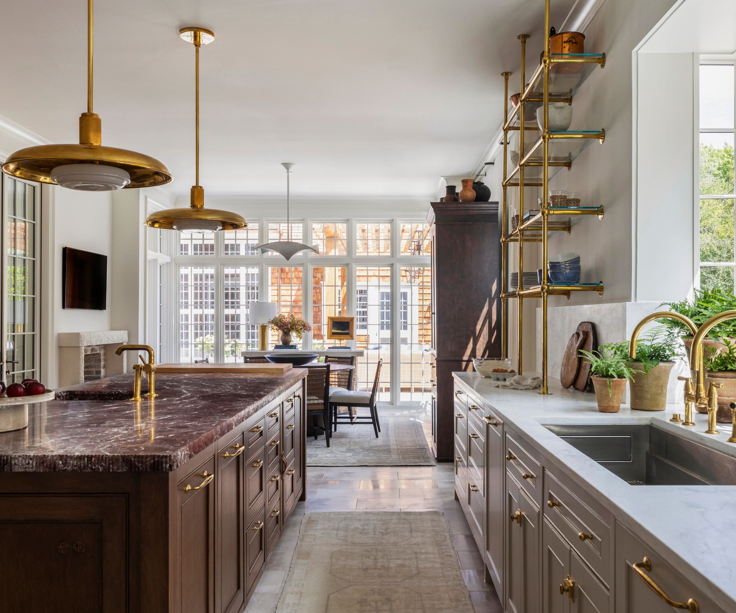
Over the past year, kitchen trends have embraced an old-meets-new look, and this kitchen perfectly blends traditional style with more modern features. 'For this project, the residence isn't historic, but the original architect infused it with classic Georgian elements,' says interior designer Marie Flanigan, who designed the space.
Natural light was a key factor during the redesign. 'The homeowners prioritized creating a space that feels both open and inviting. With abundant natural light flooding the room, we carefully chose a paint color that would look beautiful throughout the day,' she explains.
'We also incorporated natural elements that harmonize with the stunning picture windows in the breakfast nook and near the sink, enhancing the connection between indoors and out.'
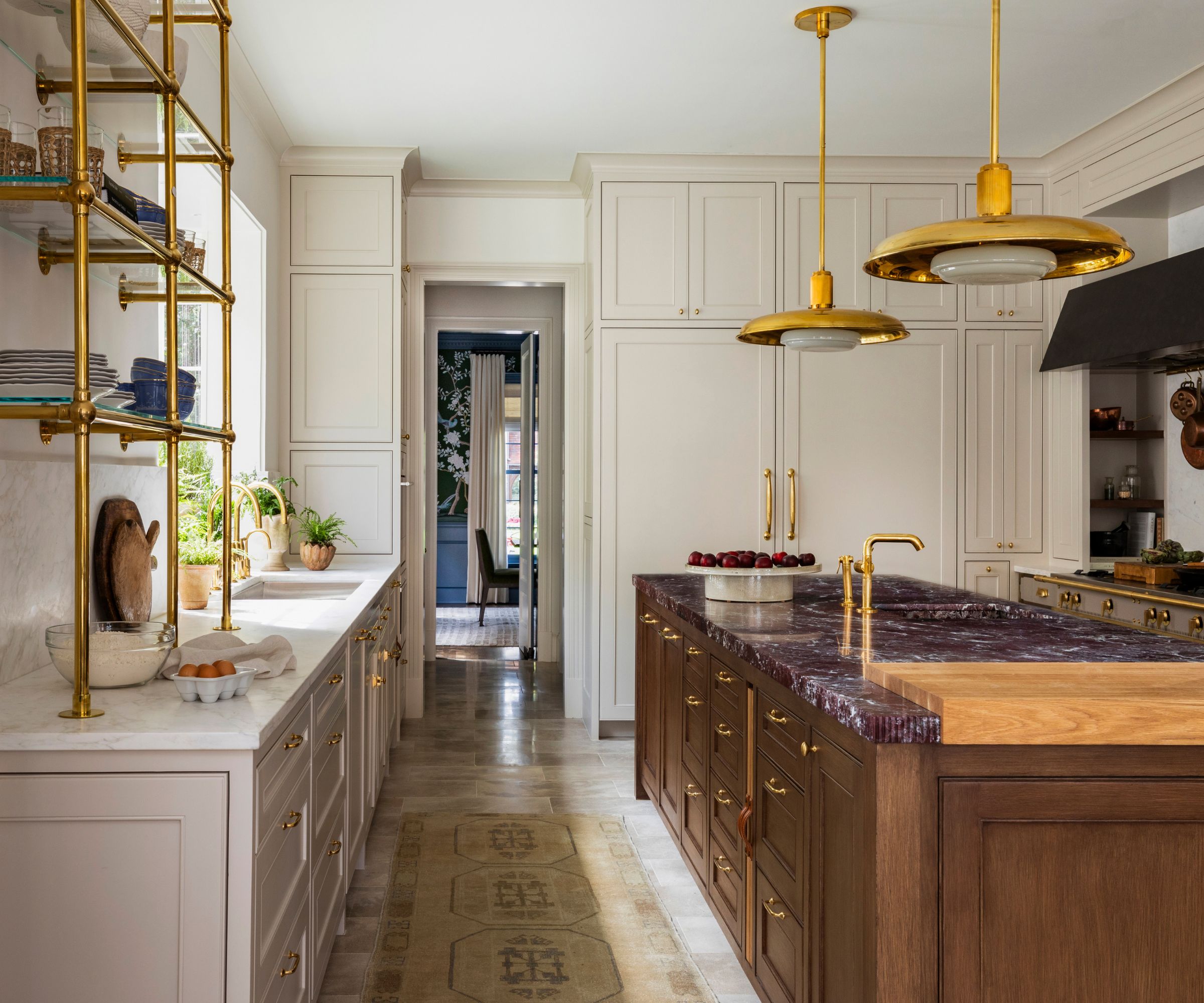
The result is a beautiful, timeless scheme, but it was just as important to create a functional space for the family's ever-evolving needs. 'We reimagined the kitchen to maximize counter space and storage while ensuring it felt timeless for a busy family of four,' says Marie.
'Our goal was to honor the architecture while adding a touch of Southern flair to make it less traditional. The result is a space that feels both authentic to its Dallas roots and beautifully functional,' she explains.
A blend of statement features, elevated finishes, and subtle contrasts make the kitchen feel unique. And it's the dark kitchen island that catches your eye as you walk into the room.
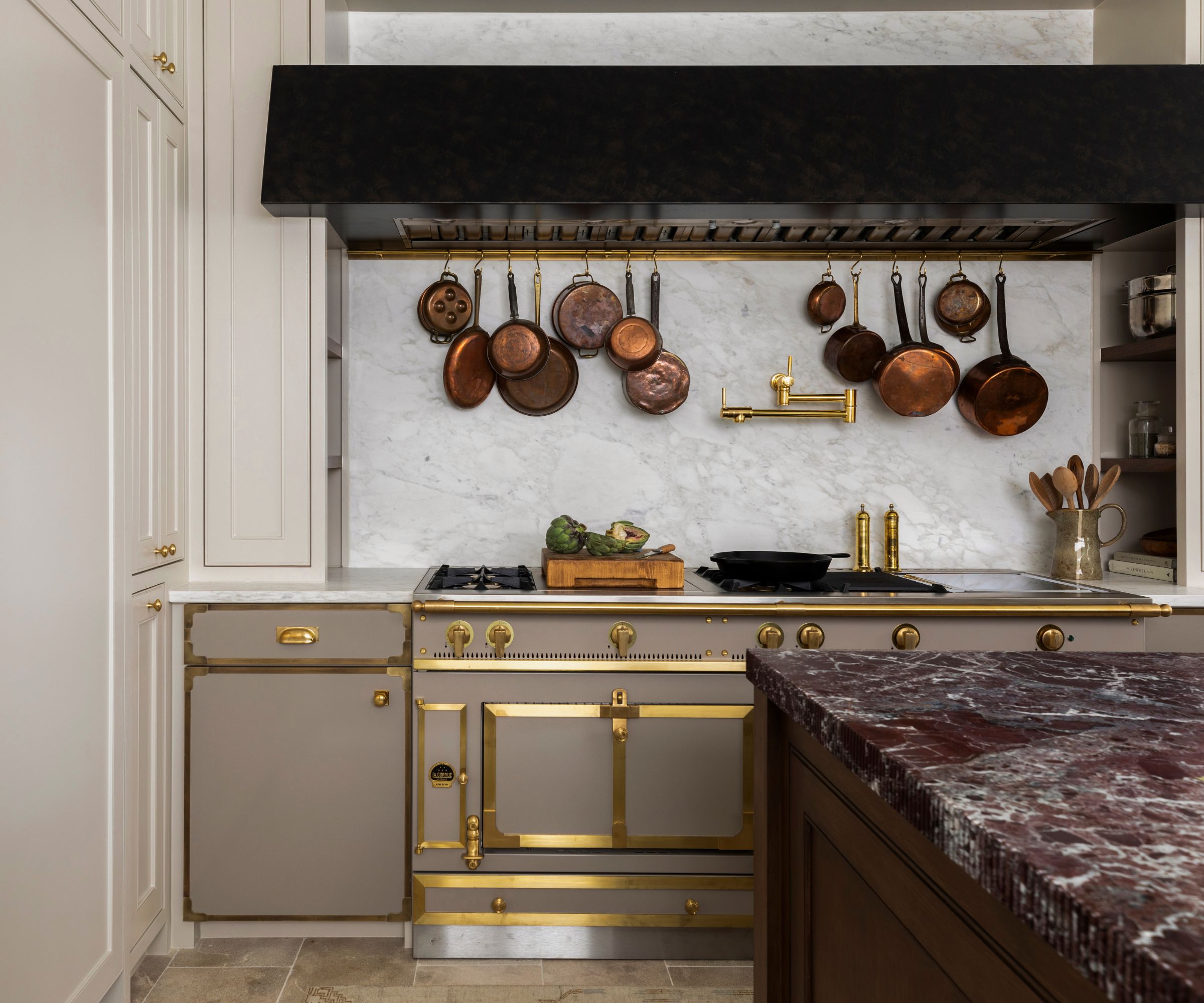
'The oversized island, featuring a stunning Rosso Levanto marble with a polished finish and fluted edge, adds a bold, unexpected detail to the kitchen. The wood, stained rather than painted, brings depth and warmth to the predominantly light space, creating a dynamic contrast.'
The carefully considered finishes tie the scheme together. From the shelving to the lighting to the kitchen hardware, brass carries a common theme throughout the space. 'Brass hardware further enhances the richness of the wood, while a strategically placed sink near the range adds functionality to this beautifully designed centerpiece,' says Marie.
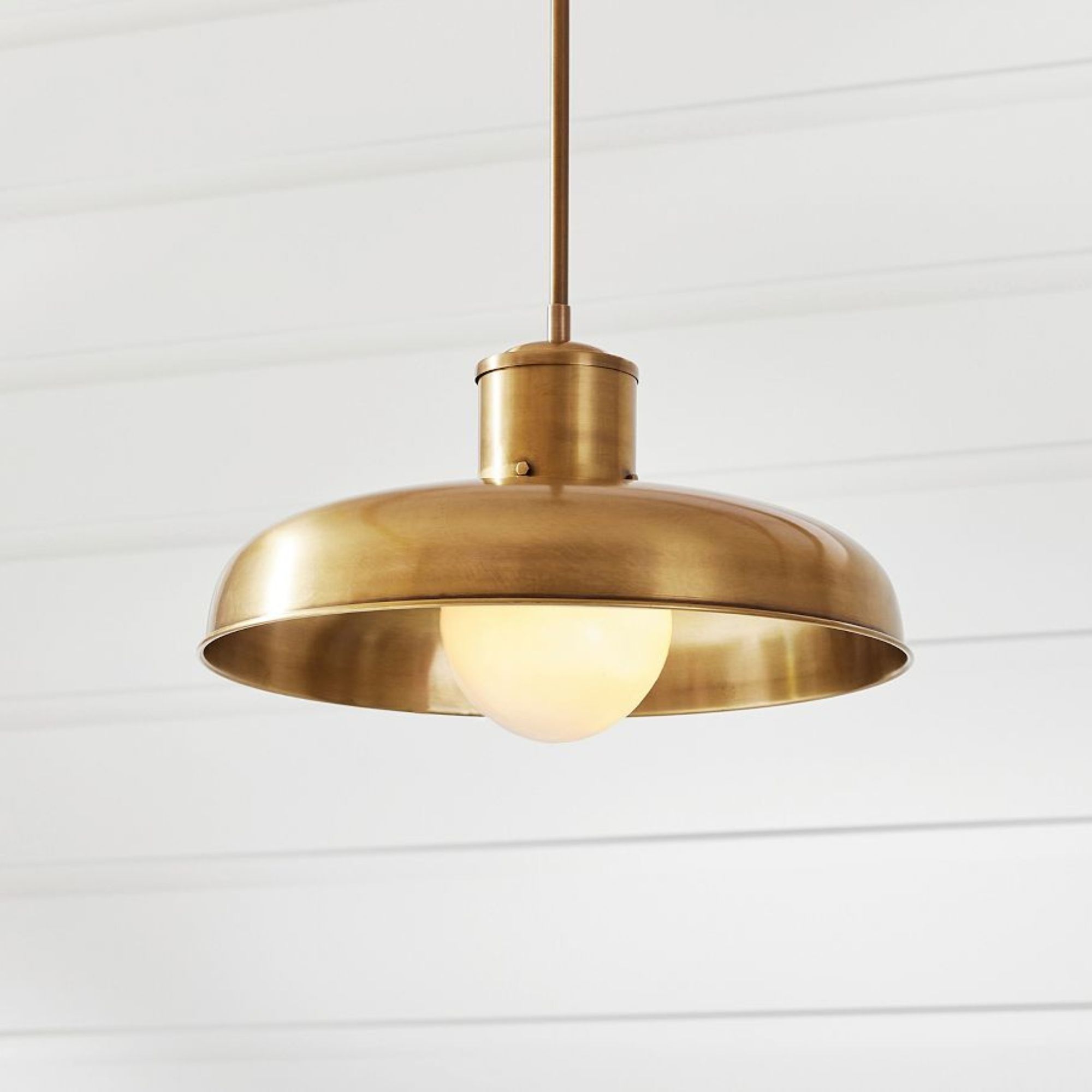
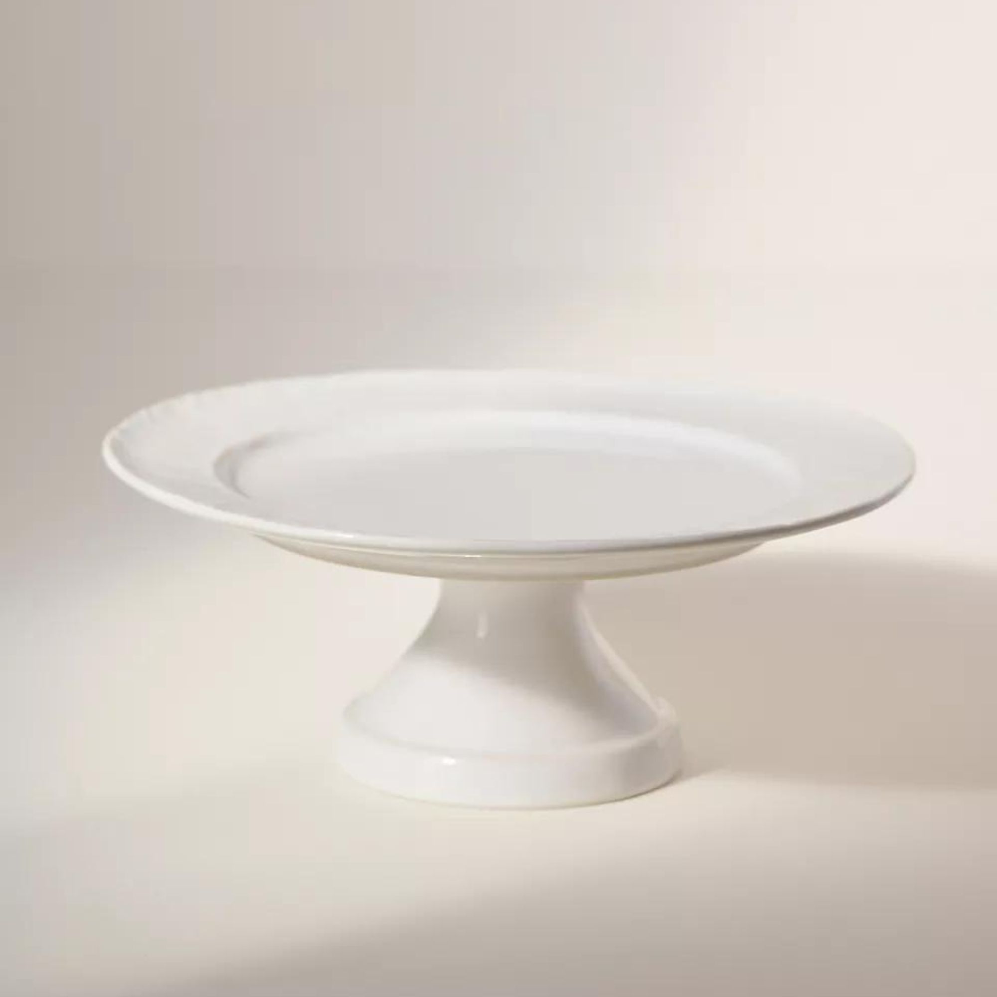
Bass is the finish of choice in the kitchen by Marie Flanigan Interiors. This pendant light is perfect for hanging above an island.
All of these spaces have one thing in common – they're truly timeless with their own unique appeal. So, whether you're obsessed with marble countertops or needed ideas for balancing light and dark, each of these spaces have something we're dying to recreate!
Sign up to the Homes & Gardens newsletter
Design expertise in your inbox – from inspiring decorating ideas and beautiful celebrity homes to practical gardening advice and shopping round-ups.

I’ve worked in the interiors magazine industry for the past five years and joined Homes & Gardens at the beginning of 2024 as the Kitchens & Bathrooms editor. While I love every part of interior design, kitchens and bathrooms are some of the most exciting to design, conceptualize, and write about. There are so many trends, materials, colors, and playful decor elements to explore and experiment with.
-
 Everyone is obsessed with vintage tiles right now – bring the nostalgic charm of this classic design feature into your home with our 5 design ideas
Honor the past with our favorite ways to decorate with vintage tiles, as suggested by interior design experts
By Eleanor Richardson Published
-
 'It's a fast reset button' – using the 1, 2 ,3 ,4, 5 decluttering method cleared my persistent mess in seconds
It's easy, effective and so quick to do
By Ottilie Blackhall Published
