The design secrets of this kitchen include a glow-in-the-dark island
The ingenuity doesn't stop there: this kitchen has 7 stand-out features
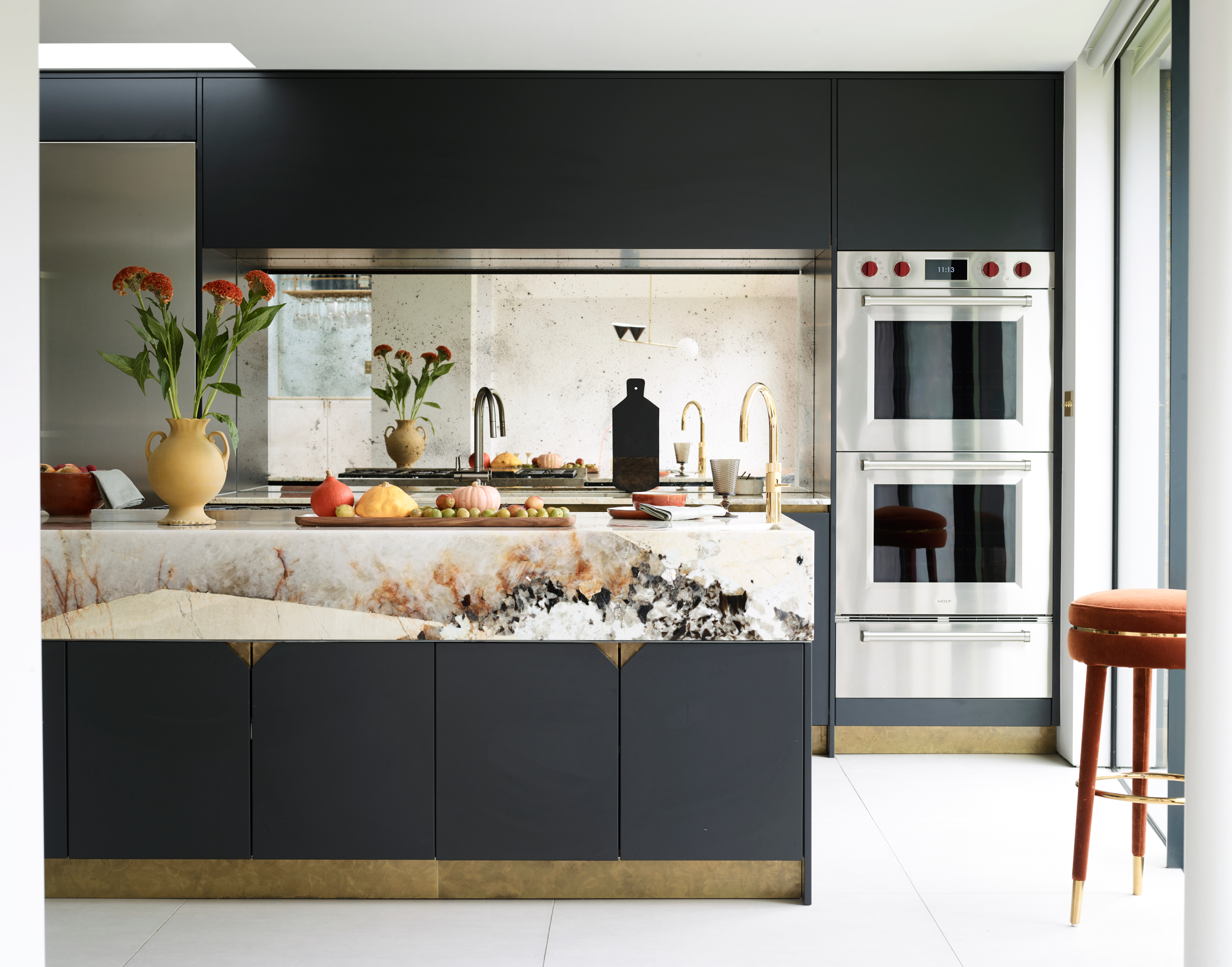

Aesthetically, this kitchen is simply beautiful. However, it hides some intriguing, unique design features that will surprise you, and which we reveal below. It has also been designed to be more than just the perfect family kitchen – there is a home bar just for adults and a ton of hidden storage to keep this busy room uncluttered-looking.
We asked the designer about the kitchen ideas she focussed on for this project – and she reveals how to recreate them in your own home.
'The clients wanted a unique and beautiful kitchen that would work for them as a family; a kitchen that would be hardy, and would work for both grown-up and family time. This is the client’s forever home, so we had to think about the kids growing up, and the family evolving,' says Alice Hood, Senior Designer at Roundhouse.
'The large range top, large ovens and warming drawer are key; also essential are the large refrigerator and freezer as the family often eat at different times of the day due to busy schedules, and the keen cooks of the family require plenty of storage for an assortment of ingredients when hosting dinners with friends and family.
'The large island and expansive dining area are great for hosting. A separate utility/back kitchen area is located to the left of the kitchen, which also serves as a private area for dumping dirty dishes and glasses out of site when entertaining, and stores newly washed sports kits and sports bags, keeping clutter out of main hallway so that entrance way is not filled with laundry, coats and bags.
'The kitchen has lots of concealed storage so the area can be cleared quickly and always look tidy. There’s nothing on display that can look messy. A large larder houses the coffee machine and toaster to avoid clutter. This also works to separate breakfast activities from the main cooking.
'The layout of the kitchen defines clear cooking/social/and washing up zones to accommodate for the entire family.
1. Make your kitchen island glow for evenings
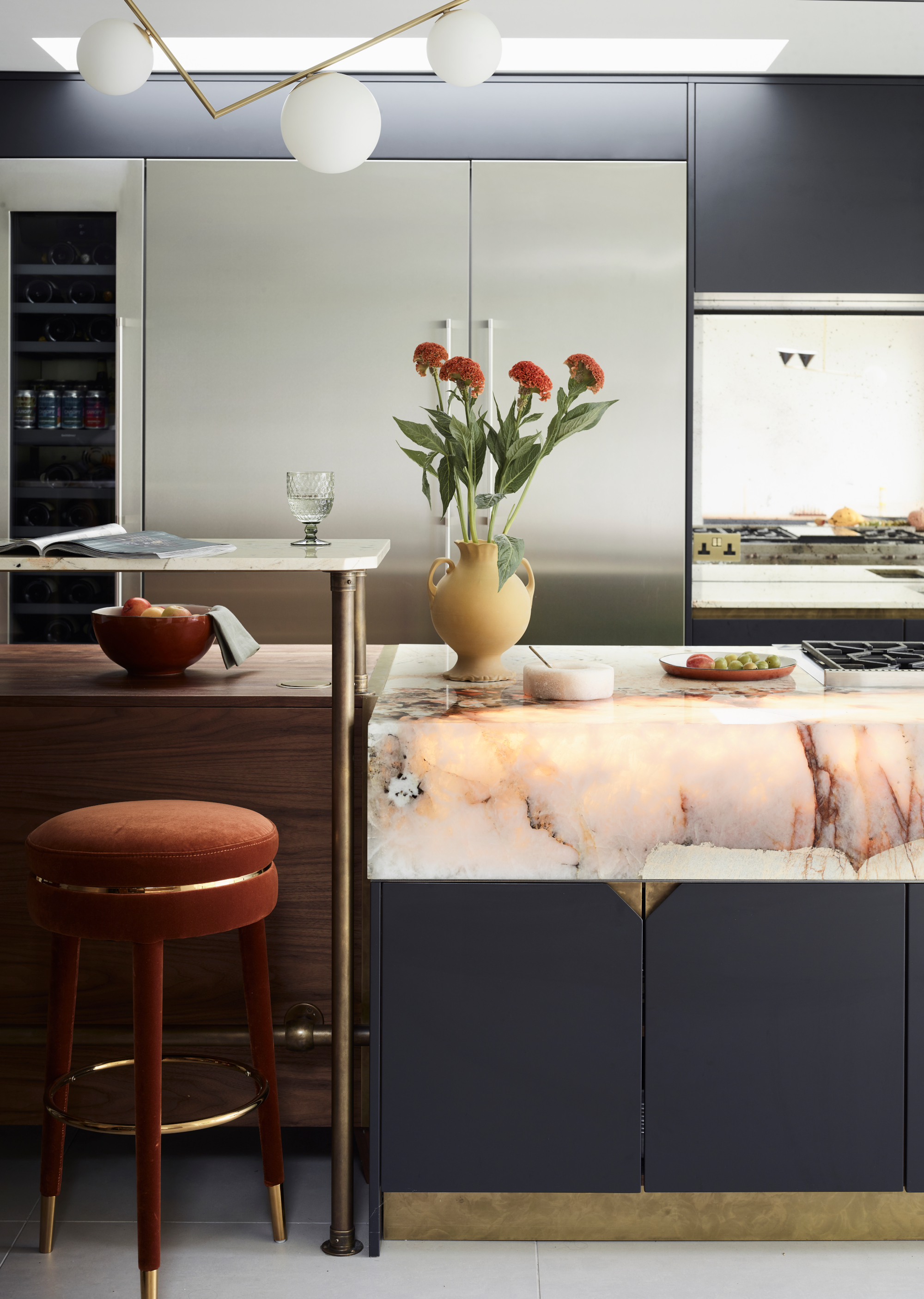
If you are looking to center your kitchen's design around kitchen island ideas, this one has a fascinating feature: a countertop that glows in the dark.
'The client wanted the island to glow. This was a first for Roundhouse, and it proved to be very technical. We specifically designed an internal lighting system for the countertop to create a striking glow within the natural stone. To do this we used Perspex carcass sections so that carcass lines wouldn’t show through the stone, and this fun element is certainly few of its kind.'

2. Use a raised breakfast bar to zone a kitchen island
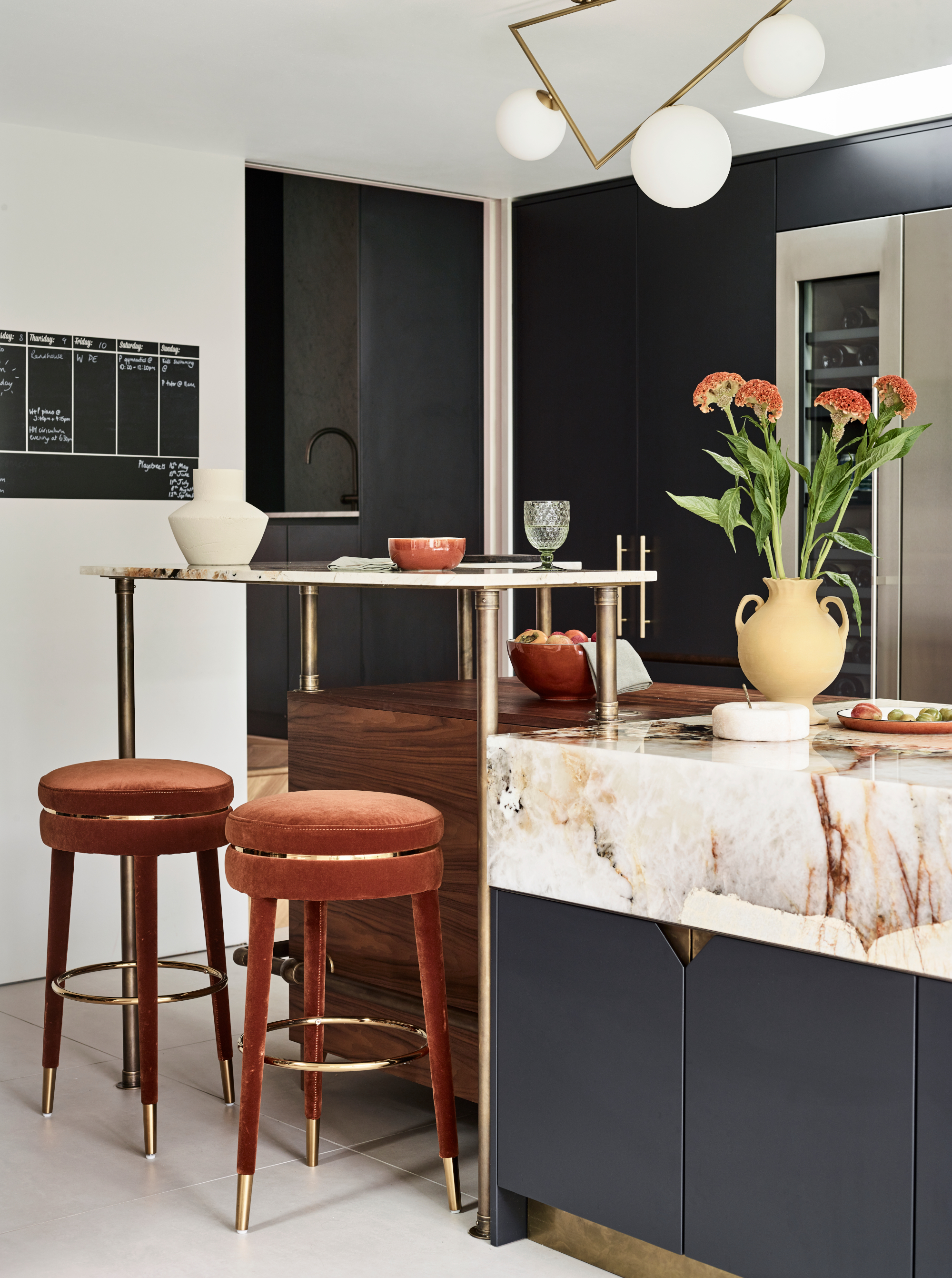
Kitchen countertop ideas don't stop at the lit material at the cooking end of the space; a material change, to a rich wood, was worked into the design, and a space-efficient breakfast bar for the kids to sit at – or adults when the family are socializing.
'We designed the kitchen, bearing in mind the active lives of the children, and so that the social area is located away from the cooking zone for safety, allowing for a space at the island for breakfast whilst parents prepare and pack up lunches, for example.
'As the size of the island exceeds the stone slab size, and joins can look undesirable, we changed the material and height at the seating end of the island to create a design feature with brass legs and detailing for eye-catching focal point.'
3. Use awkward spaces for bespoke storage
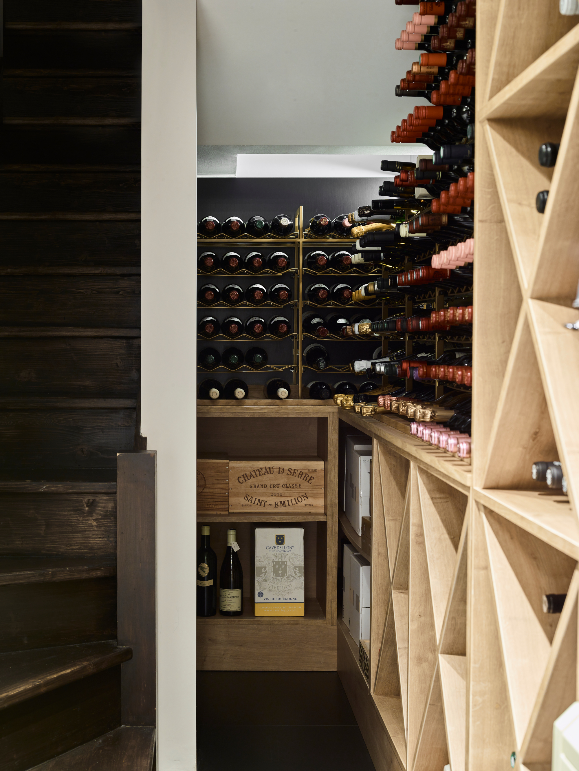
The bespoke Pearl Gold and Oak wine room idea came from a need to use an awkward, unused space.
'It is in the basement, just a few steps away from the kitchen, and is a great example of compact, clever design. The clients had a large wine collection that they wanted to be able to access easily, so this was the perfect space for it.
'Maximizing the capacity and the need to accommodate an array of bottle sizes and crates was key, so I designed a combination of bespoke metal racking and timber shelving to help provide the most flexible storage possible. This cool space away from the kitchen heat makes for great storage zone, and glass panels in the floor of the hallway above give an inviting glimpse of what lies below.'
4. Include a separate bar area for adults
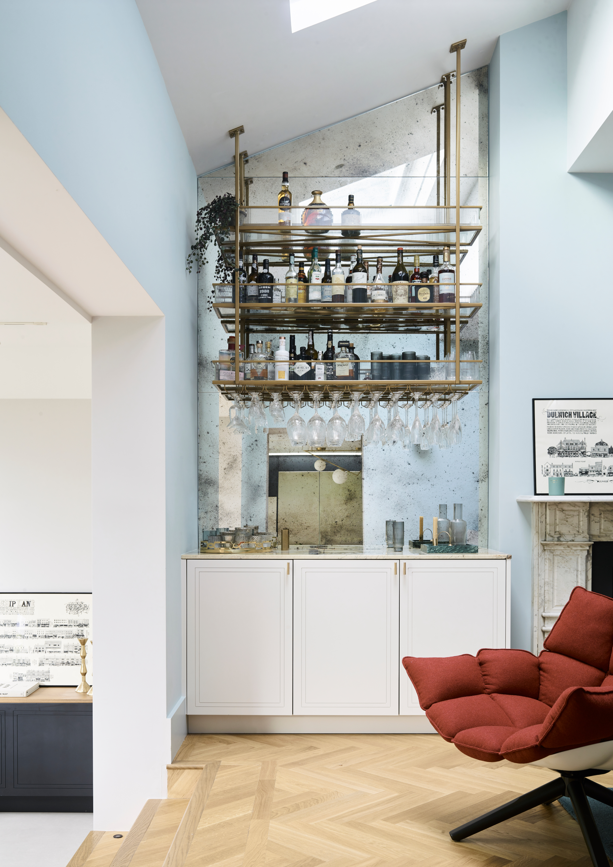
Home bar ideas are a must in a home where socializing is a regular event – and kitchens designed for entertaining are a trend that is not going away any time soon.
'This is a family home, with keen cooks with busy work and family lives, and active children. The broken-plan living room consists of clear zones that work well together for multiple activities, and as defined areas that create different moods with the interiors. A second reception room with a TV, for example, is located just off the kitchen to provide a chill-out zone separate to the front living room.
'A separate Pearl Gold bespoke hanging bar with reeded glass trimmings in the snug was created for cocktail making when the children are asleep or to entertain with friends, striking a balance between having a grown-up area while still maintaining the feeling of a family home.'
5. Use an antique mirrored backsplash to add depth
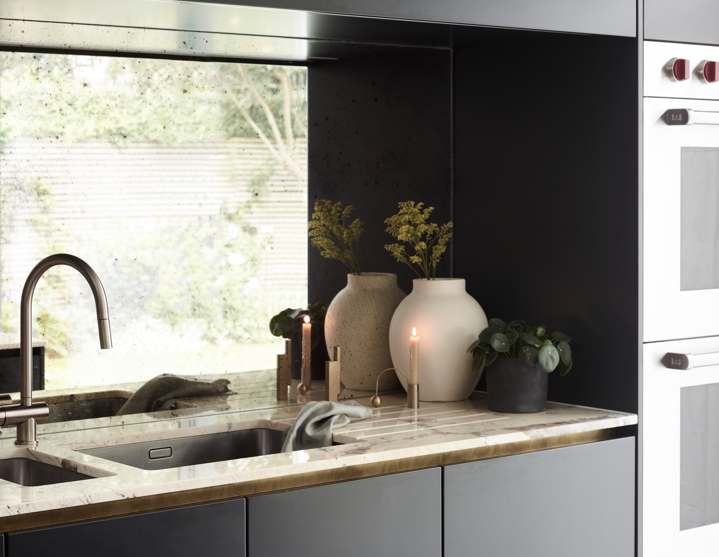
For anyone looking for space- and light-enhancing kitchen backsplash ideas, think: antiqued mirrored glass.
'For many clients the initial thought of a mirror as a backsplash sounds daunting, and prompts thoughts of constant cleaning and possible unsightly reflections of themselves whilst cooking. However, using an antiqued mirror with a tinted background and a patina across the surface helps disguise any splashes yet to be wiped and distracts from the direct reflection.
'Instead, luscious greens from the garden are brought inside, sunlight is bounced around, and depth is added to the space all helping it feel light and airy – something to be mindful of when using such a dark cabinetry at higher levels. In terms of practicality, as seen in this kitchen, it also proves to be a handy feature as one can stay in the conversation or keep an eye on the children even when one's back is turned.'
6. Incorporate an extra sink on the island
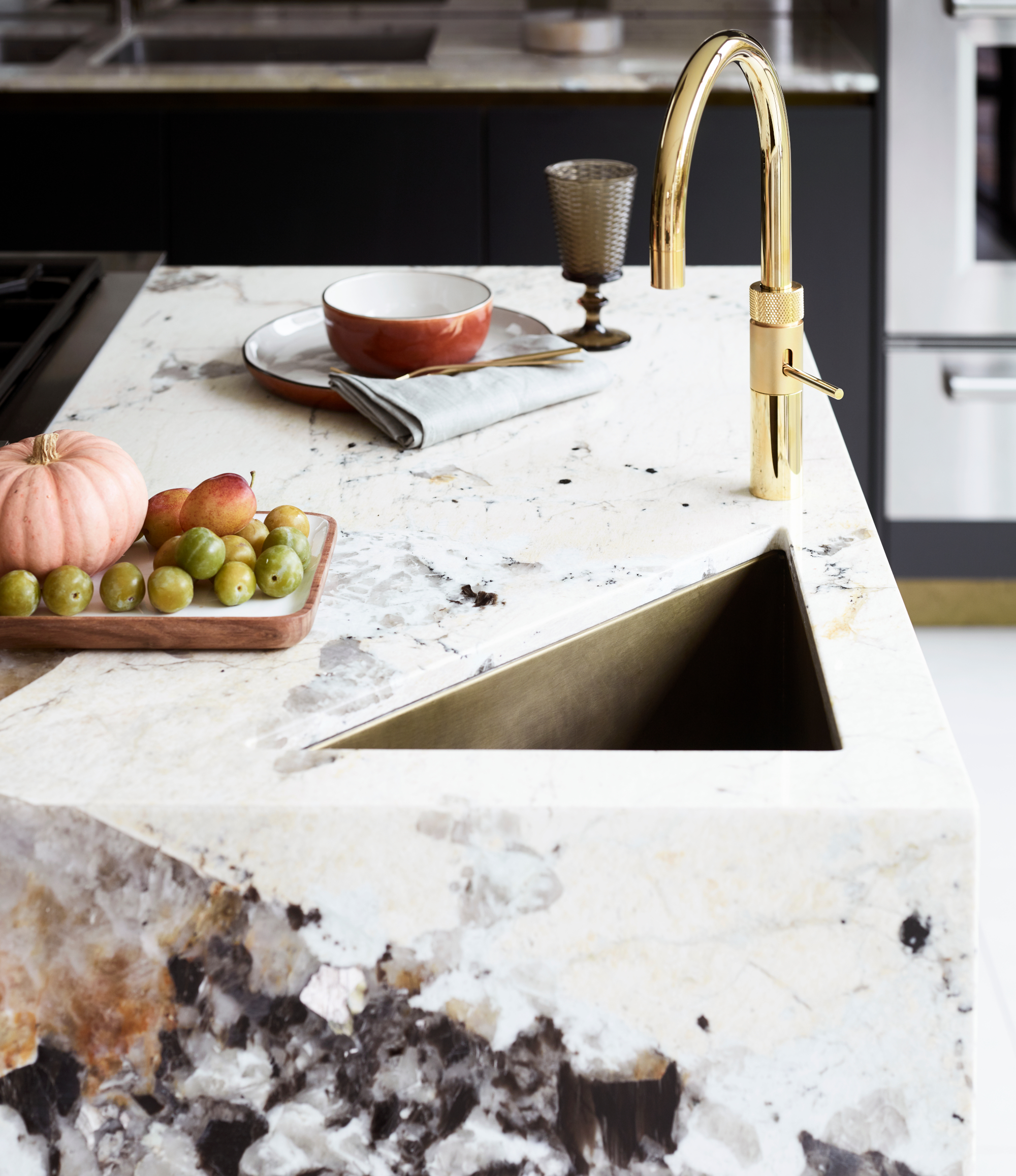
This space proves that kitchen sink ideas can be part of the design aesthetic as well as incredibly practical.
'We had to incorporate a separate drinks' sink and tap on the island so that the children and guests can access chilled sparking water without getting in the way of the cook.
'The architect had a triangular theme – the back wall of the house is slanted, and there are triangular skylights. We echoed this fun theme in the kitchen design with a bespoke brass triangle sink, brass detailing on the undercounter cabinetry, the angular crystals set within the countertop, and the pendant lights.
'The bar area had an angled ceiling, so we designed bespoke bar shelving again, to make a feature of the angles. This theme threaded through the space acted as a fun and unique element.'
7. Make the design sustainable

Sustainability in design has to be this decade's biggest consideration, and it is achieved here in a number of ways.
'Timber elements are FSC registered and from sustainably managed forests, and we are part of a tree-planting scheme with The Woodland Trust that puts back for tomorrow what we take out of the environment today. We also used off-cuts of the Patagonia Quartzite from the kitchen in the bar area to save waste and extra slabs, and all the cabinets and metal work was manufactured locally. All our timber offcuts and the dust from the extraction system get fed into our biomass boiler, as fuel resulting in heating and hot water for the factory – reducing landfill and emissions from transport to the waste disposal.
'Also designed with longevity in mind, the matte lacquer doors are easy to change the color of down the line should the clients wish, though the whole space has been designed as the ‘forever home’ so considerations have been taken into account for the children getting older and the high-end, long-lasting appliances and materials used. The components used are the highest spec of BLUM (with a lifetime guarantee) and the carcasses have solid tops and are glued and screwed meaning the will last a very long time.'
Sign up to the Homes & Gardens newsletter
Design expertise in your inbox – from inspiring decorating ideas and beautiful celebrity homes to practical gardening advice and shopping round-ups.

Lucy Searle has written about interiors, property and gardens since 1990, working her way around the interiors departments of women's magazines before switching to interiors-only titles in the mid-nineties. She was Associate Editor on Ideal Home, and Launch Editor of 4Homes magazine, before moving into digital in 2007, launching Channel 4's flagship website, Channel4.com/4homes. In 2018, Lucy took on the role of Global Editor in Chief for Realhomes.com, taking the site from a small magazine add-on to a global success. She was asked to repeat that success at Homes & Gardens, where she has also taken on the editorship of the magazine.
-
 Martha Stewart's intelligent cabinets 'take every inch into consideration' – their 'visually light' style will solve your small kitchen storage problems
'Every kitchen can be beautiful and functional, no matter what the size': 9 years since sharing her clever storage, Martha's cabinets are just as beautiful
By Megan Slack Published
-
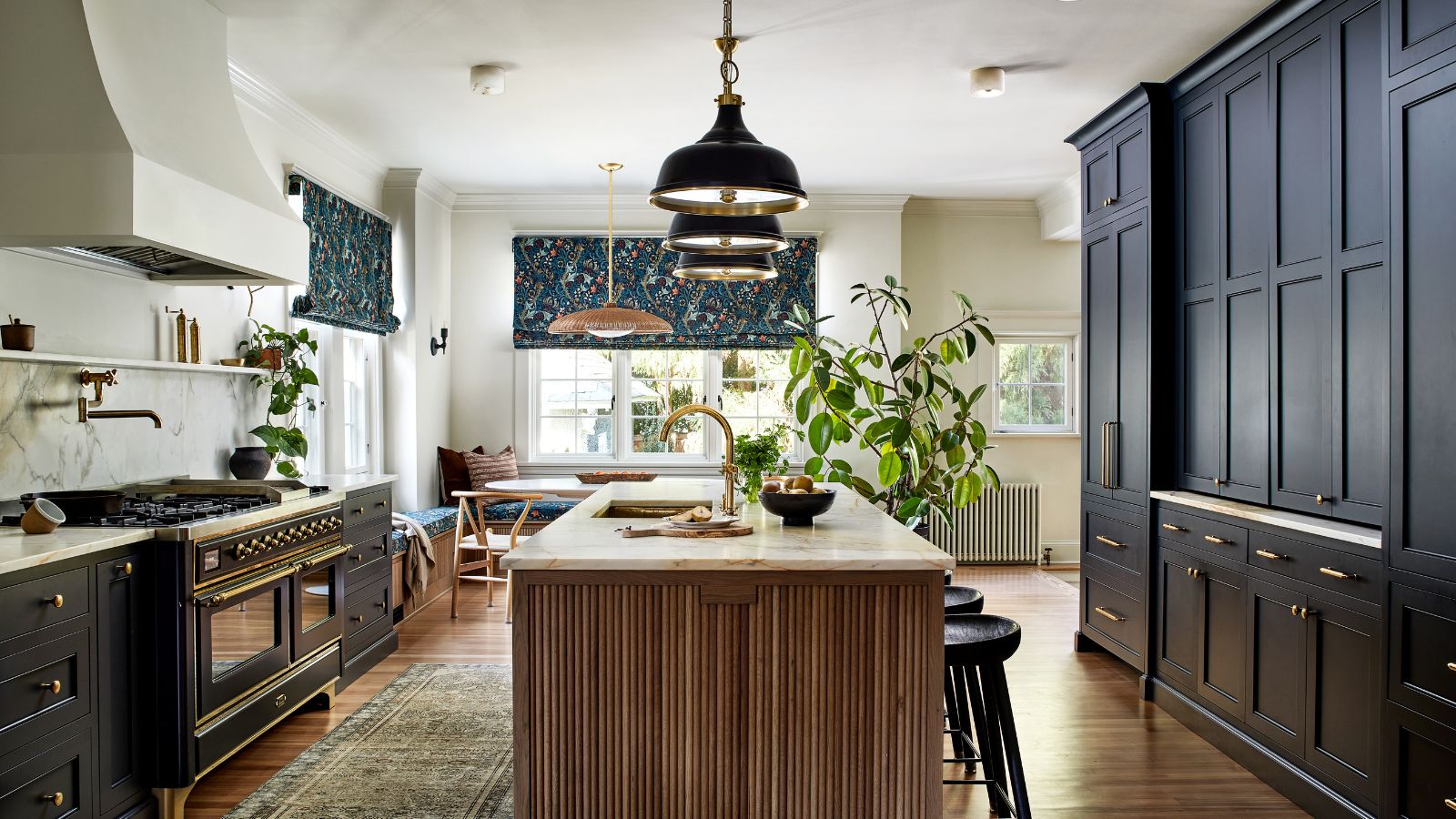 This once-dated kitchen is now a timeless space with the coziest details – and its the classic color palette that's made it a chic, welcoming space
Warming colors and natural materials combine to create this enduringly classic kitchen scheme
By Molly Malsom Published