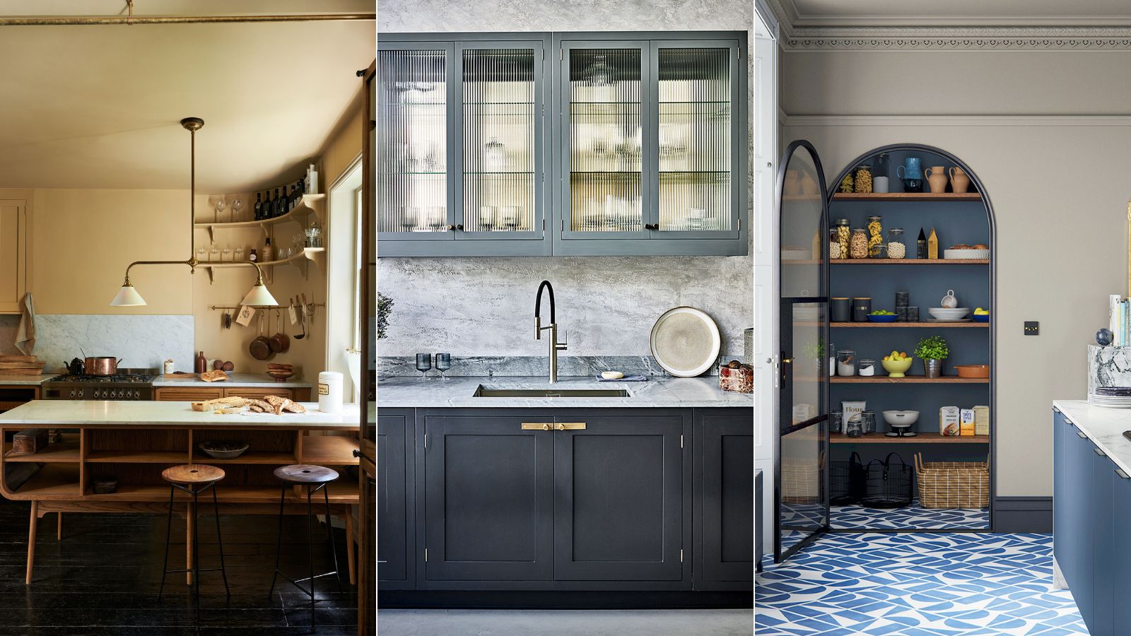
Kitchen storage trends – 7 statement looks and innovations that will change kitchen design forever
In any kitchen, there is one ingredient that will maximize space and make it look beautiful – good storage

Linda Clayton
Smart kitchen storage, matched with precision planning, can truly transform a chaotic space, so if you don't want your chosen design to look dull or dated, it is important to consider the now and the next in kitchen storage trends before you begin.
When it comes to finding good-looking and practical solutions to help keep your kitchen beautiful and neat, it can be a minefield of designs, colors, and materials. Whether you prefer a classic look with lots of detailing or something more modern, these kitchen storage ideas and trends will provide you with the inspiration you need to create a scheme that fits your home's period, your chosen decorating style, and the room's proportions.
Kitchen storage trends 2025
With exciting new kitchen brands cropping up and lots of innovative design ideas on display in kitchen showrooms across the US, there are plenty of on-trend looks and contemporary storage ideas and designs to pick from.
With this in mind, we've talked to some of the best kitchen designers and kitchen trend experts to find out which kitchen storage trends will be big in 2023 to make choosing storage a simple decision.
The Perfect Kitchen, Barbara Sallick | From $21.87/£30.45 at Amazon
Learn more about the fundamentals of kitchen design in this bestselling book. Find inspirational advice as well as hundreds of images to inspire your own remodel
1. Invest in handle-free options
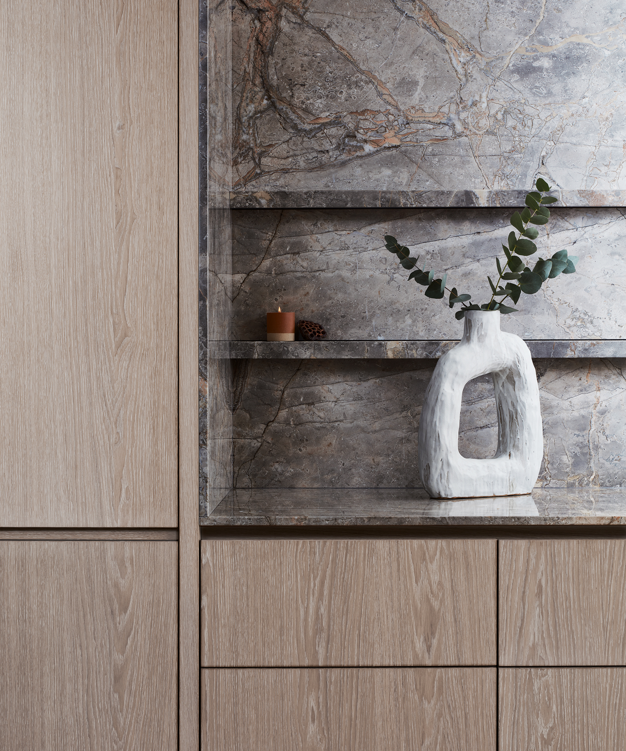
Bespoke kitchen in stained oak and Fiori di Bosco stone, Lanserring
Wonderfully discreet, invisible kitchens are having something of a moment. The minimalist kitchen aesthetic has been around for a while, but this kitchen storage trend takes this one step further, with the aim to conceal as much of your kitchenware as possible.
Recessed or push-touch opening mechanisms allow cabinets to blend into the background. ‘Handleless kitchen storage design provides a unique opportunity to create simple furniture language without the competing complexities of additional materiality that handles present,’ says Alex Beaugeard, creative director at Lanserring.
2. Fill an awkward corner with shelving
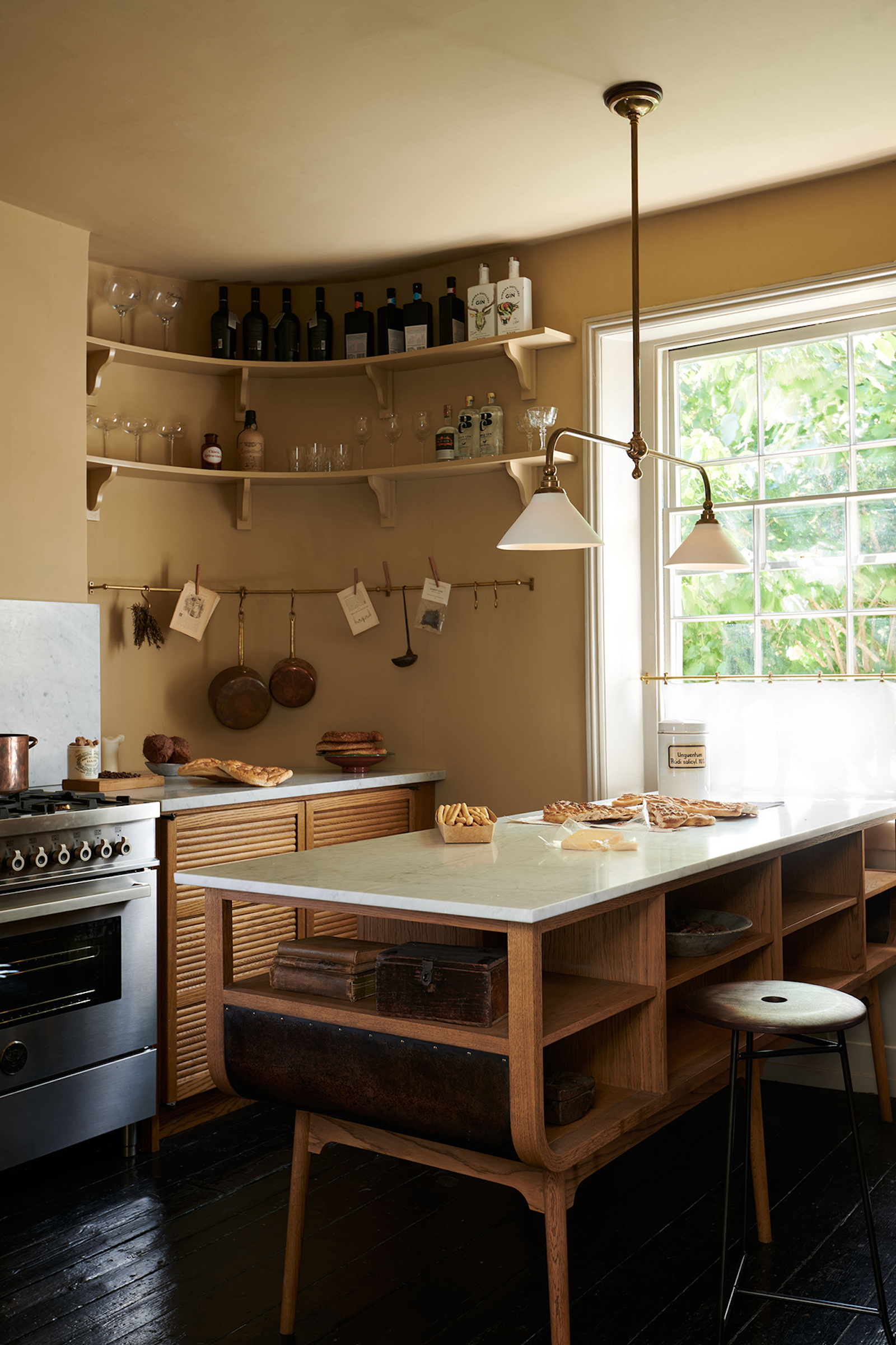
Haberdasher’s kitchen by deVOL
Unusually shaped rooms do not have to stand in the way of efficient kitchen layouts. A bespoke design that works with the shape of the room can create opportunities to add in necessary kitchen storage, especially if you are trying to maximize kitchen storage without new cabinets.
Sign up to the Homes & Gardens newsletter
Design expertise in your inbox – from inspiring decorating ideas and beautiful celebrity homes to practical gardening advice and shopping round-ups.
This deVOL kitchen accentuates the property’s original curved walls and low windows while still incorporating plenty of practical storage space. ‘The curved wall has bespoke shelves and a brass rail, giving this area a special feel,’ says Helen Parker, creative director at deVOL.
3. Take a mix-and-match approach
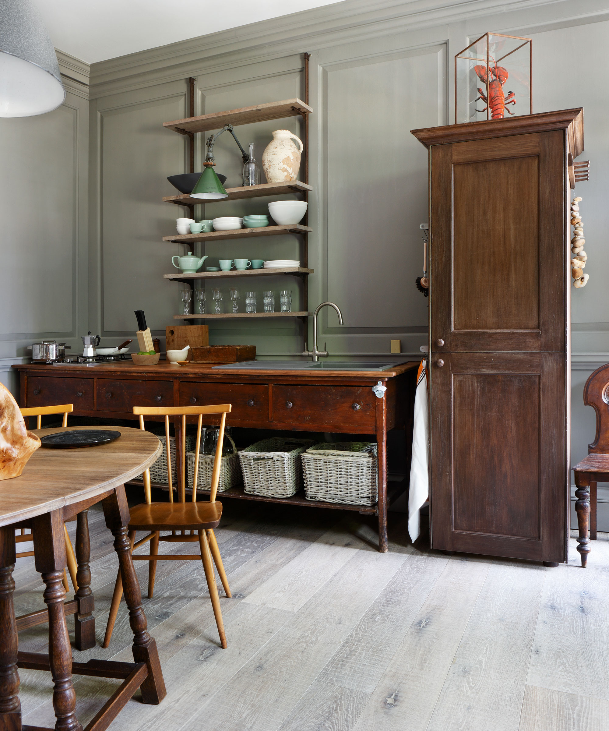
Playful and distinctive in their aesthetic, mix-and-match kitchen cabinet ideas have been a talking point of late, and for all the right reasons.
A mix-and-match approach with freestanding furniture can often be better than fitted kitchen cabinetry when it comes to storage. Chris Dyson Architects helped restore the original features of this Grade I-listed home in England. An antique-style tall freestanding cupboard houses a fridge freezer, while an impressive sideboard has been adapted to include a sink and hob, and house under-counter storage boxes.
4. Hide essentials behind fluted glass
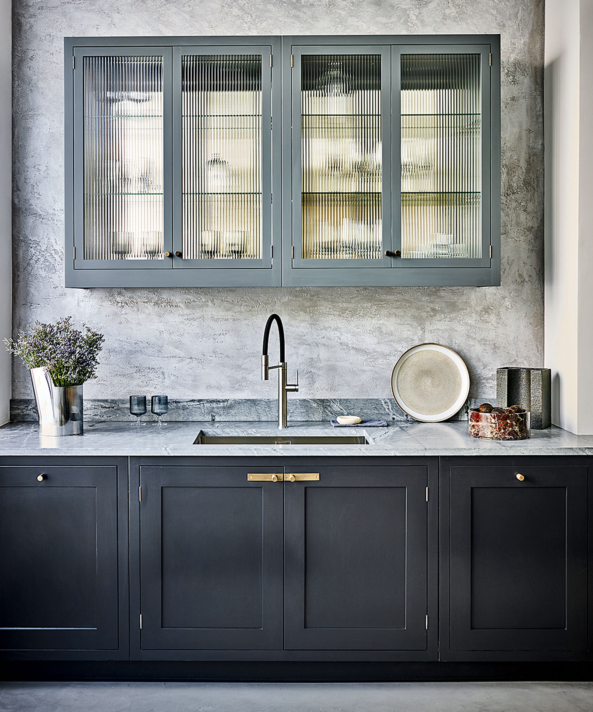
Ribbed and fluted designs are making waves in kitchen design, especially when it comes to cabinetry and kitchen islands.
Why is this kitchen storage trend so popular? This decorative glass has become a firm kitchen favorite. In contemporary settings, fluted patterns can be used to provide 3D interest – just enough to add character, while retaining the simplicity required to work in modern designs.
‘Fluted glass is extremely popular at the moment, and for good reason,’ enthuses Paul Welburn, senior design consultant, at Roundhouse. ‘Not only does it look more interesting than regular glass, but fluted glass also offers a degree of concealment. You don’t have to be quite so careful about keeping cupboard contents tidy.’
Use it to make wall cabinets feel less dominating, or to screen off a walk-in pantry. Lit from within, fluted glass reflects and refracts, adding extra sparkle and atmosphere by night.
5. Get ahead of the curve
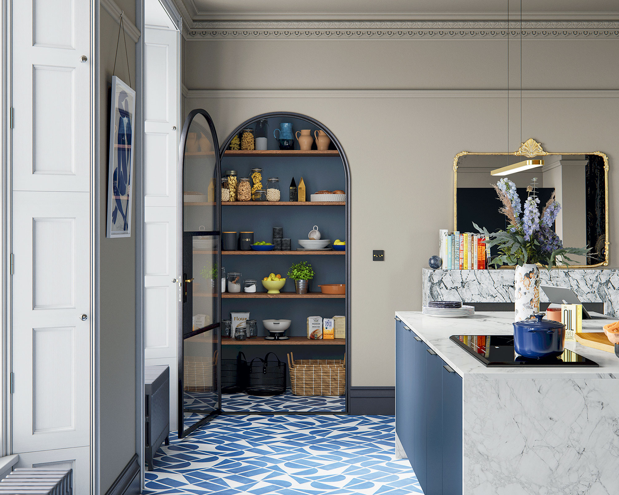
Architecturally inspired curves are of the moment, with soft, rounded lines cropping up everywhere. Moldings and curves that soften straight lines represent the best of contemporary biophilic design.
Curves are certaibly having a moment – and it only takes one to turn simple storage into a special feature. The dynamic relationship between the rooms' architecture and the shapely design strikes a note here.
‘An arched pantry is an interesting accent, softening lines and adding character,’ says Jen Nash, design excellence manager, Magnet.
6. Larders with living room looks
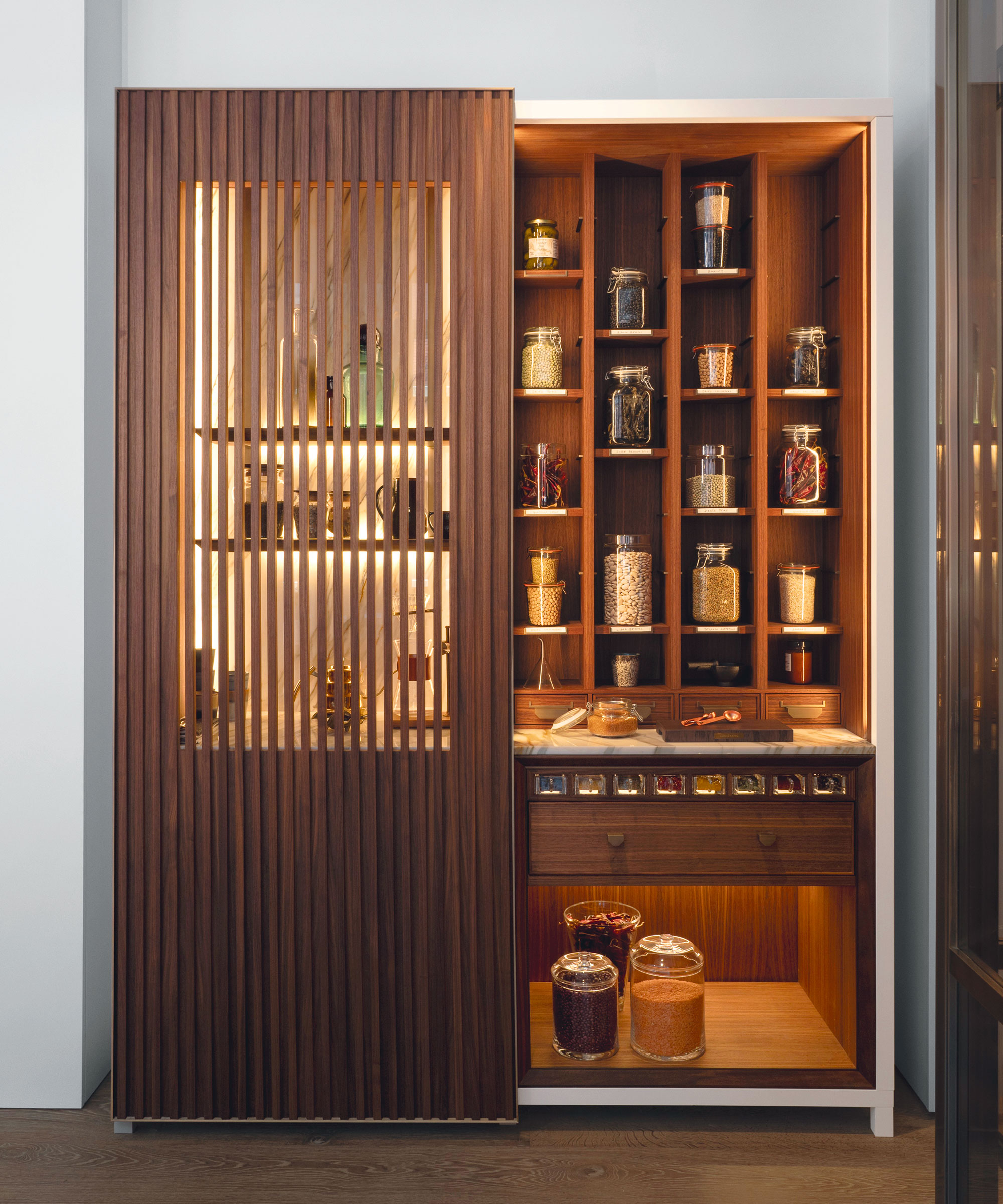
Kitchen, from Lanserring
Previously designed in isolation from the rest of the home, kitchens are not being planned to harmonize with adjoining rooms – this is particularly important if you have an open-concept layout.
Here, this bespoke Pickling Cabinet is an exquisite example of larders that are taking design cues from living room furniture. It is crafted from American walnut, patinated brass, and marble, with slatted sliding screens offering glimpses of lighted internal spaces.
7. Hang storage high
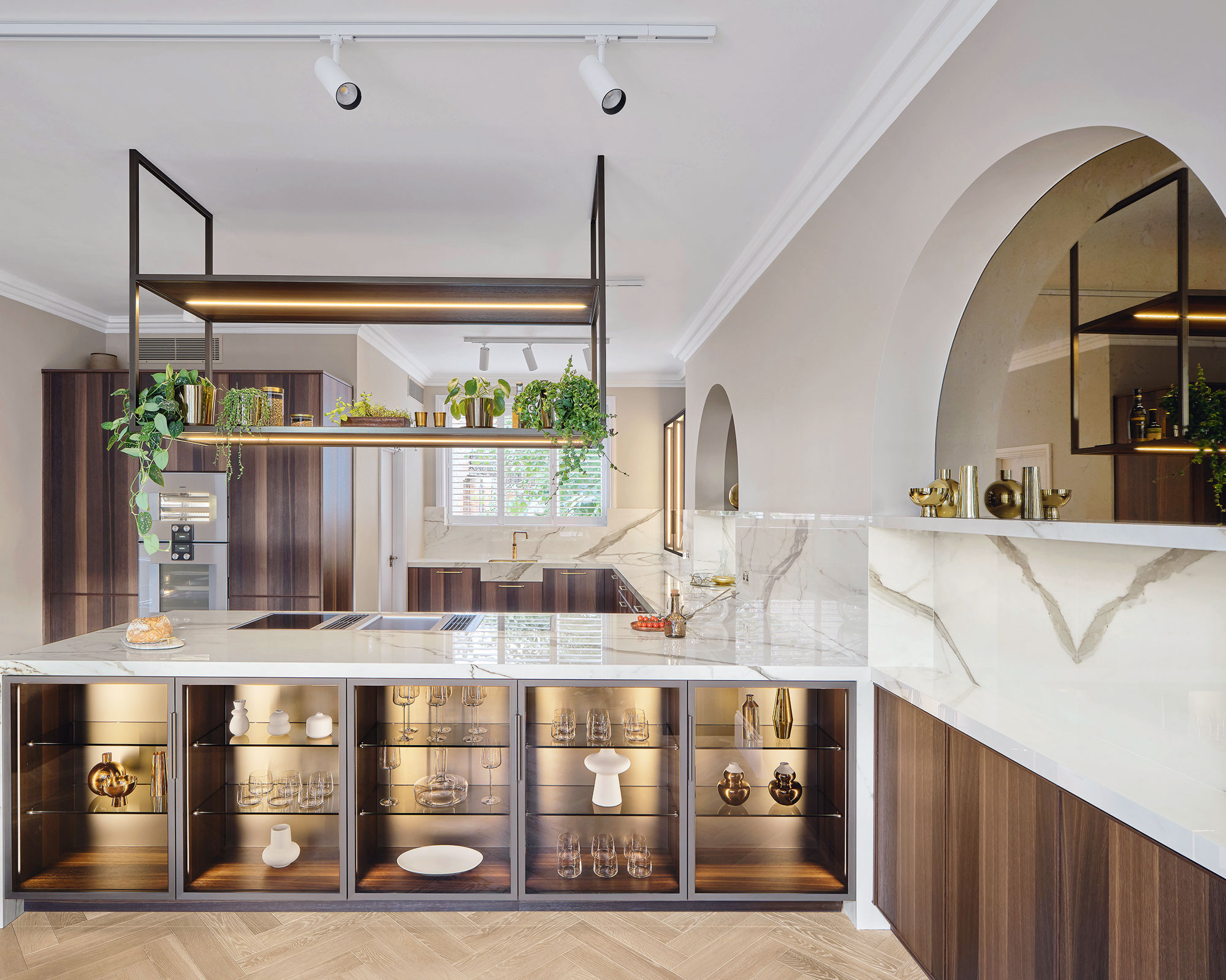
When it comes to creating extra storage, kitchen designers recommend looking up for missed opportunities. Downdraught extraction has cleared the way for hanging storage to shine.
‘Ceiling-mounted storage is a great way to bring elements of the professional kitchen into the home,’ says showroom manager of Scavolini by Multiliving, Brani Hadzhi. ‘It’s also brilliant for keeping your favorite essentials out of the way but within reach.’ Use greenery, glassware, and recipe books to blend and soften.
Here, 'this bespoke shelf features the same smoked oak veneer as the furniture, while LED strips offer vital task lighting,’ says Natasha Wegrzyn, studio manager, Poggenpohl.

Jennifer is the Digital Editor at Homes & Gardens. Having worked in the interiors industry for several years in both the US and UK, spanning many publications, she now hones her digital prowess on the 'best interiors website' in the world. Multi-skilled, Jennifer has worked in PR and marketing and occasionally dabbles in the social media, commercial, and the e-commerce space. Over the years, she has written about every area of the home, from compiling houses designed by some of the best interior designers in the world to sourcing celebrity homes, reviewing appliances, and even writing a few news stories or two.
-
 'Wick away the ick' – 6 things people with clean laundry rooms always do to make this hardworking space shine
These tips on how to clean your laundry room will banish grime
By Seraphina Di Mizzurati Published
-
 Jennifer Aniston’s bedroom is a ‘goldmine of simple sumptuousness’ – it’s 2025’s version of quiet luxury and so easy to recreate
The actress's unique space features James Mont-designed lamps and a raised bed inside a walnut plinth – but you can recreate its understated sophistication
By Megan Slack Published
