11 kitchen layout mistakes – frustrating to live with, they make your space look smaller too
Expert advice on the kitchen layout mis-steps to avoid

If you have a remodel on your mind for your kitchen, it's just as helpful to know what to avoid as what to include. And the most important in this particular room? Kitchen layout mistakes, which can make or totally break your space.
'Getting your kitchen layout ideas straight before you even look at cabinetry is the first step in good design practice,' advises Lucy Searle, Editor in Chief of Homes & Gardens, and a veteran kitchen remodeller.
'Rushing ahead with cabinetry materials and not paying attention to the floorplan really is the biggest of the kitchen design mistakes I see. And, while you might want to place full trust in your kitchen designer, I would always urge you to note what frustrates you about your current kitchen, or any kitchen you've lived with in the past. That will help you to move forward, as will this list of the most common kitchen layout mistakes we get asked about.'
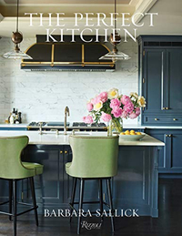
The Perfect Kitchen, Barbara Sallick | From $21.87/£30.45 at Amazon
Learn more about the fundamentals of kitchen design in this bestselling book. Find practical advice as well as hundreds of images to inspire your own remodel
Kitchen layout mistakes to avoid
The biggest kitchen layout mistake is to ignore the kitchen triangle planning rule, where the main elements of the kitchen (refrigerator, sink, oven/hob) are within easy reach of each other. Getting this right first is vital. Below, we highlight more kitchen layout errors that bother expert designers; the images show you how to get it right.
1. No 'circulation space' around the kitchen
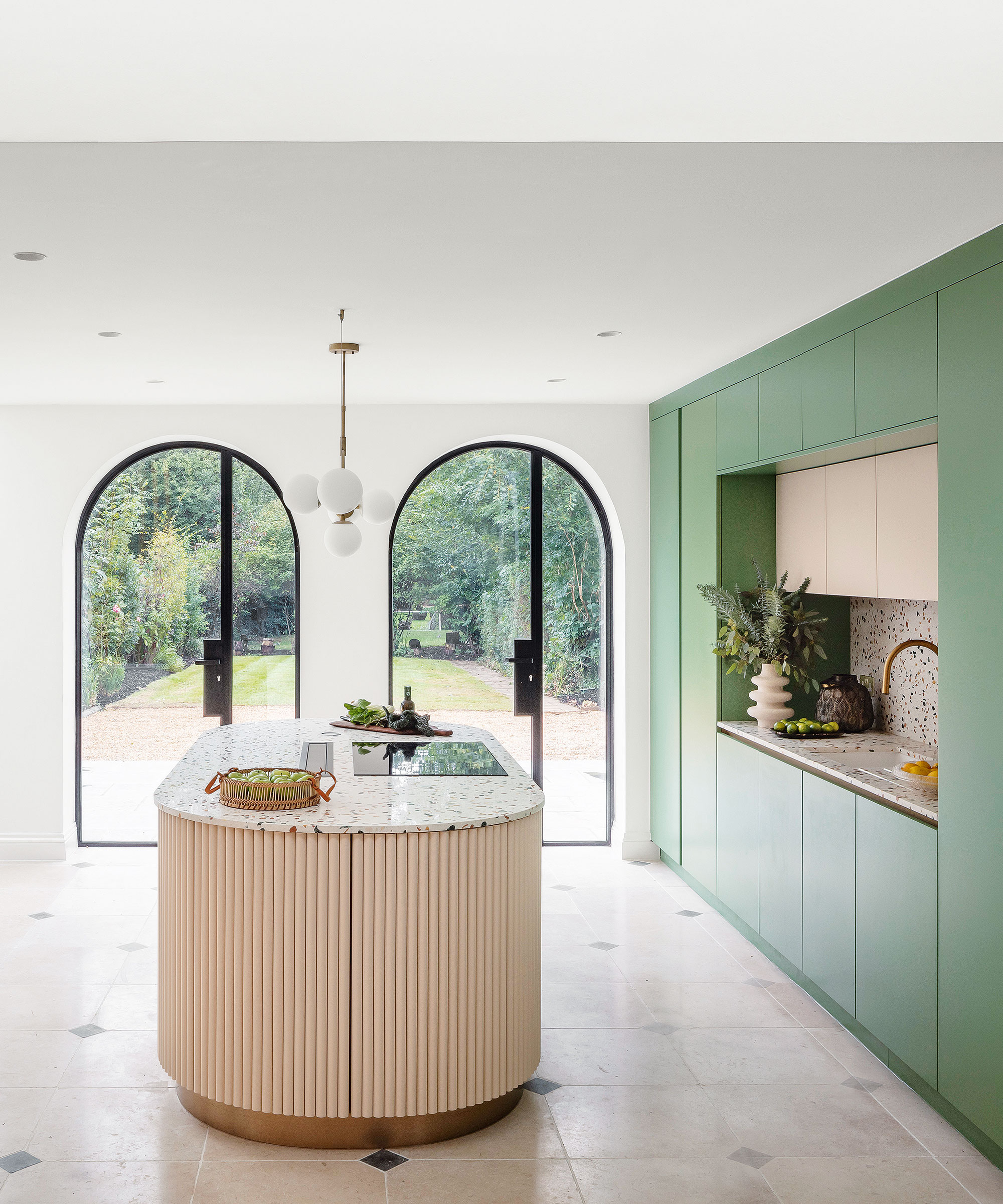
'You should always start your kitchen design process by understanding how you might use your space, especially when preparing and cooking meals. Island kitchens are arguably the most popular kitchen layout option right now, especially in open plan living spaces,' says Al Bruce, founder of Olive & Barr.
'The island kitchen creates a centerpiece in the kitchen, allowing you to utilize your kitchen as both a workspace and social area where friends and family gravitate throughout the day. But it’s essential to leave enough room to move freely around the island, to create flow and functionality.'
This gap is typically ideal between 42 and 48in; leaving too little room between an island and other cabinetry, but a dining space too is a kitchen island design mistake to avoid.
'The setup is ideal for gathering the family and the added worksurface allows multiple members of the family to get stuck in and help at dinner time,' says Al.
2. Ignoring invaluable wall space
While we are big fans of kitchen shelving ideas and the display opportunities they offer, it's vital to be honest with yourself about your kitchen storage needs. Many kitchen designers will advise against open shelving where space is an issue.
'Less open concept, more walls,' says Annie Obermann, principal and co-founder of Forge & Bow.
'I know, most people love the open concept kitchen, but we need walls to put all your stuff – this includes wall ovens. Too often, clients want to give us one wall, with windows and then a giant island, hoping to accommodate everything, this just doesn't work.'
3. Not getting your island size right
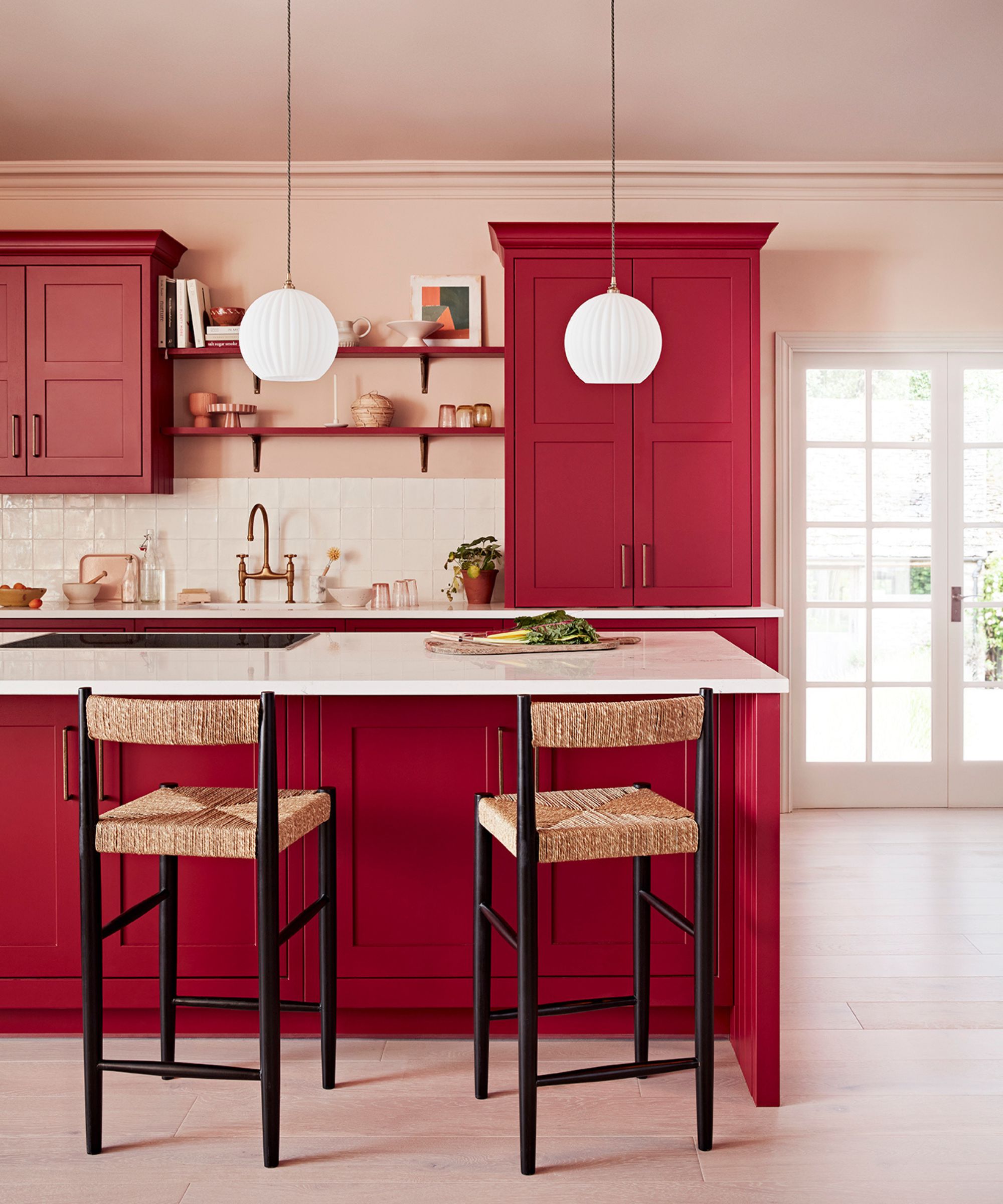
With its position carefully plotted, the next kitchen layout mistake to avoid is not being careful with choosing the right size kitchen island.
'When planning your kitchen be careful not to be over ambitious with freestanding elements. You should ensure you precisely measure your floor so that an island or dresser will fit comfortably within your space,' says Ben Burbidge, managing director of Kitchen Makers.
'When you’re considering the size of your island, look to maximize the internal and worktop space but don’t be tempted to make the overall dimensions too big as it could dominate or restrict movement around the kitchen. When placed in the center of the kitchen, an island should leave enough floor space for you to manoeuver around and access the rest of the kitchen.
'When planning a kitchen remodel, homeowners can often prioritize aesthetic over practicality, however innovative storage solutions mean it is no longer necessary to compromise space for style. Storage should be practical and functional but also a beautiful stand out feature of your kitchen that you take pride in.'
4. Not thinking of the placement, concealment and measurements
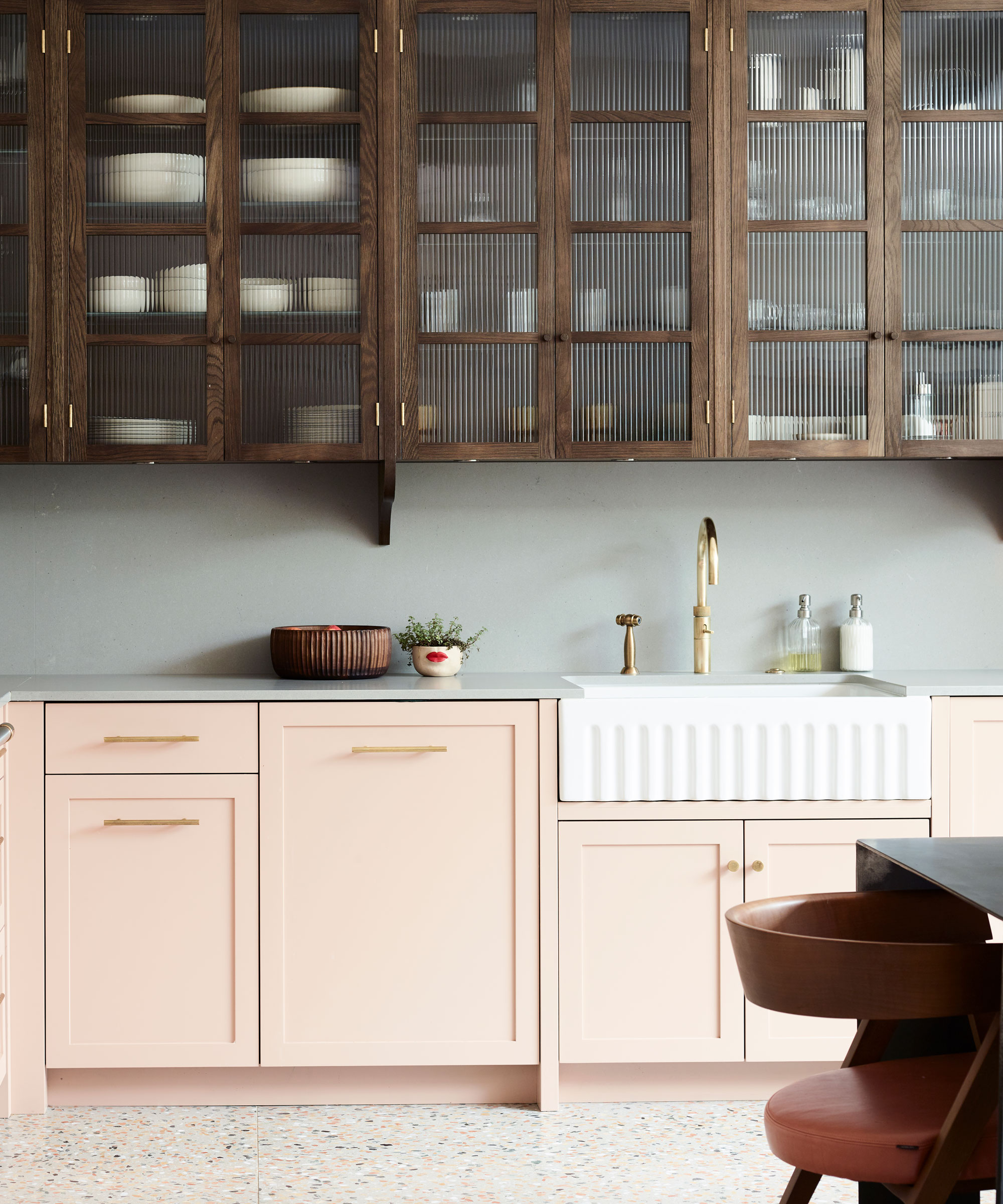
'Often we get carried away with the more exciting aspects of kitchen design – the colors, countertop material, fluted glass, flooring... and neglect the practical (and, let's face it, dull) aspects, such as where are the trash cans going to go? Are they big enough to cope with the demands we put on them? Is my cooker too big for the space? Will the dishwasher fit?
'Measuring up both the room and every single aspect should fall to your kitchen planner, but often it is the responsibility of the homeowner and it's vital to get right. Positioning of the elements is vital to get right, but so is concealment.
'It is worth sacrificing some storage space to ensure appliances and trash cans are concealed,' says Jennifer Ebert, digital editor, Homes & Gardens. 'Ideally, the food trash can ought to be sited close to the sink and dishwasher for easy clear ups. A small recycling can will ideally sit next to it, so packaging can be rinsed and stashed; however, it need only be small if you are limited on space, though that will mean regular emptying to a larger one outdoors.'
5. A breakfast bar with no leg room

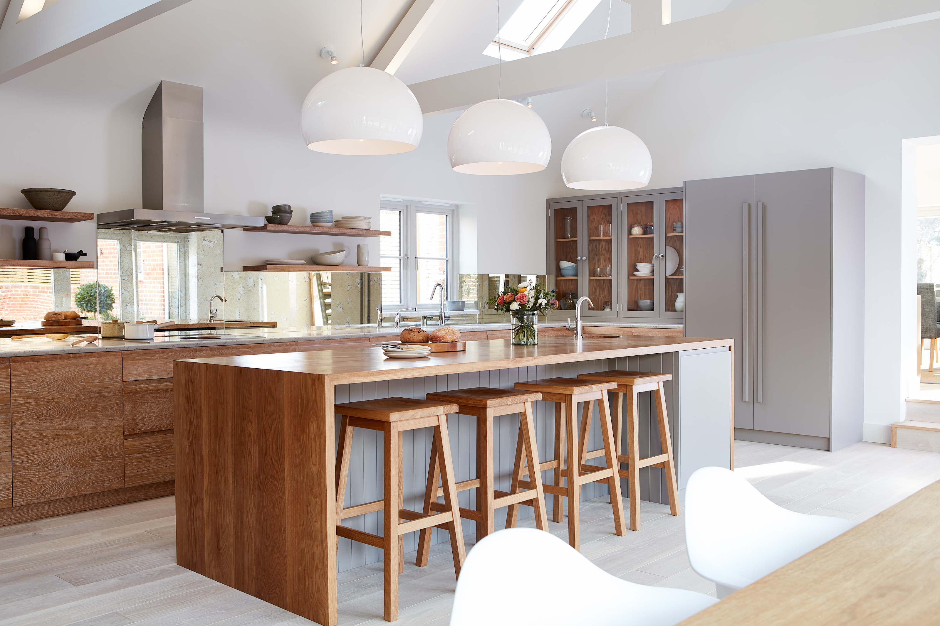
'This may sound unlikely, but I have sat at plenty of breakfast bars where you have to swivel sideways as there's not enough leg room. Be generous with your space – the dining space the heart of the kitchen after all and you want it to be a social, comfortable hub for friends and family,' says Lucy Searle, global editor in chief, Homes & Gardens.
'Let's quickly talk stools, too. Bear in mind that upholstered, high-backed ones may be more comfortable, but visually they are much bulkier than stools, so I would say to only invest in these if you are likely to spend lots of time sitting in them for dining or socializing. Otherwise, a more streamlined style like the ones above are a better choice, and easier to clean.'
6. Having the dishwasher miles from the sink
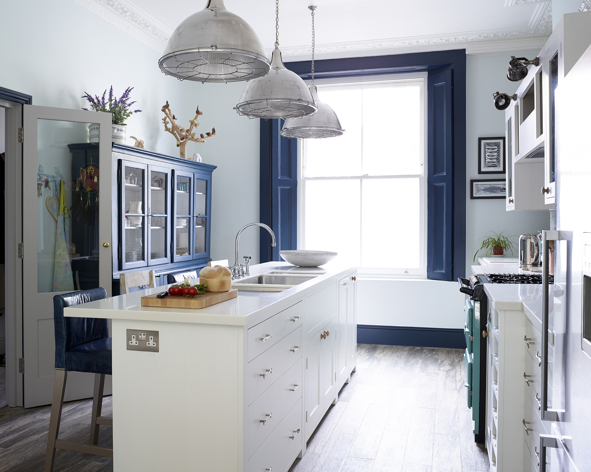
Wondering where a dishwasher should be placed in a kitchen? The quick answer is that it should be as near as possible to the sink and trash cans so that tidying up after meals is easy. Ideally, it shouldn't be too far from your cutlery, china and pan drawers, too.
'When space is tighter, you can make your kitchen island work harder for you by having the sink put in it – and the dishwasher too. There's nothing worse than having the latter miles away from the sink; having a sink in the island isn't the ideal since dirty dishes are more often on show, however, in a small space it can be a great solution. Then it's just a case of working out whether your dishwasher should be to the left or right of your sink,' says Jo Bailey, deputy editor, Homes & Gardens.
7. Ignoring the multifunctionality of today's kitchens
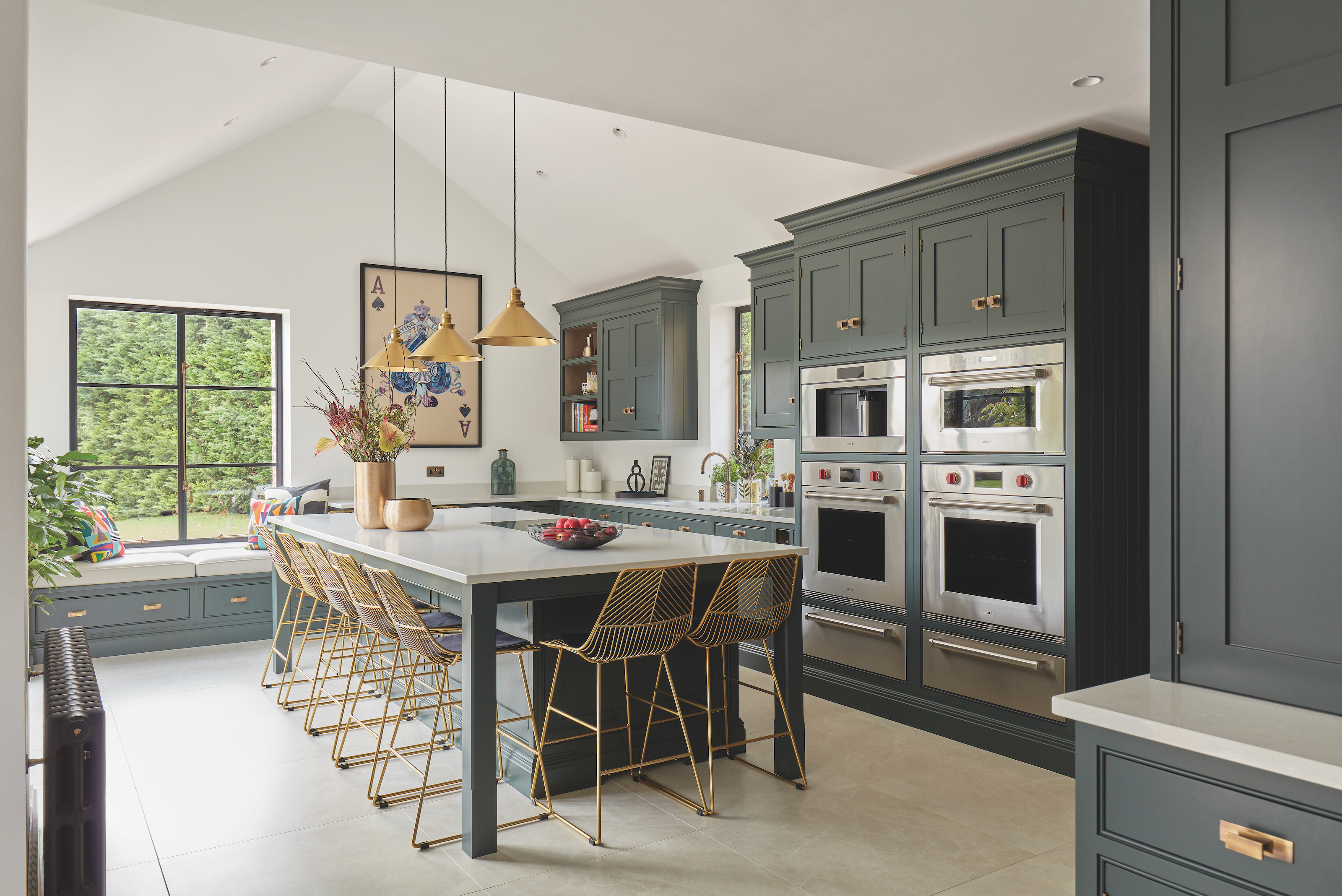
'I do not believe that the dining room is a redundant space, but the kitchen is becoming a dual-functional space for cooking as well as eating, meaning open plan living with seating has to be second nature,' says Tom Howley, design director of Tom Howley.
'There is a time and a place for formal dining, but the modern kitchen has to be able to accommodate an impromptu pasta with friends, or an unforeseen stir fry with the family. Not only this, but the kitchen is also a homework base, a relaxed office space and a home bar. A wide island counter or baker’s table will provide a generous and welcoming gathering place, especially when lined with textural bar stools.’
8. Missing a trick by not having a casual dining space
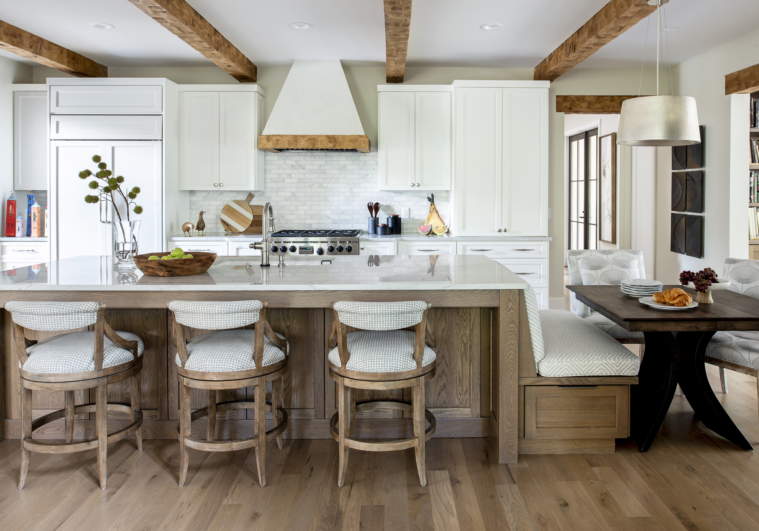
'If you have seating around the island, I suggest turning the corner so multiple people can sit and chat without turning their head constantly to the side. Think of making a conversation triangle!' says Kristin Bartone, creative director and principal of Bartone Interiors.
9. Assuming a 'one wall kitchen' can't work
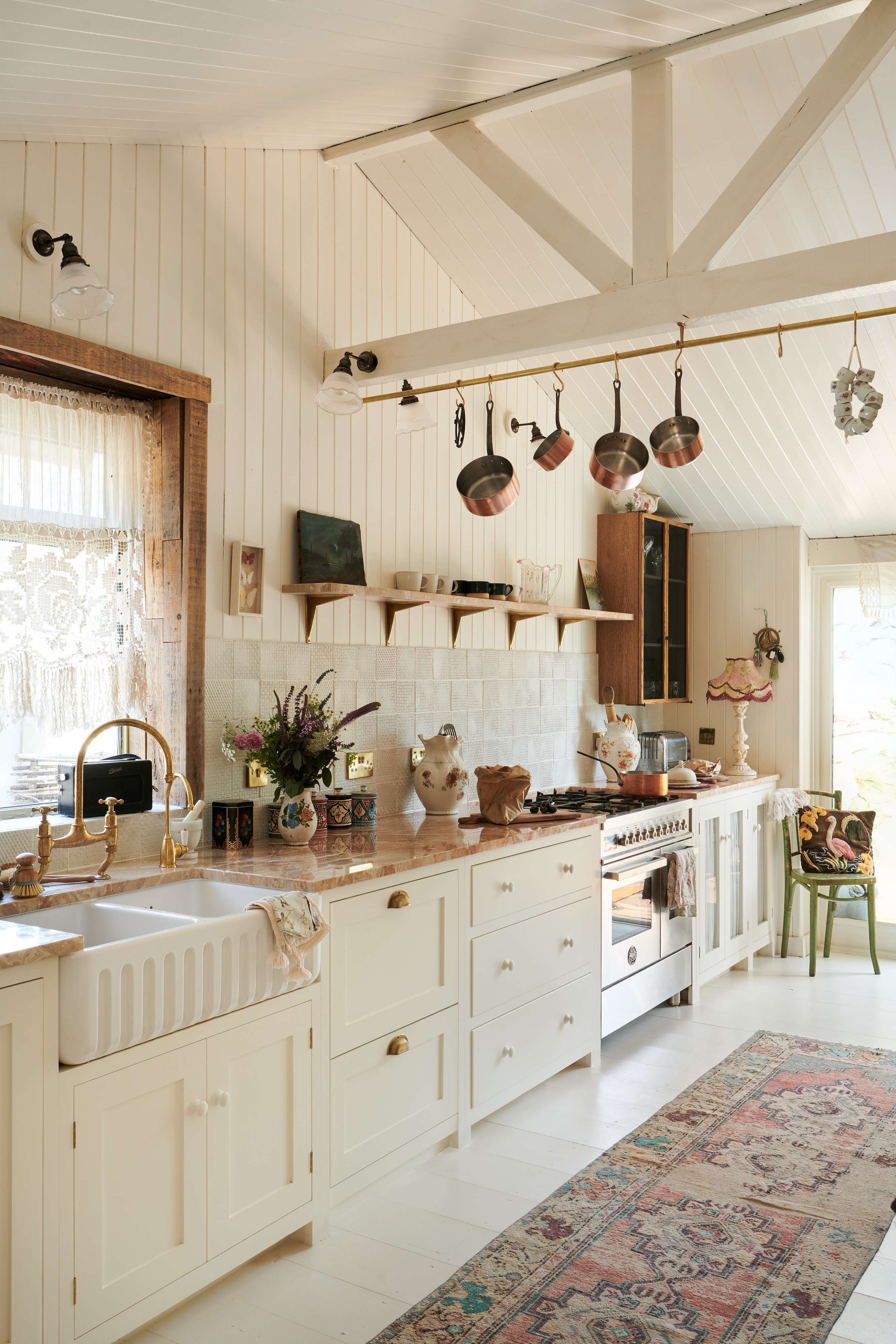
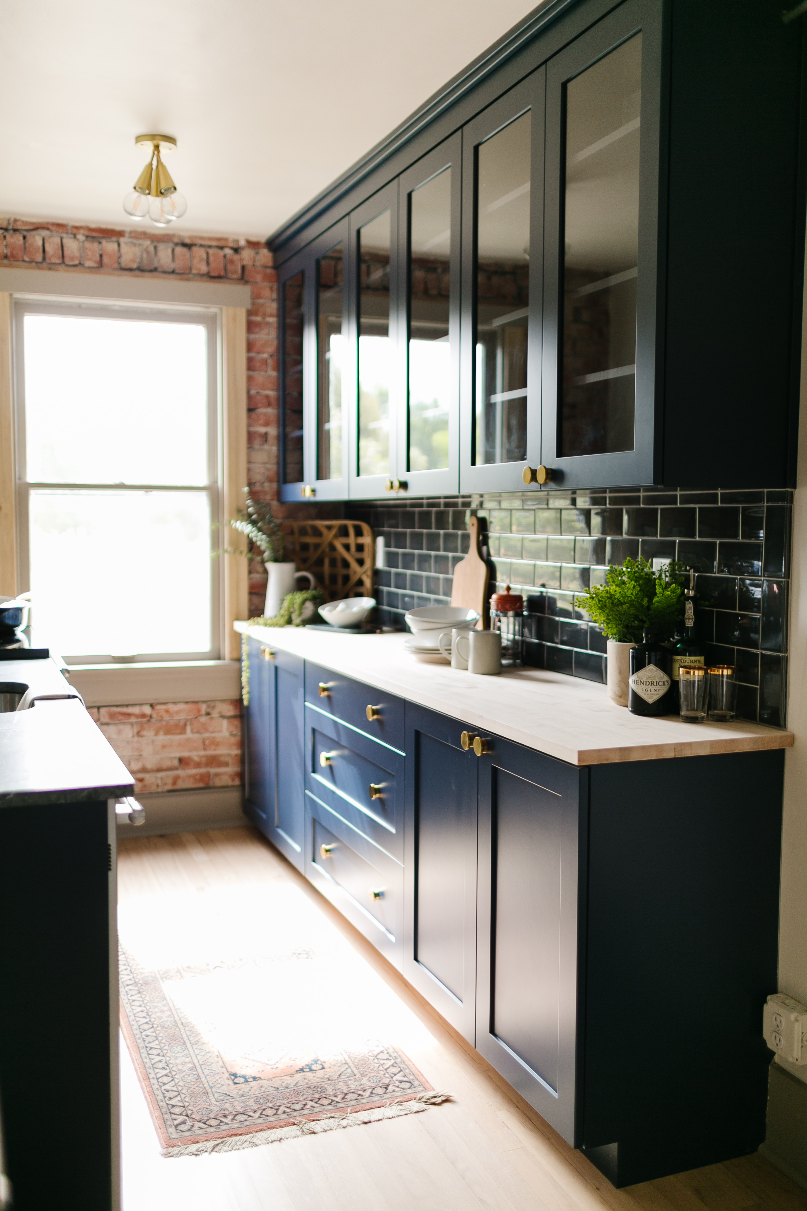
'The thought of only having one wall of kitchen cabinets may be concerning, but it is possible to make it work successfully. Sometimes, depending on the dimensions of the space, it's the only option.
'I would always advise having deep drawers only in base cabinetry to maximize storage and accessibility, and glazed wall cabinets for more storage (the glazing makes it less dominating. I would also advise using ceiling space where possible to boost storage of nicer looking items, such as the copper pans, above,' says Jennifer Ebert, digital editor, Homes & Gardens.
10. Wasting space on a kitchen island
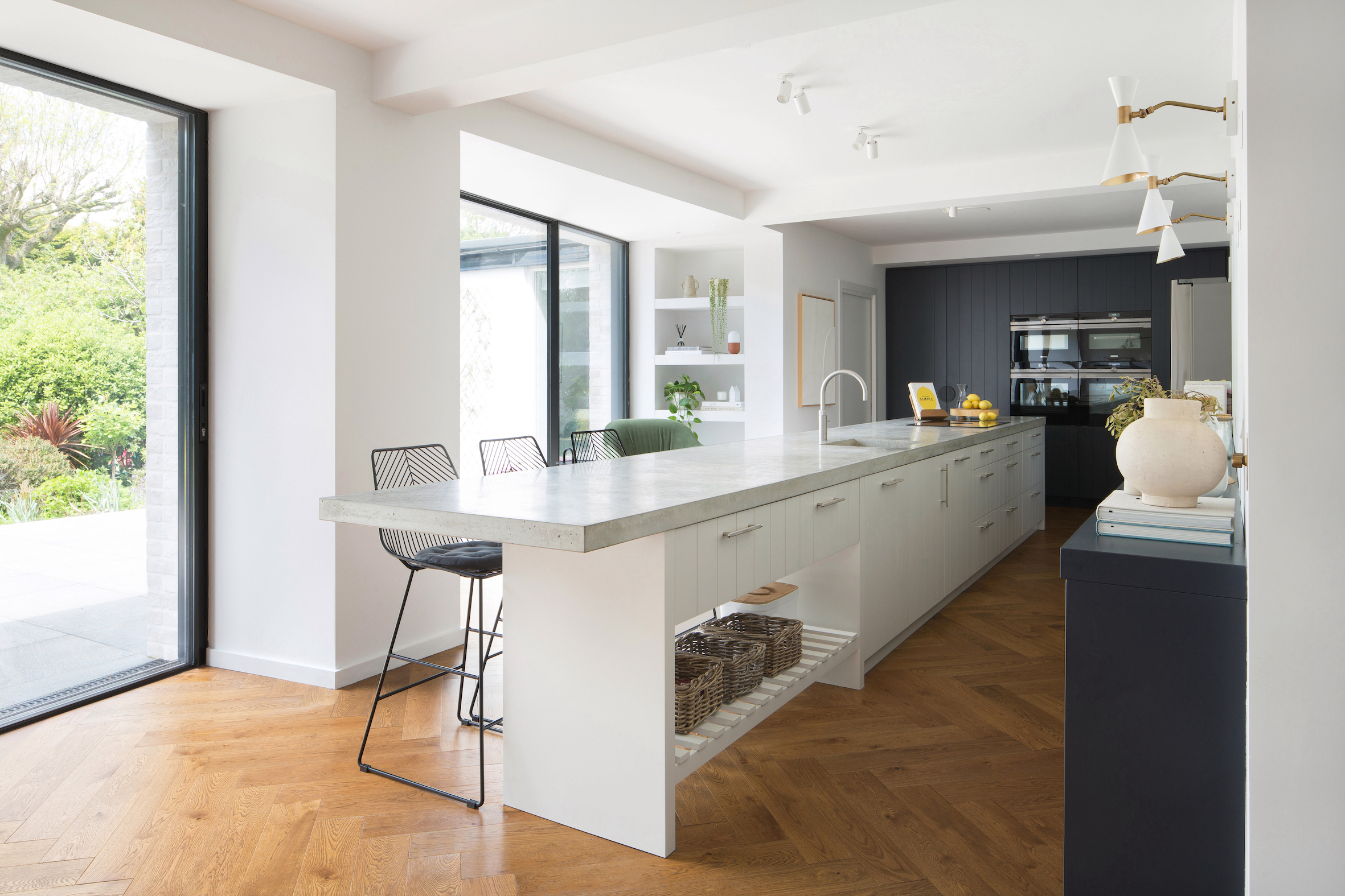
'In order to be really useful a kitchen island should be at minimum 4 feet long by 2 feet wide, but ideally larger.
'A lot of people assume that when you increase the length, you should also increase the width but a long thin island will prove more useful and practical at housing a cooker, appliances and appliances and well as providing plenty of storage and space for seating, than a chunky wide island in which the center is often a void that can’t be used.
In a recent project we created a bespoke 10ft long island with a poured concrete work surface,' says Tom Rutt, founder of TR Studio.
Super deep islands, by contrast, will mean the central part is difficult to reach and therefore wasted space.
11. Poor lighting placement
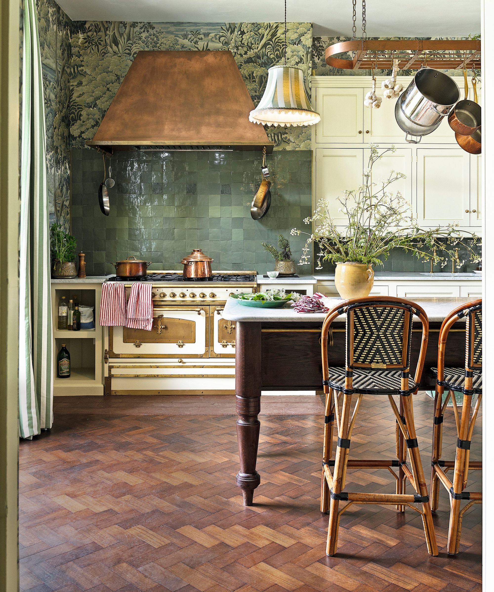
Kitchen lighting ideas need to be planned in absolute step with your kitchen layout. Not doing so will result in poorly lit prep areas, few opportunities to alter the atmosphere of the space, and a flat finish. Don't just consider the traditional pendants over kitchen island, downlighters and in-cabinet lighting: think stand out features, too.
'We tend to choose a cooker hood that blends into the scheme and see them as function over form, but if you have a range as spectacular as this one it needs a ventilation hood with lighting that matches in sheer style.
'So make a design feature of it within your kitchen layout and allow the rest of the scheme to be secondary – whilst still being practical of course!' says Jo Bailey, deputy editor, Homes & Gardens.
What is the biggest kitchen layout mistake to avoid?
Getting the positioning of the main elements of your kitchen wrong is the biggest layout mistake you can make. This means leaving a wide prep space (minimum of 4ft) between the sink and cooker; ensuring the refrigerator and dry food storage isn't too far from the prep spaces; and making sure the sink, dishwasher and trash cans are all within easy reach of each other. Cutlery drawers need to be near the dining area; pans and cooking utensils near the hob. Get these elements right and you will be less frustrated by your kitchen.
Sign up to the Homes & Gardens newsletter
Design expertise in your inbox – from inspiring decorating ideas and beautiful celebrity homes to practical gardening advice and shopping round-ups.

Sophie has been an interior stylist and journalist for over 20 years and has worked for many of the main interior magazines during that time, both in-house and as a freelancer. On the side, as well as being the News Editor for indie magazine, 91, she trained to be a florist in 2019 and launched Flowers Inside My Head where she curates beautiful flowers for modern weddings and events. For Homes & Gardens, she writes features about interior design – and is known for having an eye for a beautiful room.
-
 How to grow crepe myrtle in pots – and transform even the smallest of yards with dazzling flowers this summer
Growing crepe myrtles in pots will inject splashes of brilliant color into your outside space
By Thomas Rutter Published
-
 I've spent over 200 hours testing vacuums and swear by my two Dysons – this is how I properly clean a Dyson vacuum filter for longer-lasting appliances
Your Dyson vacuum will last much longer and clean at its best
By Dan Fauzi Published
