5 kitchen hardware mistakes interior designers say homeowners always make, and how to fix them
Hardware is the finishing touch to any kitchen design – and these mishaps could be making your entire design feel awkward
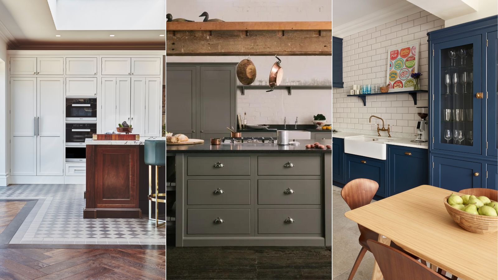

An essential in every scheme, there are a few kitchen hardware mistakes that interior designers see all too often – and it could be the detail that's throwing off your entire design. Hardware may be relatively small in size, but it has a profound impact on the overall look and feel of your space.
There are so many kitchen cabinet hardware ideas to inspire your design, but it can be tricky to choose the perfect design for your scheme. Do you choose something traditional, follow kitchen hardware trends, or match your faucets and cabinetry handles?
As there are so many great ways to introduce hardware to your space, we've asked interior designers to share the kitchen hardware mistakes they see most frequently, and how to fix the problem areas in a really quick and easy way.
5 kitchen hardware mistakes to avoid
Whether you've opted for warm metals or chrome designs for your kitchen hardware, there's more to getting the hardware right than just the finish. These kitchen hardware mistakes are worth having on your radar when finishing your scheme.
1. Wrong positioning
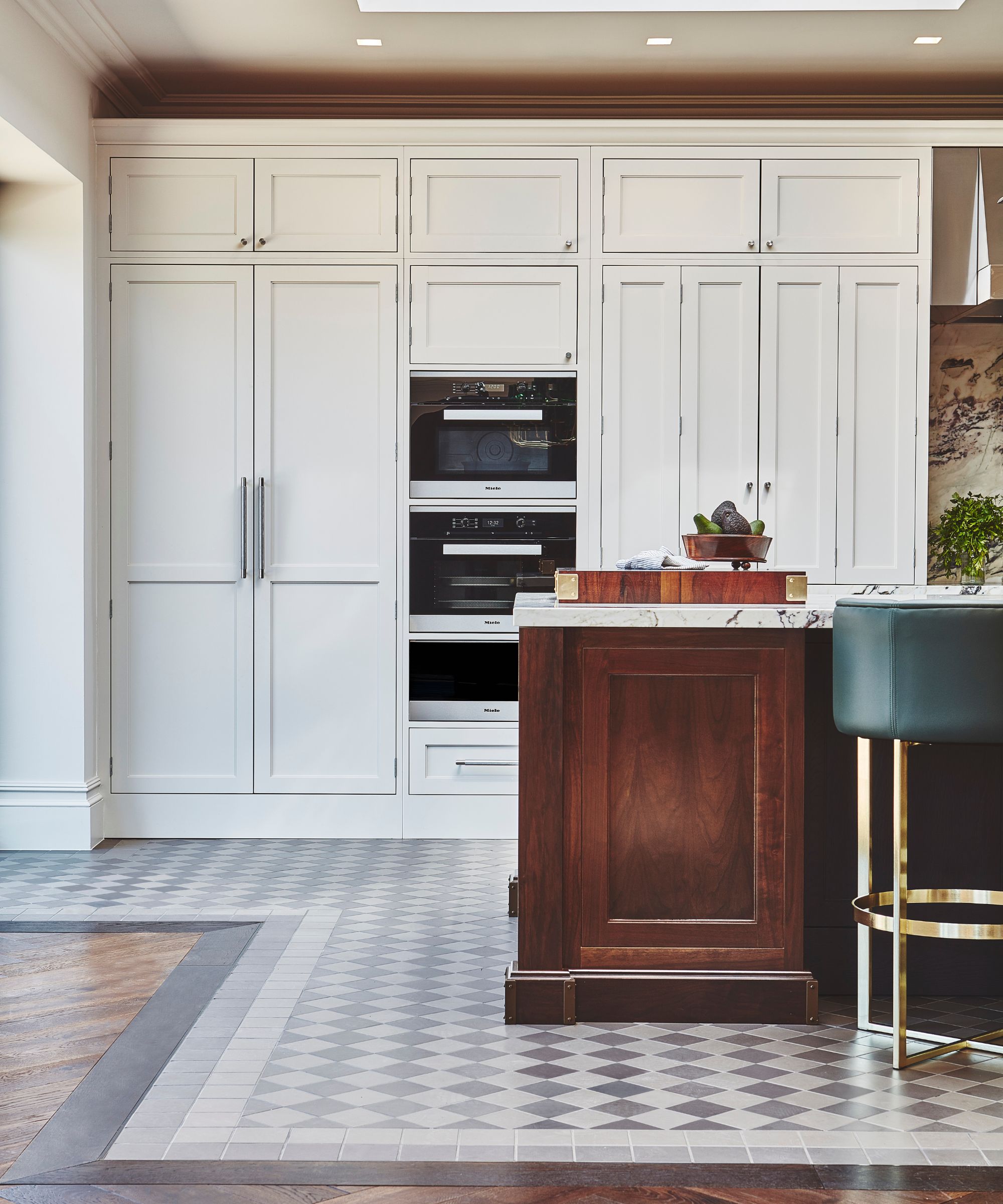
A common kitchen hardware mistake – which has a straightforward fix – is a case of positioning. While there are no rules as such, there are a few guidelines worth following when positioning your kitchen hardware in the best place.
'Care needs to be taken with the positioning of the handles. For example, a cup handle works horizontally but not vertically, such as for a wall cabinet. In this case, a smaller knob can be used,' says Jayne Everett, creative director at Naked Kitchens.
It's also important to make sure the positioning is right in terms of where on the cabinets the hardware is placed. Handles placed too high will look out of place and potentially difficult to reach. You also need to make sure the hardware is placed in the same place on every cabinet and draw – uneven handles will instantly bring down the look of your space.
We explore how to adjust kitchen cabinet handles that are misaligned in our dedicated feature.
2. Not considering the scale of the hardware
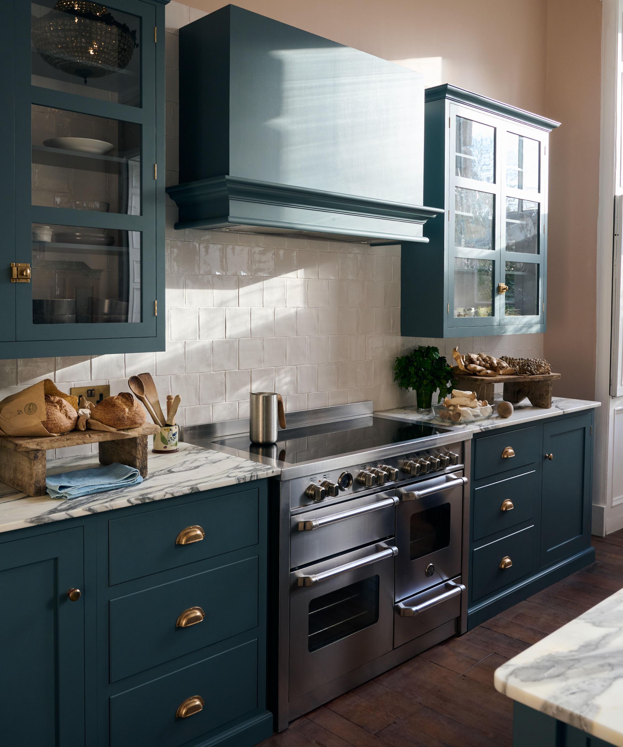
When you consider the interior design of any space, there is always talk about scale. This is just as important in the kitchen – and it's one of the kitchen hardware mistakes to be aware of when you're designing your space.
'Balancing the scale of hardware on different sizes of doors and drawers is critical. If you are paneling appliances, you need a larger scale pull for stability. Think about how this relates to the size of the main cabinet hardware. Hardware is the jewelry, and while there is a large range of pricing I would not recommend skimping as it can make or break the cabinets,' says Elle Cantrell, owner and lead designer at Elle Du Monde.
'Determine your smallest and largest panels, and work from there filling in the gaps. We try to stick to a maximum of two to three lengths for pulls throughout to create consistency. Also, consider how and where the knobs or pulls will mount on each panel and how you can create consistency with the placement,' she advises.
3. Complex designs that simply aren't practical
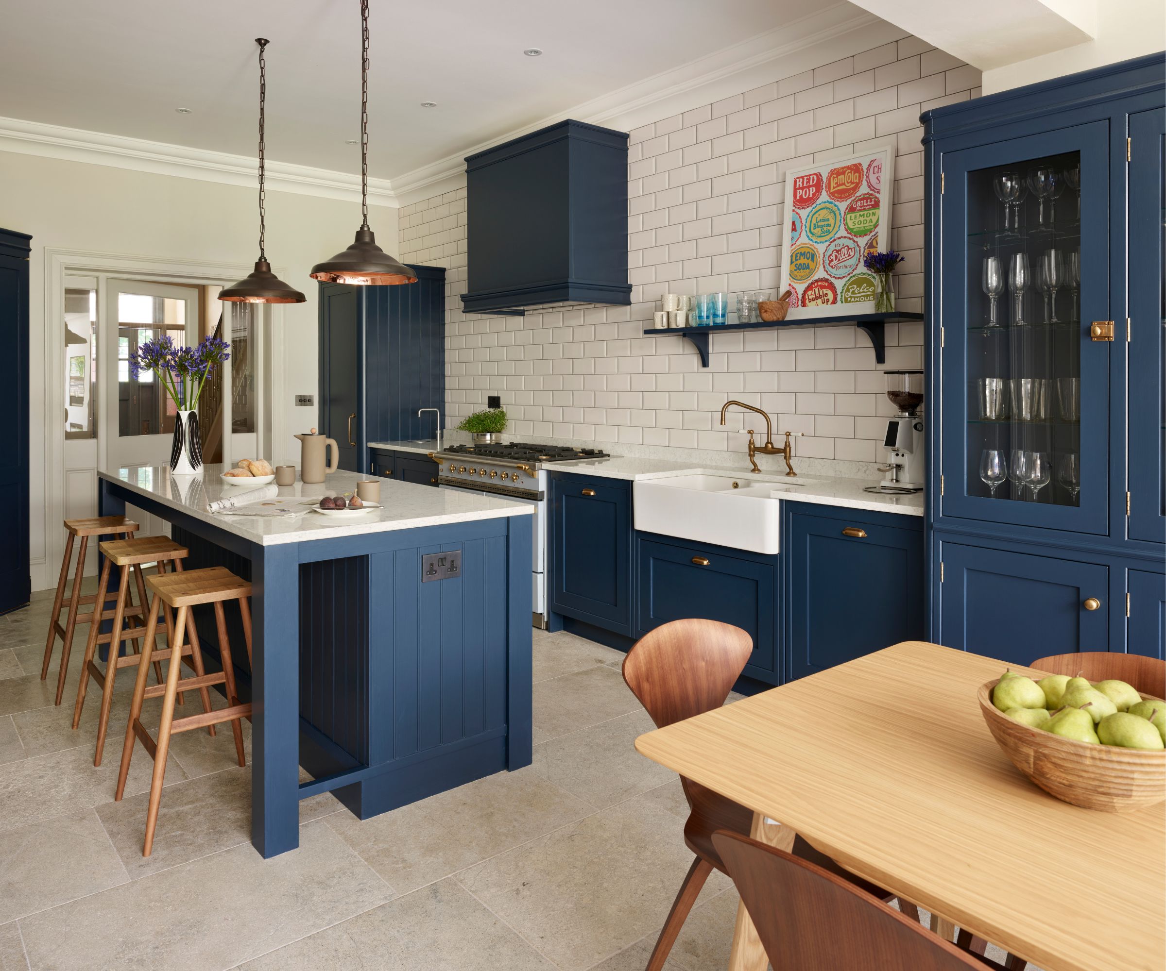
As much as hardware can be used as a finishing touch to tie your scheme together, it still needs to be practical. Opt for hardwearing designs so you don't have to replace them regularly.
'There is a growing trend for more complex handles – for example, some now incorporate a catch. Whilst these can look beautiful, it’s important to check they will still be practical to use,' says Richard Davonport, managing director at Davonport.
'If you are using the cupboard regularly, it might be that these styles of handles aren’t suitable as the latch makes access harder than other styles of handles,' he adds. You want your kitchen to be as functional as possible as you're cooking and cleaning, so opt for beautiful designs that don't compromise on practicality.
4. Intricate designs that are difficult to clean
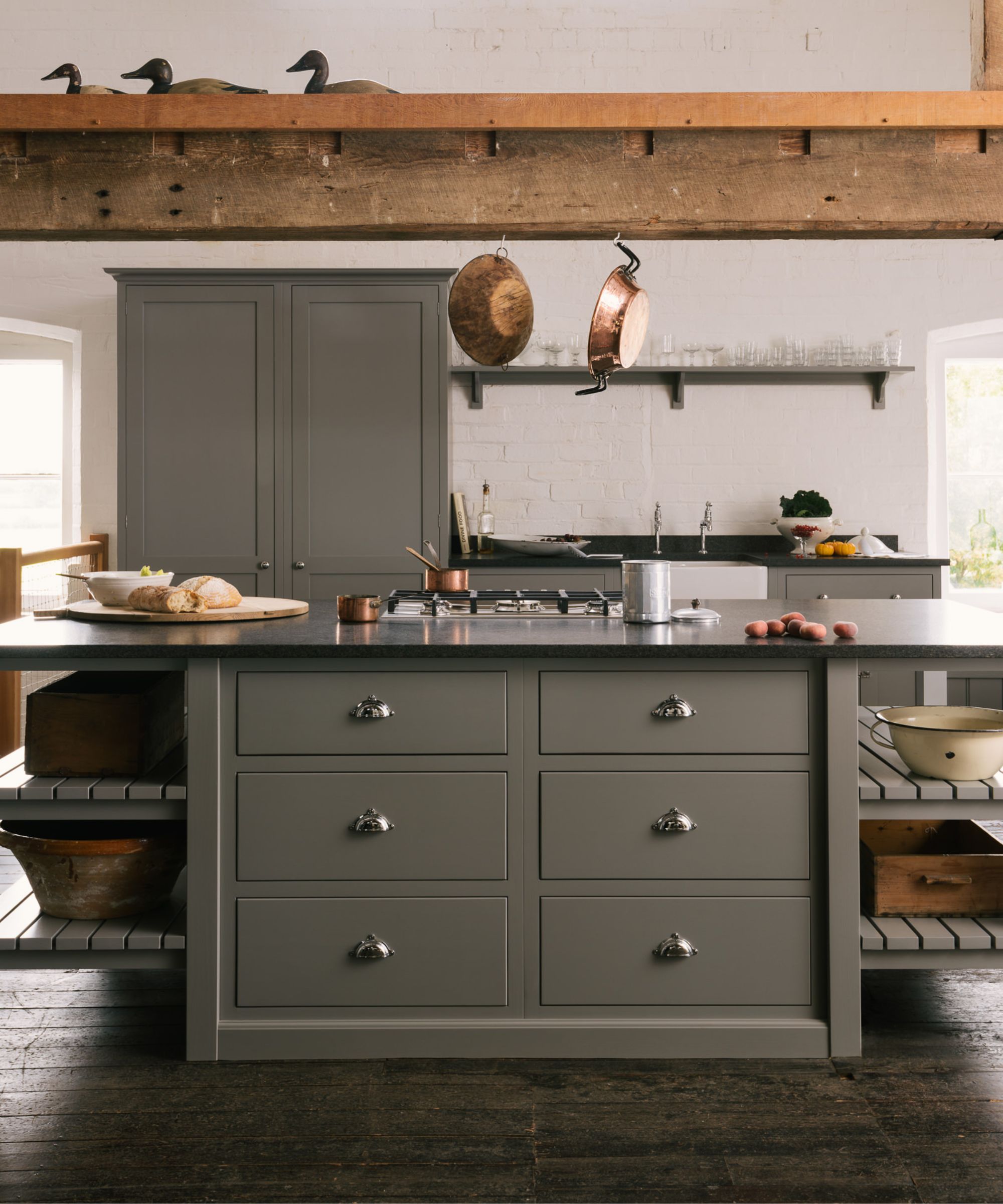
When you're designing a kitchen, the last thing you're probably thinking about is having to clean it. As mundane as it is, choosing hardware that is difficult to keep clean will become one of your biggest bugbears in the future.
'A common mistake is choosing hardware that looks great but is uncomfortable to use daily, such as overly ornate handles that are difficult to grip. Overlooking practical aspects, like the ease of cleaning, can also lead to regrets, especially in a high-use area like the kitchen,' says Allison Kaminsky, lead designer at Lola Tucker Interiors.
Avoid designs that are overly detailed with small indents or grooves, as this is where you can expect to find a build-up of dirt (and they're often more difficult to grip and use day-to-day). 'Test the hardware in person to ensure comfort and functionality, making sure it feels good in your hand and is easy to operate,' suggests Allison.
If you're really struggling with final decisions, she suggests turning to professionals. 'Consider consulting with a designer to ensure your choices enhance both the aesthetics and functionality of your kitchen, avoiding common kitchen hardware mistakes and achieving a cohesive look.'
5. Hardware that doesn't complement the cabinet color
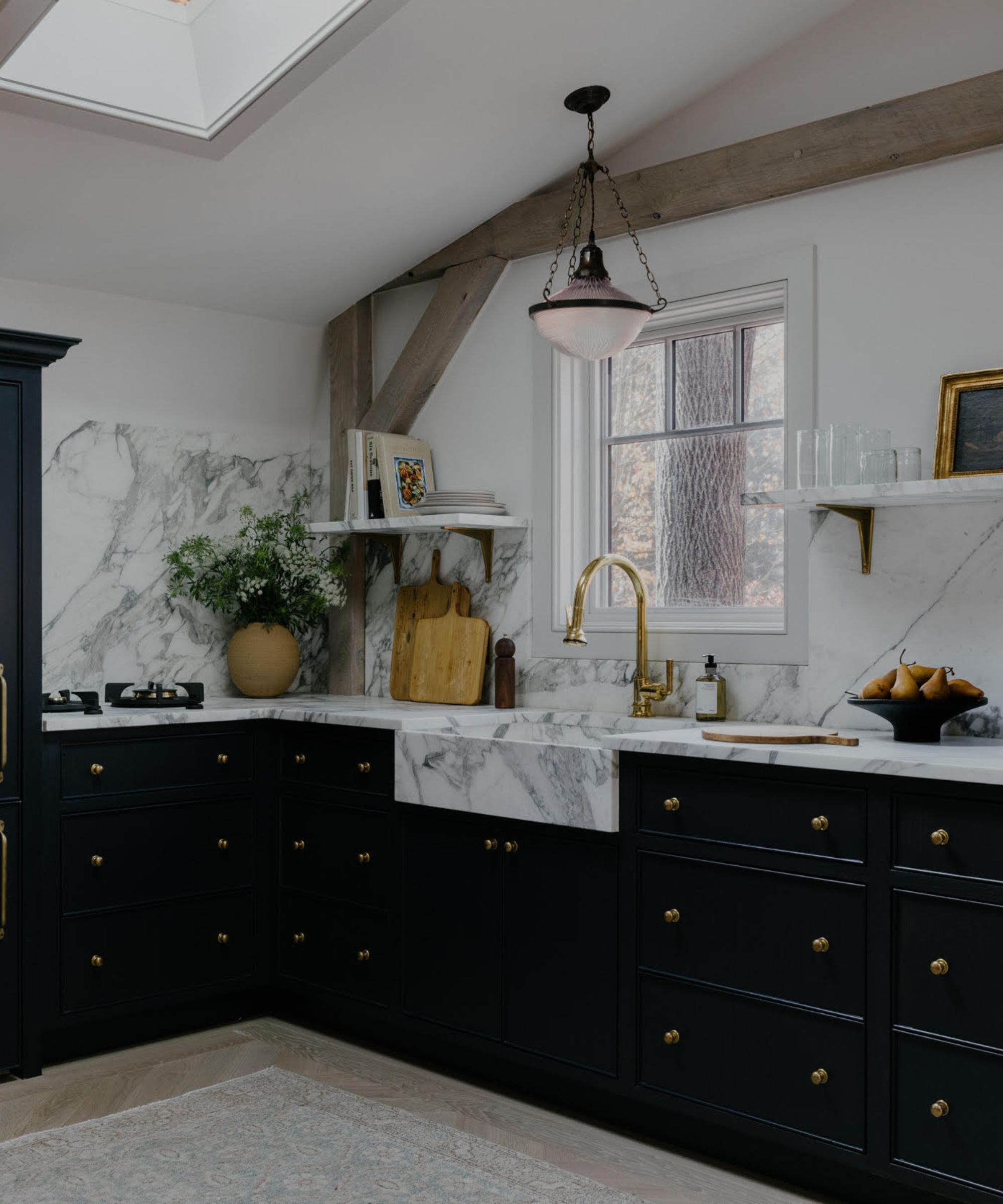
When choosing the finish of kitchen hardware, it's important to opt for something that complements your kitchen cabinet color, rather than clashing. This is more applicable to colorful kitchens – neutral or white kitchens work harmoniously with almost any hardware finish.
To avoid making this kitchen hardware mistake, take a sample of your cabinet color to try next to different hardware finishes. This will help you to see how they work together and if you can achieve the right contrast.
Opt for a finish that can be seen on your cabinets – this doesn't mean the hardware has to be bold or a statement, but you don't want them to get lost in your design. For example, if you've opted for a moody color palette on your cabinetry, black hardware would be difficult to see, whereas gold or brass would add an elegant finish.
Hardware might be one of the smallest details in size, but it makes a big difference to your scheme. Creating an elevated kitchen design is all in the details, so try to avoid these kitchen hardware mistakes – they might be the component adding an awkward feel to your space.
Sign up to the Homes & Gardens newsletter
Design expertise in your inbox – from inspiring decorating ideas and beautiful celebrity homes to practical gardening advice and shopping round-ups.

I’ve worked in the interiors magazine industry for the past five years and joined Homes & Gardens at the beginning of 2024 as the Kitchens & Bathrooms editor. While I love every part of interior design, kitchens and bathrooms are some of the most exciting to design, conceptualize, and write about. There are so many trends, materials, colors, and playful decor elements to explore and experiment with.
-
 This ultra-tiny 'luxury villa' is sold on Amazon – estate agents say this unconventional, pre-assembled home is more than a novelty
'Tiny homes are more than a trend. They’re part of a bigger conversation about how we live' – this foldable house is one of many shaping 2025's real estate industry
By Megan Slack
-
 You won’t believe these chic coastal backyard finds are from ALDI – and everything’s under $50
Hampton's style on an ALDI budget
By Charlotte Olby
