5 fool-proof kitchen color combinations that designers swear always work
Decided on a kitchen color? How about two? These are the best pairings to go for...

Choosing your kitchen color scheme is perhaps the biggest design decision you are going to make with this space. Sure, the layout is important, and of course, the style of the cabinetry makes a difference, but in terms of what's going to be most noticeable to everyone that walks into that room. So, no pressure, but it's an important call.
And the best, most interesting kitchens don't just stick with one kitchen color scheme. There's a considered room color scheme made up of two or three key shades that work together to create a space with layers and character. We aren't just taking bold pairings either, although there are some suggestions here that might change your mind about going for the 'safe' option, you can make just as much of a statement with neutral color combinations.
We asked designers and color experts for their advice – what are the best color combinations in a kitchen? What tones and shades should you bring together to create a kitchen color scheme that's both classic and reflect your personal style...
5 best kitchen color combinations
'It is increasingly popular to use at least two colors on kitchen cabinetry, sometimes mixing timber cabinetry with painted, as we do quite often,' explains Simon Temprell, interior design manager at Neptune. 'Kitchen islands are often painted in a contrasting color from the rest of the cabinetry to create a dramatic focal point, or base cabinets might be a different color to those above. It can also be very effective to paint a contrasting color on the interior of cabinets and drawers to create interest every time you open something up.'
But as with any kitchen trend, you want to ensure it still has longevity. We love a two-toned kitchen and the look is definitely a classic, you just need to pick shades that work together, aren't too trend-led, and that you can live with for years to come. So here are our top five suggestions...
1. Crisp white and deep blue toned grey
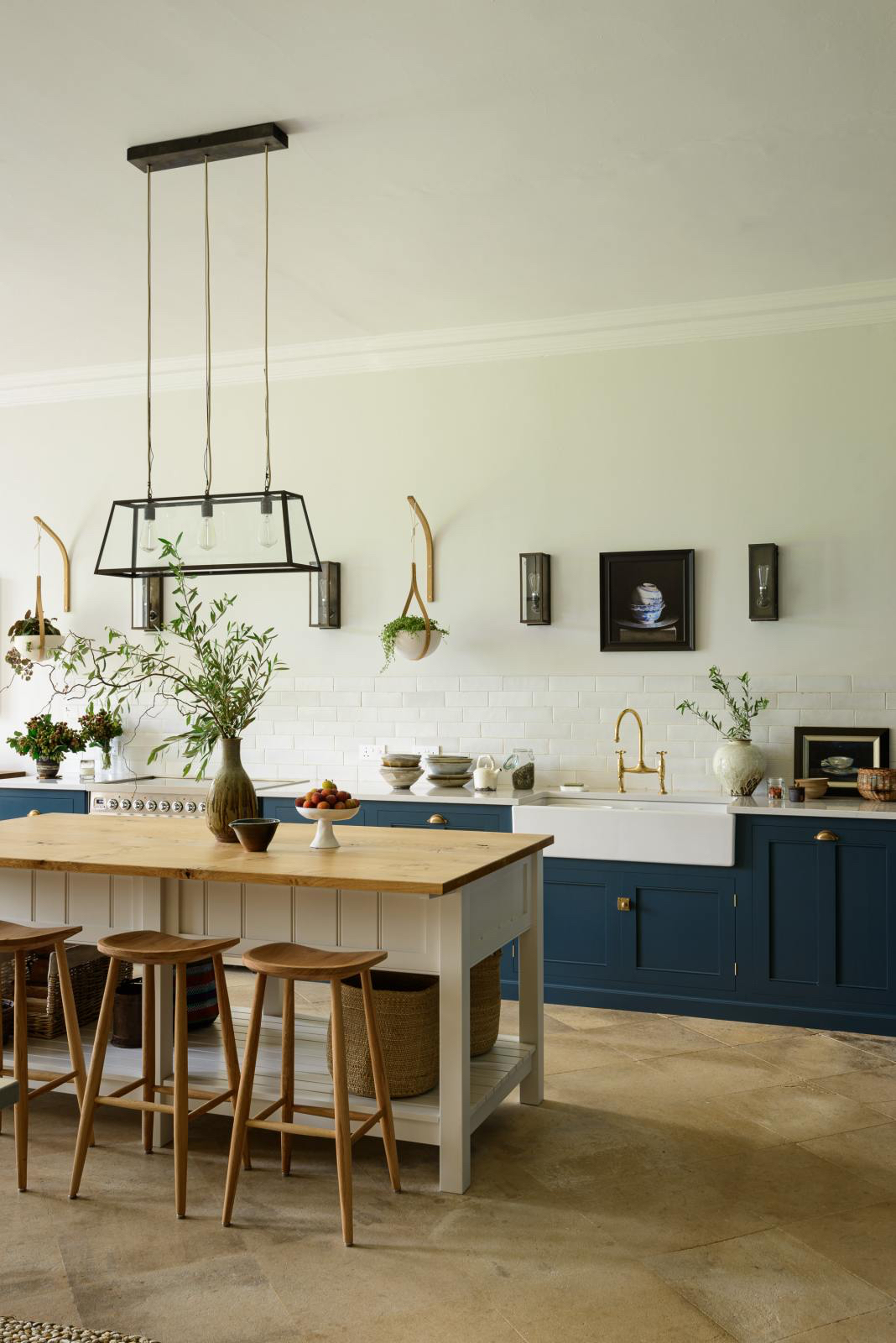
This is a classic kitchen color scheme and the perfect way to dabble in the never-ending trend for darker shades without compromising on light and brightness. Even just a splash of white used on countertops or a backsplash will lift blue cabinetry. When choosing a blue, we'd go for something with a grey undertone rather than a classic navy blue – love navy but navy kitchens are everywhere right now, and opting for something a bit steelier and edgier will make the space more unique.
'When choosing a color palette for your kitchen you need to consider the amount of natural light the kitchen receives at different times of the day, alongside artificial light and of course, the colors that you like, says Tom Rutt, founder of TR Studios. 'As a studio, we like to advocate timeless and classic colors which don’t date. Kitchens are an investment, so you don’t want to be stuck with a cabinet or tile color which you dislike in only a few years.'
'We like to pair neutral walls, Strong White from Farrow & Ball or Pointing, with dark, dramatic kitchen cabinet colors for a modern look. A dark charcoal timber from DeVOL, or a warmer dark walnut is a great pairing with a neutral backdrop and when paired with marble backsplashes/surfaces and brass hardware, a simple palette can really wow. Dark blue is another great color to use in a kitchen paired with white. It’s a classic! For those looking for something softer, a greige-toned timber for cabinets and a taupe/beige wall can equally look smart.'
For a more contemporary take on the combination, switch the blue for an almost black. 'Monochromes are a popular choice when it comes to small kitchen designs in particular,' explains Rhiannon Phenis, Head of Design at Sola Kitchens. 'These subtle kitchen color combinations create a contemporary look and can open up the space. A combination of black and white is classy, modern and will keep your kitchen from looking cramped. A great way to incorporate black into your kitchen, a color that you should generally avoid if the space is small.'
2.Pale pink and soft white
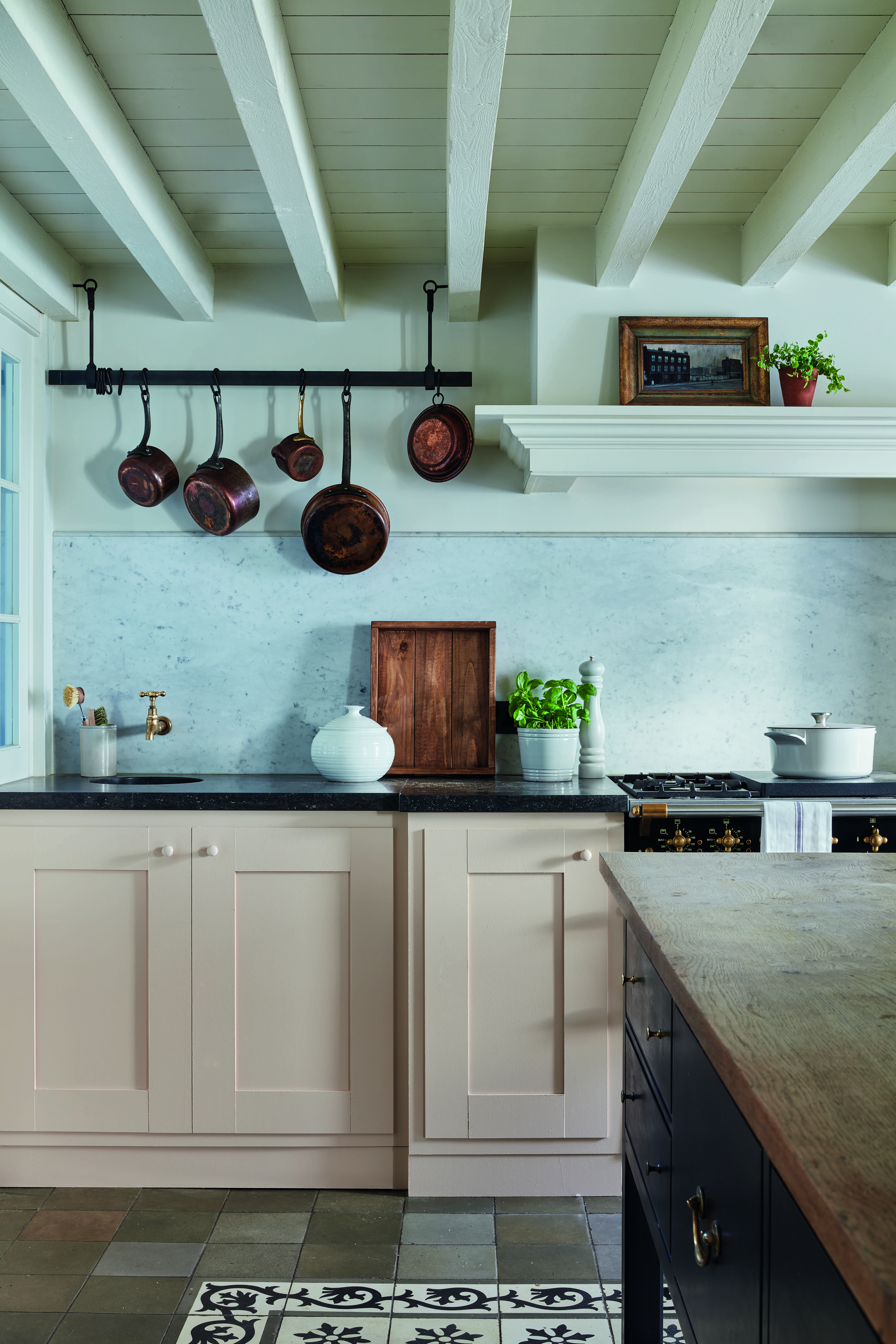
Now this kitchen color combination may sound a bit overly sweet, too soft even, but ground this pairing with some deeper shades and cooler accents and it creates a beautifully calming kitchen. This pink kitchen gets it all right – the contemporary marble backsplash plus the deeper blue of the kitchen island make this kitchen far more stylish than saccharine.
'A new take on the country kitchen – move over sage green and embrace the pink,' says Patrick O'Donnell of Farrow & Ball. 'Not a candy pink but something much more gentle, more nuanced, a slightly browner, earthier pink. Seen here, Setting Plaster from Farrow & Ball, offers a delicate dose of warmth but resonates so beautifully with the oh-so-fashionable grey veined marble backsplash and black granite – adding softness to the stone elements.'
'For a play on this delicate pastel shade, it has been teamed with a gentle white named School House White that has an underlying note of yellow and green, delivering a perfect scheme that offers charm and freshness to this low-ceiling kitchen. For a splash of drama, the island has been picked out in our blackest blue Railings which brings in a ‘modern’ note and acts as a focal point.'
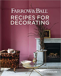
Farrow and Ball: Recipes for Decorating | $43.16 at Amazon
Farrow & Ball is a leading producer of high-end paint and luxury wallpaper, and their design experts share their wisdom for creating harmonious interiors and beautify home décor in this inspirational book.
3. Deep red and pale pastels
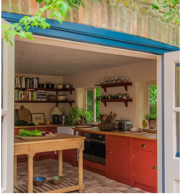
Red may sound like a very bold color to introduce into a kitchen, and in its very pure primary forms, it probably would be. But pick a soft, chalky muted red and it can help create such a cozy, characterful kitchen that in fact doesn't feel bold at all but cocooning. Case in point, this wonderful red kitchen, designed by British Standard.
It helps that the red cabinetry is paired with soft, creamy pink pastel walls to create a tonal effect that balances out any of the vibrancy. 'The dark with the light is a lovely combination that brings a dash of color that is evened out by the lighter calming pastels. It adds interest whilst keeping the space light and airy,' explains William Durrant, founder of Herringbone Kitchens.
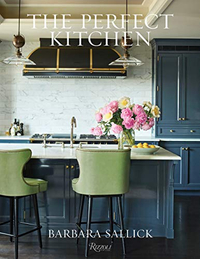
The Perfect Kitchen, Barbara Sallick | From $21.87/£30.45 at Amazon
Learn more about the fundamentals of kitchen design in this bestselling book. Find practical advice as well as hundreds of images to inspire your own remodel
4. Blush pink and olive green
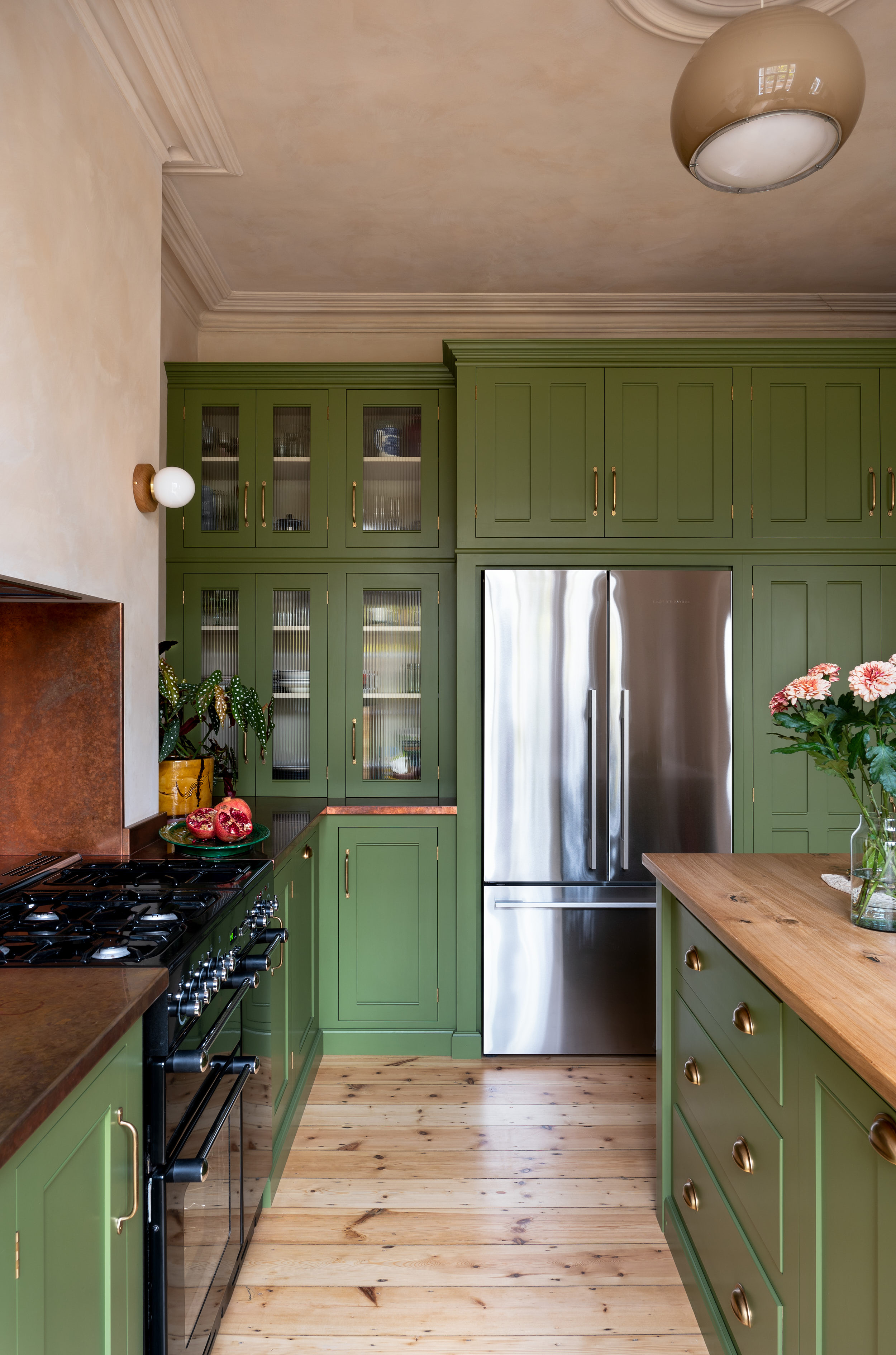
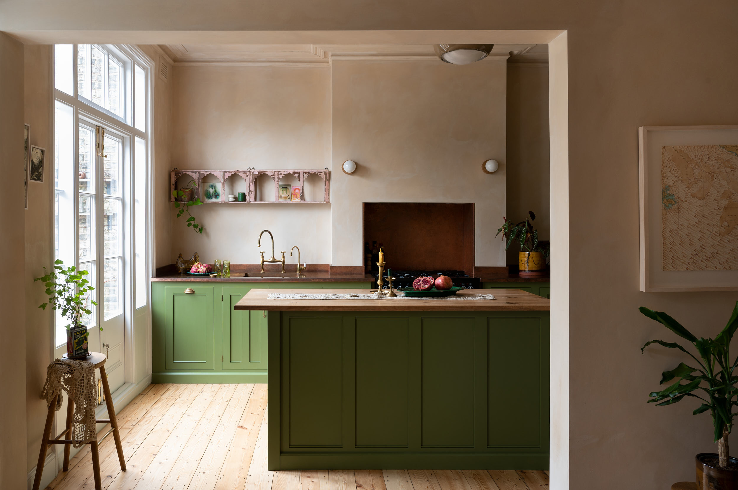
Whoever said pink and green must never be seen could not have been more wrong. They are the perfect pairing, especially in a kitchen, and it is a far less bold combination than you might think. In their most muted forms, we think pink and green almost act like a neutral – no bolder than gray. See how in this green kitchen the olive, sagey tone feels very livable and the plaster pinks and soft woods help bring out those warmer tones to make it an even softer shade. It's the perfect combination if you want a more colorful kitchen but still want it to feel chic and soft.
'I am a sucker for pink. It’s so girly, I know, but I’m ok with it,' says Helen Parker, creative director at deVOL. 'There is something exciting about having pink in your home. It feels a little frivolous and not very grown up, or at least it used to. More recently we have seen pinks become sophisticated and acceptable. Soft blush pinks and faded rose pinks mix so perfectly with sage and olive greens. The green–pink combination is one we love at deVOL. It’s a mix taken from nature, which is why it works so well.'
5. Deep forest green and warm white
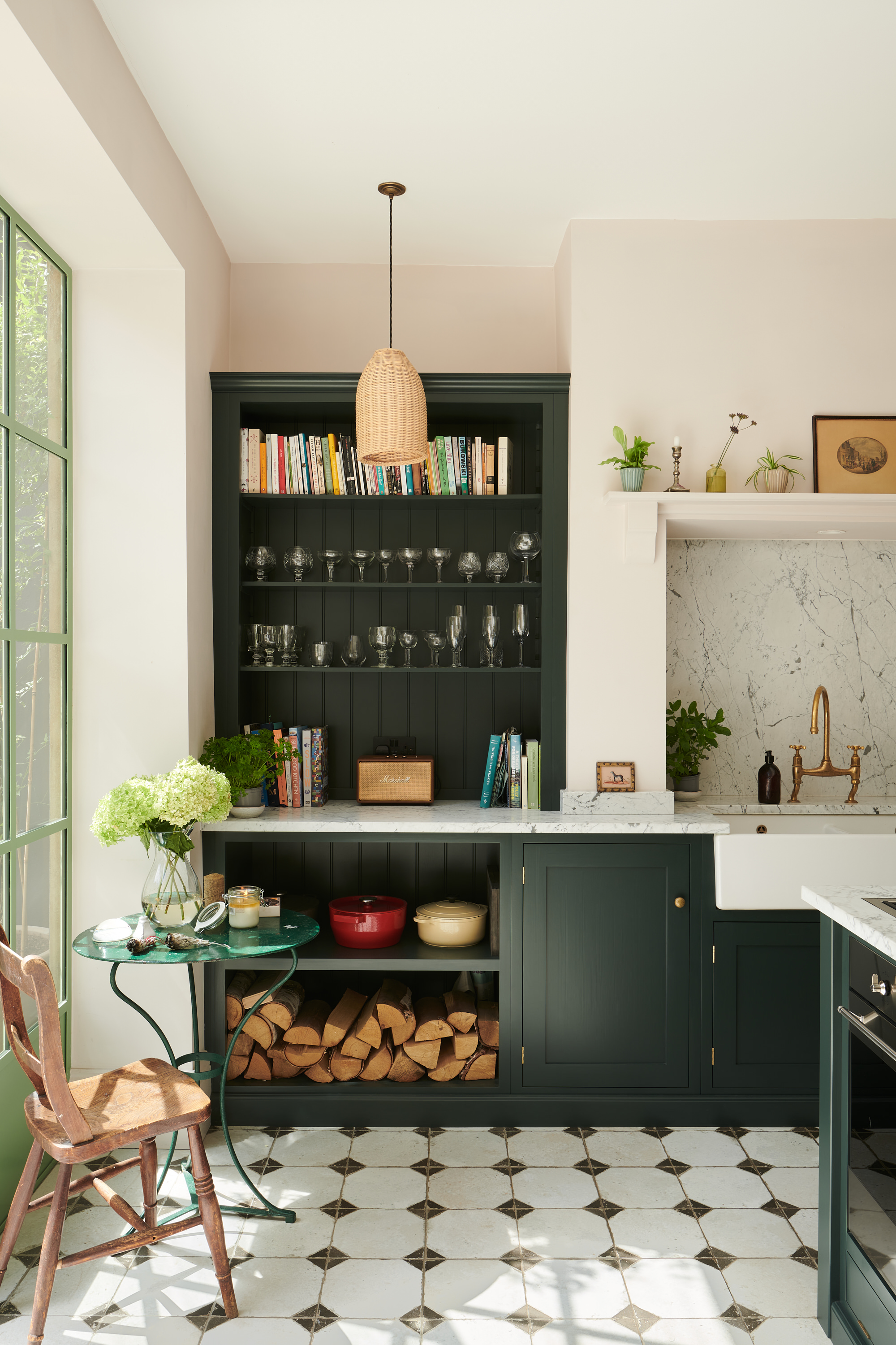
Noticing a lot of green here? But green is such on classic kitchen color if you are looking for something a bit bolder than neutral and it's a color that pairs so well with other shades.
Green and white are ideal if you are after an effortlessly elegant kitchen. Dark forest greens are perfect for adding some drama, and a safe choice even for a kitchen cabinet color as the love for this shade is going nowhere. Then you can tone down that dramatic edge with a soft, warm-toned white with plenty of yellow or pink undertones. In fact, a cream or a super pale pink would work in this combination too.
This paler shade freshens up the green, adding contrast and balancing out the darker color to make it a more liveable option. 'Pair dark cabinetry with a gently nuanced off-white for some light relief on your walls and woodwork. It creates a calm and cohesive scheme with just the right amount of dramatic statement but most importantly, never overwhelms!' suggests Patrick O'Donnell.
Richard Davonport, managing director at Davonport adds that 'Finding the right color scheme for your kitchen can be tricky, and it is something that you will have to live with for the foreseeable future so it needs to be something that you love. I'd recommend soft cream shades alongside dark greens as a classic combination that works well with shaker-style cabinets. This color combination works particularly well when accessorizing with brushed gold hardware which is so popular at the moment.'
What is the most popular color for a kitchen?
The most popular kitchen color trends do change slightly as trends change, but colors we have noticed hanging around for years now are gray kitchens and navy kitchens. Classic and chic choices that can be adapted to any style of space and work well with plenty of other shades. Then you of course have white and cream which will always be very popular kitchen shades, purely for how easy they are to work with, and how they make spaces feel bigger and brighter. Plus, you know your kitchen will be on trend for decades, there's no risk of a white kitchen ever dating.
What are the best colors for a kitchen?
As with any question like this, it all comes down to personal style. What colors do you love? What colors are you drawn to? And there's the space too – what style is your home and the kitchen? What size is it? What light does it get? There are so many factors to consider, so maybe 'best' isn't the right color to be looking for, but more 'best for your space'.
We will say, remember a kitchen is a big investment and it's a room you spend a lot of time in. So the color needs to be something you won't tire of too quickly. Something livable and that has longevity. This is why neutrals are such popular colors – whites, grays, and creams all of which make for great kitchen colors. If you are after something with more drama, deep greens, blues, and charcoal greys work wonderfully. Just be sure to order swatches and samples, and see how different colors work in your space and how you feel about them.
Sign up to the Homes & Gardens newsletter
Design expertise in your inbox – from inspiring decorating ideas and beautiful celebrity homes to practical gardening advice and shopping round-ups.

I am the Head of Interiors at Homes & Gardens. I started off in the world of journalism in fashion and luxury travel and then landed my first interiors role at Real Homes and have been in the world of interior design ever since. Prior to my role at H&G I was the digital editor at Livingetc, from which I took a sabbatical to travel in my self-converted van (not as glamorous as decorating a home, but very satisfying). A year later, and with lots of technical DIY lessons learned I am back to writing and editing, sometimes even from the comfort of my home on wheels.
-
 These are the 6 must-have colors to decorate with in April 2025
What do retro-inspired yellows and beautiful blues all have in common? They're on our hot list for the season ahead
By Sophia Pouget de St Victor Published
-
 Plants never to grow next to fruit trees
Expert advice on which plants to keep away from fruit trees to encourage a healthy harvest
By Jacky Parker Published
