8 kitchen backsplash mistakes to always avoid, according to interior designers
This is what interior designers see go wrong with backsplashes and how you can swerve the same errors
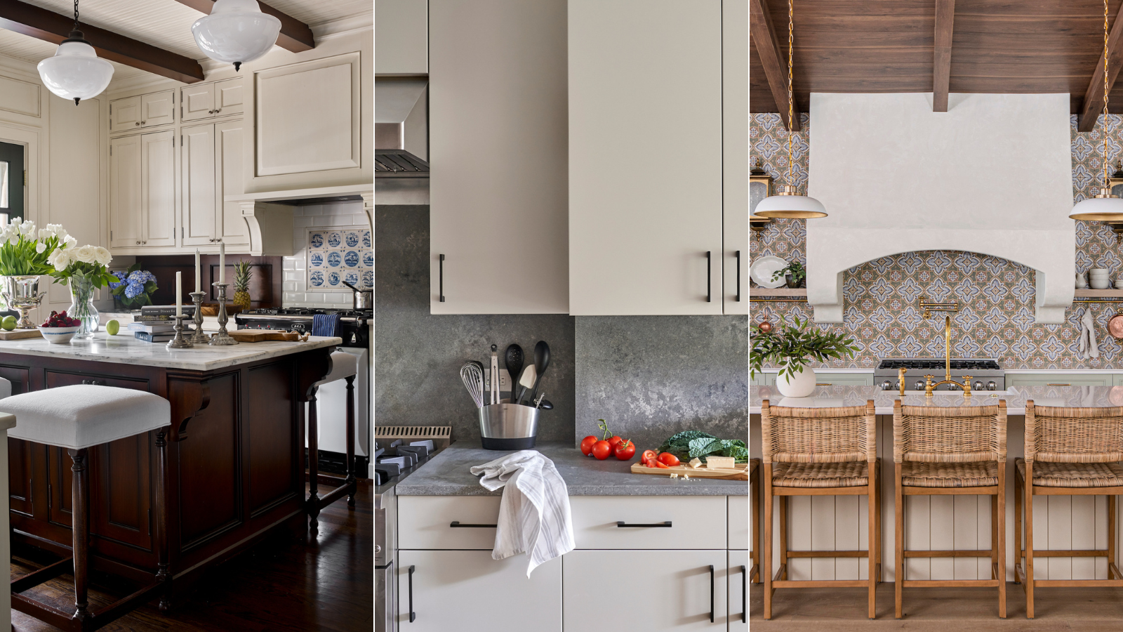

A backsplash does important work in protecting a kitchen wall from splatters and marks, and it’s also an element of the room’s aesthetic. Get the design wrong, though, and it will be a disappointment on both counts, and that’s why it’s crucial to know the kitchen backsplash mistakes to avoid.
And who better to ask what can go wrong than interior designers, who tend to see the same errors again and again when it comes to kitchen backsplash ideas. Know which blunders they see and you can avoid the heartache of having to start over – or the necessity of tolerating a design that doesn’t deliver.
Below are the top kitchen backsplash mistakes design professionals see along with their expertise on what you should do instead.
1. Not prioritizing function
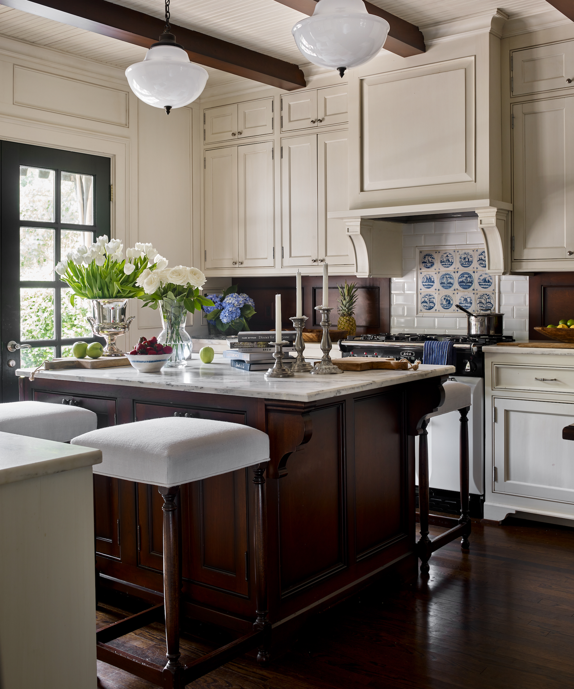
If you want to get the right kitchen backsplash for the area behind the stove, it’s a mistake not to think about what it’s going to have to deal with, according to interior designer Julie Anne Burch.
‘A client of mine fell in love with a stunning mosaic from a renowned NYC tile company,’ she says. ‘It had a delicate, seashell-like design – an absolute work of art. However, it was installed behind the stove, and while it looked beautiful, everyday kitchen splashes quickly made it impractical. We had to swap it out for something more durable.’
She adds: ‘The key takeaway: the backsplash behind a stove should prioritize function over artistry. The trick is to choose a design that both looks beautiful and can withstand the heat and splashes of a busy kitchen. This could be a favorite color or a durable artistic tile (like the Dutch tiles, above).’
2. Failing to seal stone
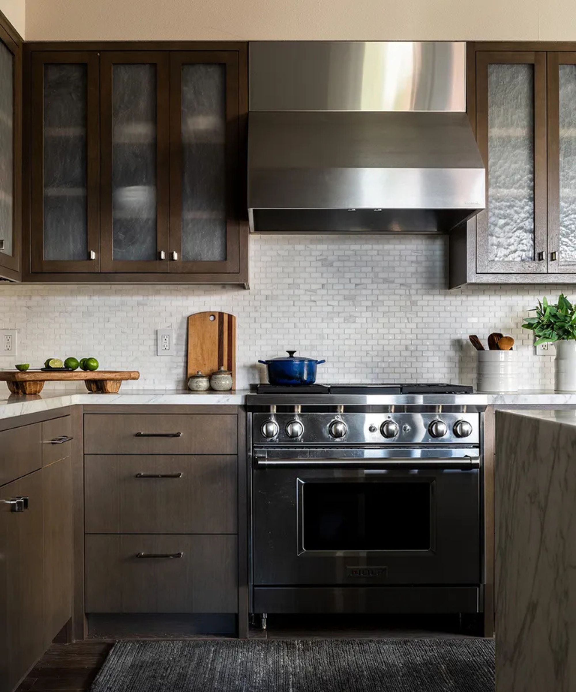
Natural stone can create an attractive backsplash material but the pros often see the results of not sealing it.
‘Choosing porous materials like marble or natural stone without sealing them can lead to staining and damage from cooking splatters,’ says Alan Berman, president at Archetype Architecture. ‘To avoid stains, reseal the stone backsplash every six months. To test if it’s time to reseal, you can drop a small amount of water on the backsplash. If the water beads up, the seal is still effective. If it soaks in, it’s time to reseal.
‘Another option to avoid stains would be to install a protective film such as TuffSkin,’ he says.
3. Ending the backsplash too low
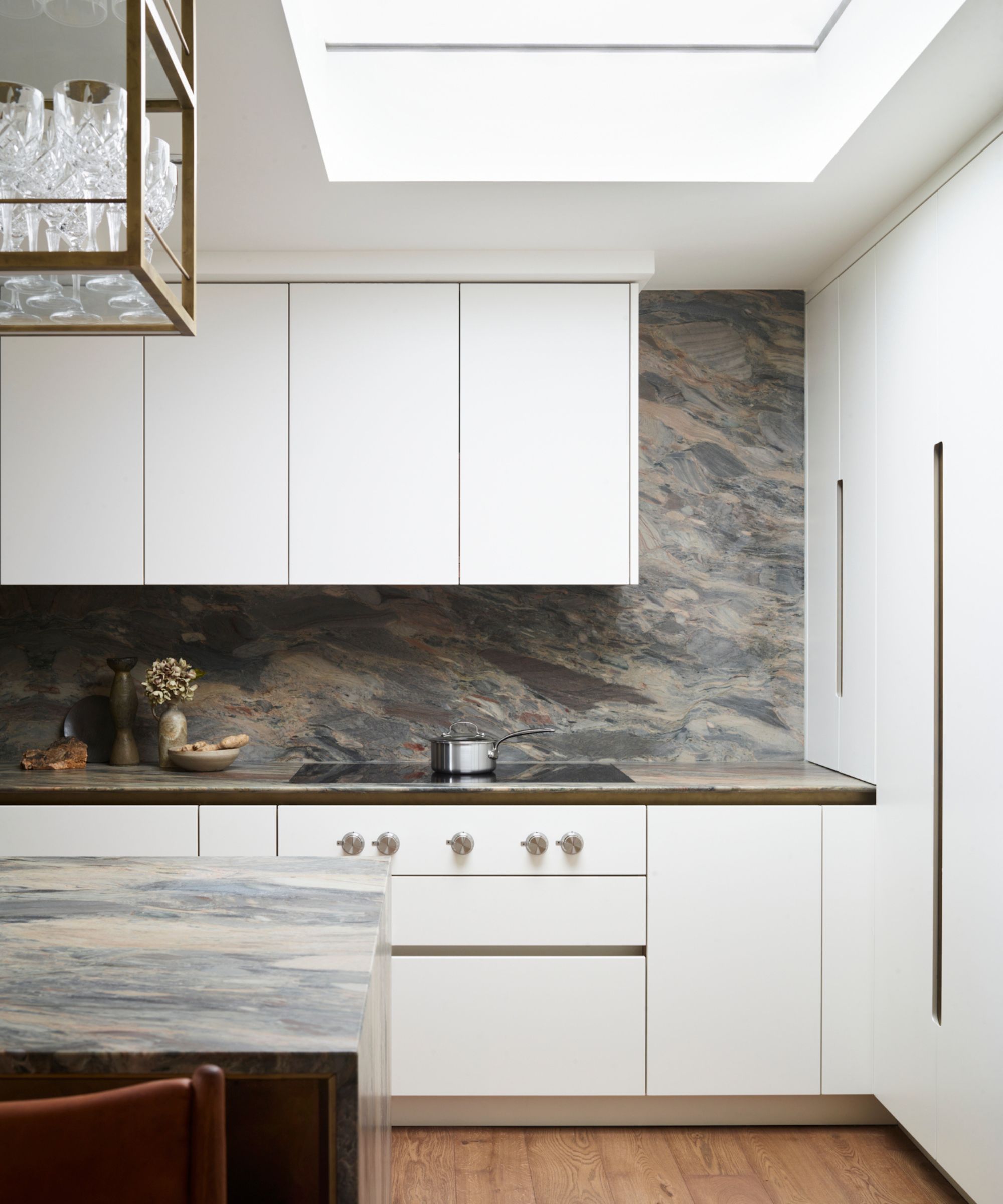
A backsplash that finishes in the middle of a wall is a no-no – but it’s something designers see frequently.
‘Not continuing the backsplash all the way up the wall to meet the bottom of your cabinets or all the way up to the range hood behind a stove is a big mistake,’ says Leslie Dapper, lead designer at Rumor Designs in Colorado. ‘It often makes that space feel unfinished.’
Going higher is an easy solution, but make sure you allow for the extra tile in your budget.
4. Neglecting to align it left and right
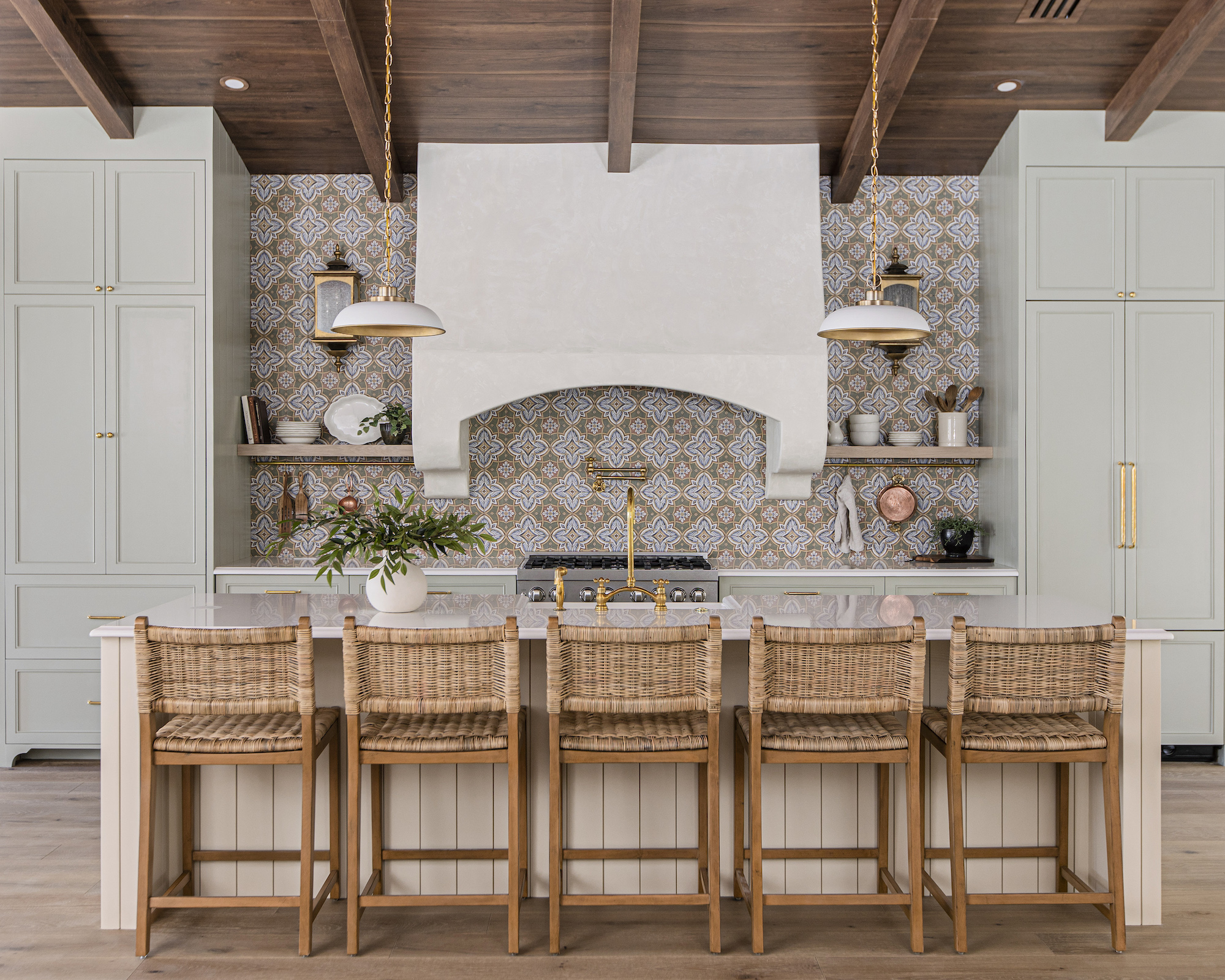
Failure to align it at both ends is a blunder when you’re ending a backsplash on an open wall.
‘A big mistake is not extending your backsplash appropriately to line up with countertops or cabinets nearby,’ says Teri Simone, the head of design at Nieu Cabinet Doors. ‘If you have a natural stopping point (ie a wall) this can make the design simple, but if your wall is open beyond where the countertop stops, the backsplash should stop in line with the uppers and lowers.’
5. Ignoring the overall design
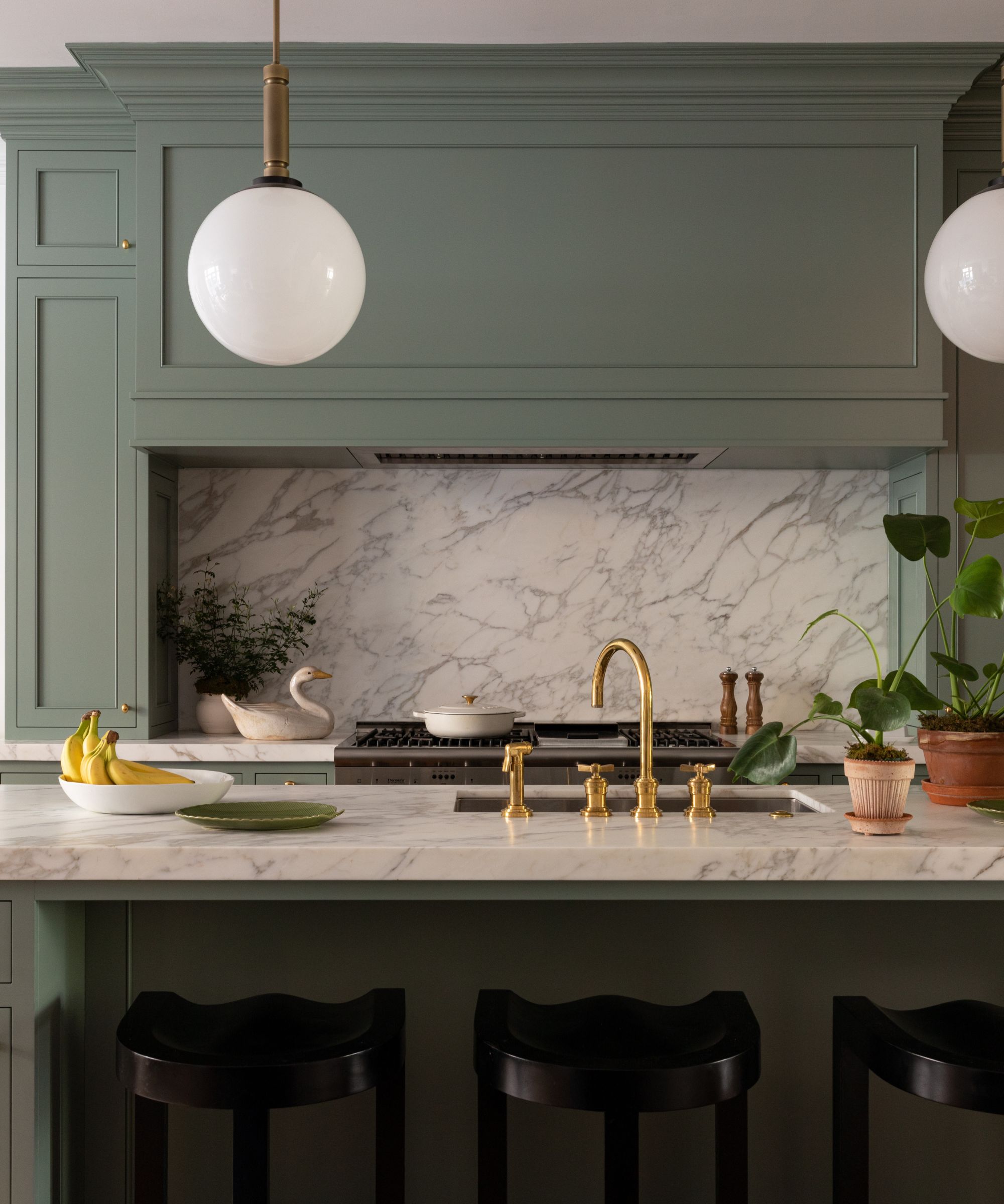
It’s easy to think about the backsplash in isolation, but that can be an error, say Mark Williams and Niki Papadopoulos of Williams Papadopoulos Design.
‘Sometimes when clients do a little shopping on their own, or spend a little too much time scrolling through Pinterest, they can be easily seduced by vibrant exciting samples in a tile showroom, or by perfectly curated photography on the design blogs with a myriad of punchy backsplash options photographed in unrealistically empty kitchens,’ they say.
The reason an attention-grabbing backsplash can be a mistake? ‘First, kitchens are generally now part of our main family living spaces, and need to exist within the entire design context peacefully with all of the other elements in a complementary way,’ they say. ‘Anything, like a loud backsplash that screams “Hey! Look at me!”, can disrupt the balanced composition of the home space that we occupy the most.
‘Second, all of the beautiful vibrant tile store samples in isolation may look like beautiful pieces of art, but when used as as a backsplash in your kitchen, inevitably a “layer of real life” ends up on the countertop in front of that backsplash. Once you layer those two things on top of one another, you end up with a visual circus.’
Their advice? ‘Because so many kitchens are just one piece of an open plan comprehensive informal dining and family living area, we tend to keep our backsplash selections quiet. Most often simply using the same slab material from the countertops on the backsplash as well.
‘Don’t misunderstand, we’re not advocating for designing a “bland bowl of oatmeal” because it’s safe,’ they add. ‘We’re strongly suggesting that your backsplash selection may not be the right place to locate the “statement moment” in the most important space of your home.’
6. Mismatching styles
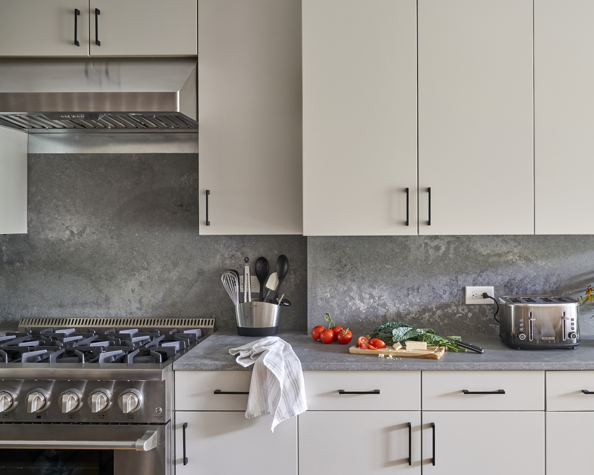
Teaming a backsplash and kitchen cabinets that have different interior design styles is a mistake that’s often encountered by professionals.
‘Not considering the overall kitchen style is a common mistake,’ says Alan Berman. ‘For example, an ultra-modern kitchen and a traditional backsplash can feel out of place.’
And the reverse is true, too. Put together a backsplash with modern style with traditional or transitional cabinets and the result won’t be harmonious. The good news is that this is an error that’s easy to avoid through consistency in style.
7. Teaming a counter backsplash and tile
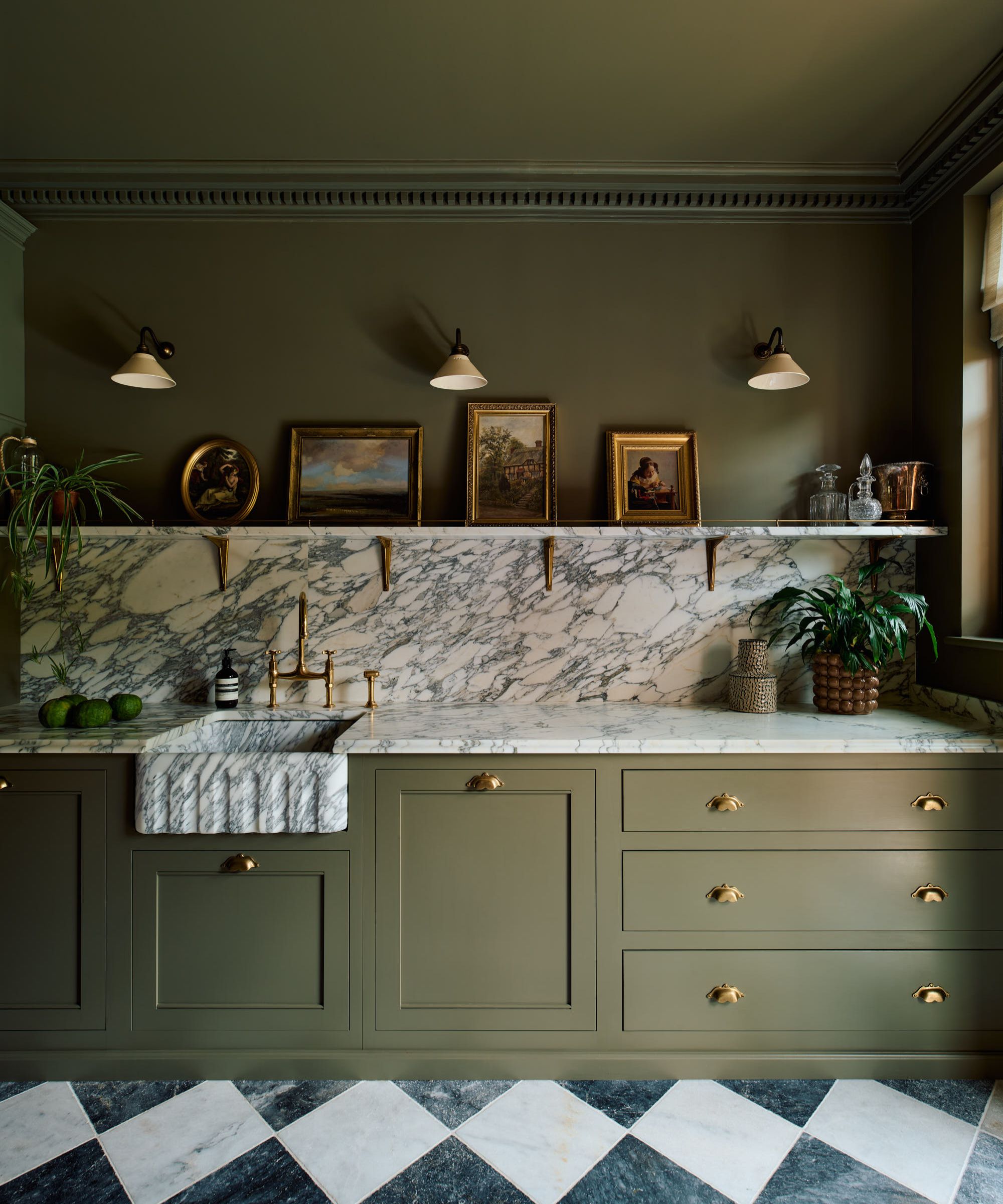
Putting together a counter backsplash and tile is a misstep that won’t do a kitchen any favors. ‘Four-inch counter backsplash and then tile above it tends to look dated and we typically don’t design it like that anymore,’ explains Leslie Dapper.
There are two alternatives, though. ‘You should either continue your countertop all the way up the wall to serve as the backsplash or do tile from where it meets the counter and up the wall,’ Leslie advises.
8. Getting the scale wrong
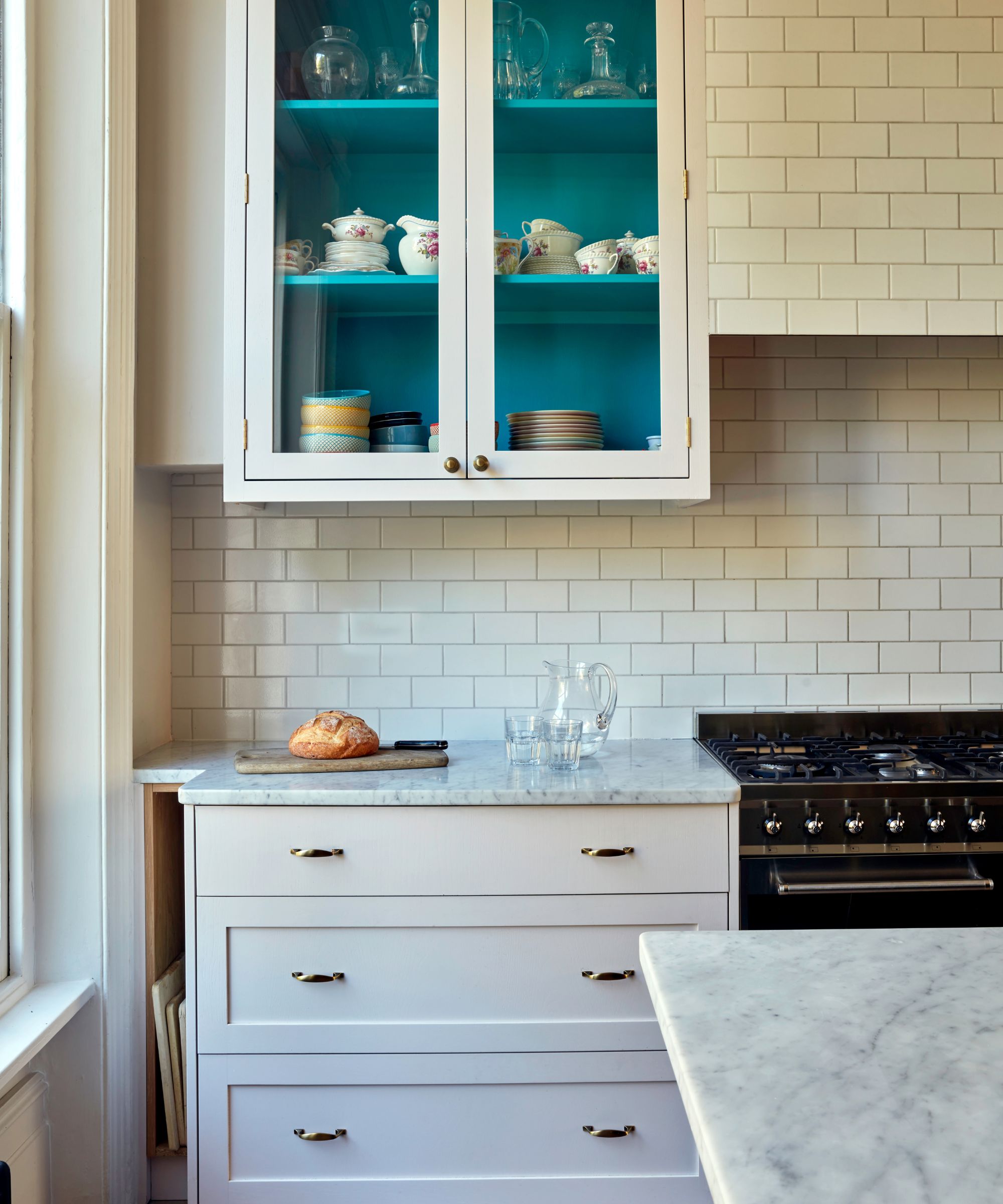
Not taking the size of tiles and the proportions of the area to be tiled into account is a slip, according to Tracy Metro, interior designer and host of interior design show House Doctor.
‘If the kitchen has a short distance from the counter to under cabinet – approximately 18 inches – it’s important to think about the size and direction of the backsplash tiles,’ she says.
‘If you were to choose a very standard 6 x 3 inch subway tile and were to lay it vertically, you would only get three rows of tile from the counter to under the cabinets,’ she explains. ‘This would make the space feel a bit clunky. However, if you were to lay the tiles horizontally, you would install six rows which would make the backsplash feel vaster.’
The way to swerve this backsplash trap? ‘It’s important to think of size in conjunction with layout,’ she says.
A backsplash that elevates a kitchen needs coherence with the rest of the kitchen’s colors, material and its style. But practicality is a must, too, with a choice that won’t be compromised by preparation and cooking, nor prove hard work to keep clean.
Sign up to the Homes & Gardens newsletter
Design expertise in your inbox – from inspiring decorating ideas and beautiful celebrity homes to practical gardening advice and shopping round-ups.

Sarah is a freelance journalist and editor. Previously executive editor of Ideal Home, she’s specialized in interiors, property and gardens for over 20 years, and covers interior design, house design, gardens, and cleaning and organizing a home for Homes & Gardens. She’s written for websites, including Houzz, Channel 4’s flagship website, 4Homes, and Future’s T3; national newspapers, including The Guardian; and magazines including Future’s Country Homes & Interiors, Homebuilding & Renovating, Period Living, and Style at Home, as well as House Beautiful, Good Homes, Grand Designs, Homes & Antiques, LandLove and The English Home among others. It’s no big surprise that she likes to put what she writes about into practice, and is a serial house renovator.
-
 Orange and green is the bold color pairing quietly transforming homes in 2025 – here's 4 reasons why
Interior designers are making the orange and green combination work wonders – this is how you can too
By Sophia Pouget de St Victor Published
-
 This Michelle-Pfeiffer-approved chair is made of a forebodingly unusual material, opening the debate: Is it a rustic stunner, or a danger to sitters?
The actress took to Instagram with a chair made of a controversially sharp material – and fans are unsure of how they feel about it
By Sophie Edwards Published