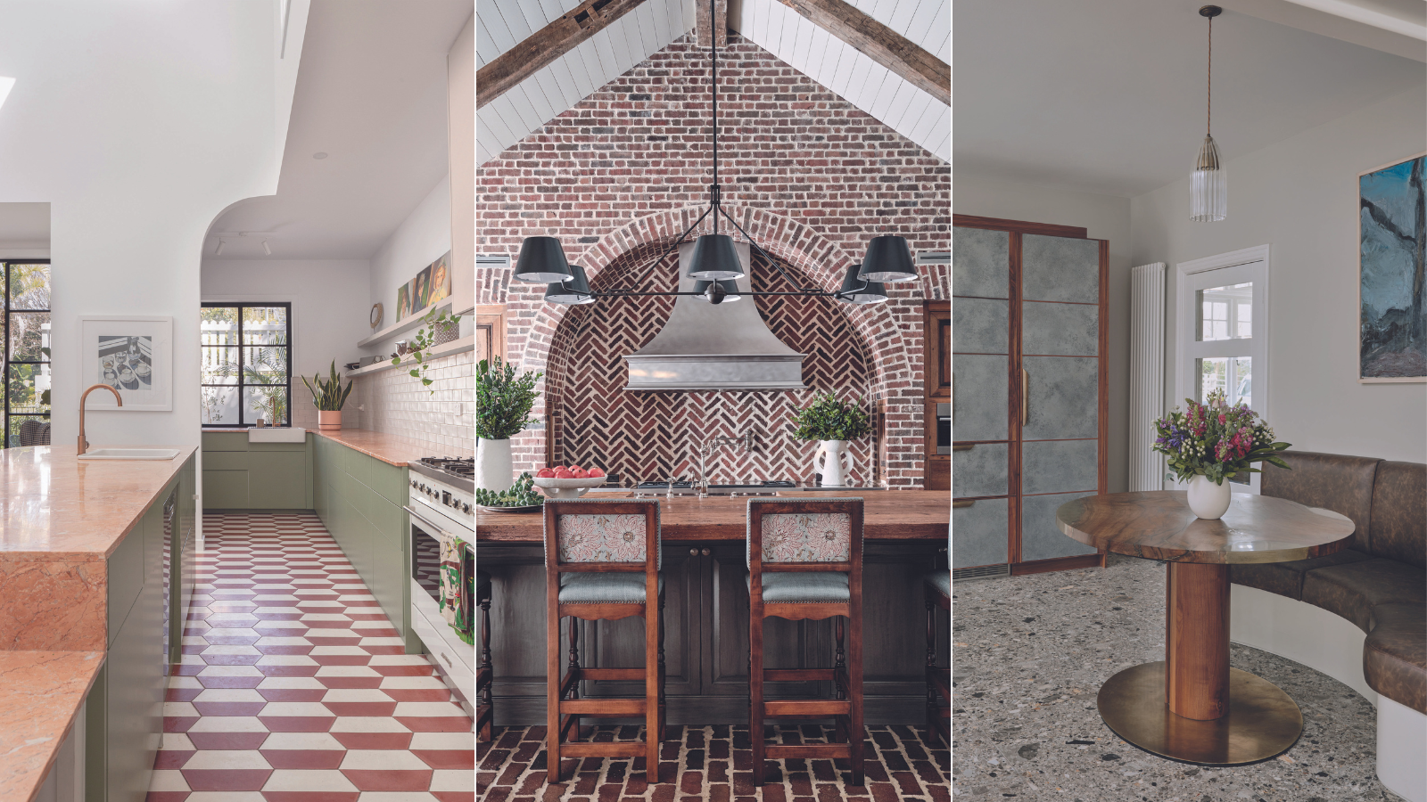
8 designers on how they add movement to a kitchen to prevent this practical space from feeling bland
We speak to interior designers about how to create rhythm in this vital room

Holly Ransome
The concept of movement in interior design is central – being that a space should have a feeling of its objects, furniture, and structure as all flowing together. By being aware of how our decor can create a sense of rhythm, we can bring a greater feeling of ease to our daily lives.
Movement and flow in interior design help to create airiness, both by improving ventilation, as well as a more metaphorical feeling of openness – if our interior surroundings gently guide us to move through our homes effortlessly, we are more likely to feel calm.
This is one of the grounding beliefs of Feng Shui decorating, and arguably the kitchen is one of the most important spaces to get right. We spoke to interior designers about their top tips for enhancing the feeling of movement in the kitchen.
8 examples of how to create a sense of movement in the kitchen
From cabinets, islands, and lighting, it's worth paying attention to the rhythm created by your decorating choices. In the kitchen, it's especially important to create a relaxing sense of movement. We hear from the experts on 8 ways to achieve this.
1. Add in arches to contrast straight lines
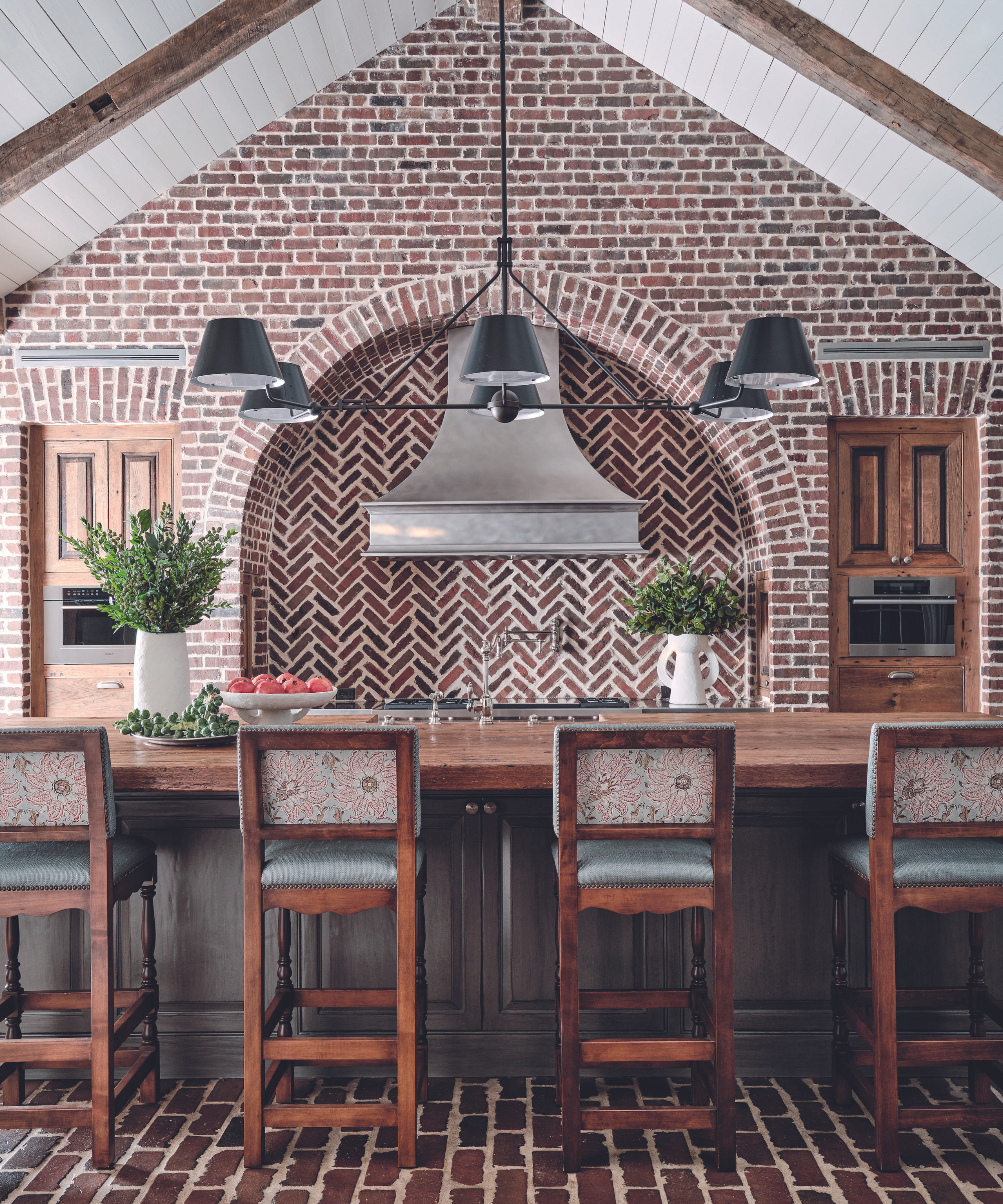
Interior design by Lucas/Eilers Design Associates. Design and build by Thompson Custom Homes.
If you have the opportunity to start from scratch, a soaring arch is a compelling way to introduce architectural character, as demonstrated in this striking build by Thompson Custom Homes, with interior design by Lucas/Eilers Design Associates.
‘The brick arch, embodying both form and function, serves as a visual anchor, grounding the room with its timeless appeal,’ says founding partner, Sandra Lucas. ‘The custom zinc vent hood adds individuality, while the reclaimed street pavers, laid in the original style, without mortar, offer distinctive character.’ The bespoke kitchen cabinets and island countertop were milled from reclaimed oak, infusing the room with a warm ambiance.
2. Bring in curves with a peninsular
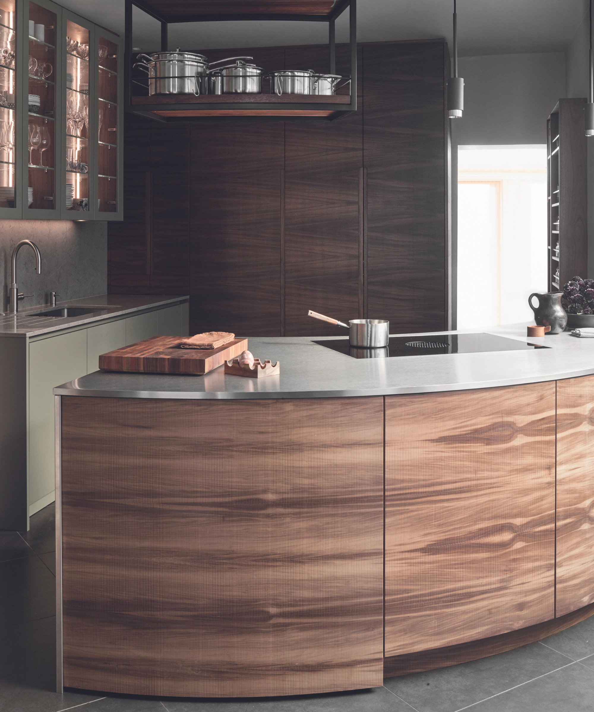
Urbo cabinetry in Matt Lacquer and Smoked Walnut, Roundhouse.
Working curves into a small kitchen can provide valuable spatial gains. In this compact kitchen with limited wall space, a sweeping curved peninsular provides substantial kitchen storage opportunities, alongside an abundance of style. Topped in seamless stainless steel with a flush-mounted hob, the gentle curve encourages smooth passage through the room.
‘The curve provided an opportunity to use a standout finish on the cabinetry with an exquisite book-matched Riven Walnut veneer,’ adds Ben Hawkswell, senior designer, Roundhouse. ‘Laid horizontally to highlight the length of the curve, the fluctuating grain flows from side to side, emphasizing the natural patterning.’
3. Soften cabinet corners
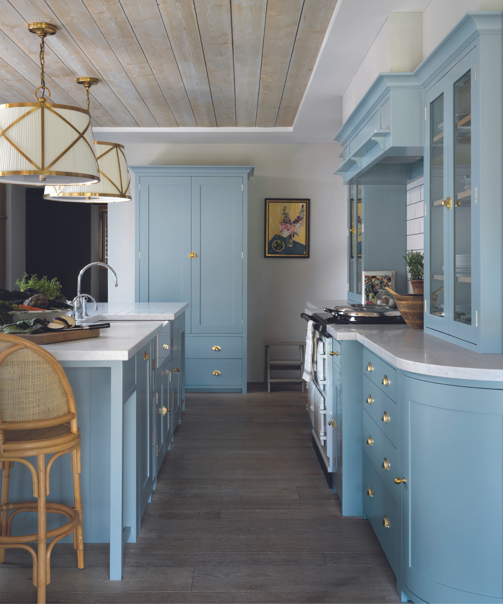
The Suffolk kitchen in Flax Blue, Neptune. Project by Sims Hilditch.
Ending a run of base cabinets on a curve creates a softer stopping point and removes the danger of sharp corners in busy family kitchens. ‘A curved end unit will gently lead you through the space, helping create a sense of flow,’ says Emma Sims-Hilditch, creative founder, Sims Hilditch.
‘As a design feature, it can be used at one end of a cabinet run or both ends, which will make the kitchen feel more free-standing.’ Storage-wise, Emma suggests using a curved end unit to store small appliances or vases. ‘Open curved end cabinets are also good for displaying decorative kitchen serving bowls,’ she adds.
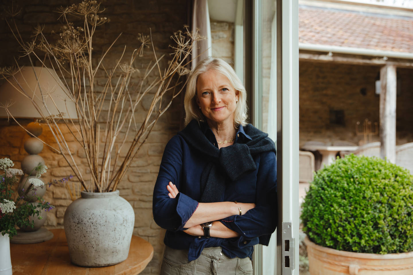
Emma Sims-Hilditch founded her interior design company in 2009, segwaying from a background in film production. The business has locations in both London and the Cotswolds and works with clients globally. It has worked on estates, mews houses, and manors.
4. Create unusual shapes with circular lighting
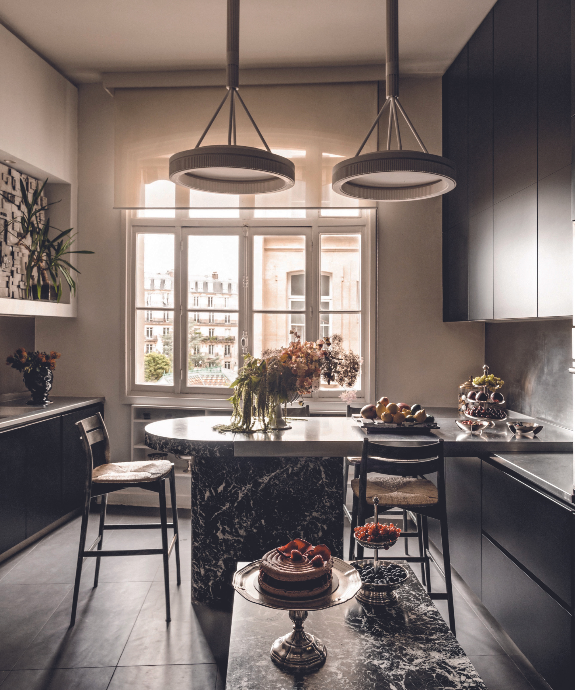
Custom pendant lights designed by Aline Asmar d’Amman, Culture in Architecture.
Make bold moves with outsized kitchen lighting sporting strong circular silhouettes. Originally imagined for the Jules Verne restaurant at the Eiffel Tower, architect Aline Asmar d’Amman installed two custom pendant lights in her apartment in the French capital.
‘Suspended from the tall ceiling, they amplify the curved allure of the Black Marquina kitchen tabletop below. The contrast of black and white infuses the space with personality and a very Parisian aesthetic,’ explains Aline, founder of Culture in Architecture. ‘The role of lighting in a space is not only a functional element but a transformative one, capable of accentuating architectural features and creating a sense of drama.
5. Create movement with arched cabinet fronts
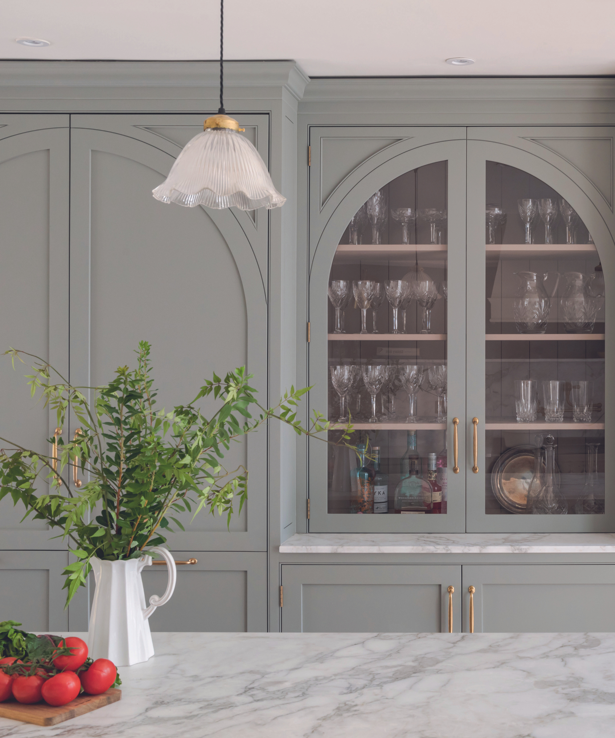
Bespoke hand-painted Shaker kitchen, designed by K&H Design x Kate Feather Kitchen Design.
‘While horizontal curves are great for improving circulation in a kitchen, vertical curves can elevate the aesthetics of beautiful cabinetry,’ says Katie Glaister, founder of K&H Design. ‘Scale and proportion are key, and it pays to find a bespoke maker to achieve the high levels of craftsmanship required for perfect curves.’ The arched detail in this kitchen is inlaid on rectangular doors to access the full glass storage within
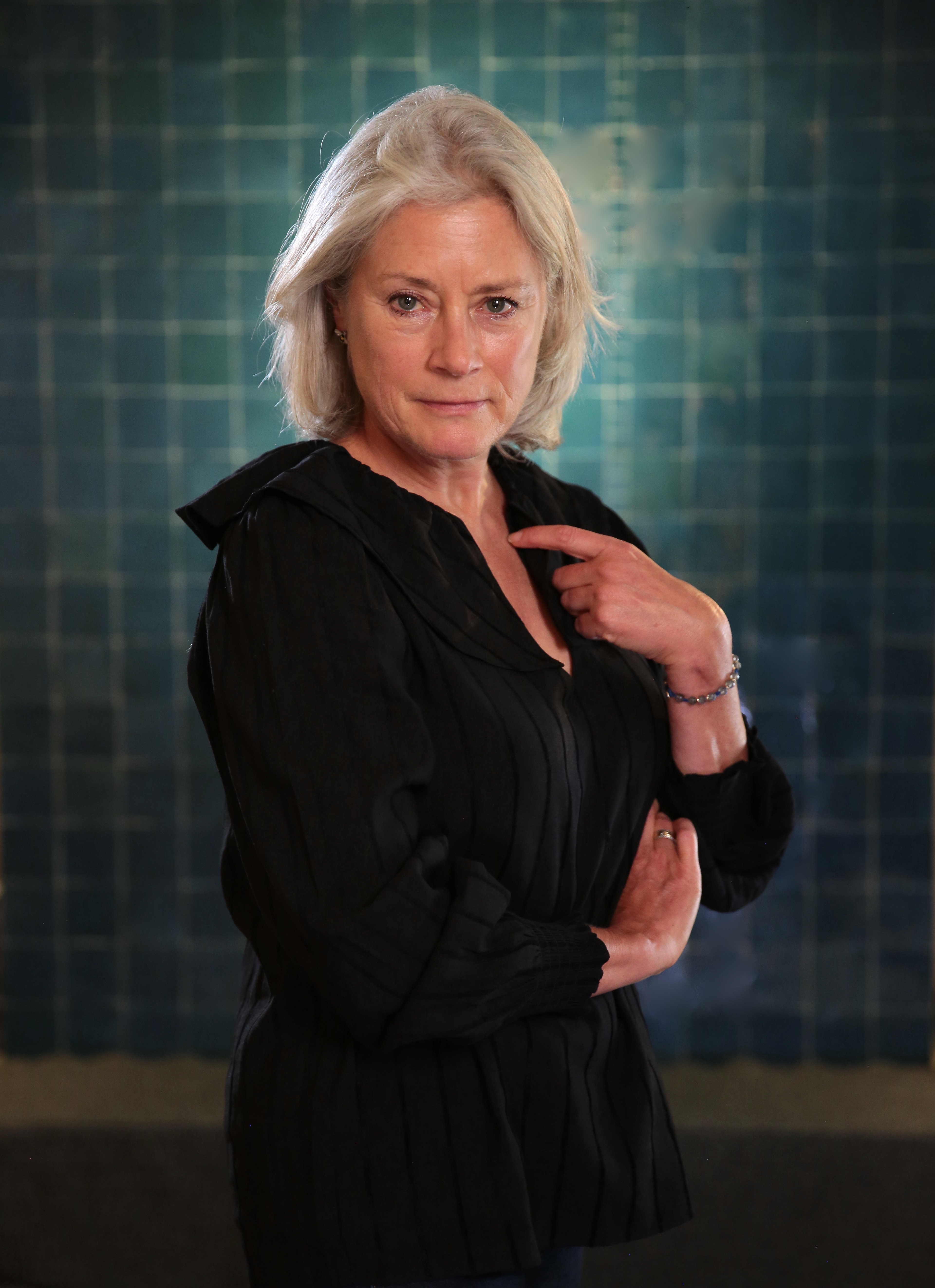
Katie Glaister is the founder of interior design studio K&H Design. As well as residential clients, she has worked with hotels and on large-scale commercial properties. Their service includes interior architecture, spatial planning, and bespoke furniture.
6. Don't just opt for a rectangular island
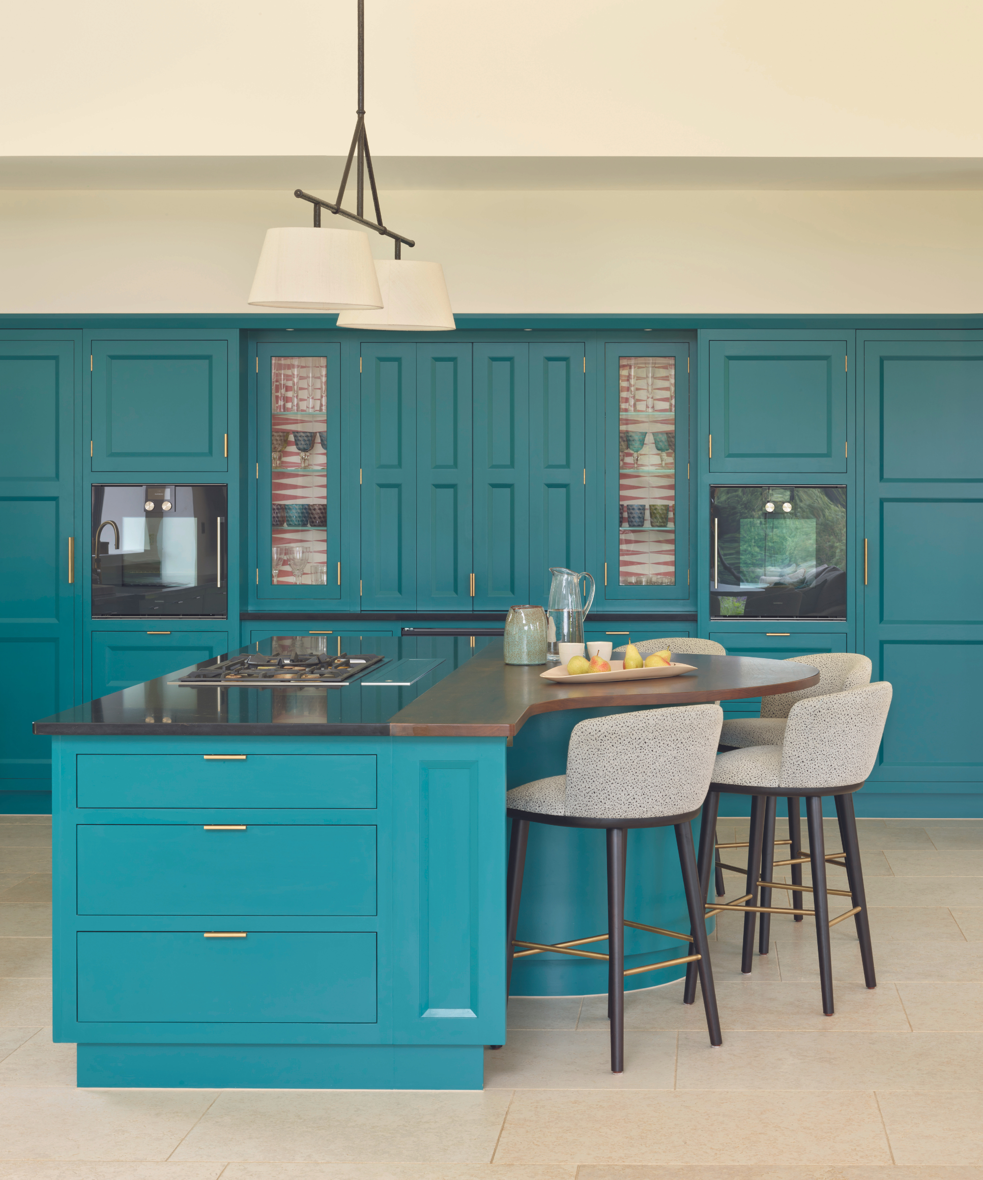
The New Deco kitchen, Martin Moore.
Adding a shapely breakfast bar to your island unit will instantly invigorate a regular rectangular design. ‘Bowed or curved breakfast bars are perfect for creating a more sociable, relaxed seating arrangement in the kitchen. It allows everyone into the heart of the cooking zone, interacting with the hosts, without being in the way and it means they can more comfortably face each other when socializing, contributing to a more convivial atmosphere,’ says Richard Moore, design director, Martin Moore.
For a clear distinction between zones and to accentuate the curve, Richard recommends using different worktop materials for the breakfast bar area and main island.
7. Lean into quirks
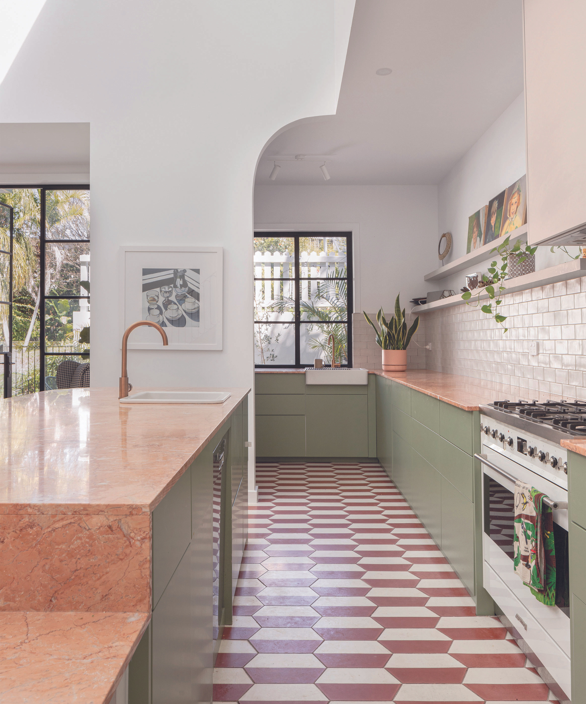
Elysian kitchen mixer tap in Brushed Copper; Penelope kitchen sink drainer in Brushed Copper, both ABI Interiors. Project by Aude Interiors.
The smallest architectural curve can be all it takes to balance the linearity of sleek modern cabinetry. ‘In this kitchen designed by Aude Interiors, the incorporation of a half-arched walkway and brushed copper tapware introduces curvature that enhances the spatial fluidity of the design,’ notes Luli Farrell, co-founder of ABI Interiors.
The same space without that simple half-arch overhead would look far less interesting, and the narrow double-galley layout even skinnier. ‘This simple addition creates a more balanced feel and is crucial for a seamless flow in the overall aesthetic,’ agrees Luli.
8. Use furniture to add curves
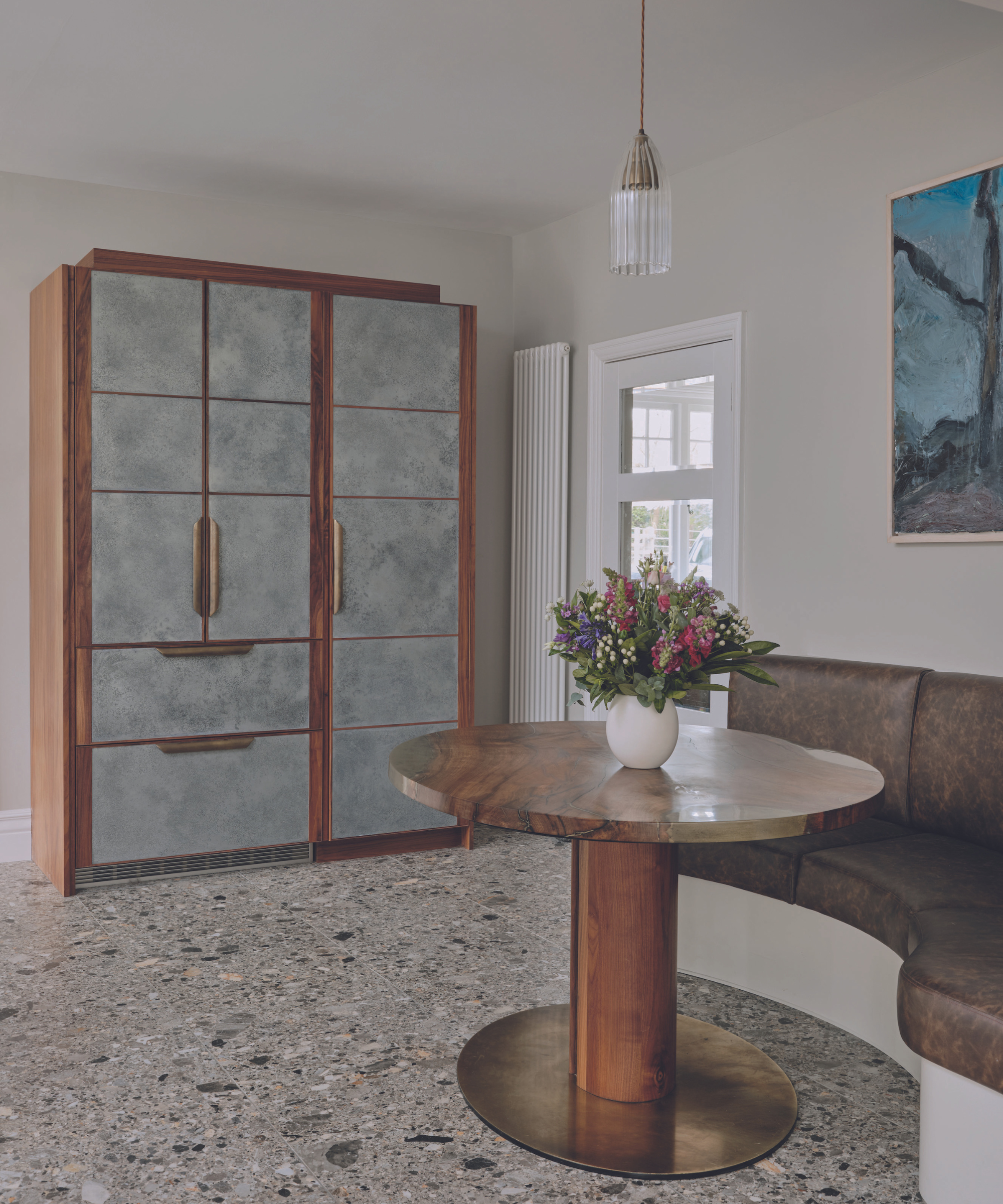
Kitchen, Ledbury Studio.
Hugging the wall, the serpentine shape of this built-in seating is more interesting than a straight execution could ever be. ‘The curve softens this corner, creating an intimate spot to enjoy a coffee while taking in the view through the windows at the opposite end of the room,’ says Charlie Smallbone, founder, Ledbury Studio.
‘Using a curve is the best way to maximize spatial restrictions. Curves also add aesthetic appeal. The elliptical walnut and aged brass table and matching curved banquette seem to invite you in!’

Ledbury Studio offers a bespoke kitchen design service that utilizes high-quality materials, exceptional craftsmanship, and the latest advancements in technology. Charlie Smallbone has a long history of working in the kitchen design industry.
The kitchen is more often than not what feels like the beating heart of our homes. It's where we brew our morning coffee and relax with our loved ones in the evening. Pay attention to creating a feeling of movement in this room and it will help to bring a sense of tranquility to your daily life, as well as creating a space that looks harmonious and sophisticated.
Sign up to the Homes & Gardens newsletter
Design expertise in your inbox – from inspiring decorating ideas and beautiful celebrity homes to practical gardening advice and shopping round-ups.
Linda graduated from university with a First in Journalism, Film and Broadcasting. Her career began on a trade title for the kitchen and bathroom industry, and she has worked for Homes & Gardens, and sister-brands Livingetc, Country Homes & Interiors and Ideal Home, since 2006, covering interiors topics, though kitchens and bathrooms are her specialism.
- Holly RansomeEditorial Assistant (print and digital)
-
 Orange and green is the bold color pairing quietly transforming homes in 2025 – here's 4 reasons why
Interior designers are making the orange and green combination work wonders – this is how you can too
By Sophia Pouget de St Victor Published
-
 This Michelle-Pfeiffer-approved chair is made of a forebodingly unusual material, opening the debate: Is it a rustic stunner, or a danger to sitters?
The actress took to Instagram with a chair made of a controversially sharp material – and fans are unsure of how they feel about it
By Sophie Edwards Published