10 creative ways interior designers work color into neutral kitchens
Tucked behind closed doors or primed for maximum prominence, punchy color can make a big impact in the kitchen
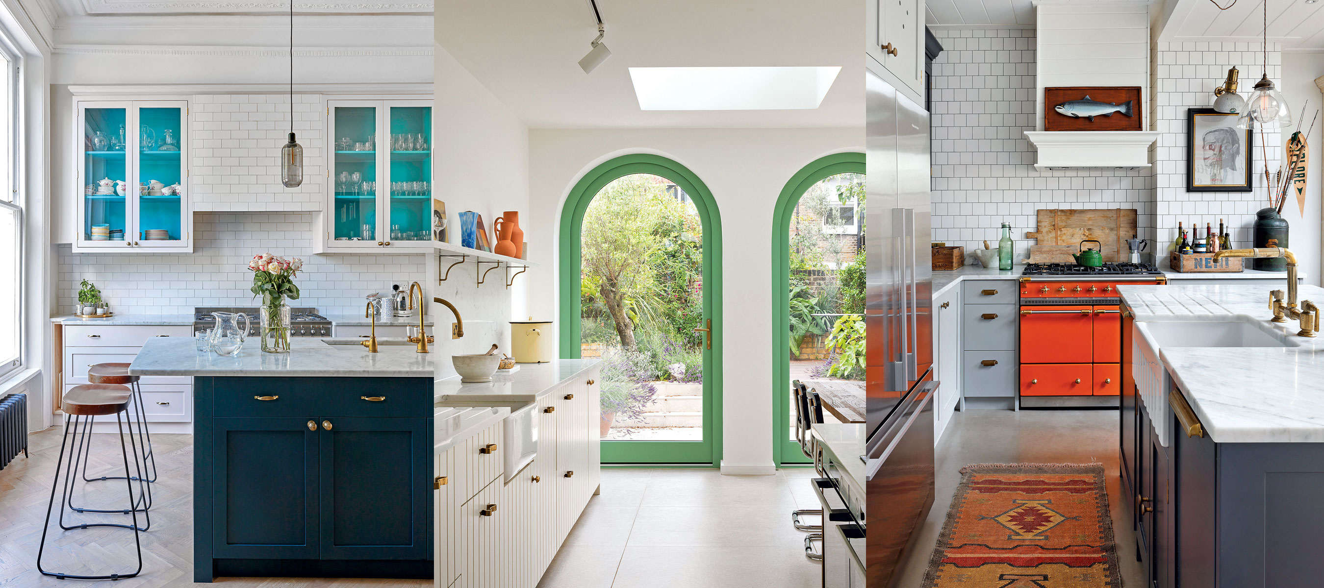

Jennifer Ebert
Finding the right kitchen color that you will love for years to come has never been more important, with the kitchen now a multi-purpose room designed as much for living as it is for cooking.
Neutral kitchens are rife with kitchen color opportunities, from appliances and flooring, to window treatments and cabinets. Start by deciding how much of permanent commitment you are willing to make to your neutral kitchen. One of easiest and least expensive options is to paint a wall or cabinet that can be easily updated should you tire of it.
Our curated collection of the best ways to add color to a neutral kitchen will inspire you to give your kitchen a bold new look.
How to add color to a neutral kitchen
'It’s amazing how a change of paint color, brightly colored appliances, dazzling tiles or fresh upholstery can give a neutral or white kitchen a completely new look,' says Rob Whitaker, creative director at Fired Earth.
For anyone who has dismissed notion of adding bold color to a neutral kitchen, let us change your mind.
1. Paint the interior of a cabinet
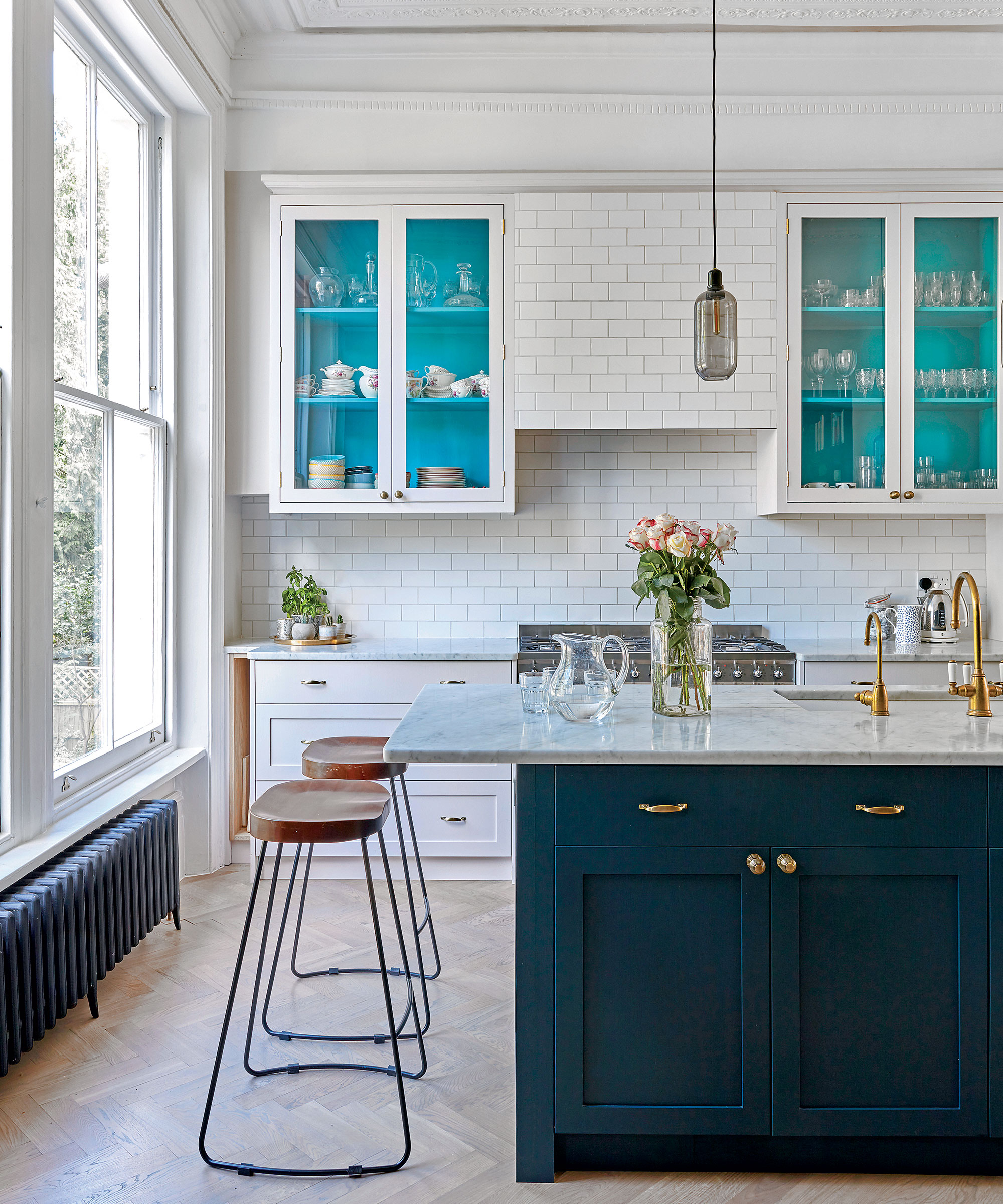
‘Painting the interior of glazed wall cabinets is a really effective way to add a touch of personality to your kitchen,’ says Jayne Everett, creative director, Naked Kitchens.
If you really want to celebrate your favorite color, go for clear glass and let the color sing. The breezy blue used here only accounts for 10% of the kitchen’s overall color palette but its eye-level placement and vibrancy ensure the color goes much further.
‘Reeded glass doors will provide a more diffused color, when shut, especially if the shelves are filled with glassware. No color is too bright or out of bounds,’ adds Jayne.
2. Introduce an accent chair
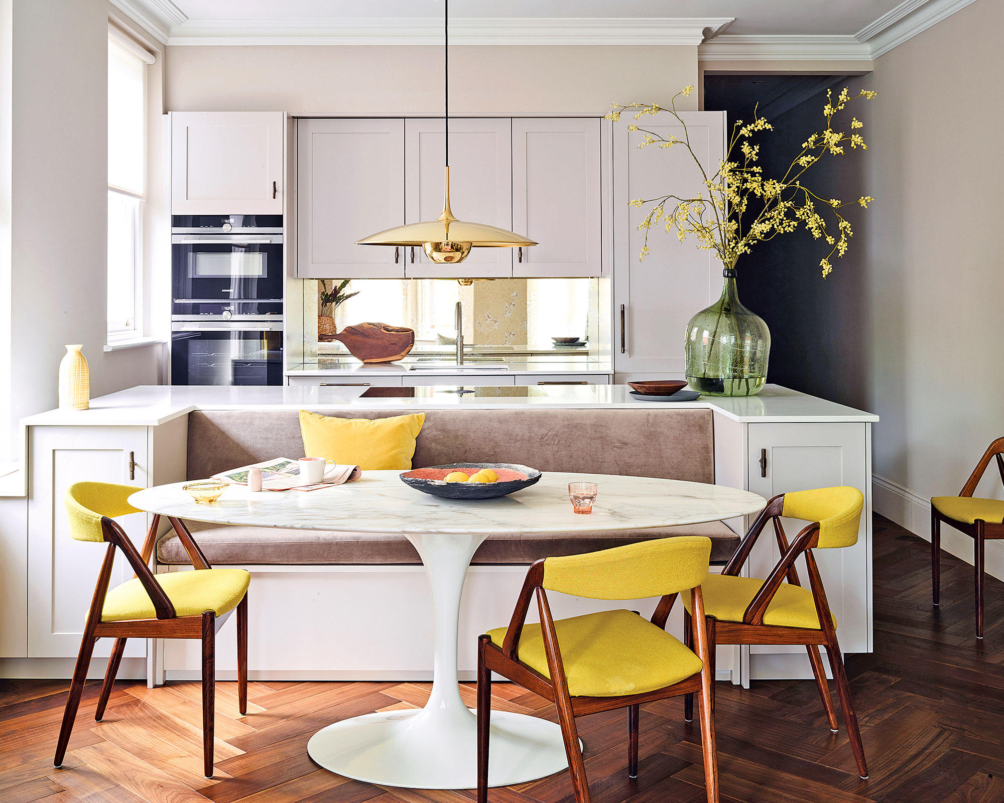
‘One of the easiest ways to freshen up a neutral kitchen is to work a vibrant accent color on upholstery. Chairs, bar stools, blinds and banquettes are all perfect fodder for a splash of color and are much simpler to change than repainting cabinetry should you fancy trying a fresh new shade,’ says Sam Hart, designer, Roundhouse.
Accent color can also work as a zoning tool by drawing attention to a specific area in larger rooms. In this open-plan kitchen space, a strong accent color on the upholstery helps to define the dining area, allowing the kitchen to fade into the background.
3. Be subtle with color additions
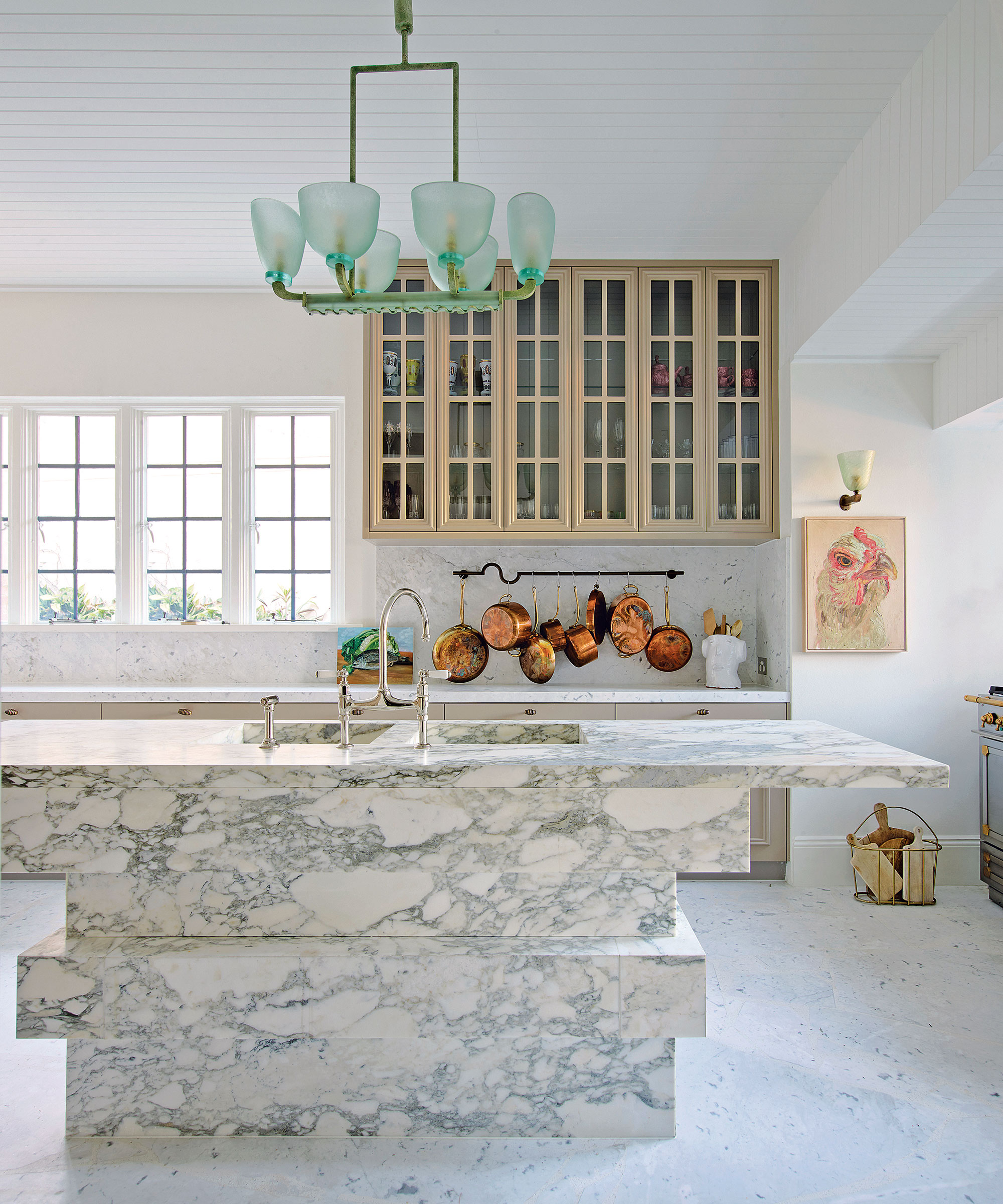
Accent colors are supplementary shades that often contrast the primary colors used in the kitchen with the aim of dialling up the drama – just a little. However, accent color can also play a quieter, more complementary role, as American interior designer Tamsin Johnson demonstrates in this kitchen.
In a stronger shade, the arresting mid-century pendant light by Gio Ponti would have stolen too much attention from the sculptural Arabescato marble island below, which is absolutely the star of the show. But in delicate pale green, the vintage glass fitting plays a balancing role that softens the hard angles of the island and lends a harmonizing, feminine touch.
4. Add unexpected interest
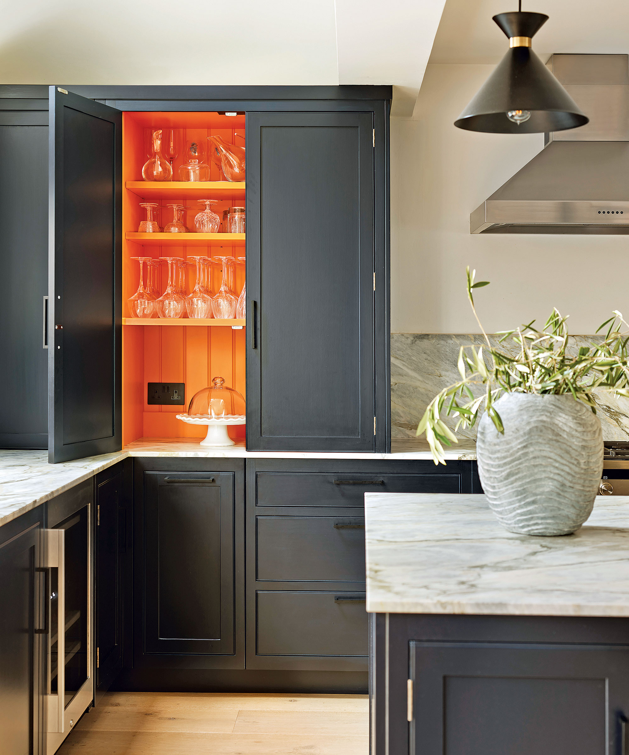
For a flexible approach that allows you to control the color in your kitchen to suit your mood, consider painting inside cabinets with solid doors. ‘Applying bold accent colors in unexpected places, like this dresser interior, changes the initial impression of the room and instantly adds depth to the aesthetic,’ says Melissa Klink, creative director, Harvey Jones.
‘Strong colors are highly emotional but designing with them in a controlled manner ensures they liven up the overall feel of the room instead of overpowering it. Choose an uplifting shade that will put a smile on your face every time you open the doors.’
5. United front
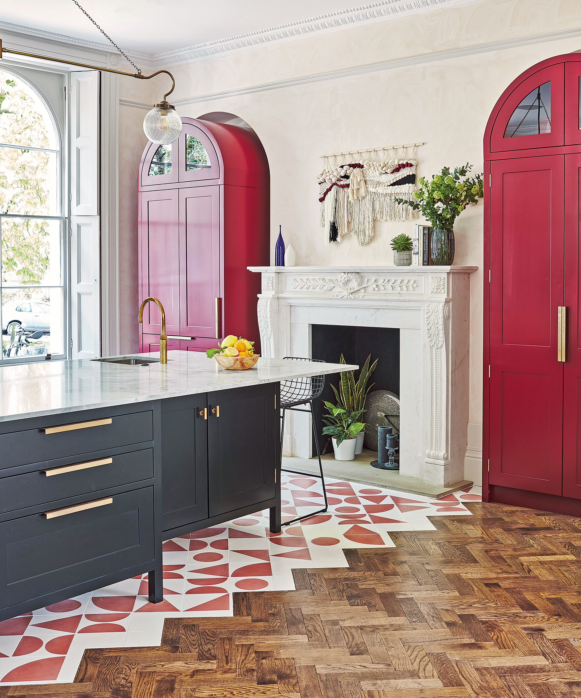
Carrying an accent color across the floor can help a large open-plan kitchen feel cohesively connected from every angle. ‘As this large spacious room has very high ceilings, it was important to create meaningful points of interest within,’ explains Blakes London’s lead designer Annie Ebenston.
‘Using warm red on the pantries that frame the fireplace lifts the whole elevation to be more than just a period fireplace.’ In isolation, the pantries could have overpowered but the custom-colored floor tiles play an anchoring role that unites them with the rest of the kitchen. ‘The matching tile color ties the room together beautifully,’ says Annie.
6. In the frame
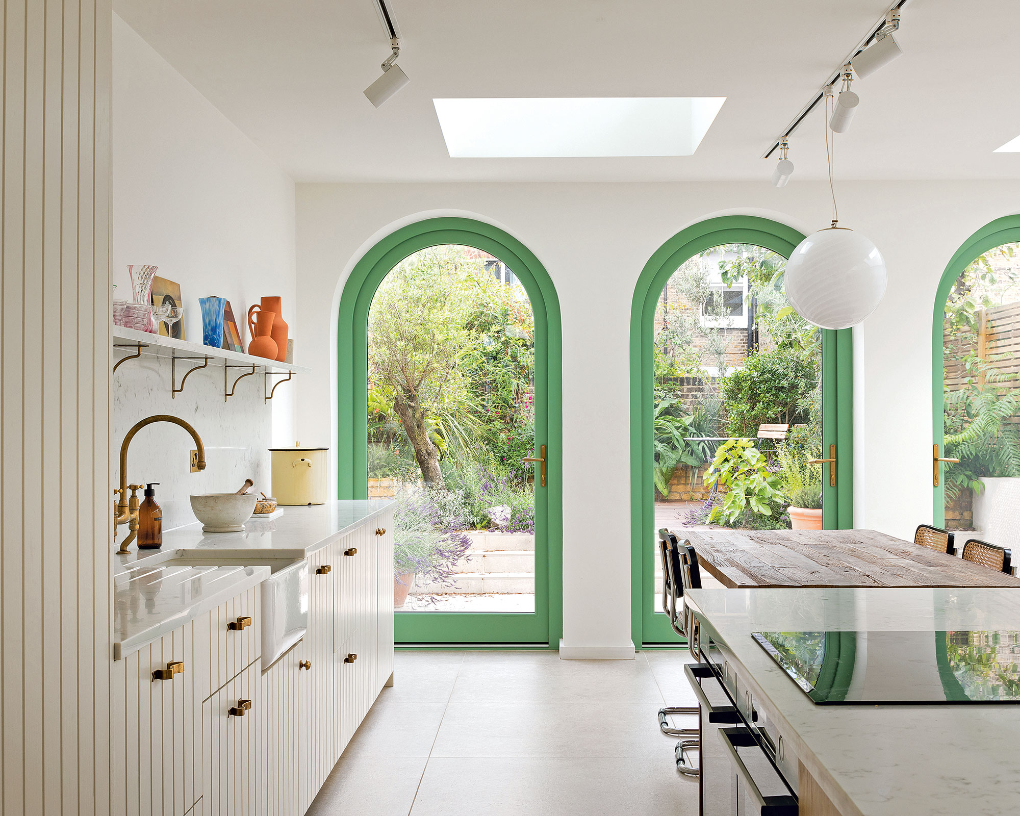
White has long been the go-to for window and door frames but plumping for a standout accent color can prove more compelling.
Here, Turner Architects used Farrow & Ball’s Folly Green to frame the outdoor views and draw the eye through the space. The contrast also emphasizes the stunning curves in the arched doors, highlighting shape alongside color. In the otherwise neutral kitchen, this vibrant shade steals the show.
‘The color was selected from Raphael’s School of Athens fresco, which was part of the design narrative throughout so there’s nice continuity, too,’ adds architect Paul Turner.
7. Paint above eye level
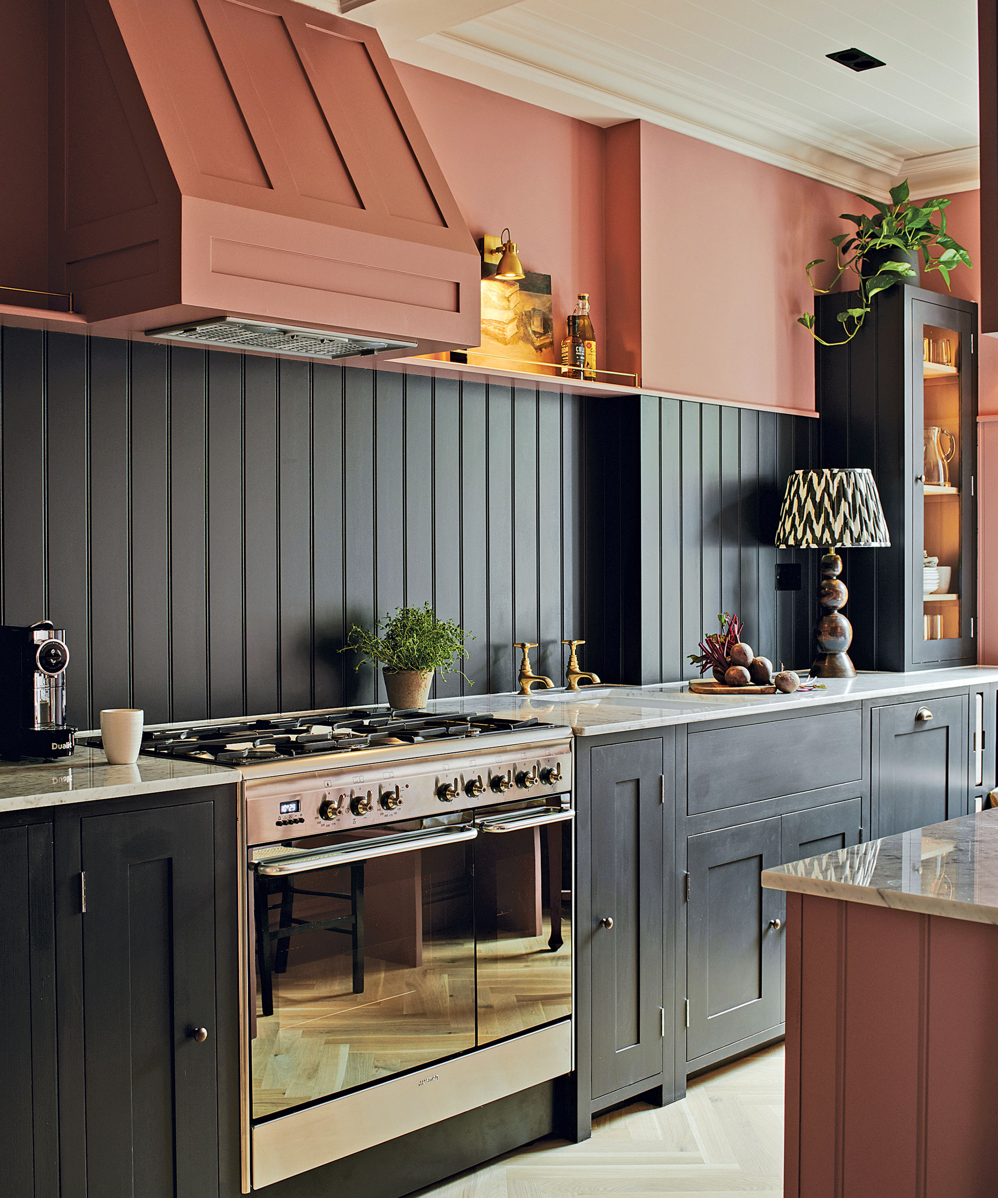
‘An accent color above eye level is a simple way to add strong contrast to a room, without overpowering. As it’s not immediately noticeable, the accent color will draw the eye up for a visual surprise,’ says George Miller, home designer, Neptune.
‘This can have particularly good results in rooms with taller ceilings or grand cornicing, accentuating either feature to great effect.’ Continuing the accent color across different surfaces and planes – for instance, the cooker hood here – has a blocking effect that feels modern and can help smooth out any awkward architectural junctures.
8. Take an alternative approach
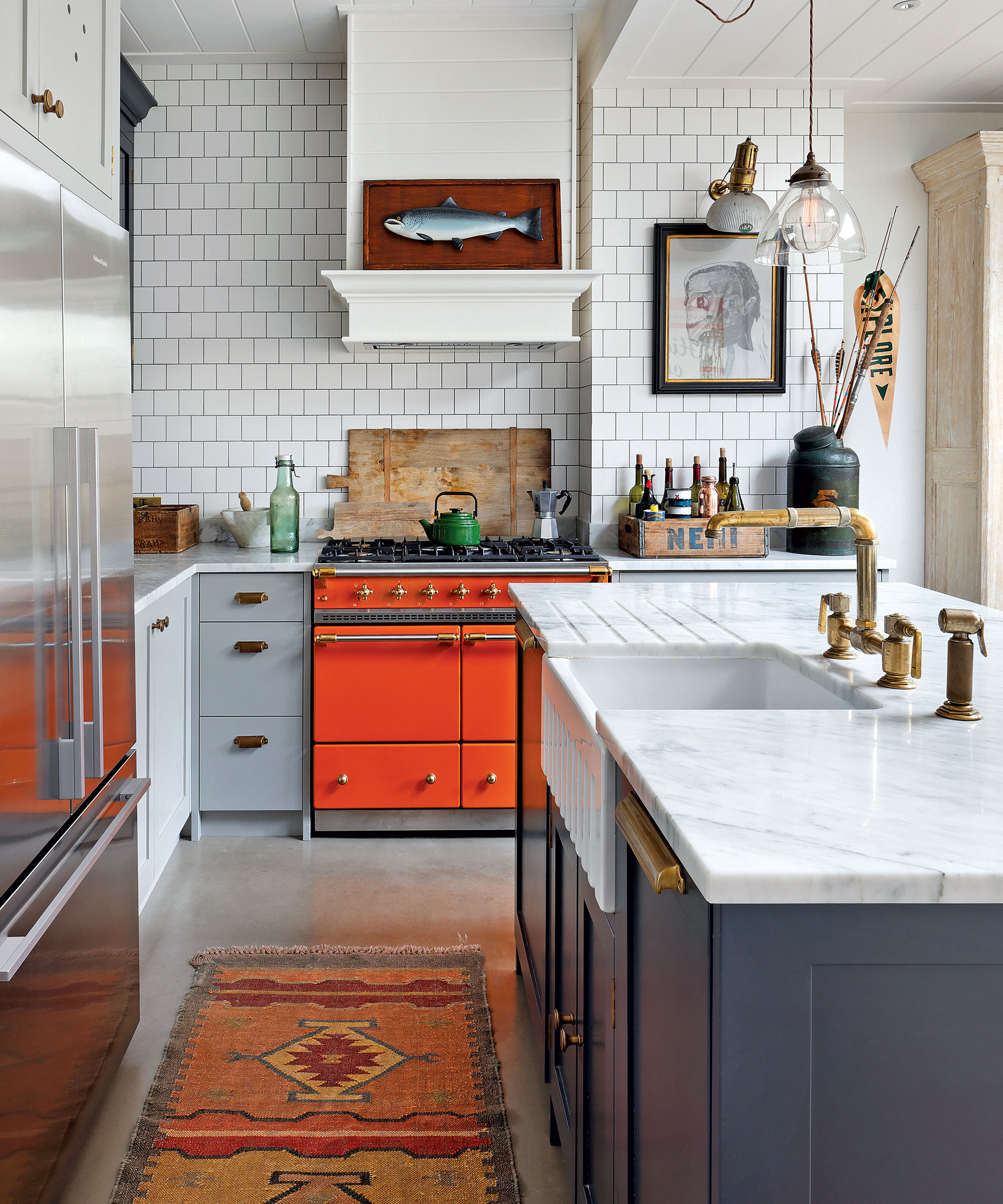
On big investments like range cookers, it’s often easier to play it safe with a neutral black or white finish. However, stepping outside your comfort zone with a vibrant color will secure its place in the spotlight, as HÁM Interiors demonstrates.
‘We love adding a pop of color to enliven our schemes. Here, a Mandarin orange cooker punctuates an otherwise neutral space, adding a lot of personality,’ says Tom Cox, co-founder, HÁM Interiors.
The bright range cooker pulls the eye through the kitchen, past the bulky fridge-freezer, and provides a playful touch that feels young and modern.
9. Paint an island
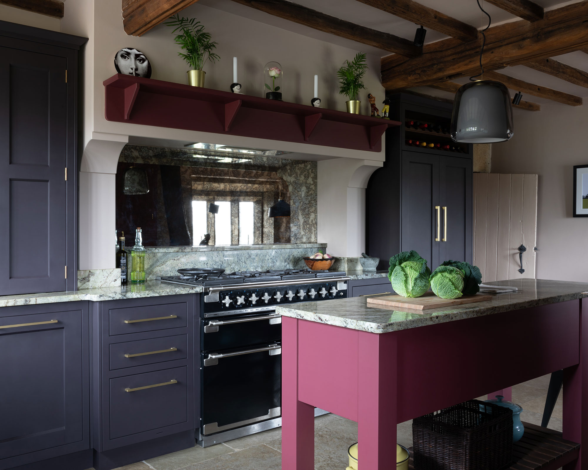
Island paint color ideas are a wonderful way to bring personality to a kitchen, allowing you to stamp your individual style on the space. As central pieces, island units are prime targets for a color shift – and alone can be effective painted kitchen ideas.
One of the most popular routes is to pick an uplifting color for the kitchen island and set it against cooler, neutral tones on the perimeter cabinetry. The idea is to really make the island color sing, so choose a darker backdrop for extra definition. Using a different countertop on the island will also help it stand proud.
10. Add statement color through light fittings
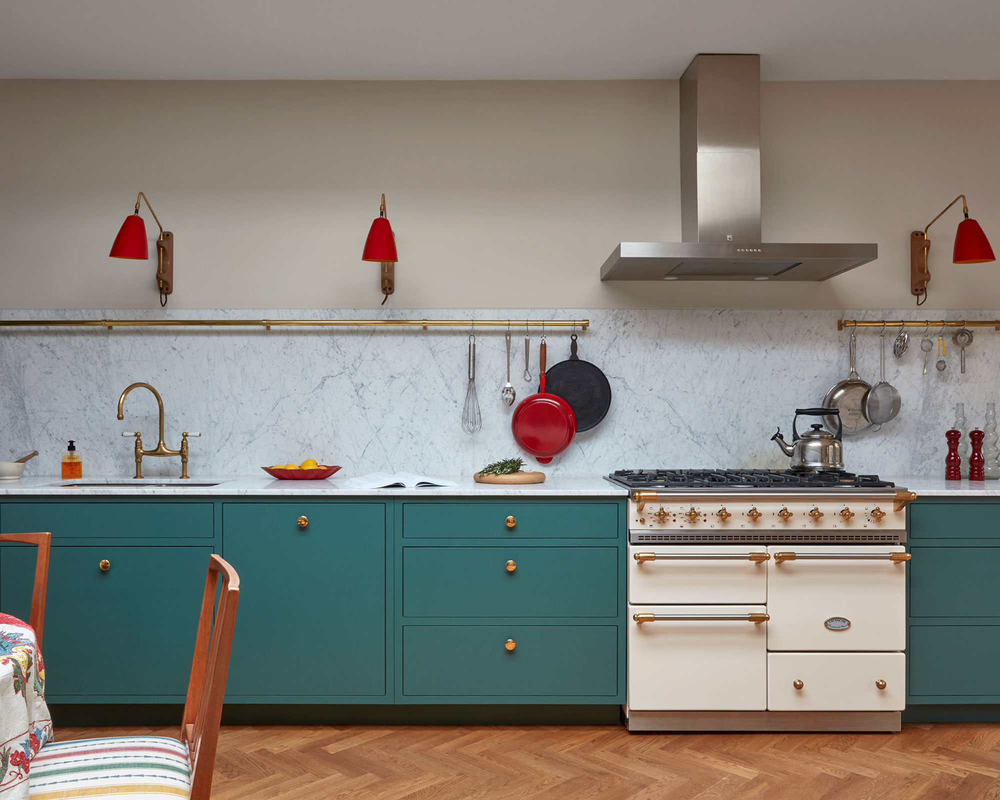
Light fixtures might not be your first port of call when thinking about adding color to neutral colors, but it certainly shouldn't be an afterthought. Making a color part of the scheme rather than the focus of it offers a more contemporary feel.
If you want to start experimenting with bold colors, a good way to do it is through statement lighting. This will give a splash of excitement, but won't overwhelm the entire room – or break the budget.
How do you brighten a neutral kitchen?
Neutral kitchens are ripe for color. First think about which colors go best with neutrals, and go from there. Thankfully, most neutral kitchens can take the most daring colors, so don't hold back.
Choosing color for a predominantly neutral space is such a personal experience – in fact no one knows for sure whether we all even see the myriad shades in the same way. Mark Wilkinson, Founder of Mark Wilkinson Furniture, believed that the colors we choose automatically are naturally influenced by current kitchen trends.
‘The color in a kitchen – be it on walls or fittings – should last for at least five years, minimum, so try to look beyond immediate trends and choose a color additional that will keep you feeling good long term,’ Mark advised.
Sign up to the Homes & Gardens newsletter
Design expertise in your inbox – from inspiring decorating ideas and beautiful celebrity homes to practical gardening advice and shopping round-ups.
Linda graduated from university with a First in Journalism, Film and Broadcasting. Her career began on a trade title for the kitchen and bathroom industry, and she has worked for Homes & Gardens, and sister-brands Livingetc, Country Homes & Interiors and Ideal Home, since 2006, covering interiors topics, though kitchens and bathrooms are her specialism.
- Jennifer EbertDeputy Editor (Digital)
-
 Charli XCX's front door color 'feels deliberate, and almost calculated' – estate experts say it carries authority (but it comes with a warning)
The singer's sophisticated front door color gives a 'psychological head start' to sellers, but it has a potentially unlucky downside
By Megan Slack
-
 How to choose eggplant companion plants for abundant and healthy harvests – we reveal 7 of the best to pick, plus the ones to avoid
Discover some beneficial vegetables, herbs, and flowers to grow with eggplant
By Drew Swainston