How do you make sure a white kitchen isn't boring? 10 no-fail designer strategies
Don’t let a white kitchen look bland or clinical. These are the clever ways designers add interest

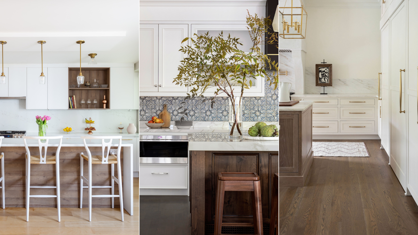
- 1. Focus on cabinet doors
- 2. Introduce texture and contrast
- 3. Pay attention to hardware
- 4. Treat faucets as jewelry for the home
- 5. Incorporate personal touches
- 6. Add pattern
- 7. Create interest with the hood
- 8. Think walls, ceiling and floor
- 9. Go for a darker island
- 10. Make an impact with lighting
Design expertise in your inbox – from inspiring decorating ideas and beautiful celebrity homes to practical gardening advice and shopping round-ups.
You are now subscribed
Your newsletter sign-up was successful
Want to add more newsletters?
A white kitchen can appear spacious, pristine and timeless. But, whisper it, they can also end up looking downright plain and dull, leaving you asking how to ensure a white kitchen isn’t boring.
Yet the reason white kitchens are enduringly popular is because this doesn’t have to be their fate. A good design strategy can create a room full of decorative interest and lasting appeal and that’s why this classic color remains a favorite.
We asked interior designers to weigh in on making this kitchen color a winning choice for a home, delivering a clean space-expanding palette and a look you’ll never call boring again, and these are the strategies they use.
Article continues belowHow to ensure a white kitchen isn’t boring
A white kitchen often appeals because it seems like the perfect blank canvas – and that’s the problem. Without attention to detail when designing a kitchen, the room can lack the thoughtful elements that bring depth and interest. But the issue is avoidable and following these expert tips will mean a white kitchen isn’t a bland one.
1. Focus on cabinet doors
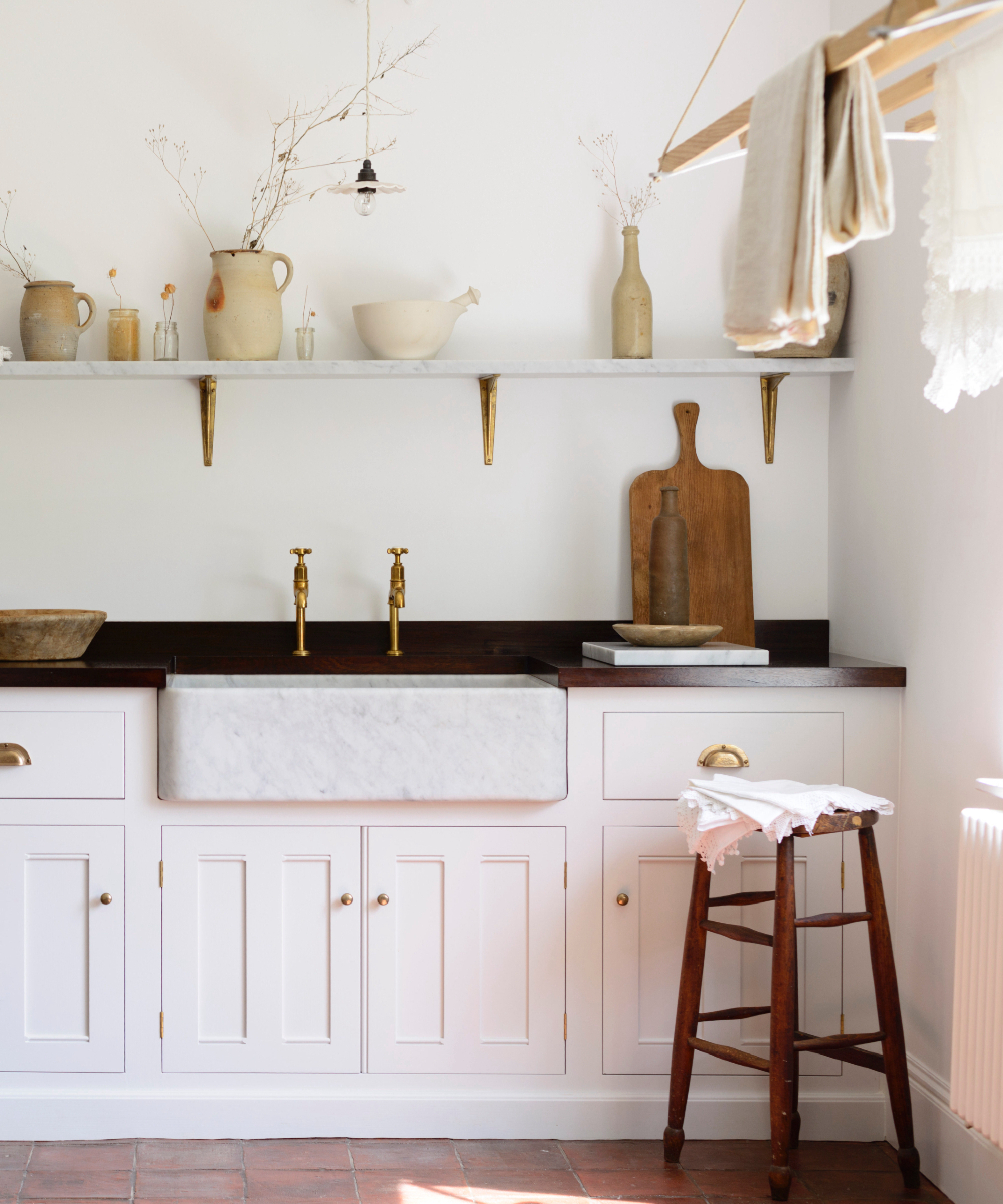
Careful selection of kitchen cabinets can prevent a white kitchen from being boring. ‘Select something with detail, like a raised panel with multiple layers of beading,’ advises Jennifer Weisberg, interior designer and owner of JLW Interiors. ‘This will give a simple white cabinet color a lot more depth.’
And consider glass-fronted cabinets, too. ‘Add some strategically placed glass cabinets to create visual interest,’ she says. ‘I like to utilize a textured or antiqued glass as it gives the white cabinets some separation so they look more refined and less blocky.’
2. Introduce texture and contrast
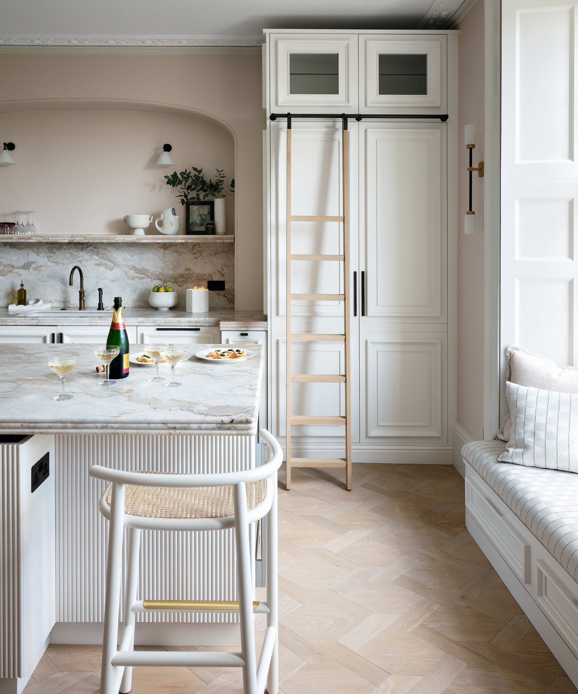
To elevate a white kitchen, add layers of texture and subtle contrast, recommends Elizabeth Vergara of Vergara Homes.
Design expertise in your inbox – from inspiring decorating ideas and beautiful celebrity homes to practical gardening advice and shopping round-ups.
‘For example, incorporate natural elements like wood accents on open kitchen shelving, rattan barstools, or a warm butcher block countertop to bring in organic warmth,’ she says.
‘Another great tip is to use a mix of matte and glossy finishes – this can be as simple as a high-gloss backsplash paired with a matte countertop, which adds visual interest without overwhelming the space,’ she suggests.
3. Pay attention to hardware
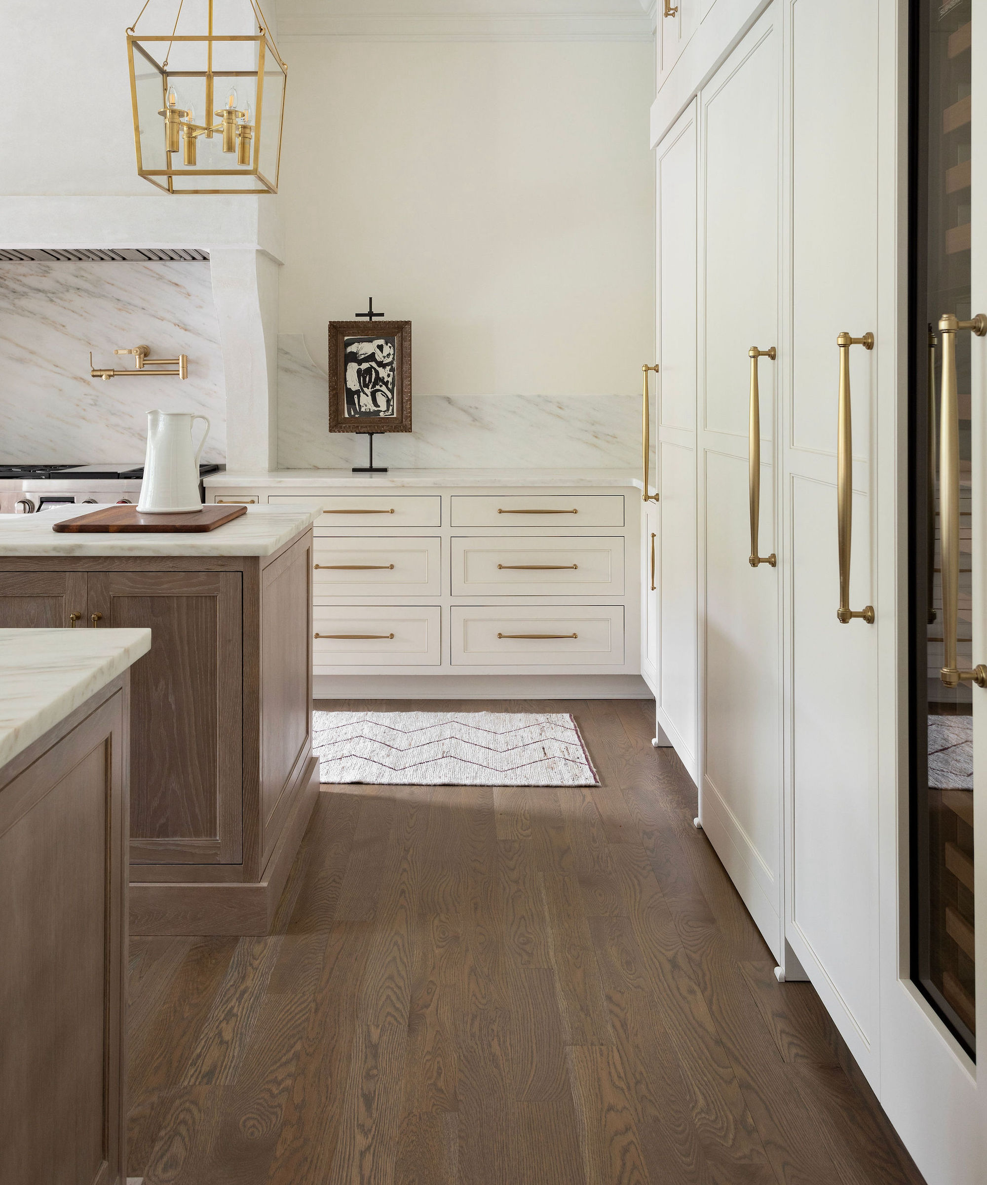
The kitchen hardware selected for a white design can ensure it doesn’t look boring.
‘Hardware is a great opportunity to lift the space,’ says Carolyn Cerminara, founder and principal designer at Cerminara Design. ‘There are so many cool designs to choose from. Brass, matte black, even antique all add character and interest. I’m all about making a statement here; bold handles or knobs can do so much for a white kitchen without overpowering the look.’
4. Treat faucets as jewelry for the home
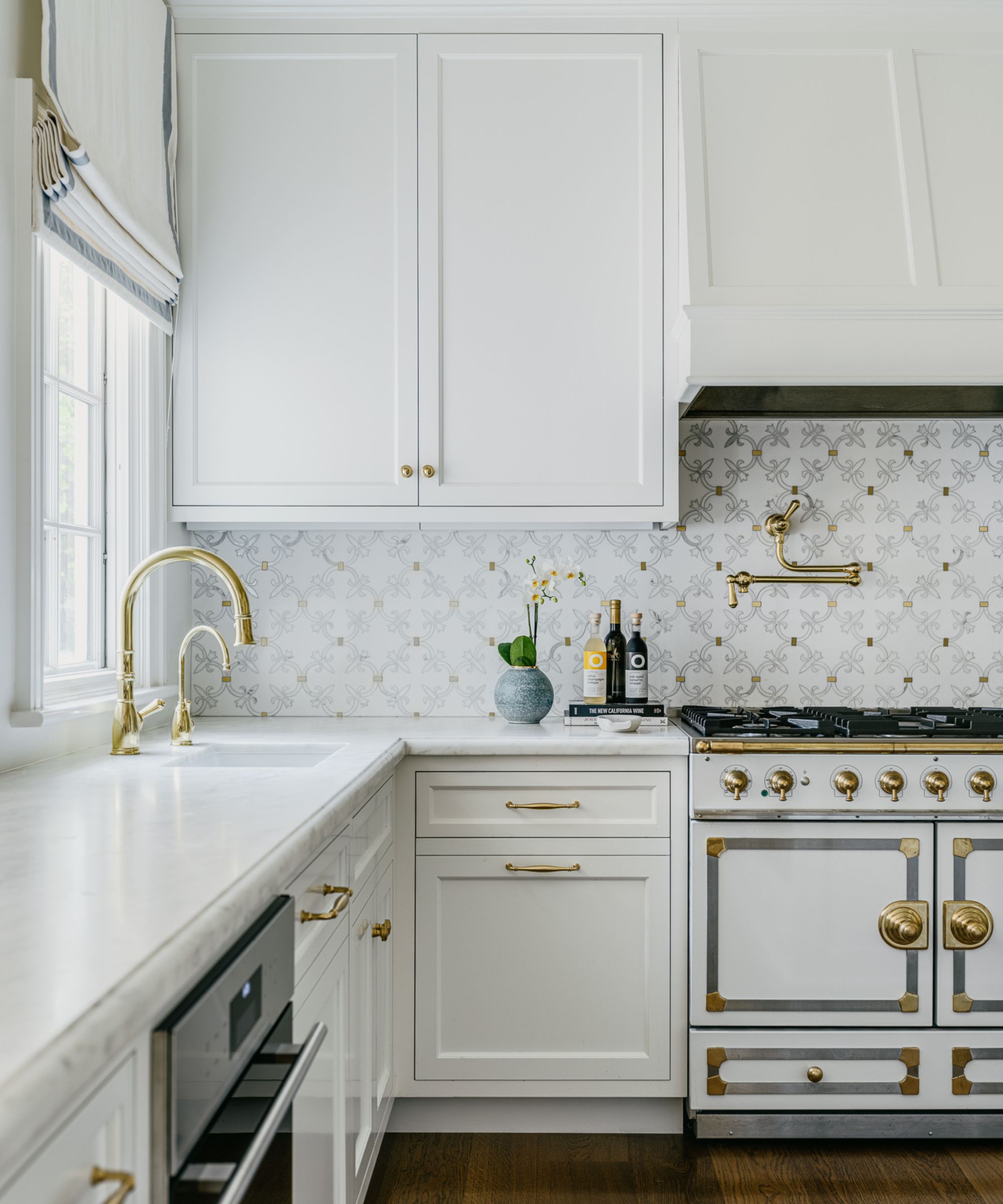
Just as handles can add interest to a white room, so do kitchen faucets if you choose well. A white kitchen is a great backdrop for being bolder with your basic elements like faucets, appliances, fixtures, etc.
‘A custom metal cabinet pull or a beautiful faucet can act as jewelry for the home, and a white kitchen is the perfect base to allow these elements to shine,’ says Jennifer Weisberg.
5. Incorporate personal touches
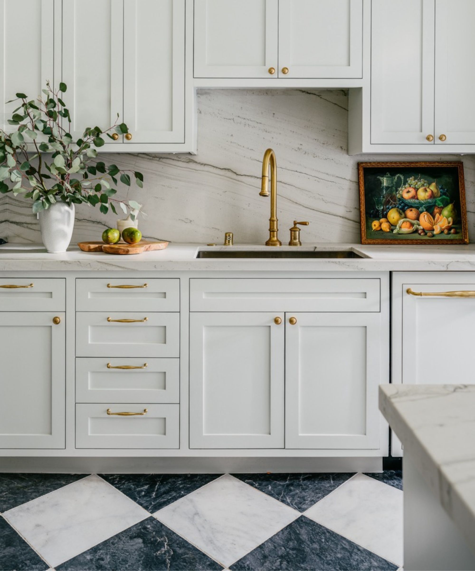
The smaller elements of a white kitchen offer plenty of potential to lift the look. ‘To keep the space from feeling plain and enhance its charm, incorporate personal touches like cookbooks, decorative accents, or small trinkets,’ recommends Stacy Garcia, founder and chief inspiration officer of Stacy Garcia Design Studio.
Think fabrics, too. ‘Add warmth and texture with elements such as tablecloths, kitchen curtains, and upholstered seating, creating a kitchen that’s both stylish and inviting,’ she suggests.
6. Add pattern
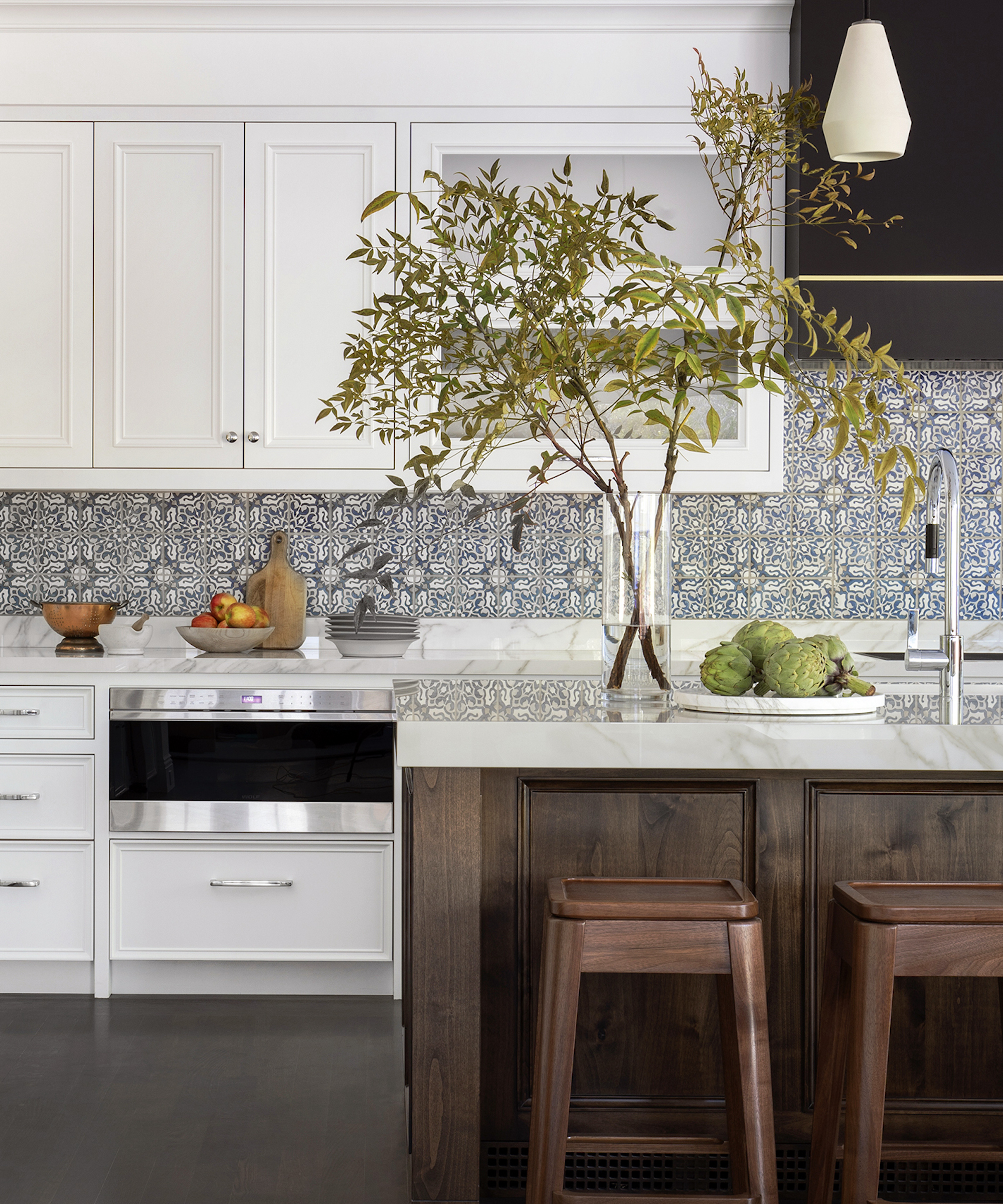
The kitchen backsplash chosen can make all the difference to a white design. ‘Choosing a patterned backsplash tile is one surefire way to prevent a white kitchen becoming a snoozefest,’ says Jennifer Jones, principal designer at San Francisco-based Niche Interiors.
‘In this kitchen, we added a blue Mediterranean-inspired backsplash tile and carried it all the way up to the hood for maximum impact.’
7. Create interest with the hood
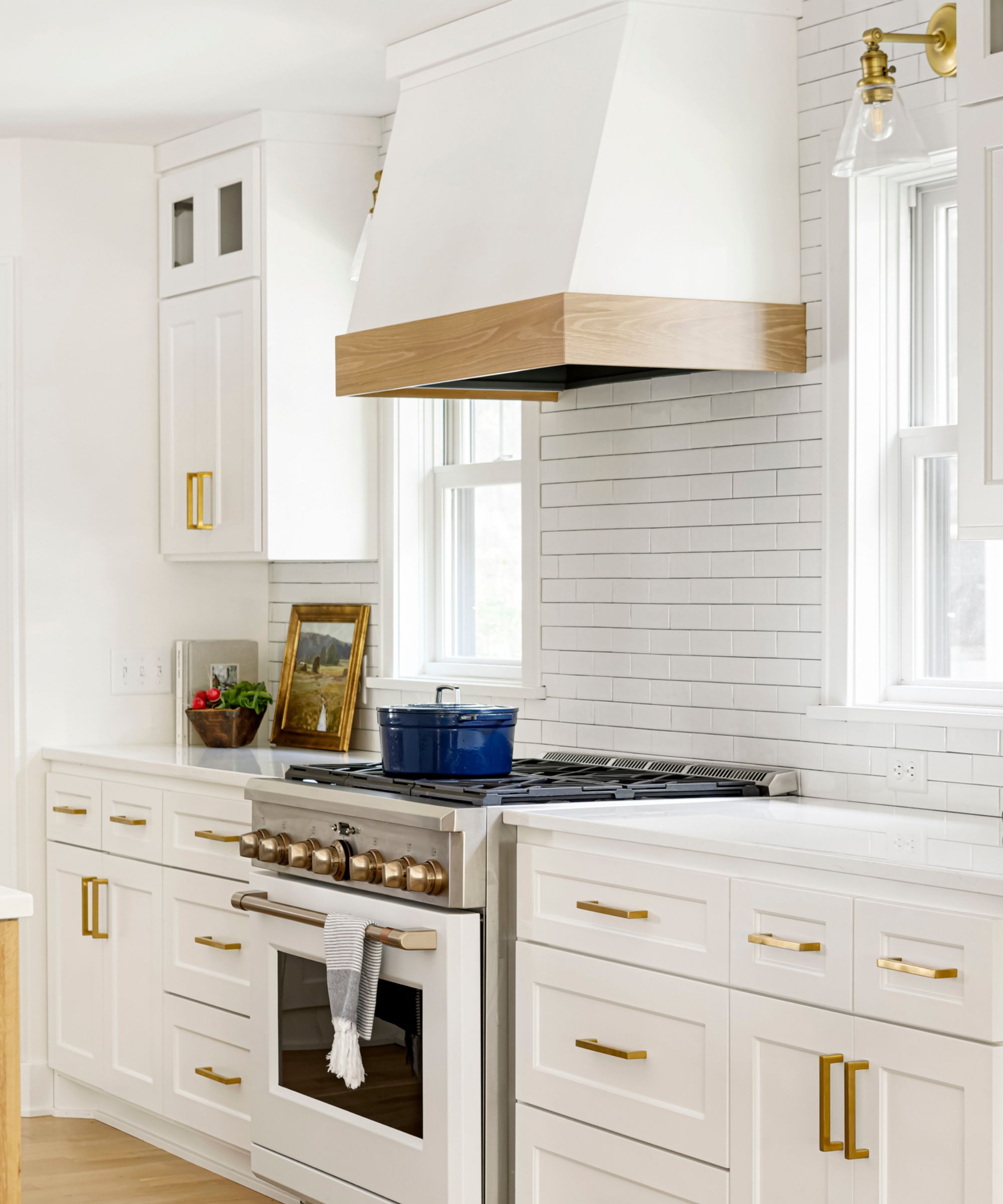
The hood is another area of a white kitchen with the potential to prevent the design looking boring, according to Carolyn Cerminara. ‘Playing with its shape or texture can make it a great detail of the kitchen, adding a level of interest that pulls the whole room together,’ she explains.
8. Think walls, ceiling and floor
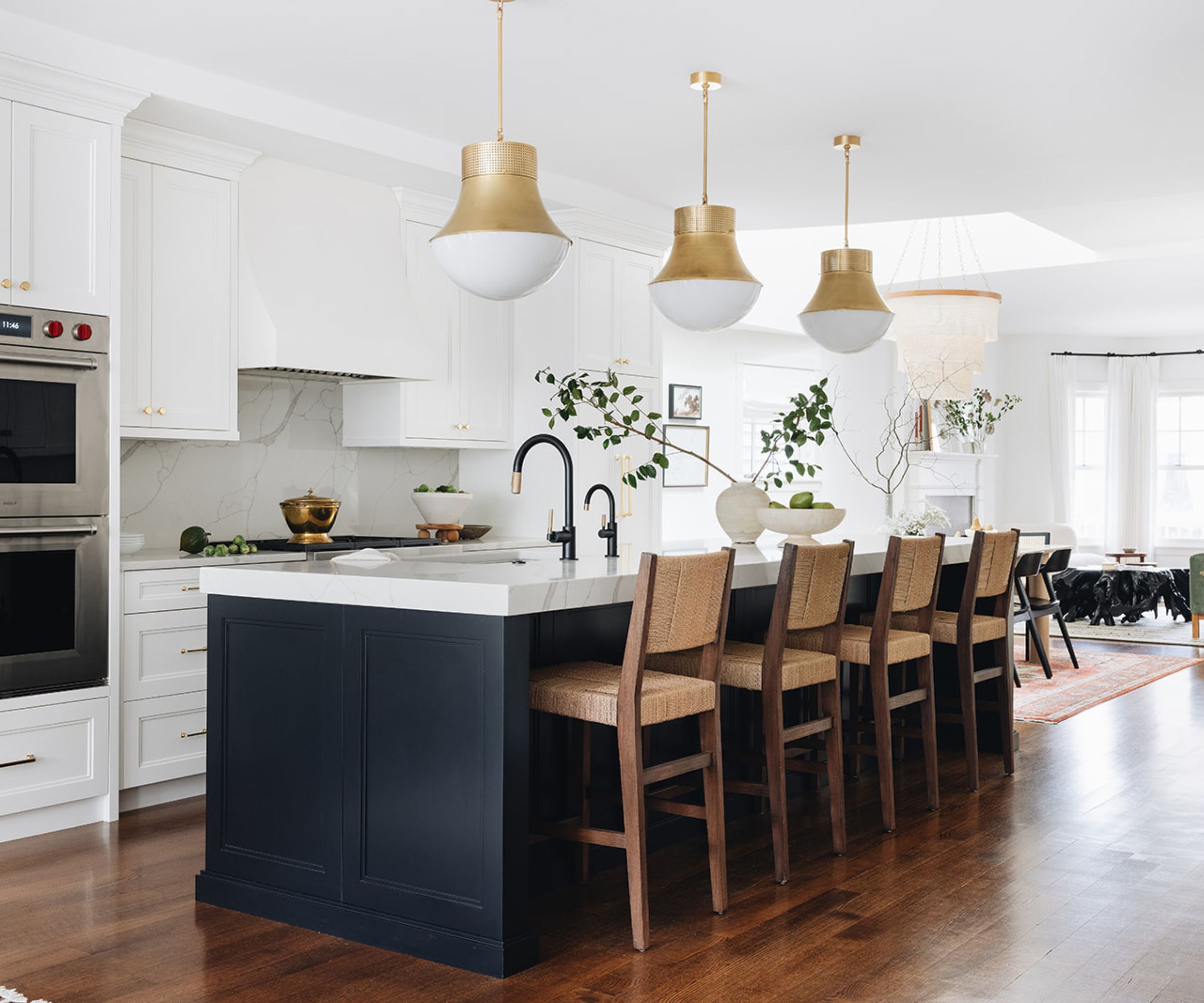
The walls, ceiling, and floor provide the opportunity to stop a white kitchen from being a dull one.
‘We love a wood floor in the kitchen to create a flow from room to room, and add natural depth and character,’ says Noel Gatts, HGTV host and designer and owner of beam&bloom interiors.
‘Beams as accents on the ceiling or wrapped cased openings bring the wood tones and the eye up. If you’re fortunate enough to have a pantry or other visible doors, look into wood tones or paint colors.’
9. Go for a darker island
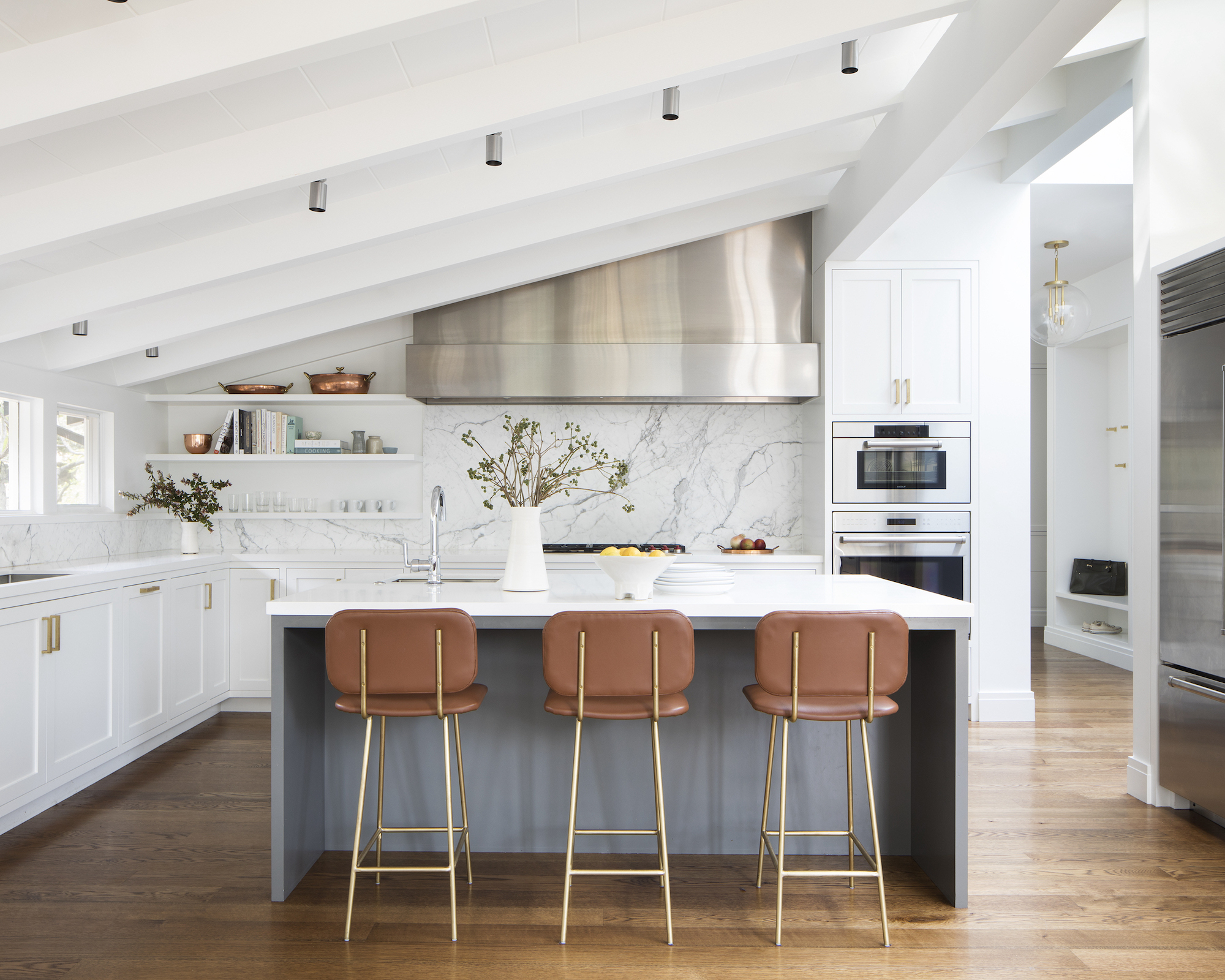
A kitchen island in a different color is a neat design strategy to make a white room interesting.
‘Painting your island a darker contrasting color will prevent your kitchen from becoming a boring sea of white,‘ says Jennifer Jones. ‘We used a medium gray tone in this space which picks up on the veining in the marble backsplash.’
10. Make an impact with lighting
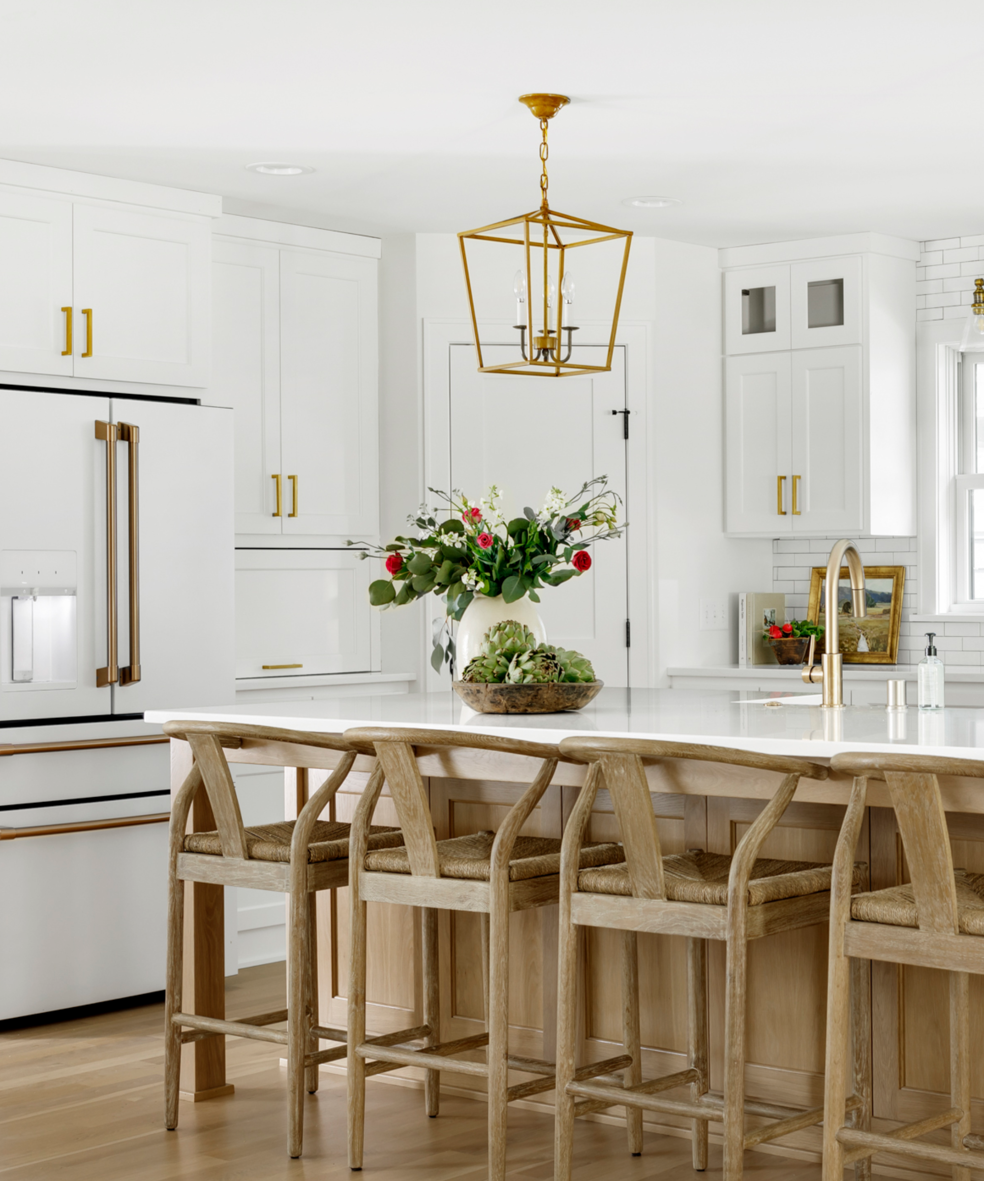
Don’t ignore kitchen lighting if you want to ensure a white design isn’t dull. ‘Here is where I recommend that clients invest,’ says Carolyn Cerminara.
‘Lighting is absolutely essential to make the kitchen feel special. I love playing with unique fixtures, from pendants to under cabinet lights. Lighting will bring out texture and create depth.’
‘White kitchens are always in style – there’s something about it that’s so timeless and refreshing,’ says Carolyn Cerminara. And they certainly needn’t be dull. ‘The key is layering details to keep it from feeling flat,’ she says.

Sarah is a freelance journalist and editor. Previously executive editor of Ideal Home, she’s specialized in interiors, property and gardens for over 20 years, and covers interior design, house design, gardens, and cleaning and organizing a home for Homes & Gardens. She’s written for websites, including Houzz, Channel 4’s flagship website, 4Homes, and Future’s T3; national newspapers, including The Guardian; and magazines including Future’s Country Homes & Interiors, Homebuilding & Renovating, Period Living, and Style at Home, as well as House Beautiful, Good Homes, Grand Designs, Homes & Antiques, LandLove and The English Home among others. It’s no big surprise that she likes to put what she writes about into practice, and is a serial house renovator.