How can I make my kitchen look expensive? 9 expert techniques that don't cost a fortune
These are the tricks and techniques to make a kitchen look expensive, whatever your budget, according to design professionals
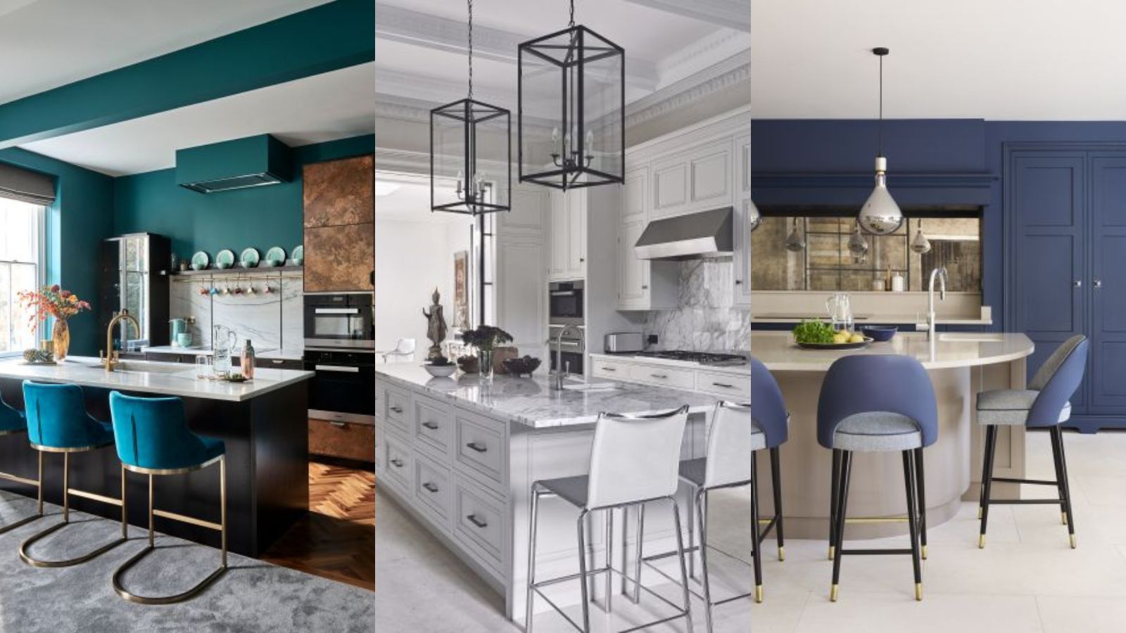

If you are wondering 'how can I make my kitchen look expensive?' you are either building up to hosting a celebration or looking to move house. Or perhaps you just want to make whatever budget you have go as far as possible for your remodel?
The kitchen is certainly the place to do this. It's likely to be the one room that guests are guaranteed to spend time in, plus it's the single most important room in a house for clinching a house sale.
Below, we garner kitchen ideas from some of the world's top design experts to discover just how you can make a kitchen look expensive, without spending a fortune.
How can I make my kitchen look expensive?
There are a few key luxury kitchen ideas that are very translatable. From upgrading cabinetry to simply getting the layout right and picking timeless color schemes, this is how to make your kitchen look expensive, according to experts.
1. Give the layout room to breathe
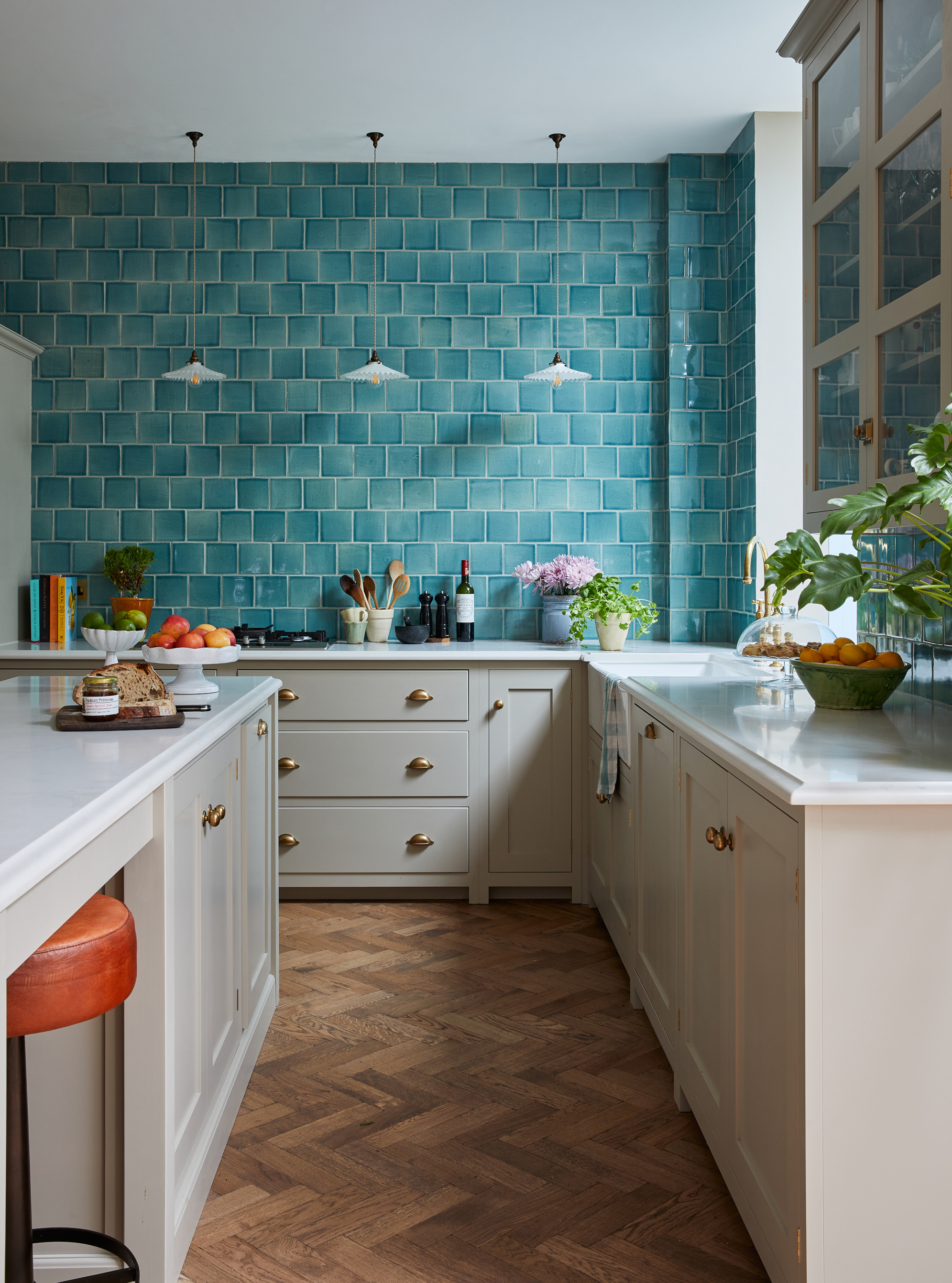
What is the best kitchen layout? There are six types of kitchen layout, and the one you choose will largely be dictated by the size and architecture of your room. However, your final kitchen layout ideas will have as much impact on how expensive your kitchen looks as the cabinetry does.
'It's vital that your kitchen layout caters to your needs and how you function within the space, which means following all the usual, sensible rules around the kitchen triangle,' says Sarah Spiteri, Homes & Gardens' Editorial Director. 'However, it is also really important that the room has space to breathe. In other words, at design stage, you must ensure that there is ample space between facing cabinetry, between cabinetry and the dining table, and in the room's thoroughfares. Ideally, these "gaps" would be around 4 feet to be comfortable and practical.'
2. Choose a cabinetry finish that's timeless
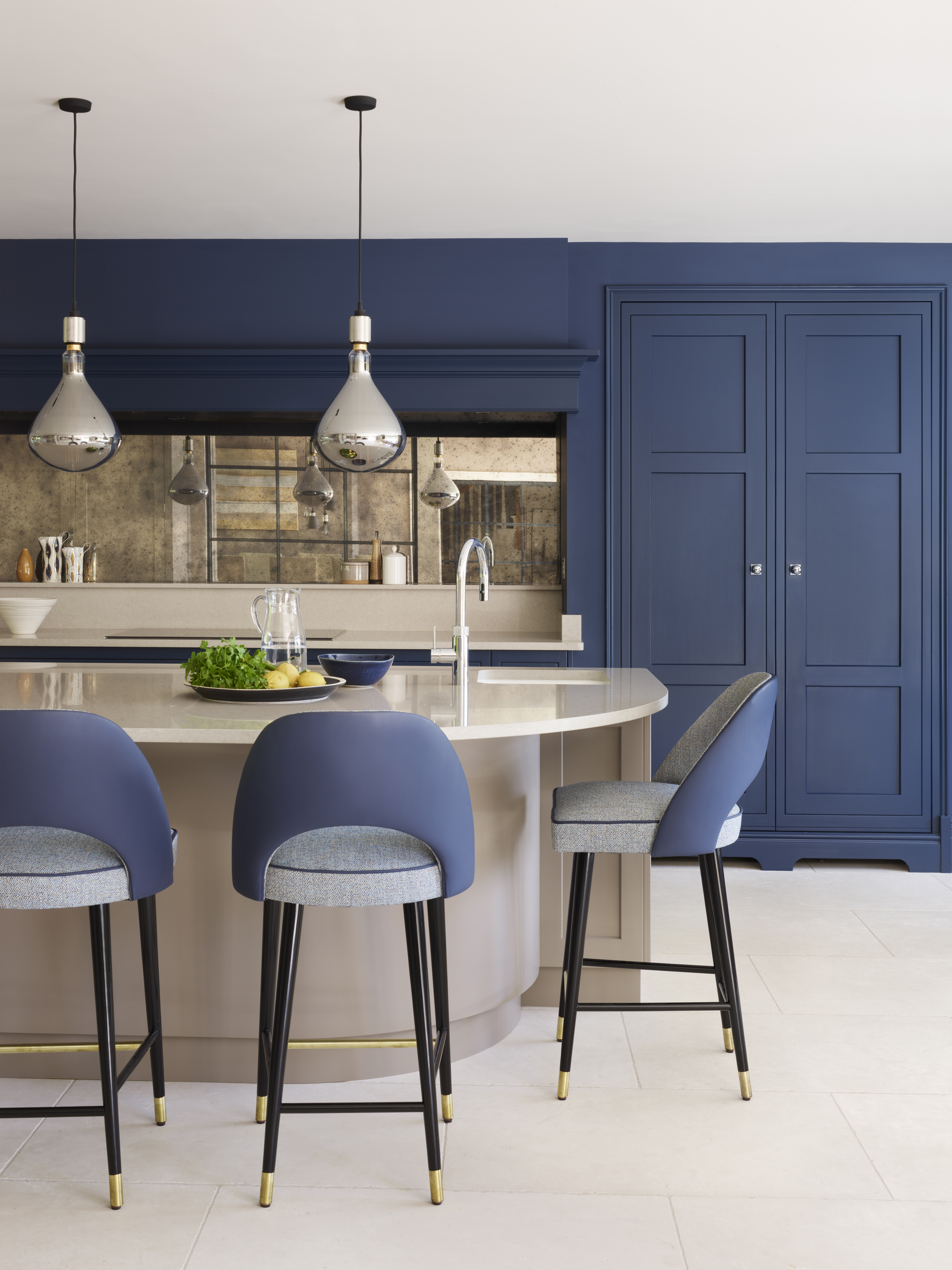
Wondering 'how can I save money on kitchen cabinets?' but still ensure your kitchen looks expensive? The trick is to pick a finish and structure that won't date and that is easy to keep smart-looking.
'Painted kitchen cabinet ideas are a really sensible option for anyone hoping to create a luxe feel in their kitchen,' says Jennifer Ebert, Homes & Gardens' Deputy Editor. 'This applies too if you are on a budget or simply want to reduce waste, because painting kitchen cabinets yourself is a good way to update kitchen cabinets without replacing them.
'As for structure, I would suggest looking to Shaker kitchen ideas. This most famous of American kitchen styles has outlasted every one of the kitchen trends we've reported on over the years, and will continue to endure. It's a great match for contemporary and period homes, and is the perfect companion for a painted finish.'
3. Combine off-the-shelf with bespoke or one-offs
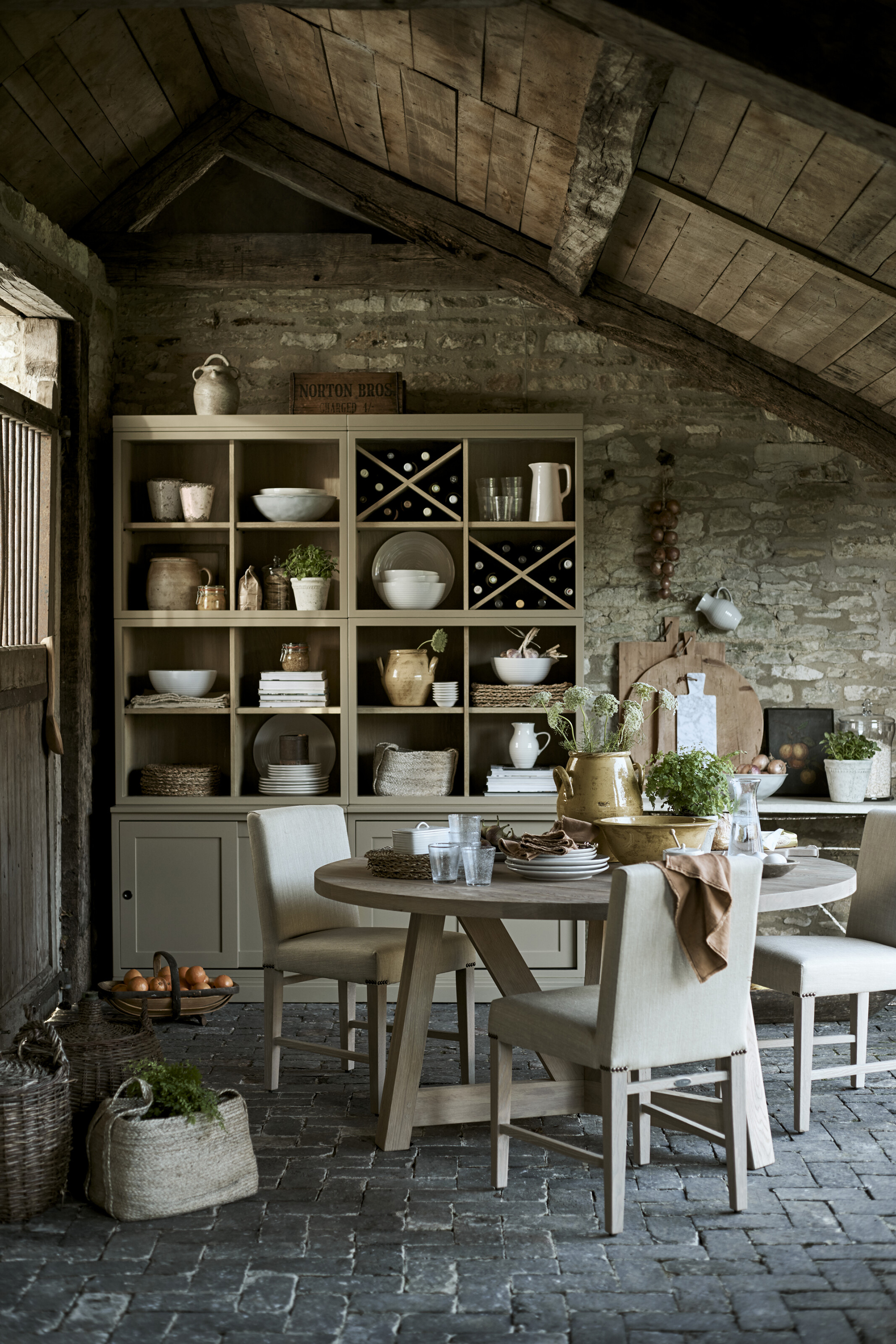
'It's a fact of life that we all want to feel special rather than one of many,' says Charu Gandhi, Founder and Principal Designer at Elicyon. One way to make your kitchen look expensive is to cater to this, by putting bespoke or one-off pieces into the mix. This could be as simple as an antique dining table, an eclectic choice of dining chair or a dresser that complements but doesn't entirely match the rest of your kitchen cabinet ideas.
'Bespoke can mean different things to different people,' continues Charu. 'I make a distinction between bespoke kitchens with joinery made from scratch and those made to order from ranges offered by established, high-end brands. Most often, we make a hybrid of the purely bespoke and made to order, by personalizing a branded design with one-off elements.'
Having open shelving means ensuring kitchen styling is given attention too. Hide away the ugly functional, show off the beautiful.
4. Utilize space-enhancing tricks to make it feel larger
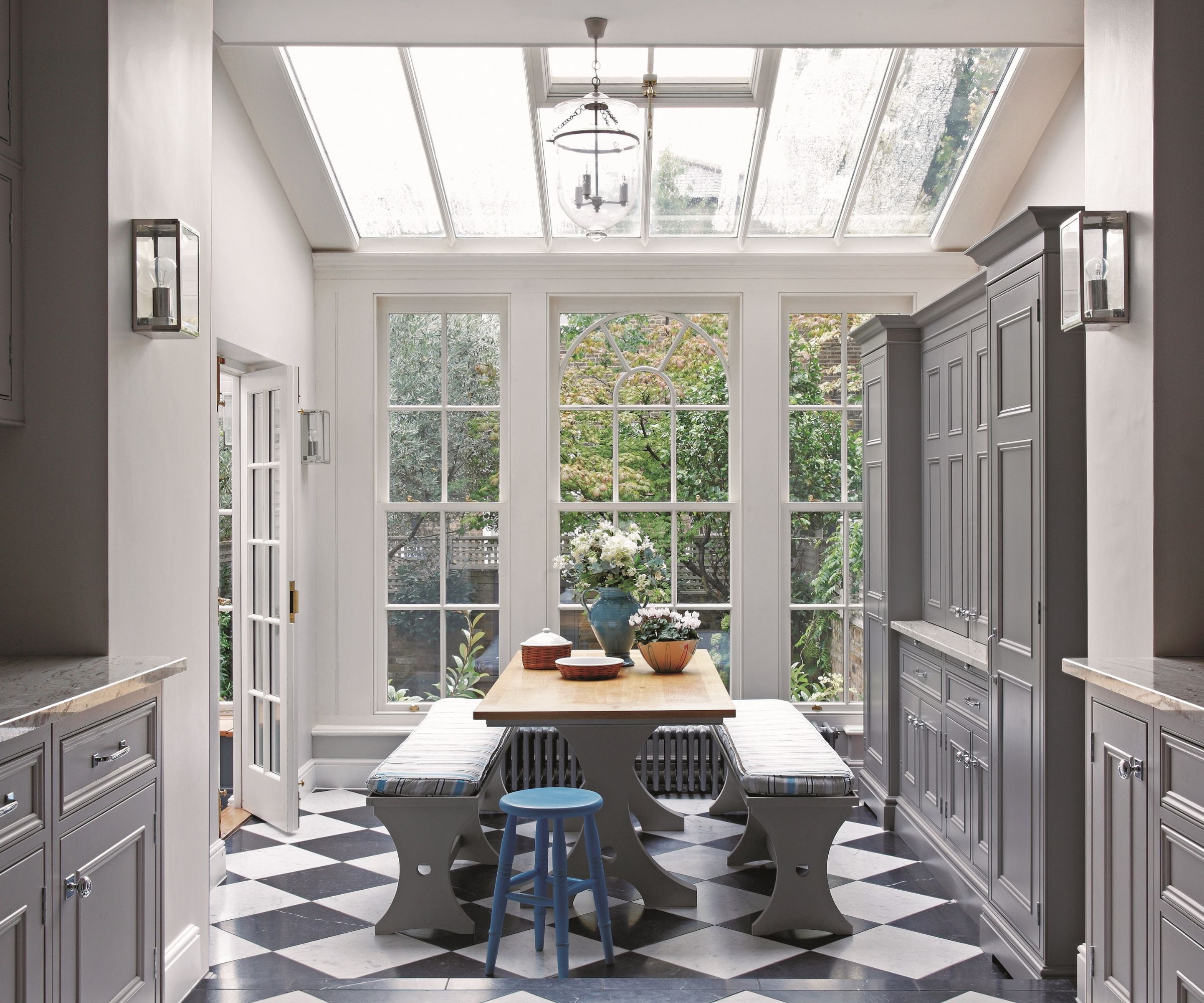
Small kitchen ideas largely concentrate on getting the layout of the space just right, but most every kitchen will benefit from being made to feel bigger and brighter, and there are some surprisingly clever ways to achieve this.
'Laying chequered kitchen flooring diagonally will draw the eye out to the corners of a room, tricking the brain into seeing it as larger than it is,' says stylist and Homes & Gardens' Deputy Editor Jo Bailey. 'In this kitchen the effect is doubled with the natural lighting pouring through the glazed roof – 'top light' is around three times brighter than light comes in from a window in a wall, so even if you have a small space in which to insert a roof window, do it.'
5. Pick on stand-out material or finish
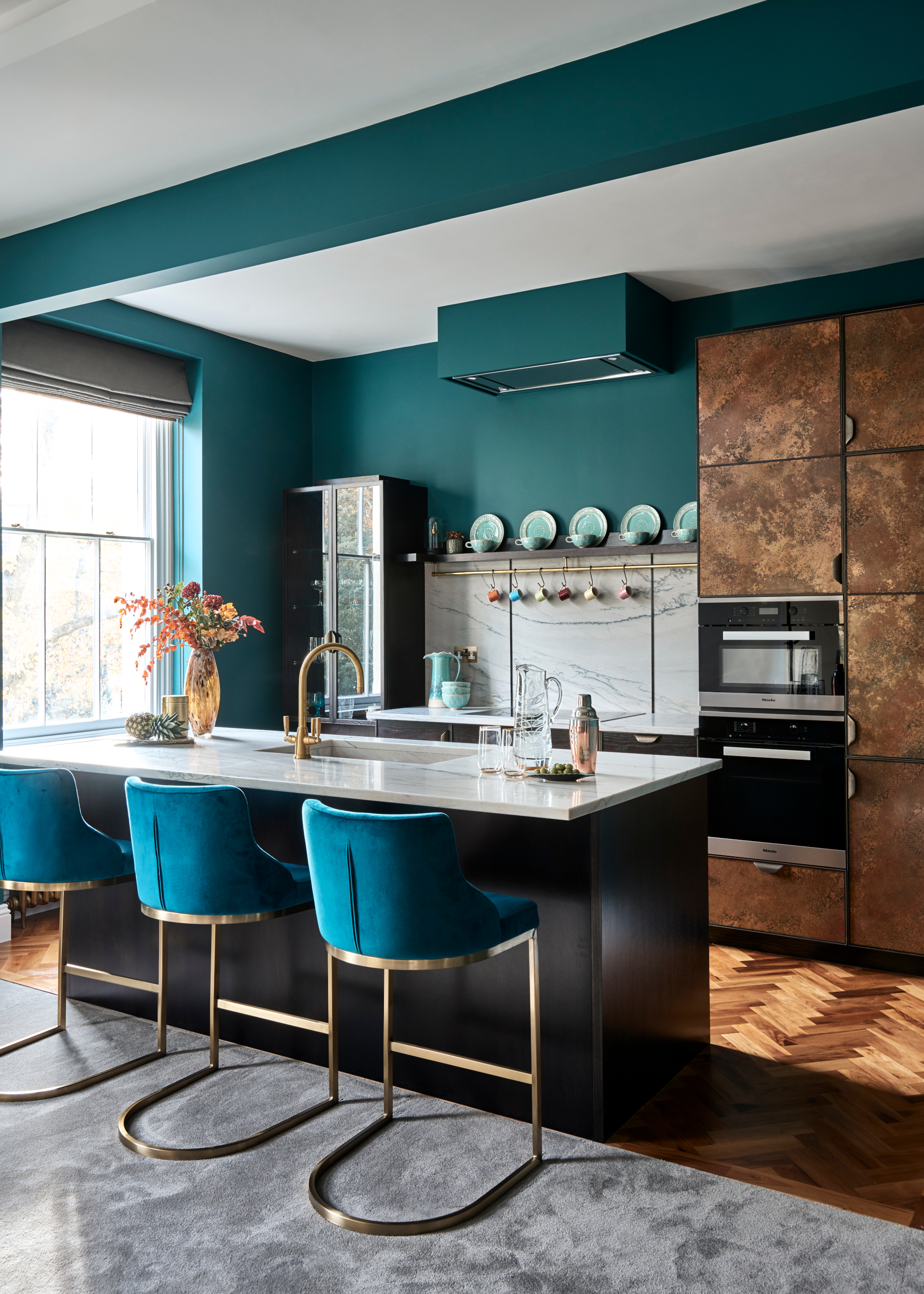
Using texture in interior design just as important when designing a kitchen as a living room. Picking out one stand-out finish, whether eye-catching kitchen countertop ideas or cabinet door fronts with a smoked glass, or bar stools covered in a touchable fabric can make a kitchen look more expensive.
'I like to work out how to introduce an atmospheric quality to kitchens, which can otherwise be quite functional,' says Elicyon's Charu Gandhi. 'Interesting materials, such as metal-mesh door fronts or those in panels of ombre smoky-gray glass, can look beautiful, while tactile surfaces, such as leathered-finish stone countertops, add another note of luxury.'
6. Introduce fabric for luxe appeal
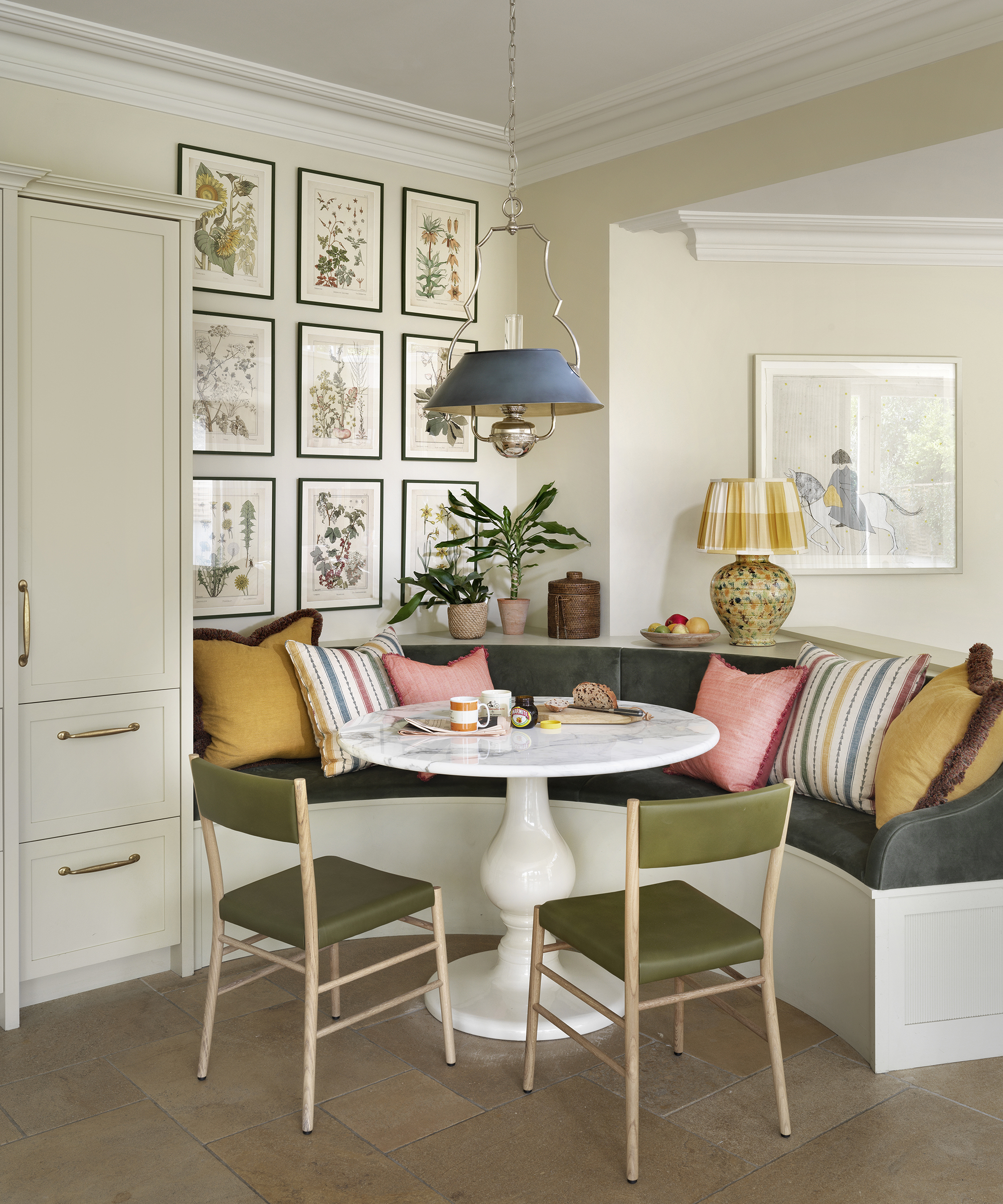
Using furnishings you might usually reserve for a living space is one way to make a kitchen look expensive. This can range from cushions on dining chairs to upholstered banquette seating ideas to fabric-covered dining chairs. The use of fabric also allows for more color and pattern to be introduced.
'Experiment with color on upholstered dining chairs: you don't have to slavishly use the same color and fabric on each one,' says interior designer and founder of Firmdale Hotels Kit Kemp. 'I would stick to the same shape of chair, but use a variety of colors and fabrics.'
7. Focus on the kitchen island
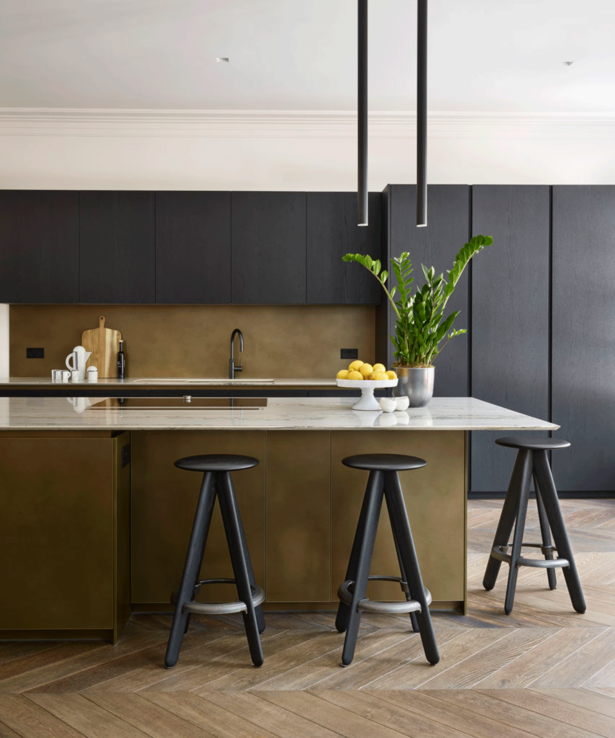
Making a kitchen look expensive means focussing on the room's centerpiece. This usually means ensuring your kitchen island ideas are ambitious, though that needn't mean costly.
'For example, you might choose standard cabinetry for the perimeter of the room but then pick an amazing marble for your island,' says Charu Gandhi.
If you've concluded that the best countertops for a kitchen are beyond your budget, using island paint color ideas cleverly are another way to ensure it stands out. Neutral or natural colors will ensure the room feels upscale, and received wisdom is that the island is usually a darker shade than the perimeter cabinetry because this will help make a small kitchen look bigger, too.
8. Pay attention to kitchen lighting
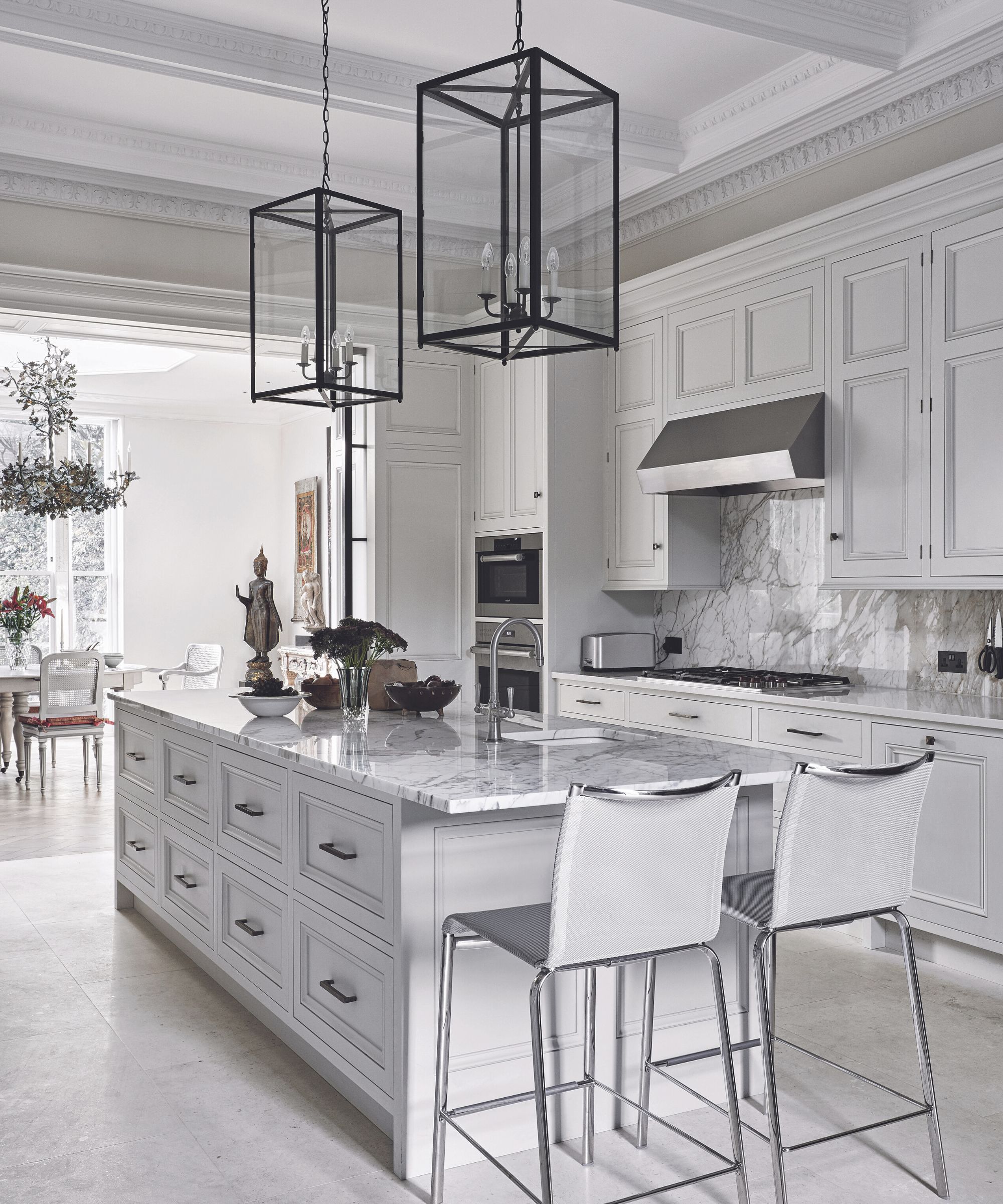
Kitchen lighting ideas don't just take care of the functional, they can help you adjust the atmosphere of the room to suit the occasion, highlight details, such as beautiful appliances or even kitchen art, and will allow you to create a more layered space.
'Lighting is important,' says interior designer Kelly Wearstler. 'It sets the mood and guides the eye around the room. Accent lighting is a great way to set the scene for different uses, such as dimmable overhead pendant lights for an ambient mood while dining, or table lamps near seating for task lighting.'
9. Choose elegant colors
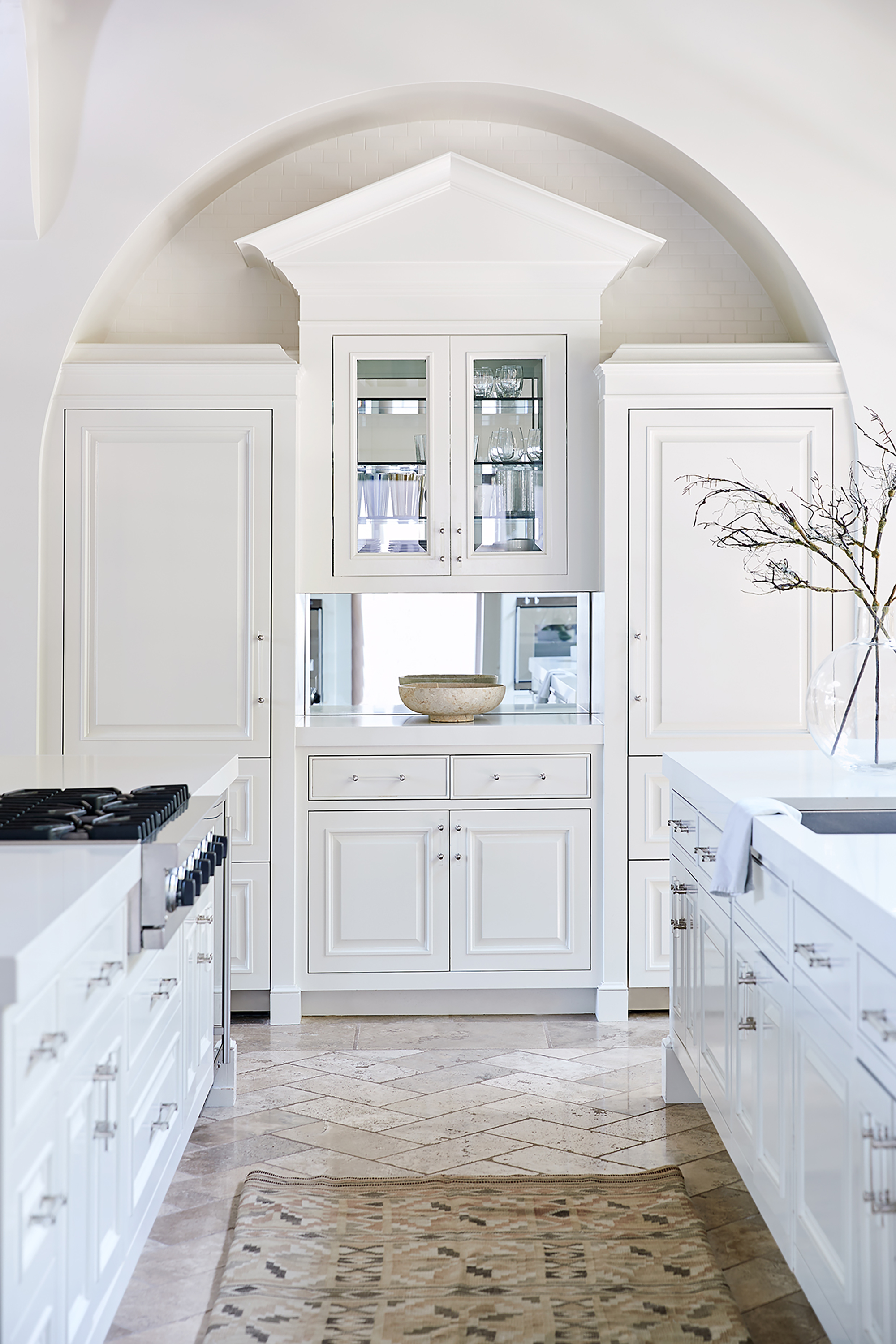
Choosing kitchen color ideas that are elegant and timeless usually means picking out a safe, neutral scheme that will please the majority of people. White kitchen ideas and grey kitchen ideas are the most popular choices and will, at least in other people's eyes, make your kitchen look expensive, or at least well-designed.
However, you can introduce color and have an expensive-looking kitchen, with blue or green kitchens very on trend currently. Still, restraint is always urged.
'Be bold but not frantic with color,' says Kit Kemp, who is famed for her use of and love of bright colors, even in kitchens. 'Curate colors and patterns before you start so you can prioritize for maximum impact.'
How do I make a simple kitchen look expensive?
To make a simple kitchen look expensive, these updates are particularly useful for budget kitchen remodels:
- Update handles and knobs on cabinetry – ensuring their finish and style match other hardware such as faucets.
- Replace kitchen cabinet doors – this is much cheaper than replacing an entire kitchen and can give your kitchen an expensive look very quickly.
- Concentrate on kitchen window ideas – ensure your kitchen window curtains, blinds and shutters are practical but pretty.
How can I make an affordable kitchen look luxurious?
To make an affordable kitchen look luxurious, the first thing to do is work on decluttering. Organizing a kitchen of any size, but particularly compact ones, can instantly make them feel sleeker. That done, look to surfaces that you can upgrade for a reasonable cost: painting kitchen cabinets and replacing kitchen countertops for smarter, more expensive-looking ones will help an affordable kitchen look luxurious, too. The same goes for flooring. Finally, add smart window dressings and accessories, such as artwork.
Sign up to the Homes & Gardens newsletter
Design expertise in your inbox – from inspiring decorating ideas and beautiful celebrity homes to practical gardening advice and shopping round-ups.

Lucy Searle has written about interiors, property and gardens since 1990, working her way around the interiors departments of women's magazines before switching to interiors-only titles in the mid-nineties. She was Associate Editor on Ideal Home, and Launch Editor of 4Homes magazine, before moving into digital in 2007, launching Channel 4's flagship website, Channel4.com/4homes. In 2018, Lucy took on the role of Global Editor in Chief for Realhomes.com, taking the site from a small magazine add-on to a global success. She was asked to repeat that success at Homes & Gardens, where she has also taken on the editorship of the magazine.
-
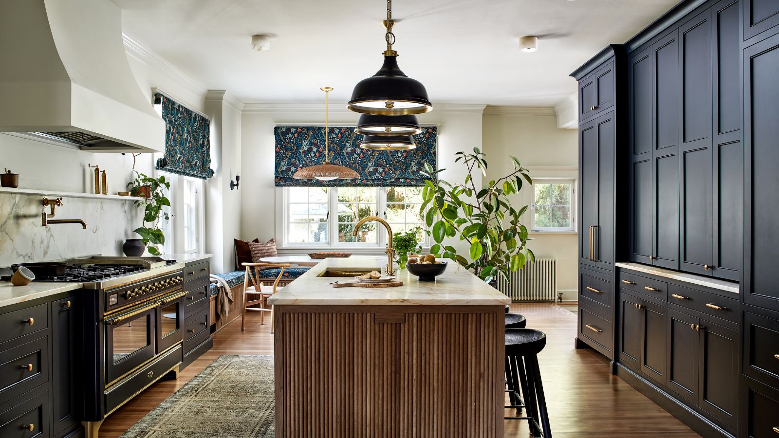 This once-dated kitchen is now a timeless space with the coziest details – and its the classic color palette that's made it a chic, welcoming space
Warming colors and natural materials combine to create this enduringly classic kitchen scheme
By Molly Malsom Published
-
 How to grow crepe myrtle in pots – and transform even the smallest of yards with dazzling flowers this summer
Growing crepe myrtles in pots will inject splashes of brilliant color into your outside space
By Thomas Rutter Published