How can I make a small kitchen look stylish? 7 interior designers share their decorating dos
Seven of the world's best interior designers share how they ensure a small kitchen feels anything but

Amelia Thorpe
A tiny kitchen might not be blessed with a large or sociable space, however, there is still plenty to feel positive about. Look beyond function to create an uplifting small kitchen to cook, entertain and dine.
For a start, when designing a small kitchen, you'll soon realize that it’s easy to keep everything to hand. Plus, there is a wealth of clever small kitchen storage ideas available to get the very best out of every inch.
And, finally, you can afford to go for unabashedly luxurious materials. With a limited amount of door, floor, and drawer fronts to cover, investing in a little luxe easily elevates your kitchen area from small to stylish.
How can I make a small kitchen look stylish?
These stylish small kitchen tips are useful, whether you are looking for remodeling ideas for small kitchens or looking to furnish an existing space.
Here, we spoke to some of the best kitchen designers with a proven record of creating dynamic and ergonomic designs for small spaces.
1. Forgo wall cabinets
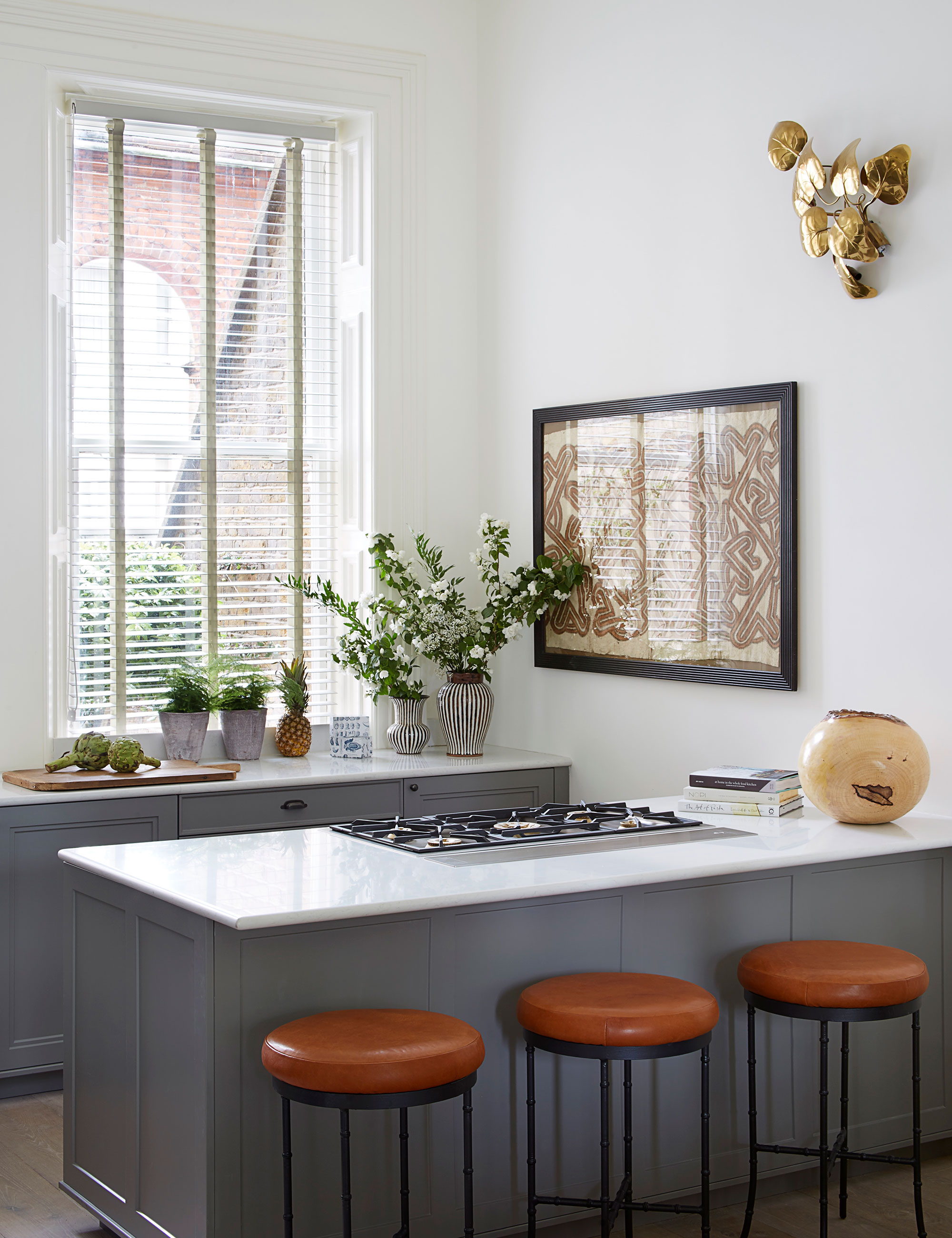
‘Wall units can overwhelm a small kitchen,' says Katie Lion, senior interior designer, Kitesgrove. 'Sometimes less is more. In this kitchen, we decided not to hang wall cupboards to preserve the beautiful natural light and airy atmosphere and help the space feel much bigger. The eye is left free to wander above the base units towards the focal point, a large artwork full of pattern and color, and a striking bronze wall sconce, which is both sculptural and functional.
'To compensate for reduced kitchen storage, we recommend drawers under countertops as they are easier to navigate in a tight space than cupboards, and a slim breakfast bar for additional seating without taking up too much room.’
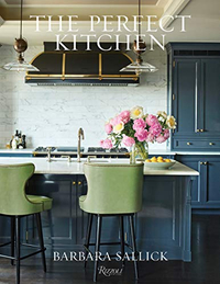
The Perfect Kitchen, Barbara Sallick | From $21.87 at Amazon
Learn more about the perfect kitchen design in this highly-rated book by Barbara Sallick. Inside you will find beautiful images and practical advice for your own kitchen remodel.
2. Add built-in seating
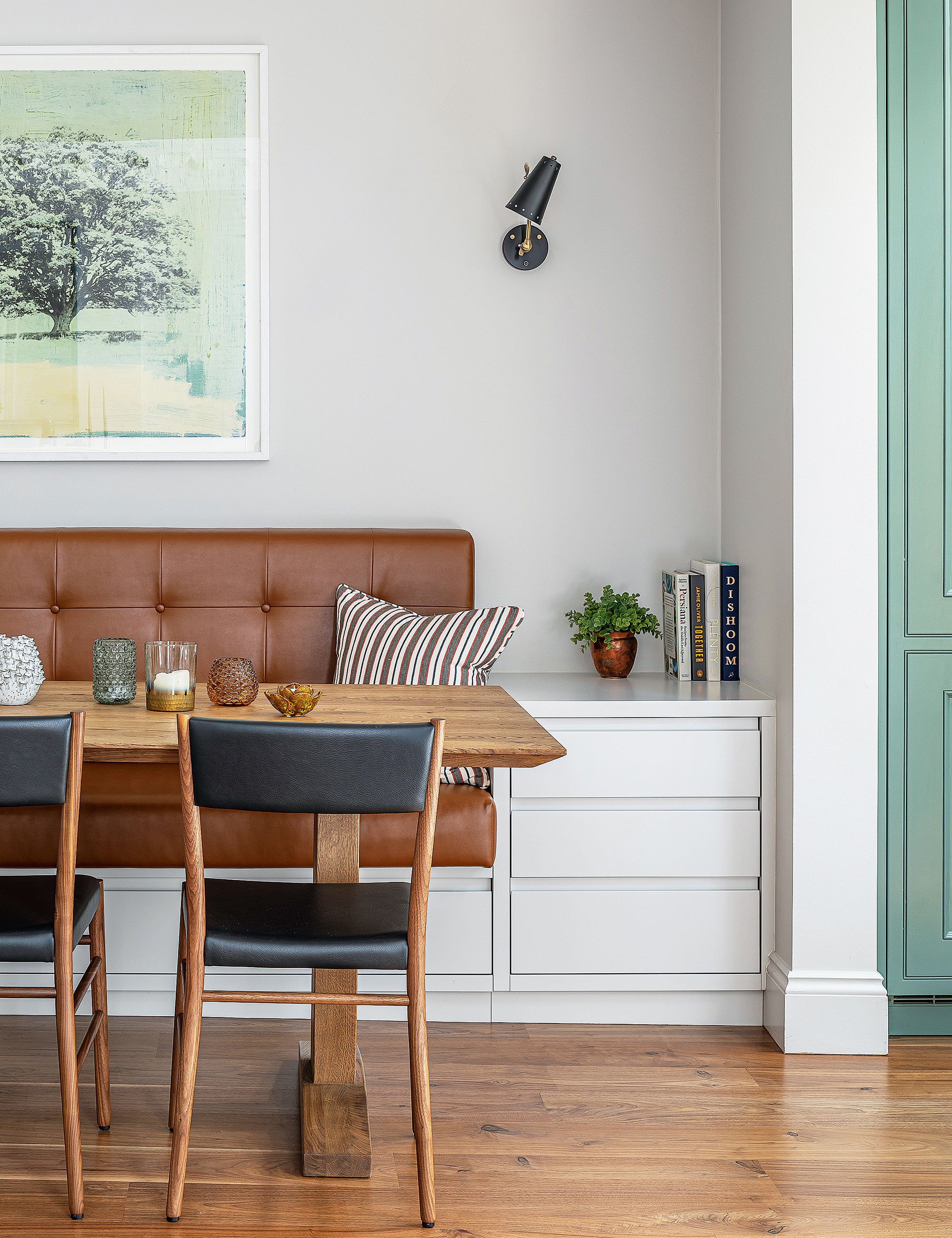
'Banquette seating comes into its own when space is at a premium, for three practical reasons,' says Ali Johnson, director, of Otta Design. 'Firstly, you can fit more people on a bench than on individual chairs. Secondly, it is fitted against a wall, therefore reducing the overall footprint of the dining area as you do not need a thoroughfare on one side of the table.
'Finally, you can design the banquette, as we did here, with storage underneath – perfect for housing bulky appliances and other paraphernalia. On a decorative note, a beautifully executed banquette can be used to introduce artwork, color, and pattern.'
3. Reflect surfaces
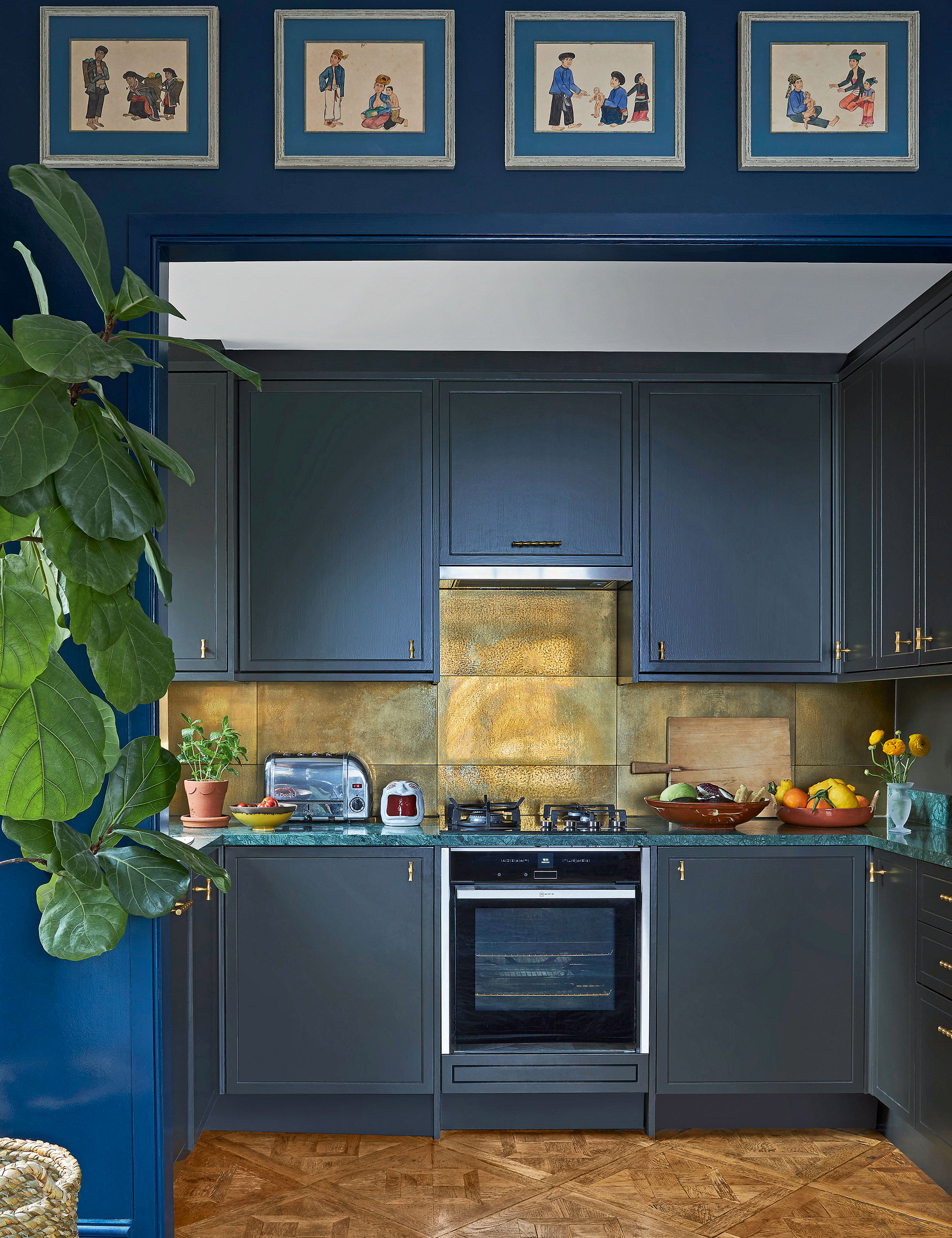
'Using the same strong cabinetry color on walls and ceiling is an effective way to trick the eye, enhancing depth and height,' says Lucy Mayers, decorator, Sibyl Colefax & John Fowler. 'To help balance the dark walls and cabinets, the choice of backsplash was of utmost importance. These porcelain tiles look like brass but are easier to clean and have a brilliant reflective quality, beefed up with under-cabinet lighting. The surface injects a real sense of glamor while helping to bounce light around the space. Avoid overdoing statement surfaces, sometimes having less of something can make it feel even more luxurious.'
4. Make considered color choices
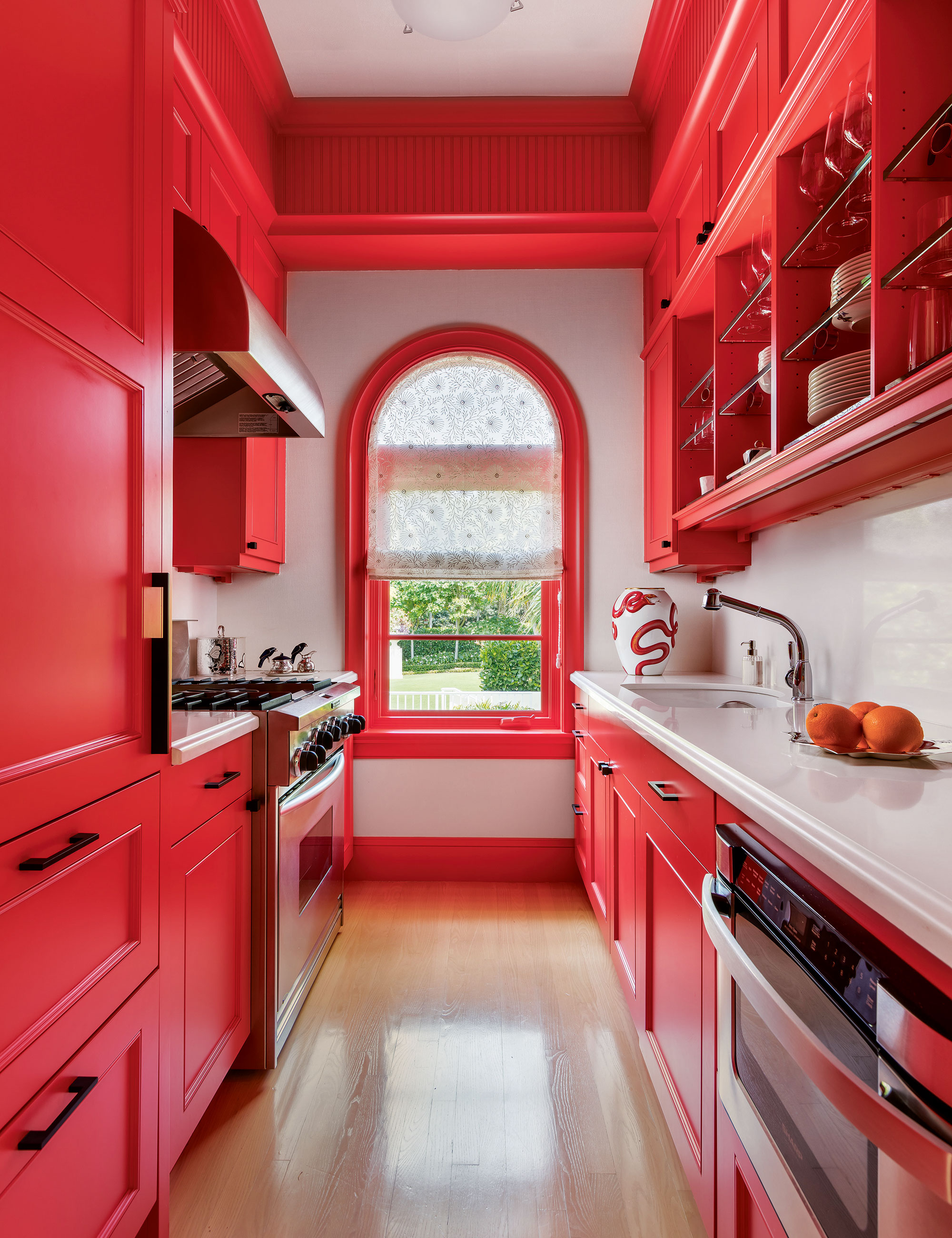
When space is tight, you can distract the eye with color, but limit your palette to just one strong or predominant color scheme.
'Bold kitchen color is one way to grow a space that physically has a small footprint,' says Matthew Boland, principal, of MMB Studio. 'In this guest house, the bijou kitchen is narrow, so I wanted to make it a star. The color – Sherwin-Williams’ aptly named Energetic Orange – grabs your attention and allows your eye to travel the entire length and height. The smallest spaces can be the most memorable if you keep the focus strong. Here, the focus was the paint color and we used it with vigor.
5. Maximize wall space
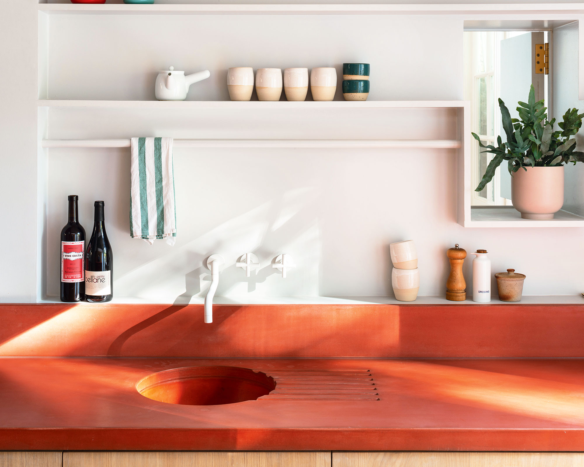
If your kitchen proportions are limited, introduce a decorative display on walls and decorate above kitchen cabinets. Architect Ben Allen of Studio Ben Allen emphasizes the practical function of shelving above the worktop in small kitchen design.
‘We love providing space to display all things cooking and food-related, so we often design open shelves,’ he says. ‘On the lowest shelf, there will be space for items that are used every day – salt and pepper, oil and vinegar, perhaps an open bottle of wine and pots of herbs.’
He might add a rail for hanging tea towels, cooking implements, small pans, or strings of onions and garlic. Higher shelves can be used for attractive cups, teapots, and china, and variations in height and depth can bring playful touches to the design.
6. Work the floors
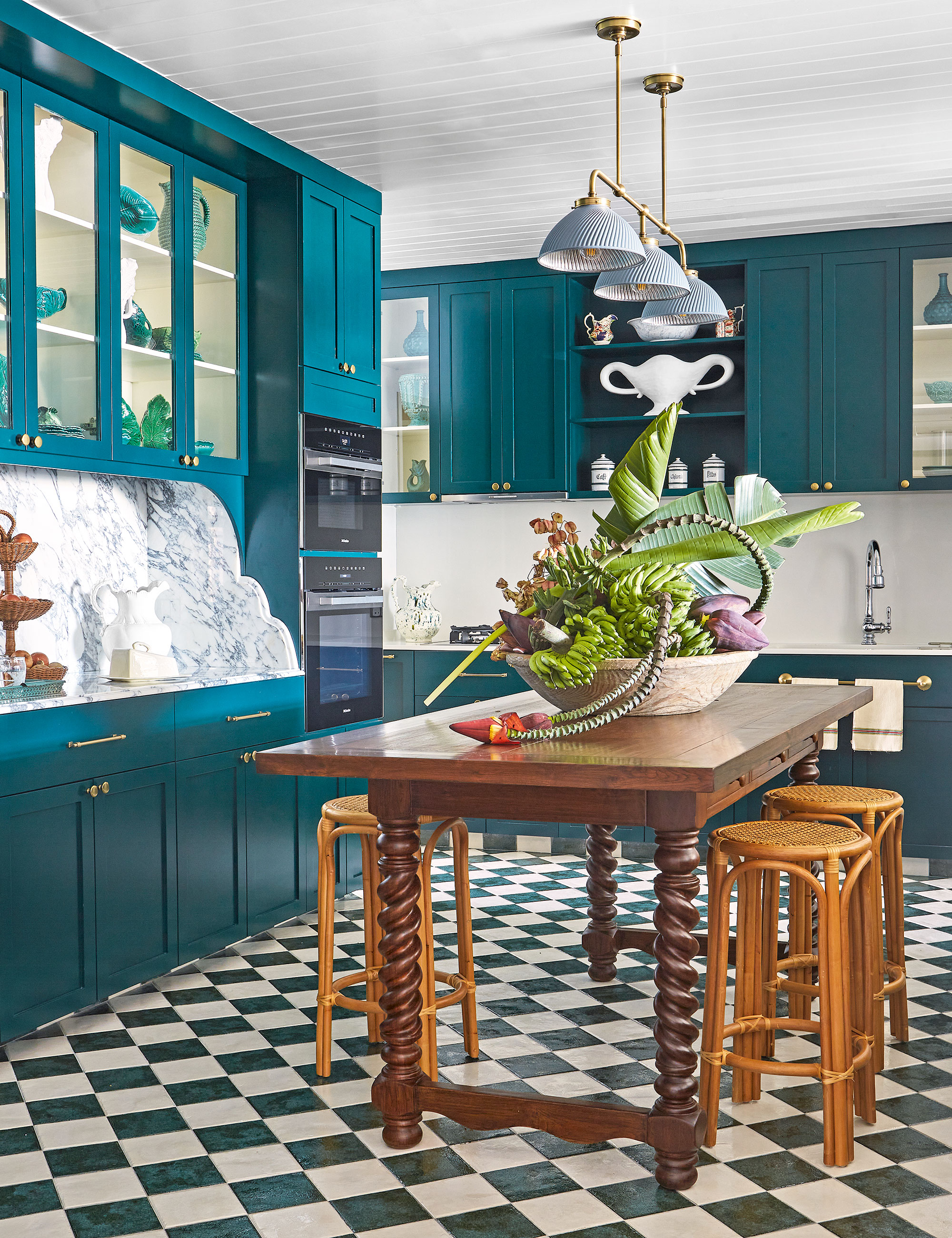
In a small kitchen adding a patterned floor is a wonderful way to bring another decorative element to a room where it is mostly hard surfaces, says interior decorator Elizabeth Hay. She designed this decorative kitchen with green-and-white floor tiles, teal cabinets, a teak table and rattan stools for clients in Singapore. Overhead is a light from Hector Finch and she’s added tongue-and-groove cladding to the ceiling for extra texture.
‘The kitchen is now the heart of the home and we want it to feel like a room we can relax in rather than just see it as a utilitarian space,’ says Elizabeth. ‘Adding a pattern to the floor in a small room is one way of creating interest and can be achieved in a practical way through tiles which are easy to keep clean.’
7. Use luxurious materials
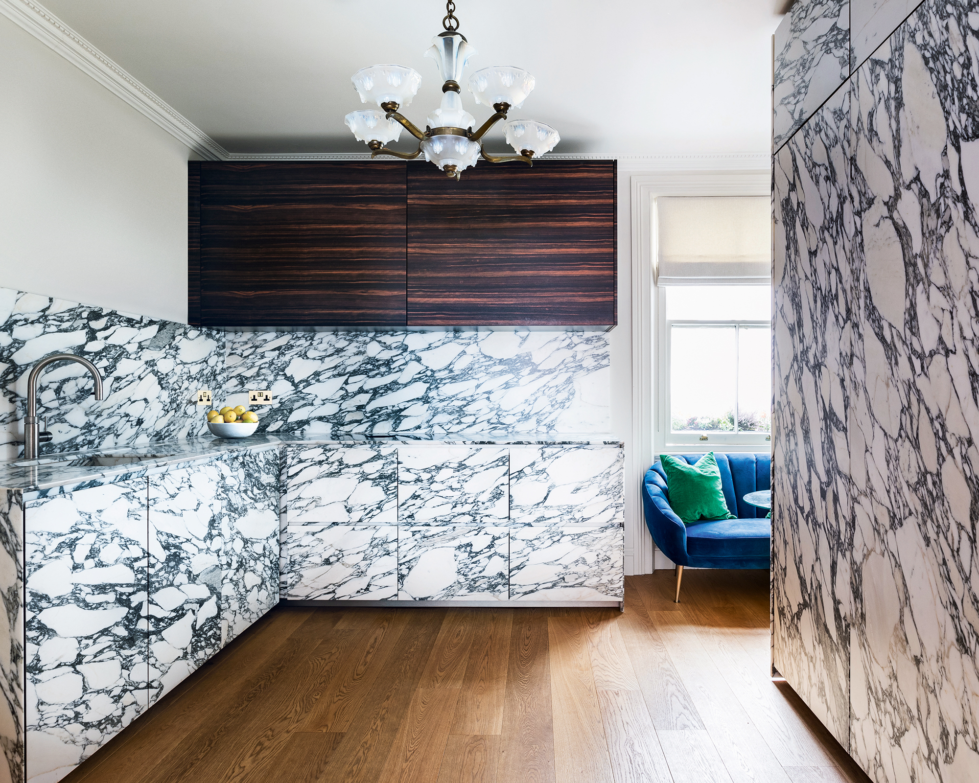
Invisible kitchens are garnering tremendous praise for the way they hide away the conventional parts of a cooking space to let the fabulous parts of a small kitchen truly shine.
Discreetly hidden kitchens don’t have to be quiet and featureless, as this striking scheme by Minotticucine London proves. ‘At the heart of this minimalist kitchen design ethos lies visual silence, a philosophy whereby all elements that identify and age a kitchen are hidden from view,’ explains Anthony McLean, head of design, Minotticucine London.
‘In this bijou kitchen project, the appliances are hidden from view behind a pocket door, allowing the beautiful Arabescato marble kitchen ideas to form the uncontested centerpiece.’
Sign up to the Homes & Gardens newsletter
Design expertise in your inbox – from inspiring decorating ideas and beautiful celebrity homes to practical gardening advice and shopping round-ups.
Linda graduated from university with a First in Journalism, Film and Broadcasting. Her career began on a trade title for the kitchen and bathroom industry, and she has worked for Homes & Gardens, and sister-brands Livingetc, Country Homes & Interiors and Ideal Home, since 2006, covering interiors topics, though kitchens and bathrooms are her specialism.
- Amelia ThorpeContributing Editor
-
 Nate Berkus says slipcovered sofas are back on trend – and I just found a way to create this designer-approved laid-back look from just $86
This classic style is making a strong comeback, but did you know you don't have to buy a whole new couch to get this Nate-approved look?
By Eleanor Richardson
-
 Gardeners are putting pasta in bird feeders this spring – but there is one important warning you need to know before following suit
Cooked pasta can be a nutritious snack for birds, but serving it in the wrong way could cause them harm
By Tenielle Jordison
