Floor-to-ceiling kitchen storage ideas – 10 looks loved by designers
Clever floor-to-ceiling kitchen storage ideas, matched with precision planning, can transform a chaotic space
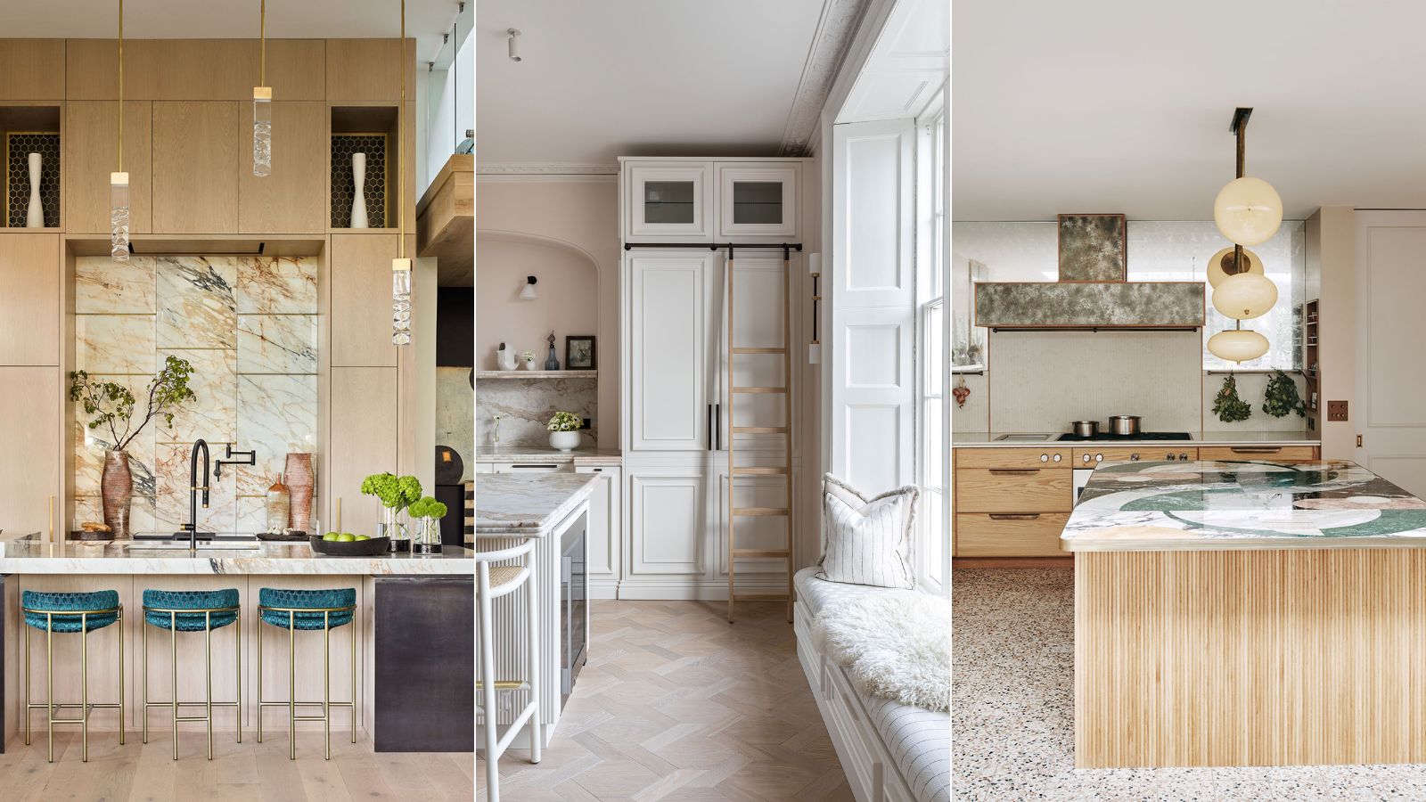
- 1. Employ floor-to-ceiling cabinets in small kitchen
- 2. Create a high-end bespoke look
- 3. Ditch the dust
- 4. Mix and match cabinetry size
- 5. Provide a step ladder
- 6. Consider an open-plan layout
- 7. Use glass to generate a sense of light and clarity
- 8. Create a sleek one-wall kitchen
- 9. Consider color
- 10. Build up for drama
- FAQs

Floor-to-ceiling kitchen storage has become more popular over the last five years, have we all grown taller? No, but you will need steps or a ladder to reach that uppermost shelf! So why, the change in cabinet design?
As modern kitchens began to flourish in the 20th century, the concept of cupboard storage, multi-purpose shelves, and units became more in vogue. Eventually, contemporary kitchen storage evolved to boast fitted cabinets and designer appliances as our kitchens became the central space to life inside the home.
Floor-to-ceiling kitchen storage
This evolution continues, as we seek to create as much storage in our kitchens as possible, and the tradition of gaps between a wall cabinet and the ceiling begins to fade.
But should all kitchen cabinets stretch to the ceiling? Does this style work in smaller kitchens, or should only large spaces consider it? Do floor-to-ceiling kitchen cabinets impact the rest of the layout in the design, do they make a small kitchen look bigger or smaller? How should this design element be incorporated, and how do you reach the top? We have asked our favorite designers the answers to these questions, read on to find out more.
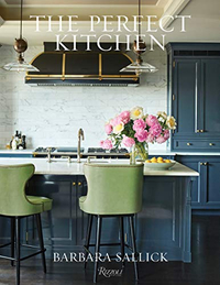
The Perfect Kitchen, Barbara Sallick | From $21.87/£30.45 at Amazon
Learn more about the fundamentals of kitchen design in this bestselling book. Find practical advice as well as hundreds of images to inspire your own remodel.
1. Employ floor-to-ceiling cabinets in small kitchen
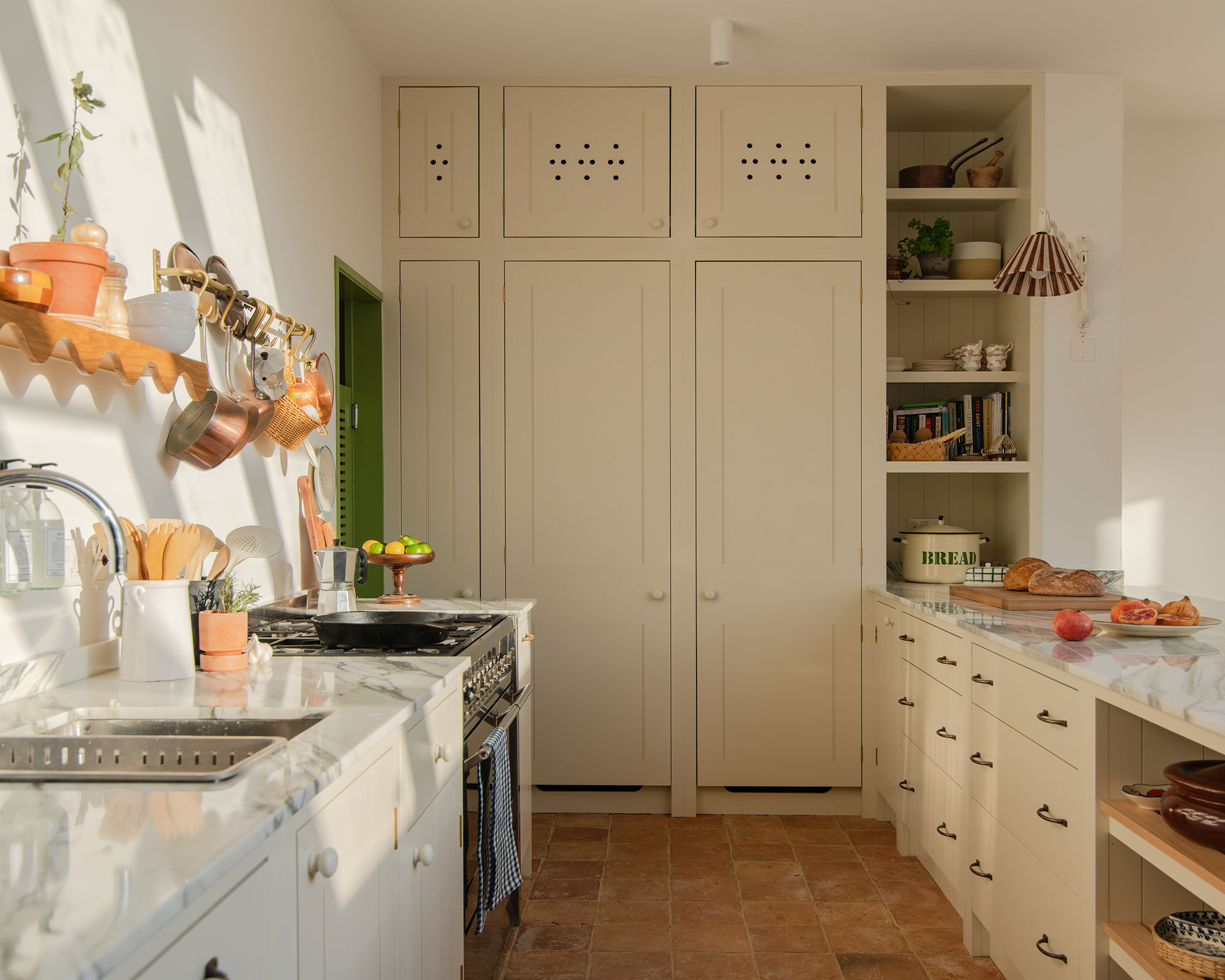
‘If the ceilings are high, in a small kitchen, then use this space and create high storage with tall wall cupboards, they may be harder to reach but the space will become invaluable,’ advises the creative director of deVOL, Helen Parker.
A modest kitchen can benefit from floor-to-ceiling kitchen storage, particularly if the cabinets are painted in a color that allows them to disappear into the walls. This clever design trick ensures that the space does not feel cluttered or smaller with this type of cabinetry.
Jen Nash, senior design lead at Magnet agrees: ‘Floor-to-ceiling cabinets is a perfect option for those looking to transform, adapt or maximize the functionality of their kitchen. A dream for smaller or awkwardly shaped kitchens, lengthy cabinets replacing entire wall spaces can be used to reframe and expand the look and feel of kitchen spaces. Storage is also maximized effortlessly with cabinets blending seamlessly into the background.’
Lighter, minimal cabinetry finishes should be used in smaller kitchens with bolder cabinetry design used in larger kitchens to prevent the space from feeling enormous.
2. Create a high-end bespoke look
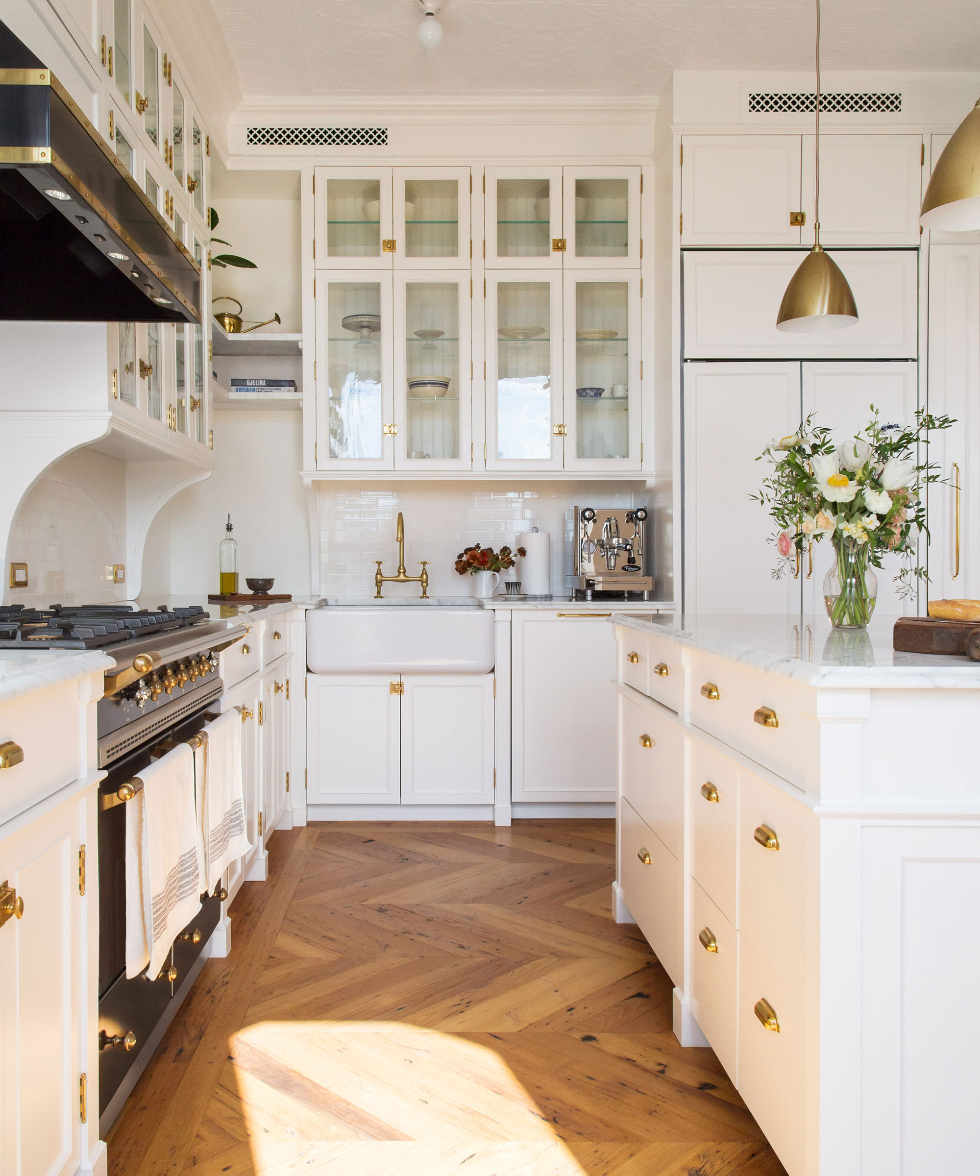
Cabinets that run to the ceiling naturally look and feel bespoke, ensuring that this type of kitchen design makes a grand statement. Swapping out bare wall spaces for something notably more interesting and attractive like floor-to-ceiling storage cabinets creates that wow factor.
Keren Richter, co-founder and principal designer at White Arrow: ‘I love cabinetry that runs to the ceiling. Cabinetry that stops below the ceiling or a room’s crown molding feels unfinished and looks cheap, whereas cabinetry that draws the eye up makes use of vertical storage and considers the whole wall. This style feels high-end and bespoke.’
3. Ditch the dust
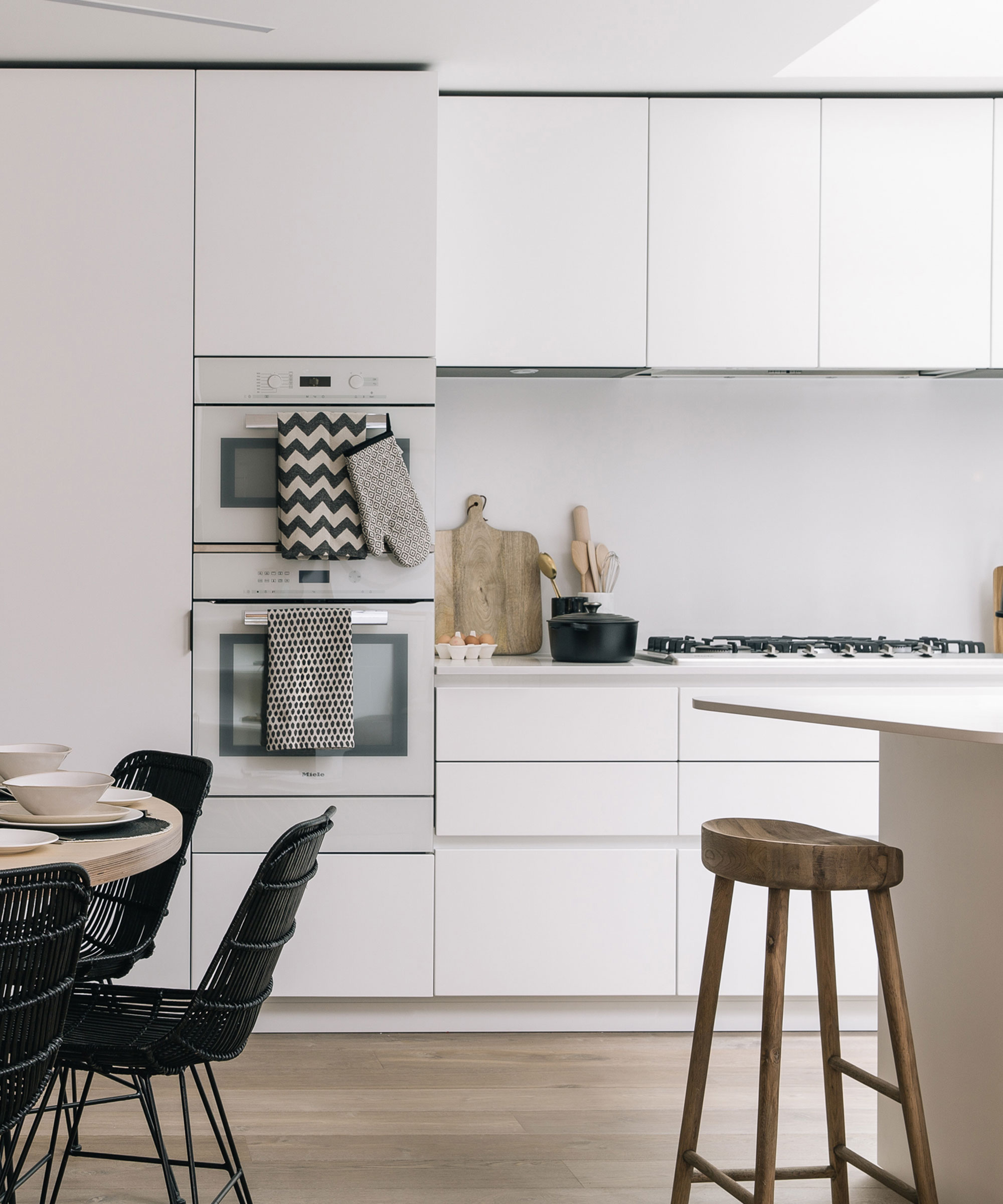
Traditionally kitchen cabinets would leave a generous space between the top of the cabinet and the ceiling. This design was clearly developed so that the average height of a person working in their kitchen would have easy access to everything around the room.
As design and style have changed and floor-to-ceiling cabinets become more popular so does the distinct lack of dusting in these former empty spaces, where bottles of holiday liquor or chocolate boxes were stashed and then languished, forgotten for years.
4. Mix and match cabinetry size
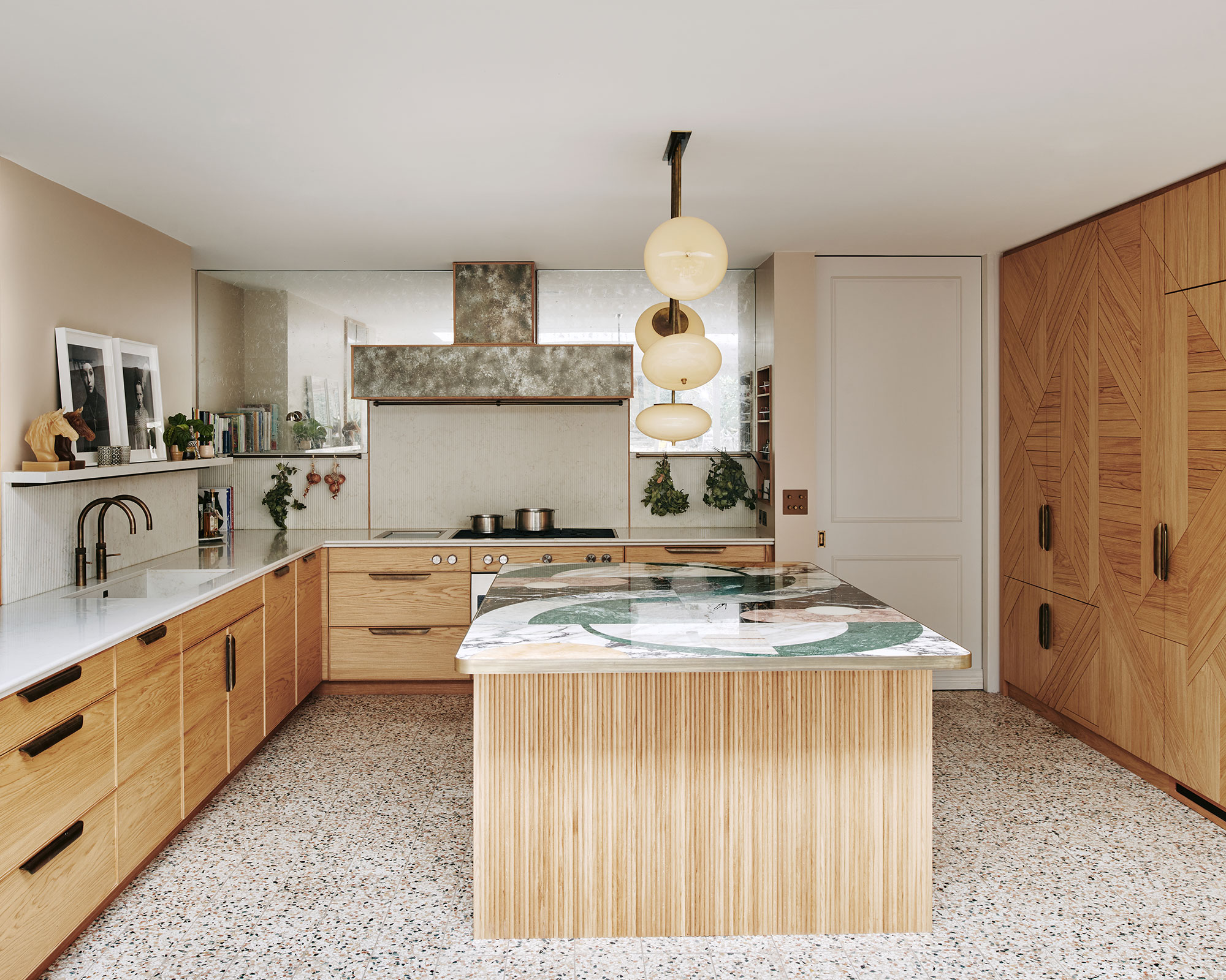
Beware of covering every wall in your kitchen with floor-to-ceiling cabinets, an overwhelming sense of crowding will follow. To prevent this overcrowding, mix tall cabinets with stretches of open shelving or a utensil rail to create a sense of balance and openness in the room. Or select just one wall on which to fit floor-to-ceiling cabinets.
Charlie Smallbone, founder of Ledbury Studio explains: ‘If all cupboards in the kitchen are floor-to-ceiling, it can feel closed in, especially in a galley kitchen. Floor-to-ceiling cabinets located on one wall could hide a larder, fridge-freezer, or other tall storage behind paneled doors, adding a design to the doors, that is a focal point in
5. Provide a step ladder
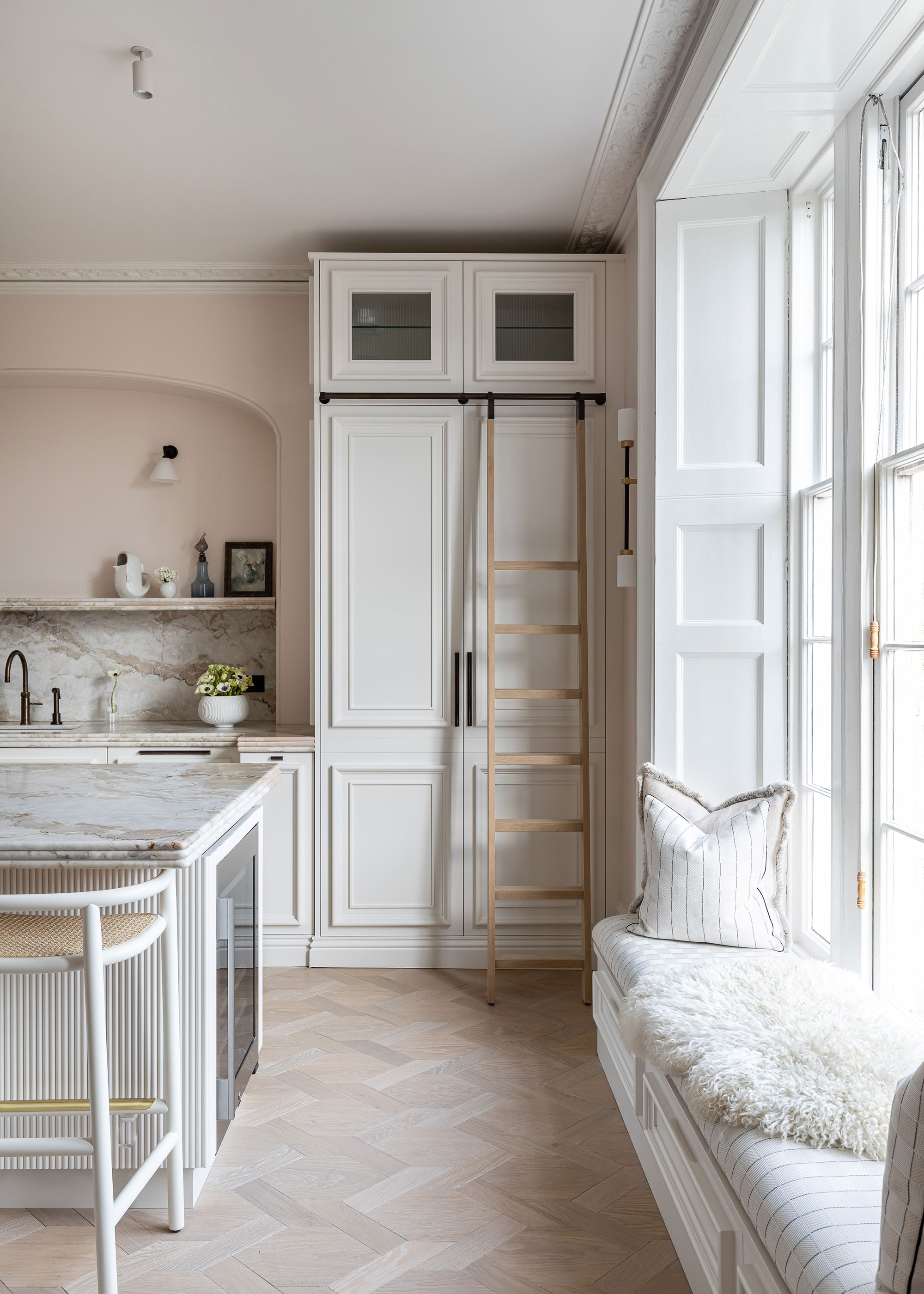
‘Whether we are designing an expansive kitchen in a sprawling residence, or a cozy eat-in kitchen for an in-town pied-à-terre, our clients almost always come forward with the same request: more storage,' says Yvonne McFadden of Y. McFadden Interiors. ‘We find that floor-to-ceiling cabinetry provides a solution to the ever-present need for storage while maintaining a beautiful and cohesive vertical visual plane.’
But, how to reach those upper shelves? Charlie Smallbone, the founder of Ledbury Studio, advises, ‘incorporating a small step ladder into the kitchen design, such as one concealed in the kickboard. This will make accessing those items easy and safe.’
6. Consider an open-plan layout
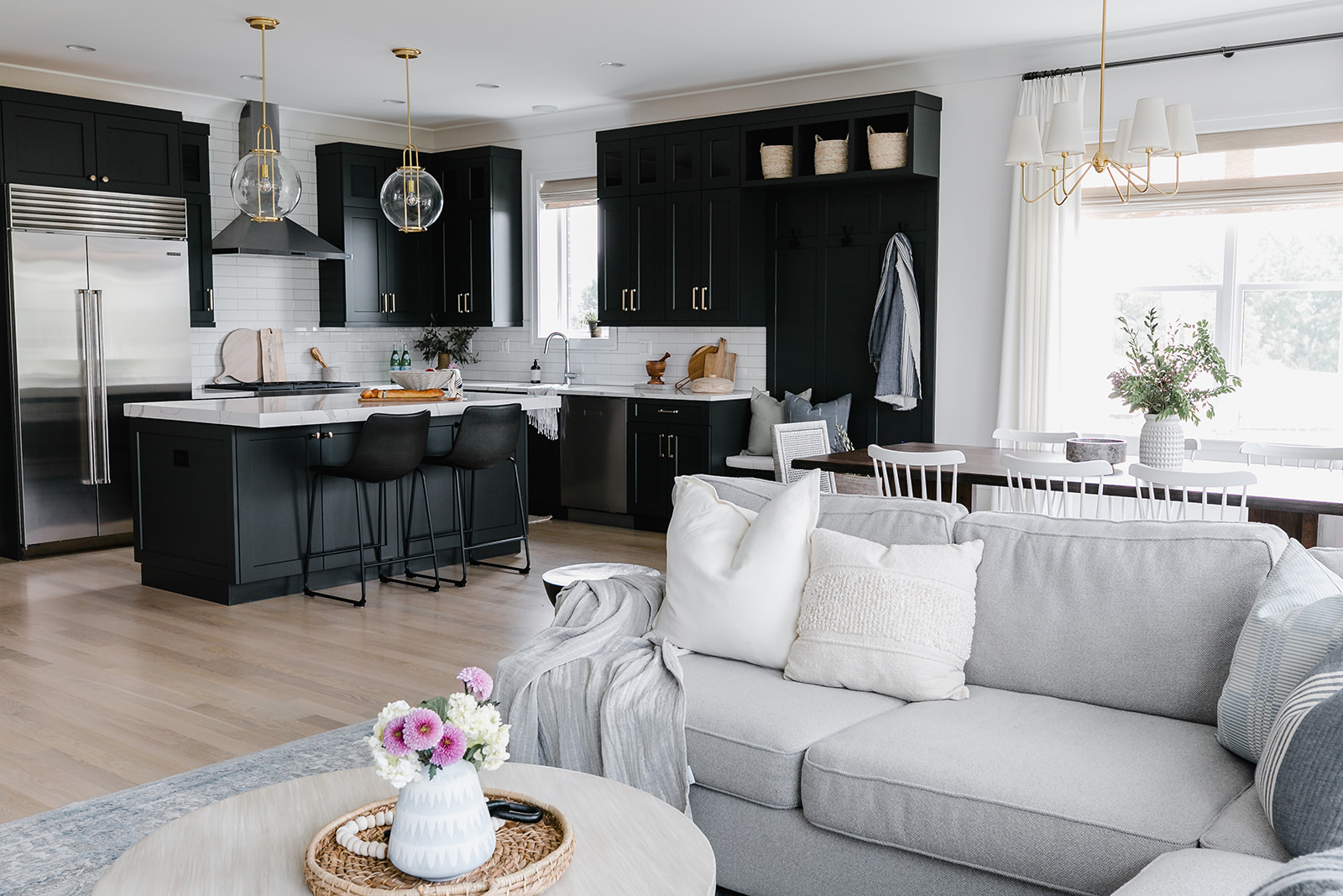
This Chicago kitchen had a wide-open layout, which also needed to provide a seating and dining area, so more storage was key. Allison Ruda at Allison Ruda Interior Design, explains how bespoke floor-to-ceiling cabinetry designed in an L shape worked so well in this space.
‘This home did not have a typical entry area, so we added a custom built-in piece to look like it was always there. The storage goes floor to ceiling and packs lots of function and beauty, including, hooks, multiple cubbies for storage, baskets and a bench. Ultimately this piece expanded the kitchen and made it feel larger and more customized.’
The L shape ensures that the other living areas do not feel opposed by the kitchen, but cohesively work together in a very large room.
7. Use glass to generate a sense of light and clarity
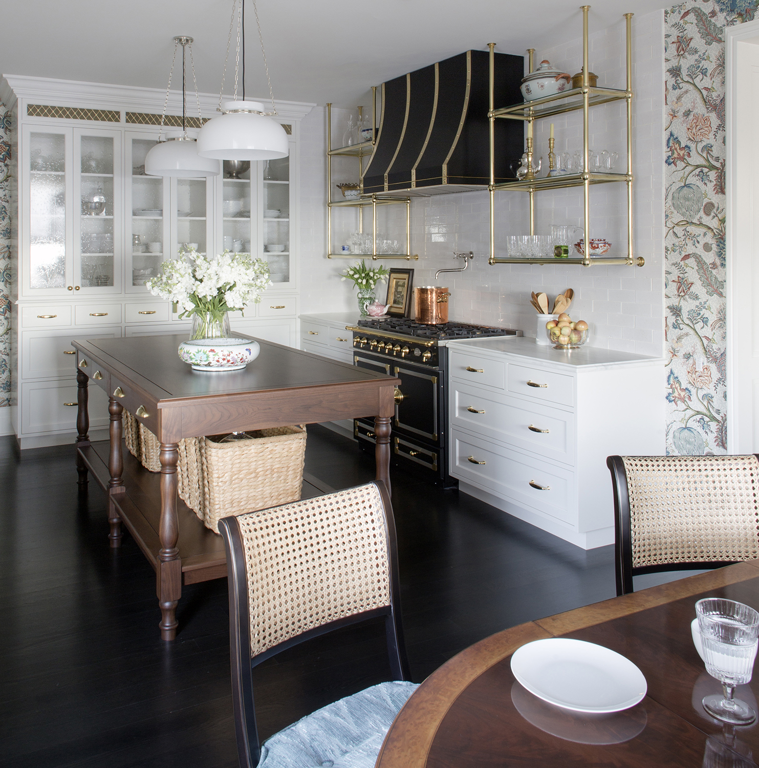
Designers will often use glazing and lighting at the top of a cabinet design in floor-to-ceiling shelving to encourage and create a lighter feel altogether.
‘Kitchen cabinets can go up to the ceiling’, says Simon Temprell, interior design manager at Neptune, ‘but this could make the room feel crowded. Consider using glazed top cabinets with lighting to display favorite objects as this will make the finished kitchen look lighter and more ‘open’.
Brittney Ferguson at Brittney Ferguson Interiors agrees: ‘A small upper with a glass front is the perfect way to showcase decorative bowls, vases or pitchers. Taking cabinets to the ceiling can make a kitchen go from spec home to custom build for a fairly low additional cost.’
8. Create a sleek one-wall kitchen
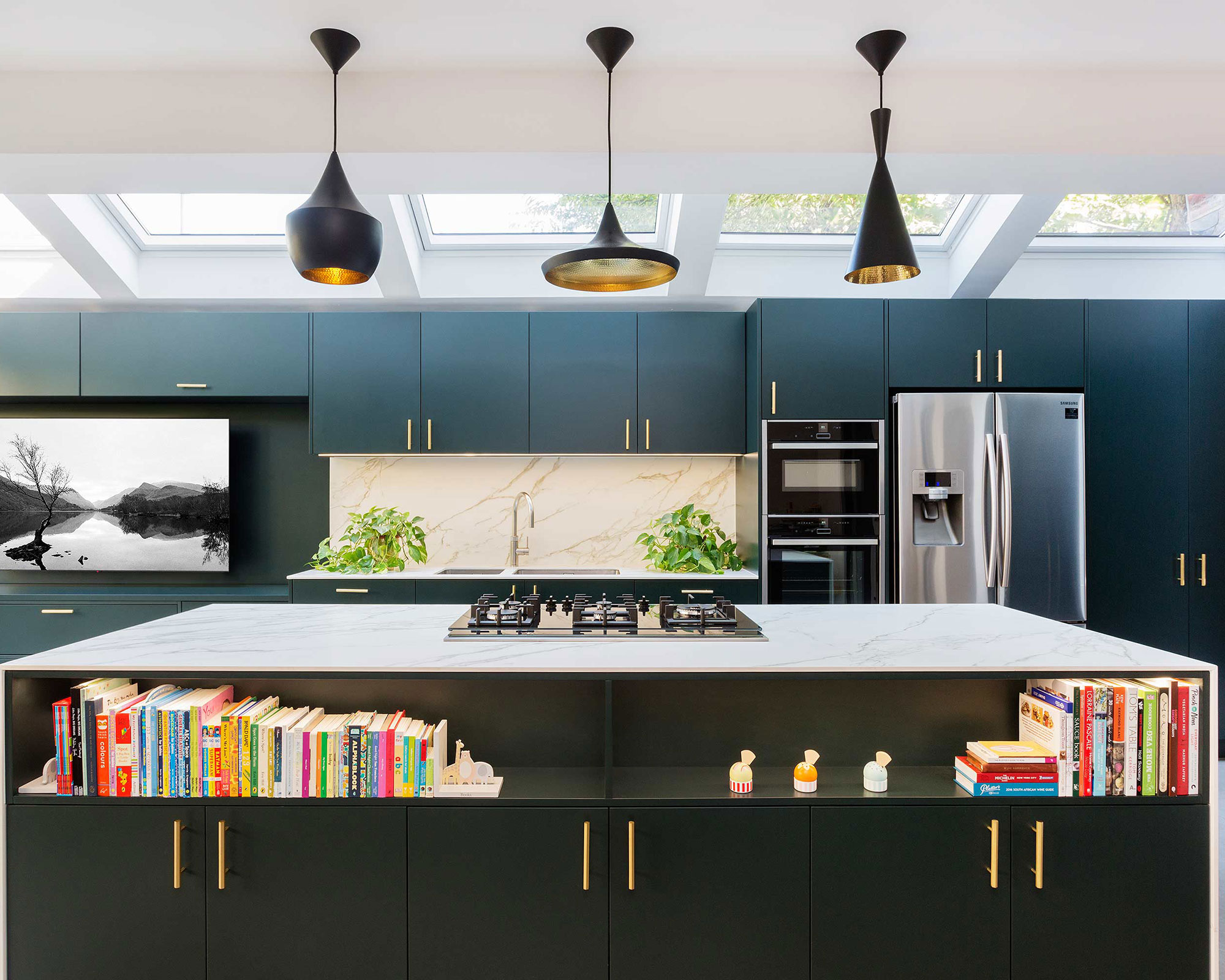
If you have the space in a large room, you can consider selecting one wall for a full floor-to-ceiling run of cabinets. The cabinets can provide neat storage for a multitude of gadgets and appliances, while keeping the overall look and feel sleek and sharp.
Felix Milns of HUX London, says: ‘Devising bespoke storage solutions that best fit the space, as well as the lives of those who will live there, is essential. Floor-to-ceiling storage can benefit a multitude of storage concepts, which can all be concealed behind a flow of cabinetry with the same aesthetic detailing across the doors, creating a seamless and sleek finish.’
Felix Milns suggests adding crafted door handles and choosing a muted palette for the cabinetry in soft neutrals for a pared-back look or rich colors for more personality.
9. Consider color
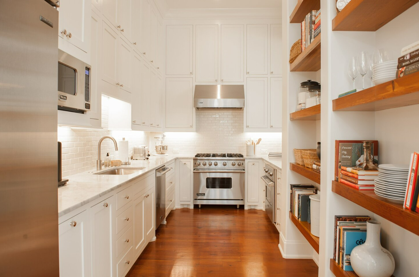
For smaller kitchens or galley spaces that are limited by workspace options, remove some full-height cupboards and replace them with wall cupboards, to provide relief in the layout, and introduce a kitchen countertop, sink, or kitchen backsplash to ease the flow of the room.
The trick is getting the proportion of the upper cabinetry correct, using tall cabinet doors and choosing pale and light paint tones will expand the kitchen vertically, emphasizing the room’s height, and making the space feel larger.
Todd Prince, from Todd Prince Design, adds: ‘Allowing the cabinetry to go to the ceiling works particularly well in galley kitchens where the space is narrow and tall. Additionally, if the kitchen can be seen from other rooms in the house, having the cabinets go to the ceiling provides a beautifully consistent and clutter-free backdrop. Remember, space is always at a premium in kitchens. Don’t forget to look up…’
10. Build up for drama
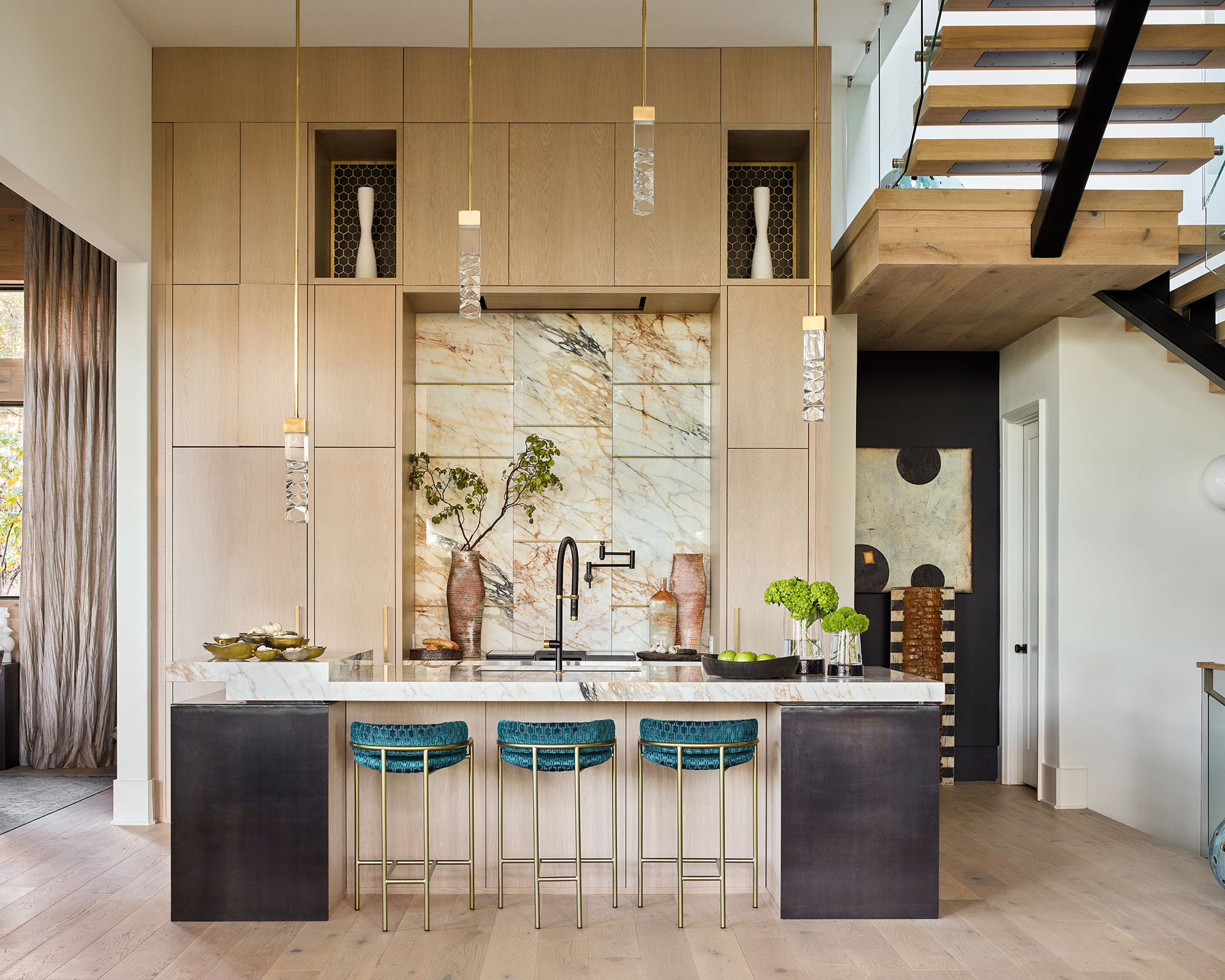
If height is no problem then be sure and reach for the sky. ‘We often design cabinetry to the ceiling to emphasize height and drama by elongating the design lines vertically with flush panels for a warm modern appeal. Clients store seasonal or less frequently used items in these upper cabinets that can be accessed when needed,' says Lorraine Enwright at Intuitive Dwellings.
At 15-foot this kitchen has panels at the very top, which have been designed to look like cabinets but are fixed, to create a continuous appearance, without the cost, creating real impact.
FAQs
Should kitchen cabinets go up to the ceiling?
Cabinets that run from floor-to-ceiling work in every kitchen, but consideration to layout must be given. Smaller kitchens benefit from using just one wall and utilizing paler, more neutral tones to keep the layout in balance.
Larger kitchens can consider going running across one entire wall, or mixing up the styles of cabinetry throughout, darker and richer tones can be used with more space. If well positioned and toned well, wall-to-ceiling cabinetry can elevate a room and make it feel taller and more spacious. Only store items that you use occasionally at the very top, or. use glazed top cabinets and lighting to display favorite objects.
Sign up to the Homes & Gardens newsletter
Design expertise in your inbox – from inspiring decorating ideas and beautiful celebrity homes to practical gardening advice and shopping round-ups.

Hannah Newton is a lifestyle, interiors, travel and design journalist and editor who has been writing for the past two decades, she has written for national newspapers including The Times, The Telegraph, The Guardian and The Observer as well as interiors titles Elle Decoration and Architectural Digest in the UK and across Europe, South Africa and Australia.
-
 Ina Garten's storage pantry is an insightful window into all of the best cookware used by the chef – and it's easy to recreate on your kitchen shelves from $48
The beautiful dishware in The Barefoot Contessa's Hamptons pantry showcases the tools she uses most often to cook – this is exactly how you replicate it
By Sophie Edwards Published
-
 Extend the lifespan of your appliance with 5 simple but crucial washing machine maintenance tips
From cleaning the filters to keeping the door open, experts reveal the washer tips they swear by
By Andy van Terheyden Published
