10 decorating mistakes that make a kitchen look smaller
The kitchen, just like any room, can become the victim of space-reducing decor mistakes. Here's what not to do, and what to do instead
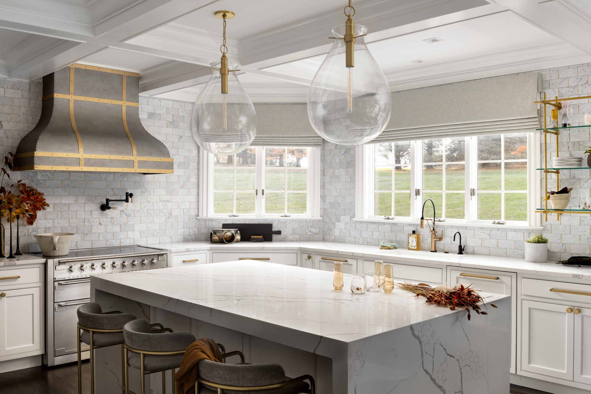
It's easy to make decorating mistakes in a kitchen. After all, the decor of this central room has had a major rethink in the past couple of years, with wallpaper, paint and fabric brands all stepping up their game in offering water-resistant, wipeable and steam-proof products that can stand the conditions of a kitchen, but which would be just as at home in a living room or bedroom.
Add to that the new adventurousness we're all showing in not only picking out braver color schemes and layering kitchen floors with rugs, and you can see how this once purely functional space can be quickly overwhelmed with visual clutter.
So, while you may have a Pinterest board of kitchen ideas ready to roll out, be aware that not all will work in your space, especially if yours is a small kitchen already. These are the biggest pitfalls to fall into, according to our team of experts.
Kitchen decorating mistakes that will make yours look smaller
Making a small kitchen look bigger is always the best aim to have when planning decor. This, though is a list of decorating mistakes that will make kitchens, of whatever size, look smaller. Of course, if yours is vast, that may be your aim. But for most of us, we'll be planning the opposite.
1. Not making a feature of a view
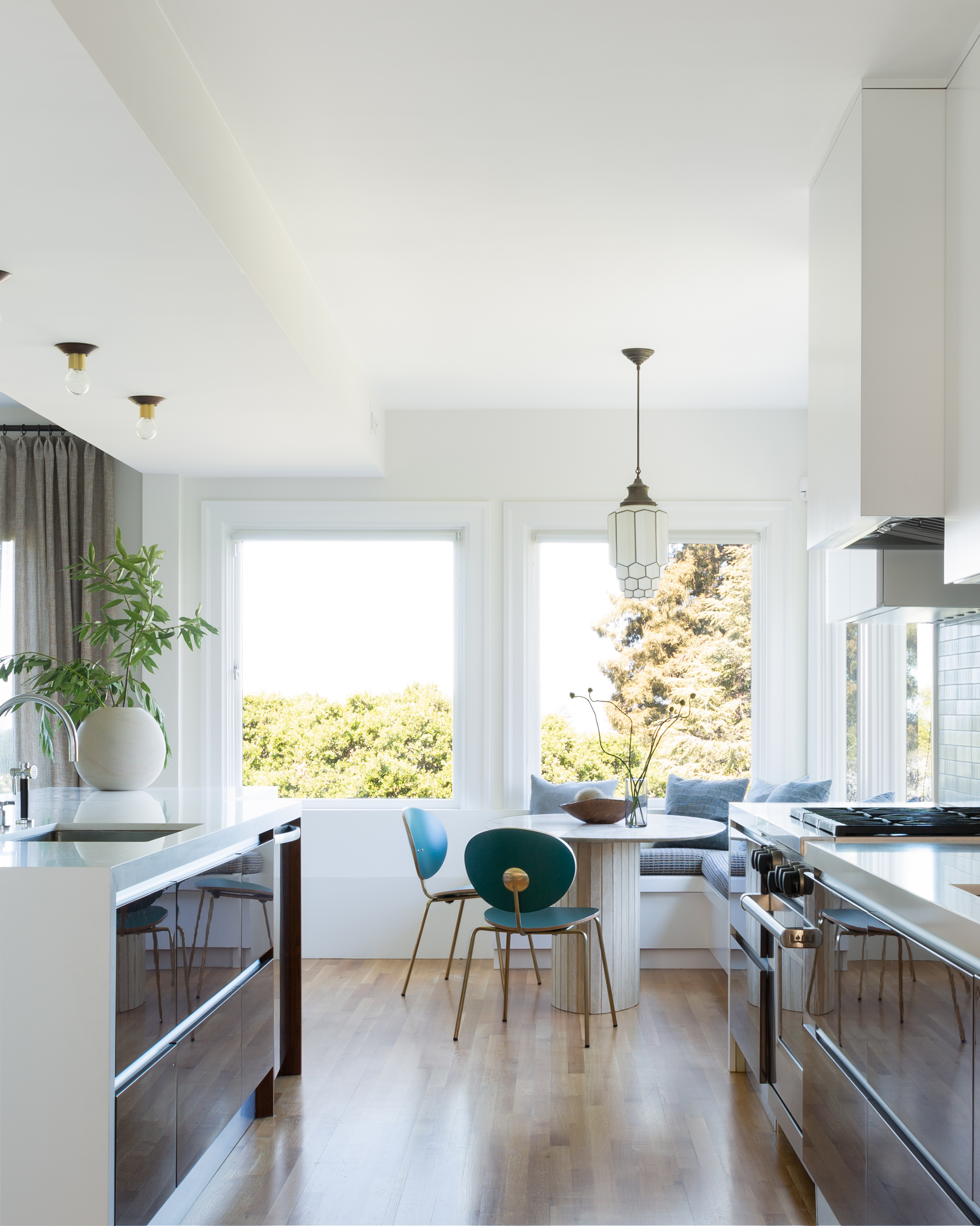
If yours is a long, narrow galley kitchen, you may be tempted to fill every inch of it with cabinetry. But if you can, it's really worth making the far end of it, particularly if it is under a window, a destination, for dining or just sitting. Not only will it make your kitchen more multi-purpose, it will open it out and give you a view over your yard.
'When designing a kitchen, creating a perfect place to dine doesn't have to take up a ton of space. Creating a dining nook around or within existing or new windows, keeps the kitchen visually feeling large and spacious,' says Regan Baker, founder and principal designer of Regan Baker Design. 'Windows, unlike walls, bring in natural light, but also visually extend the room, and who doesn't love the idea of eating dinner outdoors but with the comfort of being inside?'
2. Interrupting the visual flow with bold patterns
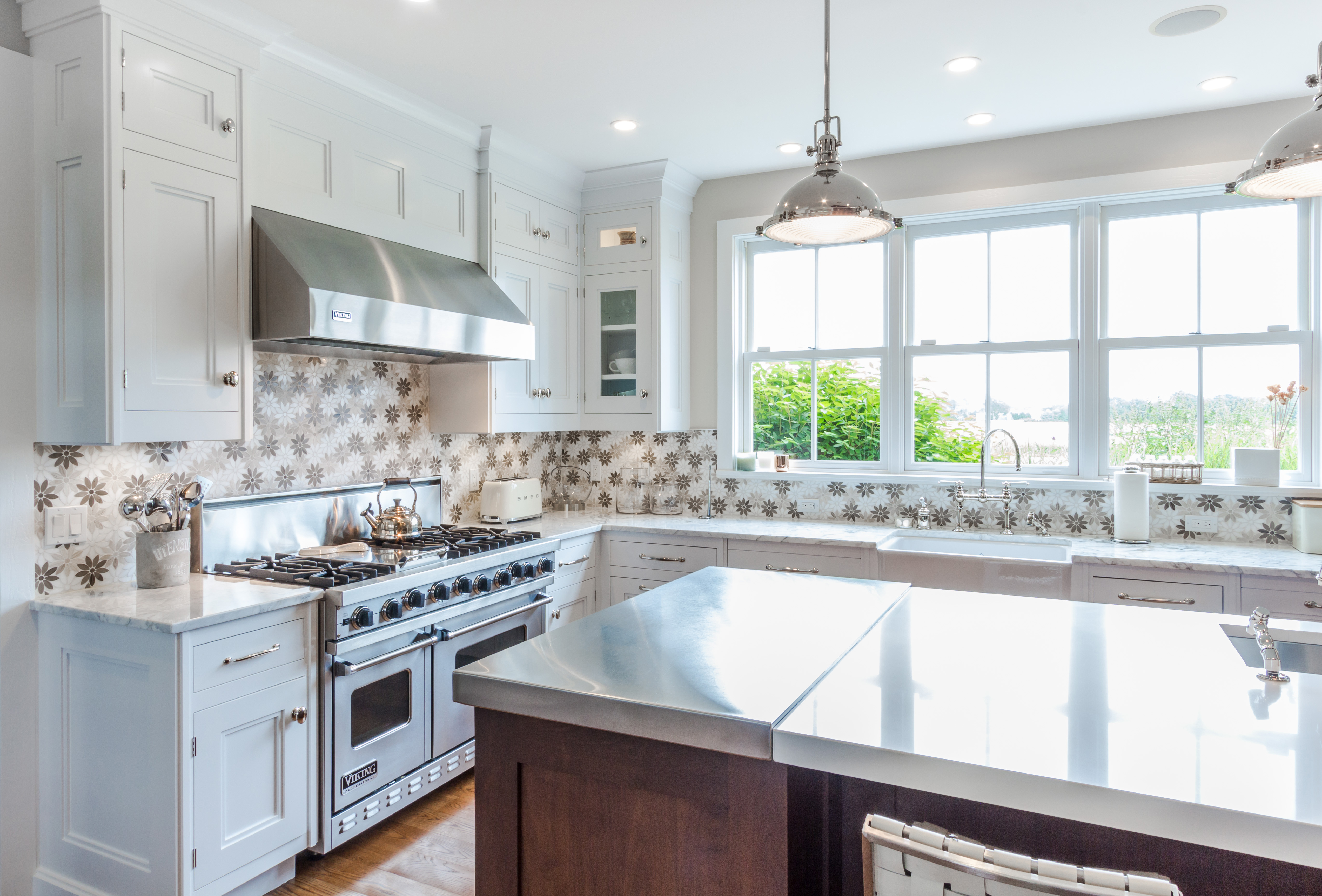
The trick to making any space feel larger is to visually extend the room's boundaries. One way to do so is to ensure the walls aren't too visually impactful, and this can mean not using bold or jarring patterns. However, that in itself can result in a room that feels less than inspiring. So what to do instead? Use pattern, but ensure the color palette is muted.
'Playing with pattern requires you to be thoughtful so as to not overwhelm the space with one element. In this kitchen, we selected a bold motif that is softened by its neutral color palette,' says Guillaume Dupre, senior designer at Bakes & Kropp. 'Each hue is also reflected within the greater kitchen design, deeming the playful tile a meaningful accent as opposed to a commanding element. This is the key to incorporating pattern in any space.'
3. Assuming a 'cool-toned' light is the best choice
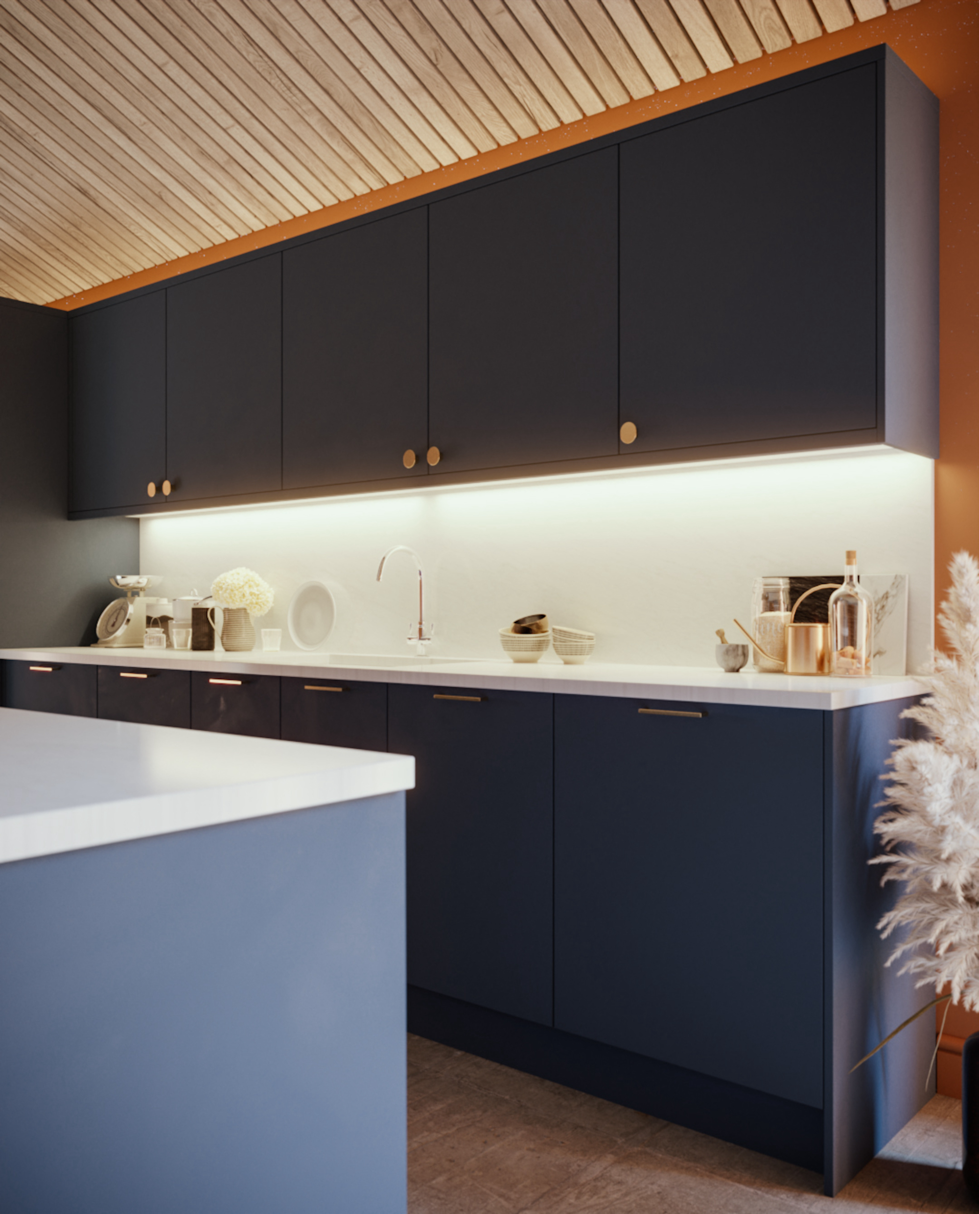
Getting the light temperature right in any room is vital to its success, and while kitchens require bright light, which in itself can make a space feel larger, in our opinion, it's the wrong kind of light to use in a domestic setting. The better choice? Well-planned kitchen lighting ideas that rely on warm bulb color.
'Be careful not to mix warm and cool-toned lights as this often makes the overall design look unconsidered and disjointed. Whilst there’s no solid rule here, warmer tones will work to make your space feel cozy and inviting, whereas a cool light will more effectively illuminate your work areas,' says Dawn Filkins, head of creative at Smile Kitchens.
4. Thinking all the elements of a small kitchen have to be small too

While any kitchen's elements need to be scaled to suit the room's footprint, don't assume that this will necessarily make a kitchen look or feel bigger; in some cases, lots of smaller items can make a kitchen looks more crowded and smaller. It's better to scale back what's on show on countertops and make the most of the space you have instead.
'When we're designing a kitchen that's smaller we tend to think "small" too – and that means larger pieces like a double sink are not considered. But here you can see how well it works, the countertop width is generous so there's still plenty of space for food prep and plants, and the double sink cleverly gives the illusion of space,' says Jo Bailey, deputy editor, Homes & Gardens.
5. Designing a kitchen island that's the wrong size for your space

Choosing the right size kitchen island is vital: too large and it will make your kitchen look crowded; too small and will look badly planned.
'A mistake we see often is an island that is too small for a space,' says Jennifer Walter, owner and principal designer of the Folding Chair Design Co.
'You need a minimum of 36n working space around an island but we like to allow at least 40-48in of space for comfortable circulation. With that said, don't sell yourself short by not utilizing all the space both around your island and in building the island itself. Even if you opt for a vintage piece or furniture-style piece, make sure it's in proportion to the rest of the kitchen.
'This kitchen island was intended for the homeowner to use every day as a breakfast spot, so we gave ample room on the eating side and the prep side while equally allowing walking space. Any bigger, and this island (with nothing interrupting the countertop) might seem overwhelming in this space.'
6. Thinking that you can't use wallpaper in a kitchen
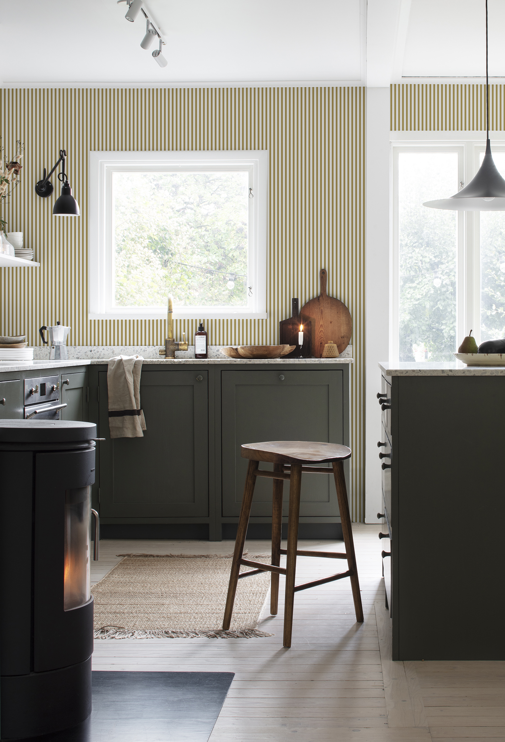
'Wallpaper in kitchens is increasing in popularity, thanks largely to the breadth of designs suitable for damp spaces. So, yes, you can and should use it in a kitchen for added color, pattern and interest. However, I would caution against using very busy patterns, which can be overwhelming in a busy room, such as a kitchen, making it feel crowded and smaller, too,' says Jennifer Ebert, digital editor, Homes & Gardens.
'Instead, use very subtle, neutral colorways, and enhance or correct a kitchen's proportions with stripes, for example. Decorating with stripes vertically can make a room feel appear taller and, used horizontally, wider. The design in this kitchen is subtle yet pulls this color scheme together perfectly without distracting from the forest green cabinetry and black accents.'
7. Using dark colors on upper cabinetry
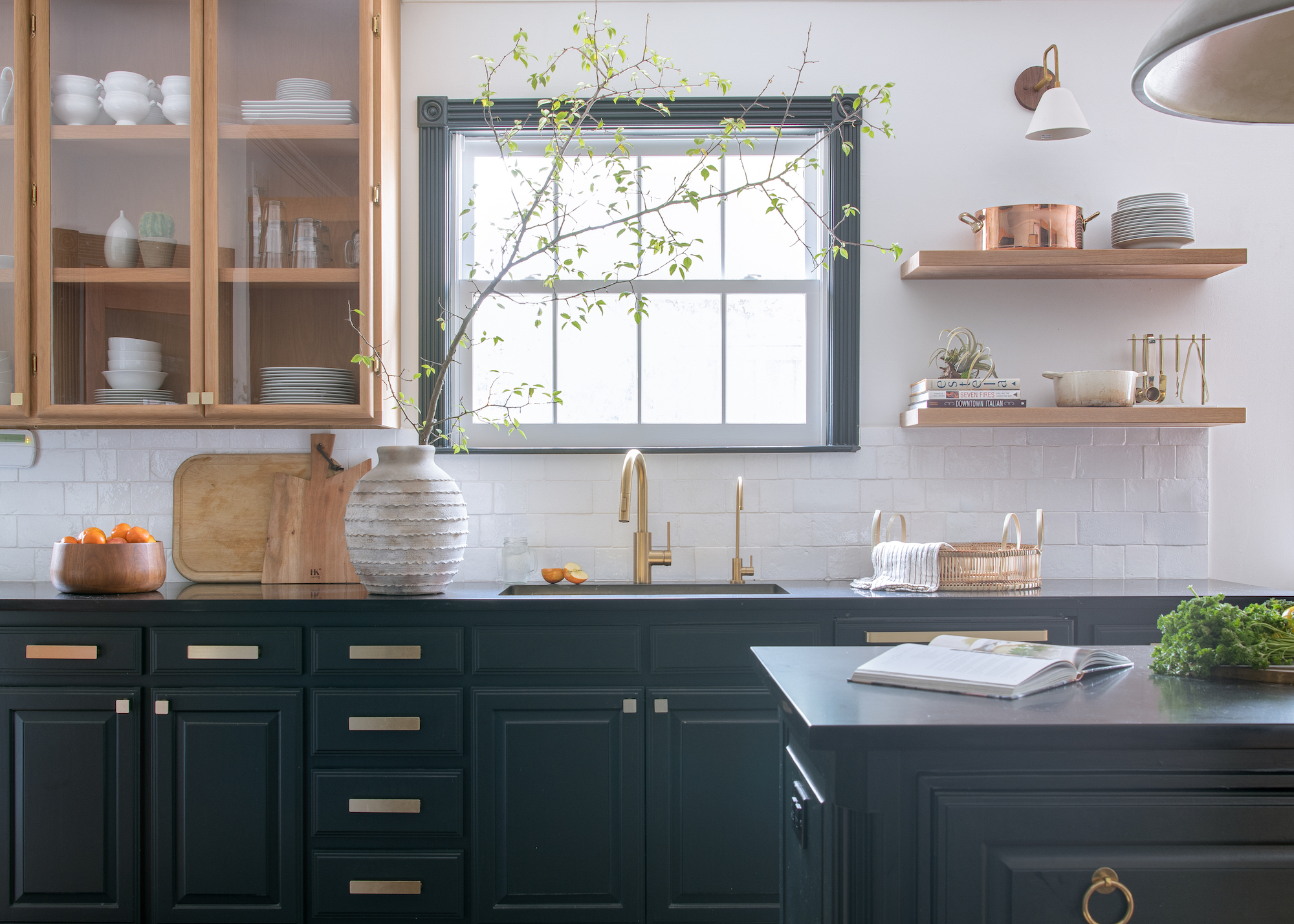
As with most interior design, balance is key when introducing darker shades. And while dark kitchen cabinetry can be successful in larger spaces, having it at eye level will inevitably make it visually advance, and in a medium-sized or smaller space, this can result in a smaller-looking room.
'By keeping the dark color on the bottom and light colors on top it feels visually lighter and not as heavy which helps in small spaces,' says Ginger Curtis, president of Urbanology Designs.
This does play into the trend for having two-tone kitchen cabinetry, with lighter colors or materials over darker ones below.
8. Pushing all the cabinetry to the walls
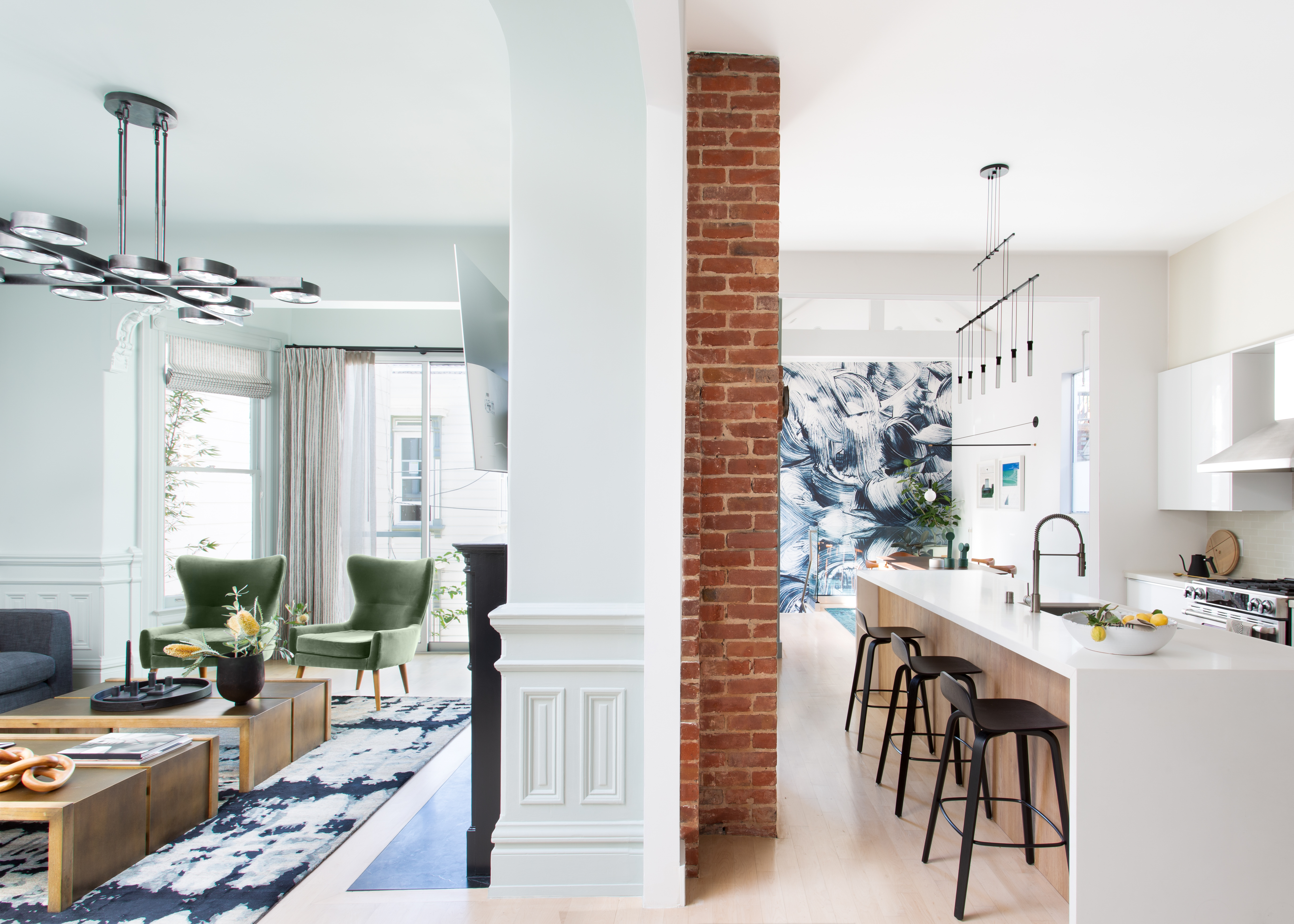
'Remodelling an older property, opening up two rooms to create an open plan space, or working with the layout of an apartment can sometimes leave you with an awkward or compromised footprint to fill. However, you shouldn't assume that your kitchen can't be a success: it's all in the finessing of the kitchen design process,' says Jennifer Ebert, digital editor, Homes & Gardens.
'In this kitchen designed by Regan Baker, there's an element of open plan with the living space one side of the fireplace wall and the kitchen on the other. Long and narrow can be tricky to navigate but the positioning of the sink within the island, with a breakfast bar on the other, means this narrow space can fulfil the function of kitchen diner, which it wouldn't have had the cabinetry simply lined the walls.'
9. Thinking wall cabinets and open shelving can't be combined
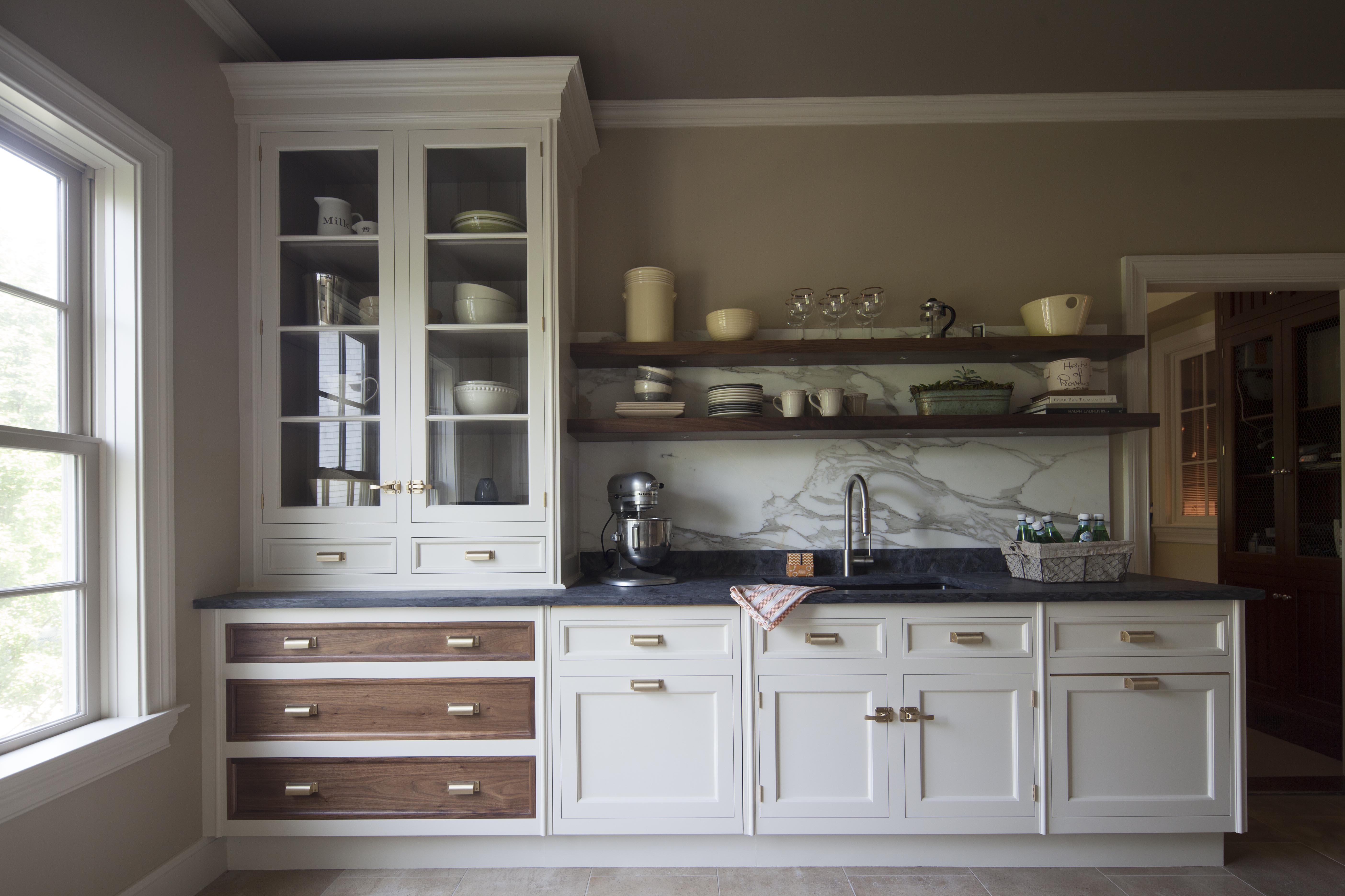
Wall-to-wall solid cabinetry is practical but always makes a kitchen look smaller. Instead, add in some beautifully curated open kitchen shelving and you'll make it feel larger and more interesting.
'The idea of having lots of closed kitchen storage is changing,' says Christopher Peacock, founder and CEO of Christopher Peacock. 'We are designing a lot more open storage in the kitchen so the client can see and access more items easily. Attractive cookware and dinnerware now hang out on open shelving and that allows the opportunity to decorate more with color and this also provides a much more eclectic and interesting visual when you look into the room.
'Think back to the days of old when kitchens were truly places to cook three times a day: “fitted” cabinetry was not a thing, so now we are trying to project that same feeling of a “cook’s kitchen” by having a more eclectic and open feel.'
10. Not considering the overall aesthetic with accessories
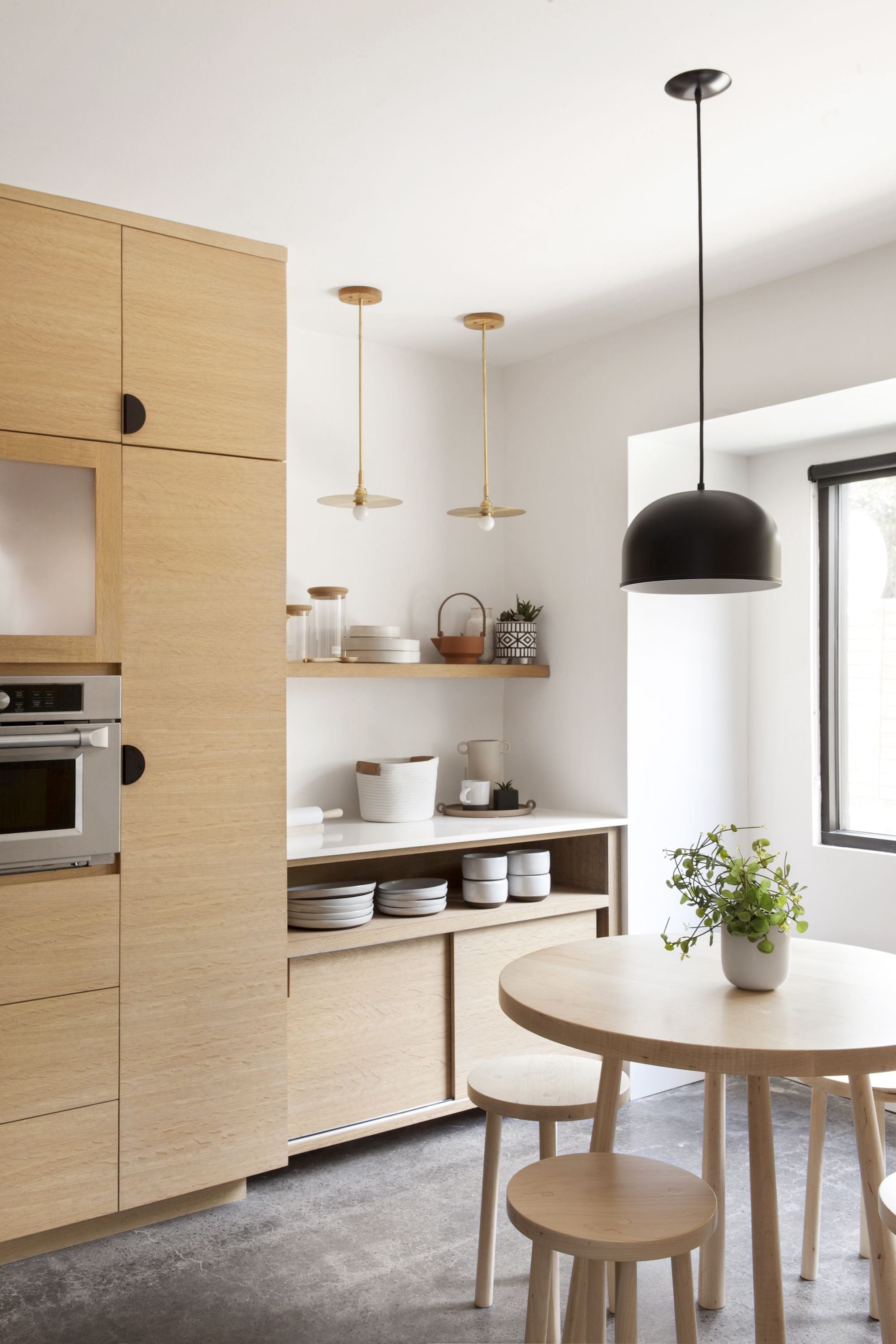
A common issue after investing in all of the larger kitchen elements and spending time and thought in making them work cohesively, is that the smaller details can be overlooked. For example, your existing accessories and tableware might not match if you're remodelling and can stand out like a sore thumb and add visual clutter to the scheme. Ginger Curtis, president of Urbanology Designs offers her advice:
'The mistake would be to overstuff your kitchen. This will make it look tight, cluttered and like there is no negative space or breathing room... which even small kitchens need.'
Our advice, ensure your storage is as capacious as possible and hide away anything that doesn't look good, get used much or simply can be stashed rather than displayed. Then, ensure what is on show fits the overall decor theme or color story.
'Lots of colors that jar against each other will make any room feel cluttered, chaotic and inevitably smaller,' says Jen Ebert. 'Of course, you want your kitchen to be functional and practical, so if you want all your appliances and essential ingredients to hand on your countertop, you will be best choosing a one-color kitchen scheme that will help the space feel streamlined however busy it is. Then use different tones of that color to add visual interest.'
What should I avoid when decorating a kitchen?
The main kitchen design mistakes to avoid center around fitted elements rather than decor (ensuring the flow of movement is right, ignoring the, not considering the lighting properly). When it comes to decorating, though, it's important to ensure that your surfaces are up to the job. This means wallpaper and paint finishes that can withstand the steam and splashes, light fittings that can be easily cleaned of grease and grime, and cabinetry finishes that don't date quickly and are durable.
Sign up to the Homes & Gardens newsletter
Design expertise in your inbox – from inspiring decorating ideas and beautiful celebrity homes to practical gardening advice and shopping round-ups.

Sophie has been an interior stylist and journalist for over 20 years and has worked for many of the main interior magazines during that time, both in-house and as a freelancer. On the side, as well as being the News Editor for indie magazine, 91, she trained to be a florist in 2019 and launched Flowers Inside My Head where she curates beautiful flowers for modern weddings and events. For Homes & Gardens, she writes features about interior design – and is known for having an eye for a beautiful room.
-
 Julianne Hough's Scandinavian-inspired wellness area is stunningly chic – the striking design is a brilliant way to create consistency in your health journey
A natural wood sauna and cold plunge look gorgeous in Julianne Hough's backyard – an expert explains the unexpected wellness benefits
By Sophie Edwards
-
 5 bedroom colors going out of style in 2025 – and what designers are using instead for a stylish sleep space
Designers are ditching these bedroom colors in favor of these on-trend and more restful alternatives
By Emily Moorman