David Beckham reveals his salsa skills on TikTok, but his brave kitchen color steals the show
Gray is said to be going out of fashion, but it's never looked better than in David Beckham's latest kitchen video

Design expertise in your inbox – from inspiring decorating ideas and beautiful celebrity homes to practical gardening advice and shopping round-ups.
You are now subscribed
Your newsletter sign-up was successful
Want to add more newsletters?
In a recent TikTok shared by Victoria Beckham this past weekend, David Beckham and his daughter Harper showed off their salsa skills – David cooking, Harper dancing – but for all keen interior design fans, it was a great opportunity to take a sneaky peek at the power couple's stunning kitchen. The consensus? That the Beckhams' aesthetic choices are hard not to love.
Though it should come as no surprise considering the couple has showcased many of their beautiful spaces before via their social media, what is unexpected is how current the kitchen feels considering the substantial use of the color gray, which, many designers have been telling us, is a color that is going out of fashion.
Gray kitchen ideas have been the go-to neutral staple of kitchen design for years, yet have been recently overshadowed by a whole host of colors replacing gray, especially warmer shades that feel more inviting and welcoming post-pandemic. Despite this, it is undeniable that the Beckhams haven't put a foot wrong in their kitchen design. Which leads to the question: what are its secret ingredients?
Article continues belowLike their London kitchen, their country kitchen looks to be designed by Italian kitchen specialists Officine Gullo. Unlike that more contemporary space, this kitchen marries a modern deep, dark gray with a more rustic backdrop. And that combination is key to its success.
'David Beckham’s kitchen works because the undertone reads as blue-black, almost midnight sky, rather than what comes to mind when you hear "gray cabinetry",' says interiors expert Charmaine Wynter. 'It’s a warm, rich, blue gray hue, and we all know colorful kitchen cabinetry is en vogue.
'Schematically, the kitchen inspires because of the mixture of materials and textures that we see in the entire space. We’ll start with the floors: 12in x 24in honed travertine stone is always appreciated, as is a wood-cladded ceiling with exposed joists.
'All of these make for a very warm and inviting personalized aesthetic, which is something that we’re seeing in design as a strong directional style for 2024.
Design expertise in your inbox – from inspiring decorating ideas and beautiful celebrity homes to practical gardening advice and shopping round-ups.
'Add in the wall of windows, a brick fireplace/pizza oven and hanging copper pots with round wooden cutting boards adorning the walls and the result is a kitchen that is oh so très chic!'

Charmaine Wynter is an award winning interior designer at Charmaine Wynter Interiors and applies her design experience to life, sharing her advice with her followers through her Instagram live 'Host-Chatting with Charmaine Live'. Charmaine has been a featured designer on TV shows across North America.
The room's success is largely down to its combination of a rustic farmhouse kitchen aesthetic, its sleek modern functionality and the more modern features, such as the use of the contemporary dark gray color used on one side of the kitchen, which helps keep the room light and bright.
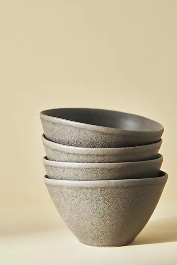
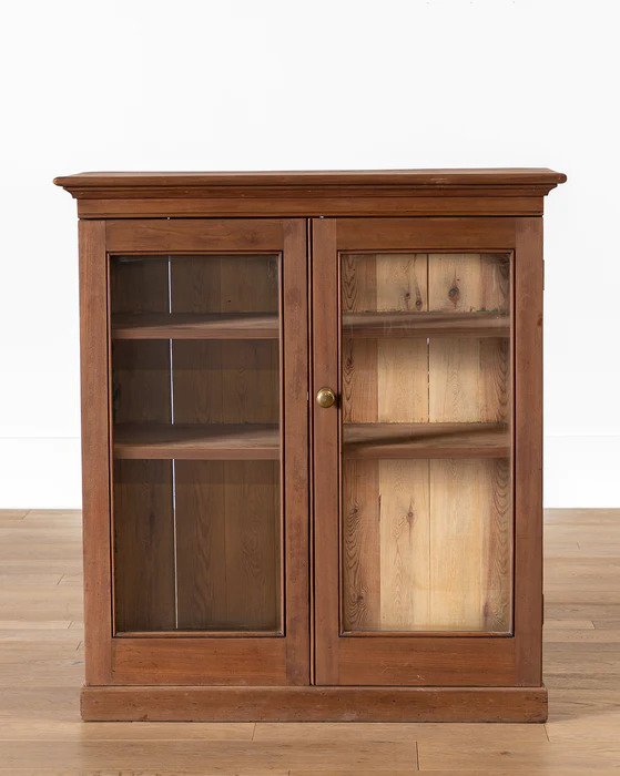
This deep gray is also featured on the wooden cabinet, and the legs of the kitchen island, accented on the top of the wooden ceiling fans and matched to the bowls David and Harper use to cook with. But it's the use natural materials and texture in the room that makes it feel inviting.
Artem Kropovinsky, Principal Interior Designer and Founder at Arsight agrees: 'The Beckhams' kitchen breathes an air of sophistication blended with warm, earthy undertones. The mingling of traditional and contemporary elements creates a harmonious balance that instills both charm and functionality into the space.
'The color palette contributes significantly to the overall aesthetic: the rustic dark gray of the cupboards, complemented by the wooden beams and the golden touch of the handles, creates a uniquely inviting atmosphere.'

Artem Kropovinsky is the Principal Interior Designer and Founder at Arsight, a New York based interior design studio. The company has a decade of extensive global design experience.
Moe Soloff, a kitchen specialist at Fabuwood adds: 'Beckhams' kitchen brilliantly epitomizes modern farmhouse style, which is gaining significant popularity. This style represents a blend of old and new, creating a comfortable and warm atmosphere. The design excellently incorporates natural elements, reflecting a trend we are seeing in kitchen designs. The connection to the outdoors through the large windows brings a serene, relaxed vibe to the space.'
Stephanie Calderon, the owner and principal designer at Stephanie Calderon Interiors agrees: 'The kitchen boasts several noteworthy elements, such as exposed brick walls, reclaimed wood ceilings, stucco-textured walls, and natural stone countertops. These materials not only add texture and depth but also establish a connection with nature within the interior space. The careful choice of dark gray cabinets, accentuated by contrasting brass pulls, further enhances the overall aesthetic by seamlessly blending all the materials together.'

Stephanie Calderon is the Owner and Principal Designer at Stephanie Calderon Interiors, a boutique interior design firm based in Charlotte, North Carolina. The company specializes in new builds, renovations and home furnishings.
The subtle use of textures in the kitchen creates various points of interest that may not otherwise stand out at first glance, adding depth that heighten the contrasting gray and brown-red tones.
'Undeniably, the effectiveness of the gray is heightened by the various textures in the kitchen. The glossiness of the gold handles, the rough texture of the stone floors and brickwork, and the smooth, natural grain of the oak shelves all contribute to the overall sensory experience of the kitchen,' highlights Artem Kropovinsky, Principal Interior Designer and Founder at Arsight.
He continues, 'It's this orchestration of textures, combined with the strategic use of color, that give the kitchen its distinctive character. In this context, the declining popularity of gray is irrelevant – it's not about following kitchen trends, but rather about creating a space that reflects personality, style, and a certain intimacy. The Beckhams' Cotswolds kitchen is a perfect example of how gray, when used thoughtfully, can elevate a space, cementing its role in interior design.'
Features such as white veins in the kitchen counter and sink add layers to the otherwise monochrome color scheme.
'When surrounded by classic materials like natural stone and wood, gray colors look more like heritage design than a fading trend. The deep, almost charcoal gray of the Beckhams' cabinetry is timeless and classy. There's hardly a hint of white, suggesting boldness of leaning into a moody, saturated space,' says Ksenya Malina is the Founder and Principal at Time and Place Interiors.
'Juxtaposing the gray cabinetry against unexpected ultra-contemporary finishes like the veined black marble countertop revives the gray color, bringing modern nuance to a "safe", transitional style.
'The combination of gray cabinets with wood shelving and white tiles has become an expected, conventional look for kitchen design. But what gives a gray kitchen originality are authentic architectural and design features: a beamed ceiling of reclaimed wood, a stone pizza oven, a cluster of copper pots, a vintage runner rug, and rustic stone decorative vessels on a countertop. These details lend personalized character to a kitchen of any color – even one in the ever popular gray.'
The hanging copper pans capture the more casual, bustling nature of the farmhouse appeal, which are are gently contrasted by the use of the gray modern kitchen cabinets. This kitchen is a masterclass in design.

Ksenya Malina is the Founder and Principal at Time and Place Interiors. She is a certified WELL AP through the International Well Building Institute.Time & Place Interiors provides interior decorating services.
Shop the look
How can I make dark gray work in my kitchen?
The blue-gray used by the Beckhams is undeniably warmer than both the cooler, lighter, more overused grays designers have fallen out of love with, and it is a rather more interesting and stylish choice than black.
And while this gray is a fantastic neutral, it does much more than just blend into the background. Instead, the darker tones of gray create a dramatic contrast to the warm, rustic materials that introduce a sense of elegance that harmoniously balance out the earthy rustic warmth of the brick walls and wooden ceilings.
Interior designer Artem Kropovinsky says, 'There's a misconception that gray is an ephemeral trend in kitchen design. On the contrary, gray has proven to be an enduring shade, bringing an element of timelessness when utilized effectively. While some might argue that its popularity is dwindling, the Beckhams' kitchen exemplifies the enduring elegance that can be achieved with gray.
'The choice of gray for the kitchen cabinets works especially well in this space due to the interplay of various textures and hues. The gray, rather than appearing dull, adds depth to the room, playing off beautifully against the ruggedness of the exposed brickwork, the natural grain of the oak shelves, and the warmth of the stone floors. This masterful utilization of gray transforms it from a simple color choice to a powerful design element.'
Stephanie Calderon, the owner and principal designer at Stephanie Calderon Interiors adds, 'What we may have grown weary of seeing were predominantly all light-gray kitchens with white accents or entirely white kitchens with subtle touches of light-gray which lacked depth and failed to captivate our interest.'
Artem Kropovinsky continues, 'Trends might come and go, but creating a space that resonates with the homeowner's identity and lifestyle will always be the key to successful interior design. The gray in the Beckhams' kitchen works because it's part of a larger design narrative, a thoughtful blend of traditional and modern elements, textures, and color. This proves that, rather than being a trend, gray is a versatile and effective design tool that, when used effectively, can create truly extraordinary spaces.'
This kitchen creates quite the opposite impact, using the gray to create drama, with equally stand-out elements of rustic stone and wooden structure.
Stephanie concludes: 'Gray kitchens can continue to thrive when approached with a thoughtful blend of shades and a mix of captivating elements.'

Lola Houlton is a news writer for Homes & Gardens. She has been writing content for Future PLC for the past six years, in particular Homes & Gardens, Real Homes and GardeningEtc. She writes on a broad range of subjects, including practical household advice, recipe articles, and product reviews, working closely with experts in their fields to cover everything from heating to home organization through to house plants. Lola is a graduate, who completed her degree in Psychology at the University of Sussex. She has also spent some time working at the BBC.
