Colorful kitchen ideas – 14 design-led ways to brighten a kitchen
Get creative with the best colorful kitchen ideas from the designers. These color schemes will give your space a beautiful and bold update
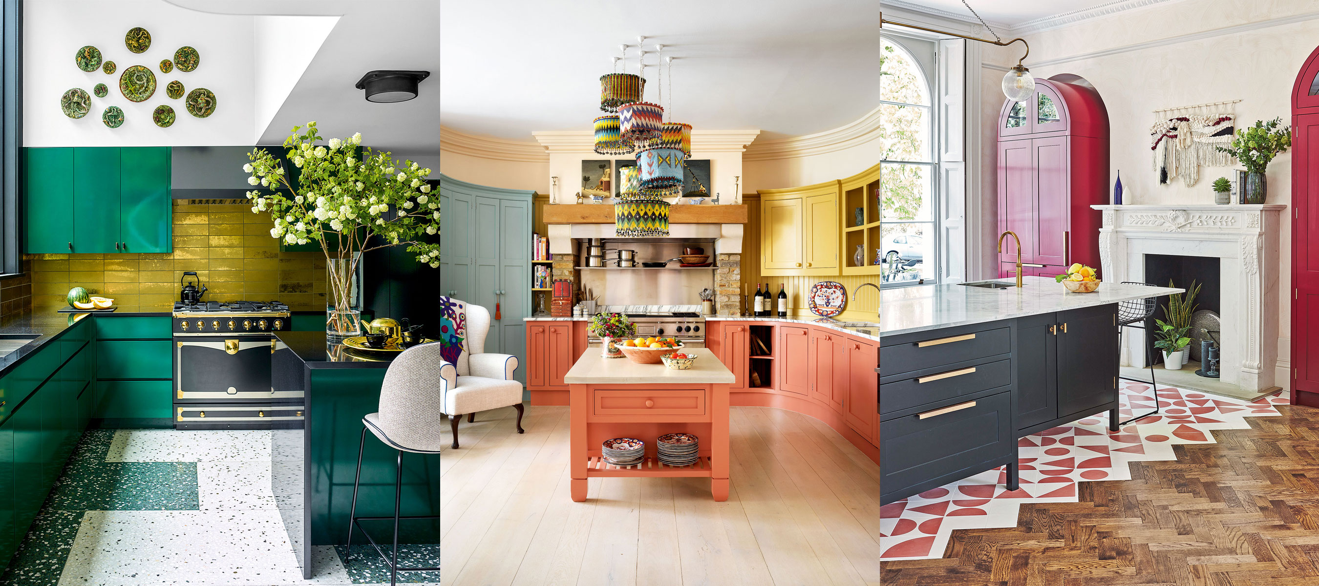

The best colorful kitchen ideas look beyond form and function to create an uplifting space to cook.
When choosing kitchen color ideas you’ll want to select kitchen cabinet colors that you’ll be happy to live with for a while to come. But you might also want to consider the decorative power of each hue; not all colorful room ideas suit every space, depending on its size, makeup and orientation.
Different painted kitchen ideas have particular benefits you may wish to exploit in your room design. Some can brighten and visually enlarge the room, while others make cleaning a less frequent necessity, for example.
Our curated collection of the best colorful kitchen ideas will inspire you to give your kitchen a bold new look.
Colorful kitchen ideas – 14 schemes as chosen by the experts
Your kitchen ideas are rife with color opportunities, from appliances and flooring, to window treatments and cabinets. Start by deciding how much of permanent commitment you are willing to make to room color ideas.
Finding the right kitchen color ideas that you will love for years to come has never been more important, so we've asked some of the best interior designers for their expertize and advice.
1. Use punchy color to create maximum prominence
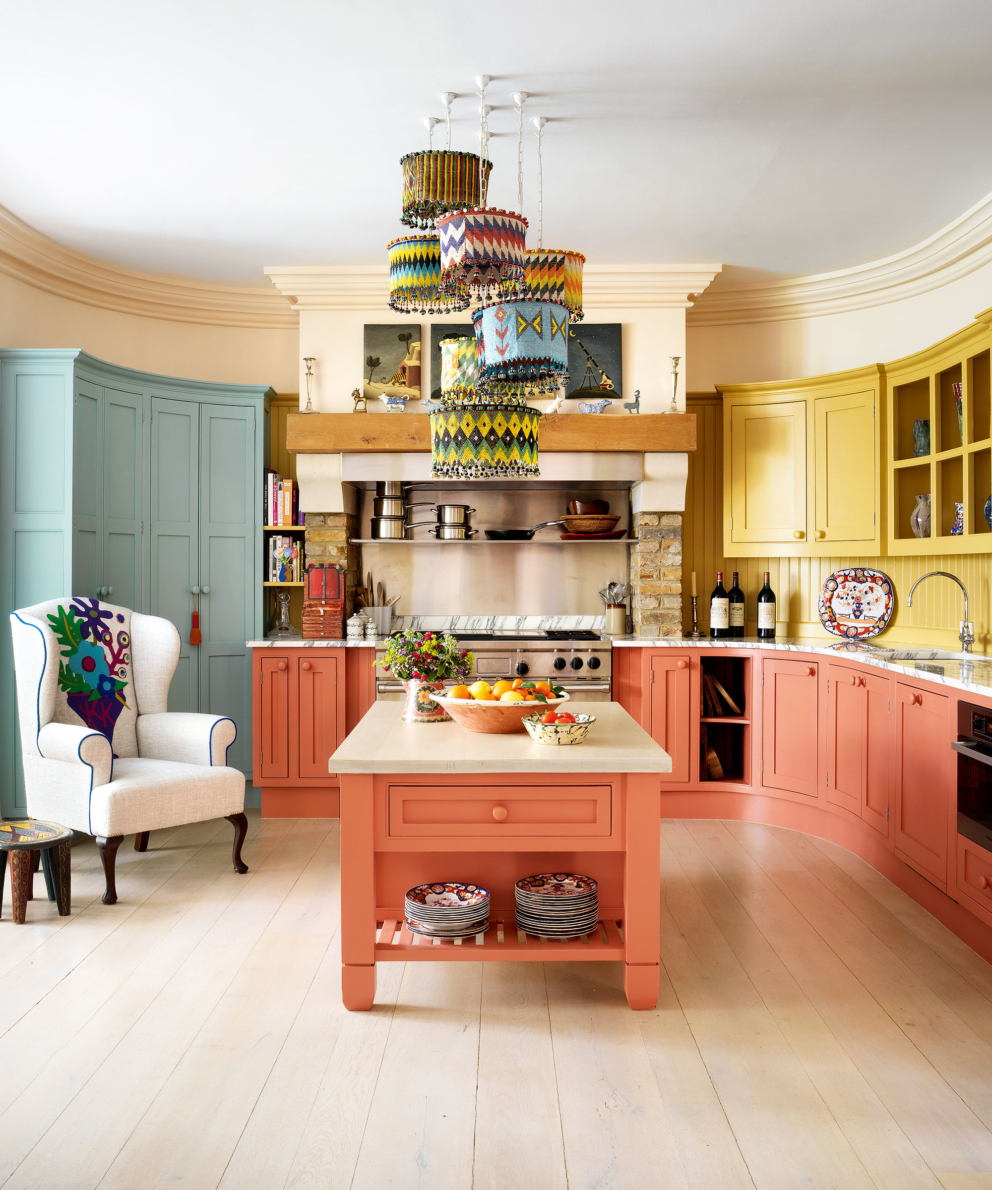
Since they purchased their 1930s townhouse in central London, just over two decades ago, co-founders of Firmdale Hotels and the Kit Kemp Design Studio, Kit and Tim Kemp, have undertaken one major renovation. This was prompted by a conversation between Kit and fellow designer Robert Kime.
‘He told me that he always advised making the best room in the house the kitchen – and it was like a light had been turned on,’ says Kit, who proceeded to transform their large, barrel-shaped dining room overlooking the garden into the kitchen, adding a conservatory leading off it for dining. ‘Which, of course, we now live in,’ she adds. Here, Kit Kemp has used saturated strong hues to give her traditional kitchen maximum prominence.
2. Use color to unite a kitchen
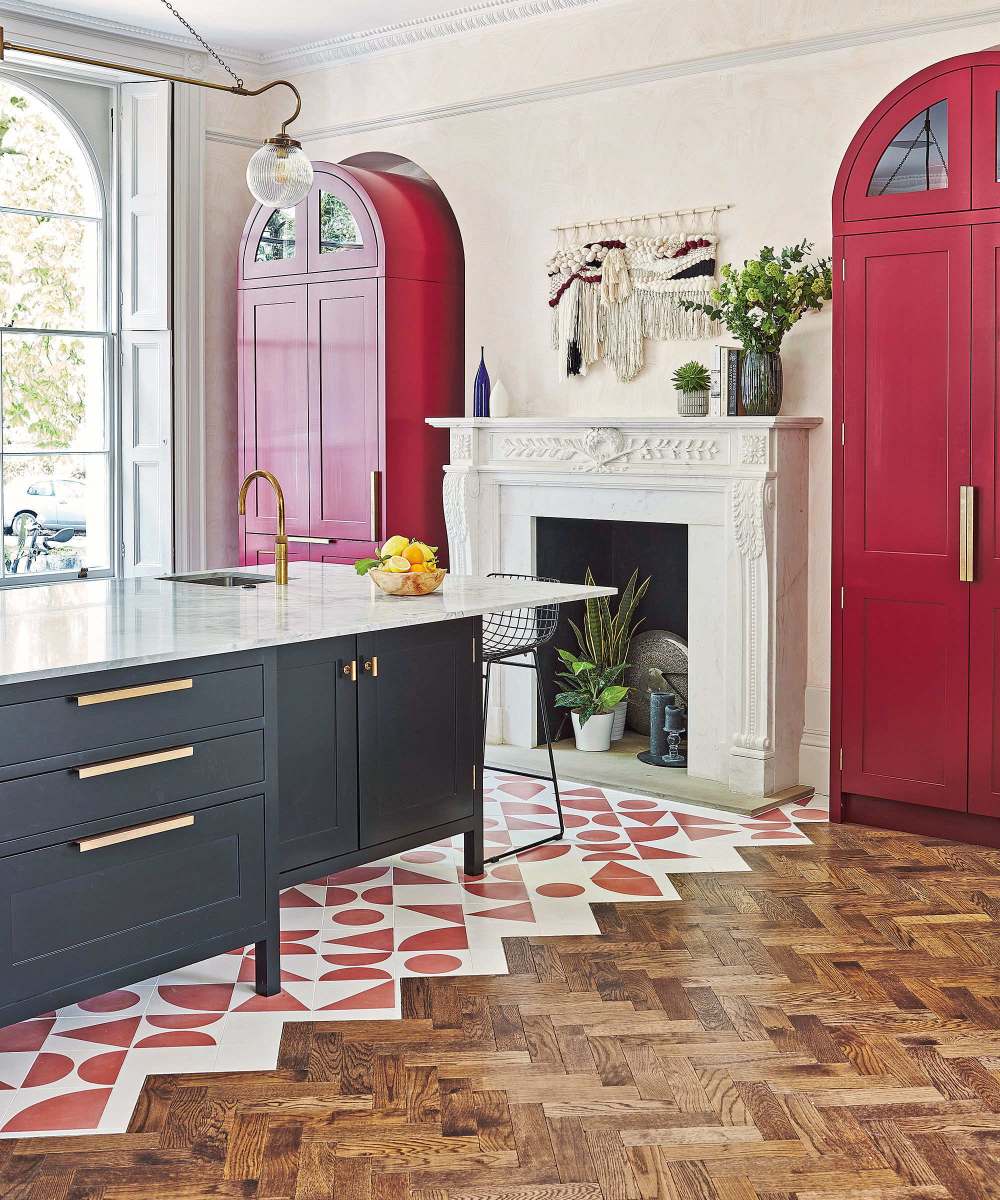
Carrying an accent color across the floor can help a large open-plan kitchen feel cohesively connected from every angle.
‘As this large spacious room has very high ceilings, it was important to create meaningful points of interest within,’ explains Blakes London’s lead designer Annie Ebenston. ‘Using warm red on the pantries that frame the fireplace lifts the whole elevation to be more than just a period fireplace.’
In isolation, the pantries could have overpowered but the custom-colored floor tiles play an anchoring role that unites them with the rest of the kitchen. ‘The matching tile color ties the room together beautifully,’ says Annie.
3. Choose unexpected color for kitchen cabinets
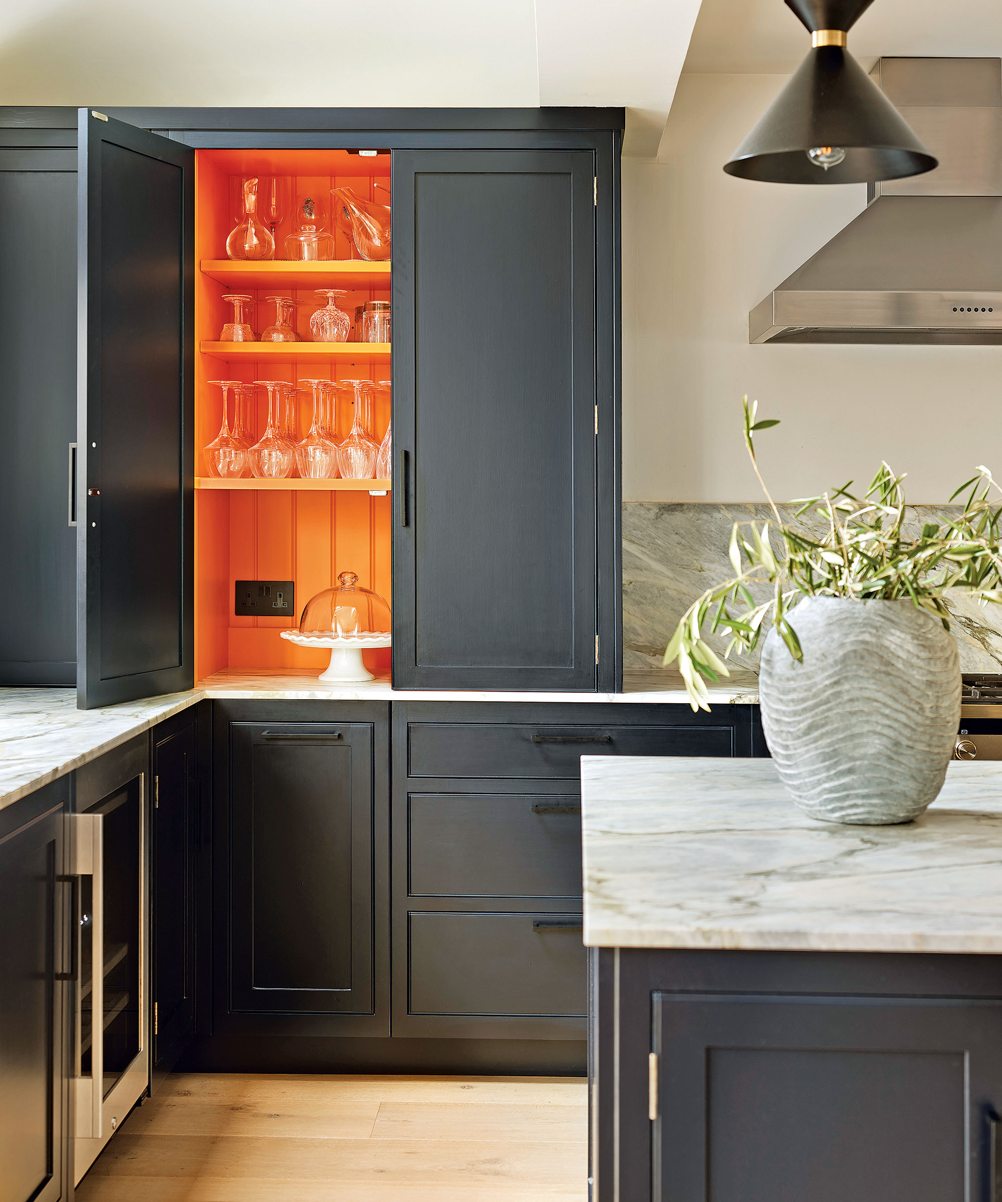
For a flexible approach that allows you to control the color in your kitchen to suit your mood, consider painting inside cabinets with solid doors.
‘Applying bold accent colors in unexpected places, like this dresser interior, changes the initial impression of the room and instantly adds depth to the aesthetic,’ says Melissa Klink, creative director, Harvey Jones. ‘Strong colors are highly emotional but designing with them in a controlled manner ensures they liven up the overall feel of the room instead of overpowering it. Choose an uplifting shade that will put a smile on your face every time you open the doors.
4. Establish a primary focus
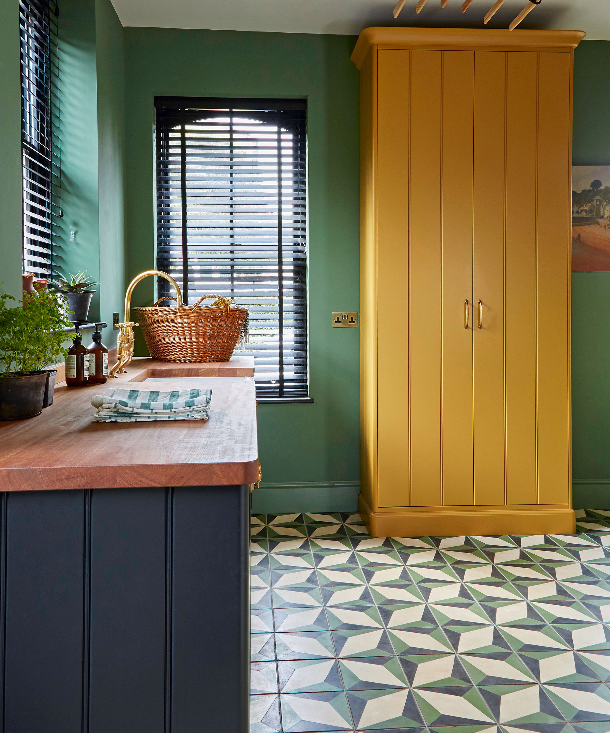
‘When planning a kitchen paint scheme, we generally choose the dominant color first, to anchor the space and provide a sense of calmness. We then look at shades that will “pop”, to make it more dynamic,’ says Natalie Forbes of Forbes Rix. Here, that impact comes from Farrow & Ball’s India Yellow on a floor-to-ceiling cupboard. ‘We recommend a maximum of three colors to keep it from becoming too busy.’
5. Balance bright colors
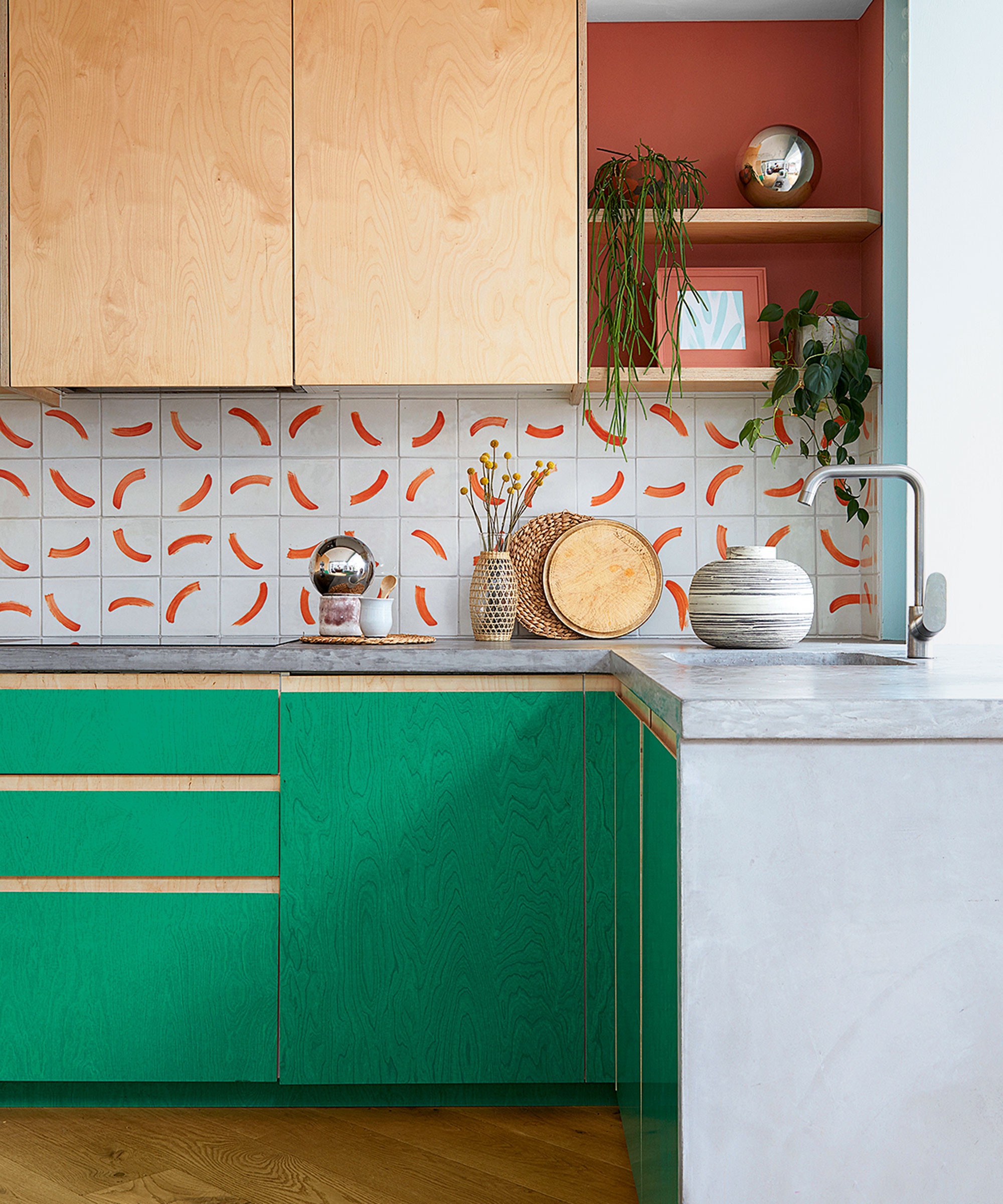
‘Strong, bright colors can energize and illuminate a modern kitchen, creating an uplifting living space that really boosts your mood,’ says founder of King Celia Studio, Jess Piddock, who designed this colorful kitchen for her own family home. Jess handmade the tiles, and has since developed the brush mark pattern, called Pool Party, for textiles and prints.
‘The emerald green is a semi-transparent film that enables the grain of the plywood to shine through while providing a protective coating that’s easy to clean,’ she adds. ‘Bright tones benefit from a grounding shade. In this case terracotta adds depth and warmth.’
6. Choose a favorite color crush
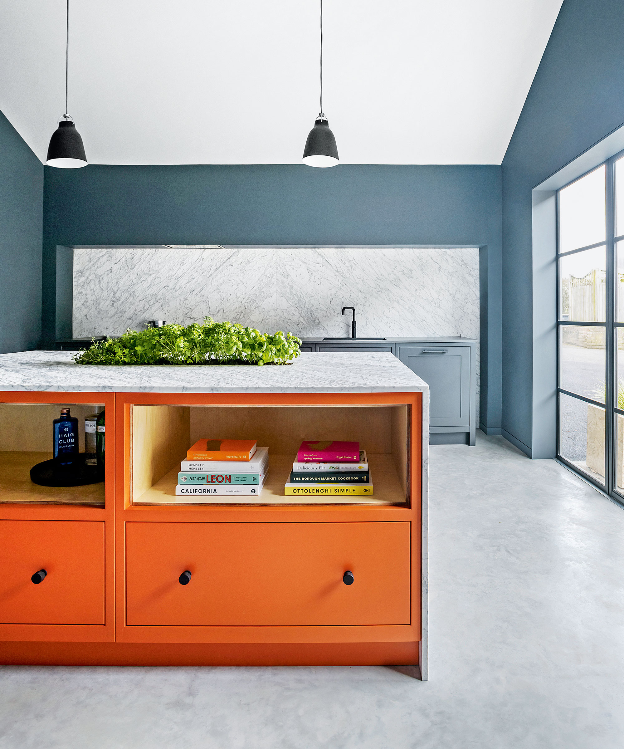
Worried your current colorful kitchen crush won’t last? ‘The beauty of a hand-painted kitchen is that in time, should fashions or your taste change, it’s simple to create a new look, especially if you restrict your bold choice to one unit, like a kitchen island or dresser,’ says Jasper Middleton, design director, Middleton Bespoke.
‘When choosing bold shades it’s important to consider the architecture of the space as a whole in order to give the color room to breathe,’ he adds. ‘Here the bold pop of orange is balanced by the soaring ceiling and simple backdrop of polished concrete and blue-grey hues.’
7. Introduce color to your floor
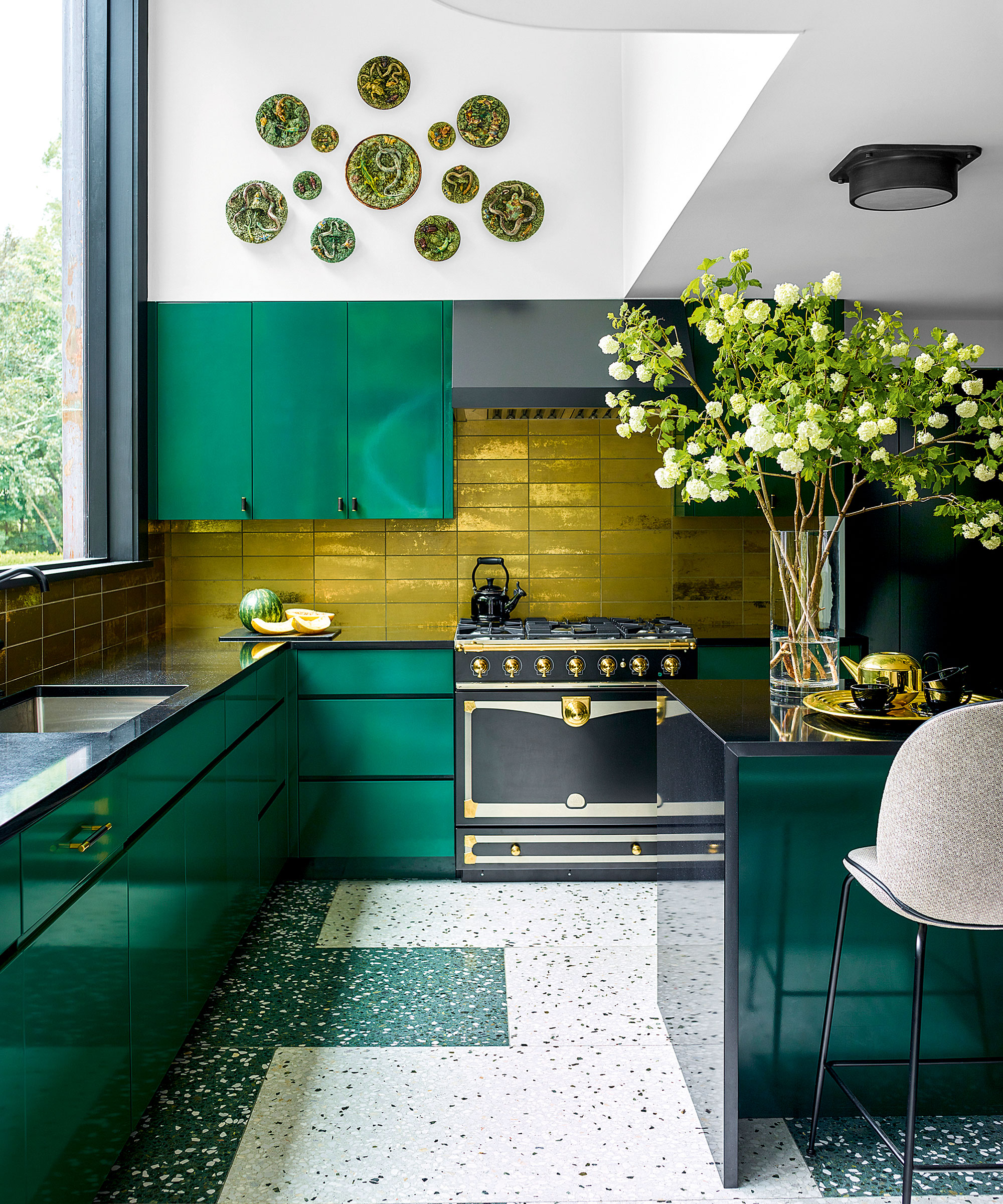
Eyes down: this year's most dynamic kitchen trend is underfoot. 'Energizing, interesting kitchen flooring ideas are becoming a must,' says Alberto Villalobos, principal of New York-based design studio A. Villalobos. 'The kitchen floor is the perfect place to be more daring, and introducing strong patterns will give your cooking space incredible depth and dimension.'
The latest flooring is working extra hard thanks to ever-innovative installation techniques. Forget fluid connections; material or color switches at unexpected junctures feel more modern. For example, the alternating tile formation lends extra punch to this terrazzo floor designed by A. Villalobos. 'The flooring adds color, excitement and texture, enlivening this kitchen,' says Alberto.
8. Add drama with shades of red
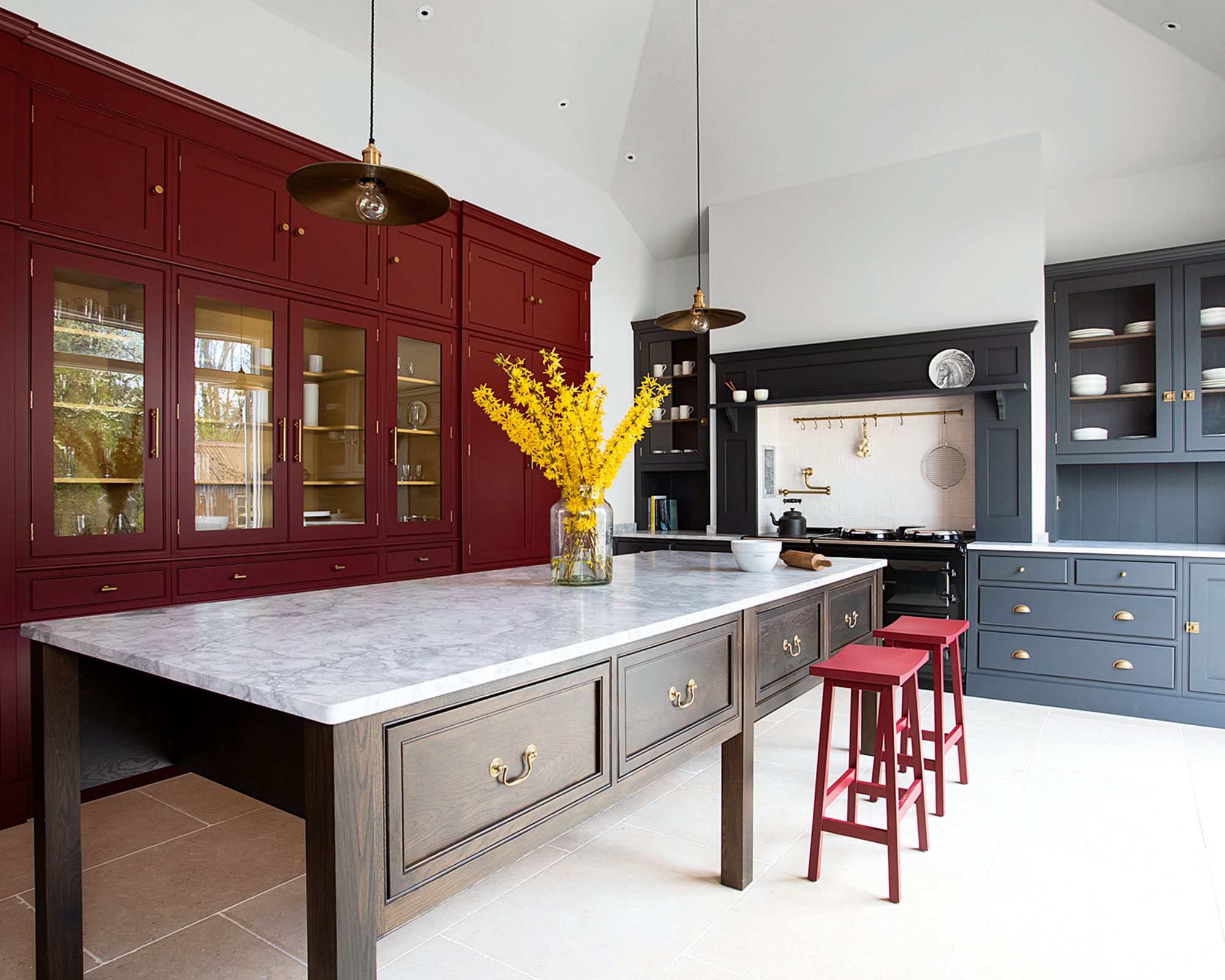
Our love affair with dramatic dark kitchen cabinet ideas is far from over but this year things are warming up. Move over blacks, deep blues and greens, because rich red kitchen ideas are radiating their way into the heart of the home.
Pure primary reds are still a bit 1990s; instead, this trend steers us towards muddier tones with tints of nature-led orange and brown. 'Perhaps it's a yearning for the light and warmth of Southern climes that's behind the current demands for reds, burgundies and terracottas,' suggests Merlin Wright, design director at Plain English. 'Warm colors are positive and inspiring and complement other Mediterranean hues such as blues, greens and yellows. Experiment with different tones to suit the light and scale of your room.'
'Reds and burgundies are rich, traditional shades that lend character and coziness,' says Jasper Middleton, design director, Middleton. 'Soften strong tones on floor-to-ceiling cabinetry with glazed sections that reveal mellow, yellow interiors.'
9. Take color to the ceiling
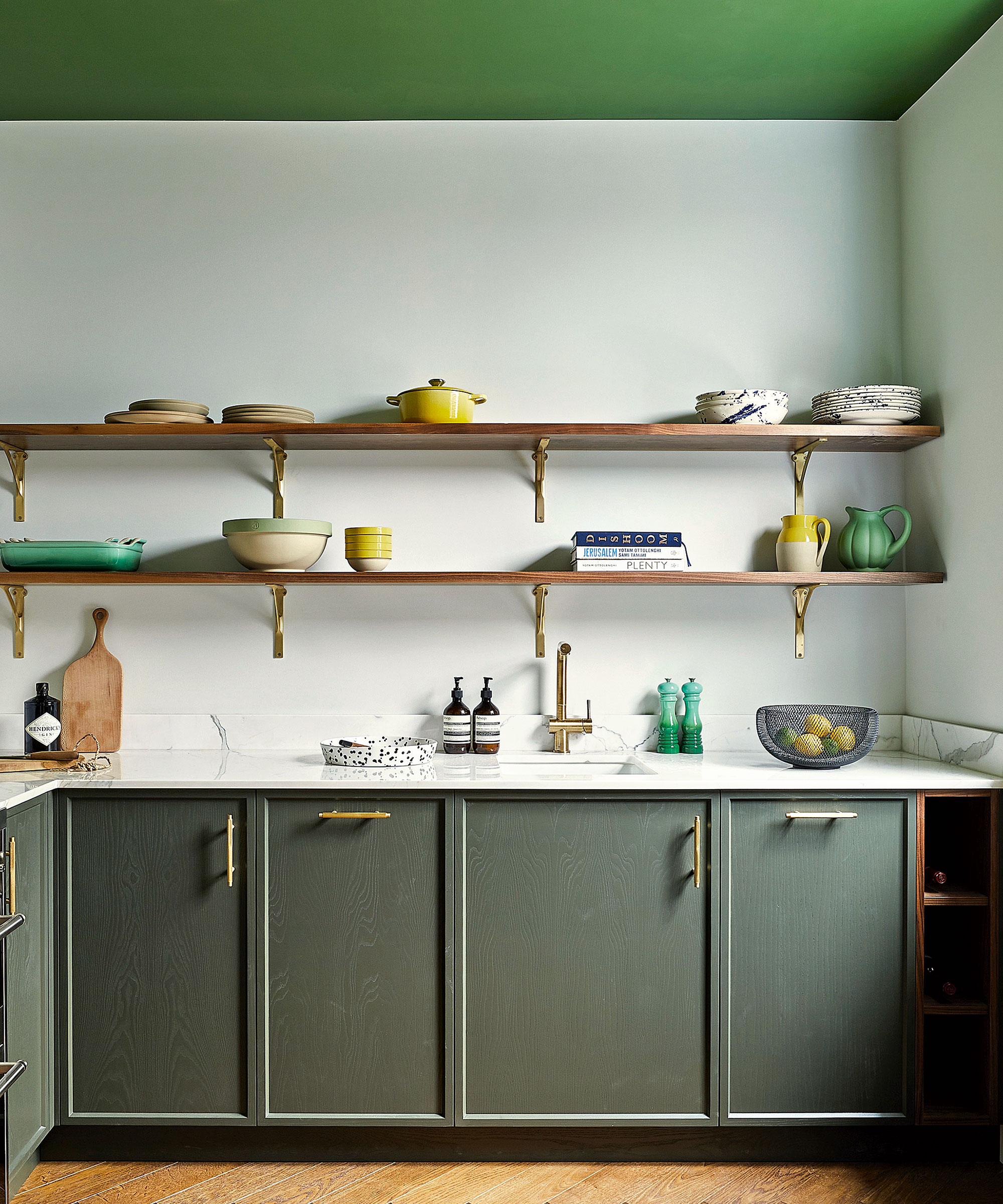
Maximize the impact of your painted kitchen cabinets, as demonstrated in this stunning design by Huntsmore, with exquisite decorative room ideas and bold ceiling ideas. Using the ceiling, the 'fifth wall', as a decorative surface can bring color and drama to a room, but it is also worth drawing attention to the finishing touches in a colorful kitchen.
Here, the simple lines of the Shaker-inspired joinery are enhanced here with elegant brass handles that accentuate the tapered-edge door detailing as well as providing tactility. The metallic theme is followed through in the normally unnoticed brackets that support the two eye-level shelves, accentuating the richness of the solid walnut and the daring green of the ceiling color, courtesy of Little Greene’s Hopper. And tying it all together beautifully is the simply styled but all-important kitchen tap, in a brushed brass that gives it a practical and visual beauty
10. Introduce complementary shades
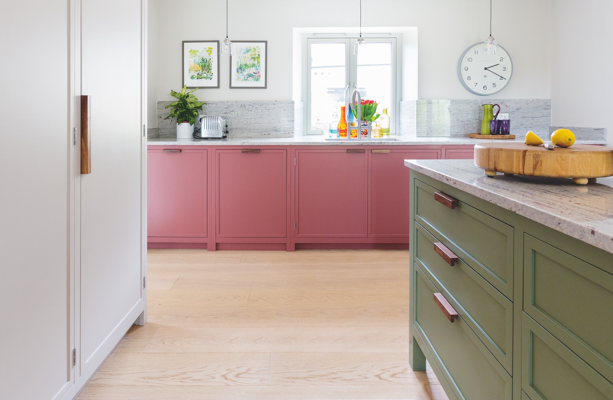
Color can bring joy and individuality to any kitchen, whatever its size and shape, and there is no rule book that says everything must match. Ruth Andrews, co-director of Lowe & Bespoke, suggests how to start.
‘We always work with the primary color element, whether that be an existing floor, our client’s favourite hue or a piece of furniture passed down through the generations,’ she says. ‘We then work outwards from there to develop a balance of colors that work well together.’
Ruth recommends using the color wheel to identify complementary (opposite) colours that make each other pop, like the off-pastel pink and green used here.
11. Max out color in a galley kitchen
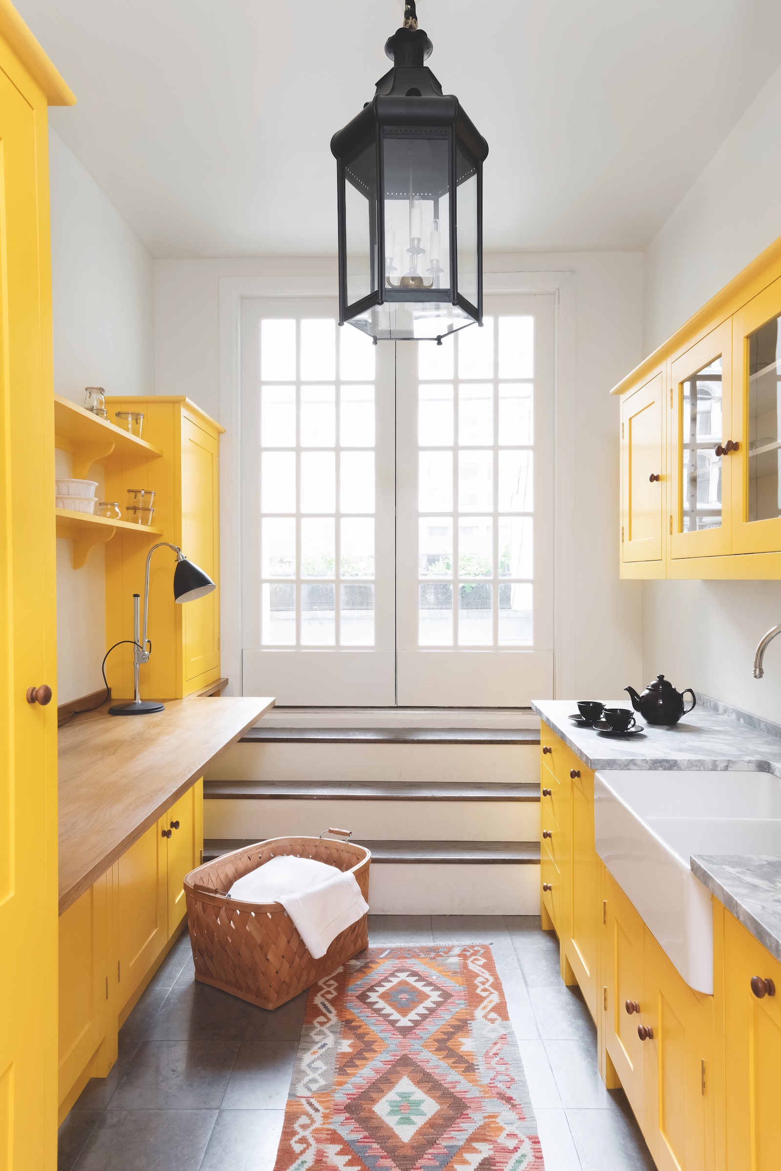
In smaller kitchens, it can be tempting to play it safe with neutral hues, but you may find it more successful to do the opposite, especially when you're devising a color scheme and decor for galley kitchen ideas.
‘Bright and playful hues add personality and an instant uplift,’ advises British Standard by Plain English design manager Adrian Bergman. ‘Don’t be afraid to use a bold colour, as the beauty of hand-painted cupboards is that they can be changed over time should you wish.’
In this hardworking galley kitchen, sunny yellow cabinetry is offset by cool white walls, while accents of wood and a darker stone floor ground the look.
12. Layer matt and shine in your color choices
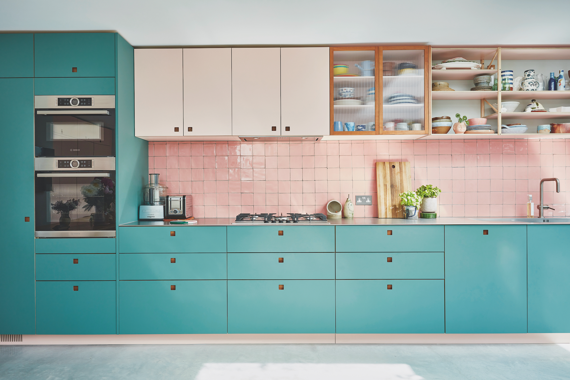
Layers of color and texture can add depth and interest to a kitchen, as George Glasier, co-founder and designer of Pluck, explains. ‘Colors and material finishes all reflect and absorb light differently, so there isn’t a homogenous feel to the scheme,’ he says.
In this design, custom-colored, matt high-pressure laminate has been used to create contrasting cabinetry. The layering continues with the introduction of the glossy backsplash tile ideas, while a section of fluted glass cupboard doors is framed in richly colored timber.
‘Objects on the worktop and shelves add more texture and color,’ says George, noting that organizing kitchen countertops can be an additional element in your overall design.
13. Use tile to add pattern as well as color
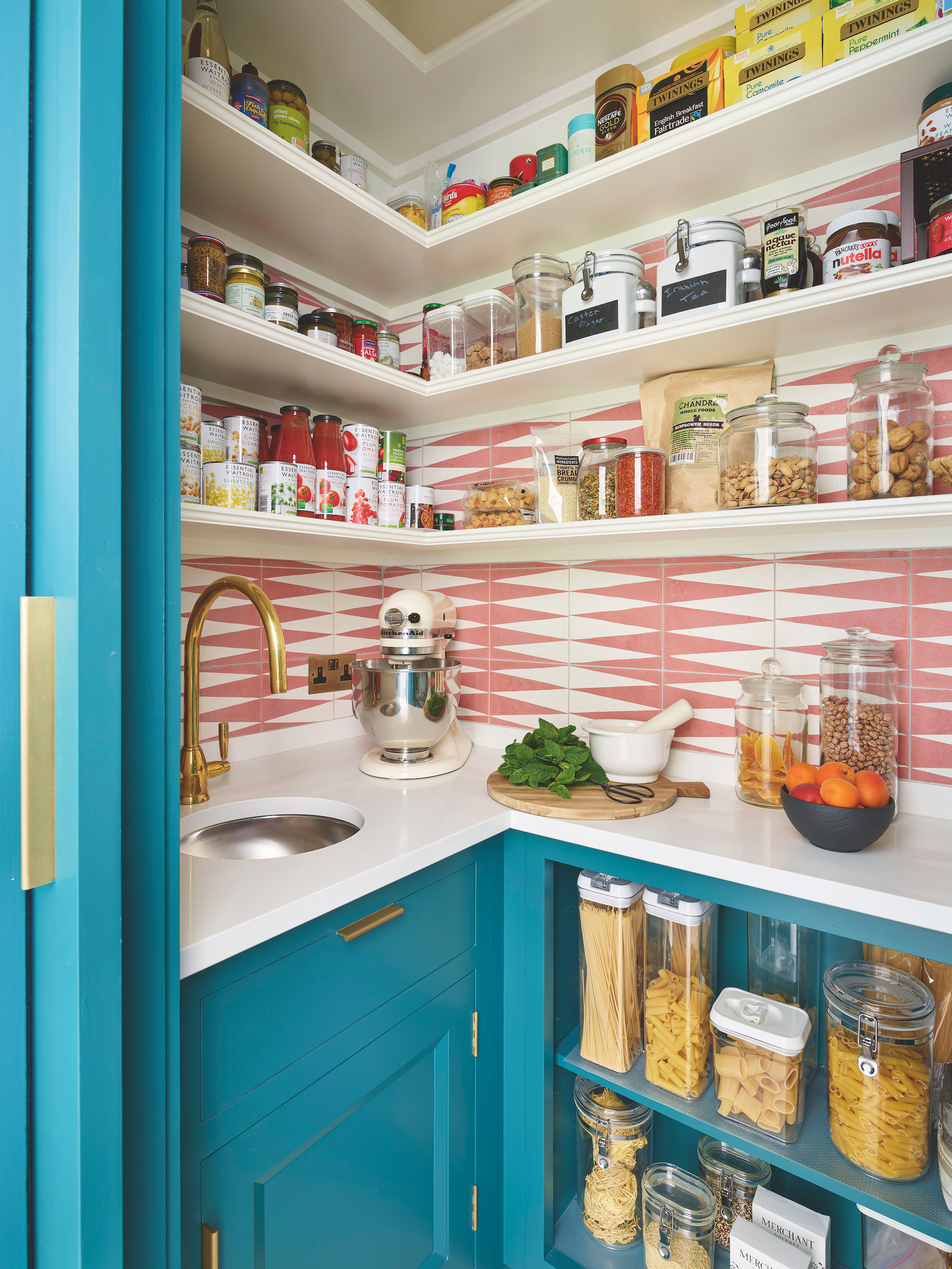
For added impact, consider combining pattern with color, perhaps by teaming painted cupboards and shelves with a splashback of joyously patterned tiles, in shades that enhance the cabinetry.
‘While of course much depends on your personal taste, generally if you have a very colorful kitchen, it is good to opt for tiles that help to break up the scheme and provide other points of visual interest,’ comments Richard Moore, design director of Martin Moore.
The key is to create a sense of balance with your kitchen tile ideas. Similar strengths of color tend to work better together, rather than one that dominates. ‘It is important to choose tile patterns and colors that don’t overwhelm an already colorful kitchen,’ adds Richard.
14. Add color with a bold backsplash
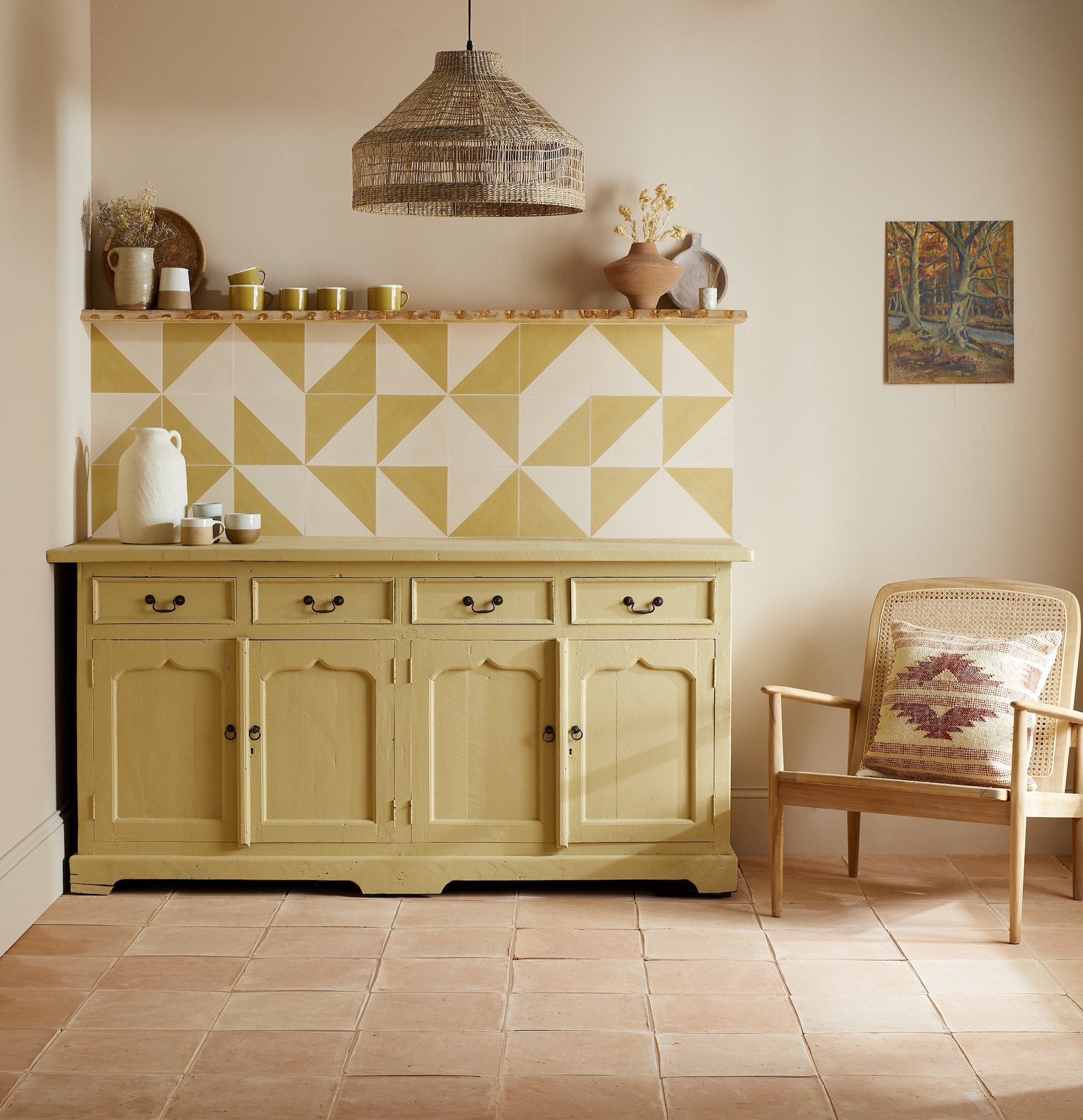
A kitchen decorated in tonal shades can be given a style upgrade with a boldly designed tile backsplash.
'This is a great way to add interest without adding shots of bold or contrasting color,' says Andréa Childs, Editor of Country Homes & Interiors. 'Although the palette in the kitchen above majors in soft shades of yellow, limestone and taupe, the look is lifted by the wayward geometric backsplash of Bert & May tiles. The result is a design-led colorful kitchen that doesn't have to shout to be noticed.'
How can I make my kitchen colorful?
There are many beautiful ways to make a kitchen colorful, from kitchen art ideas to statement flooring ideas, however, well-chosen paint ideas are the easiest way to add statement color. Painted finishes work well for timeless schemes, and of course, can be updated at a later stage if you’re confident enough with a paintbrush.
'Playing it safe with color on a long-term investment like a kitchen is entirely understandable,' says Fiona Duke, director, Fiona Duke Interiors.
'But first, ask yourself: will it ever really make an impact, and will you end up wishing you’d been braver? Committing to a colorful kitchen requires time, effort, and a whole lot of tester pots. Bear in mind that you’re looking for a shade that will make your heart sing every time you’re in the kitchen. Once you’ve narrowed it down, put your chosen color on a trial door or very large sample and live with it for a few days to make sure it’s the one.’
What color is the most popular for kitchens?
Green is 2022's most popular color for a kitchen in terms of kitchen trends, but it's true to say that blue is just as popular for those daring enough to add color to a kitchen.
However, the most popular kitchen color in terms of what we buy is white: it's enduringly popular because it's so easy to redecorate around – and future house buyers you may have in mind when remodelling your home will embrace a white kitchen enthusiastically. If you would like to choose a neutral that isn't white, gray is a very popular color for a kitchen, too.
'It’s important to consider the level of natural or artificial light in the kitchen, as this will play an important role in determining the overall feel of the space. Darker shades, for example, are renowned for absorbing light, and the application of such colors needs to be carefully planned,' says Hayley Robson, creative director at Day True.
'An effective way of integrating darker colors into your kitchen color ideas is to create contrast by adding darker tones on low cabinets, combined with white or gray worktops. This helps to reflect illumination off the horizontal surface, resulting in a colorful yet light interior.'
Sign up to the Homes & Gardens newsletter
Design expertise in your inbox – from inspiring decorating ideas and beautiful celebrity homes to practical gardening advice and shopping round-ups.

Jennifer is the Digital Editor at Homes & Gardens. Having worked in the interiors industry for several years in both the US and UK, spanning many publications, she now hones her digital prowess on the 'best interiors website' in the world. Multi-skilled, Jennifer has worked in PR and marketing and occasionally dabbles in the social media, commercial, and the e-commerce space. Over the years, she has written about every area of the home, from compiling houses designed by some of the best interior designers in the world to sourcing celebrity homes, reviewing appliances, and even writing a few news stories or two.
- Linda Clayton
- Amelia ThorpeContributing Editor
-
 Nectar vs Layla – which mattress brand is best on test?
I've set the Nectar Premier Hybrid Mattress and the Layla Hybrid Mattress head to head to help you work out which mattress meets your needs
By Emilia Hitching Published
-
 Barack and Michelle Obama's neutral accent chair is the perfect living room focal point – you can recreate their serene style in any-sized home
This designer-approved essential fits into every modern living room – it's beautiful enough to stand alone, while pairing well with your favorite cushion
By Megan Slack Published