This chic kitchen renovation features warm textures and cool tones
A cool gray color palette is given a dash of warmth with wicker counter stools, brass fittings, and striped banquette seating
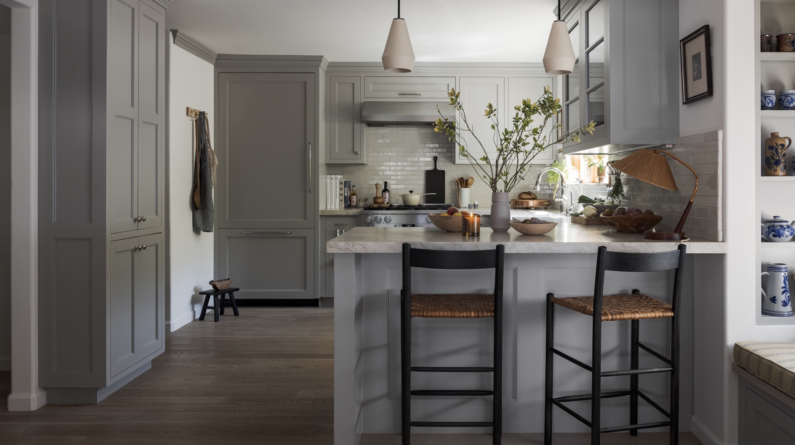
A stylish kitchen renovation in Carmichael, California, is proof, if it were needed, that a small space can pack a big design punch.
The project was spearheaded by Hana Mattingly, of Innen Studio, a design firm based in San Francisco.
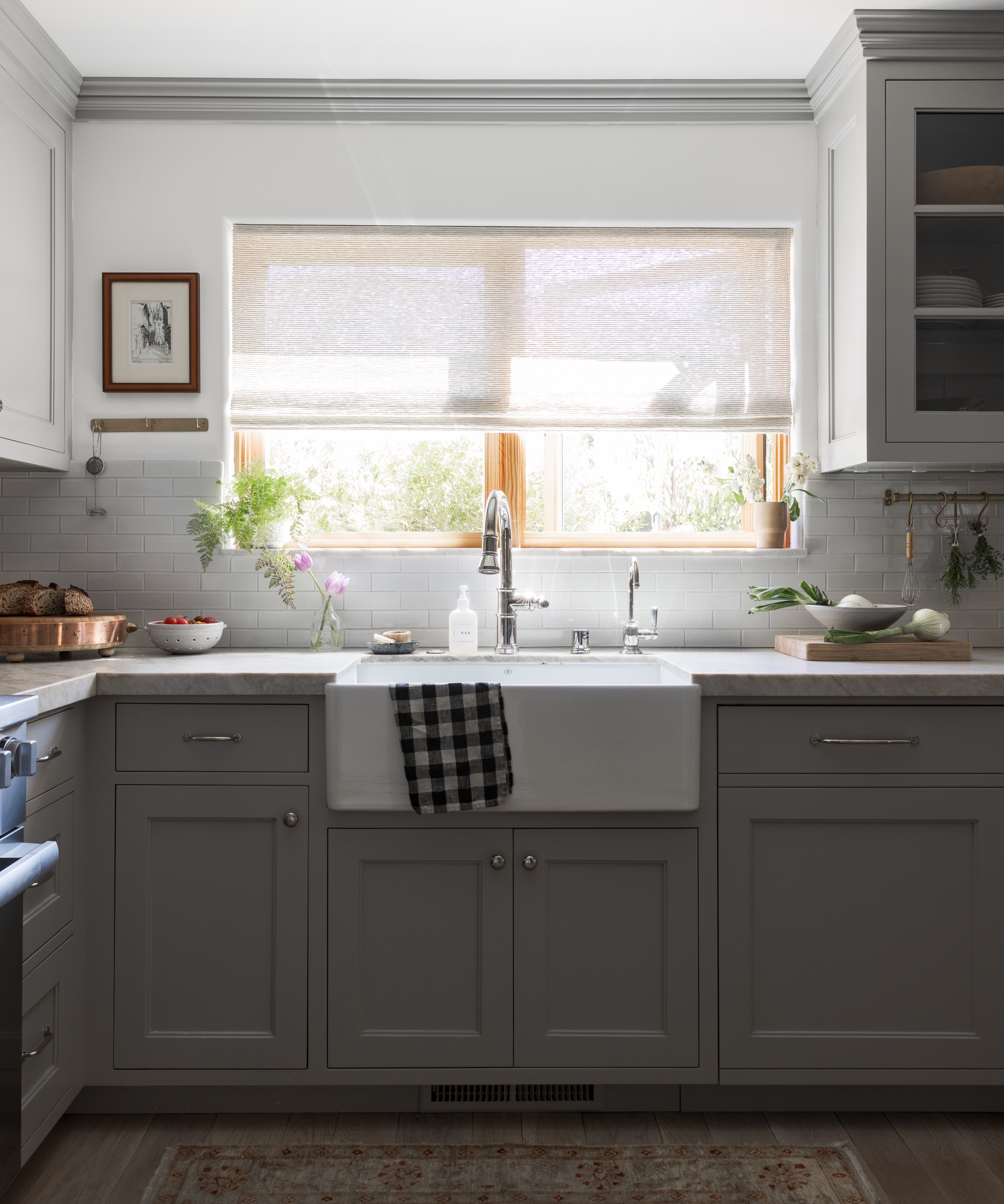
'Prior to the renovation, the kitchen was dark and filled with red oak cabinetry and 4x4 ceramic tiles used on both the countertops and backsplash,' explains Hana, who embraced designing the kitchen with enthusiasm.
'It was lacking in both function and appeal. There was a low-hanging upper cabinet over the peninsula obstructing the view to the backyard and an awkward empty space meant for a dining nook of sorts – but all I could see was unused potential.'
Hana set about opening up the room and maximizing every square inch of space without compromising on style.
With grey kitchen ideas the first choice for the client, Hana says: 'The first order of business was to bring in more light. We did this by installing new sliding doors, bigger windows and expanding the opening to the dining room.'
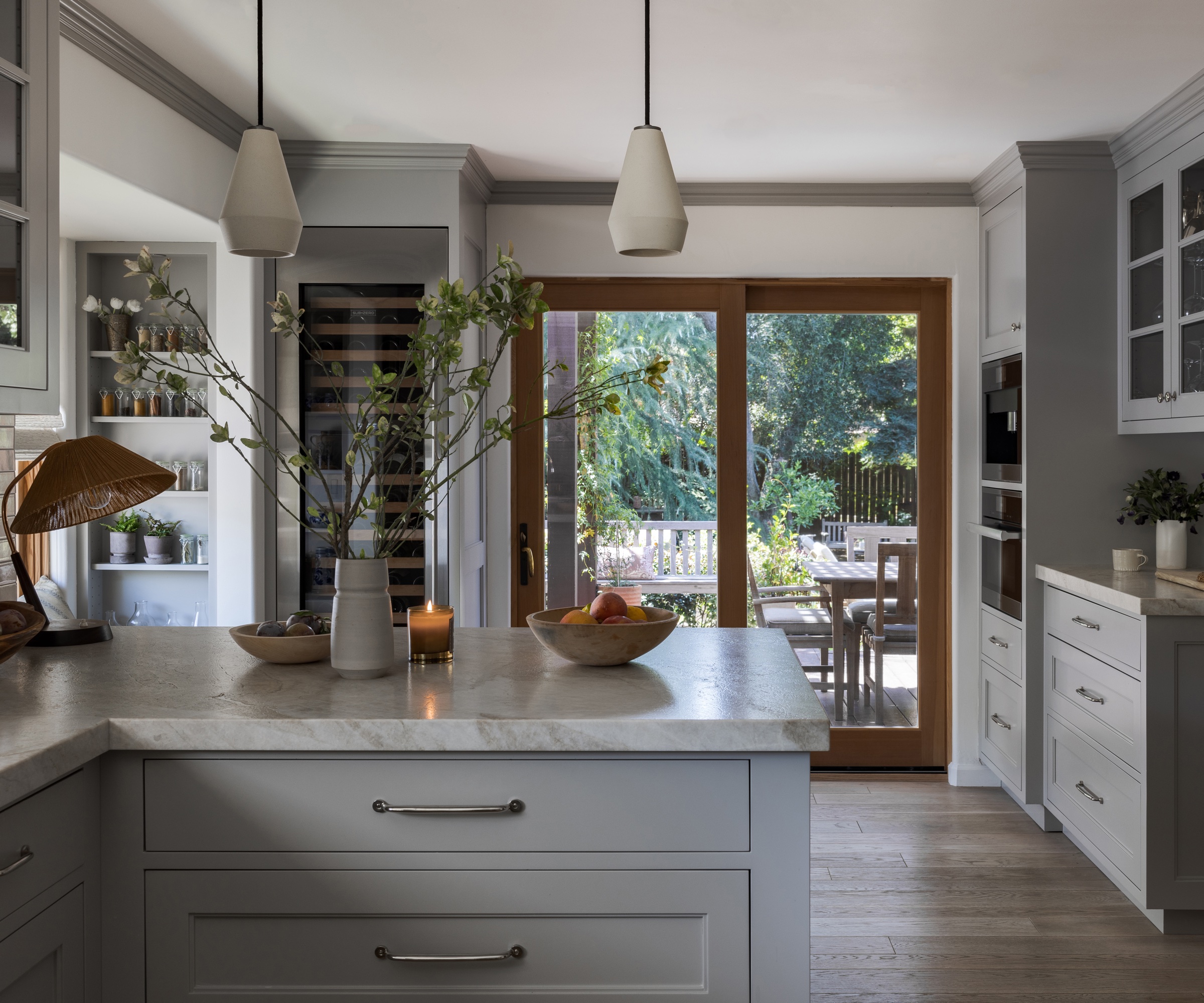
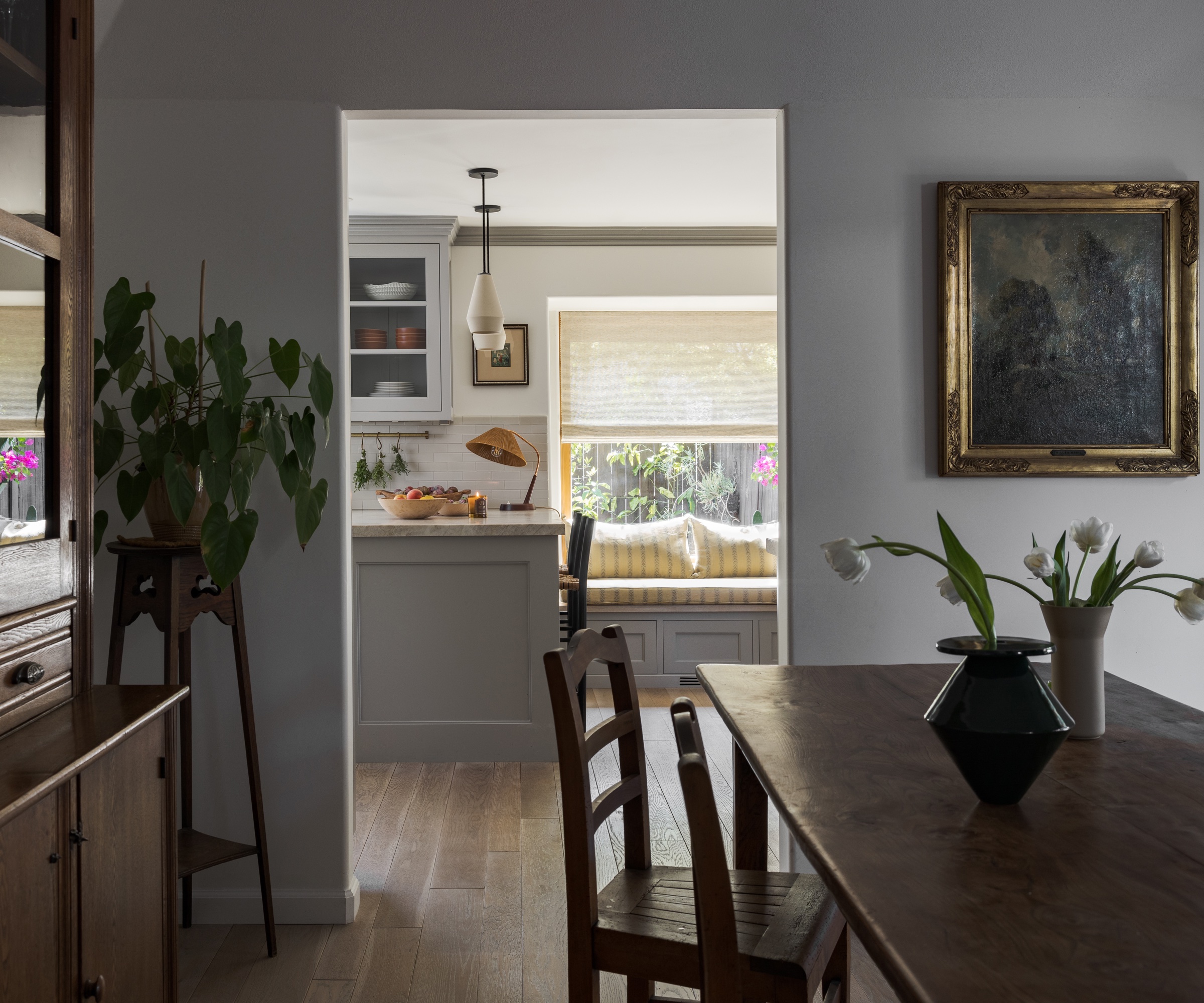
Extra seating was added in the form of a chic banquette seating idea, while the kitchen cabinetry was also extended for optimum use of the space.
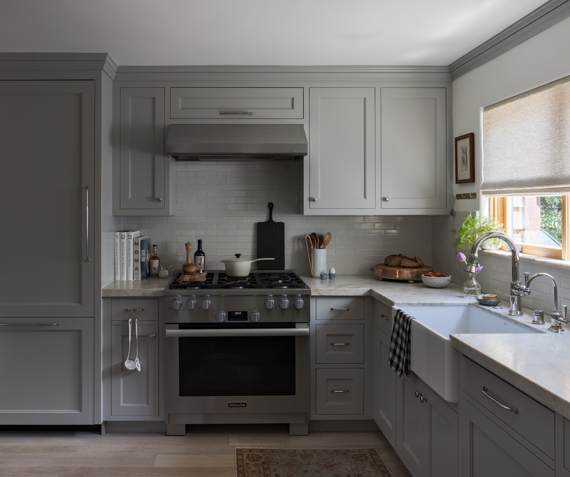
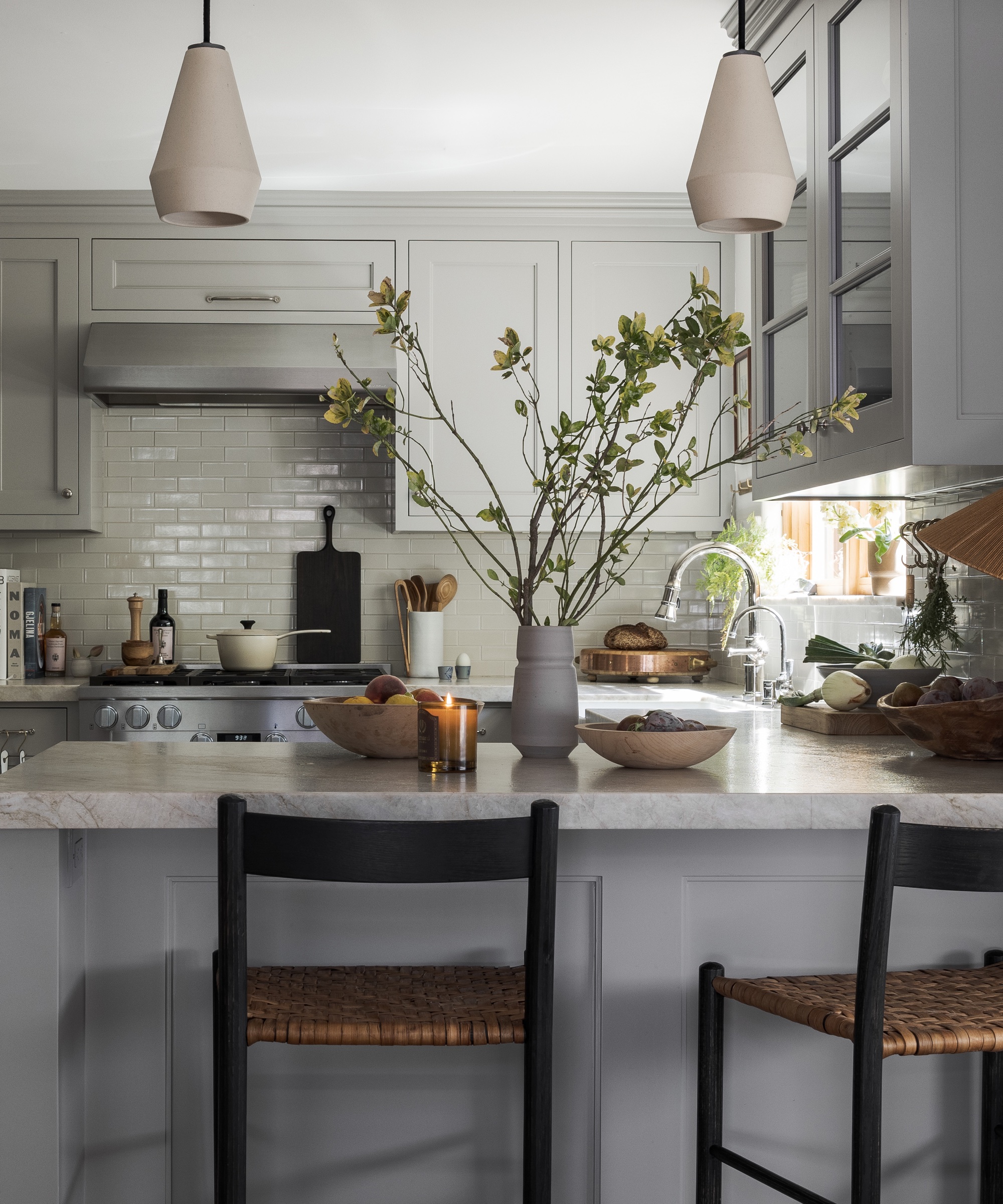
'We decided to keep the peninsula as a way to incorporate counter seating (the room was too narrow for a standalone island), but expanded the cabinetry to fill the entire room,' says Hana, adding, 'goodbye unused space.'
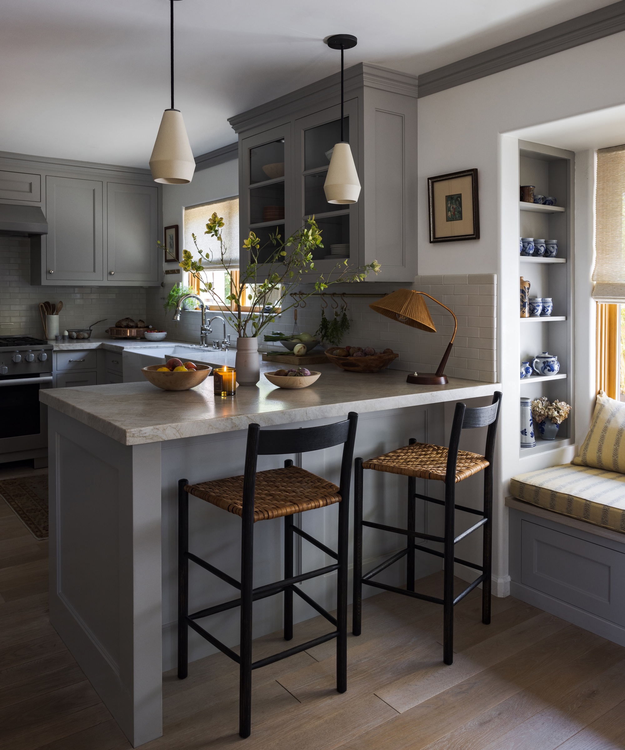
She continues: 'In the process, we were able to add a coffee station with a built-in Miele coffee machine and steam oven, Sub-Zero wine fridge and a built-in bench seating flanked by open shelves, where the client’s spices and Westerwald stoneware now reside.'
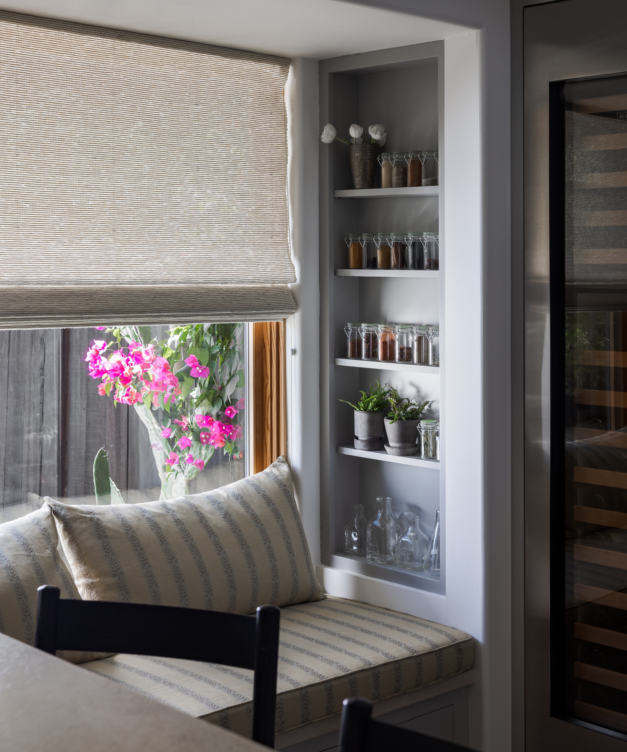
The palette is cool and calm with warmth and texture added through upholstery and accessories.
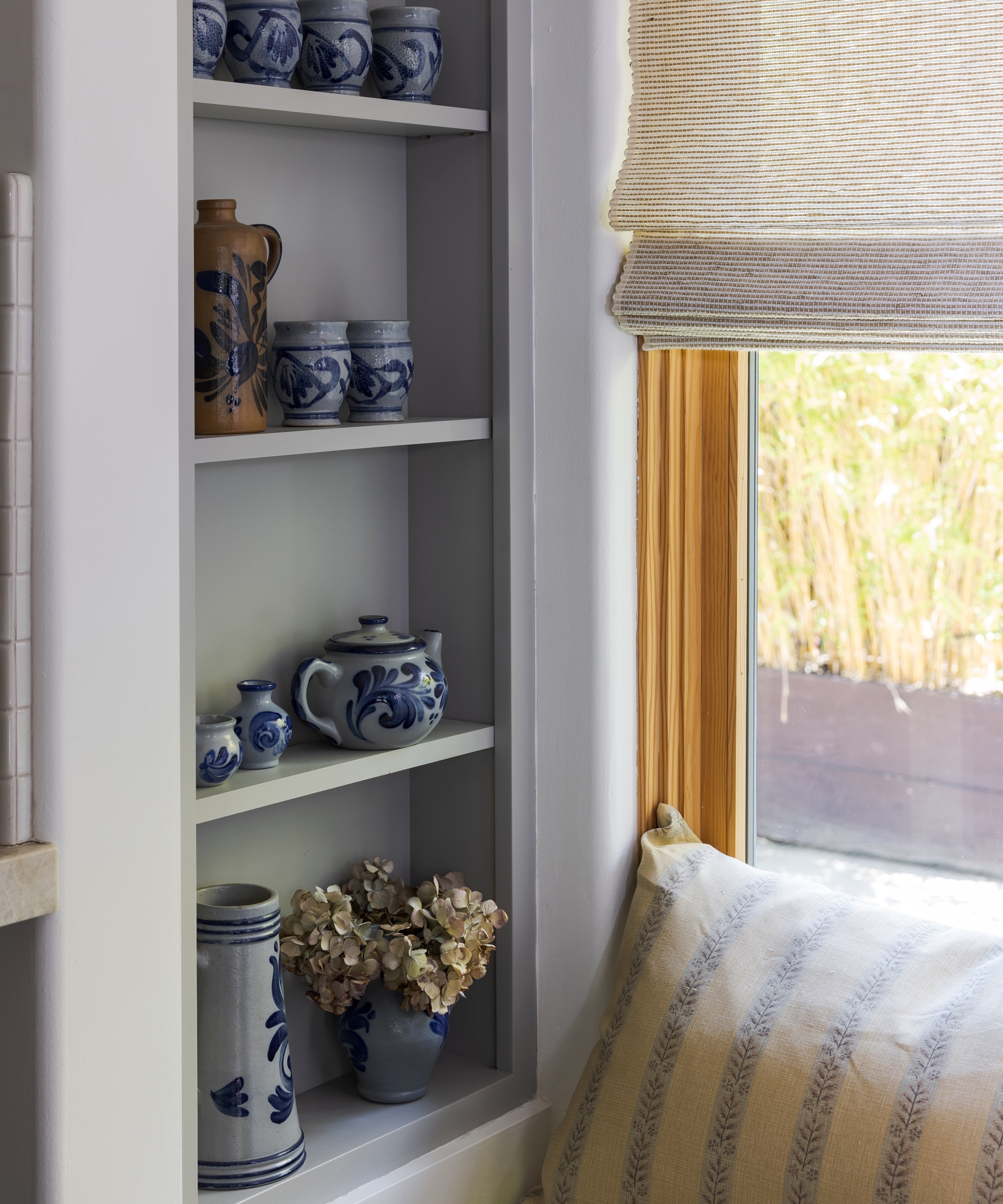
Hana says: 'When it came to choosing materials, we opted for a mix of warm and cool tones: leathered Taj Mahal stone countertops, cream-colored ceramic pendants and Heath tiles, aged European white oak floors, gray painted Shaker-style cabinets and polished nickel hardware and plumbing fixtures.
'For some pattern and texture, we added woven roman shades, Brian Persico counter stools, and coveted Rose Tarlow fabric for the cushions.'
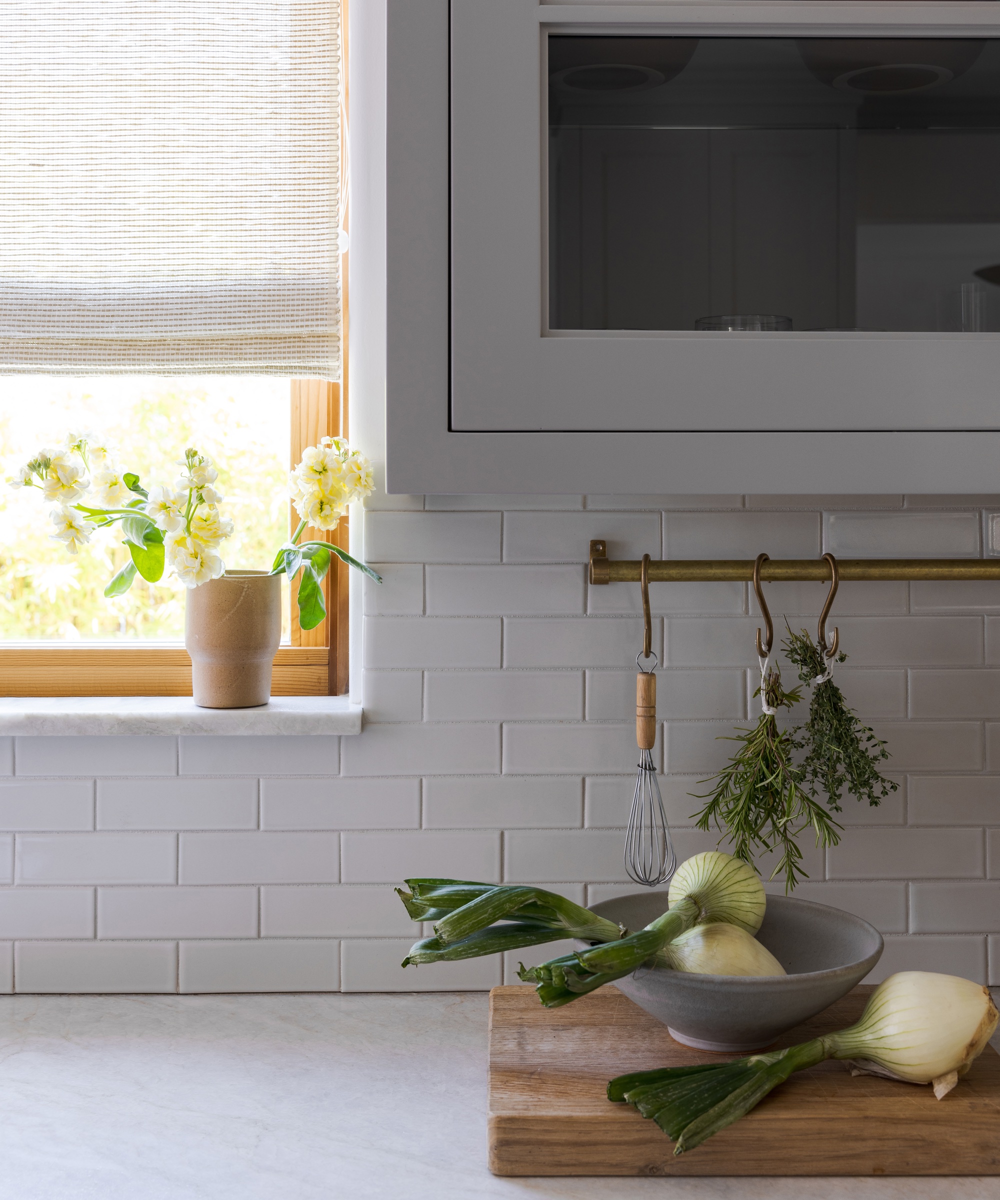
She continues: 'We also included brass utensil racks and hooks throughout the kitchen for display storage. I don’t believe every item needs to be hidden in drawers, and I prefer a well-used, inviting kitchen where anyone can come over and find the essentials.'
Hana's top spot? 'My favorite view is from the dining room into the kitchen - it feels warm and inviting; like space is drawing you in and asking you to sit and stay a while.'
Interior design: Innen Studio
Sign up to the Homes & Gardens newsletter
Design expertise in your inbox – from inspiring decorating ideas and beautiful celebrity homes to practical gardening advice and shopping round-ups.
Ruth Doherty is an experienced digital writer and editor specializing in interiors, travel and lifestyle. With 20 years of writing for national sites under her belt, she’s worked for the likes of Livingetc.com, Standard, Ideal Home, Stylist and Marie Claire as well as Homes & Gardens.
-
 This is the single best upright vacuum we've ever tested – and it's on offer with $130 off at Shark for a limited time only
You won't want to miss this one
By Dan Fauzi
-
 Nate Berkus says slipcovered sofas are back on trend – and I just found a way to create this designer-approved laid-back look from just $86
This classic style is making a strong comeback, but did you know you don't have to buy a whole new couch to get this Nate-approved look?
By Eleanor Richardson